
Recommended
More Related Content
What's hot
What's hot (20)
Viewers also liked
Viewers also liked (14)
Similar to Target Audience and Genre Analysis of Kerrang! Magazine Cover
Similar to Target Audience and Genre Analysis of Kerrang! Magazine Cover (20)
More from LaraDobsonx
More from LaraDobsonx (20)
Recently uploaded
Recently uploaded (20)
Target Audience and Genre Analysis of Kerrang! Magazine Cover
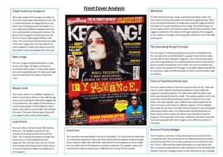
- 1. Target Audience and genre The target audience for Kerrang! are readers 15 to 25 who enjoy heavy metal and rock music. This is shown the amount of images that are on the front cover to draw the eye of the readers. It is also shown By the different typefaces which are sans serif and seem to look quite immature. The genre of this magazine is heavy metal and rock yet it can have a wide range of different rock music. This can be seen from the male rock singer in the main image. Also, the house style of the cover magazine is mainly the colours of red and black which can be stereotyped with rock music. Main Image The main image is of Gerard Way who is a well known rock singer. His body is in the axis of orientation and his head is in the primary optical area and strong fallow area. His face is quite light which contrasts with the colours on the front cover. Model credit The model credit is in in a different typeface to make it stand out on the front cover. Also the way they are surrounding the lead article suggests this is the lead article. The snippet of information is a used to draw people in to the magazine. A pull quote is also seen to try and draw in the attention of viewers. The quote that has been chosen will also appeal to the curiosity of the readers. Lead Article The lead article is the band name ‘My Chemical Romance’. The typeface used attracts the audience as it stands out from the rest of the cover. This is because the colours are bright and stand out on the dark background of the magazine. Also, the main cover line is in the axis of orientation which means that it will be seen. It is also a banner which adds to the brightness of the magazine. Masthead The Masthead of Kerrang is being covered by Gerard Way’s head. The mast head is in the primary optical area and the strong fallow area. This is to try and draw the attention of readers who enjoy this magazine and the masthead isn’t usually covered by a main image. The name Kerrang is an onomatopoeia which is the sound of a guitar riff and the exclamation mark suggests excitement. This relates to the target audience of this magazine as the audience is teenagers and young adult and they are more than likely to play guitar. The Gutenberg Design Principle The masthead is in the primary optical area and the strong fallow area. This has been done as the Masthead is a popular brand that the readers usually look for when looking for magazines. Also in the primary optical area and strong fallow area is a coverline with the mention of two famous bands to attract the attention of the reader. The axis of orientation has been used as the coverlines fill the page. In the week shallow point and the terminal area, singers of different bands are there to attract a wider range of audience. Colours/Typefaces/House style The main colours evident in this front cover are black and red. These two colours can be related to the heavy metal genre of music which the magazine is primarily based on. The yellow also makes the cover seem vibrant and attracts the eye of a reader. The typeface used for most of the coverlines is very bold and solid which seems to make the front cover bolder. The other typeface used is slightly more sophisticated than the other and may try and relate to a different audience. The one typeface that stands out the most is the ‘My Chemical Romance’ is eye catching and advertises the band name. This is because My Chemical Romance is a famous band and the readers will see the name and want to buy the magazine. The house style of this issue is identical to the other issues that have been produced with minor changes such as different positions of coverlines. Coverlines The coverlines have been placed in the axis of orientation. This is because the readers will scan the whole magazines in that order. Also, the fact that the typeface is bold and bright means that the readers will catch these coverlines first. Some typefaces are more subtle than the others and are all related to one article in particular. This typeface used on the coverline also makes it standout as it is different from the rest of the coverlines. Banners/Flashes/badges The first banner used starts in the primary optical area and ends in the strong fallow area. The second starts in the weak fallow area and ends in the terminal area. This is so the extra coverlines can be noticed first and last. There is a flash which provides information on a subscription deal. This is small as to draw attention to the coverlines first then the flash itself. However there are no badges present as the coverlines are very crowding. Front Cover Analysis