Download as PDF, PPTX


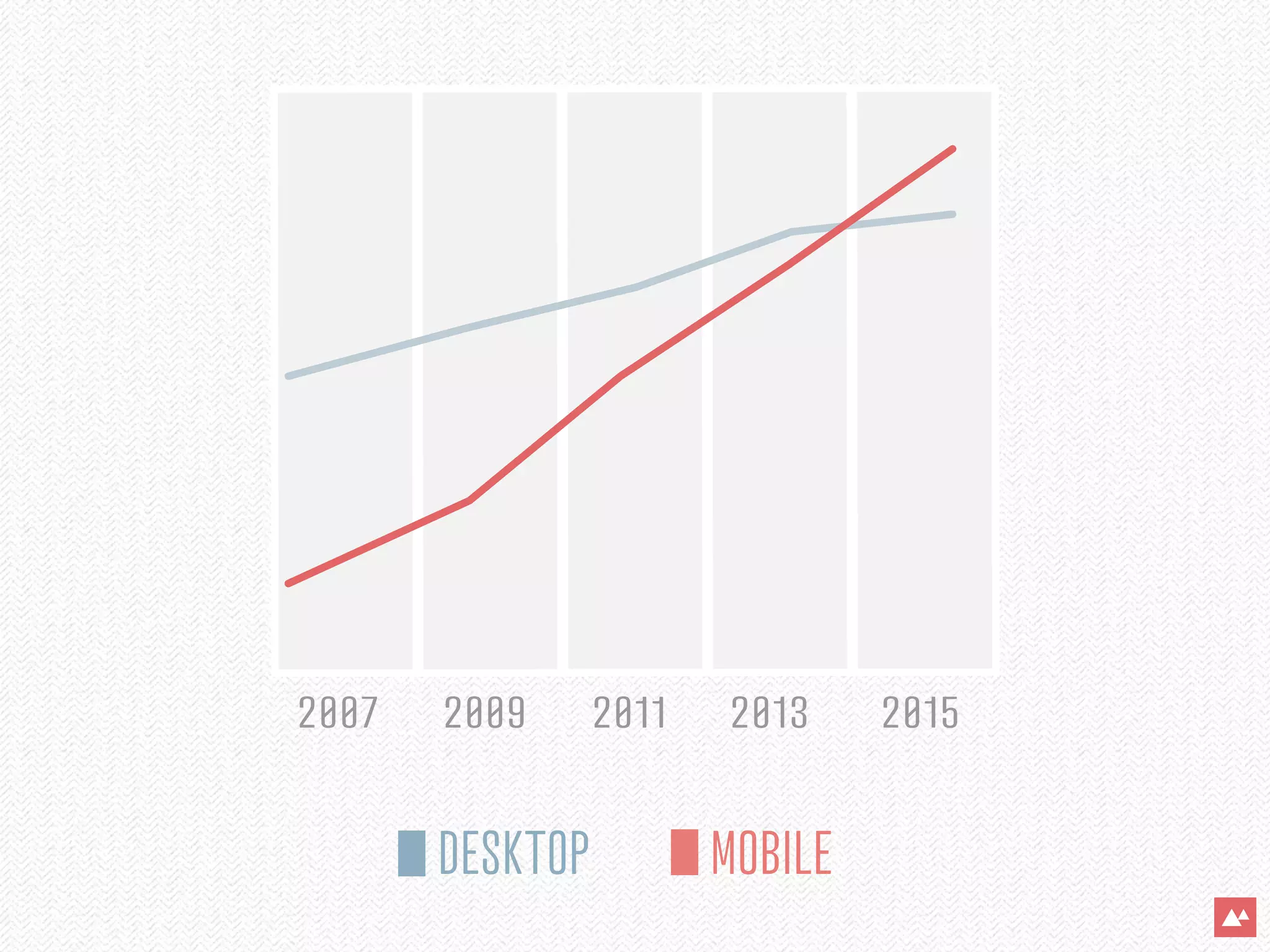
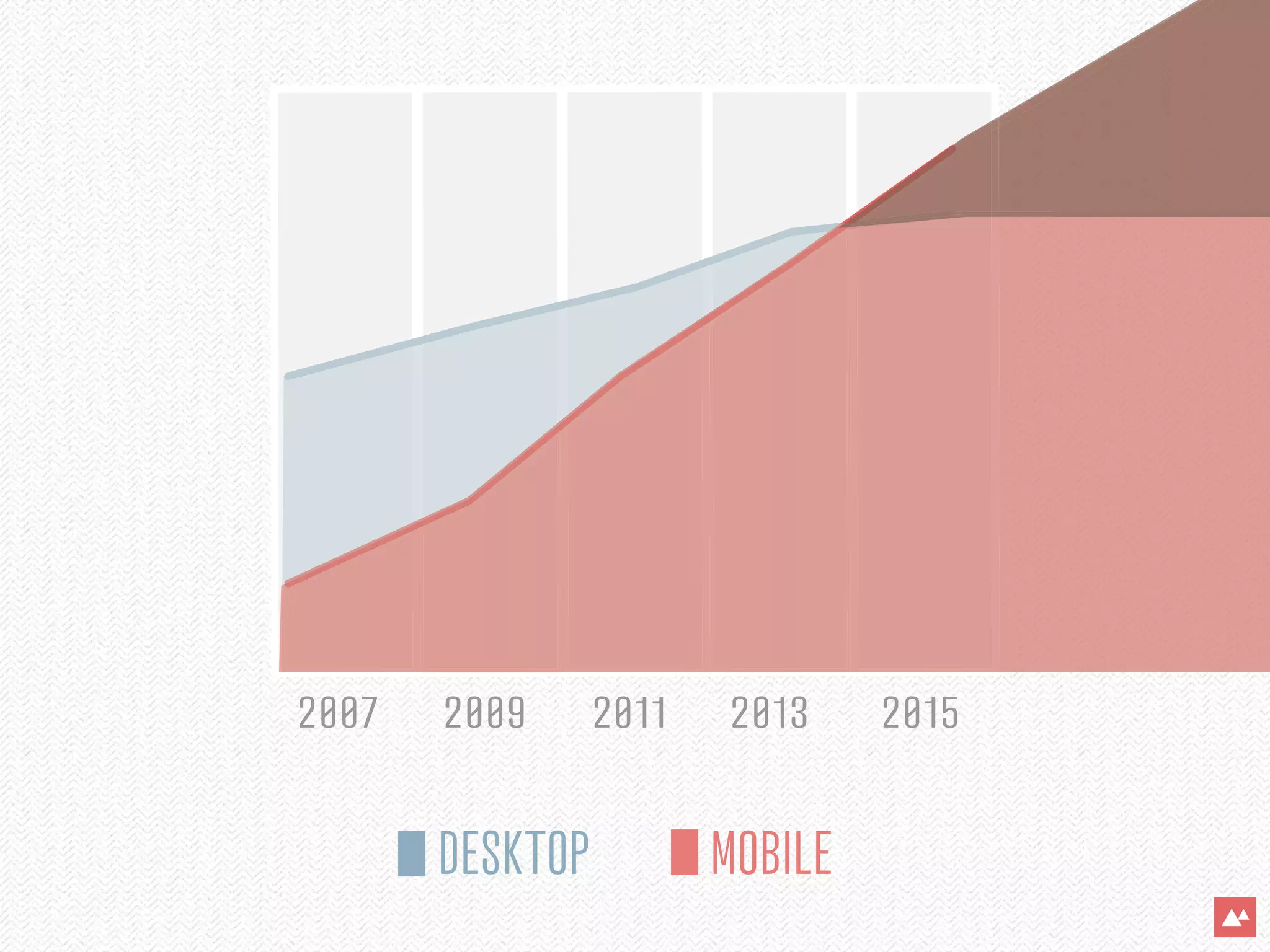


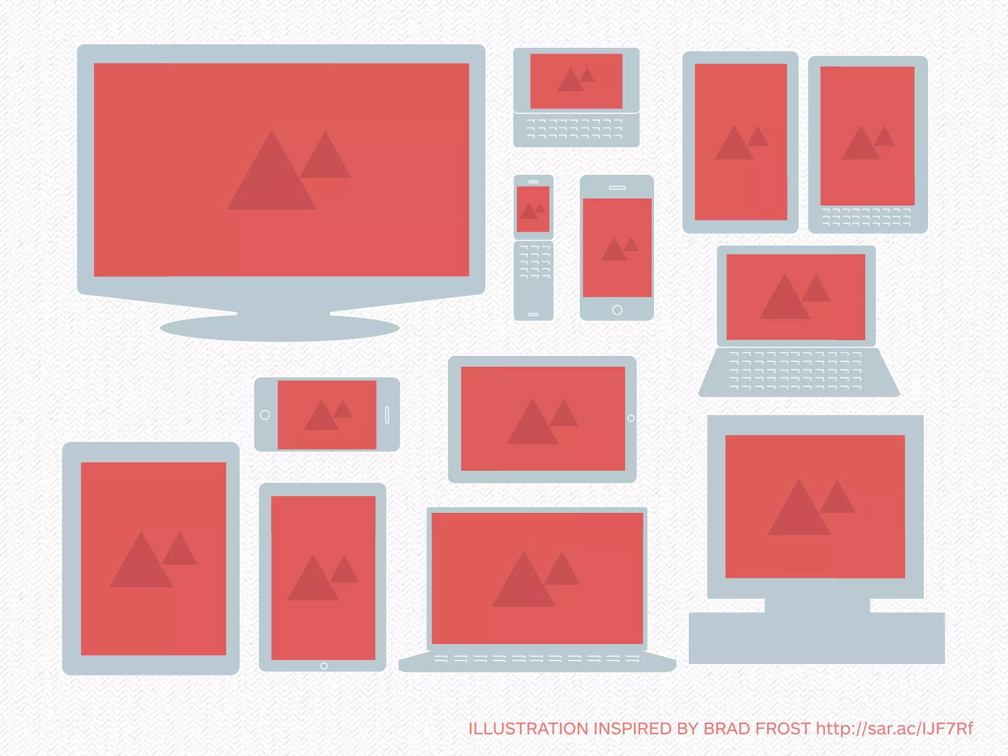


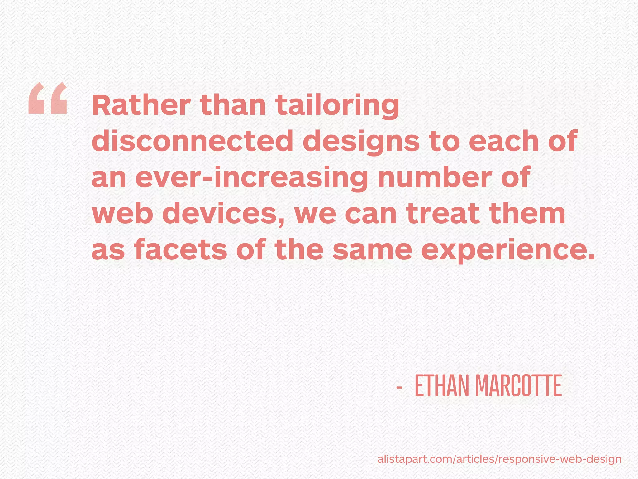

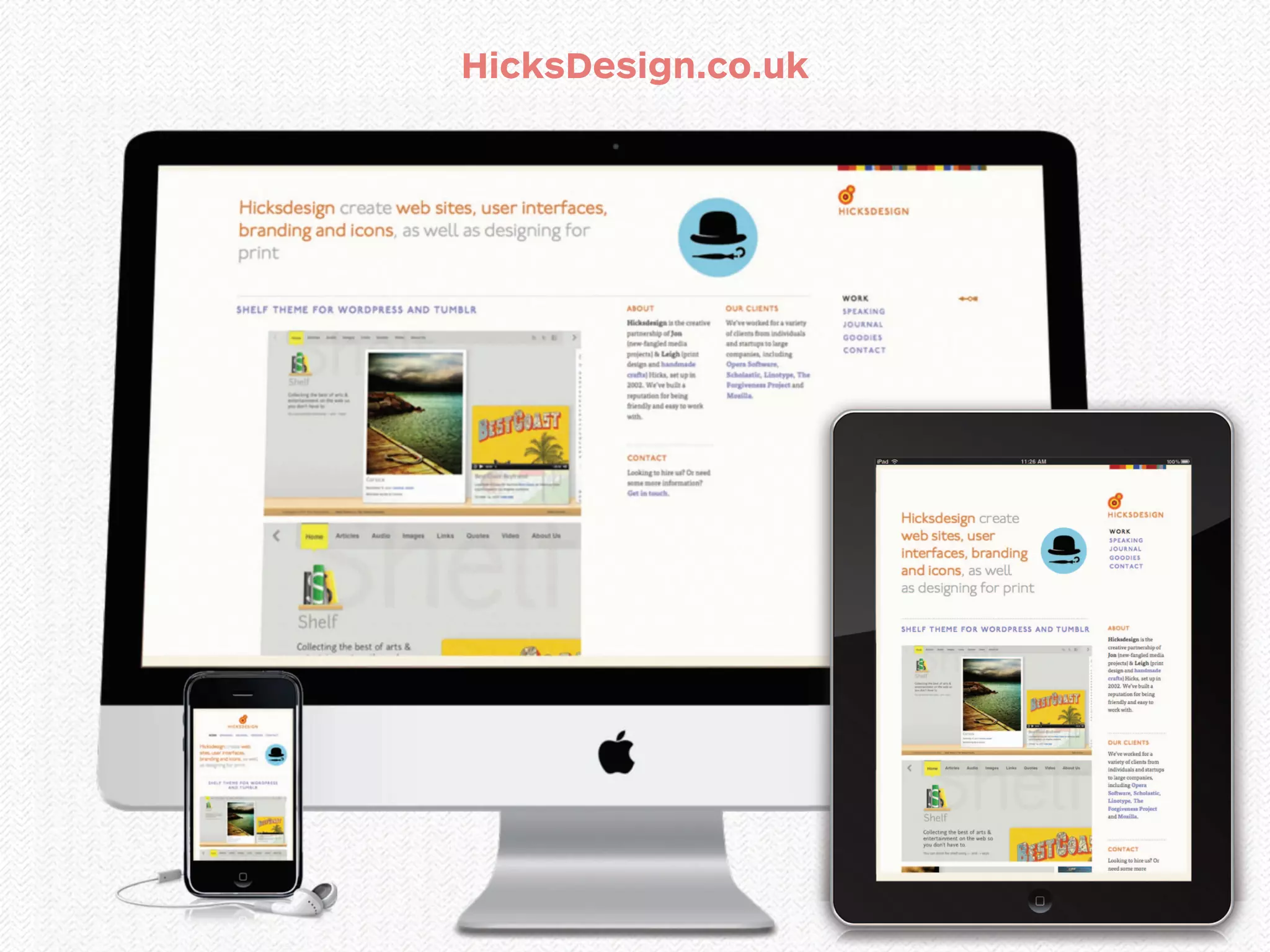
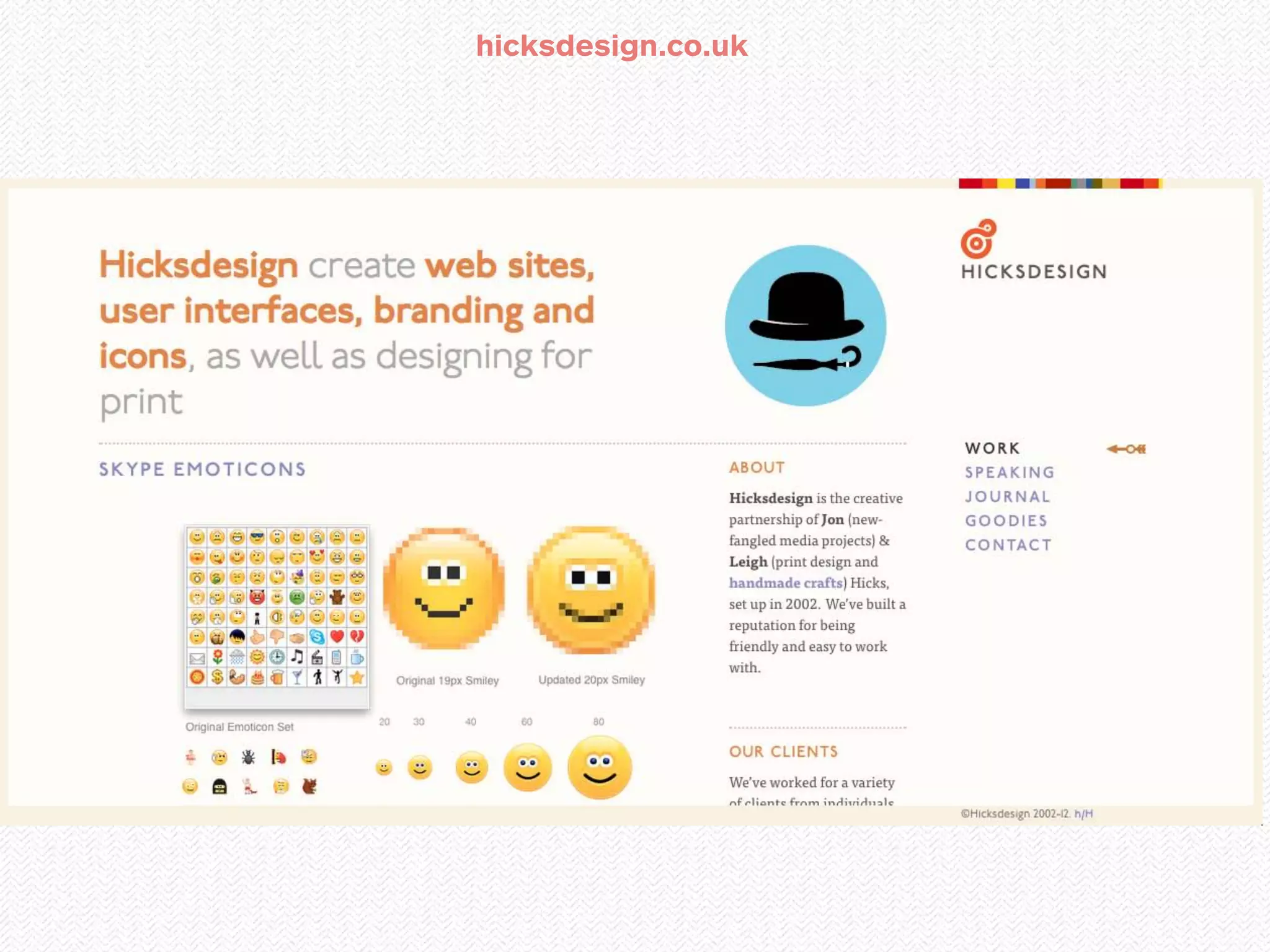
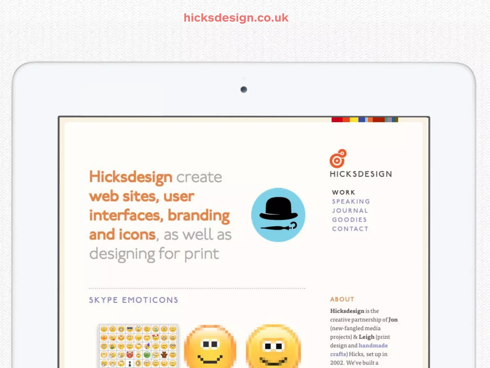


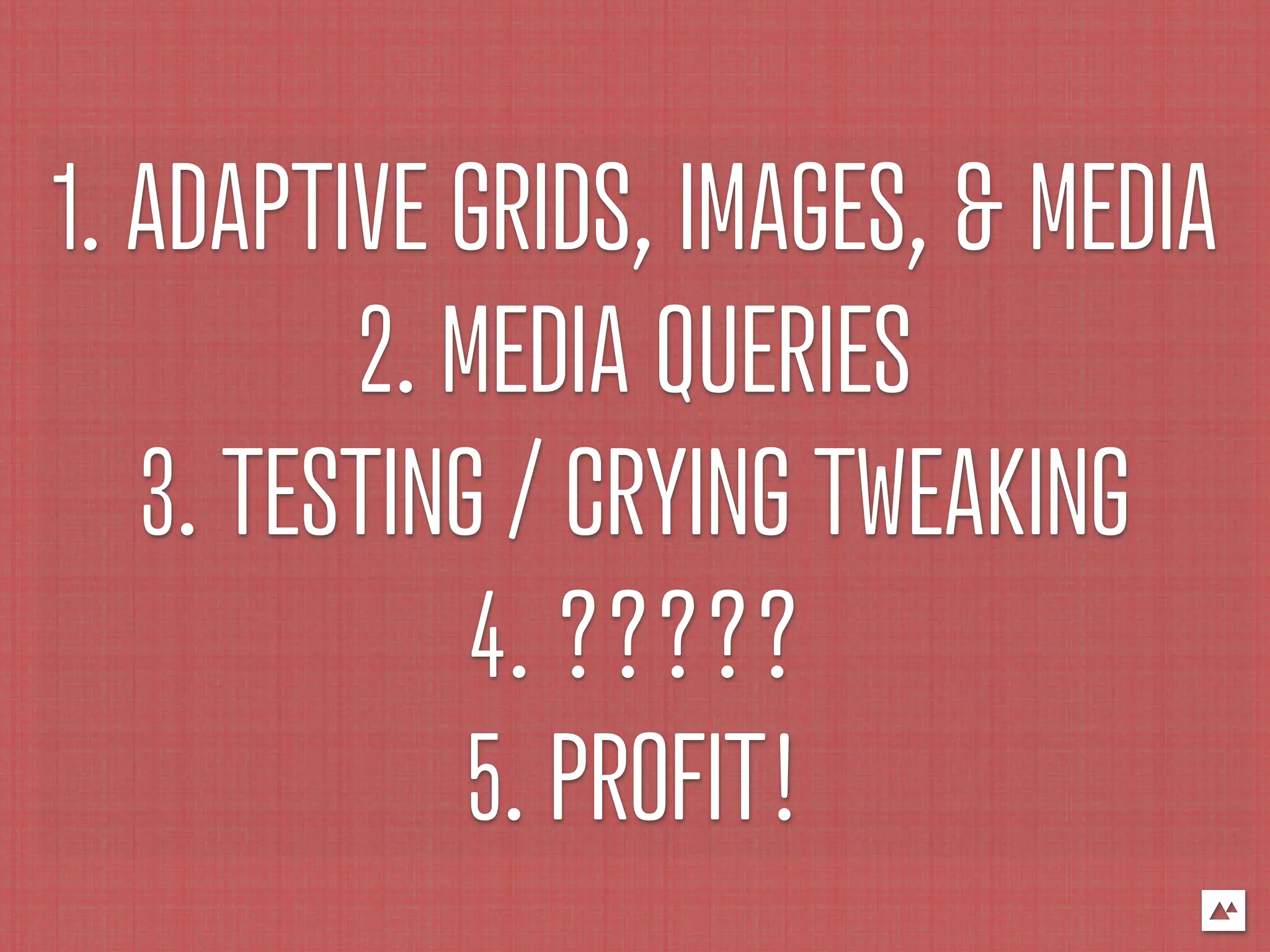
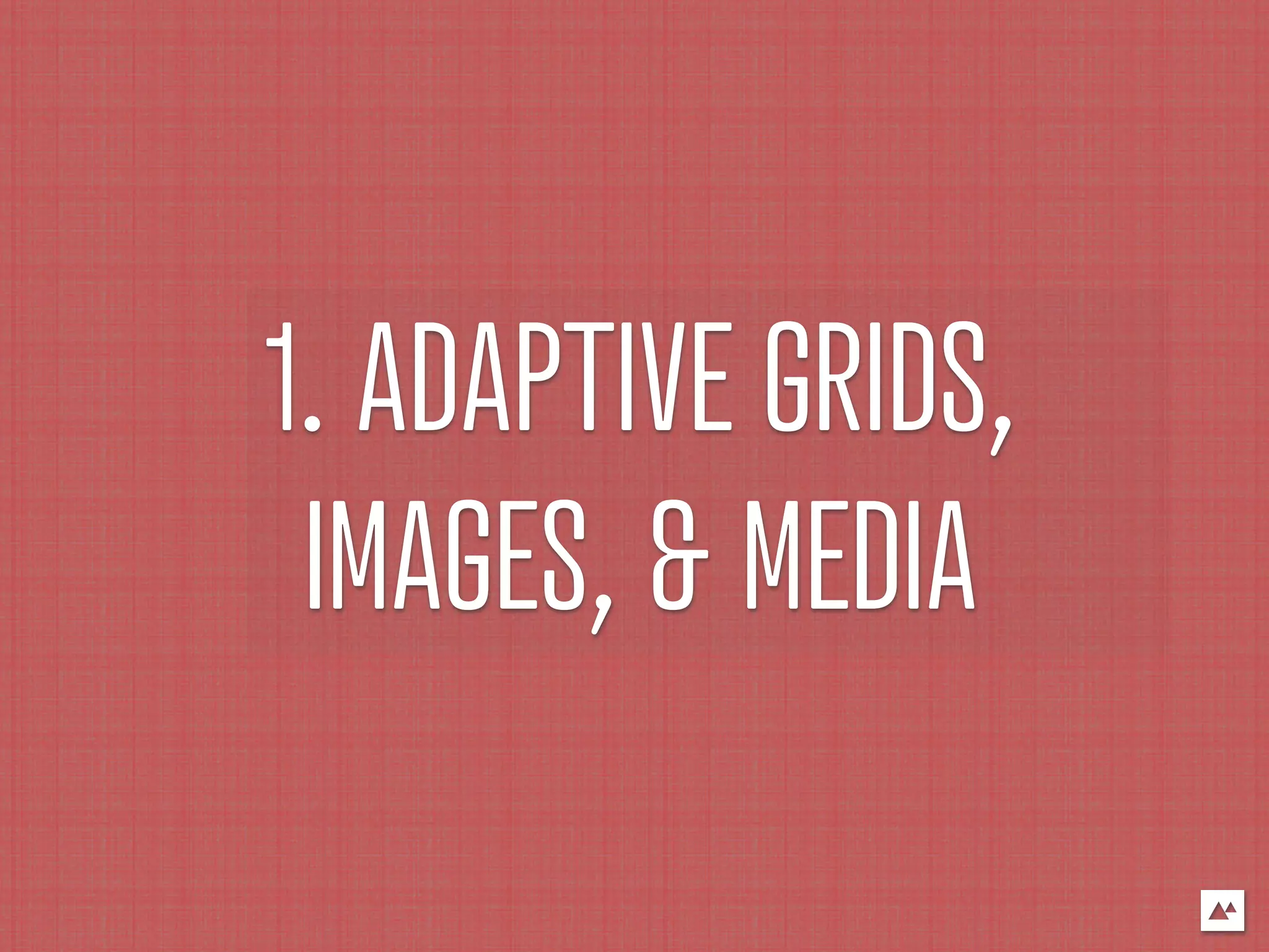

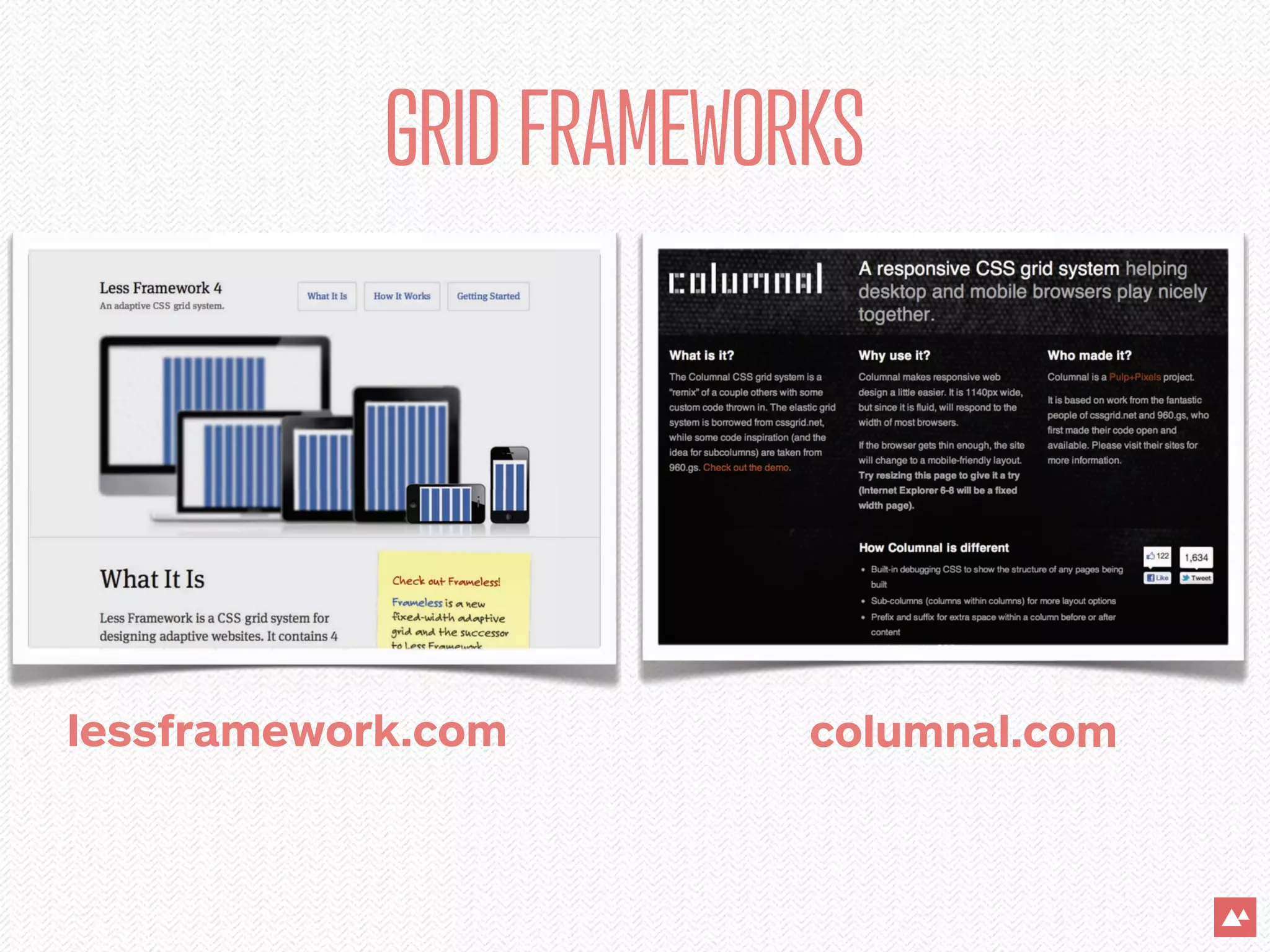

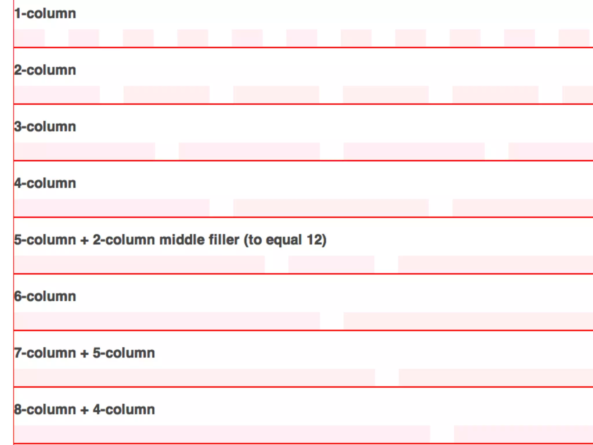


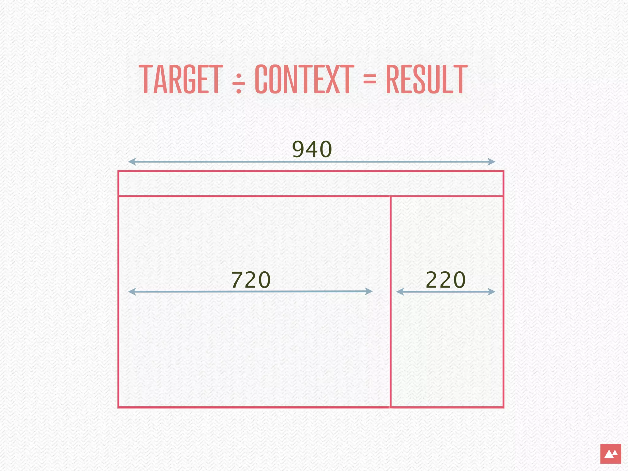
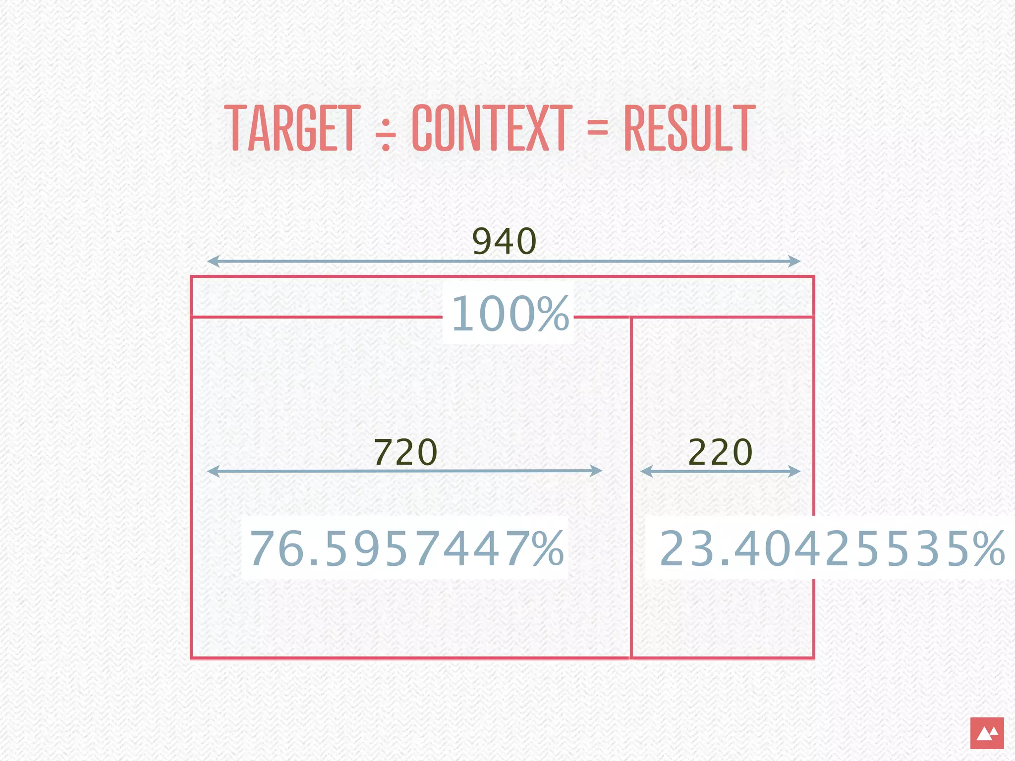
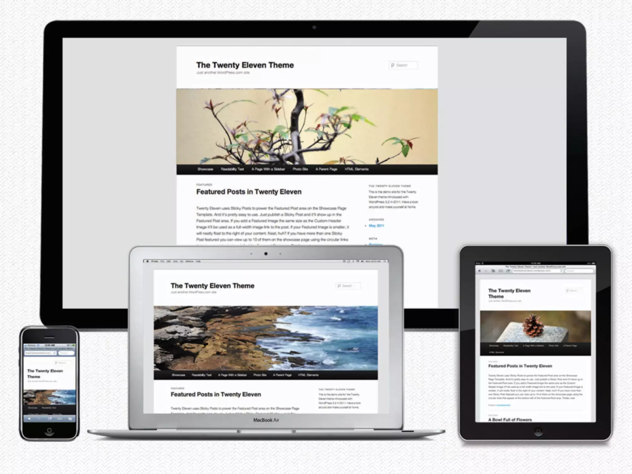


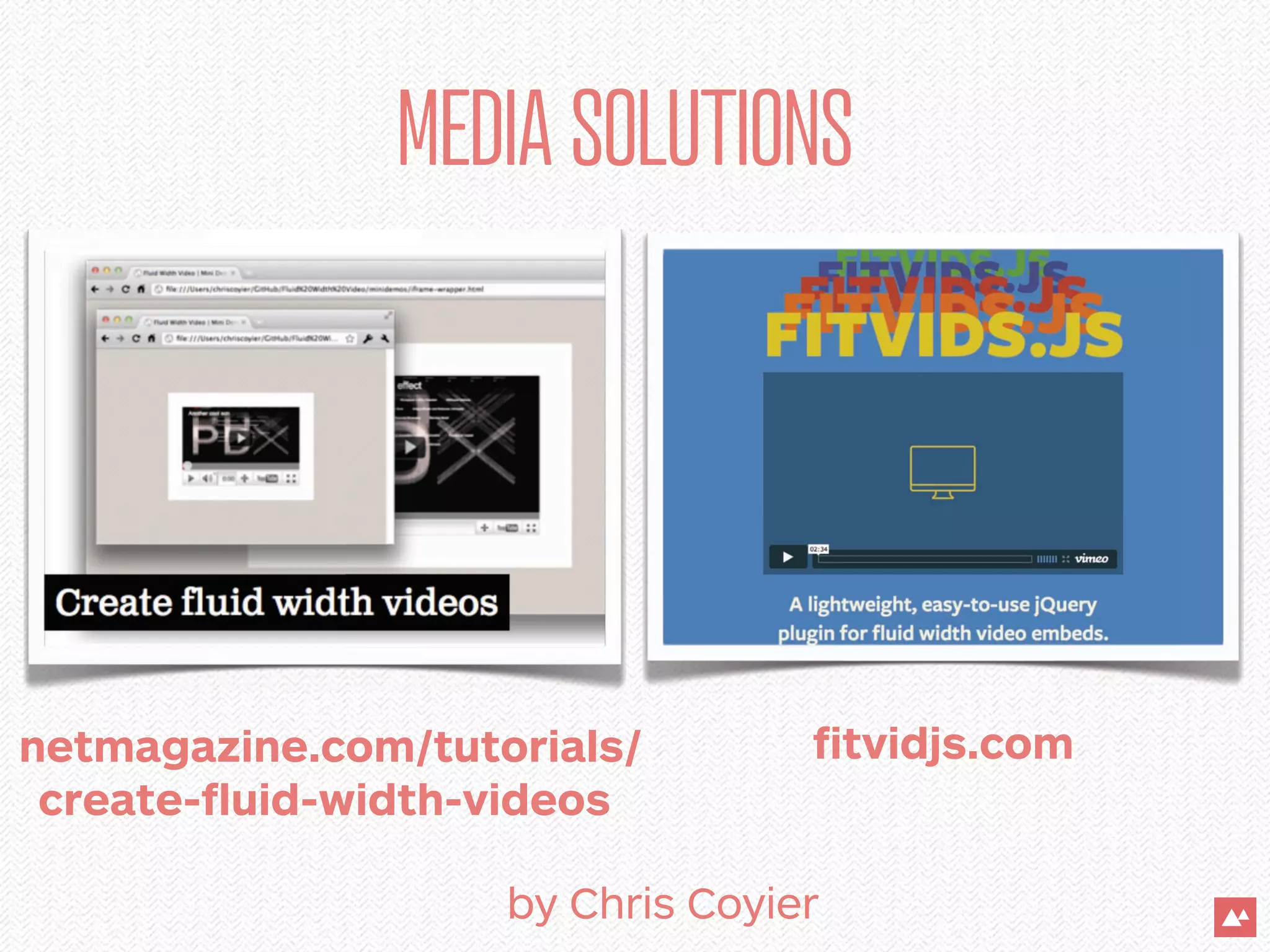


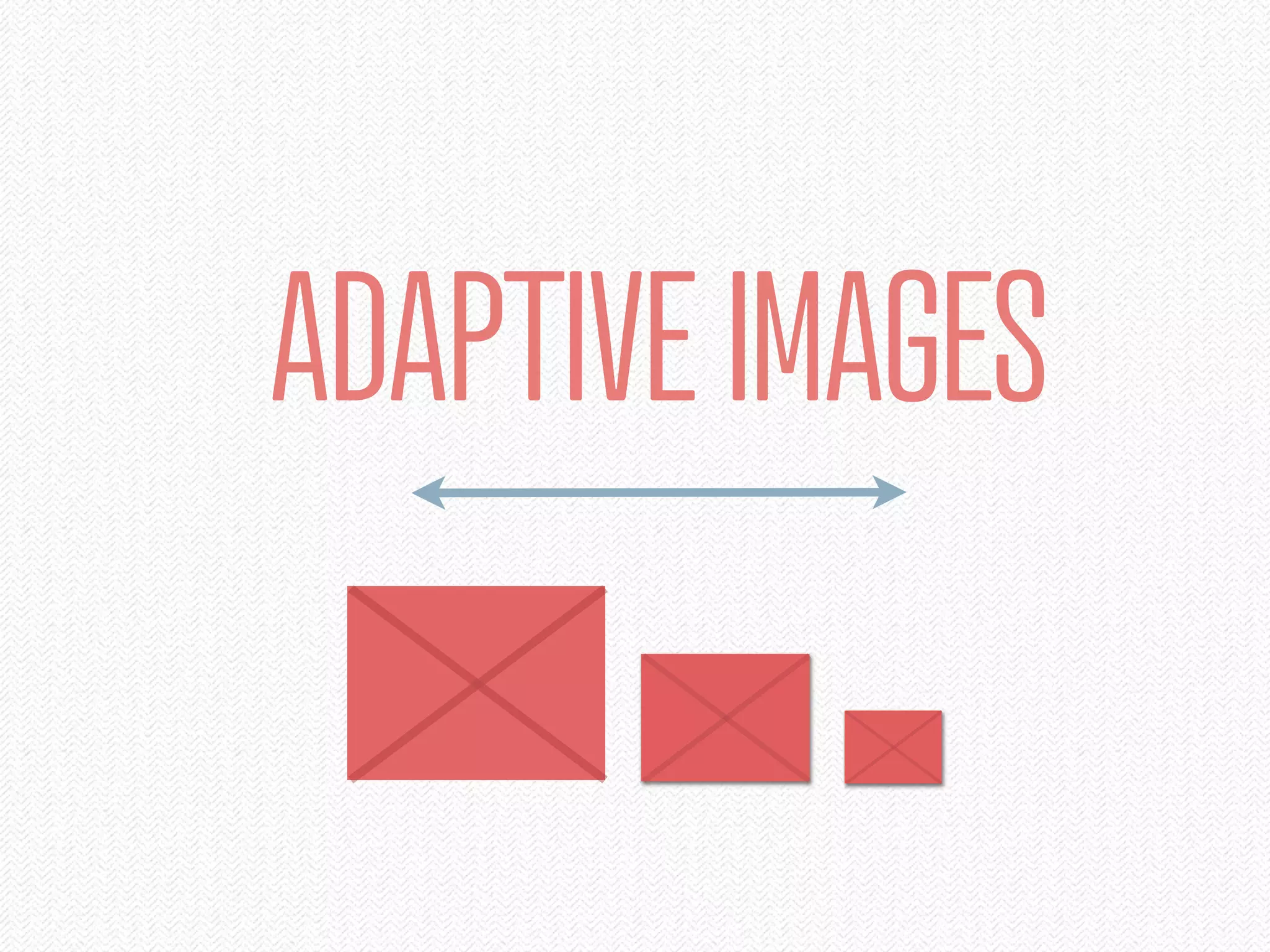
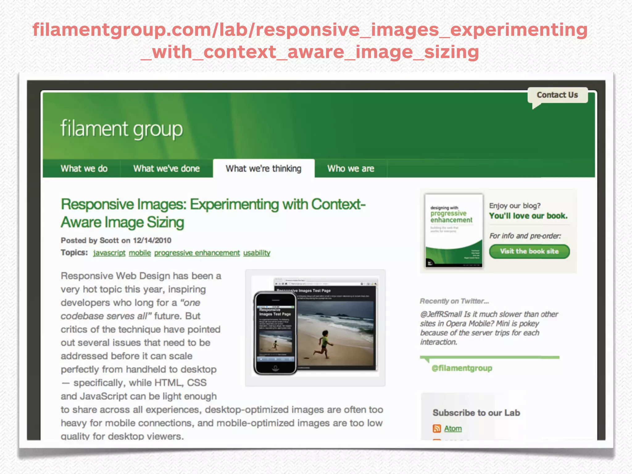


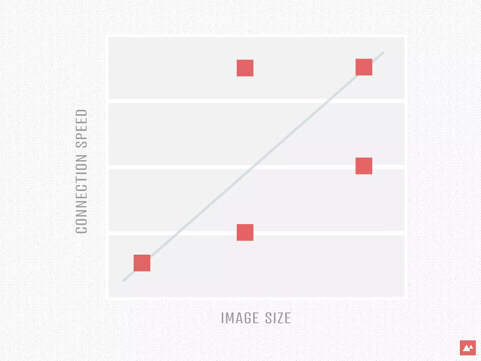
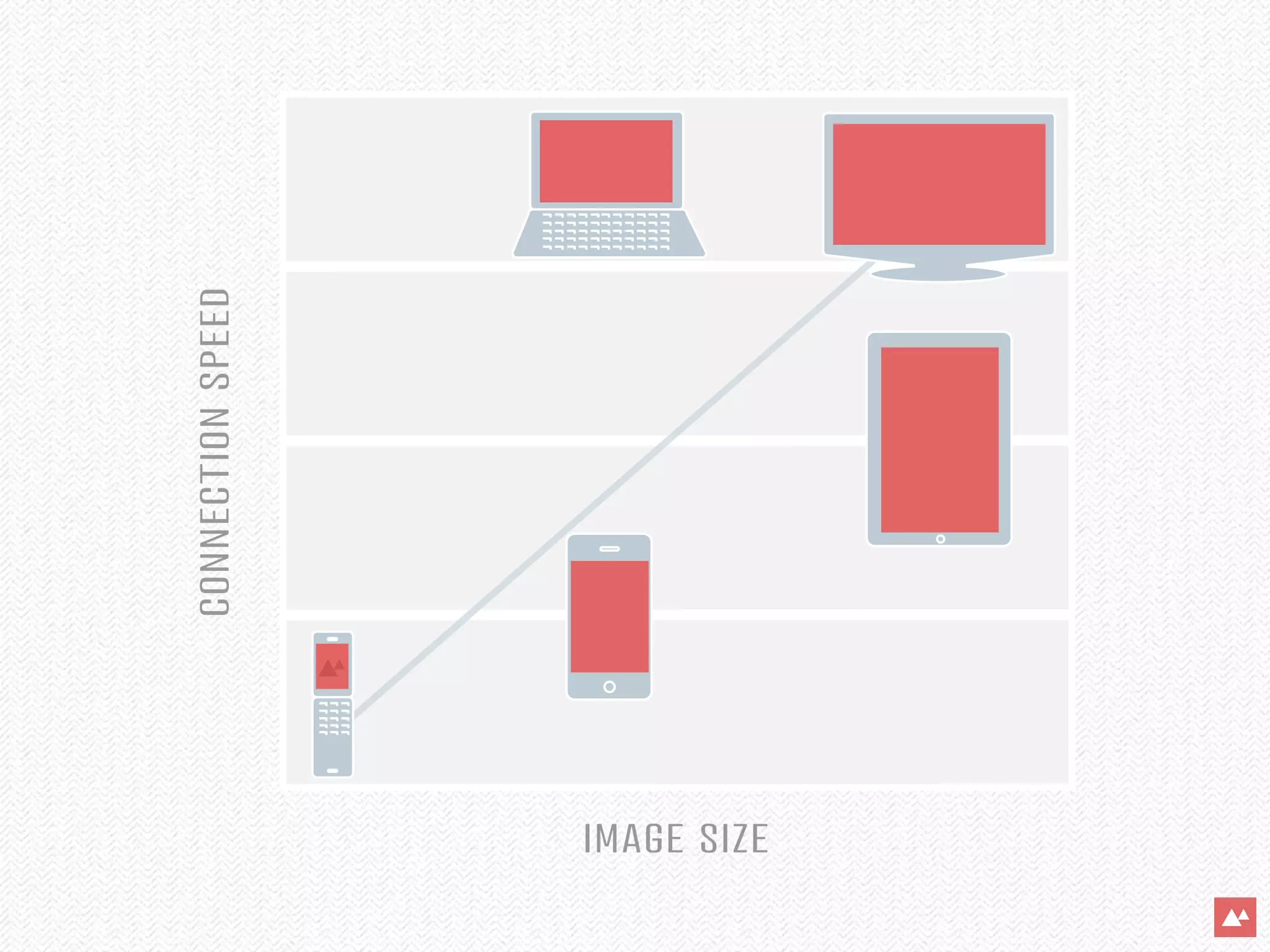


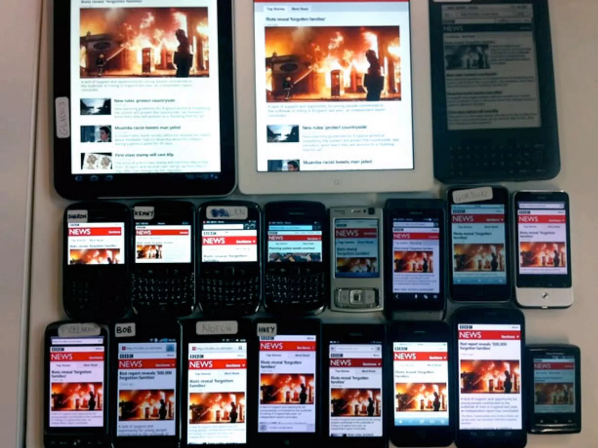


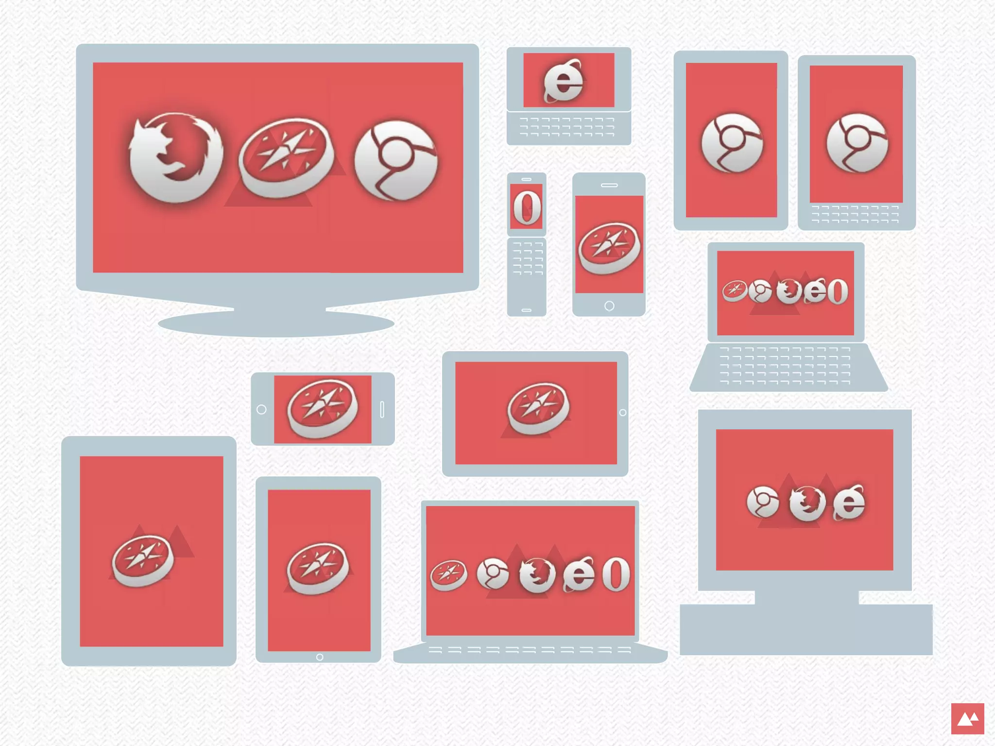


The document discusses the importance of responsive web design in adapting to the increasing use of mobile devices, projected to surpass desktops by 2015. It highlights the challenges and techniques involved in creating responsive layouts, including adaptive grids, media queries, and flexible media. The overall emphasis is on treating all web devices as facets of the same user experience rather than as separate entities.


![[Final] ReactJS presentation](https://cdn.slidesharecdn.com/ss_thumbnails/65cfd4f9-740f-4f41-b769-b496b6e60802-170119143904-thumbnail.jpg?width=640&height=640&fit=bounds)


![Vibe Coding vs. Spec-Driven Development [Free Meetup]](https://cdn.slidesharecdn.com/ss_thumbnails/vibecodingvsspecdrivendevelopment-251209105622-43f455e7-thumbnail.jpg?width=640&height=640&fit=bounds)


