Download as PDF, PPTX


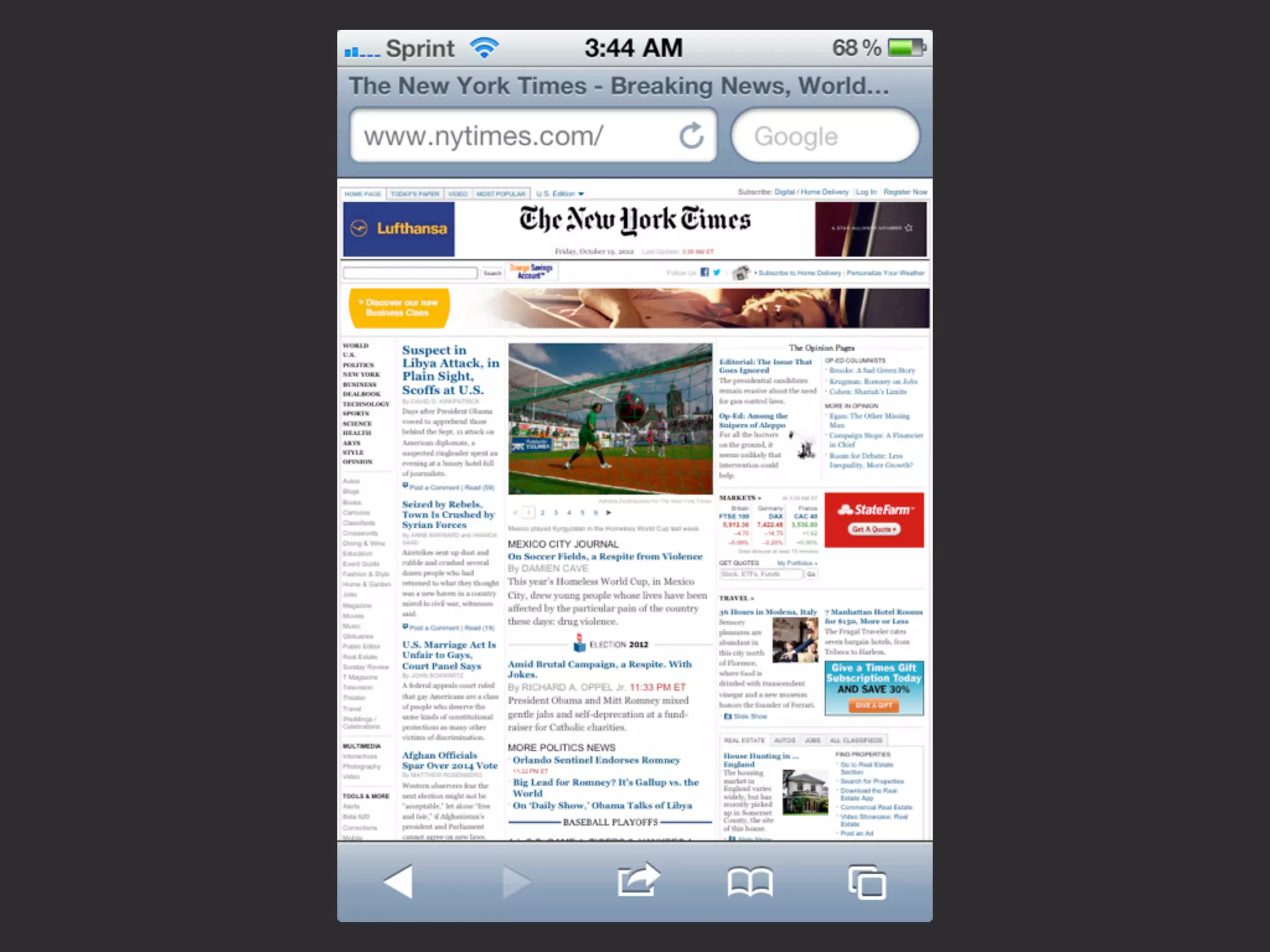


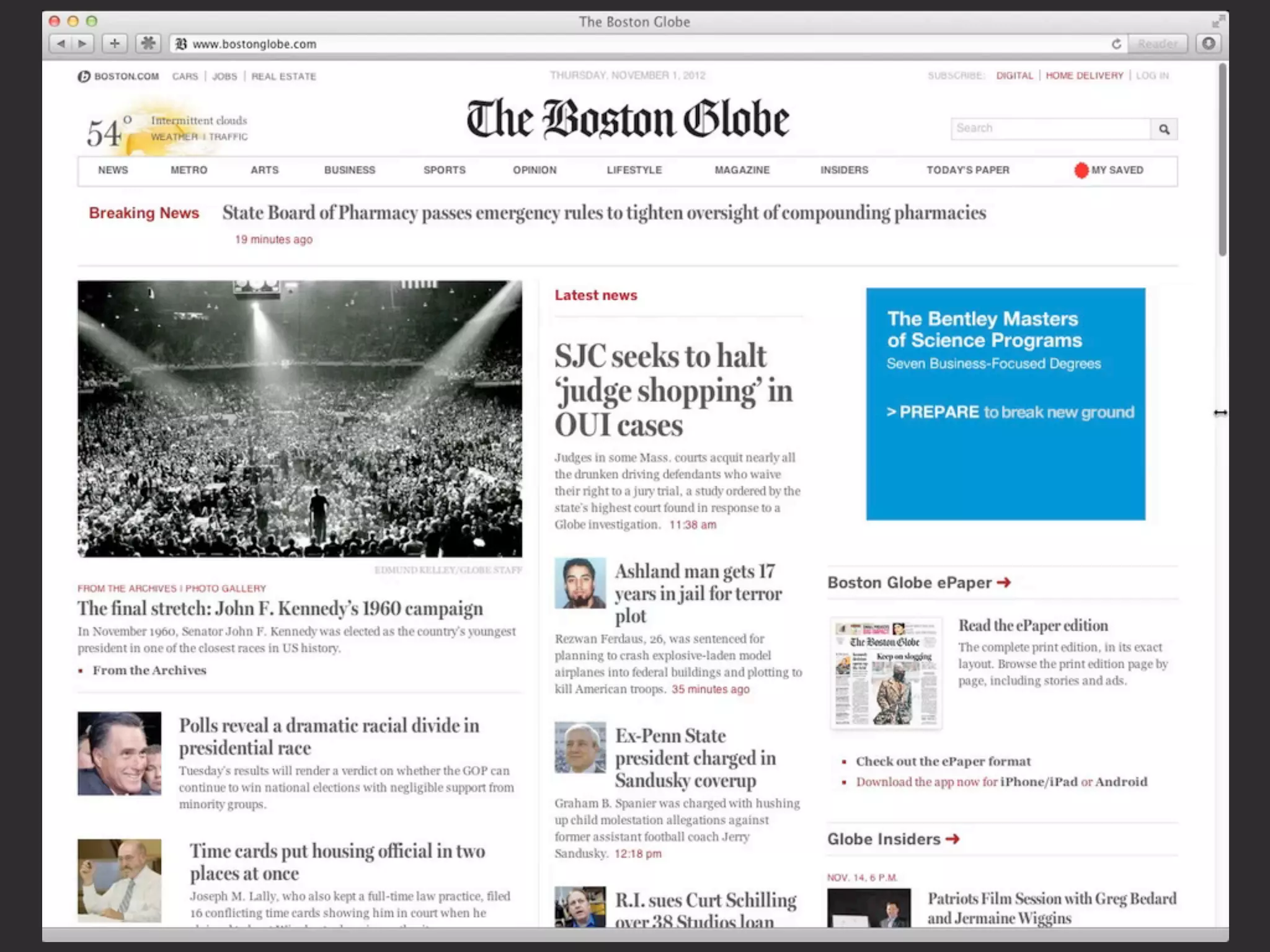
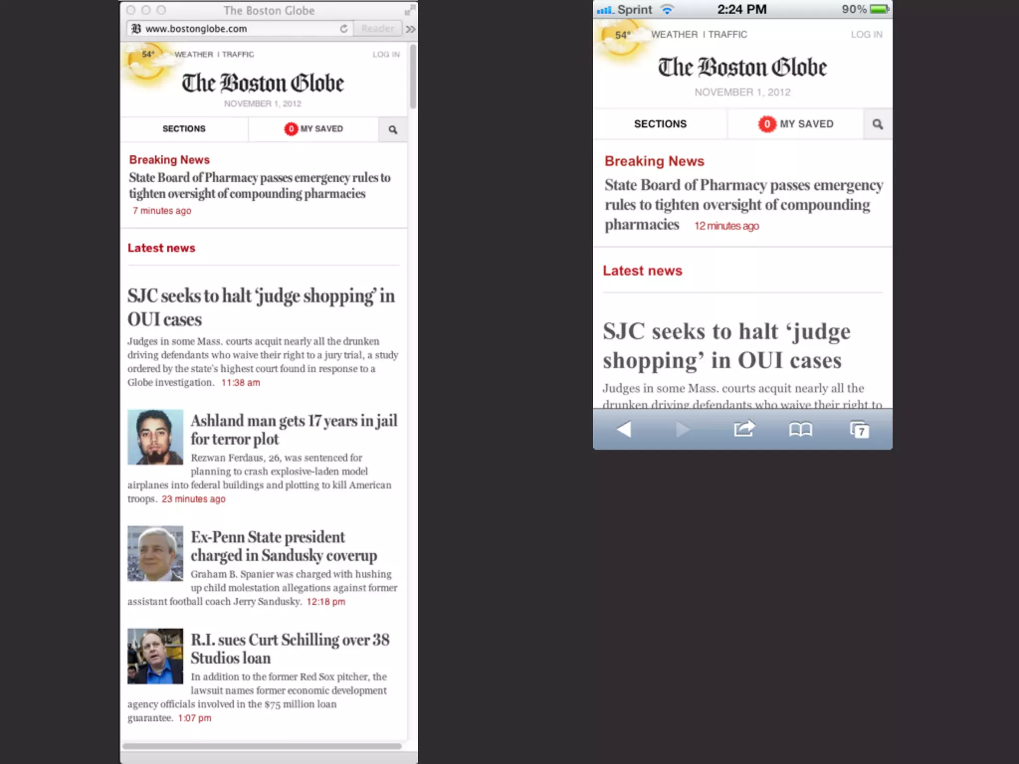
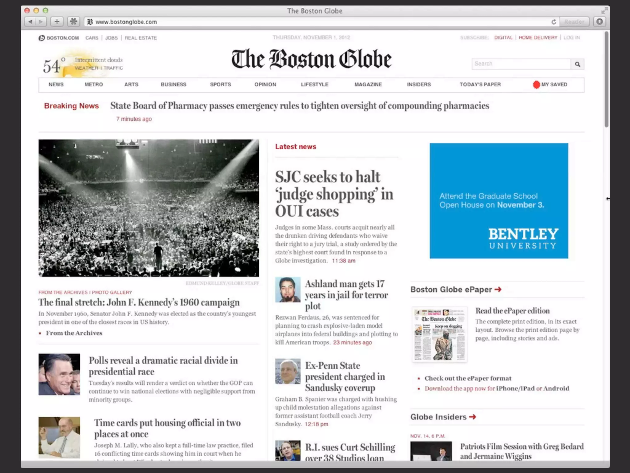


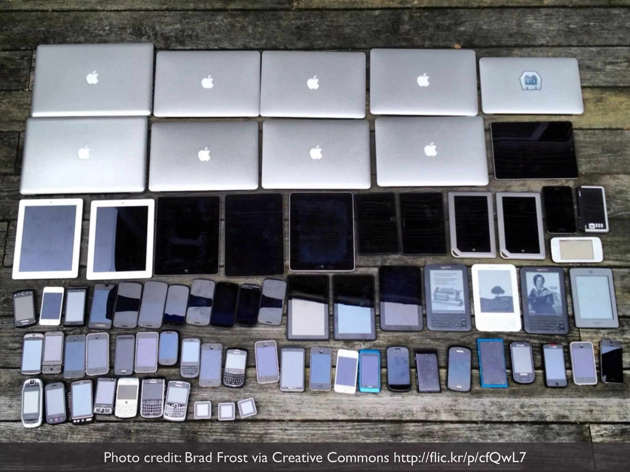

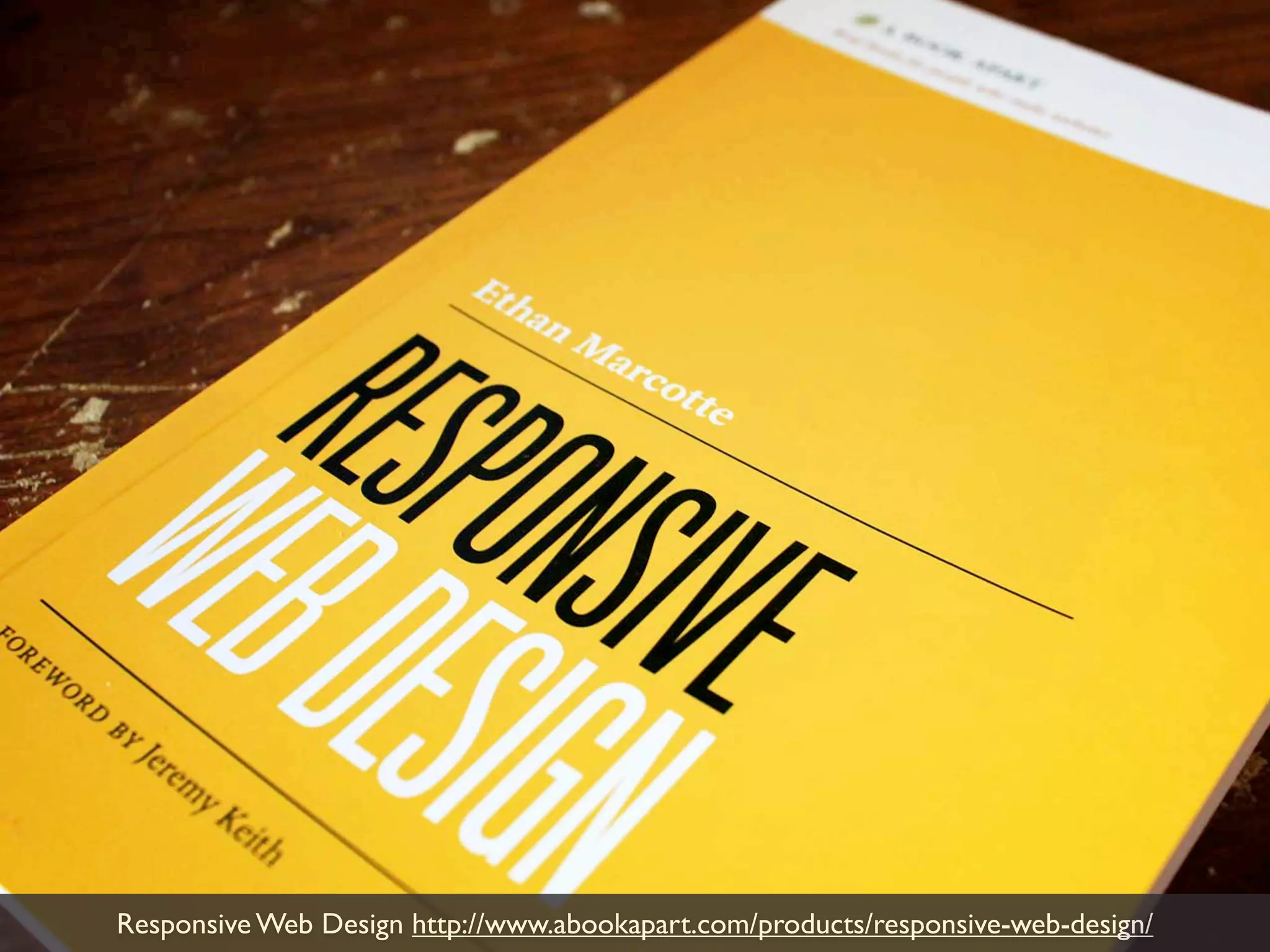
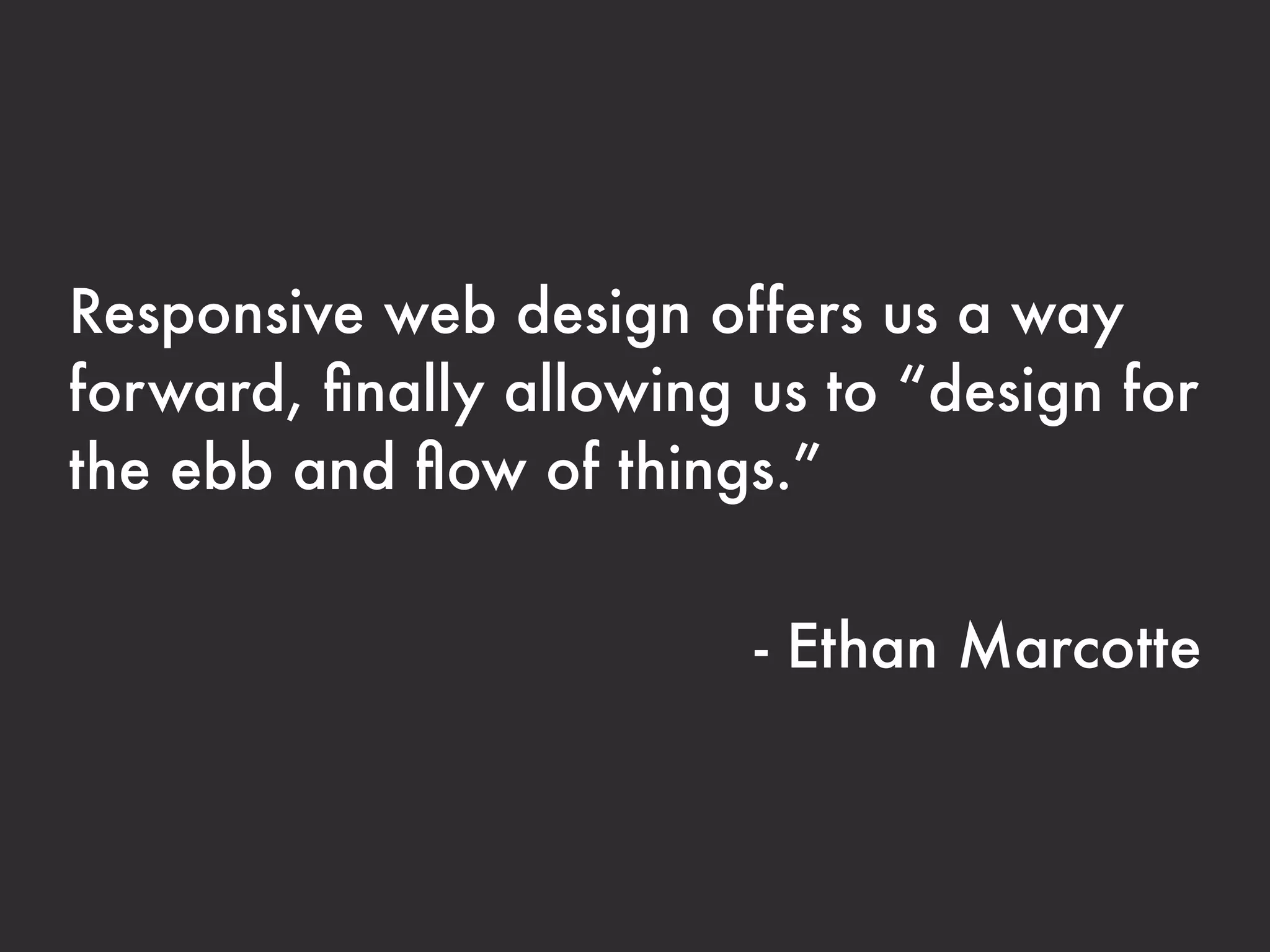

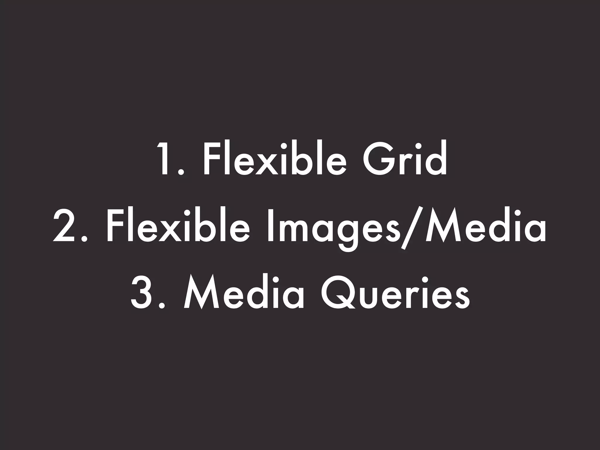
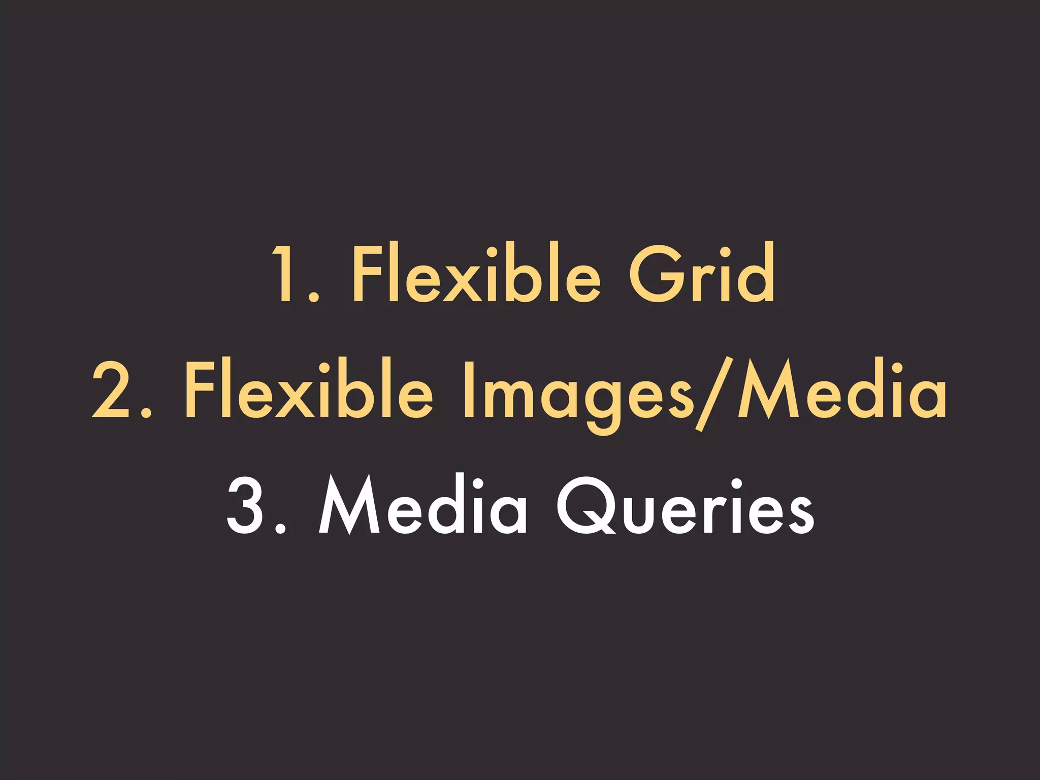
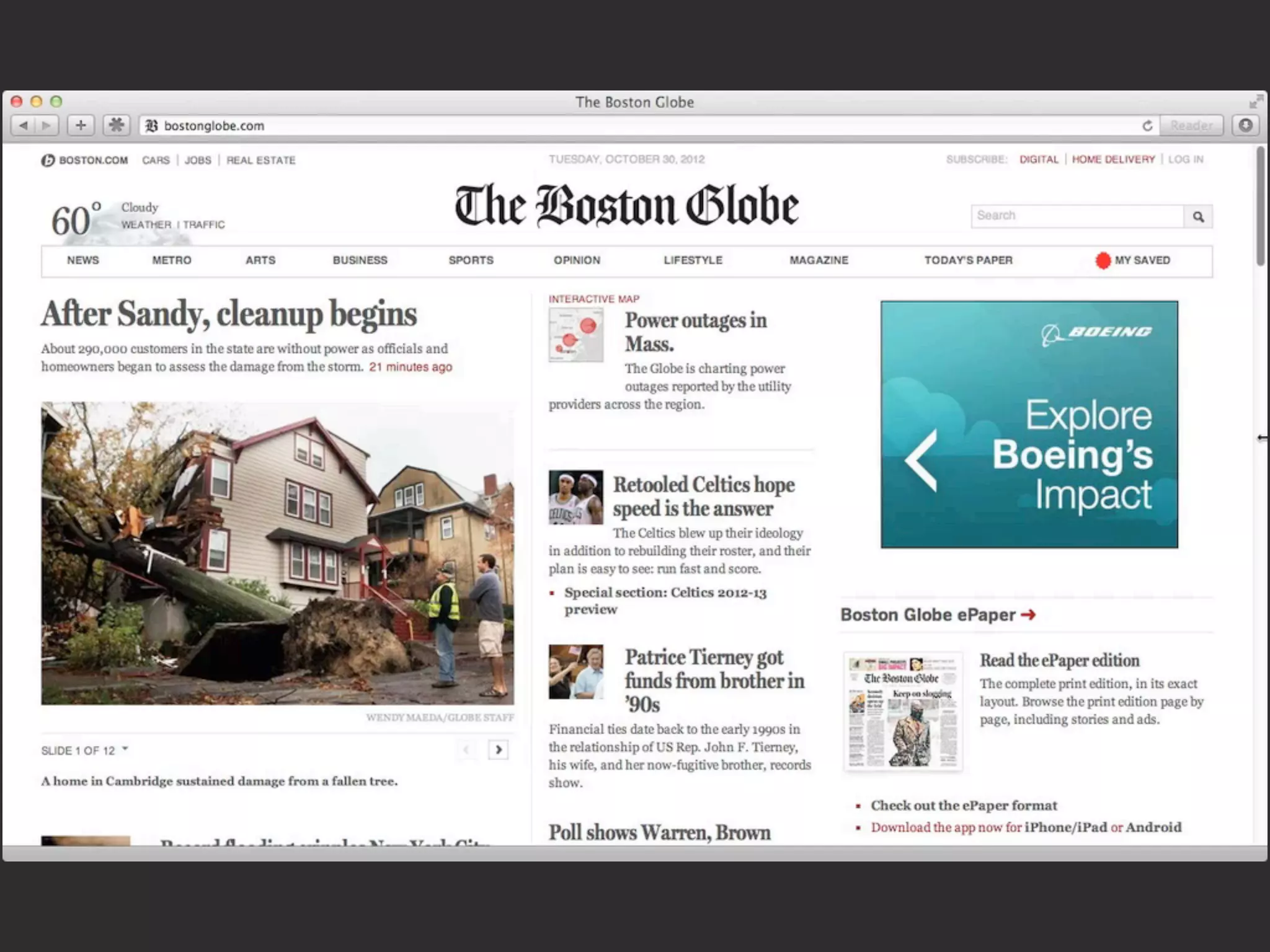
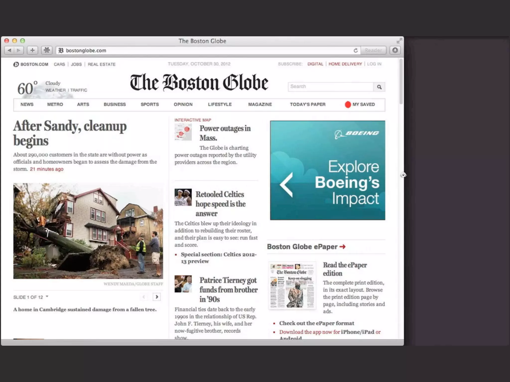
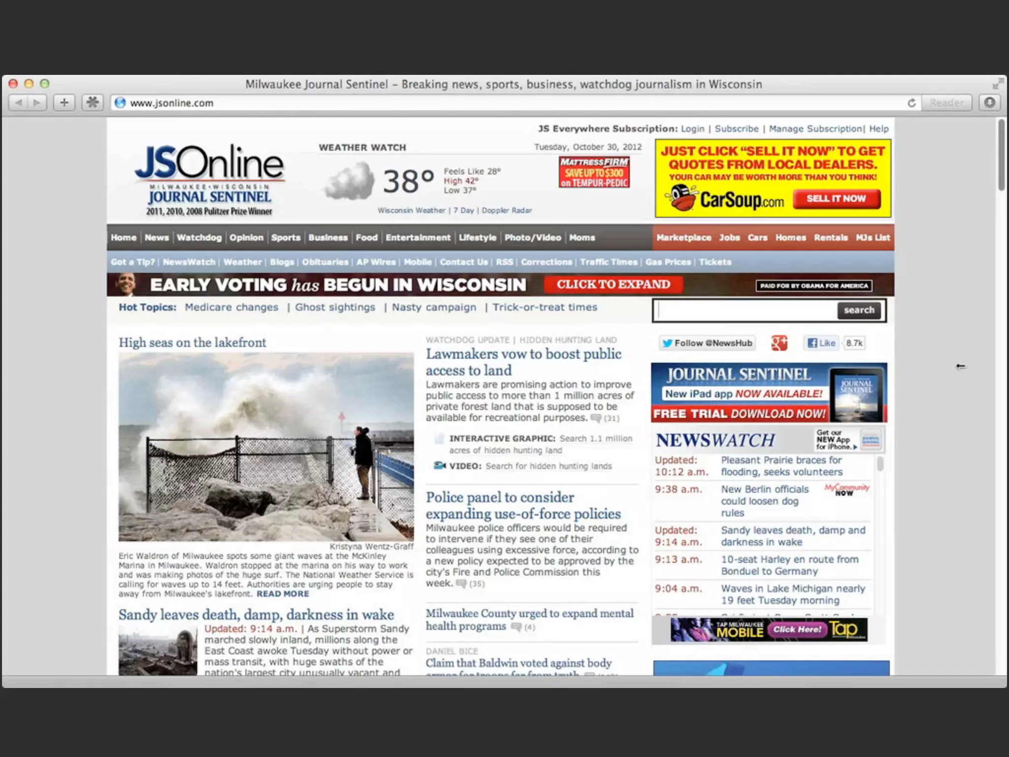
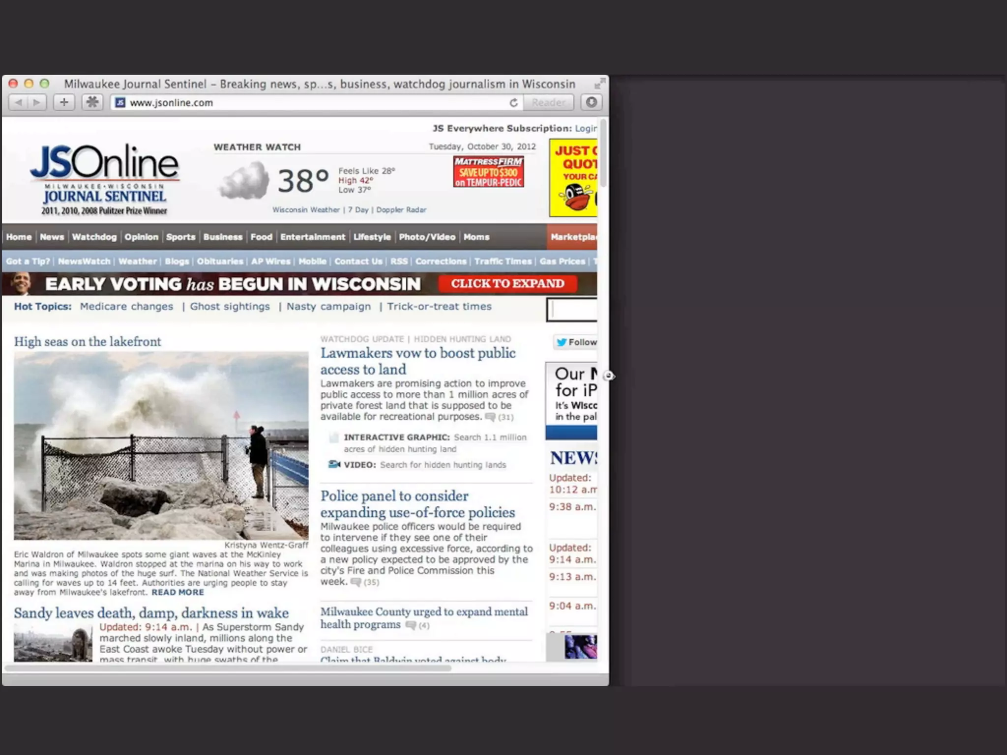


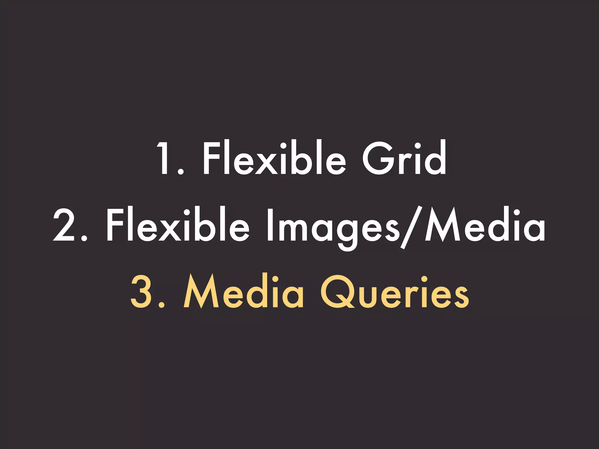


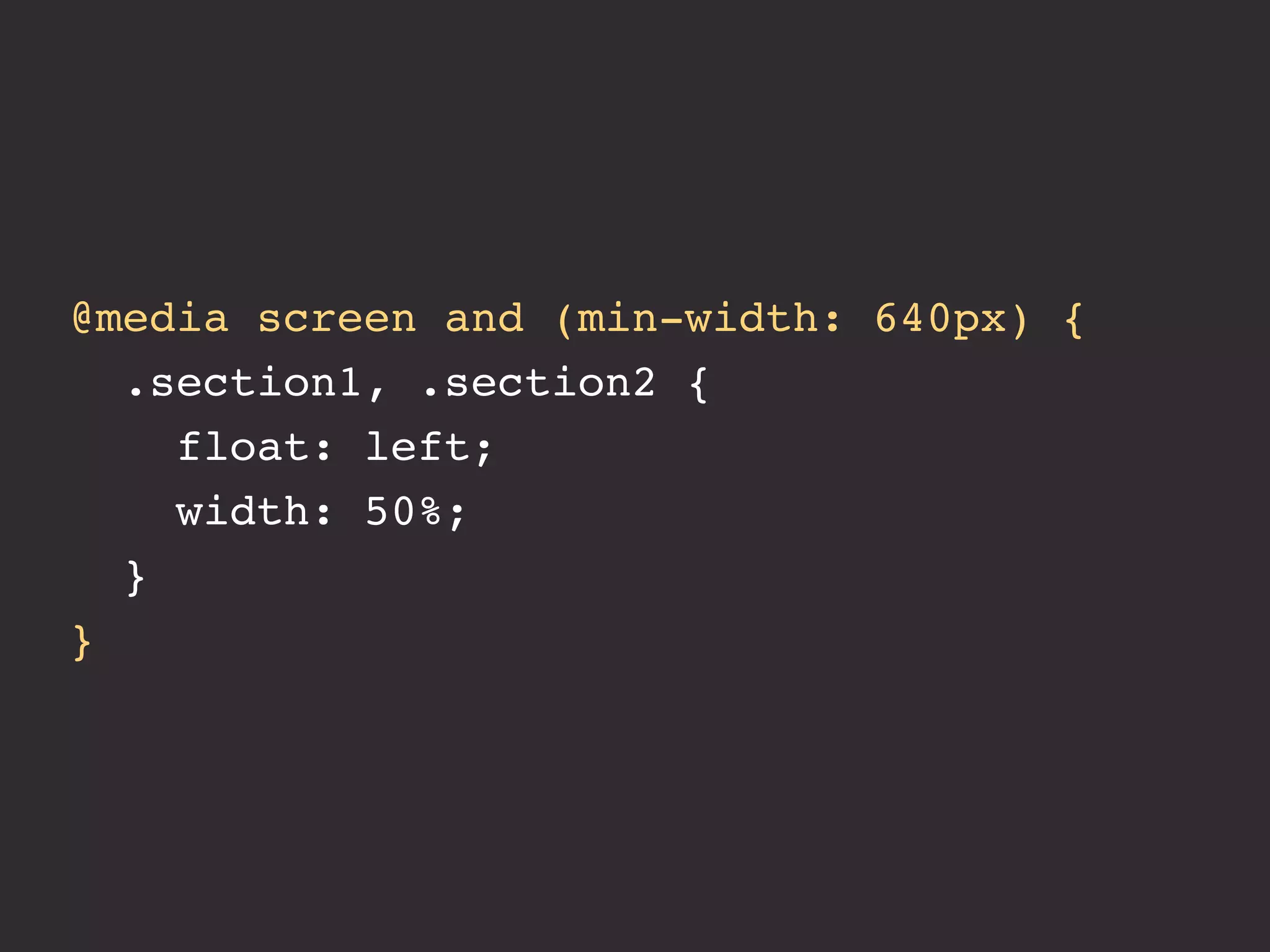
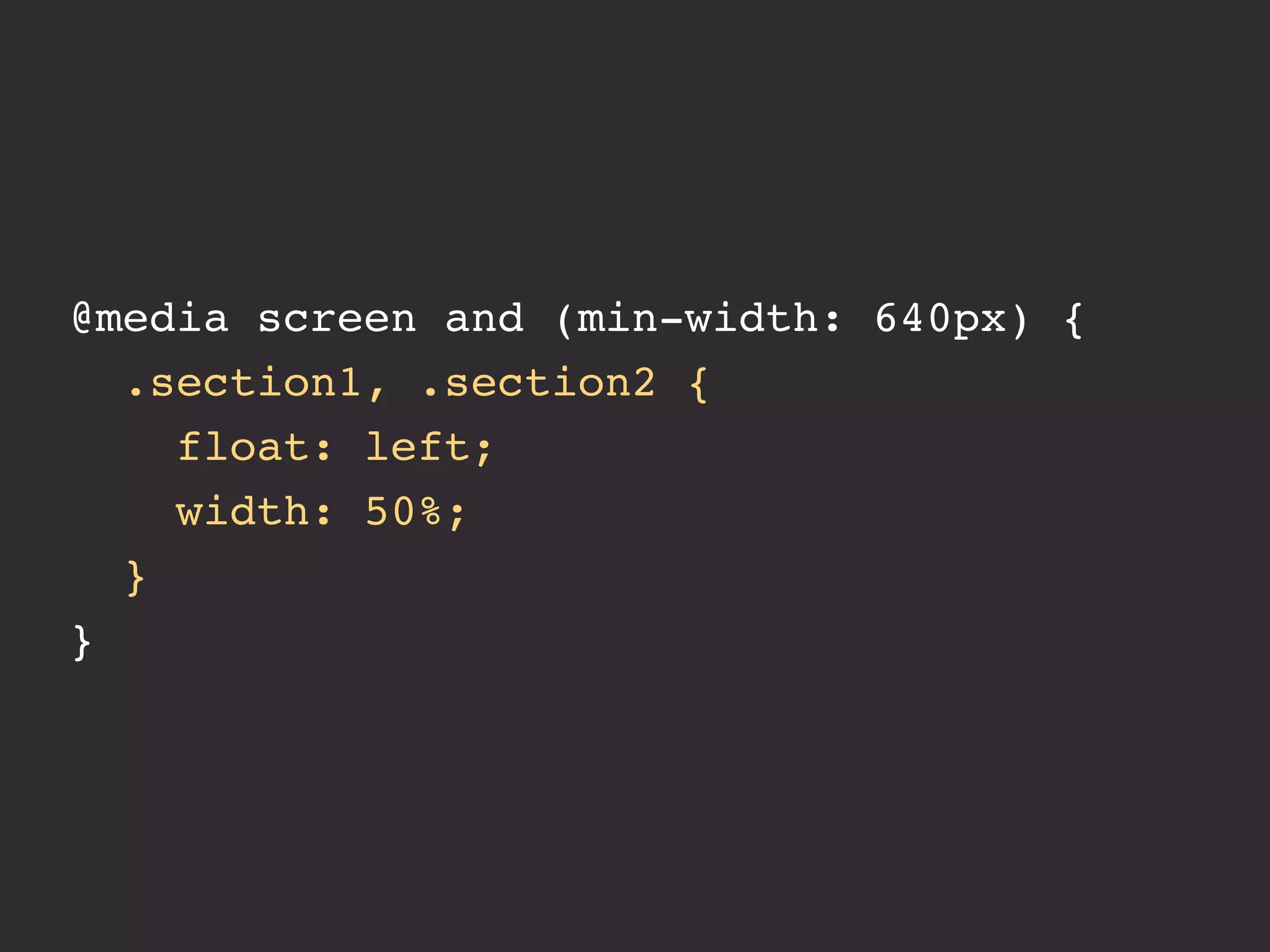


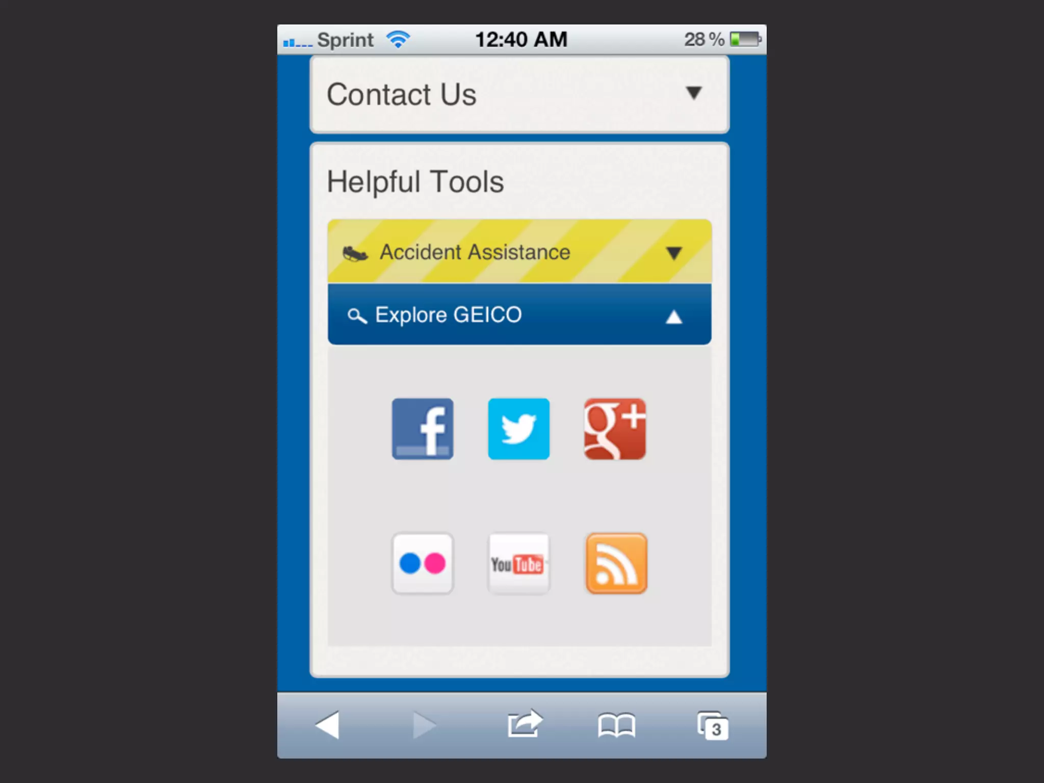
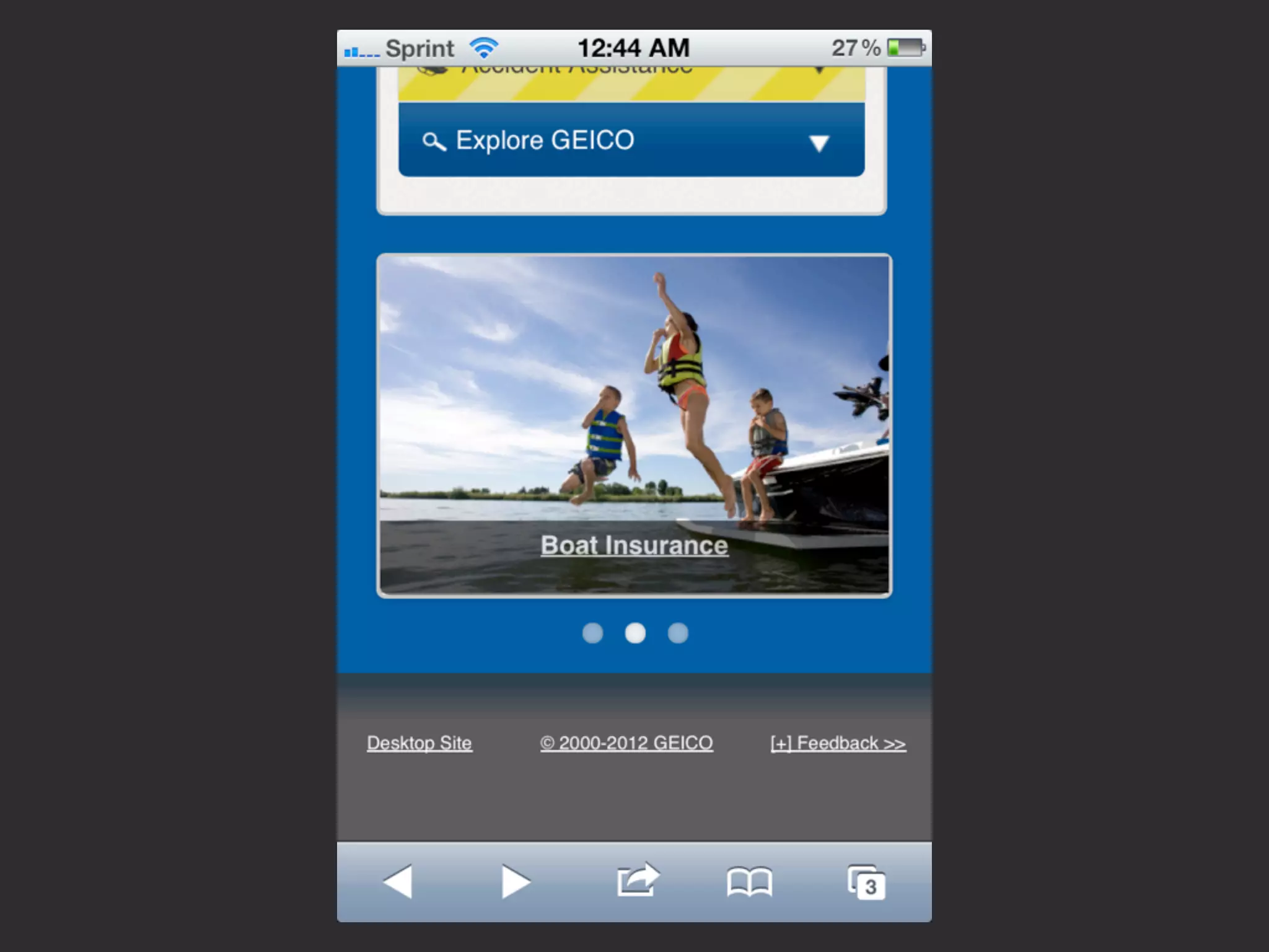


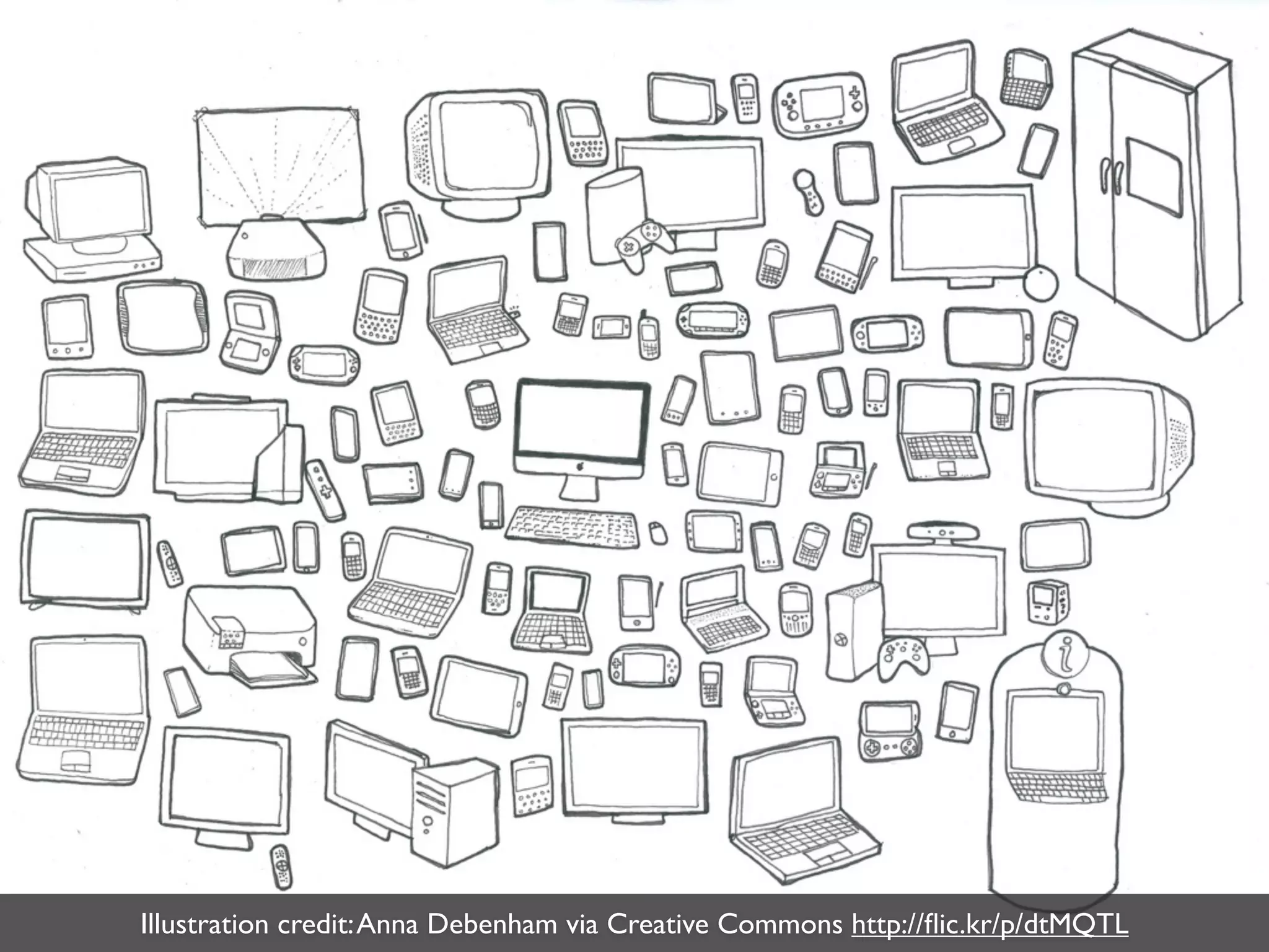

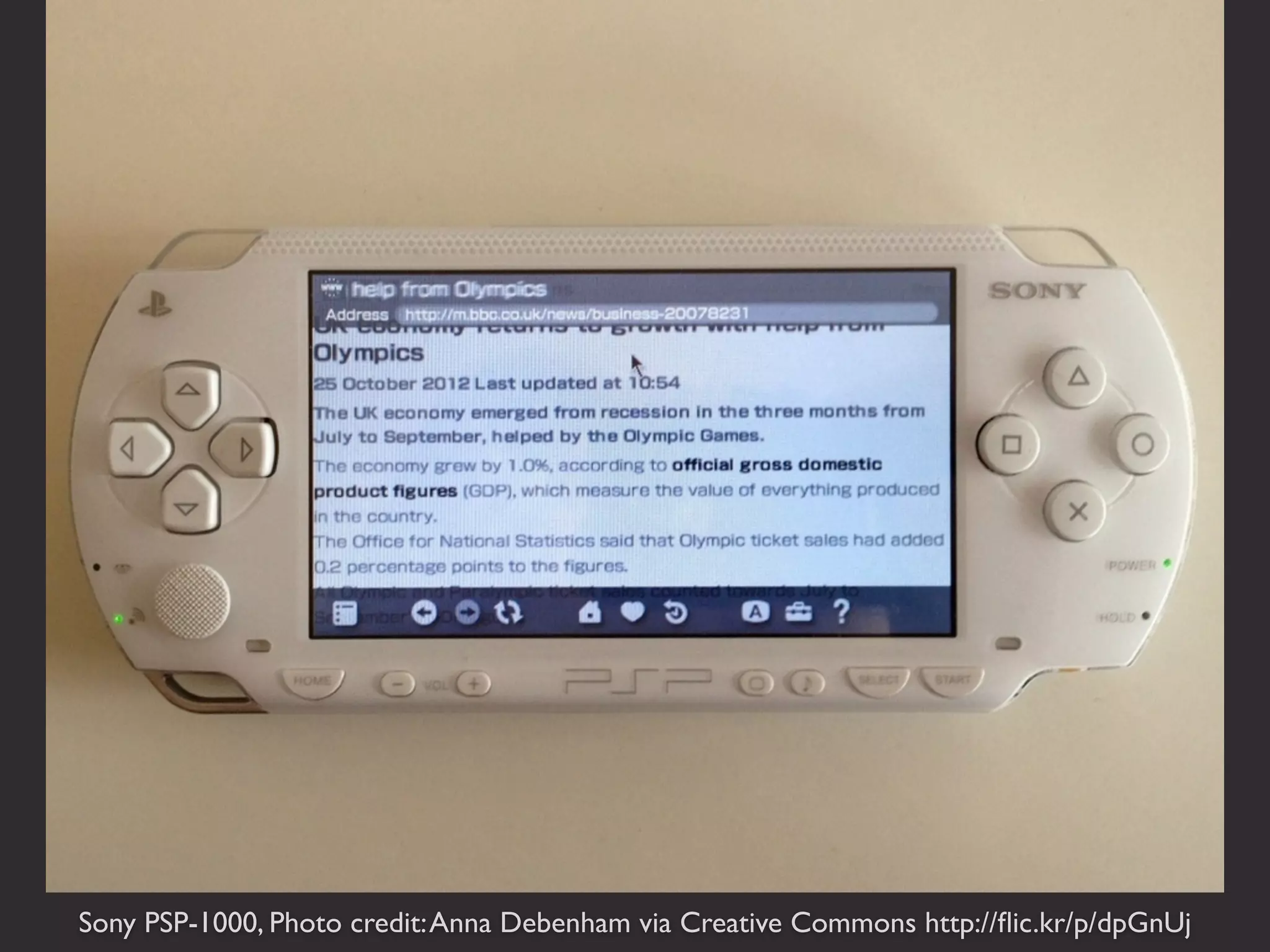
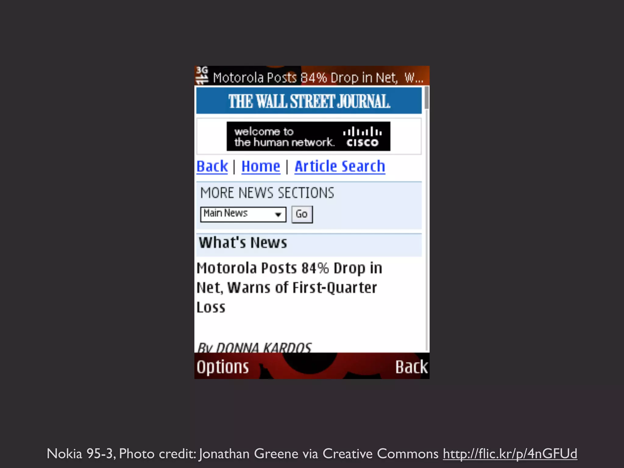


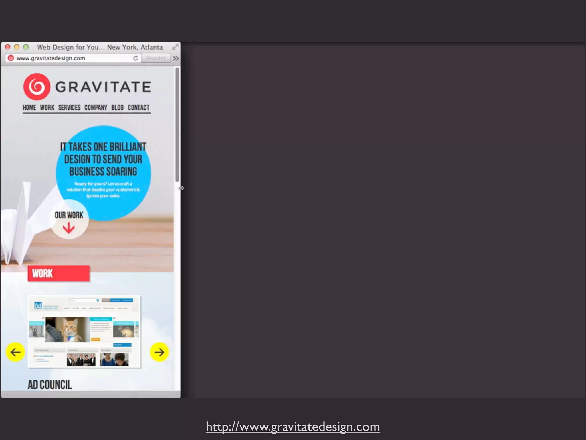
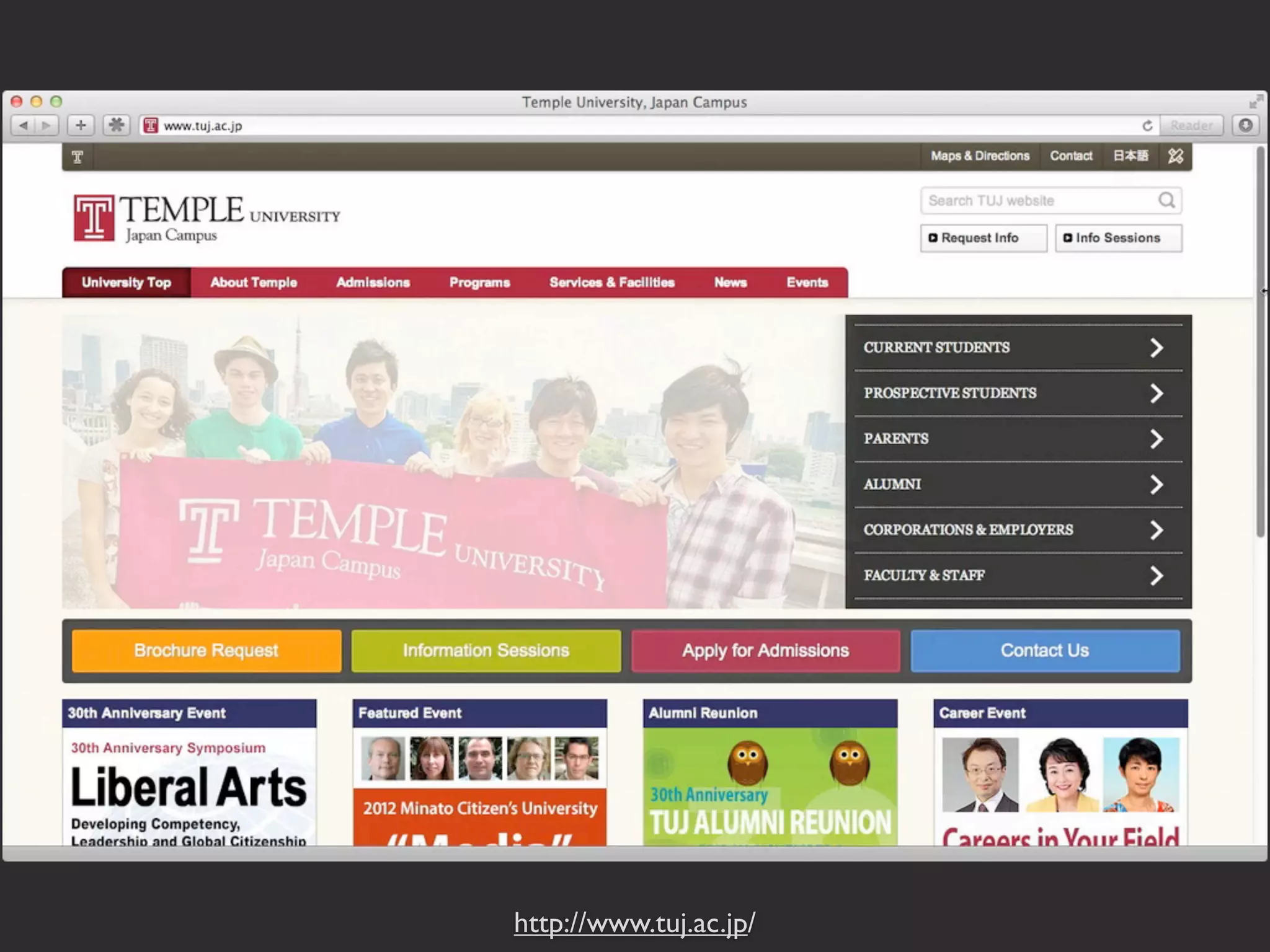
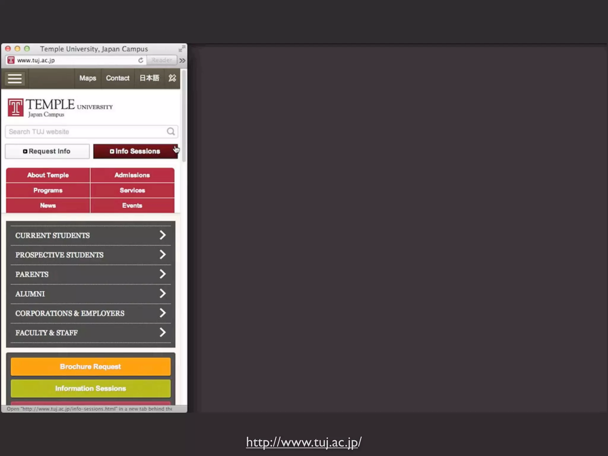

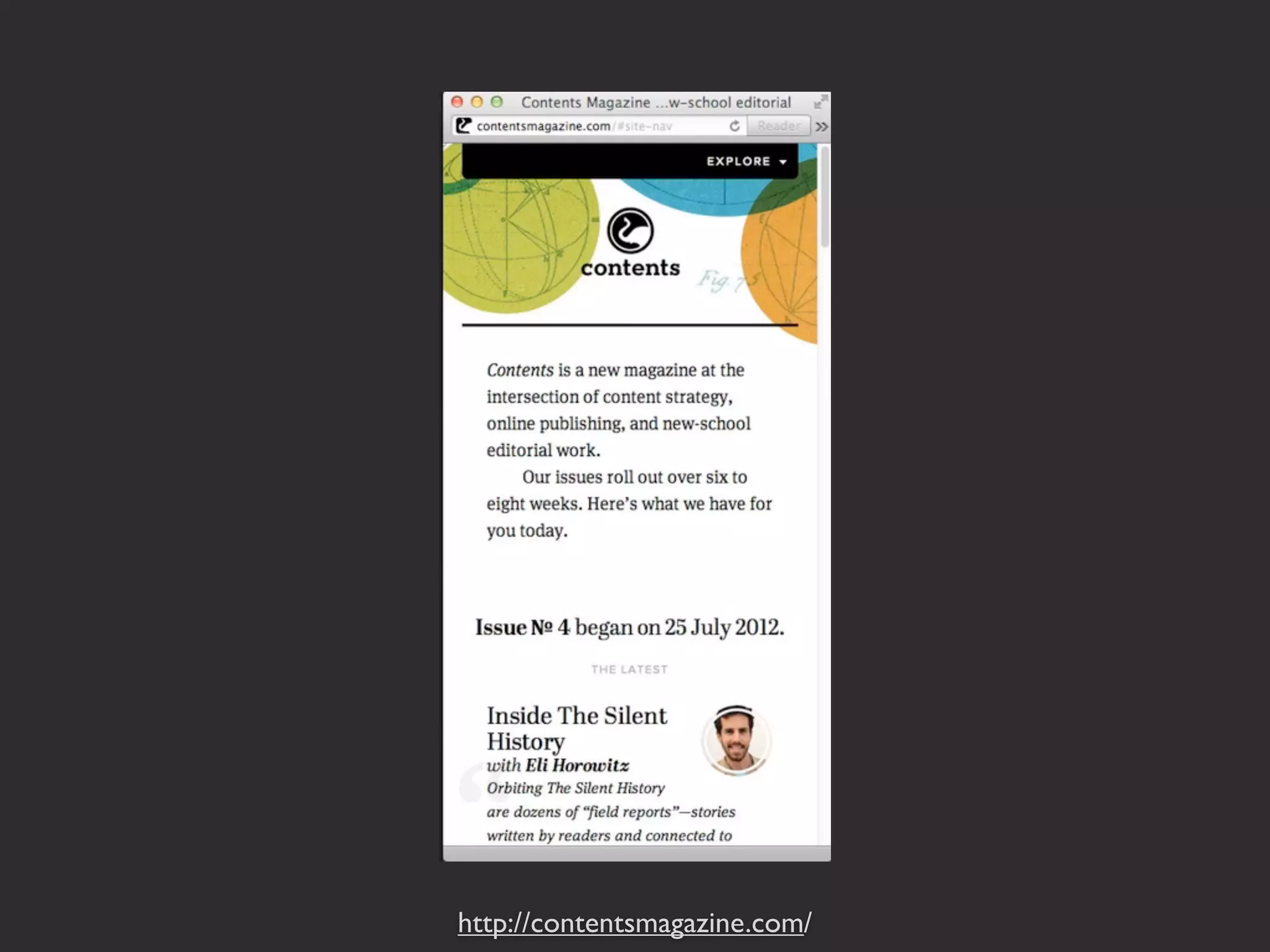
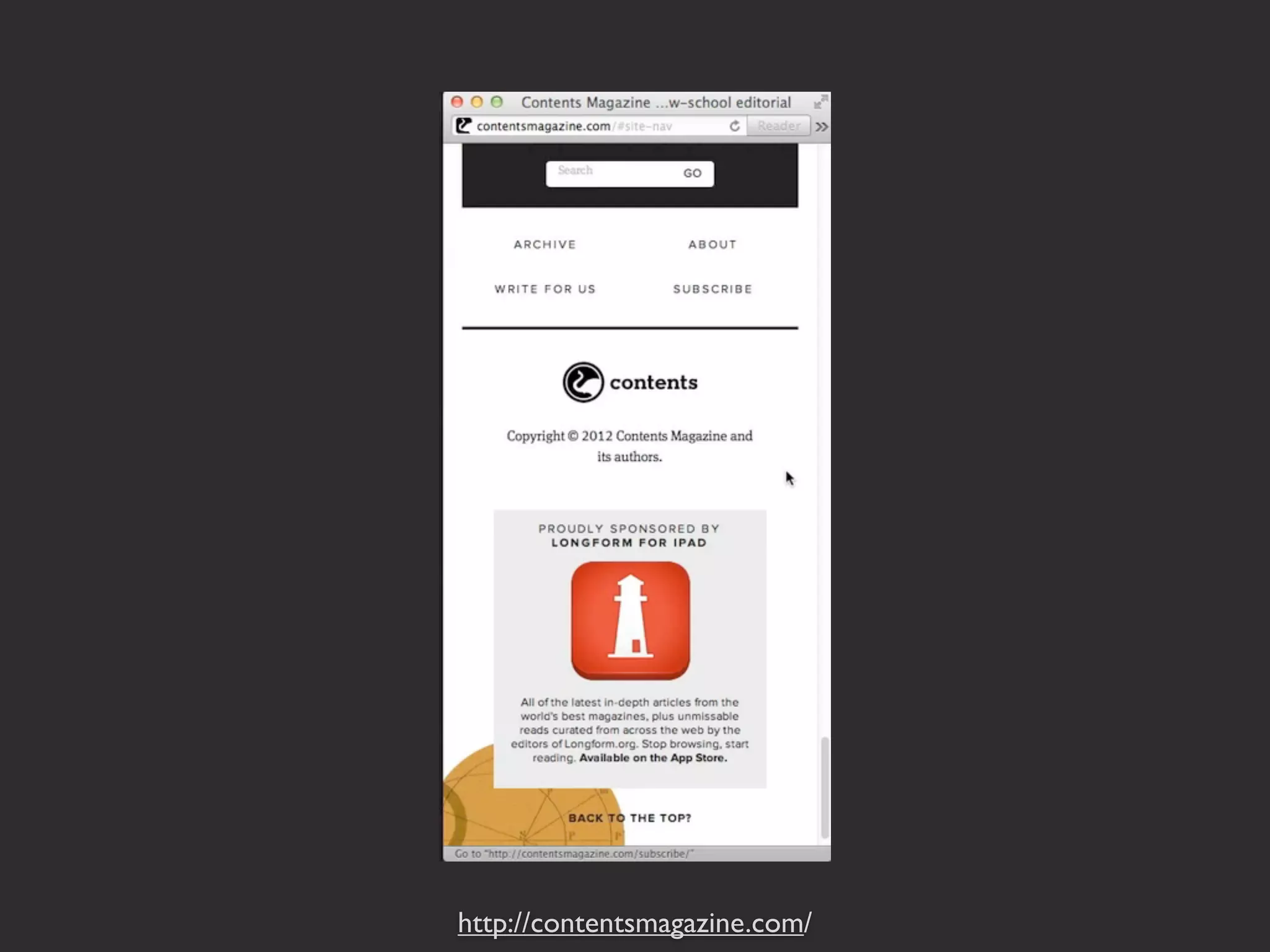
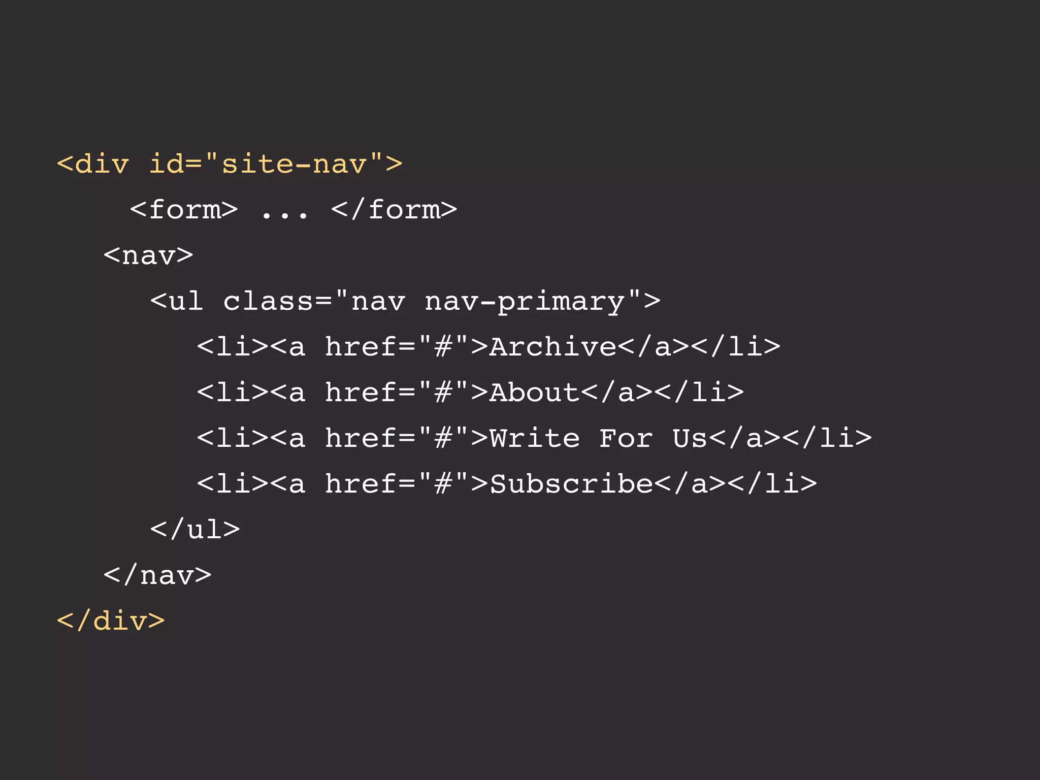
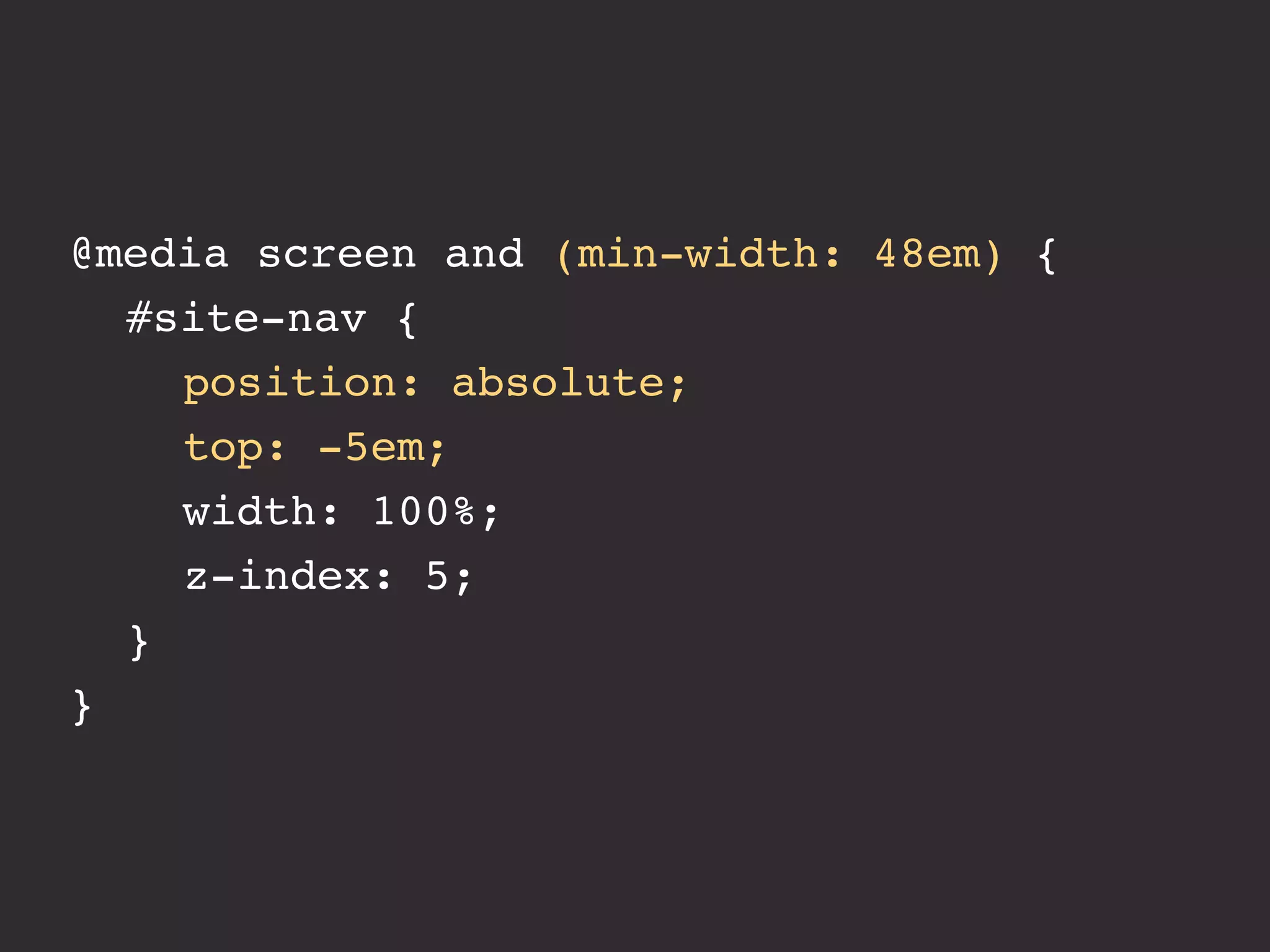
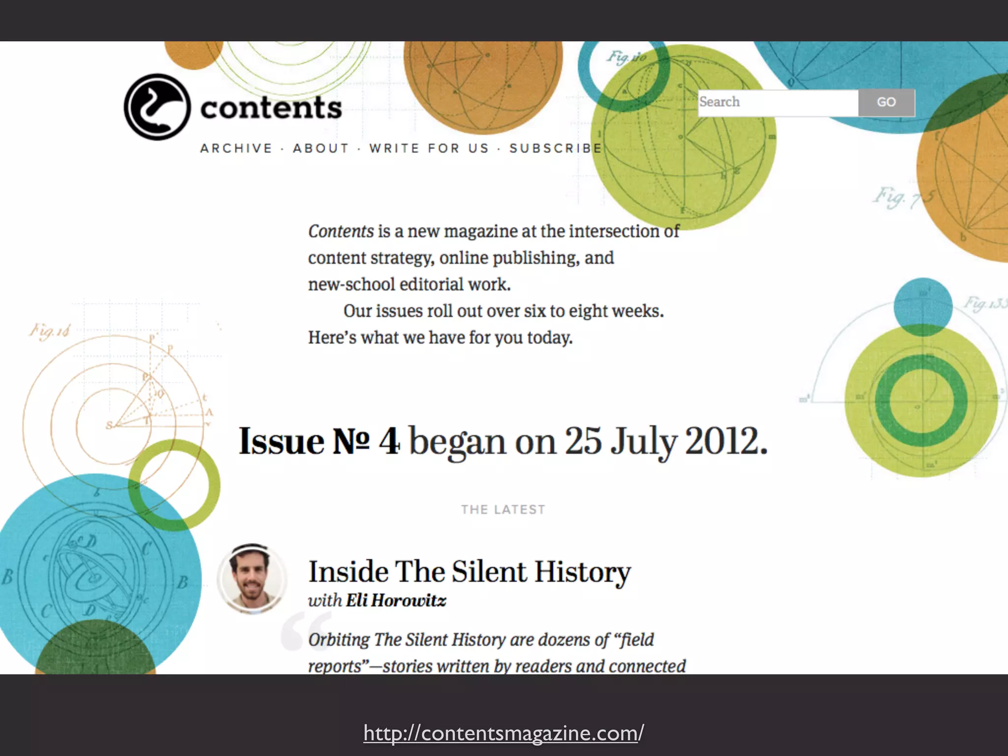

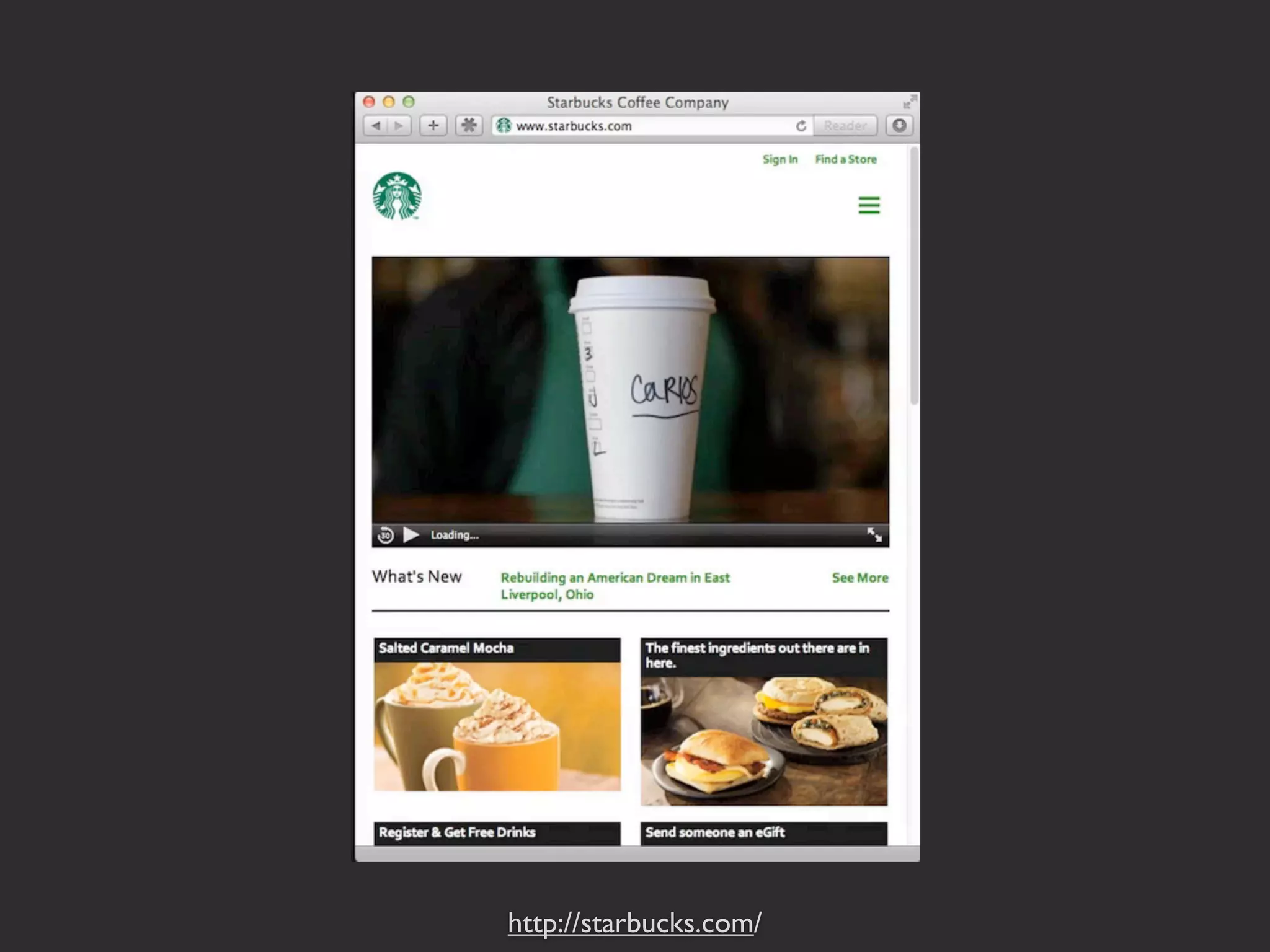
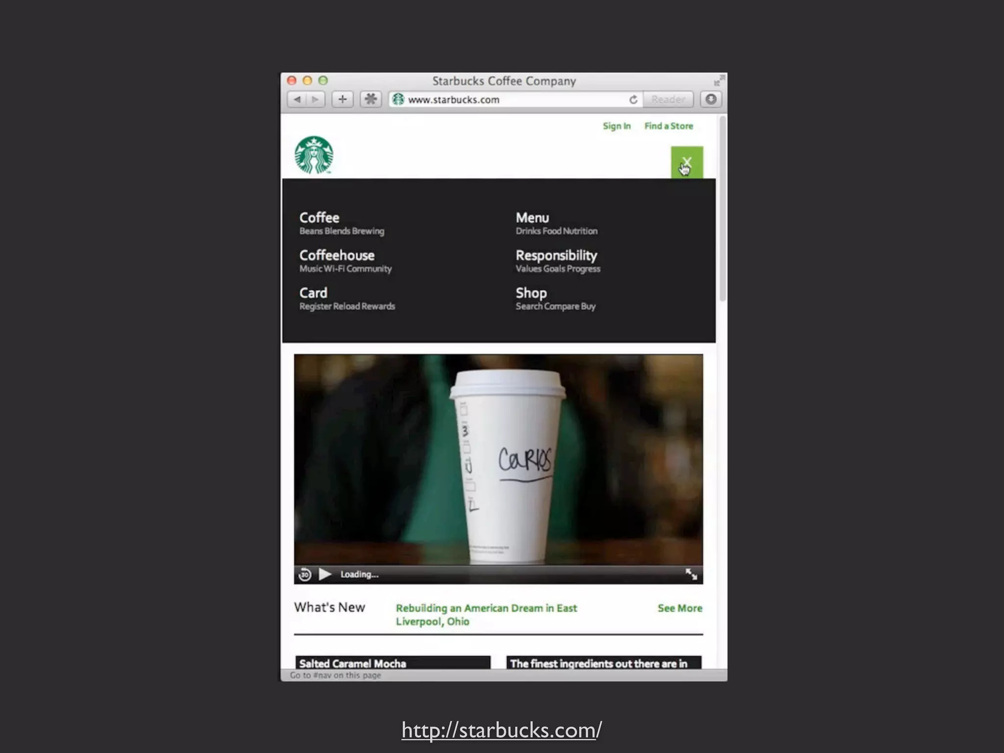
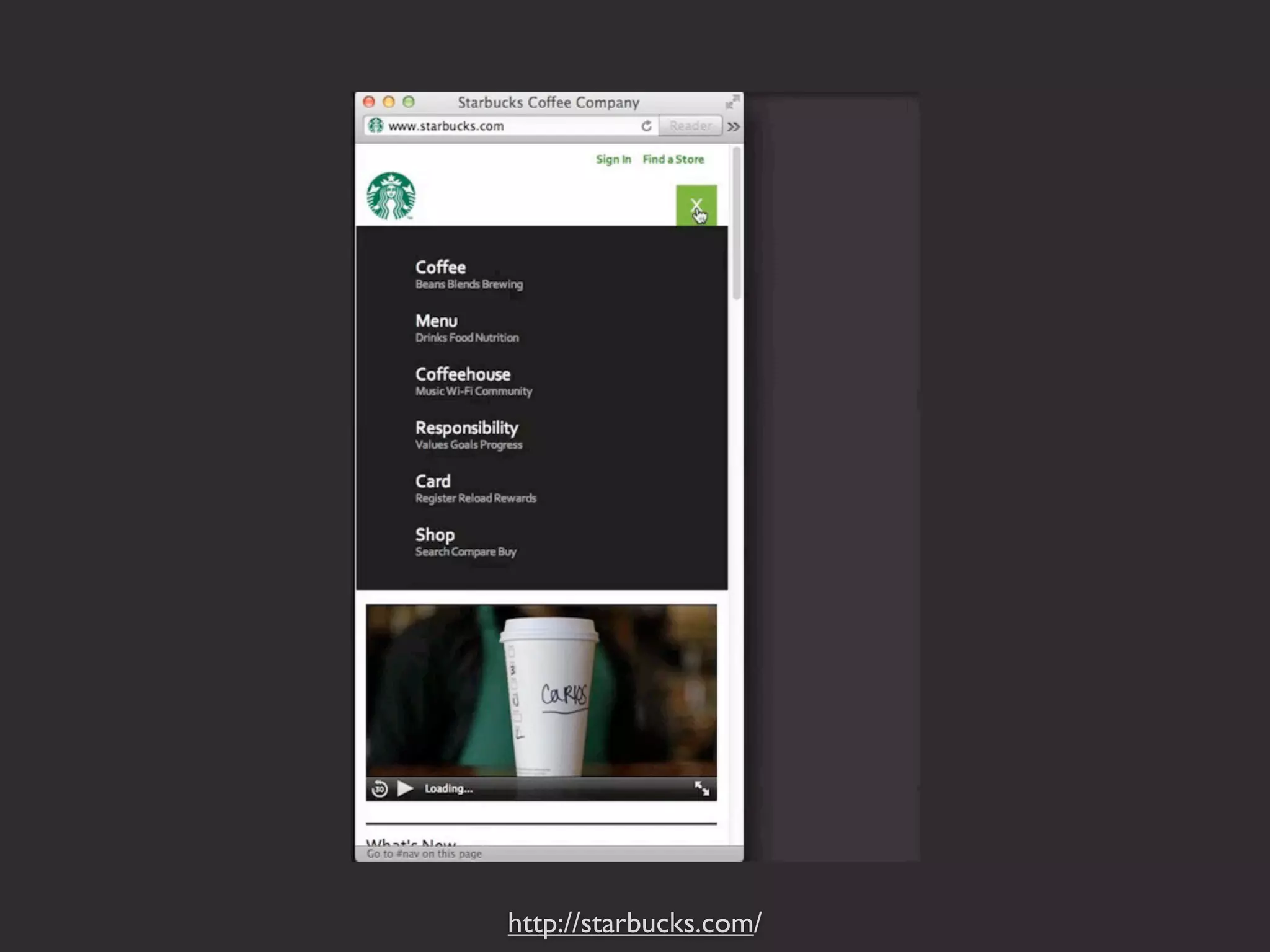

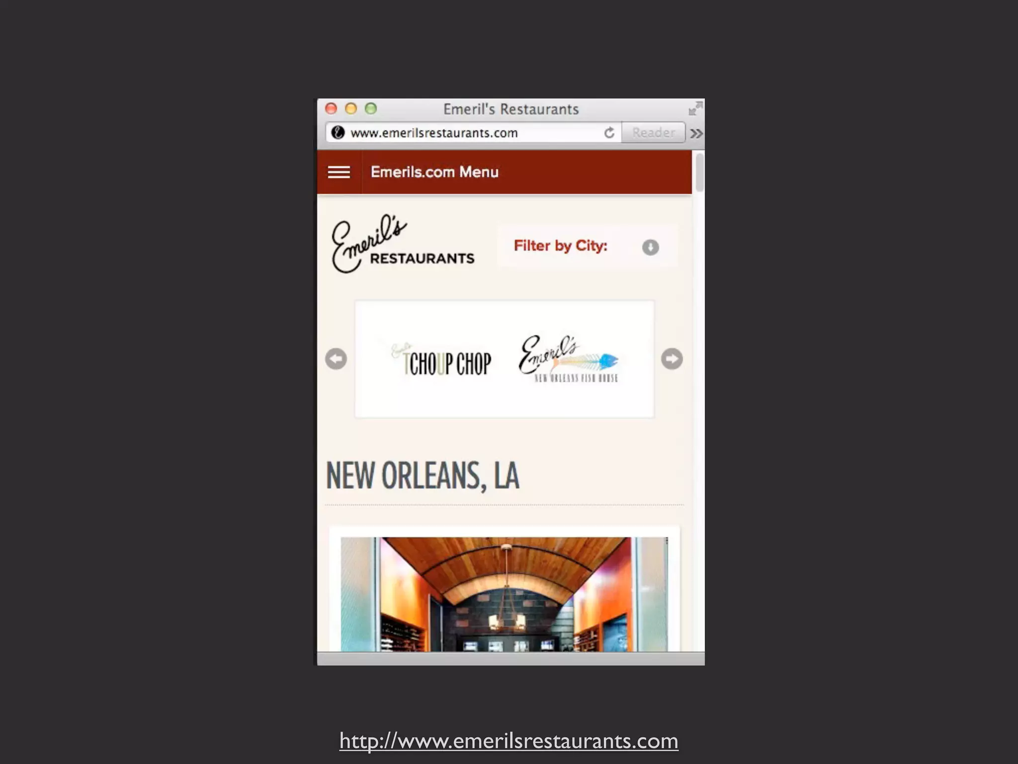
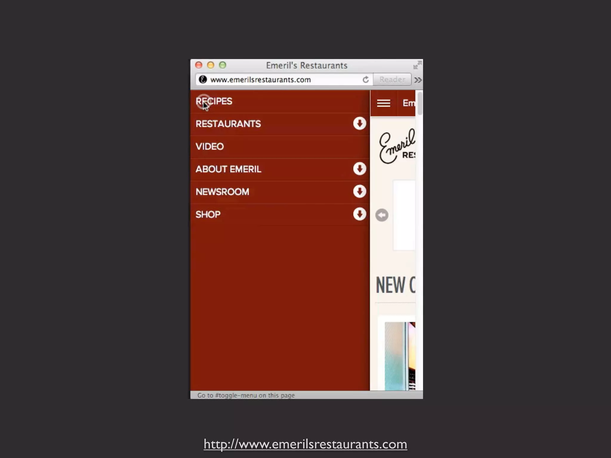
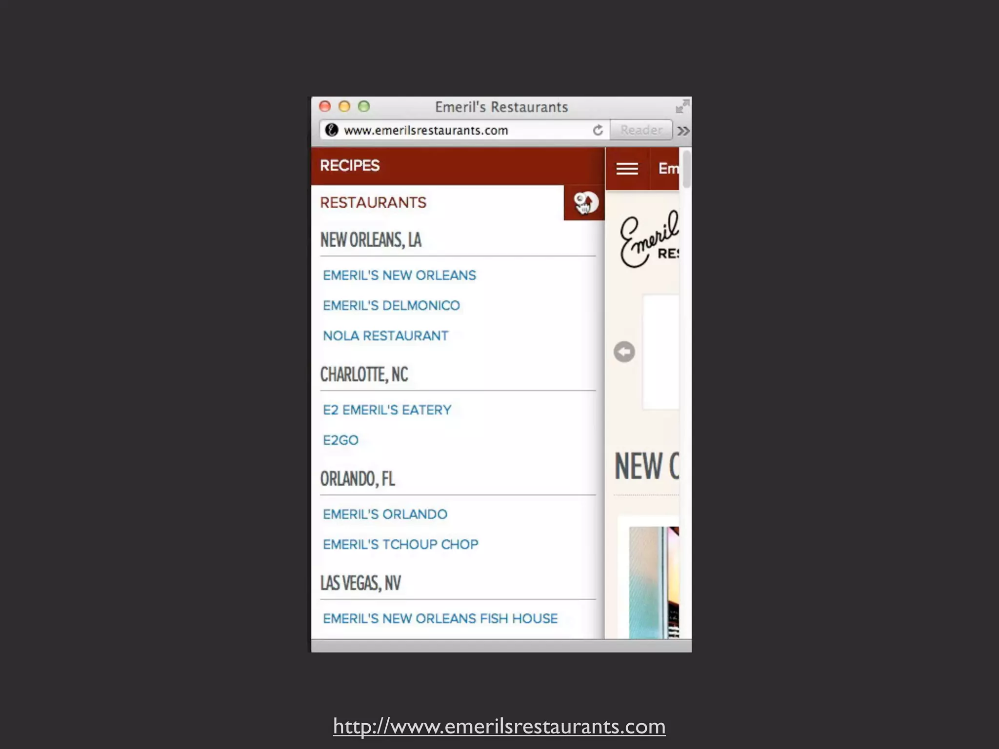

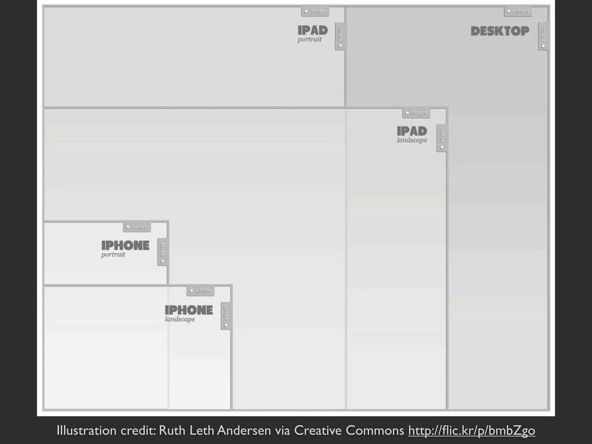


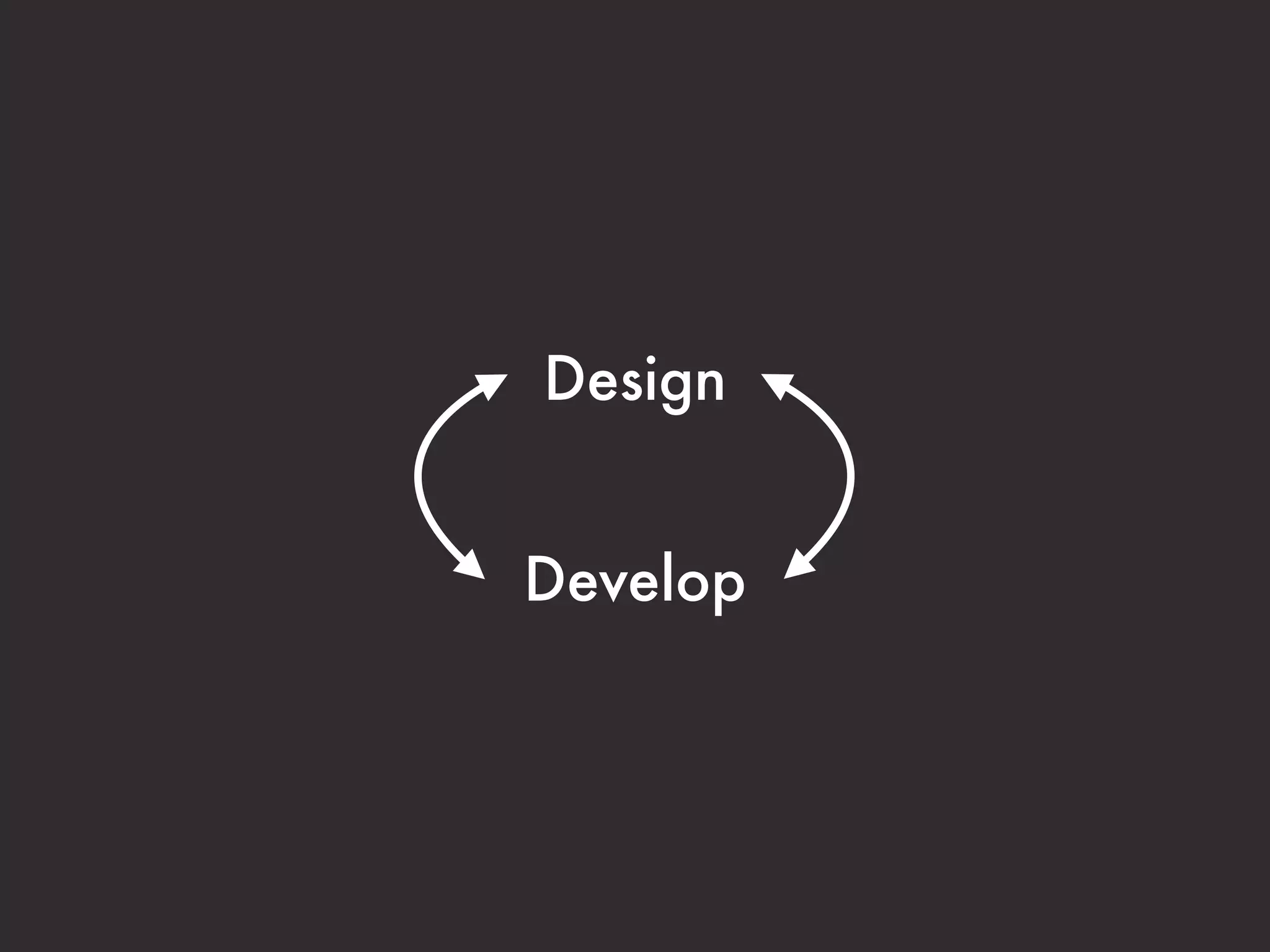

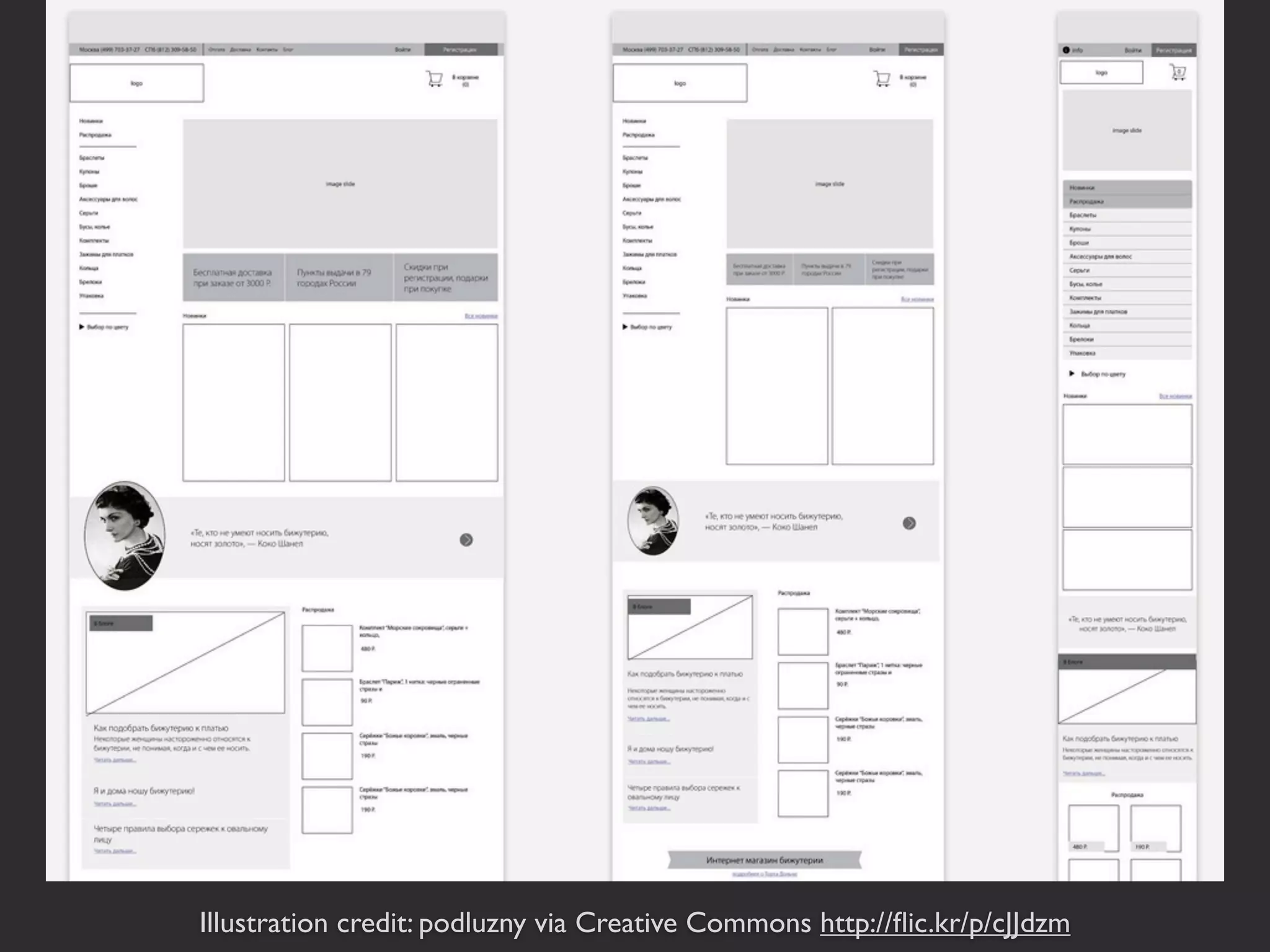

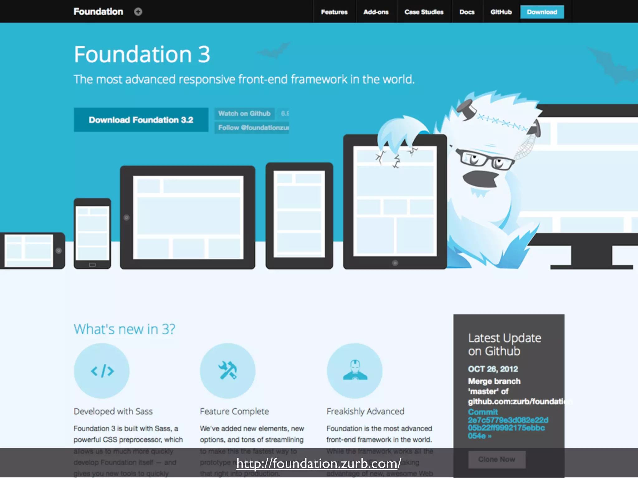


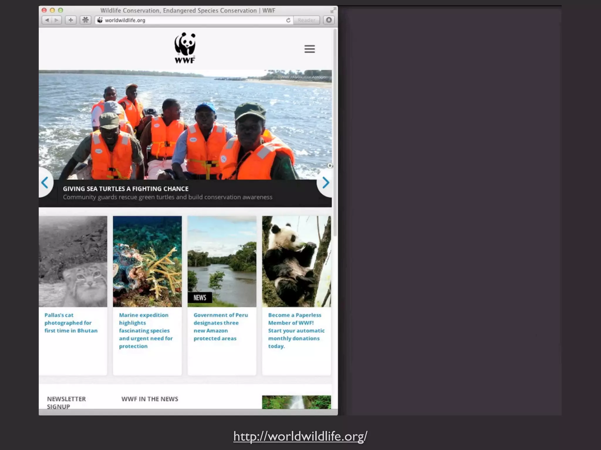
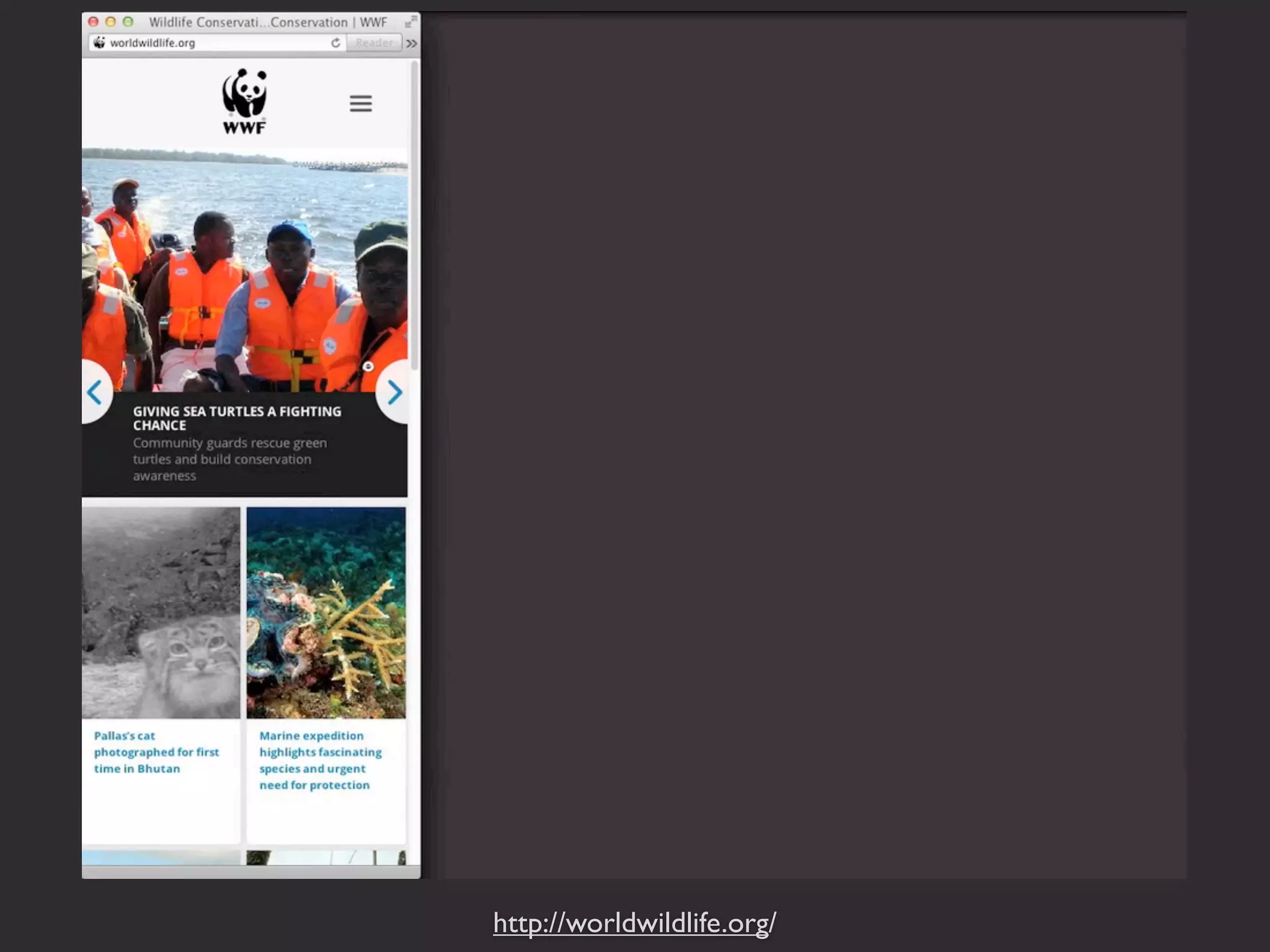
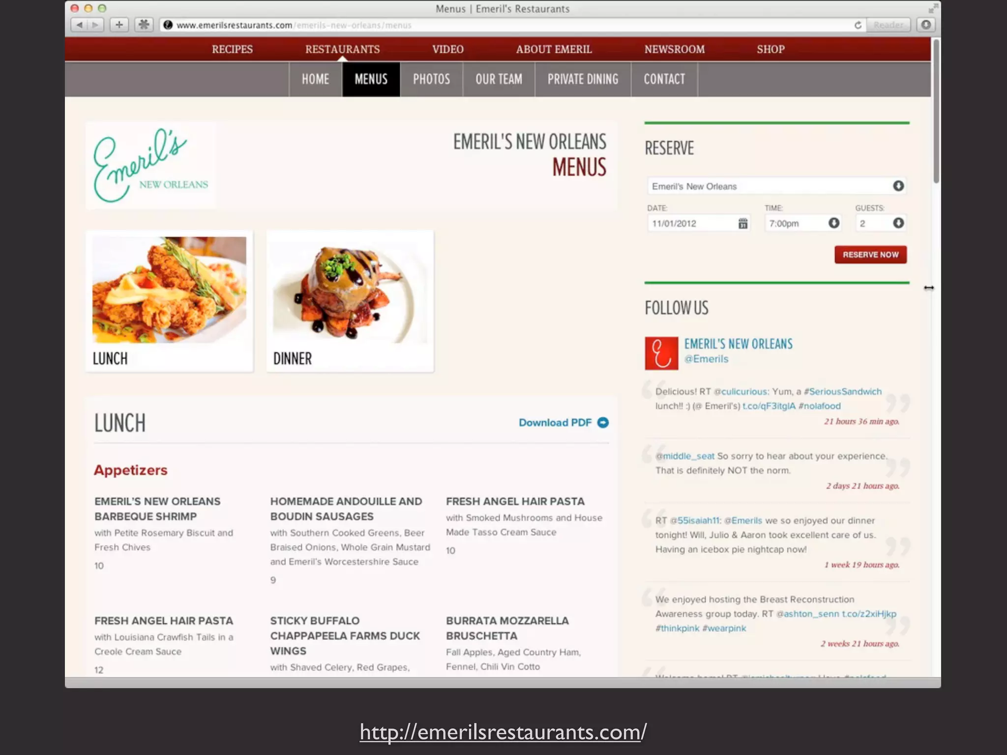
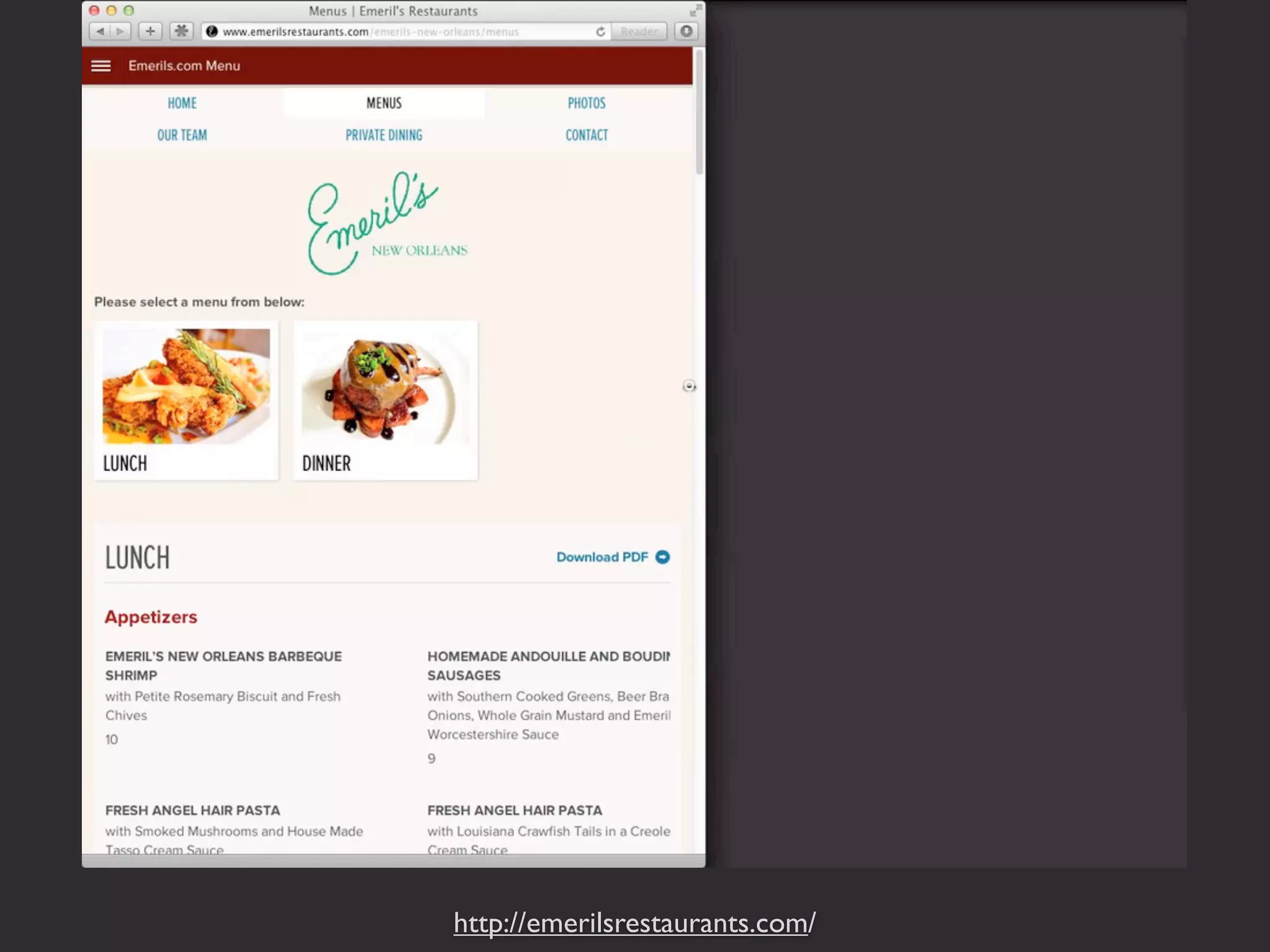
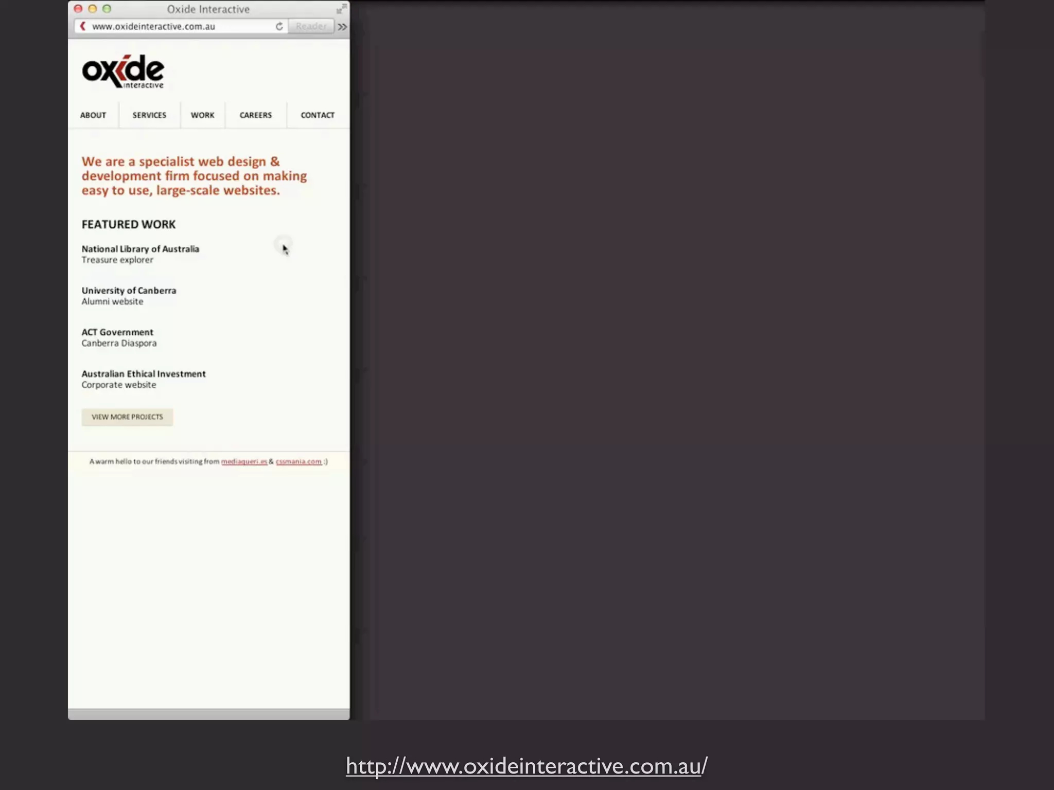
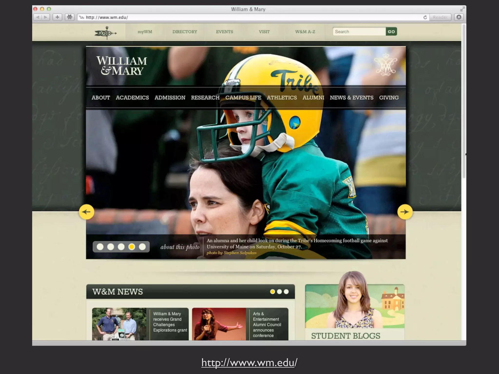
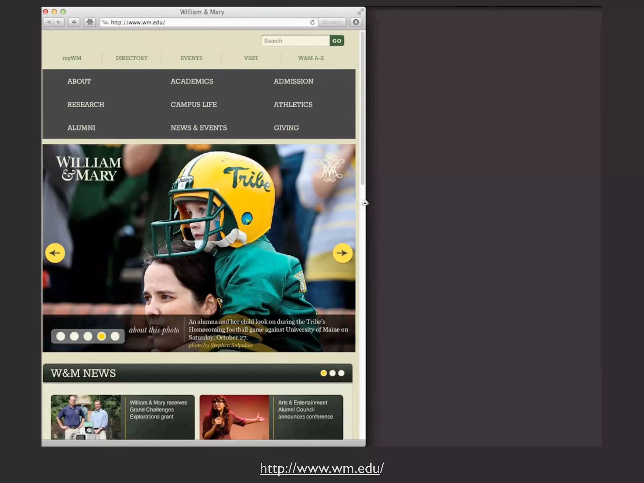
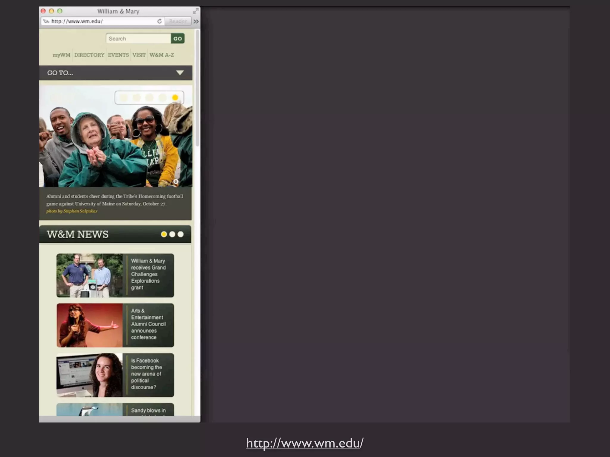
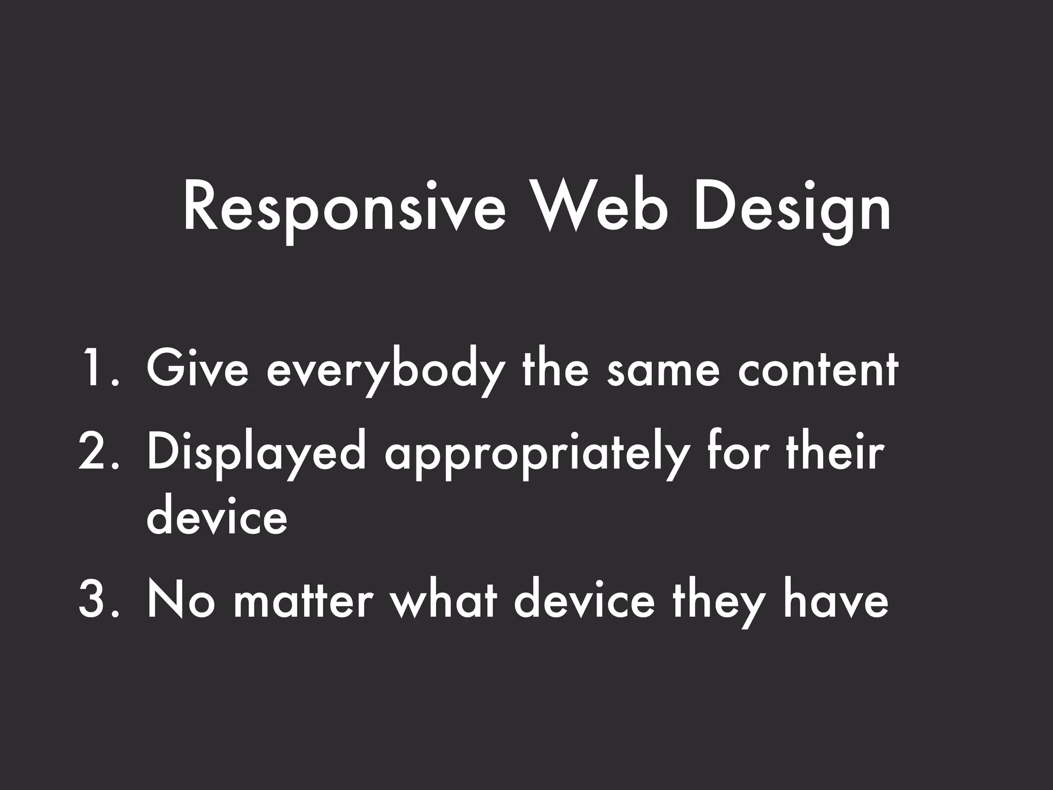

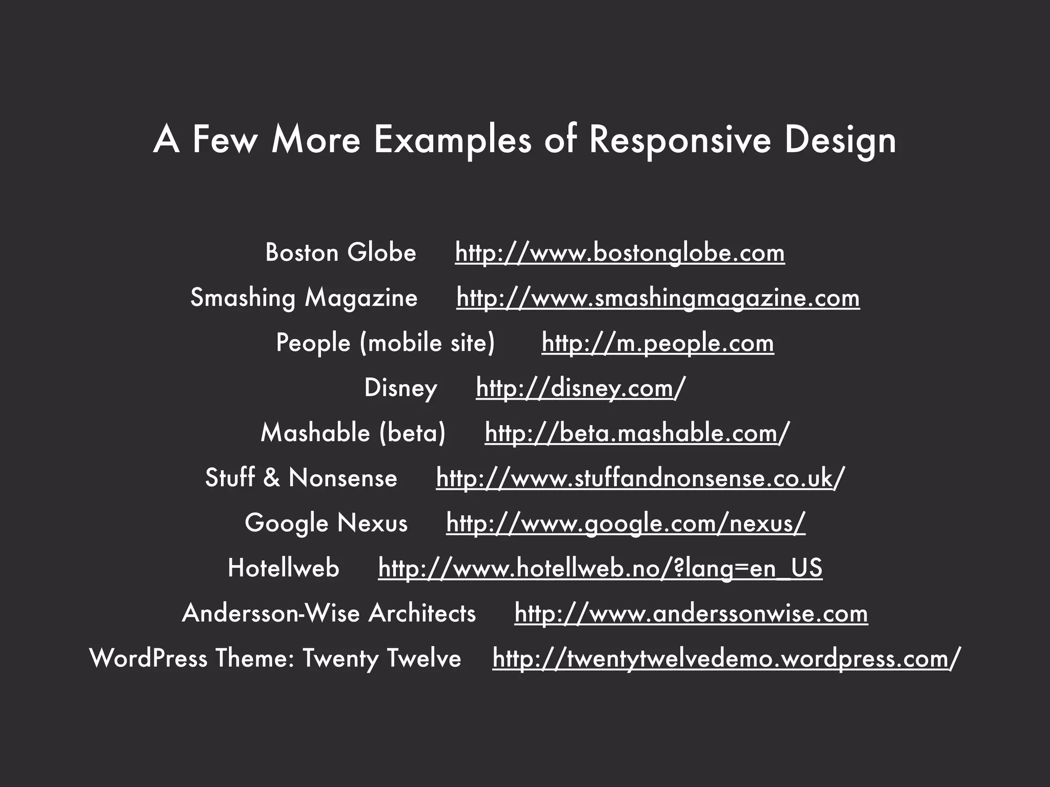
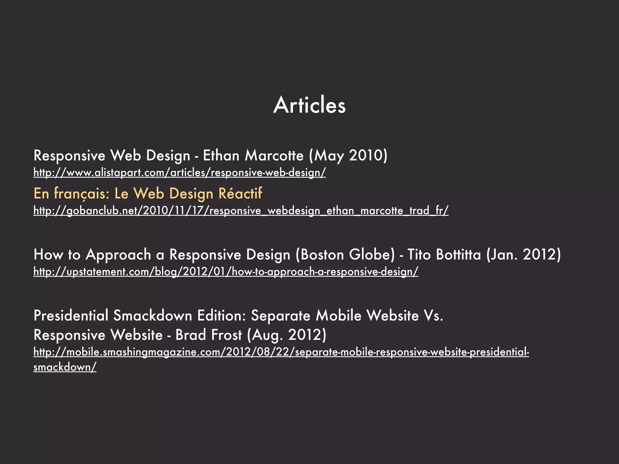


The document discusses responsive web design, emphasizing its importance in accommodating various devices with flexible grids, images, and media queries. It highlights the need for mobile accessibility given the increasing use of smartphones and presents examples, frameworks, and resources for effective implementation. The goal of responsive design is to provide uniform content access across different devices without segregating mobile web experiences from desktop ones.


![[BROCHURE] Italy Tour Project | @SlideON](https://cdn.slidesharecdn.com/ss_thumbnails/brochure8-251215152319-2805af68-thumbnail.jpg?width=640&height=640&fit=bounds)


![Chapter4_Initiation_of_Sediment_Motion_v2[1].pptx](https://cdn.slidesharecdn.com/ss_thumbnails/chapter4initiationofsedimentmotionv21-251208223747-f94ef163-thumbnail.jpg?width=640&height=640&fit=bounds)
