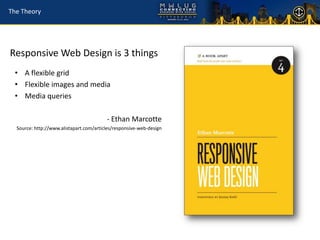
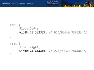
This document provides an overview of responsive web design. It begins by noting the increasing diversity of devices used to access websites. It then introduces responsive web design as a solution, allowing one website to adapt to different screens through a flexible grid, flexible images and media, and media queries. Examples of responsive sites are shown. Some criticisms of the approach are addressed. The business case for a responsive approach is made. Finally, the document gets into the technical details of implementing a responsive design through flexible grids, images, and media queries. It provides code examples and tips for supporting older browsers. Frameworks to help with responsive design are also mentioned.


