Download as PDF, PPTX


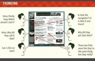
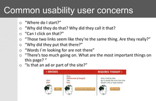
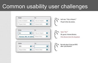

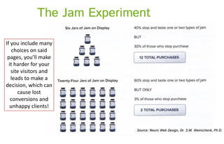


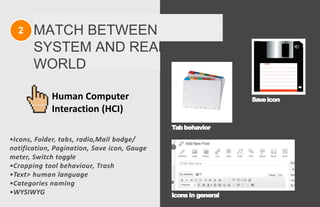
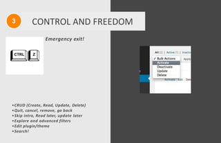
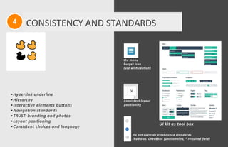

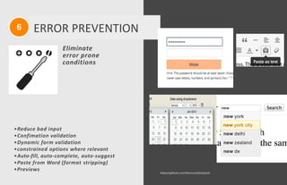


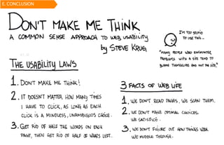


The document discusses usability principles in web design, emphasizing the importance of user experience (UX) and user-centered design approaches. It outlines common usability concerns, laws, and heuristics that guide effective interface design, such as ensuring clear navigation, error prevention, and maintaining a consistent layout. Key figures like Steve Krug and Jakob Nielsen are referenced, highlighting their contributions to understanding usability in digital environments.