Download as PDF, PPTX


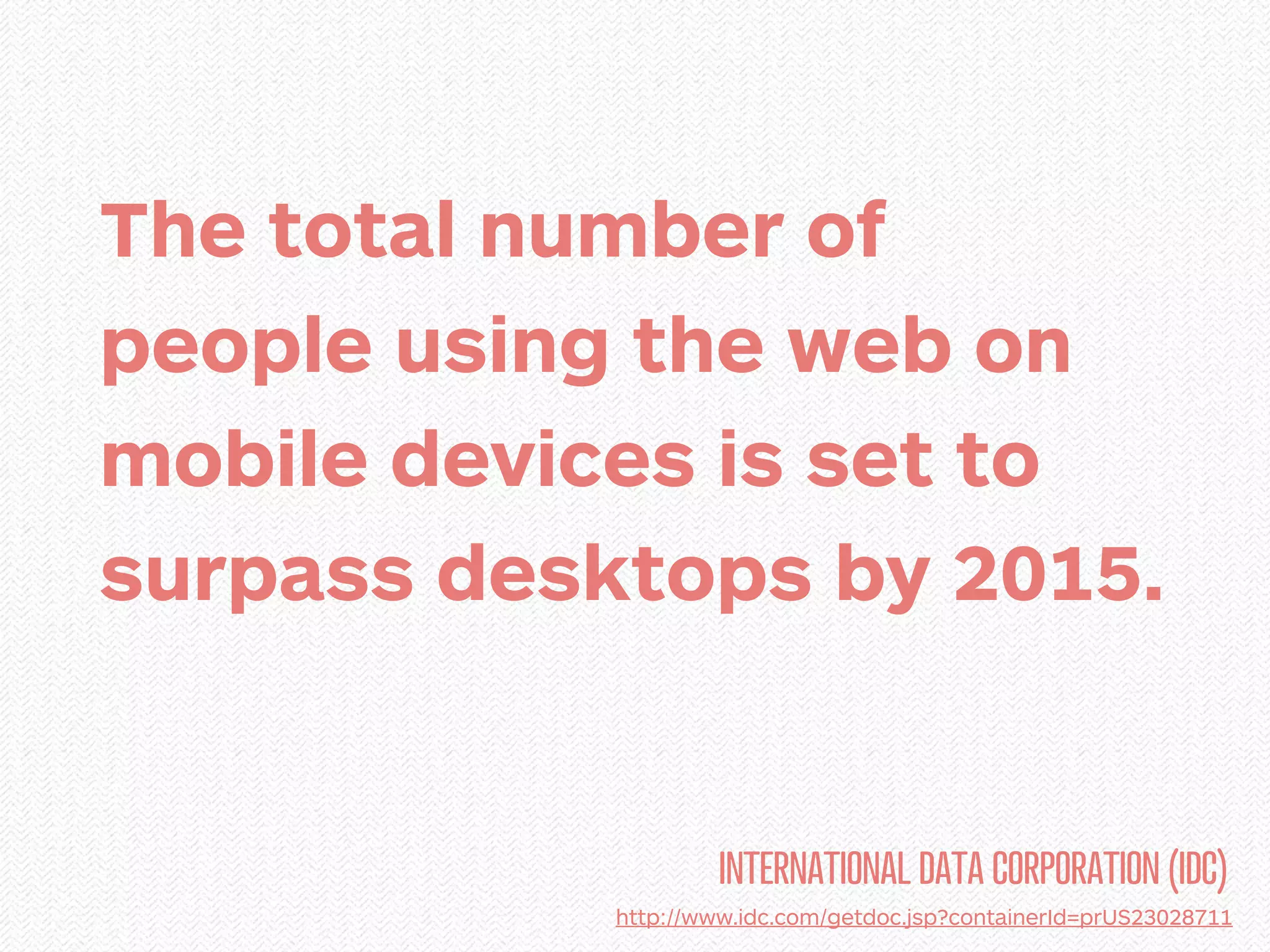
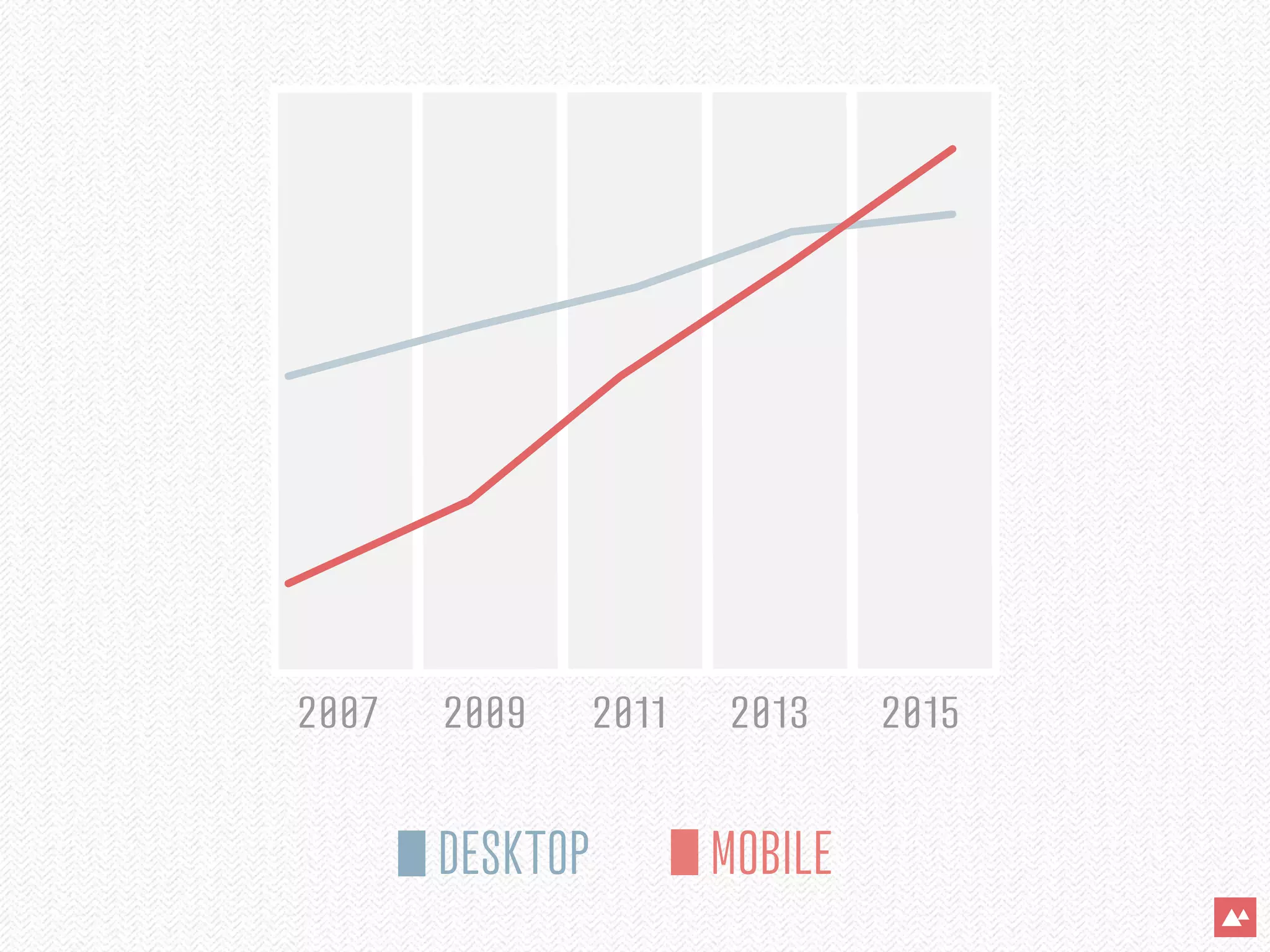
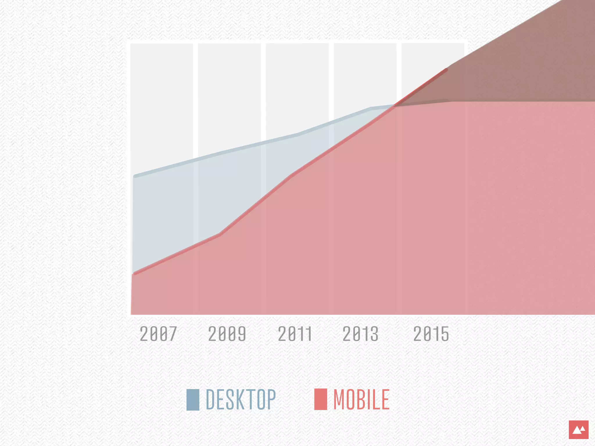


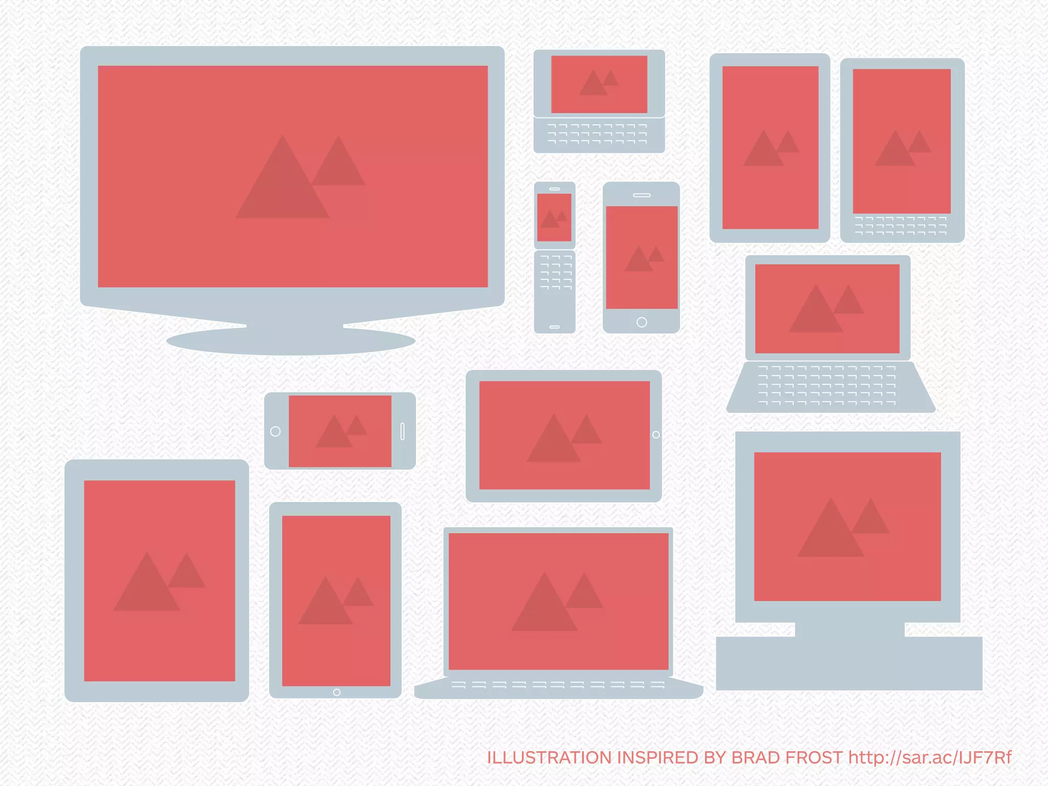


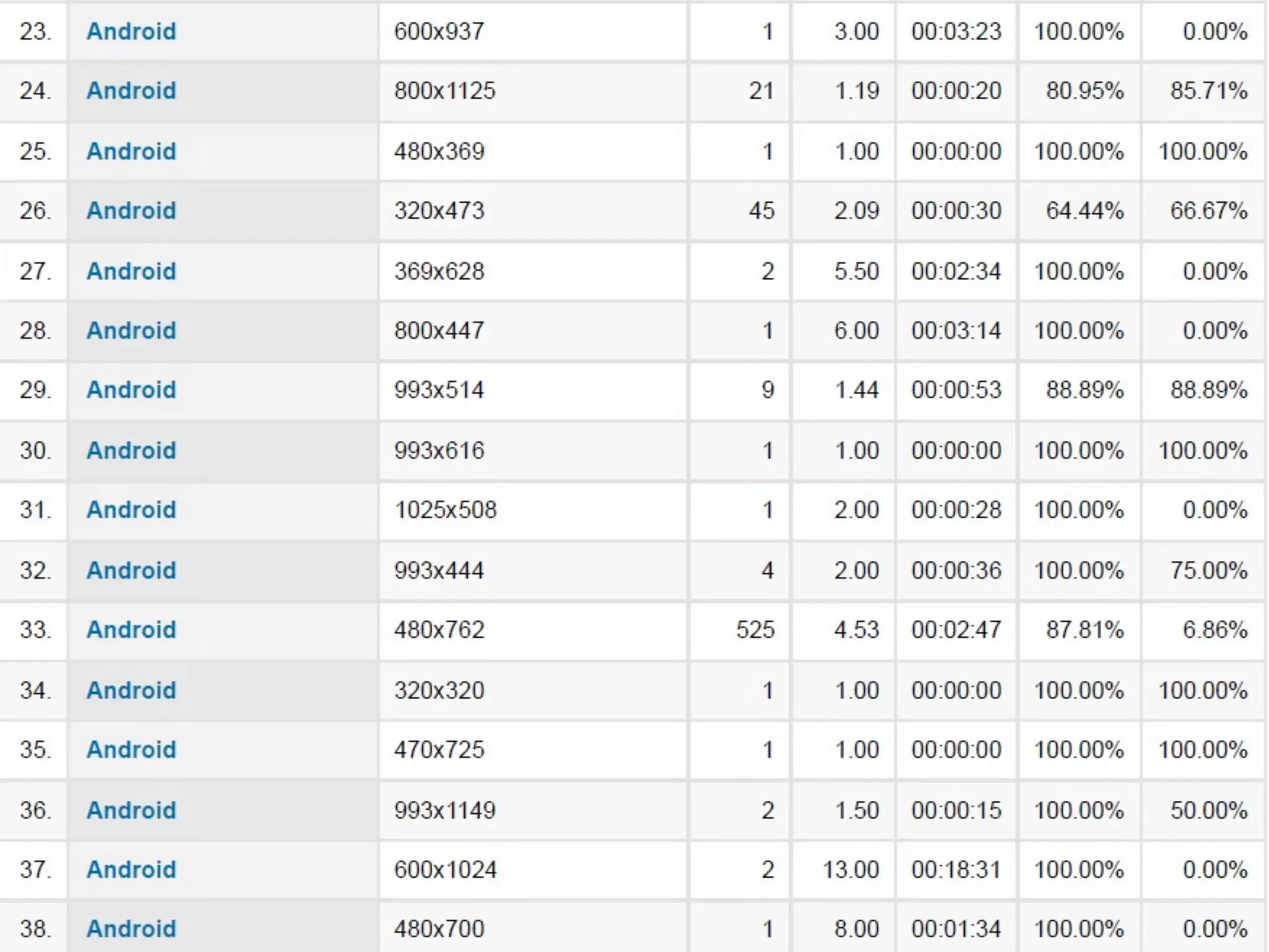
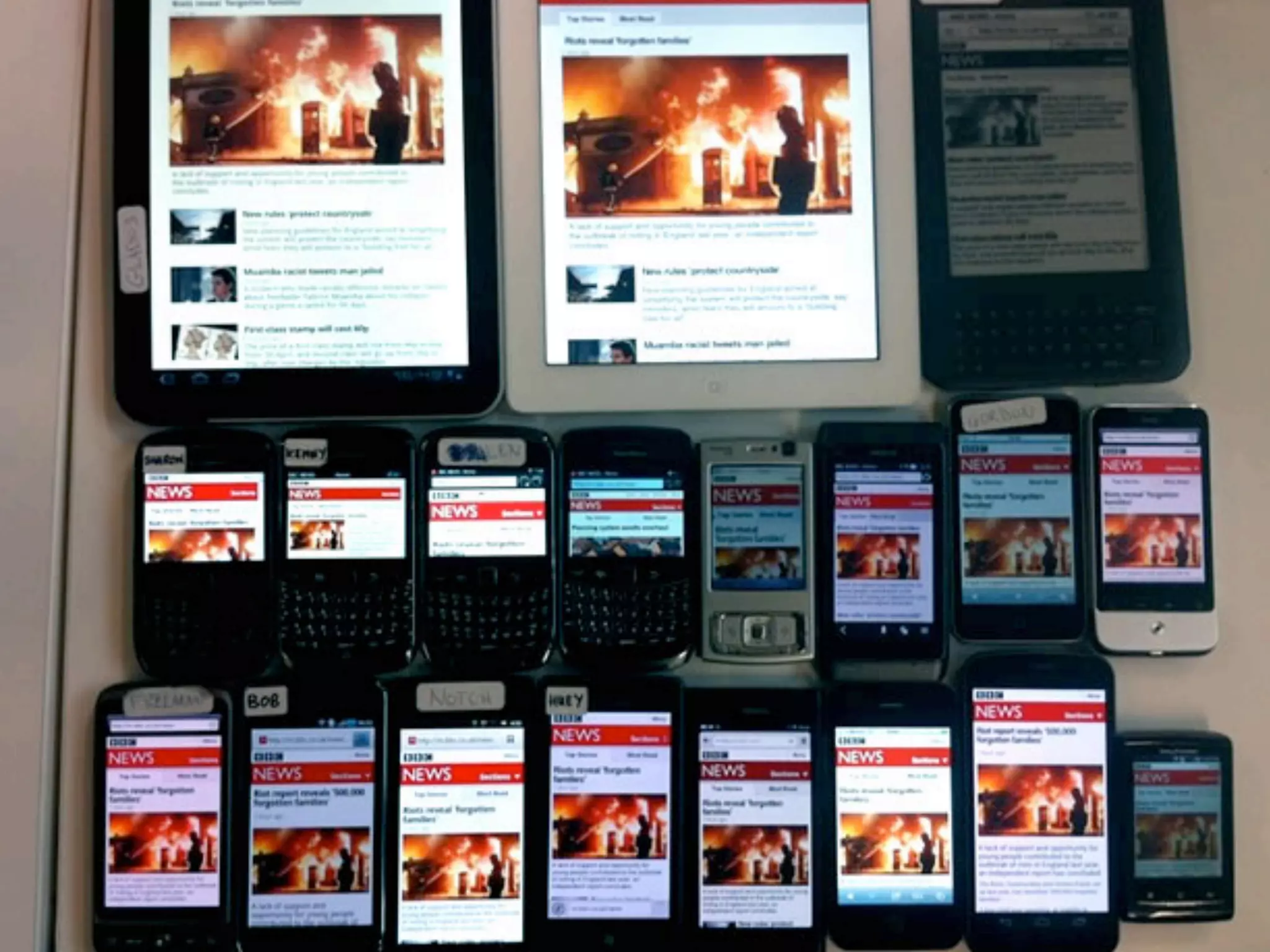
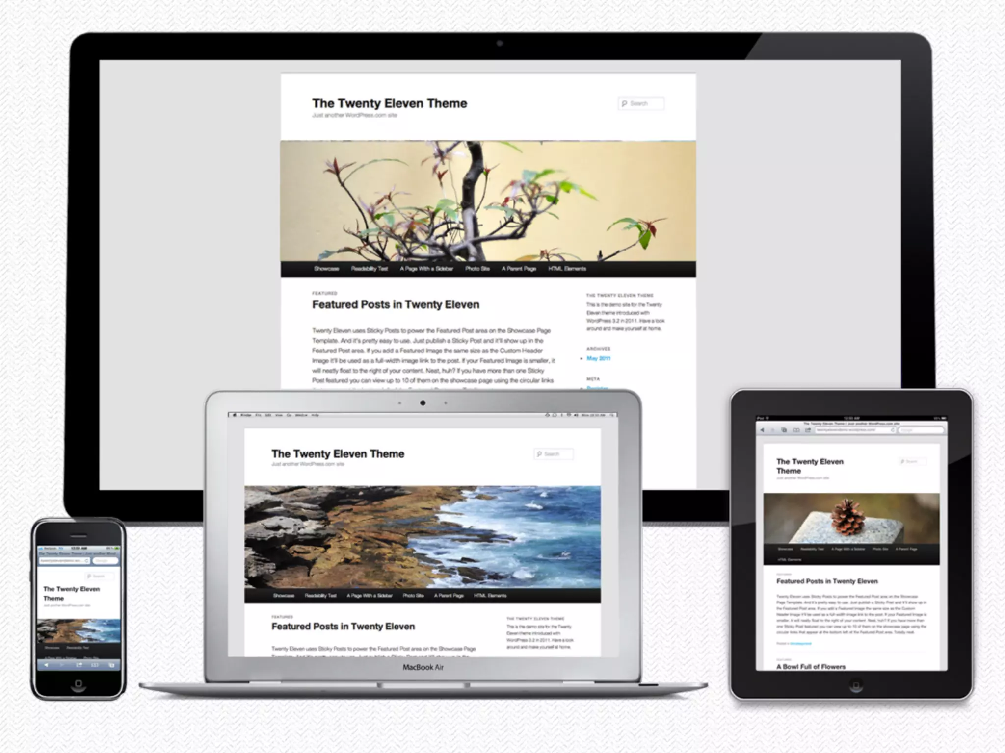
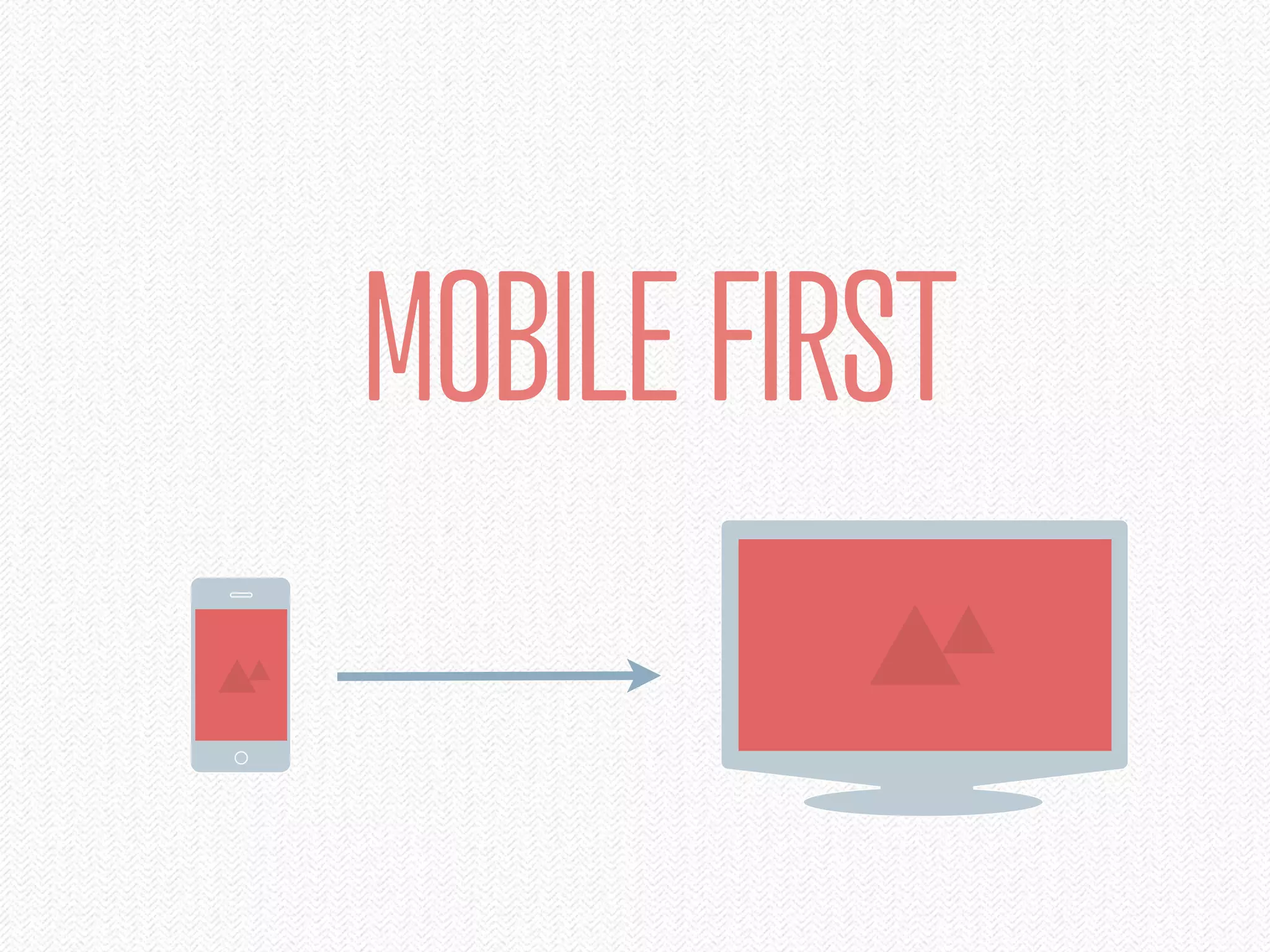
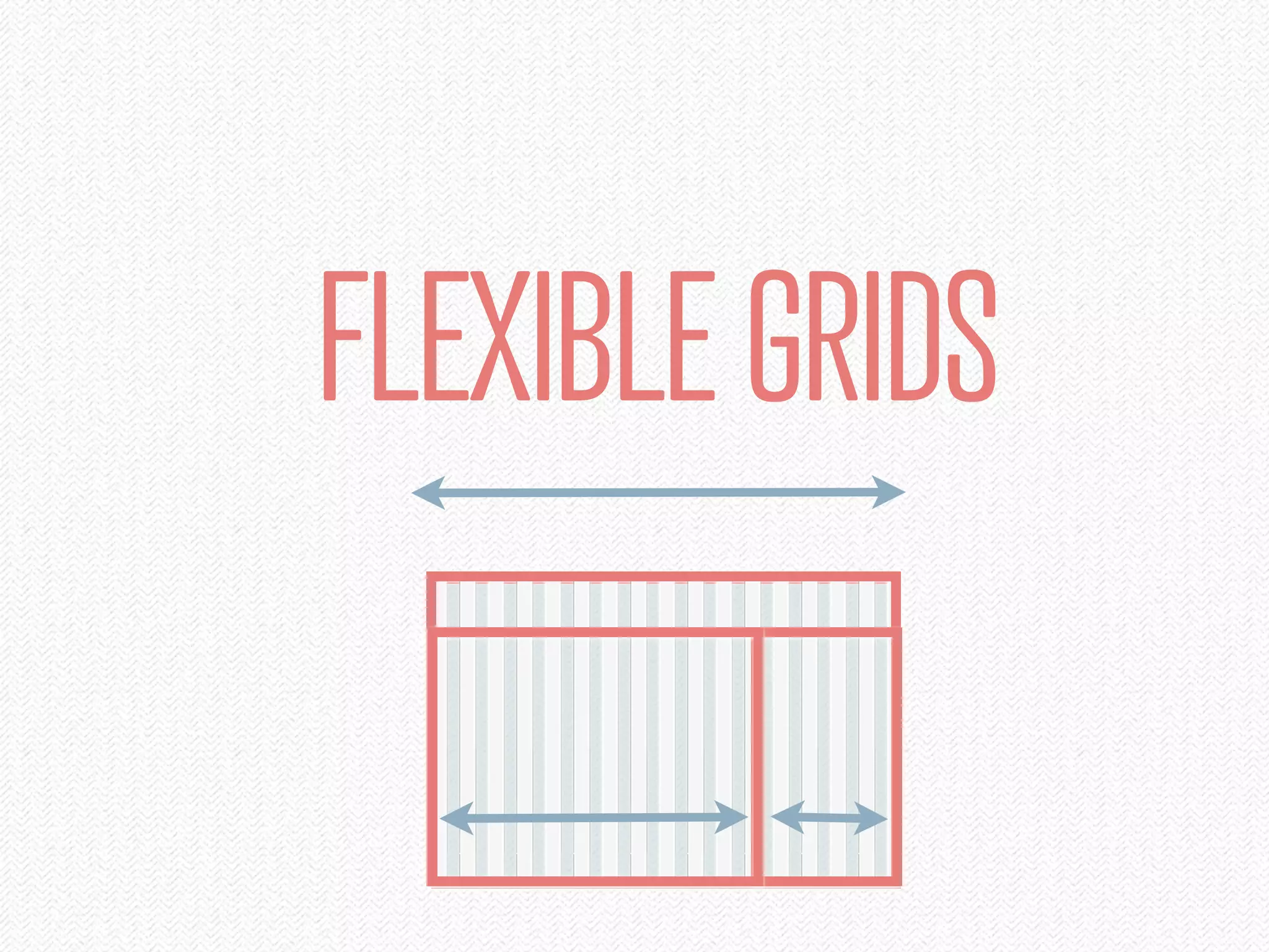
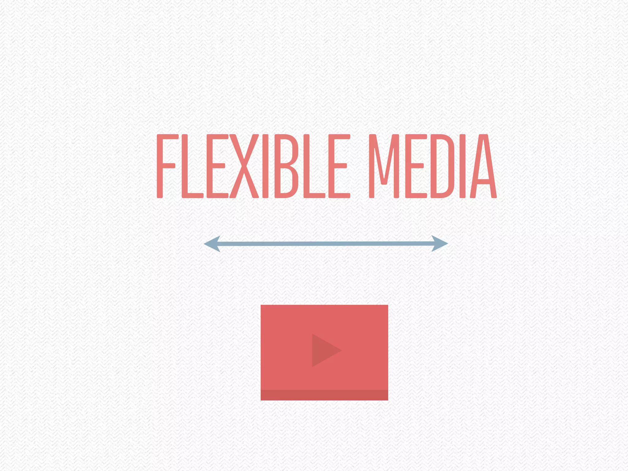
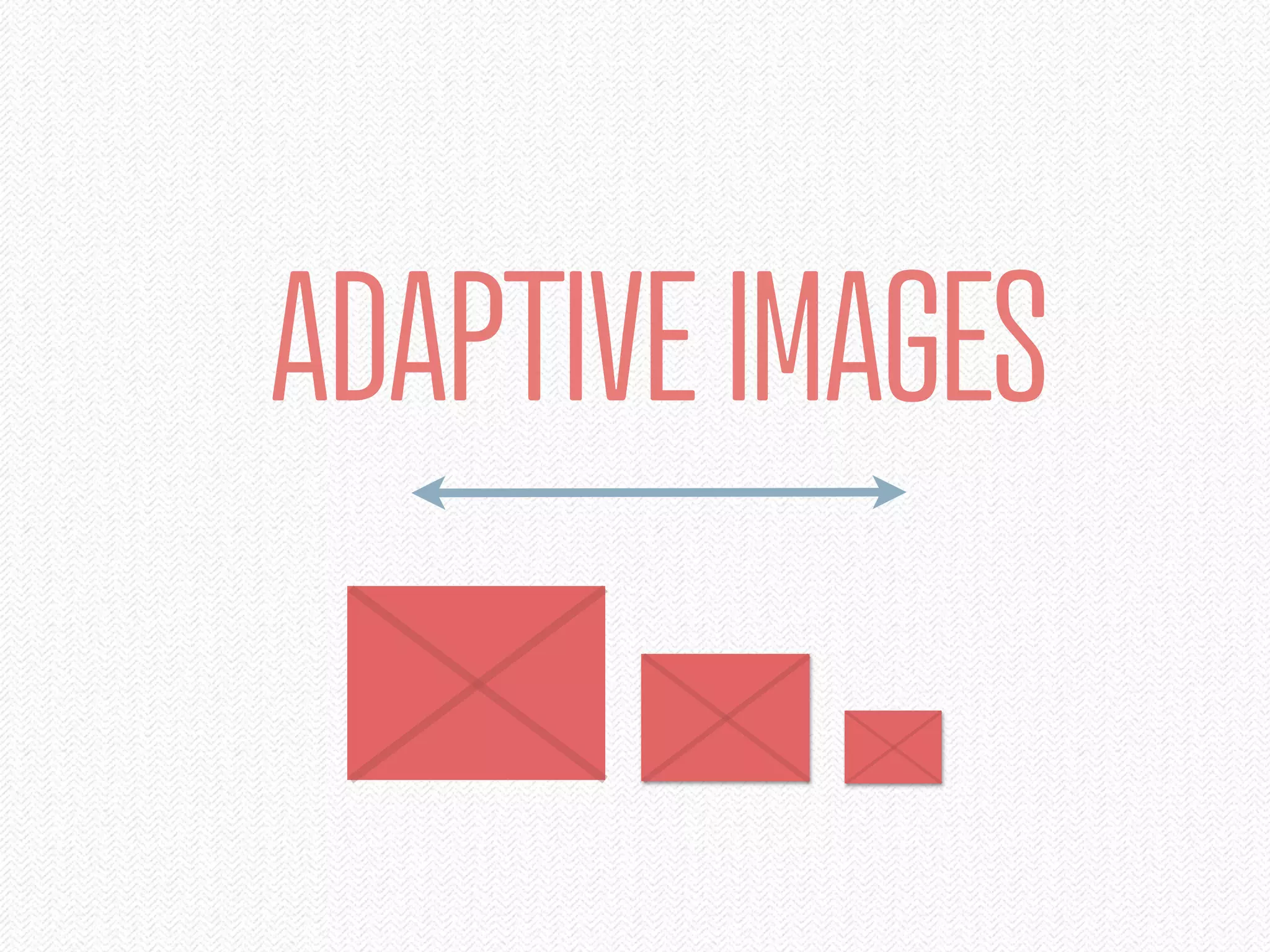


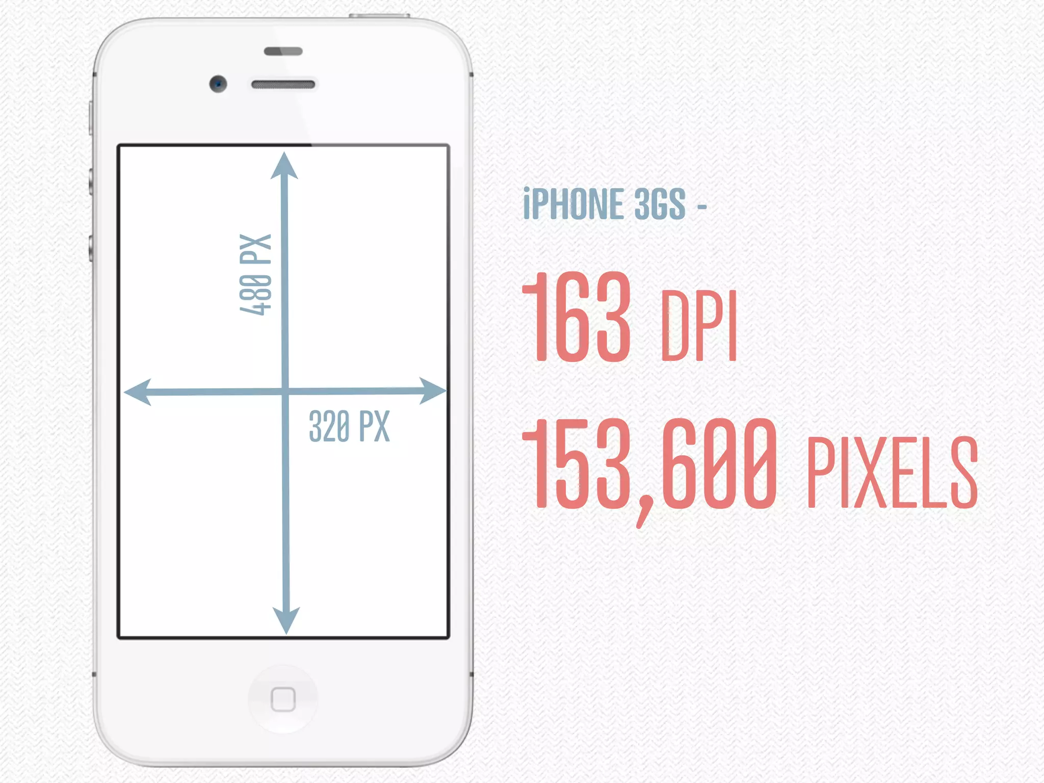
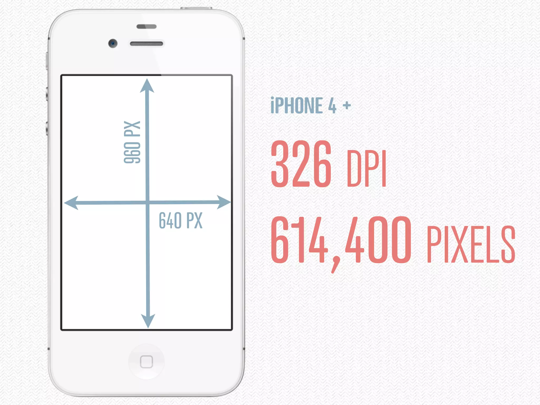
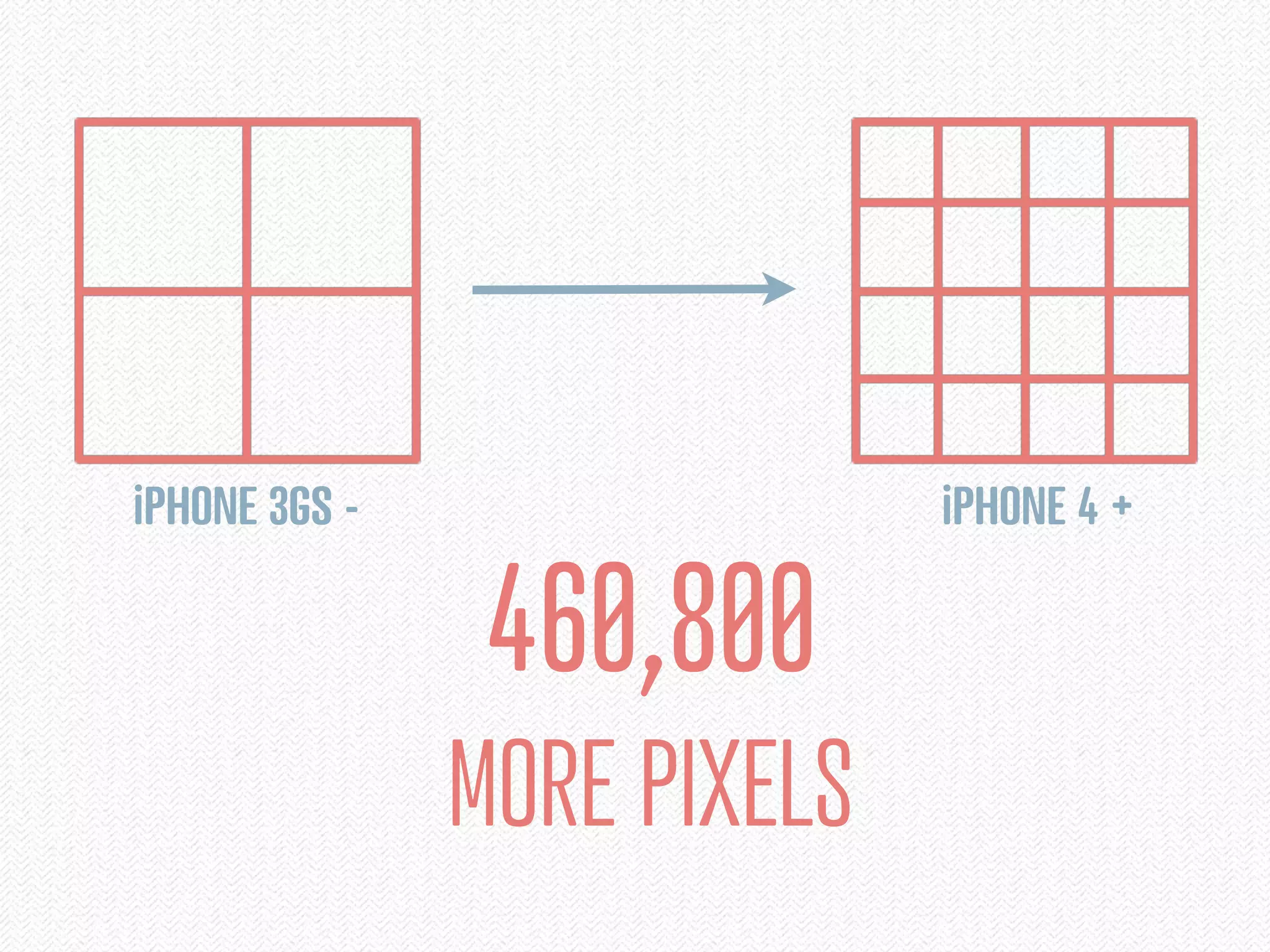
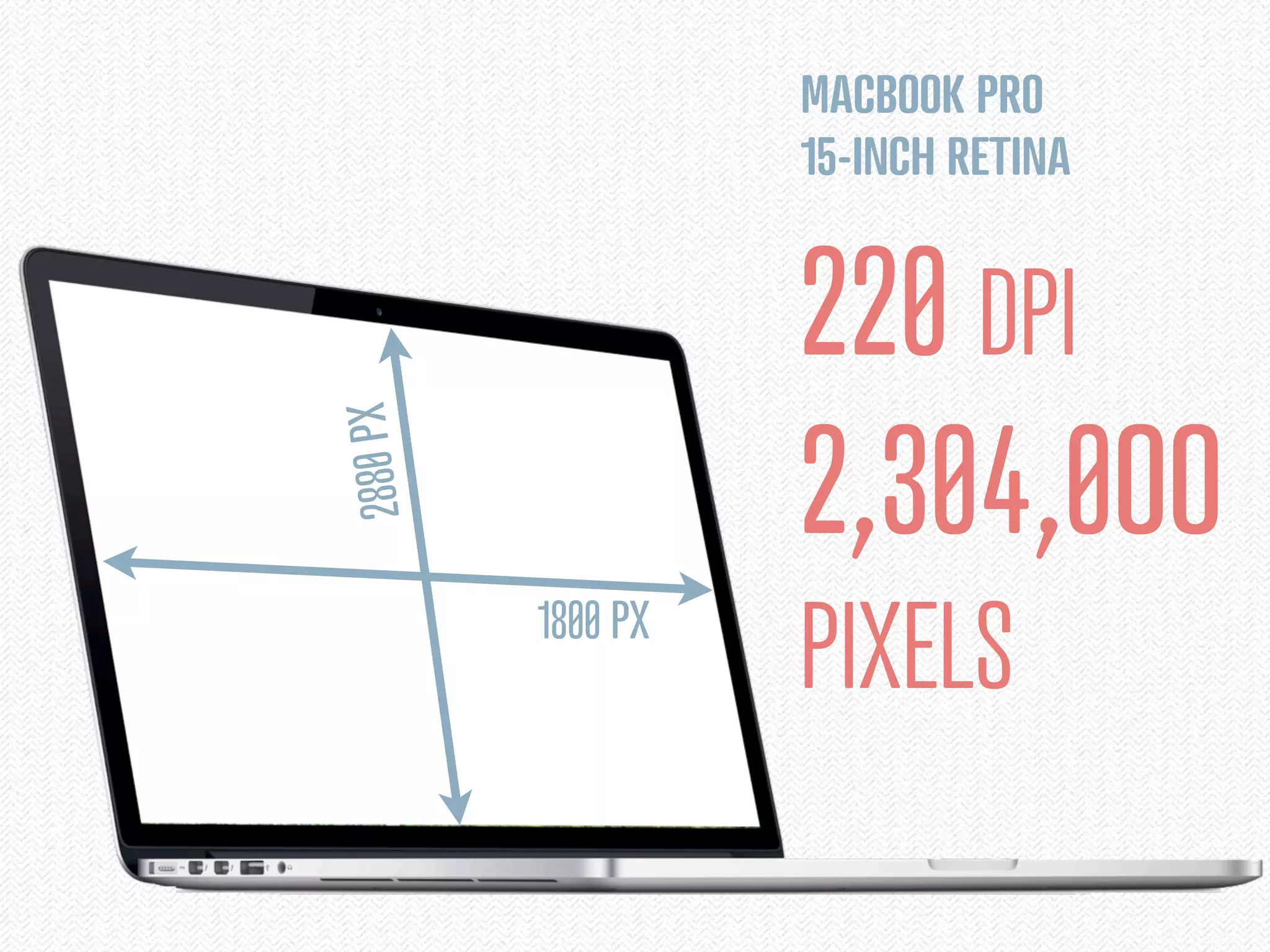
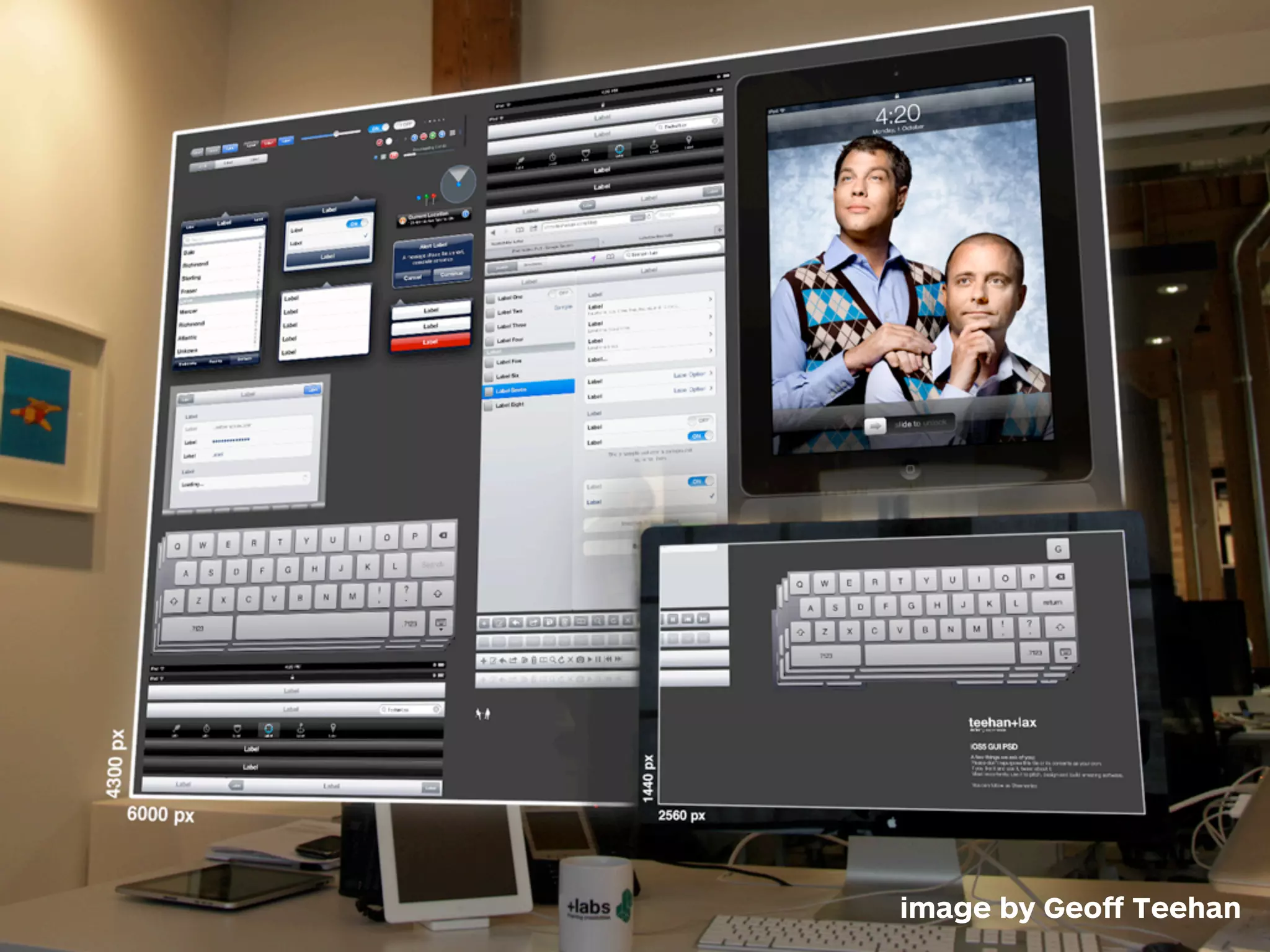
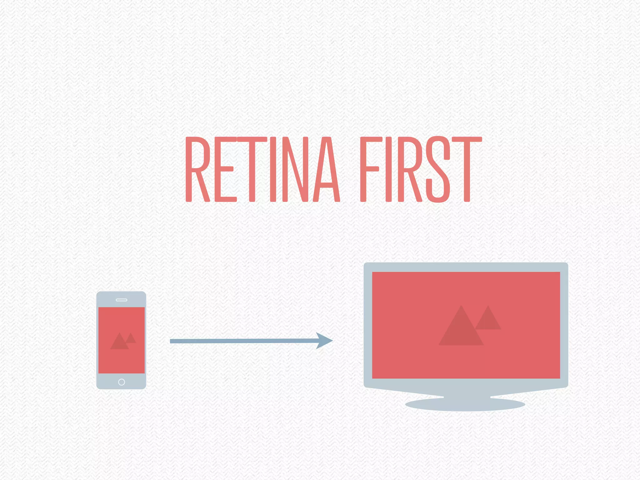
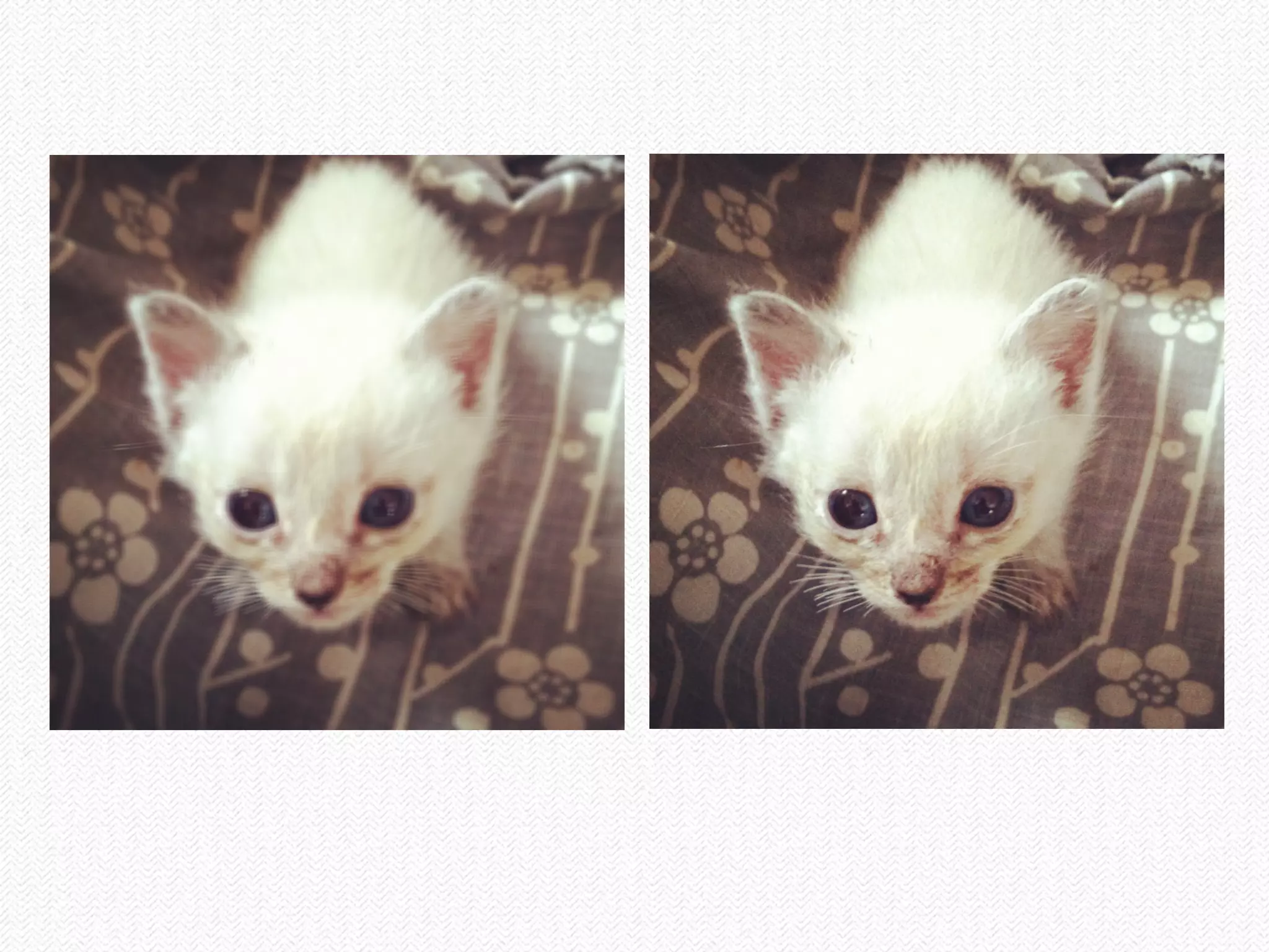
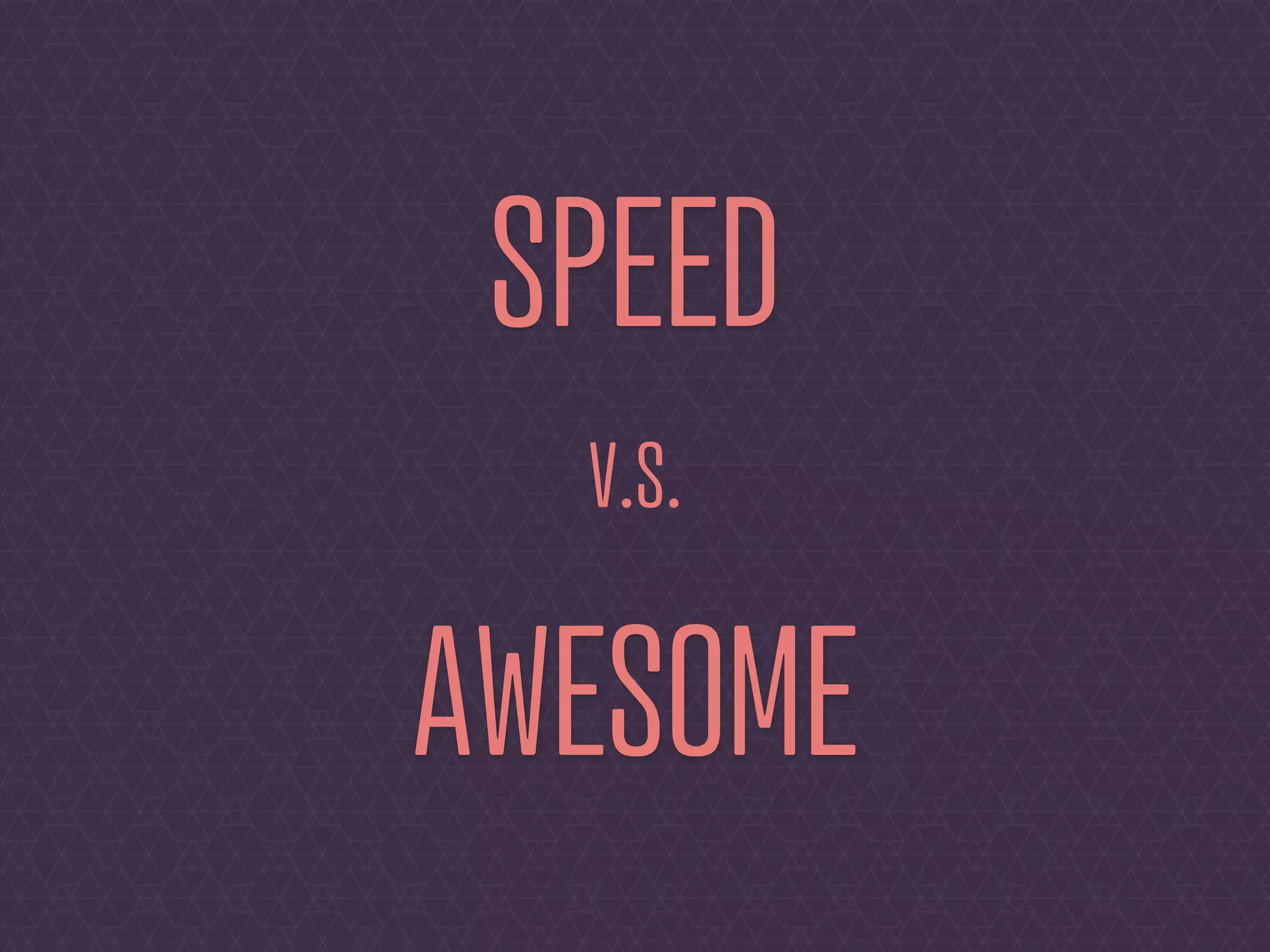

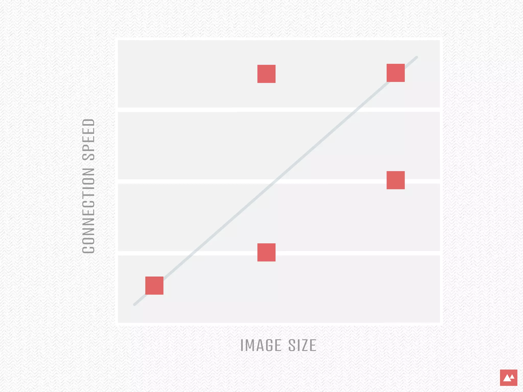
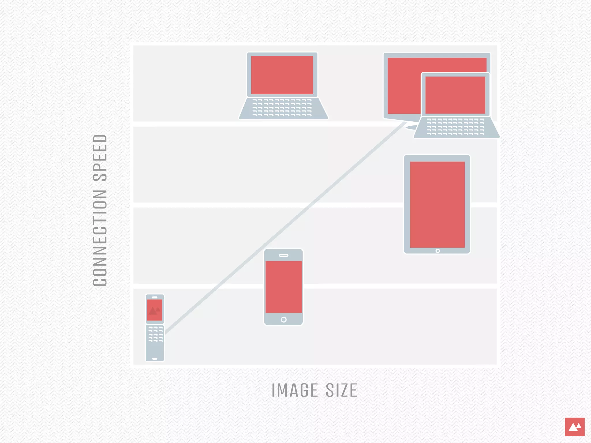

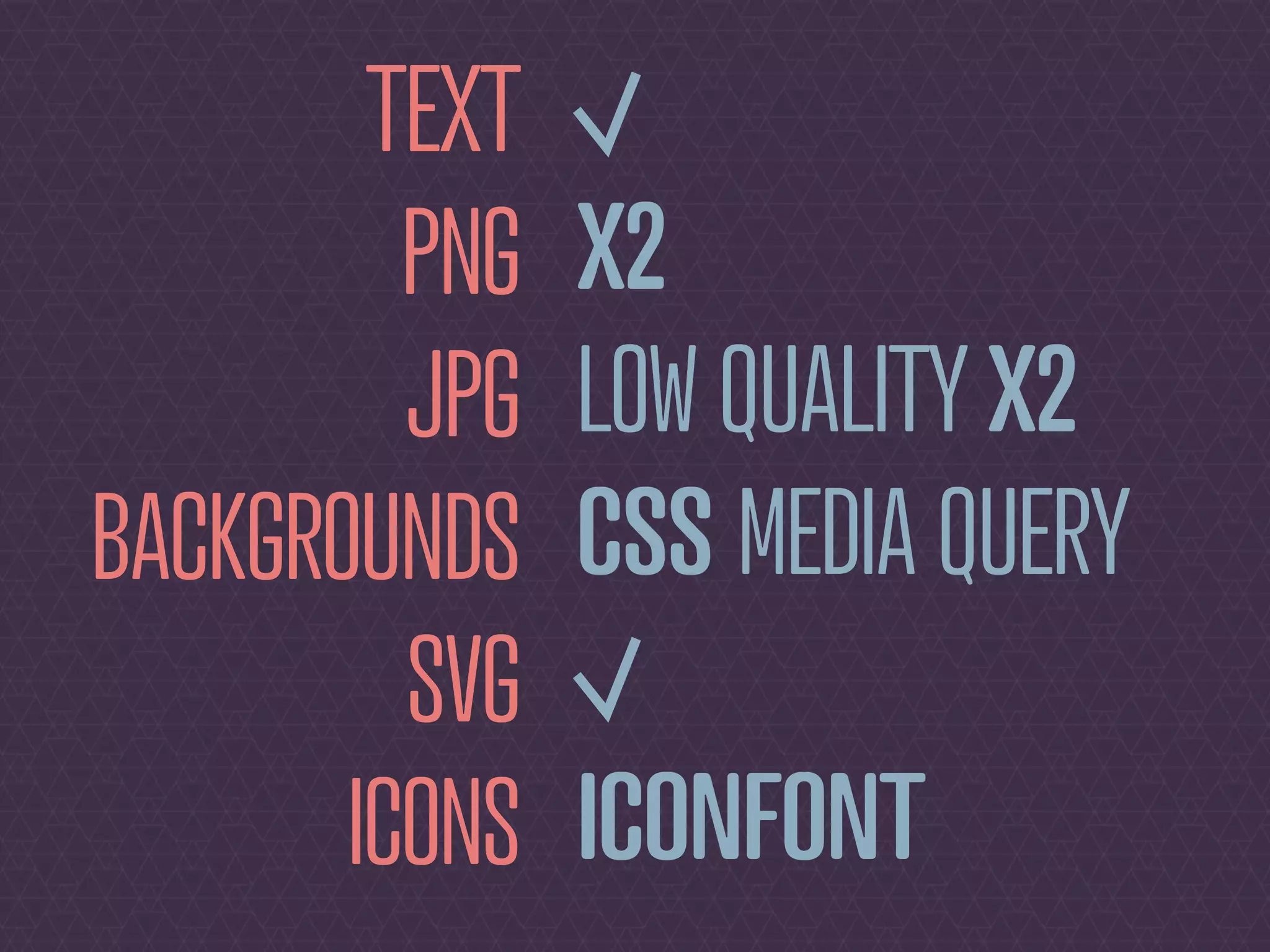
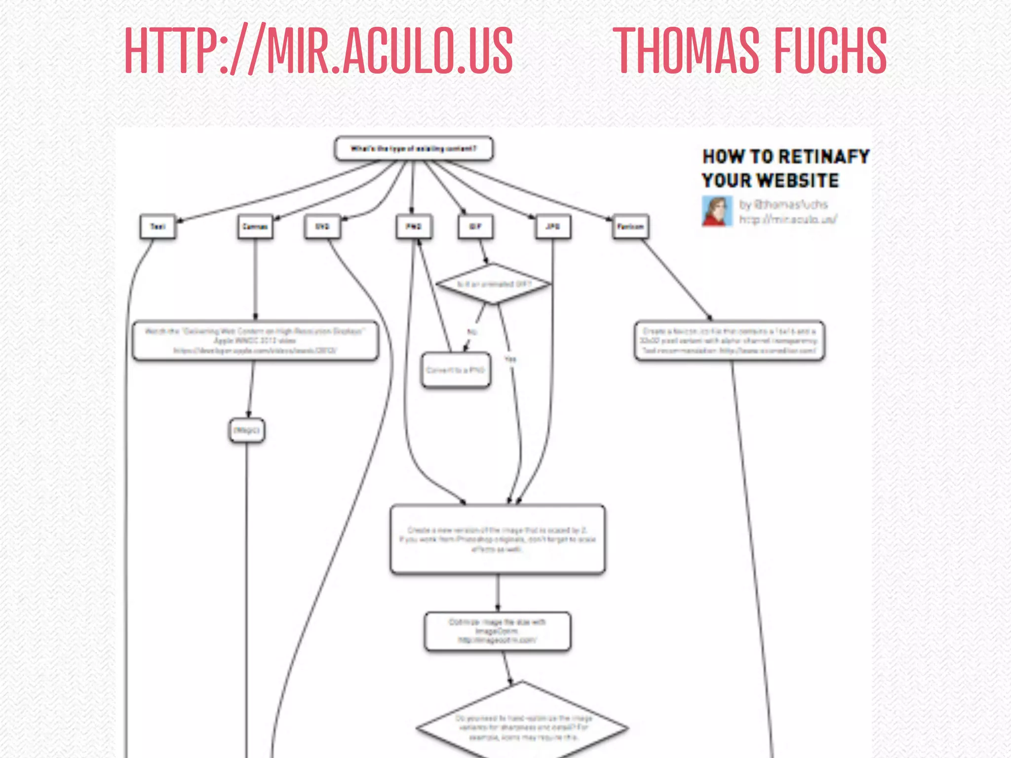


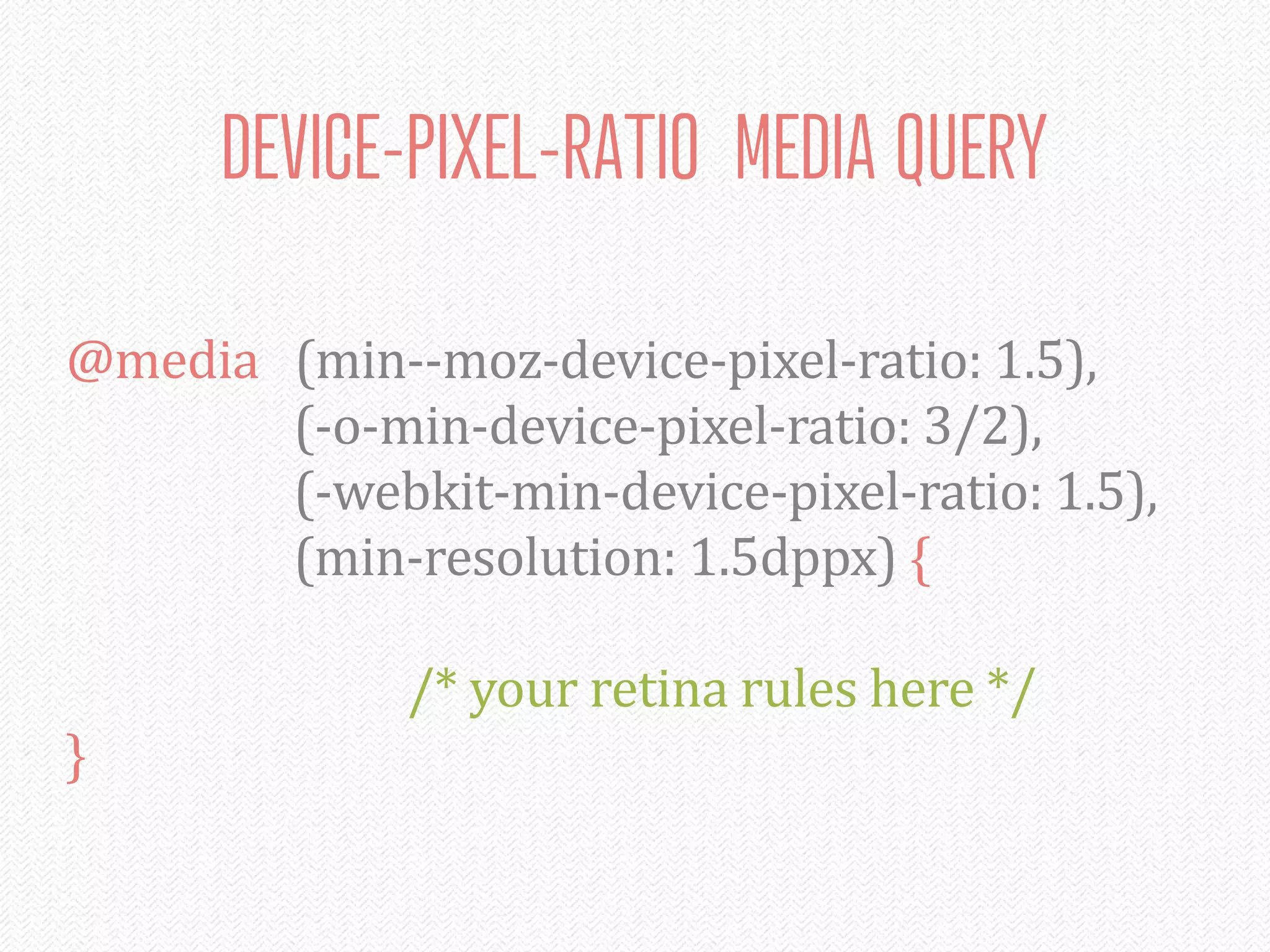
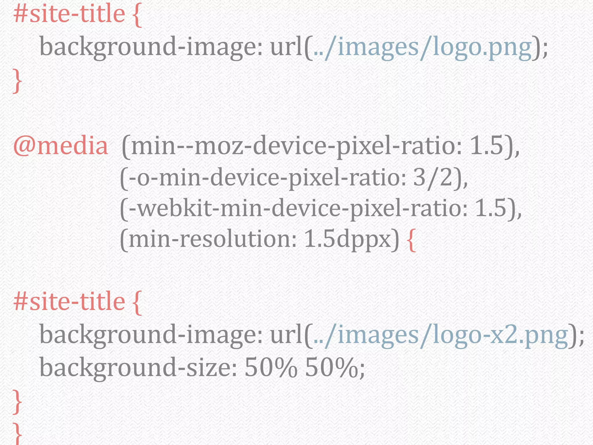


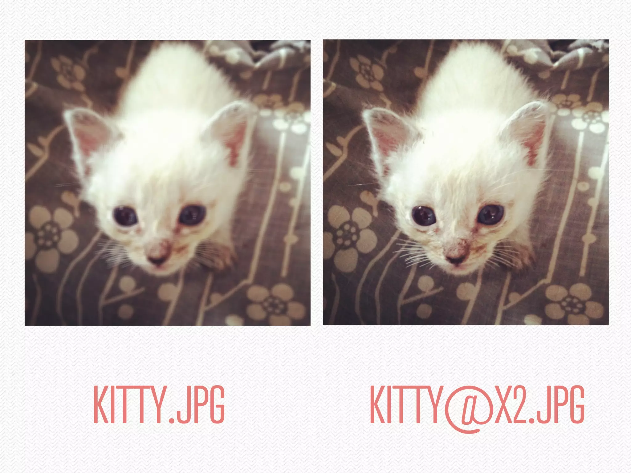


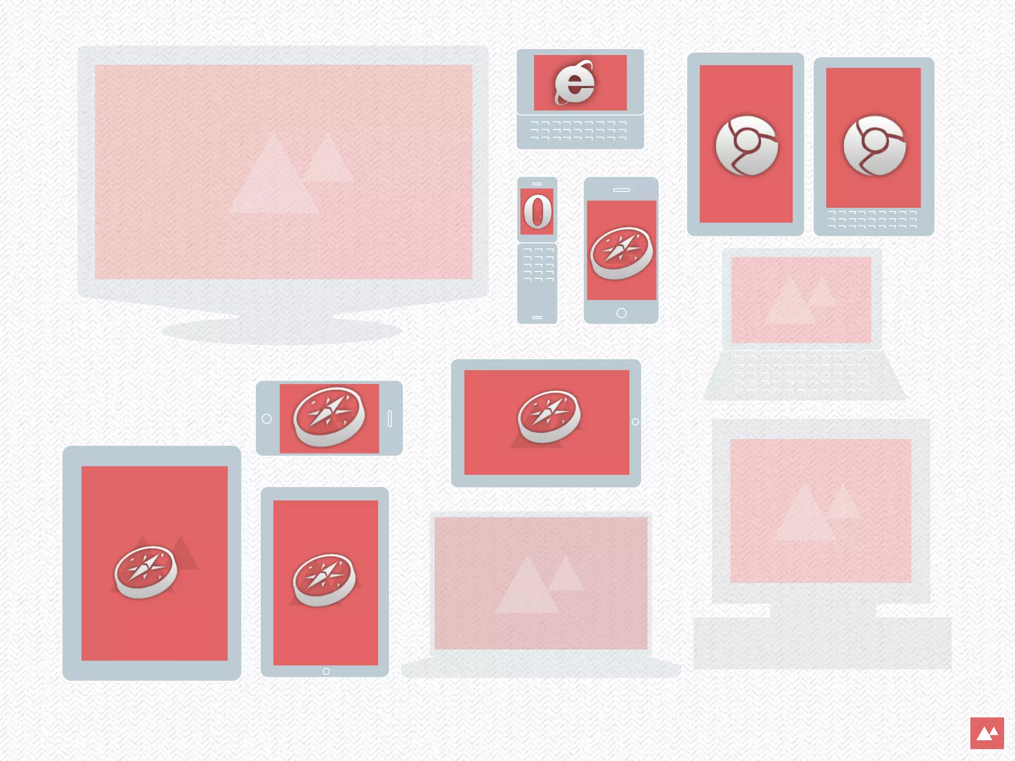
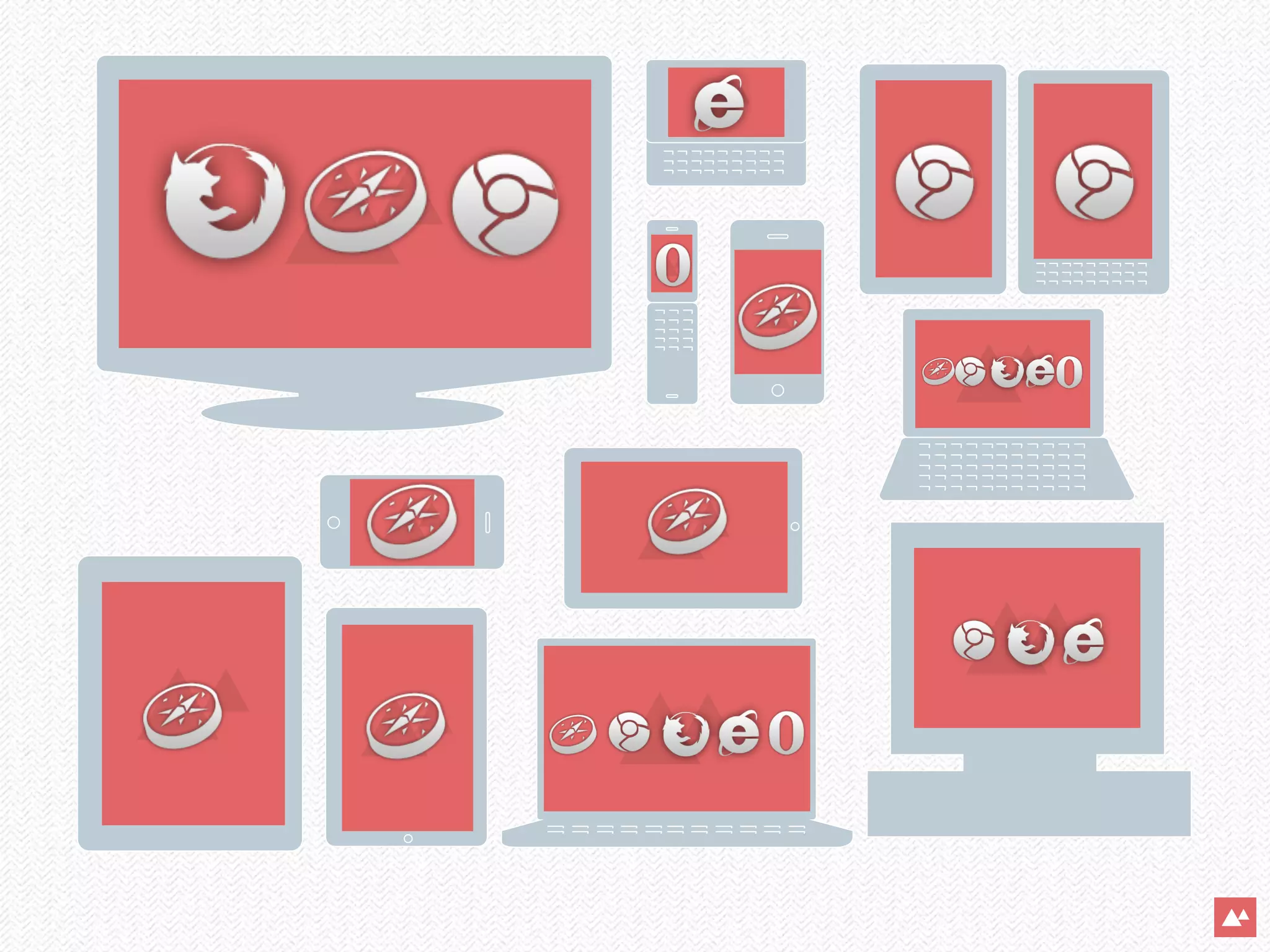


The document discusses the importance of designing for mobile devices as the number of users on mobile is expected to surpass desktop users by 2015. It emphasizes a mobile-first approach to web design, incorporating responsive web design principles, flexible grids, and retina images. Additionally, it addresses practical implementations like CSS media queries and the use of JavaScript for detecting device pixel ratios to enhance user experience on varying devices.


![[Azure Council Experts (ACE) 第14回定例会] Microsoft Azureアップデート情報 (2015/10/22-201...](https://cdn.slidesharecdn.com/ss_thumbnails/20151211aceazureupdate-151211083949-thumbnail.jpg?width=640&height=640&fit=bounds)

![[Azure Council Experts (ACE) 第33回定例会] Microsoft Azureアップデート情報 (2018/12/14-201...](https://cdn.slidesharecdn.com/ss_thumbnails/20190215aceazureupdate-190215080003-thumbnail.jpg?width=640&height=640&fit=bounds)


![[Azure Council Experts (ACE) 第10回定例会] Microsoft Azureアップデート情報 (2015/02/19-201...](https://cdn.slidesharecdn.com/ss_thumbnails/20150416aceazureupdate-150416040639-conversion-gate01-thumbnail.jpg?width=640&height=640&fit=bounds)


![[convergese] Adaptive Images in Responsive Web Design](https://cdn.slidesharecdn.com/ss_thumbnails/2012-adaptive-images-convergese-120509135732-phpapp01-thumbnail.jpg?width=640&height=640&fit=bounds)

![[cssdevconf] Adaptive Images in RWD](https://cdn.slidesharecdn.com/ss_thumbnails/adaptive-imagesv6-121210084537-phpapp02-thumbnail.jpg?width=640&height=640&fit=bounds)
![[rwdsummit2012] Adaptive Images in Responsive Web Design](https://cdn.slidesharecdn.com/ss_thumbnails/schmitt-adaptive-imagesv2-120829225201-phpapp02-thumbnail.jpg?width=640&height=640&fit=bounds)
![[html5tx] Adaptive Images in Responsive Web Design](https://cdn.slidesharecdn.com/ss_thumbnails/adaptive-images-html5tx-130202100125-phpapp01-thumbnail.jpg?width=640&height=640&fit=bounds)
![[CSSDevConf] Adaptive Images in Responsive Web Design 2014](https://cdn.slidesharecdn.com/ss_thumbnails/adaptive-images-cssdevconf-141013185313-conversion-gate02-thumbnail.jpg?width=640&height=640&fit=bounds)


