Developing for Responsive Design
Frederic Welterlin
Senior Presentation Layer Architect
San Francisco
Agenda

• What is Responsive Design?
 – How did we get here?
 – Why should we care?
• Crafting a Responsive User Experience
 – The Flexible Grid
 – Flexible Media
 – Media Queries
• When is Responsive Design Warranted?
 – Yes! and… Not Really
 – Ford Motor Company Example
 – Airline Industry Example
• Conclusions
 – Some Thoughts
 – What is Responsive Design?
 – Thanks
What is Responsive Design?
How did we get here?
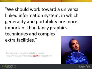
“We should work toward a universal
linked information system, in which
generality and portability are more
important than fancy graphics
techniques and complex
extra facilities.”

Tim Berners-Lee original WWW proposal.
(http://www.w3.org/History/1989/proposal.html)
“…balancing the needs of designers
for a sophisticated set of presentation
and interactive features against the
desire to make the Web accessible to
the largest possible number of
browsers (and other client
devices) and environments.”
© 1998-2001 Web Standards Project
(http://archive.webstandards.org/mission.html)
So the question is…
San Francisco MUNI
Friday, June 8, 2012
The Players
RESPONSIVE DESIGN
“is a web development approach that
suggests that design and development
should respond to the user’s behavior
and environment based on screen size,
platform and orientation.”

- Kayla Knight
http://coding.smashingmagazine.com/2011/01/12/guidelines-for-responsive-
web-design/
Why should we care?
Crafting a Responsive User Experience
The Birth of Responsive Design

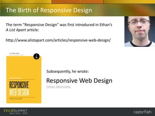
The term “Responsive Design” was first introduced in Ethan’s
A List Apart article:

http://www.alistapart.com/articles/responsive-web-design/


                      Subsequently, he wrote:

                      Responsive Web Design
                      Ethan Marcotte
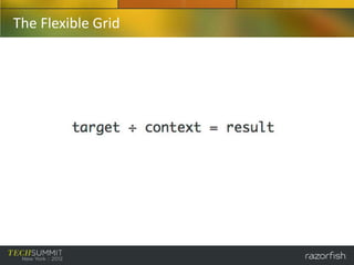
The Flexible Grid
The Flexible Grid
The Flexible Grid

 Gridpack
 http://gridpak.com/


 FRAMELESS
 http://framelessgrid.com/


 960 Grid System
 http://960.gs/


 There are so many…..
 http://www.awwwards.com/grid-based-web-design-resources.html
Other Tools, like CSS Preprocessors (LESS, SASS, Stylus)

  SASS (syntactically awesome style sheets)
  Sass is a meta-language on top of CSS that’s used to describe the style of a document
  cleanly and structurally, with more power than flat CSS allows.
  http://sass-lang.com/

  Extends CSS with dynamic behavior…

  -   Variables
  -   Nesting
  -   Mixins
  -   Operations
  -   Selector Inheritance
  -   Etc
Examples “borrowed” directly from SASS web site
 Variables                       Nesting
 $blue: #3bbfce;                 table.foo {
 $margin: 16px;                     margin: 2em;
 .content-navigation {              td.bar {
     border-color: $blue;              text-align: right;
     color: darken($blue, 9%);      }
 }                               }
 .border {
     margin: $margin / 2;
     border-color: $blue;
 }

 .content-navigation {           table.foo {
     border-color: #3bbfce;         margin: 2em;
     color: #2b9eab;             }
 }
 .border {                       table.foo td.bar {
     margin: 8px;                   text-align: right;
     border-color: #3bbfce;      }
 }
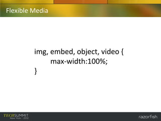
Flexible Media


         img, embed, object, video {
              max-width:100%;
         }
Media Queries
CSS3 Media Queries expands on the role of the traditional CSS2
“media” attribute with specific parameters that control how your
styles are applied for various devices.
@media screen and (max-width: 480px) {
     .foo {
            float: left;
     }
     .bar {
            margin: 0;
            border: 4px solid #666;
     }
}
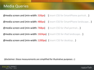
Media Queries

@media screen and (min-width: 320px)           { insert CSS for SmartPhone portrait… }

@media screen and (min-width: 480px)           { insert CSS for SmartPhone landscape… }

@media screen and (min-width: 768px)           { insert CSS for iPad portrait… }

@media screen and (min-width: 1024px) { insert CSS for iPad landscape… }

@media screen and (min-width: 1200px) { insert CSS for desktop… }


(disclaimer: these measurements are simplified for illustrative purposes :-)
Media Queries


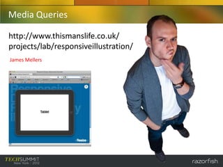
So… who is this guy??
Media Queries

http://www.thismanslife.co.uk/
projects/lab/responsiveillustration/
James Mellers
When is Responsive Design Warranted?
• YES!
  – Content focused sites: information travels in one
   direction, from source to user…
   »Newspapers
   »Magazines

• Not Really…
 –Transactional sites: complex applications that utilize
  workflows and user input…
  »Banking Applications
  »Airline Ticketing
Yes!

The business advantages of using Responsive
Design…
• One code base (less maintenance, saves money)
• Device agnostic
• Improved SEO
• Possibility of using “mobile first” approach
Ford - Support Site (http://support.ford.com/)
Not really…

The business disadvantages of using
Responsive Design…
• Does not address differing user needs between
  device usage
• Performance (un-needed markup is still being
  sent)
• Pixel perfect expectations are shattered
• Need to support legacy (non HTML5/CSS3)
  devices
www.united.com
Device: Desktop
Goal: Research Trip to NC
Task: Find/Review Flight
        Dates, Options,
        Connections
www.united.com
Device: Desktop
Goal: Research Trip to NC
Task: Get Mileage Balance
        Review Status Upgrade
www.united.com
Device: Desktop
Goal: Research Trip to NC
Task: Sign-Up for Credit Card?
www.united.com
Device: Desktop
Goal: Research Trip to NC
Task: Review Deals and
        Vacation Packages
mobile.united.com
Device: SmartPhone
Goal: Travel to New York City
Task: Go to Mobile Site
mobile.united.com
Device: SmartPhone
Goal: Travel to New York City
Task: Get Flight Status
mobile.united.com
Device: SmartPhone
Goal: Travel to New York City
Task: Check In, get Mobile Boarding
        Pass
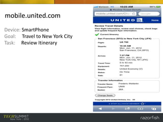
mobile.united.com
Device: SmartPhone
Goal: Travel to New York City
Task: Review Itinerary
Yeah… but Fred, isn’t what
you just showed an example
of being “responsive?”
Conclusions
Some Thoughts…

• “Responsive design” is a marketing term, and should be
  used with caution.

• Razorfish tailors technology solutions around user
  experience and business needs (and not the other way
  around).

• Responsive design is still in its infancy. Future visionaries
  and architects will continue to iterate on the “one code
  base” concept. Responsive architecture?
RESPONSIVE DESIGN
is a web development approach that
suggests that design and development
should respond to the user’s business or
task oriented needs, in conjunction with
device usage.

- Fred Welterlin
Thank You

• Thanks and respect to the following individuals…

 – James Walton and Michael Calfee (Razorfish, Austin, TX)
 – Ralph Brandi (Razorfish, New York, NY)

 – Ethan Marcotte (author, “Responsive Design”)
 – Ray Velez/Chris Stetson (Razorfish executive sponsors of this presentation)

Developing for Responsive Design - Frederic Welterlin

  • 1.
    Developing for ResponsiveDesign Frederic Welterlin Senior Presentation Layer Architect San Francisco
  • 2.
    Agenda • What isResponsive Design? – How did we get here? – Why should we care? • Crafting a Responsive User Experience – The Flexible Grid – Flexible Media – Media Queries • When is Responsive Design Warranted? – Yes! and… Not Really – Ford Motor Company Example – Airline Industry Example • Conclusions – Some Thoughts – What is Responsive Design? – Thanks
  • 3.
    What is ResponsiveDesign? How did we get here?
  • 4.
    “We should worktoward a universal linked information system, in which generality and portability are more important than fancy graphics techniques and complex extra facilities.” Tim Berners-Lee original WWW proposal. (http://www.w3.org/History/1989/proposal.html)
  • 5.
    “…balancing the needsof designers for a sophisticated set of presentation and interactive features against the desire to make the Web accessible to the largest possible number of browsers (and other client devices) and environments.” © 1998-2001 Web Standards Project (http://archive.webstandards.org/mission.html)
  • 6.
  • 7.
  • 8.
  • 9.
    RESPONSIVE DESIGN “is aweb development approach that suggests that design and development should respond to the user’s behavior and environment based on screen size, platform and orientation.” - Kayla Knight http://coding.smashingmagazine.com/2011/01/12/guidelines-for-responsive- web-design/
  • 10.
  • 12.
    Crafting a ResponsiveUser Experience
  • 13.
    The Birth ofResponsive Design The term “Responsive Design” was first introduced in Ethan’s A List Apart article: http://www.alistapart.com/articles/responsive-web-design/ Subsequently, he wrote: Responsive Web Design Ethan Marcotte
  • 14.
  • 15.
  • 16.
    The Flexible Grid Gridpack http://gridpak.com/ FRAMELESS http://framelessgrid.com/ 960 Grid System http://960.gs/ There are so many….. http://www.awwwards.com/grid-based-web-design-resources.html
  • 17.
    Other Tools, likeCSS Preprocessors (LESS, SASS, Stylus) SASS (syntactically awesome style sheets) Sass is a meta-language on top of CSS that’s used to describe the style of a document cleanly and structurally, with more power than flat CSS allows. http://sass-lang.com/ Extends CSS with dynamic behavior… - Variables - Nesting - Mixins - Operations - Selector Inheritance - Etc
  • 18.
    Examples “borrowed” directlyfrom SASS web site Variables Nesting $blue: #3bbfce; table.foo { $margin: 16px; margin: 2em; .content-navigation { td.bar { border-color: $blue; text-align: right; color: darken($blue, 9%); } } } .border { margin: $margin / 2; border-color: $blue; } .content-navigation { table.foo { border-color: #3bbfce; margin: 2em; color: #2b9eab; } } .border { table.foo td.bar { margin: 8px; text-align: right; border-color: #3bbfce; } }
  • 19.
    Flexible Media img, embed, object, video { max-width:100%; }
  • 20.
    Media Queries CSS3 MediaQueries expands on the role of the traditional CSS2 “media” attribute with specific parameters that control how your styles are applied for various devices. @media screen and (max-width: 480px) { .foo { float: left; } .bar { margin: 0; border: 4px solid #666; } }
  • 21.
    Media Queries @media screenand (min-width: 320px) { insert CSS for SmartPhone portrait… } @media screen and (min-width: 480px) { insert CSS for SmartPhone landscape… } @media screen and (min-width: 768px) { insert CSS for iPad portrait… } @media screen and (min-width: 1024px) { insert CSS for iPad landscape… } @media screen and (min-width: 1200px) { insert CSS for desktop… } (disclaimer: these measurements are simplified for illustrative purposes :-)
  • 22.
  • 23.
  • 24.
    When is ResponsiveDesign Warranted?
  • 25.
    When is ResponsiveDesign Warranted? • YES! – Content focused sites: information travels in one direction, from source to user… »Newspapers »Magazines • Not Really… –Transactional sites: complex applications that utilize workflows and user input… »Banking Applications »Airline Ticketing
  • 26.
    Yes! The business advantagesof using Responsive Design… • One code base (less maintenance, saves money) • Device agnostic • Improved SEO • Possibility of using “mobile first” approach
  • 27.
    Ford - SupportSite (http://support.ford.com/)
  • 28.
    Not really… The businessdisadvantages of using Responsive Design… • Does not address differing user needs between device usage • Performance (un-needed markup is still being sent) • Pixel perfect expectations are shattered • Need to support legacy (non HTML5/CSS3) devices
  • 29.
    www.united.com Device: Desktop Goal: ResearchTrip to NC Task: Find/Review Flight Dates, Options, Connections
  • 30.
    www.united.com Device: Desktop Goal: ResearchTrip to NC Task: Get Mileage Balance Review Status Upgrade
  • 31.
    www.united.com Device: Desktop Goal: ResearchTrip to NC Task: Sign-Up for Credit Card?
  • 32.
    www.united.com Device: Desktop Goal: ResearchTrip to NC Task: Review Deals and Vacation Packages
  • 33.
    mobile.united.com Device: SmartPhone Goal: Travelto New York City Task: Go to Mobile Site
  • 34.
    mobile.united.com Device: SmartPhone Goal: Travelto New York City Task: Get Flight Status
  • 35.
    mobile.united.com Device: SmartPhone Goal: Travelto New York City Task: Check In, get Mobile Boarding Pass
  • 36.
    mobile.united.com Device: SmartPhone Goal: Travelto New York City Task: Review Itinerary
  • 37.
    Yeah… but Fred,isn’t what you just showed an example of being “responsive?”
  • 38.
  • 39.
    Some Thoughts… • “Responsivedesign” is a marketing term, and should be used with caution. • Razorfish tailors technology solutions around user experience and business needs (and not the other way around). • Responsive design is still in its infancy. Future visionaries and architects will continue to iterate on the “one code base” concept. Responsive architecture?
  • 40.
    RESPONSIVE DESIGN is aweb development approach that suggests that design and development should respond to the user’s business or task oriented needs, in conjunction with device usage. - Fred Welterlin
  • 41.
    Thank You • Thanksand respect to the following individuals… – James Walton and Michael Calfee (Razorfish, Austin, TX) – Ralph Brandi (Razorfish, New York, NY) – Ethan Marcotte (author, “Responsive Design”) – Ray Velez/Chris Stetson (Razorfish executive sponsors of this presentation)