Download as PDF, PPTX


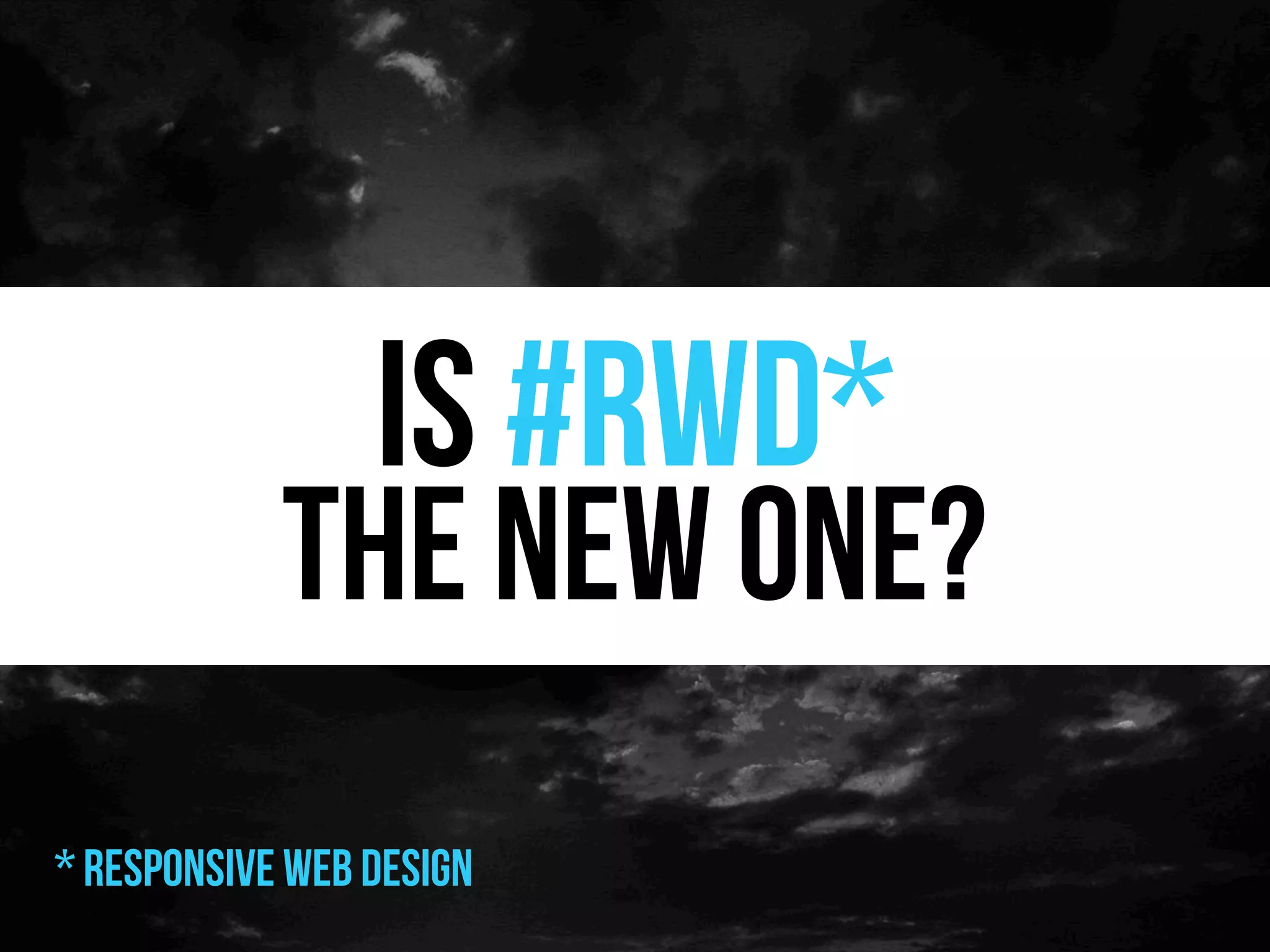

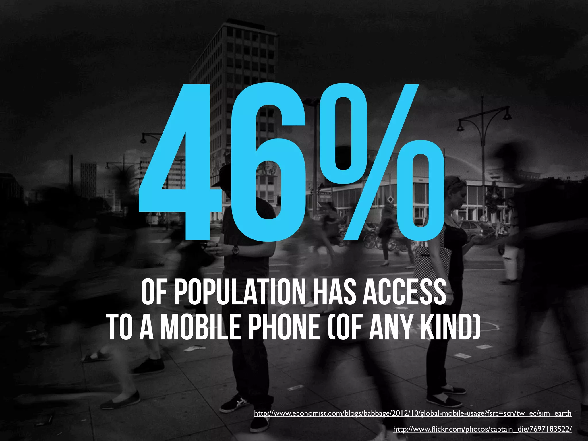

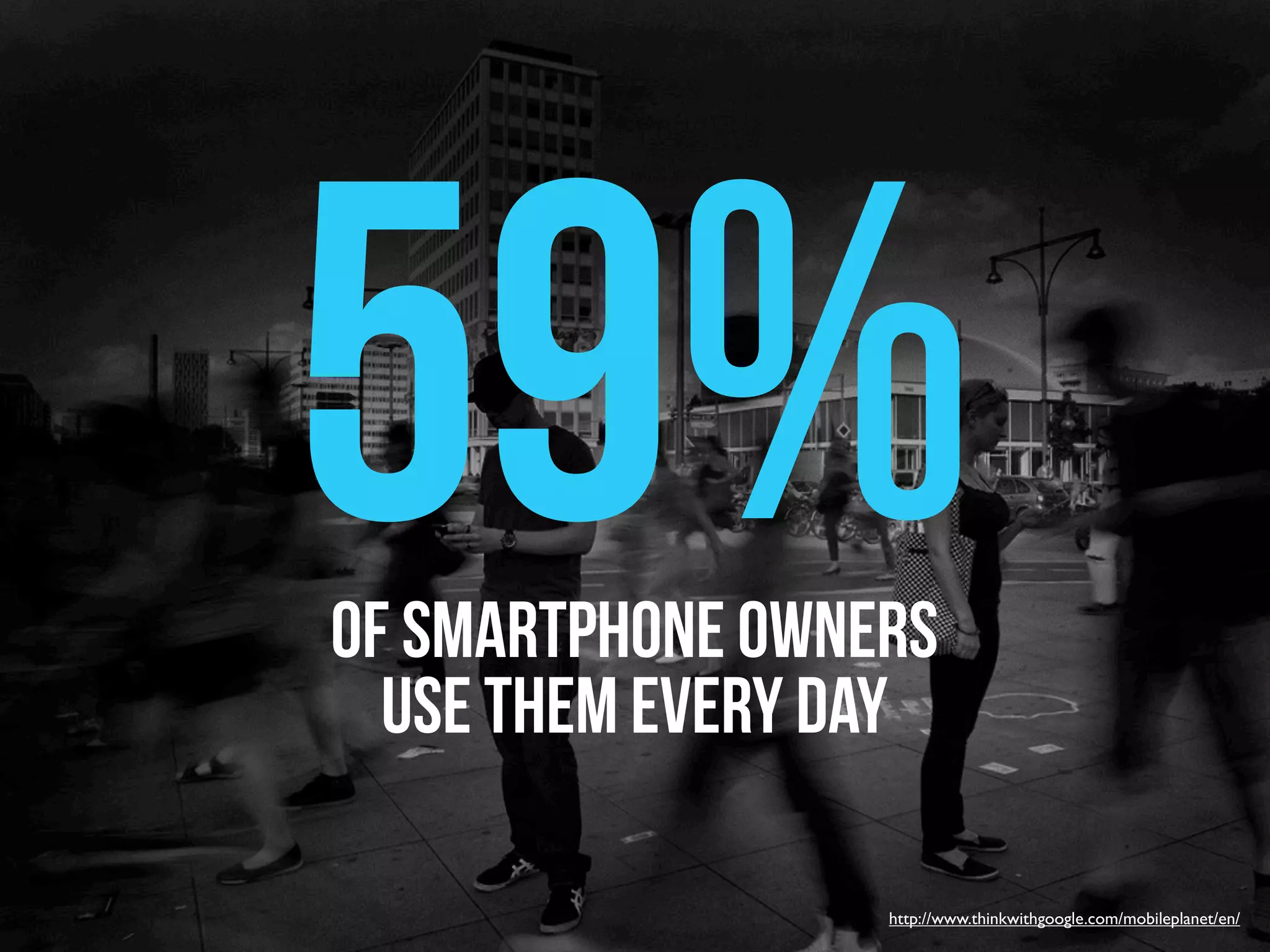

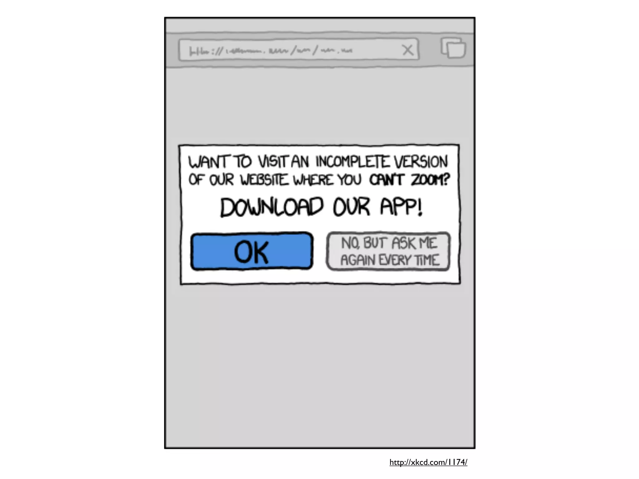

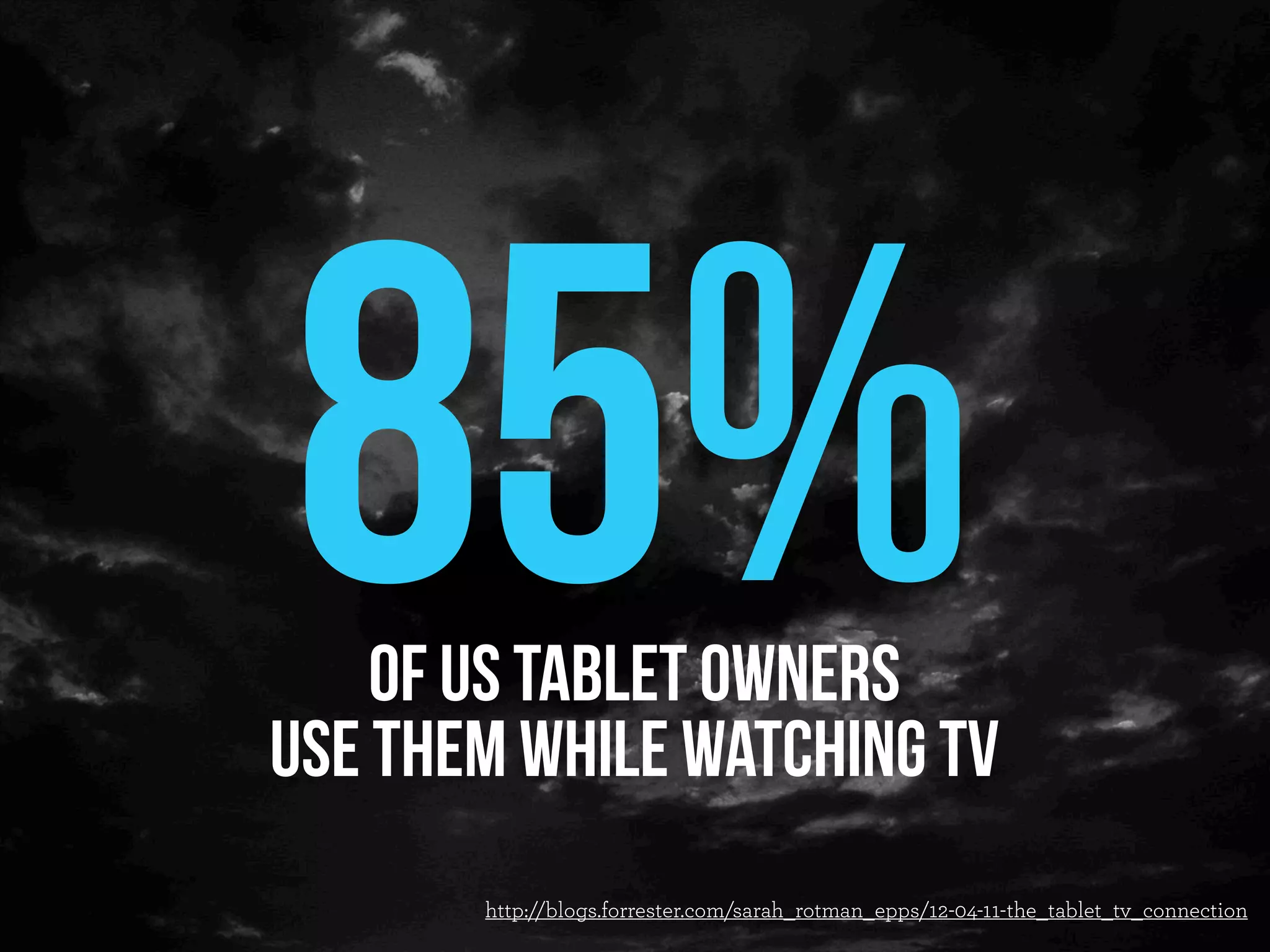

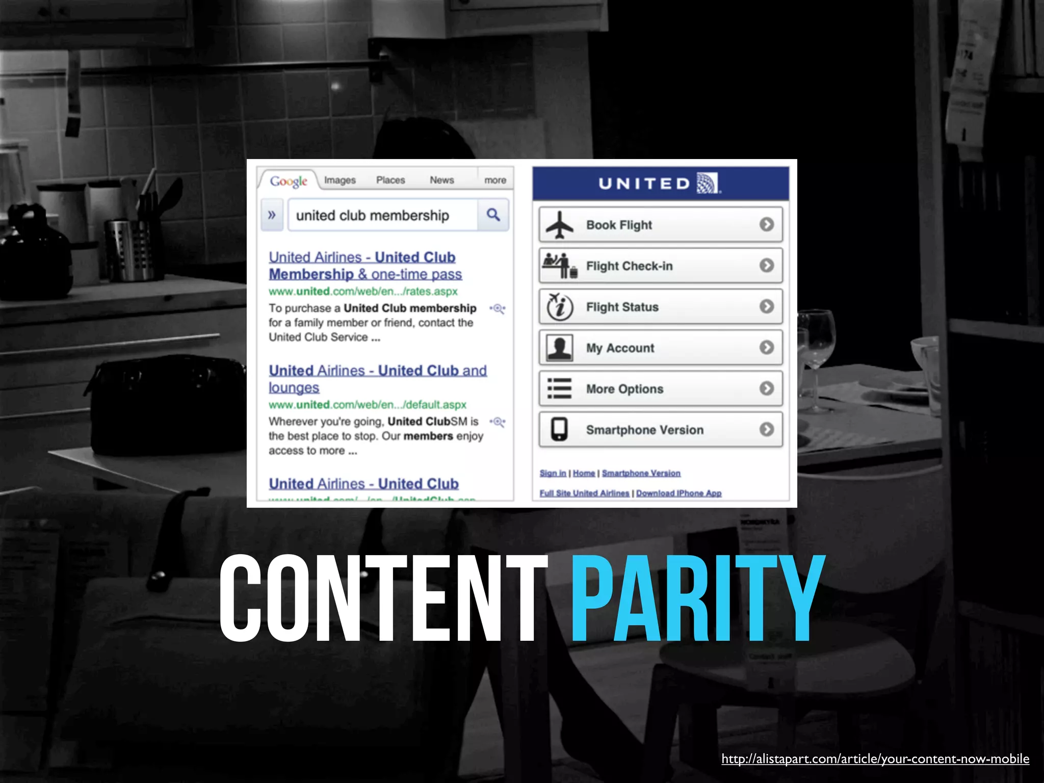


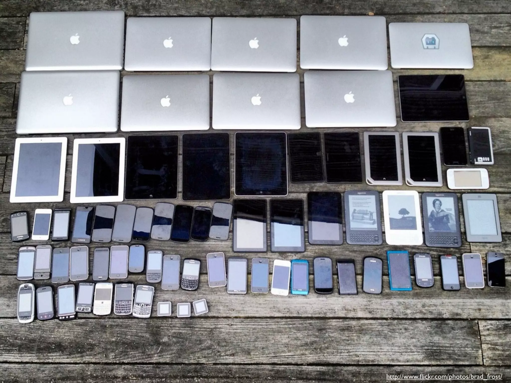


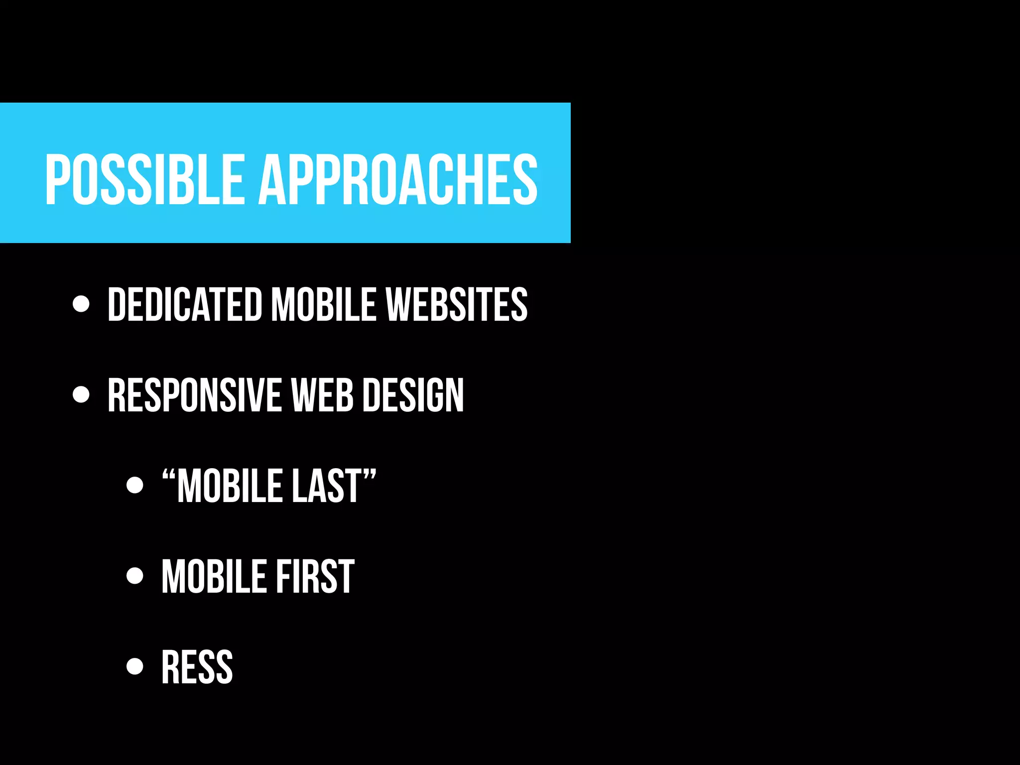
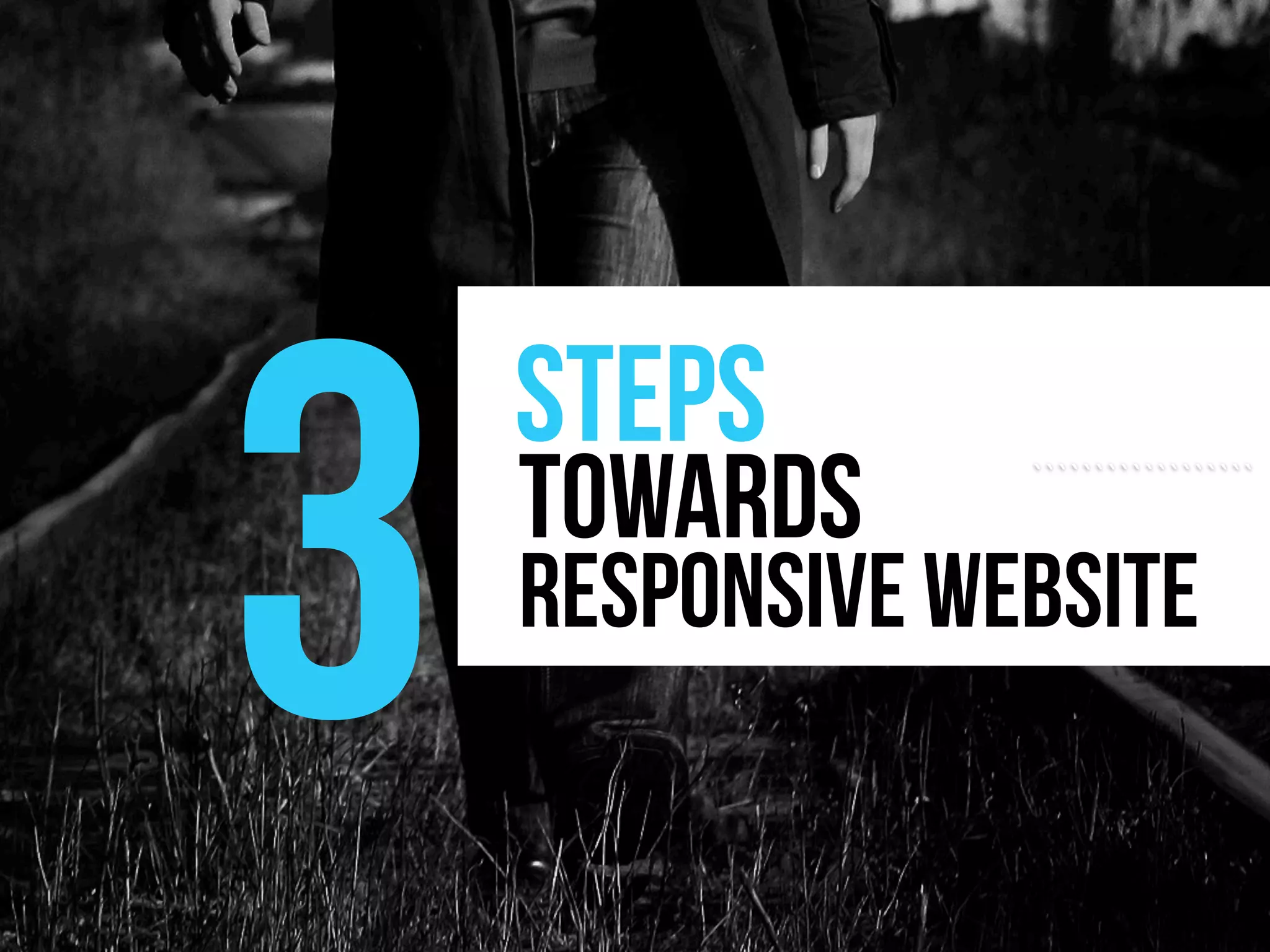


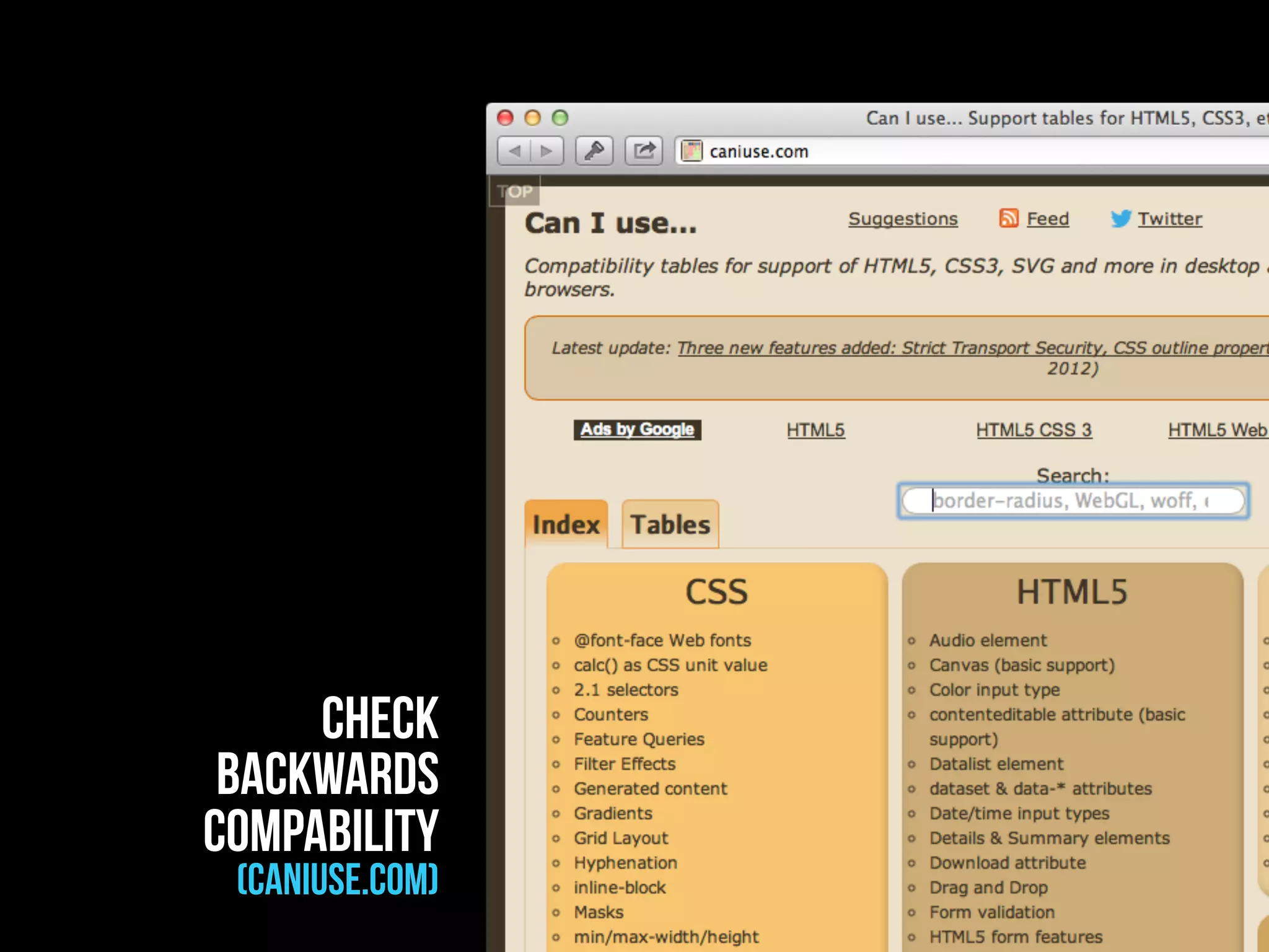


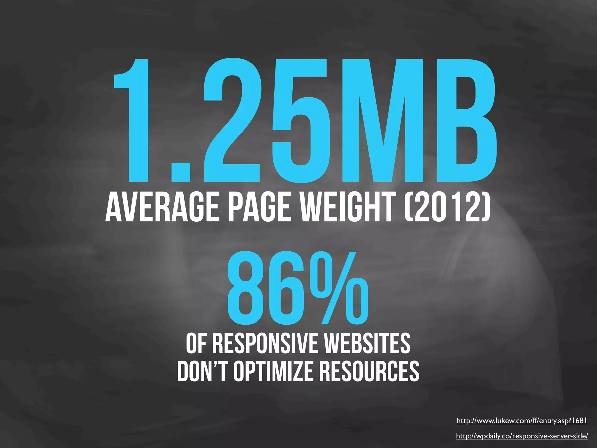
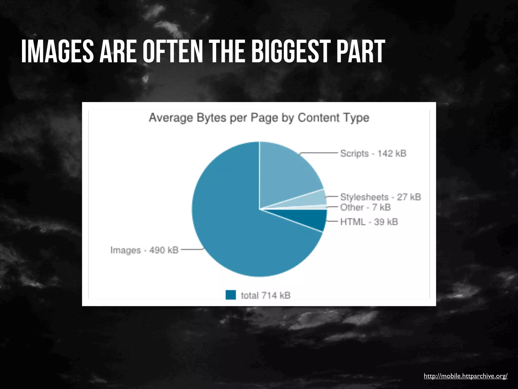
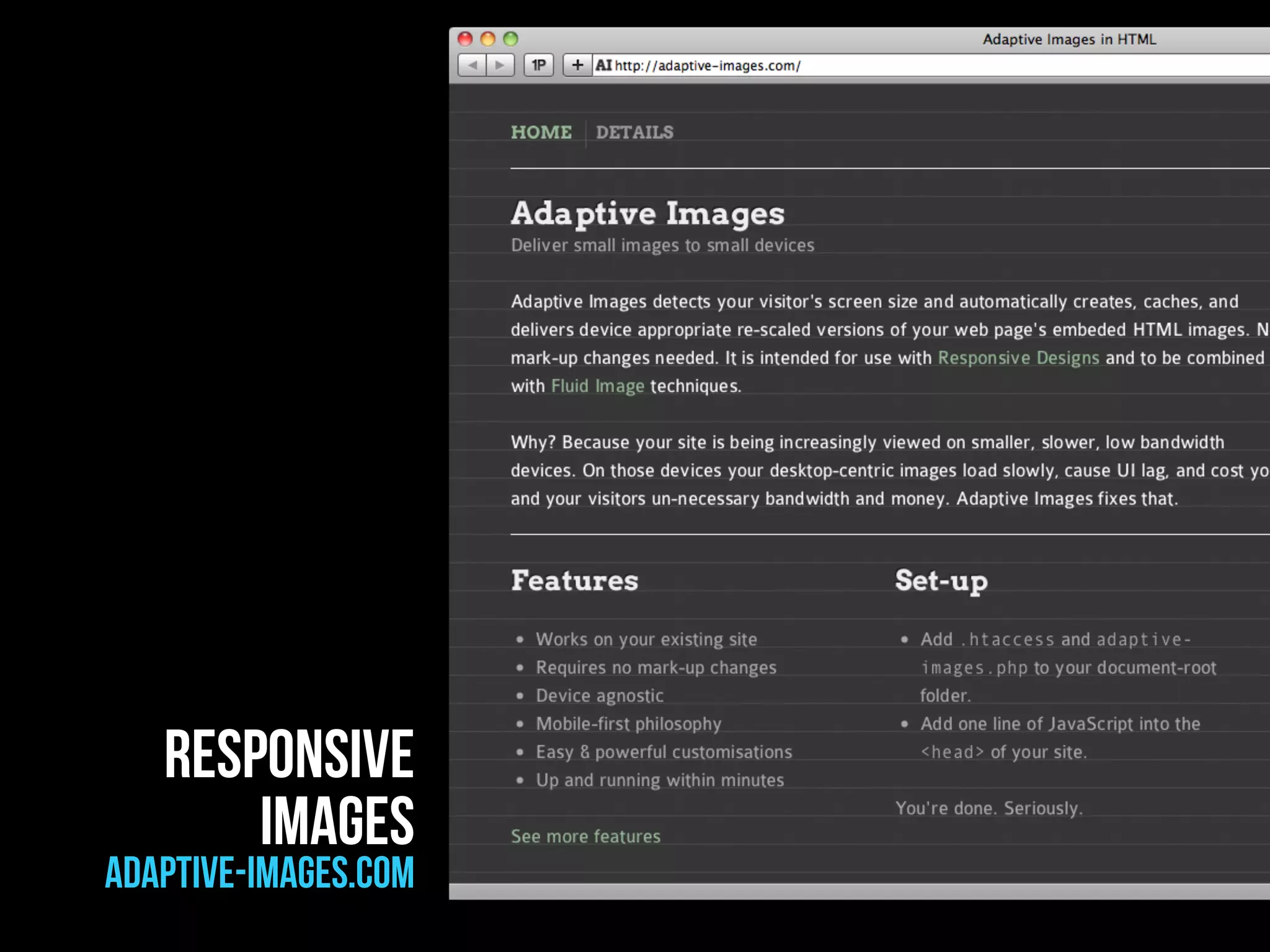


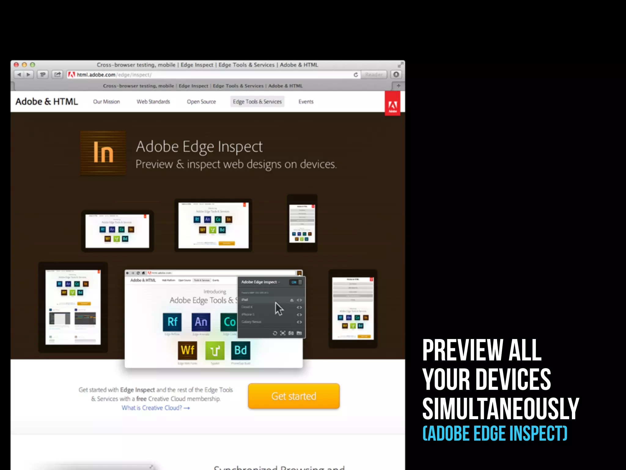


- Responsive web design (RWD) is the latest buzzword and may be the new revolution in web design as the mobile phone population grows significantly - 46% of the world's population has a mobile phone and over 1 billion smartphones are used worldwide, with 59% of owners using their smartphone daily - Websites need to be designed for all devices through responsive design which adapts the interface for different screen sizes rather than having a separate mobile site - The three main steps for responsive design are using media queries, adapting the interface, and optimizing responsive images and media for performance


![[PL] Rozpocznij karierę... Dzisiaj!](https://cdn.slidesharecdn.com/ss_thumbnails/export-120816152008-phpapp02-thumbnail.jpg?width=640&height=640&fit=bounds)


![Responsive Design & Beyond [Code & Creativity Workshop]](https://cdn.slidesharecdn.com/ss_thumbnails/codecreativityworkshop1-140506164731-phpapp01-thumbnail.jpg?width=640&height=640&fit=bounds)


![Chapt_4[1].ppt very interseting and important](https://cdn.slidesharecdn.com/ss_thumbnails/chapt41-251208222956-7cf5e0fa-thumbnail.jpg?width=640&height=640&fit=bounds)


![Chapter4_Initiation_of_Sediment_Motion_v2[1].pptx](https://cdn.slidesharecdn.com/ss_thumbnails/chapter4initiationofsedimentmotionv21-251208223747-f94ef163-thumbnail.jpg?width=640&height=640&fit=bounds)


