Download as PDF, PPTX


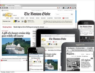


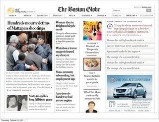

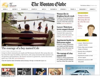

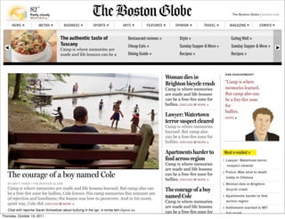


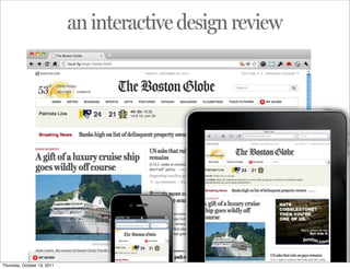


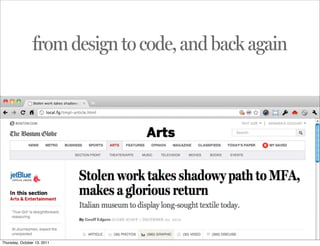


The document discusses responsive web design for BostonGlobe.com. It describes taking a user-centered approach to understand different types of readers and their needs. This involved usability testing and prototyping different designs. The key aspects of responsive design are outlined as having a flexible grid layout, flexible images and media that resize appropriately, and using media queries to design for different breakpoint widths. The process of designing and refining the layout is discussed, moving from prototypes to coding and testing in the browser.