Downloaded 711 times


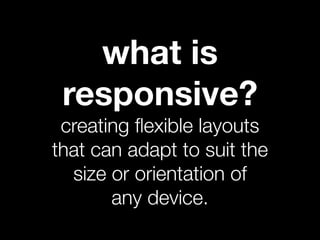


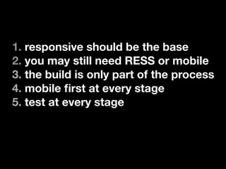

Responsive web design involves creating layouts that adapt to different screen sizes using flexible grids and media queries. It allows for a device-agnostic approach and is easier to build than separate mobile sites. Key aspects of responsive design include planning with a mobile-first approach, prototyping, using consistent breakpoints based on content, usability testing, writing for different screens, designing visually hierarchical layouts, and addressing images and media. Testing is important throughout the process. While responsive design is a good base, other solutions like responsive or native apps may still be needed, and the job requires ongoing review.


![Getting Started with Apache Spark: Big Data Made Simple [Free Meetup]](https://cdn.slidesharecdn.com/ss_thumbnails/apachesparkgettingstarted-260203175547-8361bcc3-thumbnail.jpg?width=640&height=640&fit=bounds)


