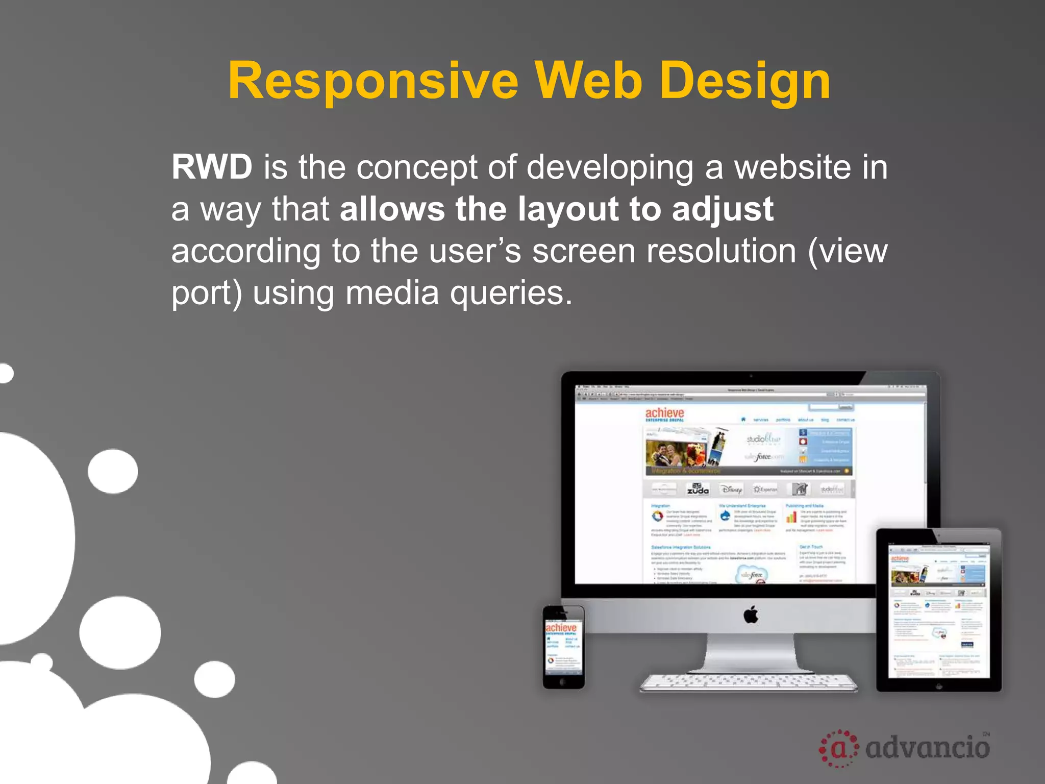
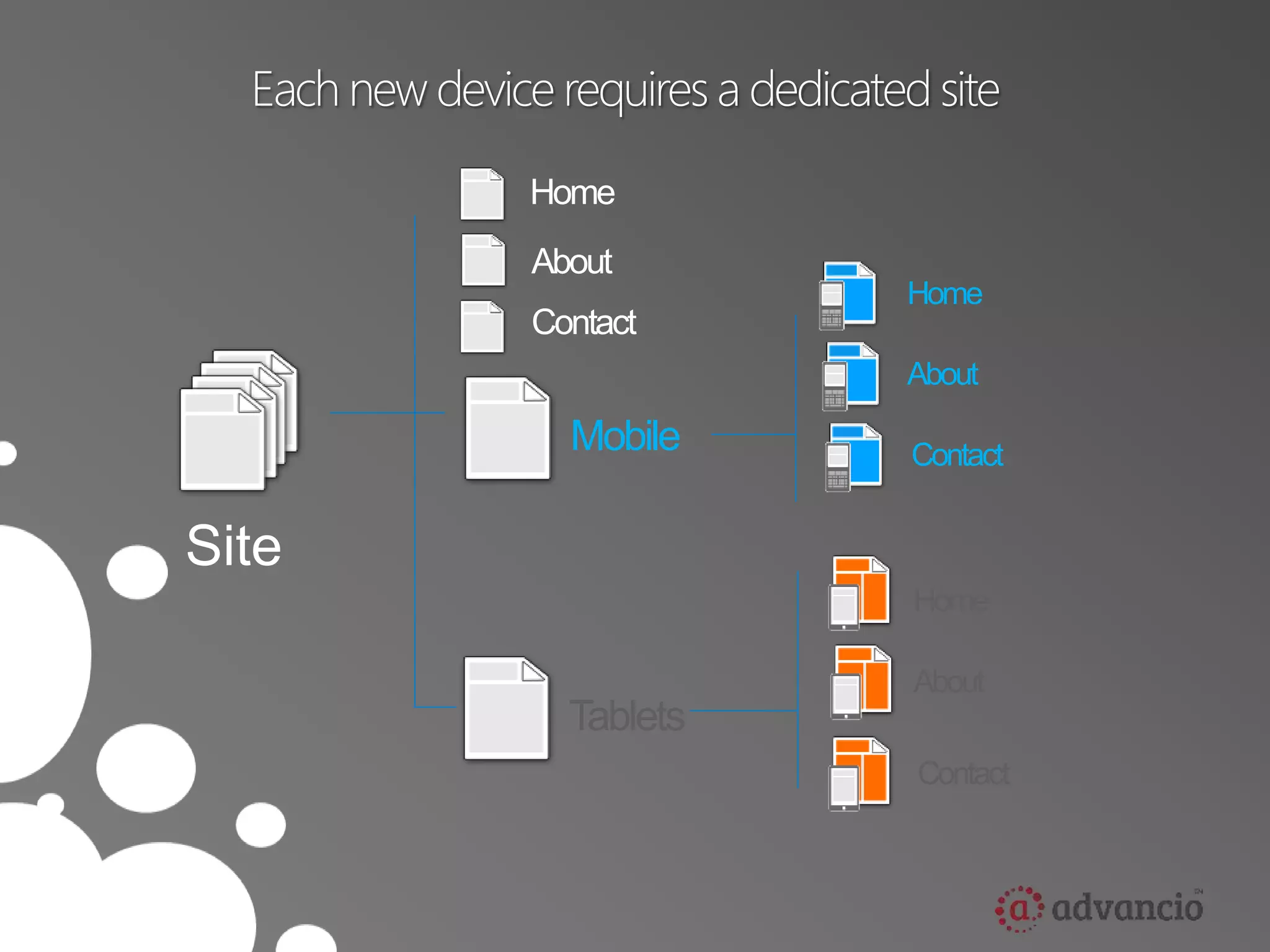
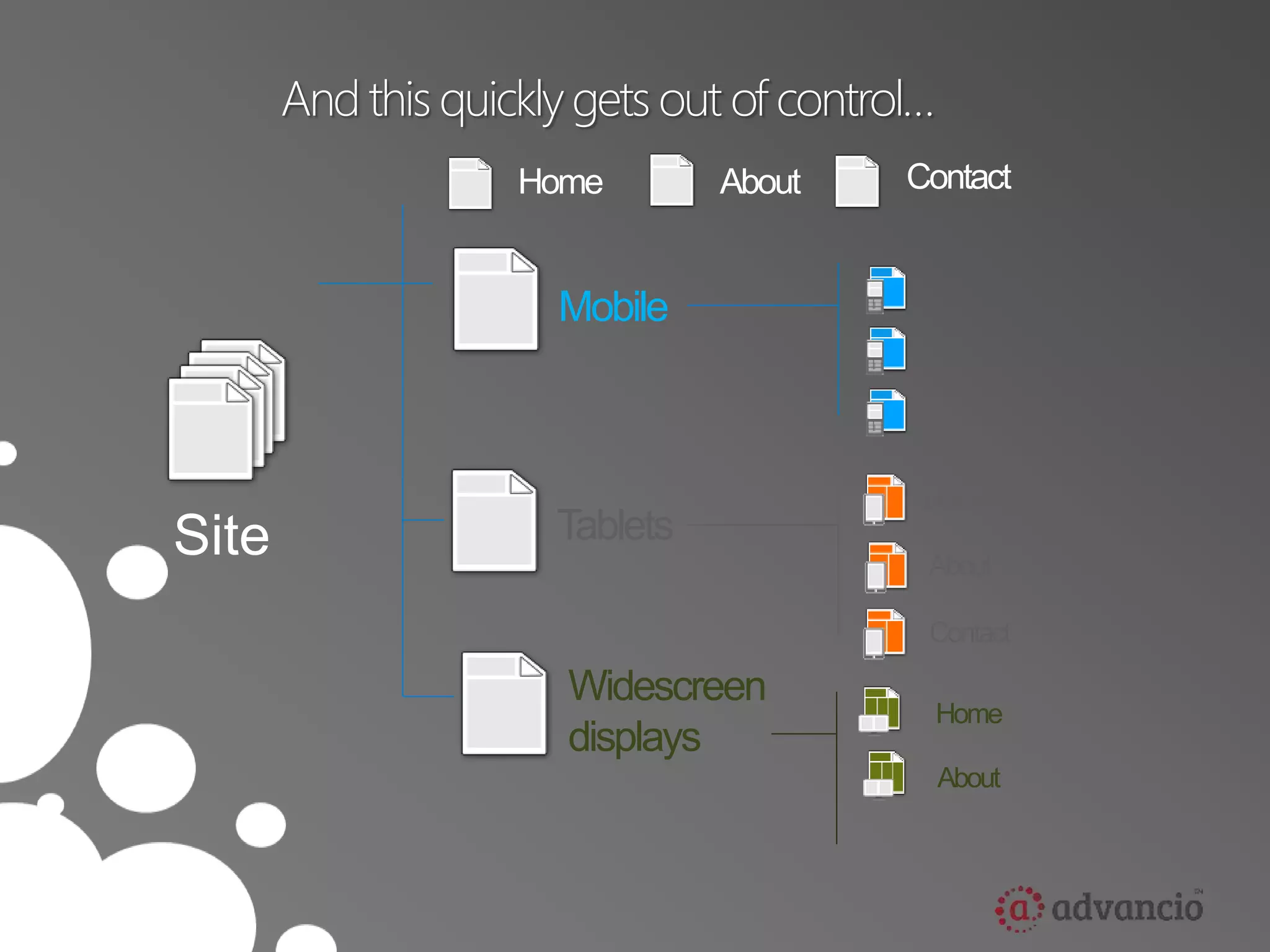
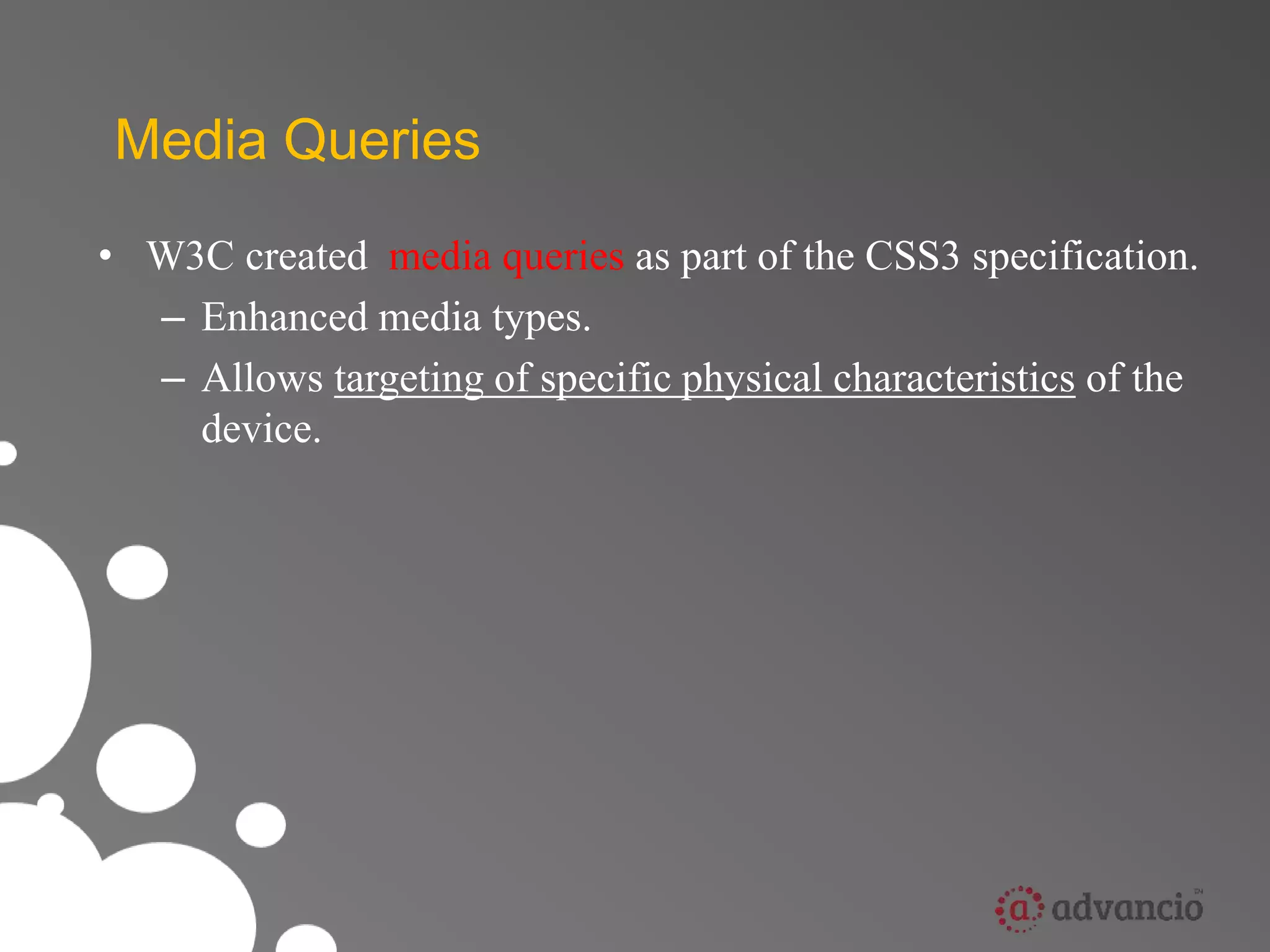
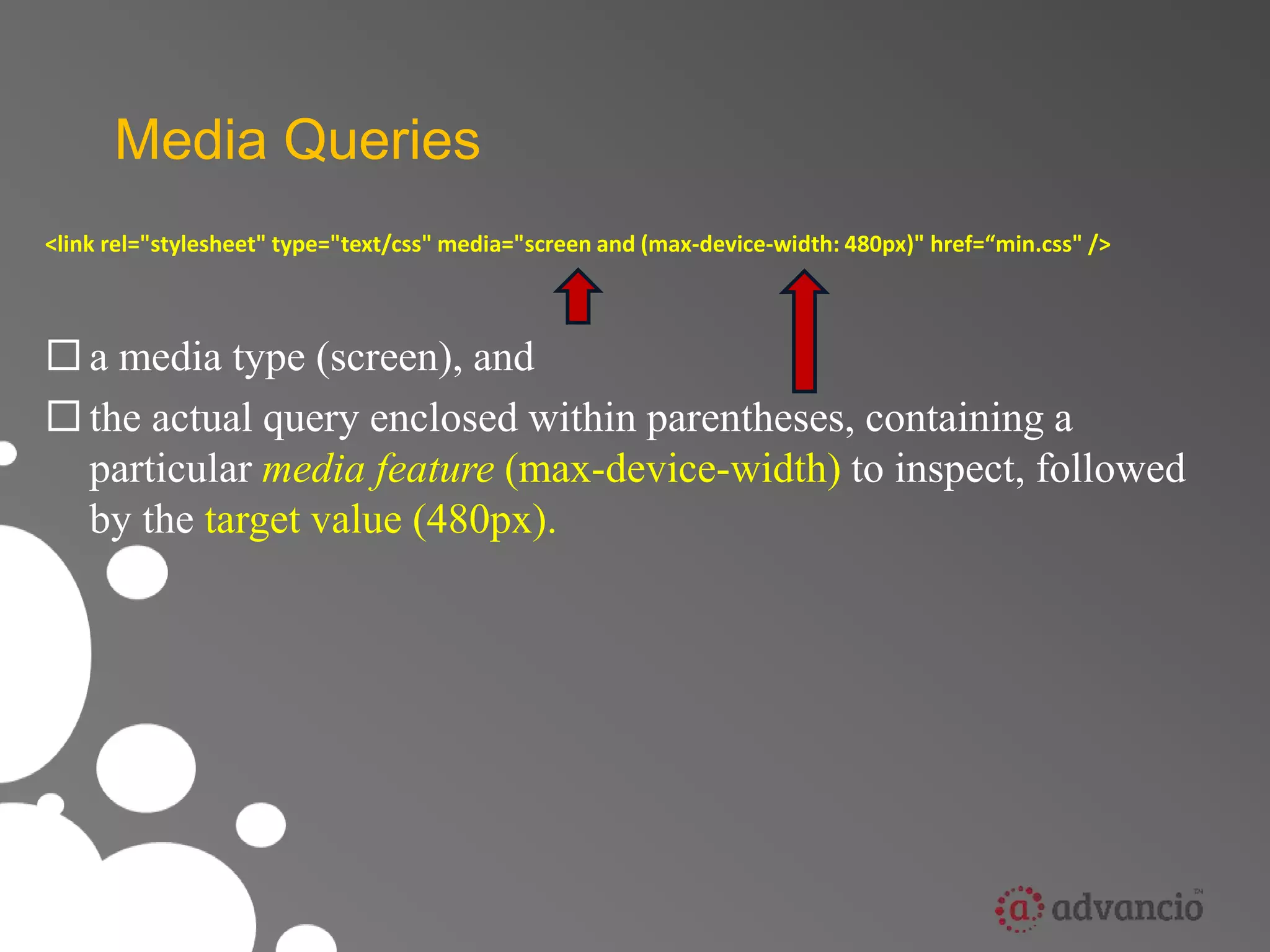
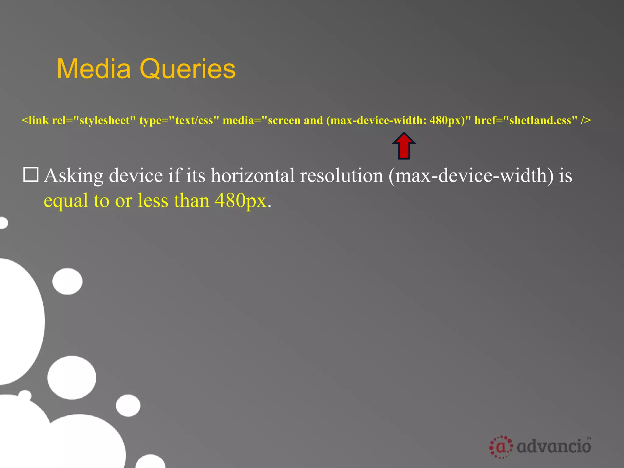
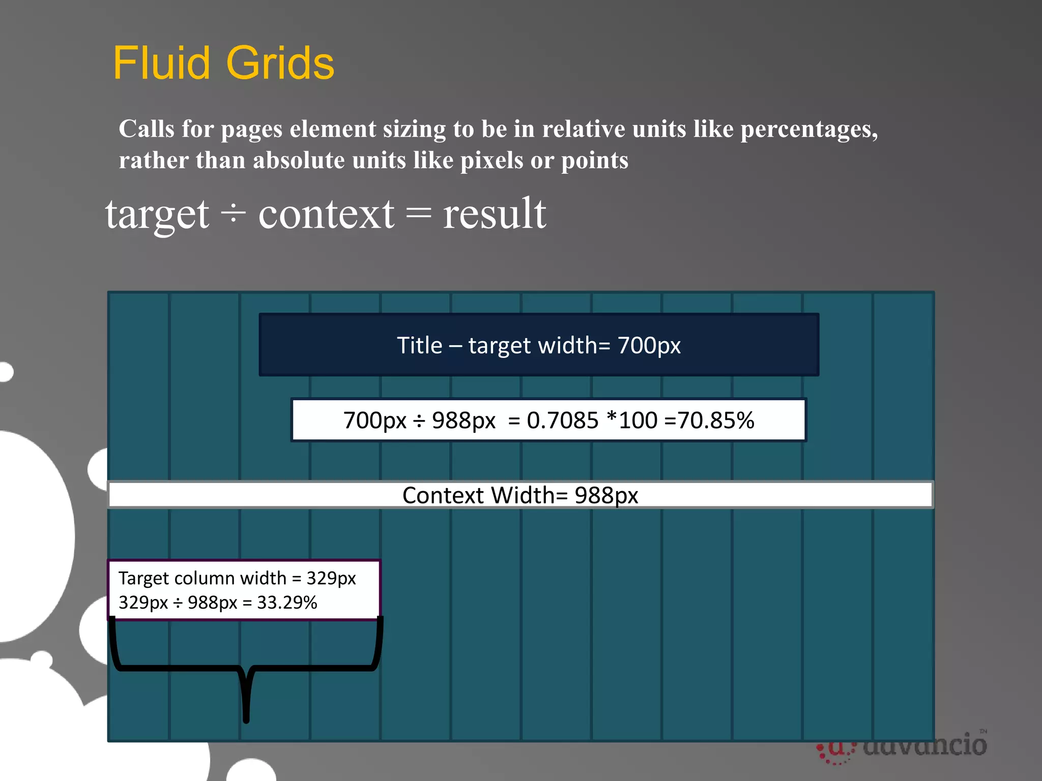
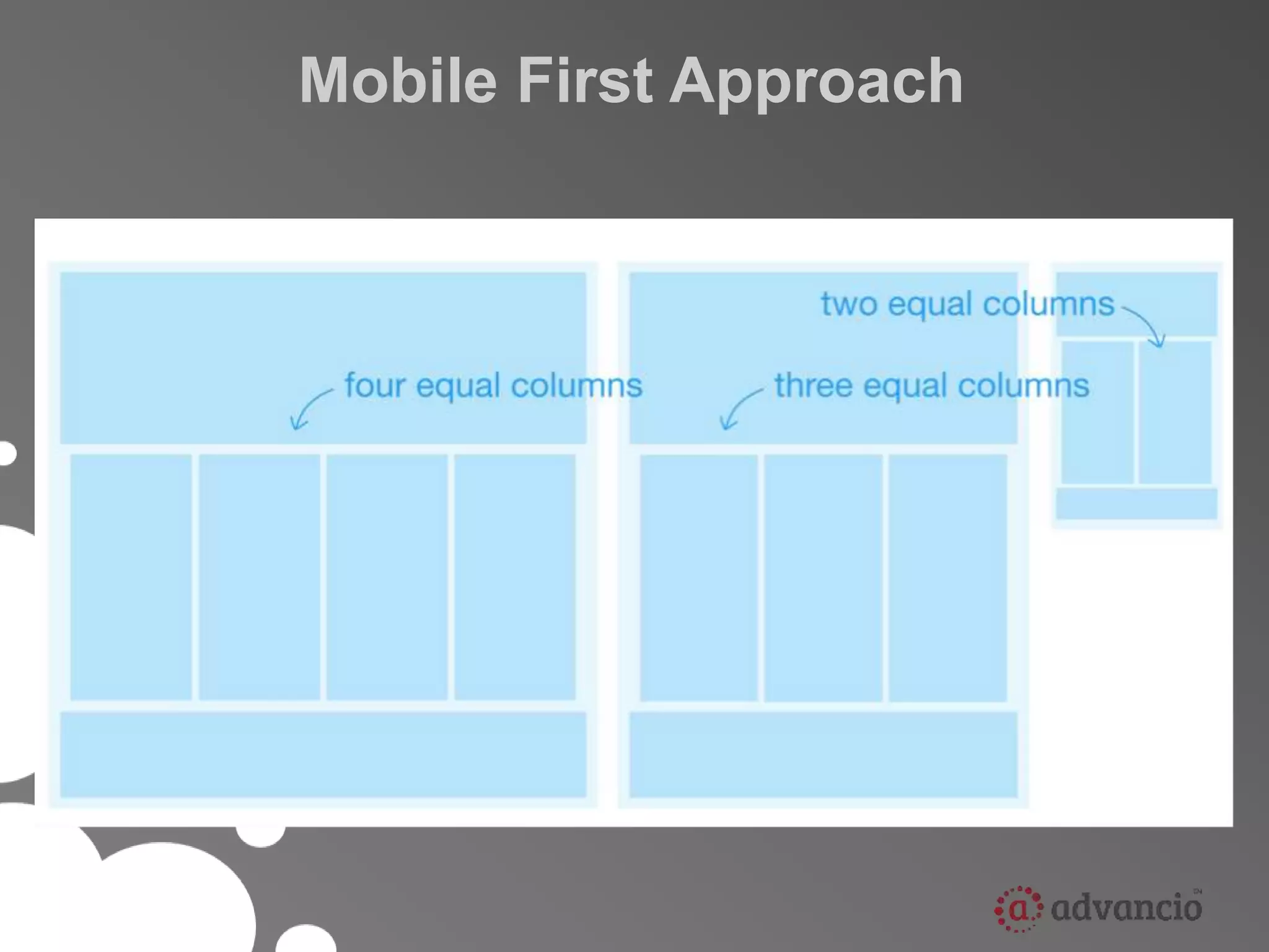
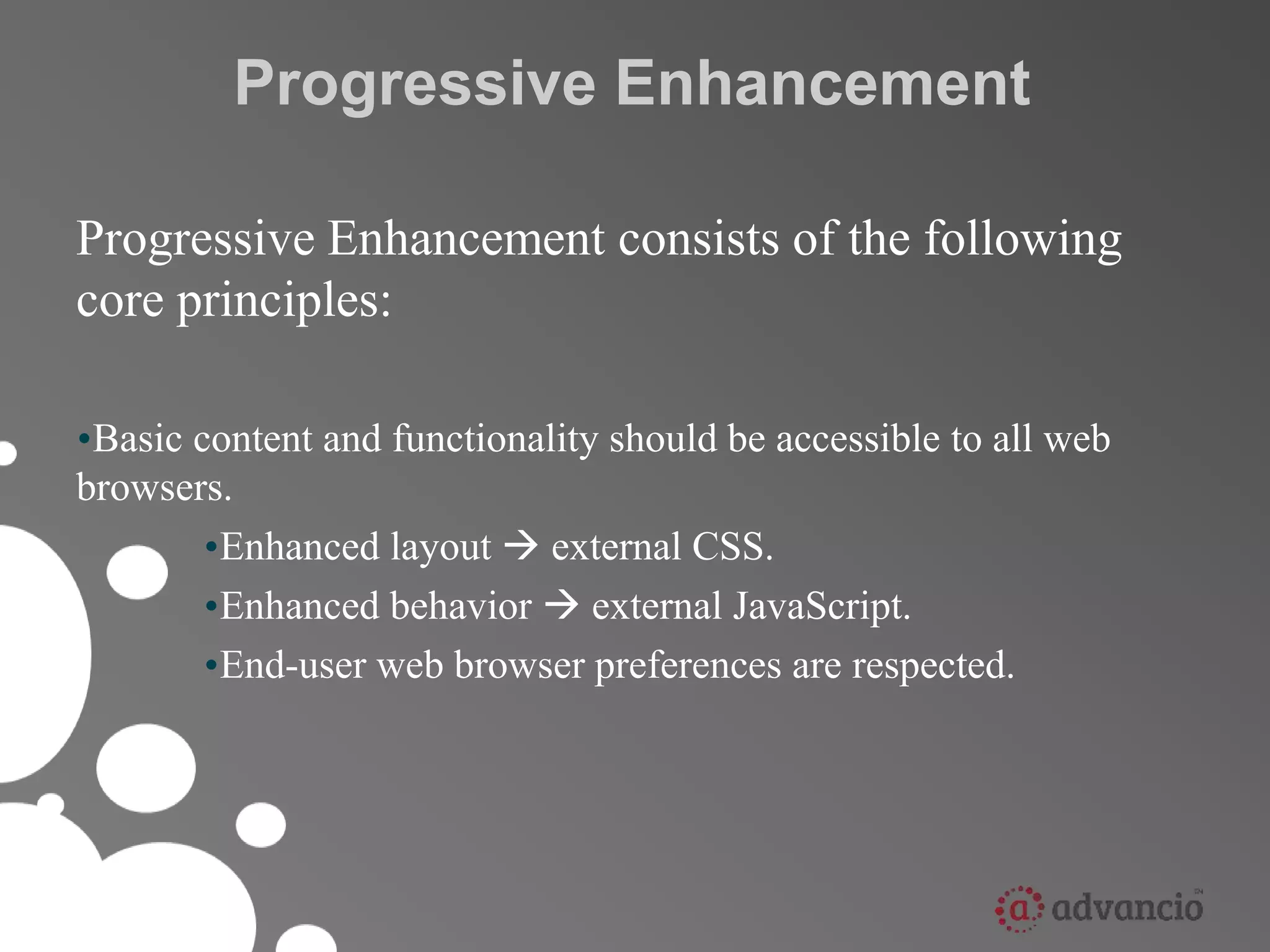
Responsive Web Design
Agenda 
• What is RWD ? 
• Main Components (How it does work ?) 
• Related Concepts
Responsive Web Design 
RWD is the concept of developing a website in 
a way that allows the layout to adjust 
according to the user’s screen resolution (view 
port) using media queries.
Our picture of a “web visitor” is rapidly evolving 
Increasingly web visitors aren’t using PC’s
Why it is relevant ? 
• 1.8 billion internet connections in the world today. 
• 6.8 billion people in the world today. 
• 3.4 billion people with mobile devices today. 
( roughly ½ the population of the planet)
So mobile is important 
(big surprise)
And today’s web statistics show plenty of fragmentation 
49% 
29% 
14% 
8% 
Smaller displays 
Tablets and notebooks 
Monitors with larger displays 
Smartphones
Each new device requires a dedicated site 
Site 
Home 
About 
Contact 
Mobile 
Home 
About 
Contact 
Tablets 
Home 
About 
Contact
And this quickly gets out of control… 
Site 
Home About Contact 
Mobile 
Tablets 
Home 
About 
Contact 
Widescreen 
displays 
Home 
About
And new Internet Devices 
are on the way
Retina Display
Google Glass
Cars
We can’t create a new 
website for each new device
What is the ideal solution? 
Create once and adapt for everywhere
Main Components 
• Media Queries 
• Fluid Grids 
• Scalable images
Media Queries 
• W3C created media queries as part of the CSS3 specification. 
– Enhanced media types. 
– Allows targeting of specific physical characteristics of the 
device.
Media Queries 
<link rel="stylesheet" type="text/css" media="screen and (max-device-width: 480px)" href=“min.css" /> 
 a media type (screen), and 
 the actual query enclosed within parentheses, containing a 
particular media feature (max-device-width) to inspect, followed 
by the target value (480px).
Media Queries 
<link rel="stylesheet" type="text/css" media="screen and (max-device-width: 480px)" href="shetland.css" /> 
 Asking device if its horizontal resolution (max-device-width) is 
equal to or less than 480px.
Media Queries 
 Can include MQ in CSS as part of a @media rule: 
@media screen and (max-device-width: 480px) { .column { 
float: none; } 
}
Fluid Grids 
Calls for pages element sizing to be in relative units like percentages, 
rather than absolute units like pixels or points 
target ÷ context = result 
Title – target width= 700px 
700px ÷ 988px = 0.7085 *100 =70.85% 
Target column width = 329px 
329px ÷ 988px = 33.29% 
Context Width= 988px
Scalable images 
Scale to size of containing element 
ul#image-icons li img { 
max-width:100%}
Scalable images 
Scale to size of containing element 
ul#image-icons li img {max-width:100%} 
ul#image-icons li img { 
max-width:50%}
Related Concepts 
• Mobile First Approach 
• Progressive Enhancement 
• Graceful Degradation
Mobile First Approach
• Mobile experience should be the first one created. 
• Three reasons why: 
– Mobile is exploding 
– Mobile forces you to focus 
– Mobile can extend your capabilities
Graceful Degradation 
• Focuses on building the website for the most 
advanced/capable browsers. 
• Older browsers are expected to have a poor, but 
passable experience. 
• Small fixes may be made to accommodate a 
particular browser ( they are not the focus )
Progressive Enhancement 
Progressive Enhancement consists of the following 
core principles: 
•Basic content and functionality should be accessible to all web 
browsers. 
•Enhanced layout  external CSS. 
•Enhanced behavior  external JavaScript. 
•End-user web browser preferences are respected.
Presented by:

Advancio, Inc. Academy: Responsive Web Design

  • 1.
  • 2.
    Agenda • Whatis RWD ? • Main Components (How it does work ?) • Related Concepts
  • 3.
    Responsive Web Design RWD is the concept of developing a website in a way that allows the layout to adjust according to the user’s screen resolution (view port) using media queries.
  • 4.
    Our picture ofa “web visitor” is rapidly evolving Increasingly web visitors aren’t using PC’s
  • 5.
    Why it isrelevant ? • 1.8 billion internet connections in the world today. • 6.8 billion people in the world today. • 3.4 billion people with mobile devices today. ( roughly ½ the population of the planet)
  • 6.
    So mobile isimportant (big surprise)
  • 7.
    And today’s webstatistics show plenty of fragmentation 49% 29% 14% 8% Smaller displays Tablets and notebooks Monitors with larger displays Smartphones
  • 8.
    Each new devicerequires a dedicated site Site Home About Contact Mobile Home About Contact Tablets Home About Contact
  • 9.
    And this quicklygets out of control… Site Home About Contact Mobile Tablets Home About Contact Widescreen displays Home About
  • 10.
    And new InternetDevices are on the way
  • 11.
  • 12.
  • 13.
  • 14.
    We can’t createa new website for each new device
  • 15.
    What is theideal solution? Create once and adapt for everywhere
  • 16.
    Main Components •Media Queries • Fluid Grids • Scalable images
  • 17.
    Media Queries •W3C created media queries as part of the CSS3 specification. – Enhanced media types. – Allows targeting of specific physical characteristics of the device.
  • 18.
    Media Queries <linkrel="stylesheet" type="text/css" media="screen and (max-device-width: 480px)" href=“min.css" />  a media type (screen), and  the actual query enclosed within parentheses, containing a particular media feature (max-device-width) to inspect, followed by the target value (480px).
  • 19.
    Media Queries <linkrel="stylesheet" type="text/css" media="screen and (max-device-width: 480px)" href="shetland.css" />  Asking device if its horizontal resolution (max-device-width) is equal to or less than 480px.
  • 20.
    Media Queries Can include MQ in CSS as part of a @media rule: @media screen and (max-device-width: 480px) { .column { float: none; } }
  • 21.
    Fluid Grids Callsfor pages element sizing to be in relative units like percentages, rather than absolute units like pixels or points target ÷ context = result Title – target width= 700px Title – target width= 700px 700px ÷ 988px = 0.7085 *100 =70.85% Target column width = 329px 329px ÷ 988px = 33.29% Context Width= 988px
  • 22.
    Scalable images Scaleto size of containing element ul#image-icons li img { max-width:100%}
  • 23.
    Scalable images Scaleto size of containing element ul#image-icons li img {max-width:100%} ul#image-icons li img { max-width:50%}
  • 24.
    Related Concepts •Mobile First Approach • Progressive Enhancement • Graceful Degradation
  • 25.
  • 26.
    • Mobile experienceshould be the first one created. • Three reasons why: – Mobile is exploding – Mobile forces you to focus – Mobile can extend your capabilities
  • 27.
    Graceful Degradation •Focuses on building the website for the most advanced/capable browsers. • Older browsers are expected to have a poor, but passable experience. • Small fixes may be made to accommodate a particular browser ( they are not the focus )
  • 28.
    Progressive Enhancement ProgressiveEnhancement consists of the following core principles: •Basic content and functionality should be accessible to all web browsers. •Enhanced layout  external CSS. •Enhanced behavior  external JavaScript. •End-user web browser preferences are respected.
  • 29.