
Recommended
More Related Content
What's hot
What's hot (20)
Similar to Creation Process of Potential New Cover.
Similar to Creation Process of Potential New Cover. (20)
More from viva_hasan
Recently uploaded
Recently uploaded (20)
Creation Process of Potential New Cover.
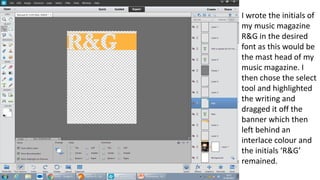
- 1. I wrote the initials of my music magazine R&G in the desired font as this would be the mast head of my music magazine. I then chose the select tool and highlighted the writing and dragged it off the banner which then left behind an interlace colour and the initials ‘R&G’ remained.
- 2. I imported my main image and my logo which I wanted to use and then tilted the top banner so it was positioned diagonally to give off an urban effect to relate to my chosen target audience. I also created another banner and again tilted it diagonally in the bottom right of the magazine to create consistency in the magazine. I then went on to import my synergy links and placed them one by one in the bottom left on top of the banner.
- 3. The first social media link I imported was Facebook. Additionally, I also placed the date and issue number of the magazine in the top left of the magazine where space had been created due to me tilting the banner. This displays my effective use of space.
- 4. I then imported my twitter logo.
- 5. I wasn’t sure whether to have a retro Facebook link or to use the conventional Facebook logo. So I imported both and then decided that I was going to keep the retro logo as this would relate more to my target audience.
- 6. Finally, in the bottom left of my magazine I added a barcode as this would add to the realism of my magazine. I also imported a Spotify link as this is well known and the users would be able to recognise this logo.