
Recommended
More Related Content
What's hot
What's hot (20)
Viewers also liked
Similar to Swifty Stands: Inside Taylor Swift's Life
Similar to Swifty Stands: Inside Taylor Swift's Life (20)
Recently uploaded
Recently uploaded (20)
Swifty Stands: Inside Taylor Swift's Life
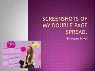
- 2. On this first screenshot I have created my two pages together to build the structure of my double page spread layout then I have added a background colour in of light purple which follows the conventions of a pop magazine as most pop magazine have light girly colours which I followed to relate more with my target audience and attract more readers. I then added in my main image of who my article is going to be able I took a picture of Kirby sitting down so that you could see her whole body also I cut around her so that she fitted into my background of purple on the page, also the image of Kirby I placed her on my page so that she was bleeding over the page towards the left hand size so that she was not just focused on the right hand side. Then I added in different coloured and sized circles around the page which where empty to create more colour and brighten up my page making it look more appealing, the colours so these circles are all colours that relate with my target audience of teen girls all bright happy colours. Lastly I added in a quote in one of the circles that Kirby had said during her interview, this quote was one of the interesting things that Kirby had said to try and pressure people into reading this article as they would want to know why she said that like what was going on at that time forcing them to read it. I made the font of that quote girly by putting it in curly italic front to be more attractive to my target group.
- 3. On this screenshot I have added in my main text which is the interview I done with Kirby, I followed the conventions from researching into pop music magazine and followed how they used there layout out for interview which was putting them into three columns as I want my pop music magazine to be a similar as proper pop music magazines. I done the question which I asked in a purple colour and made them bigger than the answers so that is would stand out and you can easily tell which was the question and which was the answer, then I put answers into a white colour and made the front smaller so that it is easier to read and follow while reading the interview. I also added credits under the last column where the interview finished giving credits to the person who took the images and who wrote the text, I done this because this what all magazine do so I was following the conventions of the pop music magazines. Lastly I added in the website of my magazine so that people can go visit my magazine online if they want to.
- 4. On this screenshot I have added in my main title of this double page spread which links in with my article, I created my title using Photoshop firstly I created a purple circle then painted the other half in pink following the colour conventions of a pop music magazine which is related to teen girls, then a created my title making the front curly so that it is more appealing towards teen girls who are my target audience I used white as with my first two words as the colour white links nicely with the purple breaking the colour also standing out against the purple, then I title the word ‘Swifty’ in a yellow colour also making that bigger than the rest of the text so that it stands out and highlights to the readers that that is the importance of title and the whole article. Then in the other half of the circle which is pink I added in the stands first which is a short piece of information which will tell the reader a short bit of information about what the article is about without giving too more detail away, I put the majority of text in black as black and pink link nicely together and then the word ‘Taylor Swift’ I made bigger than the rest of the text then changed the colour of it to yellow so that it stands out above the rest of the text and links into the yellow colour with the title. As well as I added in a arrow at the bottom right hand side of the page giving a direction on where the reader can find more information about Kirby who the article is about, I created that arrow on Photoshop making it purple so that it links in with my colour scheme then putting the text in white so it stands out against the arrow. Lastly I created a small tag on the top left hand side of the page saying ‘celeb secrets’ which highlights that it is information which cant be missed and persuades the reader to want to read on and see what this celeb secrets are I also created this tag on Photoshop making it white so that it stands out and is not missed.