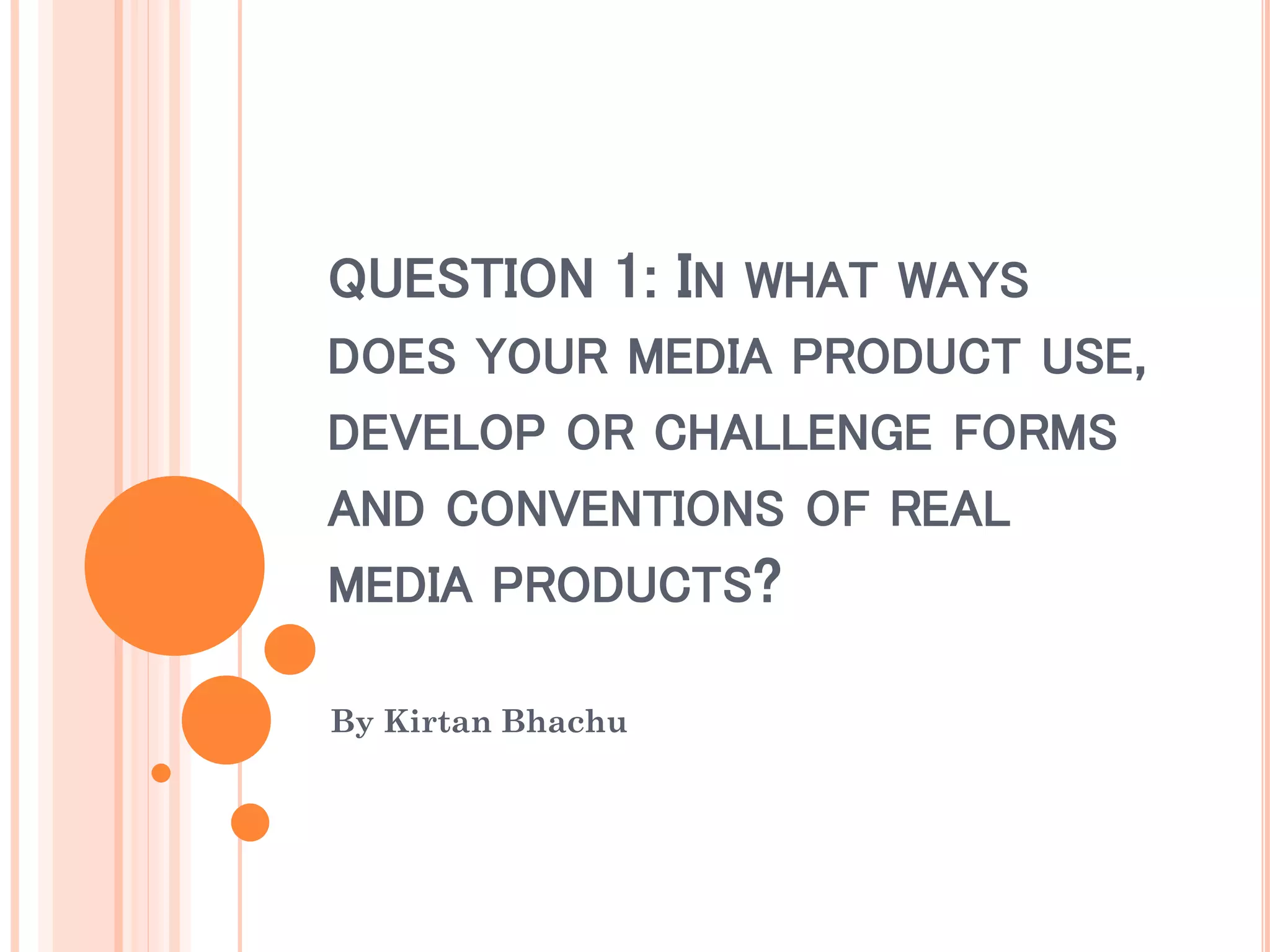
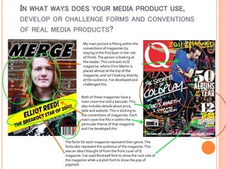
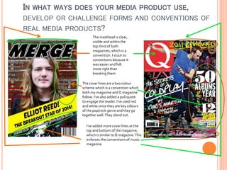
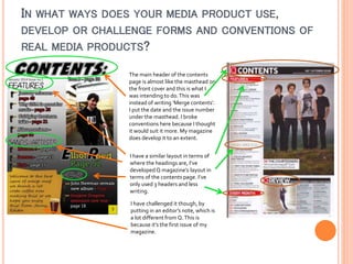
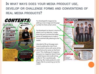
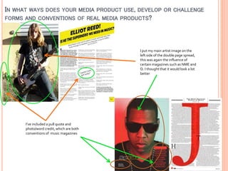
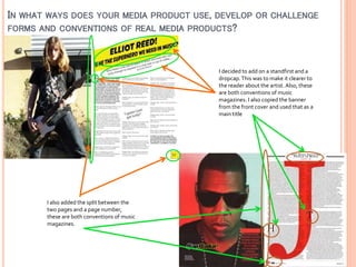
QUESTION 1: IN WHAT WAYS
DOES YOUR MEDIA PRODUCT USE,
DEVELOP OR CHALLENGE FORMS
AND CONVENTIONS OF REAL
MEDIA PRODUCTS?
By Kirtan Bhachu
IN WHAT WAYS DOES YOUR MEDIA PRODUCT USE,
DEVELOP OR CHALLENGE FORMS AND CONVENTIONS
OF REAL MEDIA PRODUCTS?
My main picture is fitting within the
conventions of magazines by
staying in the first layer in the rule
of thirds. The person is looking at
the reader. This contrasts to Q
magazine, where Chris Martin is
placed almost at the top of the
magazine, and isn’t looking directly
at the audience. I’ve developed and
challenged this
Both of these magazines have a
main cover line and a barcode. This
also includes details about price,
date and website. This is sticking to
the conventions of magazines. Each
main cover line fits in within the
particular theme of that magazine
and I’ve developed this

The fonts for each magazine represent their genre. The
fonts also represent the audience of the magazine. This
was an idea I thought of from the front cover of Q
magazine. I’ve used Rockwell font to show the rock side of
the magazine while a stylish font to show the pop of
pop/rock
IN WHAT WAYS DOES YOUR MEDIA PRODUCT USE,
DEVELOP OR CHALLENGE FORMS AND CONVENTIONS OF
REAL MEDIA PRODUCTS?
The masthead is clear,
visible and within the
top third of both
magazines, which is a
convention. I stuck to
conventions because it
was easier and felt
more right than
breaking them
The cover lines are a two colour
scheme which is a convention which
both my magazine and Q magazine
follow. I’ve also added a pull quote
to engage the reader. I’ve used red
and white since they are key colours
of the pop/rock genre and they go
together well. They stand out.
I’ve added more cover lines at the
top and bottom of the magazine,
which is similar to Q magazine. This
enforces the conventions of music
magazine
IN WHAT WAYS DOES YOUR MEDIA PRODUCT USE,
DEVELOP OR CHALLENGE FORMS AND CONVENTIONS OF
REAL MEDIA PRODUCTS?
The main header of the contents
page is almost like the masthead on
the front cover and this is what I
was intending to do. This was
instead of writing ‘Merge contents’.
I put the date and the issue number
under the masthead. I broke
conventions here because I thought
it would suit it more. My magazine
does develop it to an extent.
I have a similar layout in terms of
where the headings are, I’ve
developed Q magazine’s layout in
terms of the contents page. I’ve
only used 3 headers and less
writing.
I have challenged it though, by
putting in an editor’s note, which is
a lot different from Q. This is
because it’s the first issue of my
magazine.
IN WHAT WAYS DOES YOUR MEDIA PRODUCT USE,
DEVELOP OR CHALLENGE FORMS AND CONVENTIONS OF
REAL MEDIA PRODUCTS?
I’ve developed Q magazine by
adding a main image and the page
number for that certain artist.
I’ve developed my layout in terms of
where I put my features. I made
them big and I’ve done the bullet
points as headphones to make it
more aesthetically pleasing to the
reader.
I decided to fill up the page even
more by adding the main front
cover artist’s name with some of the
same font as his name on the front
cover. This challenges Q magazine
because my magazine doesn’t have
a stylish layout and small writing
unlike Q. This is aesthetically
pleasing. My media product is a lot
bigger, like its screaming out at the
reader
IN WHAT WAYS DOES YOUR MEDIA PRODUCT USE, DEVELOP OR CHALLENGE
FORMS AND CONVENTIONS OF REAL MEDIA PRODUCTS?

I put my main artist image on the
left side of the double page spread,
this was again the influence of
certain magazines such as NME and
Q. I thought that it would look a lot
better

I’ve included a pull quote and
photo/word credit, which are both
conventions of music magazines
IN WHAT WAYS DOES YOUR MEDIA PRODUCT USE, DEVELOP OR CHALLENGE
FORMS AND CONVENTIONS OF REAL MEDIA PRODUCTS?

I decided to add on a standfirst and a
dropcap. This was to make it clearer to
the reader about the artist. Also, these
are both conventions of music
magazines. I also copied the banner
from the front cover and used that as a
main title

I also added the split between the
two pages and a page number,
these are both conventions of music
magazines.

Question 1

  • 1.
    QUESTION 1: INWHAT WAYS DOES YOUR MEDIA PRODUCT USE, DEVELOP OR CHALLENGE FORMS AND CONVENTIONS OF REAL MEDIA PRODUCTS? By Kirtan Bhachu
  • 2.
    IN WHAT WAYSDOES YOUR MEDIA PRODUCT USE, DEVELOP OR CHALLENGE FORMS AND CONVENTIONS OF REAL MEDIA PRODUCTS? My main picture is fitting within the conventions of magazines by staying in the first layer in the rule of thirds. The person is looking at the reader. This contrasts to Q magazine, where Chris Martin is placed almost at the top of the magazine, and isn’t looking directly at the audience. I’ve developed and challenged this Both of these magazines have a main cover line and a barcode. This also includes details about price, date and website. This is sticking to the conventions of magazines. Each main cover line fits in within the particular theme of that magazine and I’ve developed this The fonts for each magazine represent their genre. The fonts also represent the audience of the magazine. This was an idea I thought of from the front cover of Q magazine. I’ve used Rockwell font to show the rock side of the magazine while a stylish font to show the pop of pop/rock
  • 3.
    IN WHAT WAYSDOES YOUR MEDIA PRODUCT USE, DEVELOP OR CHALLENGE FORMS AND CONVENTIONS OF REAL MEDIA PRODUCTS? The masthead is clear, visible and within the top third of both magazines, which is a convention. I stuck to conventions because it was easier and felt more right than breaking them The cover lines are a two colour scheme which is a convention which both my magazine and Q magazine follow. I’ve also added a pull quote to engage the reader. I’ve used red and white since they are key colours of the pop/rock genre and they go together well. They stand out. I’ve added more cover lines at the top and bottom of the magazine, which is similar to Q magazine. This enforces the conventions of music magazine
  • 4.
    IN WHAT WAYSDOES YOUR MEDIA PRODUCT USE, DEVELOP OR CHALLENGE FORMS AND CONVENTIONS OF REAL MEDIA PRODUCTS? The main header of the contents page is almost like the masthead on the front cover and this is what I was intending to do. This was instead of writing ‘Merge contents’. I put the date and the issue number under the masthead. I broke conventions here because I thought it would suit it more. My magazine does develop it to an extent. I have a similar layout in terms of where the headings are, I’ve developed Q magazine’s layout in terms of the contents page. I’ve only used 3 headers and less writing. I have challenged it though, by putting in an editor’s note, which is a lot different from Q. This is because it’s the first issue of my magazine.
  • 5.
    IN WHAT WAYSDOES YOUR MEDIA PRODUCT USE, DEVELOP OR CHALLENGE FORMS AND CONVENTIONS OF REAL MEDIA PRODUCTS? I’ve developed Q magazine by adding a main image and the page number for that certain artist. I’ve developed my layout in terms of where I put my features. I made them big and I’ve done the bullet points as headphones to make it more aesthetically pleasing to the reader. I decided to fill up the page even more by adding the main front cover artist’s name with some of the same font as his name on the front cover. This challenges Q magazine because my magazine doesn’t have a stylish layout and small writing unlike Q. This is aesthetically pleasing. My media product is a lot bigger, like its screaming out at the reader
  • 6.
    IN WHAT WAYSDOES YOUR MEDIA PRODUCT USE, DEVELOP OR CHALLENGE FORMS AND CONVENTIONS OF REAL MEDIA PRODUCTS? I put my main artist image on the left side of the double page spread, this was again the influence of certain magazines such as NME and Q. I thought that it would look a lot better I’ve included a pull quote and photo/word credit, which are both conventions of music magazines
  • 7.
    IN WHAT WAYSDOES YOUR MEDIA PRODUCT USE, DEVELOP OR CHALLENGE FORMS AND CONVENTIONS OF REAL MEDIA PRODUCTS? I decided to add on a standfirst and a dropcap. This was to make it clearer to the reader about the artist. Also, these are both conventions of music magazines. I also copied the banner from the front cover and used that as a main title I also added the split between the two pages and a page number, these are both conventions of music magazines.