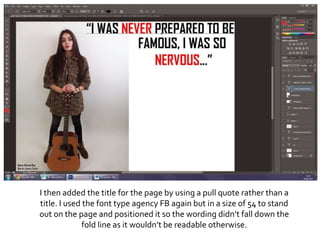
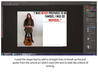
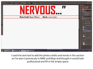
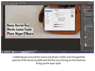
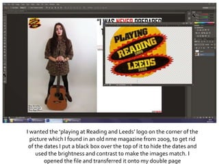
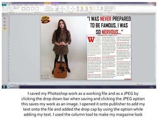
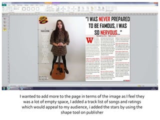
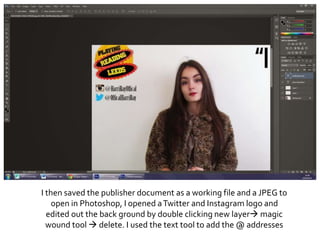
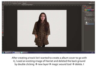
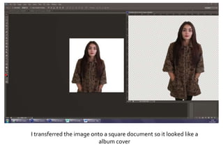
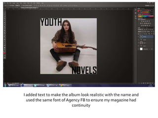
Making of my double
page spread
I had opened my image onto a Publisher a document and made my
image fit exactly half way and equal to ensure when producing my
double page it was not going to be odd and I can determine how to
put my text in terms of the fold line.
I then added my mast head logo into the bottom right hand corner
by opening it and dragging the fil across and making it small enough
to be read but not too small to not be hidden. I then use the text tool
to add the number of the page ‘13’ next to the mast head to make
sure my text fit with conventions
I used the text tool again to give credits on the name of the artist,
photographer and who wrote the article, I chose the fontAgency FB
in the size 11
I then added the title for the page by using a pull quote rather than a
title. I used the font type agency FB again but in a size of 54 to stand
out on the page and positioned it so the wording didn’t fall down the
fold line as it wouldn’t be readable otherwise.
I used the shape tool to add to straight lines to break up the pull
quote from the article as I didn’t want the text to look like a block of
writing.
I used the text tool to add the photo credits and words in this section
as I've seen it previously in NME and Mojo and thought it would look
professional and fill in the empty space
I added boxes around the name and photo credits and changed the
opacity of the boxes by 67% and did this my clicking on the boxes to
bring up the layer style.
I wanted the ‘playing at Reading and Leeds’ logo on the corner of the
picture which I found in an old nme magazine from 2009, to get rid
of the dates I put a black box over the top of it to hide the dates and
used the brightness and contrast to make the images match. I
opened the file and transferred it onto my double page
I saved my Photoshop work as a working file and as a JPEG by
clicking the drop down bar when saving and clicking the JPEG option
this saves my work as an image. I opened it onto publisher to add my
text onto the file and added the drop cap by using the option while
adding my text. I used the column tool to make my magazine look
I wanted to add more to the page in terms of the image as I feel they
was a lot of empty space, I added a track list of songs and ratings
which would appeal to my audience, i added the stars by using the
shape tool on publisher
I then saved the publisher document as a working file and a JPEG to
open in Photoshop, I opened aTwitter and Instagram logo and
edited out the back ground by double clicking new layer magic
wound tool  delete. I used the text tool to add the @ addresses
After creating a track list I wanted to create a album cover to go with
it, I used an existing image of Harriet and deleted the back ground
by double clicking  new layer magic wound tool  delete. I
I transferred the image onto a square document so it looked like a
album cover
I added text to make the album look realistic with the name and
used the same font of Agency FB to ensure my magazine had
continuity
OUTCOME

Photoshop process

  • 1.
    Making of mydouble page spread
  • 2.
    I had openedmy image onto a Publisher a document and made my image fit exactly half way and equal to ensure when producing my double page it was not going to be odd and I can determine how to put my text in terms of the fold line.
  • 3.
    I then addedmy mast head logo into the bottom right hand corner by opening it and dragging the fil across and making it small enough to be read but not too small to not be hidden. I then use the text tool to add the number of the page ‘13’ next to the mast head to make sure my text fit with conventions
  • 4.
    I used thetext tool again to give credits on the name of the artist, photographer and who wrote the article, I chose the fontAgency FB in the size 11
  • 5.
    I then addedthe title for the page by using a pull quote rather than a title. I used the font type agency FB again but in a size of 54 to stand out on the page and positioned it so the wording didn’t fall down the fold line as it wouldn’t be readable otherwise.
  • 6.
    I used theshape tool to add to straight lines to break up the pull quote from the article as I didn’t want the text to look like a block of writing.
  • 7.
    I used thetext tool to add the photo credits and words in this section as I've seen it previously in NME and Mojo and thought it would look professional and fill in the empty space
  • 8.
    I added boxesaround the name and photo credits and changed the opacity of the boxes by 67% and did this my clicking on the boxes to bring up the layer style.
  • 9.
    I wanted the‘playing at Reading and Leeds’ logo on the corner of the picture which I found in an old nme magazine from 2009, to get rid of the dates I put a black box over the top of it to hide the dates and used the brightness and contrast to make the images match. I opened the file and transferred it onto my double page
  • 10.
    I saved myPhotoshop work as a working file and as a JPEG by clicking the drop down bar when saving and clicking the JPEG option this saves my work as an image. I opened it onto publisher to add my text onto the file and added the drop cap by using the option while adding my text. I used the column tool to make my magazine look
  • 11.
    I wanted toadd more to the page in terms of the image as I feel they was a lot of empty space, I added a track list of songs and ratings which would appeal to my audience, i added the stars by using the shape tool on publisher
  • 12.
    I then savedthe publisher document as a working file and a JPEG to open in Photoshop, I opened aTwitter and Instagram logo and edited out the back ground by double clicking new layer magic wound tool  delete. I used the text tool to add the @ addresses
  • 13.
    After creating atrack list I wanted to create a album cover to go with it, I used an existing image of Harriet and deleted the back ground by double clicking  new layer magic wound tool  delete. I
  • 14.
    I transferred theimage onto a square document so it looked like a album cover
  • 15.
    I added textto make the album look realistic with the name and used the same font of Agency FB to ensure my magazine had continuity
  • 16.