
Recommended
More Related Content
What's hot
What's hot (19)
Similar to Contents Page Creation Process
Similar to Contents Page Creation Process (20)
More from viva_hasan
More from viva_hasan (9)
Recently uploaded
Recently uploaded (20)
Contents Page Creation Process
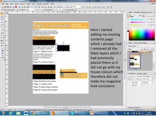
- 1. Here I started editing my existing contents page which I already had. I removed all the black layers which I had previously placed there as it did not go with my house colours which therefore did not make my magazine look consistent.
- 2. This was the outcome of me removing all the black layers. I also changed the background of my magazine to white to match the background of my double page spread. This in turn would add to the realism of my magazine.
- 3. With feedback from my teacher, she noted how my font was not professional so I changed my font to something more simple which the target audience would be able to relate to.
- 4. With inspiration from another rap magazine, I decided to position the page number in big bold Arial font.
- 5. I then imported my main image which was different to the one before. The image selected consisted of an artist who was already on the front cover which gives off the impression that she has clear relevance to the stories inside.
- 6. I then changed and altered the positioning of the text and image.
- 7. Here it is noticeable how I included an editors note in a handwriting style which again matched the needs of my user. This in turn would attract them to purchase the magazine.
- 8. Finally, I moved my logo from between the artists to the top right of the magazine as this was conventional to do so.