
Recommended
More Related Content
What's hot
What's hot (17)
Viewers also liked
Viewers also liked (14)
Similar to Contents page step 1
Similar to Contents page step 1 (20)
More from seanmillington
More from seanmillington (10)
Contents page step 1
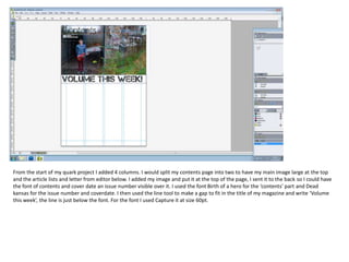
- 1. From the start of my quark project I added 4 columns. I would split my contents page into two to have my main image large at the top and the article lists and letter from editor below. I added my image and put it at the top of the page, I sent it to the back so I could have the font of contents and cover date an issue number visible over it. I used the font Birth of a hero for the ‘contents’ part and Dead kansas for the issue number and coverdate. I then used the line tool to make a gap to fit in the title of my magazine and write ‘Volume this week’, the line is just below the font. For the font I used Capture it at size 60pt.
- 2. At this point I added 4 lines where the lines would be in the columns this was to make it look neat and separate the columns and make a place to put the article list in. I also added a small line in the left hand side column to make a small box and I wrote ‘Letter from the editor’ in the box as in the column below it will be the letter from the editor as this is a convention of music magazine contents pages. For that font I used Birth of a hero at size 34pt. I then added the names of the articles with a page number. For this font I used Bronx bystreets at size 11. I then added an image of a concert I had been to of arctic monkeys to go with the arctic monkeys article.
- 3. At this stage I added another image to go with the clincton view article as it was an image I had taken of them playing. I had to use the picture content tool to make sure the quite sizeable image would fit into my slim columns. I then added the social network contacts into the bottom right corner just below my final article. I used pictures of the twitter and facebook emblems that I had to get off the internet and added Volume magazines contact details for these websites as this is a newer convention of music magazines. I then wrote a letter from the editor, this letter included details on what was good about this months magazine and a general update for the readers. I used the font birth of a hero at size 14pt for the letter. I also changed the way my page numbers were presented. I recognized that page numbers were not underneath the article as that was where to write the small details about the articles and they were usually placed to the side of each article and so I added these numbers to each article in a new text box to the side of it. These page numbers were in the font bronx bystreets at size 12pt so it would be slightly larger than the articles and stand out a little more. I then added a small description to each article underneath the article name. This just further explained what the article would be about, I used the font Birth of a hero at size 10pt.