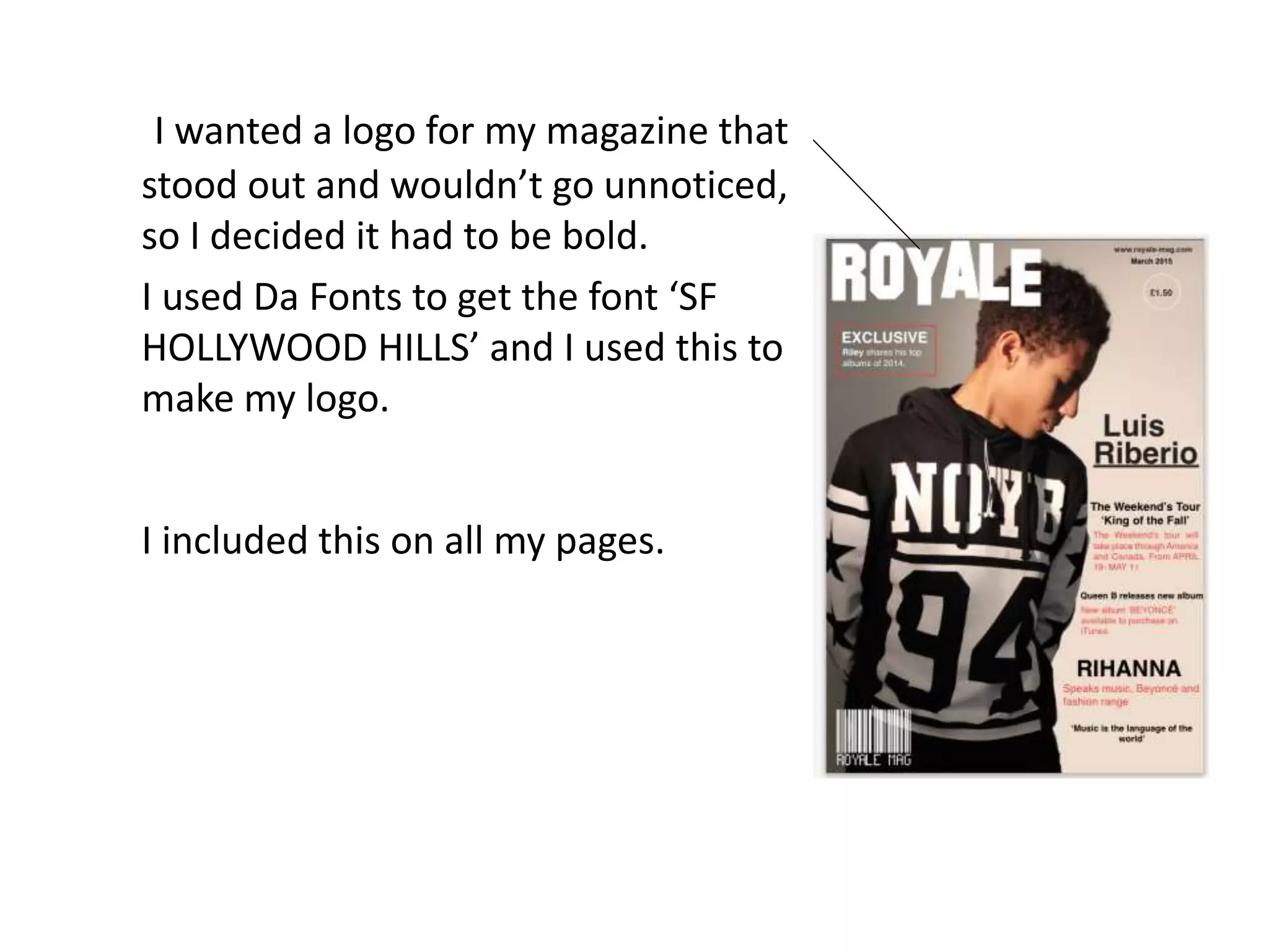
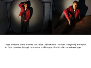
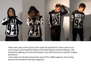
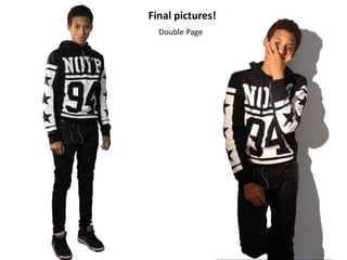
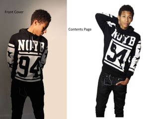
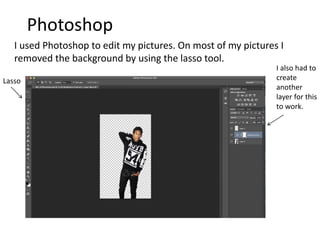
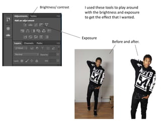
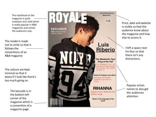
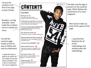
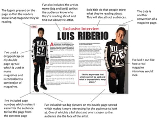
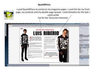
I wanted a logo for my magazine that
stood out and wouldn’t go unnoticed,
so I decided it had to be bold.
I used Da Fonts to get the font ‘SF
HOLLYWOOD HILLS’ and I used this to
make my logo.
I included this on all my pages.
These are some of the pictures that I took the first time. I focused the lighting mostly on
his face. However these pictures came out blurry so I had to take the pictures again.
These were some of the pictures that I took the second time. These came out so
much clearer and showed the details of the facial features and the clothing. I still
focused the lighting on his face which gave a nice effect because it created a shadow
behind him.
I also made sure the facial expressions were fit for a R&B magazine. (not smiling
because that would be more pop magazine)
Final pictures!
Double Page
Contents Page
Front Cover
Photoshop
I used Photoshop to edit my pictures. On most of my pictures I
removed the background by using the lasso tool.
Lasso
I also had to
create
another
layer for this
to work.
I used these tools to play around
with the brightness and exposure
to get the effect that I wanted.
Brightness/ contrast
Exposure
Before and after.
The masthead on the
magazine is quite
simplistic and bold which
is really popular in R&B
magazines and caches
the audience's eye.
The barcode is in
the bottom left
corner of the
magazine which is
a convention of a
magazine page.
Price, date and website
is visible so that the
audience know about
the magazine and how
else to access it.
Popular artists
names to also get
the audiences
attention.
The model is made
not to smile so that it
follows the
conventions of an
R&B magazine
The colours are kept
minimal so that it
doesn't’t look like there's
too much going on.
I left a space near
his face so that
there isn’t any
distractions.
Main picture takes up
most of the space on the
page.
The date and the logo is
present on the contents
page. Which follows the
conventions of a music
magazine.
Numbers are big
and bold. I even
made the numbers
red so it stands out
more.
I've left the
contents page
simple so that its
easy to follow and
easy to understand.
I've put the
contents in he
font of my logo
so that it flows.
I used the font
Helvetica for all
of the
subheadings and
writing under the
subheadings.
I made the topic in
bold so its easier for
the reader to see the
topics available. This
is also a convention
of a music magazine.
Bold title do that people know
what they’re reading about.
This will also attract audiences.
The logo is present on the
page so that the readers
know what magazine they’re
reading.
The date is
another
convention of a
magazine page.
I've used a
dropped cap on
my double
page spread
which is used in
many
magazines and
is considered a
convention of
magazines.
I’ve included two big pictures on my double page spread
which makes it more interesting for the audience to look
at. One of which is a full shot and one is closer so the
audience she the face of the artist.
I’ve laid it out like
how a real
magazine
interview would
look.
I’ve included page
numbers which makes it
easier for the audience
to find the page from
the contents page
I’ve also included the artists
name (big and bold) so that
the audience know who
they’re reading about and
find out about the artist.
I used QuarkXPress to construct my magazine pages. I used this for my front
page, my contents and my double page spread. I used Helvetica for the text. I
used Lucida
Fax for the ‘Exclusive Interview’
QuarkXPress

Presentation1 media1

  • 1.
    I wanted alogo for my magazine that stood out and wouldn’t go unnoticed, so I decided it had to be bold. I used Da Fonts to get the font ‘SF HOLLYWOOD HILLS’ and I used this to make my logo. I included this on all my pages.
  • 2.
    These are someof the pictures that I took the first time. I focused the lighting mostly on his face. However these pictures came out blurry so I had to take the pictures again.
  • 3.
    These were someof the pictures that I took the second time. These came out so much clearer and showed the details of the facial features and the clothing. I still focused the lighting on his face which gave a nice effect because it created a shadow behind him. I also made sure the facial expressions were fit for a R&B magazine. (not smiling because that would be more pop magazine)
  • 4.
  • 5.
  • 6.
    Photoshop I used Photoshopto edit my pictures. On most of my pictures I removed the background by using the lasso tool. Lasso I also had to create another layer for this to work.
  • 7.
    I used thesetools to play around with the brightness and exposure to get the effect that I wanted. Brightness/ contrast Exposure Before and after.
  • 8.
    The masthead onthe magazine is quite simplistic and bold which is really popular in R&B magazines and caches the audience's eye. The barcode is in the bottom left corner of the magazine which is a convention of a magazine page. Price, date and website is visible so that the audience know about the magazine and how else to access it. Popular artists names to also get the audiences attention. The model is made not to smile so that it follows the conventions of an R&B magazine The colours are kept minimal so that it doesn't’t look like there's too much going on. I left a space near his face so that there isn’t any distractions.
  • 9.
    Main picture takesup most of the space on the page. The date and the logo is present on the contents page. Which follows the conventions of a music magazine. Numbers are big and bold. I even made the numbers red so it stands out more. I've left the contents page simple so that its easy to follow and easy to understand. I've put the contents in he font of my logo so that it flows. I used the font Helvetica for all of the subheadings and writing under the subheadings. I made the topic in bold so its easier for the reader to see the topics available. This is also a convention of a music magazine.
  • 10.
    Bold title dothat people know what they’re reading about. This will also attract audiences. The logo is present on the page so that the readers know what magazine they’re reading. The date is another convention of a magazine page. I've used a dropped cap on my double page spread which is used in many magazines and is considered a convention of magazines. I’ve included two big pictures on my double page spread which makes it more interesting for the audience to look at. One of which is a full shot and one is closer so the audience she the face of the artist. I’ve laid it out like how a real magazine interview would look. I’ve included page numbers which makes it easier for the audience to find the page from the contents page I’ve also included the artists name (big and bold) so that the audience know who they’re reading about and find out about the artist.
  • 11.
    I used QuarkXPressto construct my magazine pages. I used this for my front page, my contents and my double page spread. I used Helvetica for the text. I used Lucida Fax for the ‘Exclusive Interview’ QuarkXPress