
Recommended
More Related Content
Recently uploaded
Recently uploaded (20)
Featured
Featured (20)
Editor's Notes
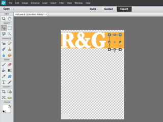
- I started off by creating an orange banner to go across the top of my magazine as this would be where my Masthead is placed across. I then also made sure that I chose a specific colour for the banner of the mast head as this would most likely be the colour that I adopt throughout the music magazine.
- I then wrote the initials of my music magazine R&G in the desired font as this would be the mast head of my music magazine. I then chose the select tool and highlighted the writing and dragged it off the banner which then left behind an interlace colour and the initials ‘R&G’ remained.
- Furthermore, I then imported my background which was of Vicky who I had earlier edited in Photoshop as well. The purpose behind choosing this image was because of her positioning and how she was in the stance of direct mode of address which would make the reader feel she is looking directly at them. This in turn would encourage the reader to purchase the magazine as they would feel she is relating to them. I also imported my logo in the top right and placed it over the banner as users would then be able to associate R&G with this logo and it would become instantaneously recognisable. Finally, just above the top strip of the magazine I left a small space where I included a pug which would further enable me to attract more readers into purchasing the magazine.
- I then went onto adding on a banner of the same colour at the bottom of the front cover as this would be the bottom strip where I would be placing other important information.
- I included a barcode on the bottom strip of the magazine to add to the realism as when I looked at existing magazines they all consisted of barcodes.
- Finally, whilst looking at existing magazines it became apparent to me that synergy was going to play big part in keeping the audience interested so I included links of synergy such as ‘Twitter, Facebook and Blogger’; all of which would link back to R&G.