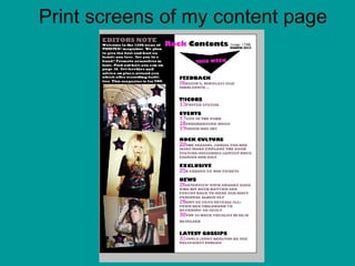
2. Firstly: In this print screen, I chose my background colours. I chose my background colours to be black and white as it further emphasises the rock culture, also because if I left it plain white it would look dull and boring.
3. Secondly: In this print screen, I added the title/main head of the ‘ROCK CONTENTS Issue 1298’ as well as the date. I chose this title because it makes it sound like a rock magazine contents page rather than any other ordinary contents page. The colour I used are pink and black because it represents punk-rock and chose the format Gill Sans Ultra Bold to give that hard looking effect to the magazine as it’s a rock magazine I am creating. Bold typography is consistent from the front page to the content page. Its very simple and too vibrant.
4. Thirdly: In this print screen, I added an arrow pointing downwards demonstrating that the links to everything included in the magazine is below as well as, writing, ‘THIS WEEK’ to let the readers know what the magazine has for them that week. I chose this format to be also Gill Sans Ultra Bold to maintain the consistency. And chosen the colour pink as it matches with the title.
5. Fourthly: In this print screen, I have added the sub-headings to organise the magazine and to make it easier to find what the audience want to read. For the sub-headings I chose black font colour because the background is white therefore black would stand out. The format style of the sub-headings is Gill Sans Ultra Bold because it’s important the sub-headings are clear for the audience to read therefore I chose it to be formal and big. The font of the sub-heading is bigger compared to other formats as it is the main part of the content page the audience would be viewing in order to get to the page they want to read. The font which I use big, bright and bold. The positive for this is that it shows the reader what they are looking for easily. The formats of the topic sentence have remained consistent from the front page to the content page. It’s very simple and not too vibrant. I have used shades of pink to also maintain the consistent of colour use and its bright therefore making it eye-catchy. Page numbers are written in big and bright colours which also male it easier for the audience to identify the page.
6. Fifthly: In this print screen, I added the editor’s note to make the magazine seem important and better than any other. I used the format Gill Sans Ultra Bold to make it stand out. The font colours are bright because the background is black.
7. Sixthly: These are the three main images I used for my contents page. I used the main image I used on my front cover. This highlights the importance to the tribute. The picture of the left hand side at the bottom represents the rock culture. I used this image because I have included a link to rock culture on my content page. The image at the top is the image I used for the sub-heading, ‘AMY DE SILVA REVEALS ALL FROM HER CHILDHOOD TO BECOMING AN ADULT’. I believe that all these images are suitable for my magazine cover because they are all dressed rocky and for example, have tattoos and heavy dark make-up on. In these images I did not use any tools to edit the images such as the spot healing tool as the images came out perfect due to the quality of my camera.
8. Seventhly: In this print screen, I used the rectangular marquee tool (m) to copy the picture onto my content page. In his print screen, I pasted the main image onto my content page and adjusted it by tilting it a little and shrinking the size of one of the main image.
9. Eighthly: In this print screen, I repeated the process of putting the main image onto my contents page as I did to the previous image.
10. Ninthly: In this print screen, I again repeated what I did to the previous two images.
11. Finally: In this print screen, I added the stars on the main images with numbers inside the stars. I did this to make the content page more entertaining. The number inside the stars provides link to the sub-headings I wrote about on the content page. For example, on the middle image I wrote the number 26—under the sub-heading, ‘NEWS’ I wrote, ‘26INTERVIEW WITH AMANDA BARR WHO HIT ROCK BOTTOM AND FOUGHT BACK TO MAKE HER MOST PERSONAL ALBUM YET’. So by including the image people might be able to identify who I am talking about if they don’t know who Amanda Barr is—as they might identify by looking at the image.