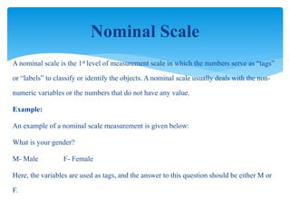
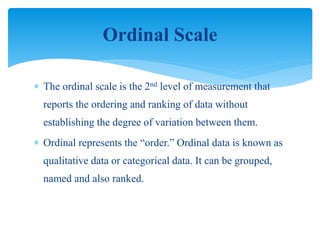
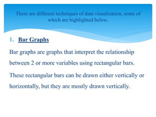
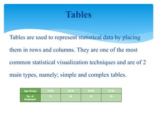
Educational
Research and
Statistics
Course Code 6461
Asima shahzadi
asimashahzadi7@gmail.com
 The purpose of analyzing data is to obtain usable and
useful information. The analysis, irrespective of whether
the data is qualitative or quantitative, may:
1. describe and summarize the data
2. identify relationships between variables
3. compare variables
4. identify the difference between variables
5. forecast outcomes
Why Do We Analyze Data
Many people are confused about what type of analysis to
use on a set of data and the relevant forms of pictorial
presentation or data display. The decision is based on the
scale of measurement of the data.
Scales Of Measurement
A nominal scale is the 1st level of measurement scale in which the numbers serve as “tags”
or “labels” to classify or identify the objects. A nominal scale usually deals with the non-
numeric variables or the numbers that do not have any value.
Example:
An example of a nominal scale measurement is given below:
What is your gender?
M- Male F- Female
Here, the variables are used as tags, and the answer to this question should be either M or
F.
Nominal Scale
 The ordinal scale is the 2nd level of measurement that
reports the ordering and ranking of data without
establishing the degree of variation between them.
 Ordinal represents the “order.” Ordinal data is known as
qualitative data or categorical data. It can be grouped,
named and also ranked.
Ordinal Scale
 Example:
 Ranking of school students – 1st, 2nd, 3rd, etc.
 Ratings in restaurants
 Evaluating the frequency of occurrences
1. Very often
2. Often
3. Not often
4. Not at all
 Assessing the degree of agreement
1. Totally agree
2. Agree
3. Neutral
4. Disagree
5. Totally disagree
 The interval scale is the 3rd level of measurement scale.
It is defined as a quantitative measurement scale in
which the difference between the two variables is
meaningful.
 In other words, the variables are measured in an exact
manner, not as in a relative way in which the presence of
zero is arbitrary.
Interval Scale
Example:
1. Likert Scale
2. Net Promoter Score (NPS)
3. Bipolar Matrix Table
 The ratio scale is the 4th level of measurement scale,
which is quantitative. It is a type of variable
measurement scale. It allows researchers to compare the
differences or intervals.
 The ratio scale has a unique feature. It possesses the
character of the origin or zero points.
Ratio Scale
 Example:
 An example of a ratio scale is:What is your weight in
Kgs?
1. Less than 55 kgs
2. 55 – 75 kgs
3. 76 – 85 kgs
4. 86 – 95 kgs
5. More than 95 kgs
 In summary, nominal variables are used to “name,” or label a series
of values.
 Ordinal scales provide good information about the order of choices,
such as in a customer satisfaction survey.
 Interval scales give us the order of values + the ability to
quantify the difference between each one.
 Finally, Ratio scales give us the ultimate–order, interval values, plus
the ability to calculate ratios since a “true zero” can be defined.
Summary
 Data interpretation is the process of reviewing data
through some predefined processes which will help
assign some meaning to the data and arrive at a relevant
conclusion.
 It involves taking the result of data analysis, making
inferences on the relations studied, and using them to
conclude.
What is Data Interpretation?
Data Analysis
Data analysis is the process of ordering, categorizing,
manipulating, and summarizing data to obtain answers
to research questions. It is usually the first step taken
towards data interpretation.
 Data interpretation methods are how analysts help people make
sense of numerical data that has been collected, analyzed and
presented.
 Data, when collected in raw form, may be difficult for the
layman to understand, which is why analysts need to break
down the information gathered so that others can make sense of
it.
What are Data Interpretation
Methods?
 when founders are pitching to potential
investors, they must interpret data (e.g. market
size, growth rate, etc.) for better understanding.
 There are 2 main methods in which this can be
done, namely; quantitative methods and
qualitative methods.
Example
 The qualitative data interpretation method is used to analyze
qualitative data, which is also known as categorical data. This
method uses texts, rather than numbers or patterns to describe
data.
 Qualitative data is usually gathered using a wide variety of
person-to-person techniques, which may be difficult to analyze
compared to the quantitative research method.
Qualitative Data Interpretation Method
There are 2 main types of qualitative data, namely; nominal
and ordinal data. These 2 data types are both interpreted using
the same method, but ordinal data interpretation is quite easier
than that of nominal data.
In most cases, ordinal data is usually labelled with numbers
during the process of data collection, and coding may not be
required. This is different from nominal data that still needs to
be coded for proper interpretation.
Types Of Qualitative Data
 The quantitative data interpretation method is used to analyze
quantitative data, which is also known as numerical data. This
data type contains numbers and is therefore analyzed with the
use of numbers and not texts.
 Quantitative data are of 2 main types, namely; discrete and
continuous data. Continuous data is further divided
into interval data and ratio data, with all the data types being
numeric.
Quantitative Data Interpretation
Method
 Mean
The mean is a numerical average for a set of data and
is calculated by dividing the sum of the values by the
number of values in a dataset.
It is used to get an estimate of a large population from
the dataset obtained from a sample of the population.
Some of the statistical methods used in
analyzing quantitative data are highlighted
below:
 Standard deviation
This technique is used to measure how well the
responses align with or deviates from the mean.
It describes the degree of consistency within the
responses; together with the mean, it provides insight
into data sets.
 Frequency distribution
 This technique is used to assess the demography of the
respondents or the number of times a particular response
appears in research. It is extremely keen on determining the
degree of intersection between data points.
 Some other interpretation processes of quantitative data
include:
1. Regression analysis
2. Cohort analysis
3. Predictive and prescriptive analysis
Visualization Techniques in Data Analysis
 One of the best practices of data interpretation is
the visualization of the dataset.
 Visualization makes it easy for a layman to
understand the data, and also encourages people
to view the data, as it provides a visually
appealing summary of the data.
1. Bar Graphs
Bar graphs are graphs that interpret the relationship
between 2 or more variables using rectangular bars.
These rectangular bars can be drawn either vertically or
horizontally, but they are mostly drawn vertically.
There are different techniques of data visualization, some of
which are highlighted below.
1. It helps to summarize a large data
2. Estimations of key values c.an be made at a
glance
3. Can be easily understood
Advantages of a Bar Graph
1. It may require additional explanation.
2. It can be easily manipulated.
3. It doesn't properly describe the dataset.
Disadvantages of a Bar Graph
 A pie chart is a circular graph used to represent
the percentage of occurrence of a variable
using sectors.
 The size of each sector is dependent on the
frequency or percentage of the corresponding
variables.
Pie Chart
 Pie Chart Example:
 There are a total of 50 students in a class, and out of
them, 10 students like Football, 25 students like
snooker, and 15 students like Badminton.
 Advantages of a Pie Chart
1. It is visually appealing.
2. Best for comparing small data samples.
 Disadvantages of a Pie Chart
1. It can only compare small sample sizes.
2. Unhelpful with observing trends over time.
Tables are used to represent statistical data by placing
them in rows and columns. They are one of the most
common statistical visualization techniques and are of 2
main types, namely; simple and complex tables.
Tables
 Advantages of Tables
1. Can contain large data sets
2. Helpful in comparing 2 or more similar things
 Disadvantages of Tables
1. They do not give detailed information.
2. Maybe time-consuming.
 Line graphs or charts are a type of graph that displays
information as a series of points, usually connected by
a straight line. Some of the types of line graphs are
highlighted below.
1. Simple Line Graphs
2. Line Graphs with Markers
3. Stacked Line Graphs
Line Graph
 Advantages of a Line Graph
1. Great for visualizing trends and changes over time.
2. It is simple to construct and read.
 Disadvantage of a Line Graph
1. It can not compare different variables at a single place
or time.
1. It helps to make informed decisions and not just
through guessing or predictions.
2. It is cost-efficient
3. The insights obtained can be used to set and
identify trends in data.
Advantages of Data Interpretation
 Data interpretation and analysis is an important aspect of working
with data sets in any field or research and statistics.
 They both go hand in hand, as the process of data interpretation
involves the analysis of data.
 The process of data interpretation is Usually cumbersome, and
should naturally become more difficult with the best amount of data
that is being churned out daily.
Conclusion
 However, with the accessibility of data analysis tools
and machine learning techniques, analysts are gradually
finding it easier to interpret data.
 Data interpretation is very important, as it helps to
acquire useful information from a pool of irrelevant
ones while making informed decisions. It is found
useful for individuals, businesses, and researchers.
 Only make claims that your data can support
 The best way to present your findings depends on the audience,
 the purpose, and the data gathering and analysis undertaken
 Graphical representations (as discussed above) may be
appropriate for presentation
 Other techniques are:
 Rigorous notations, e.g. UML
 Using stories, e.g. to create scenarios
 Summarizing the findings
Presenting The Findings
 The data analysis that can be done depends on the data gathering that
was done
 Qualitative and quantitative data may be gathered from any of the three main
data gathering approaches
 Percentages and averages are commonly used in Interaction Design
 Mean, median and mode are different kinds of ‘average’ and can have
very different answers for the same set of data
 Grounded Theory, Distributed Cognition andActivity Theory are theoretical
frameworks to support data analysis
 Presentation of the findings should not overstatethe evidence
Summary
Unit 8 data analysis and interpretation

Unit 8 data analysis and interpretation

  • 1.
    Educational Research and Statistics Course Code6461 Asima shahzadi asimashahzadi7@gmail.com
  • 3.
     The purposeof analyzing data is to obtain usable and useful information. The analysis, irrespective of whether the data is qualitative or quantitative, may: 1. describe and summarize the data 2. identify relationships between variables 3. compare variables 4. identify the difference between variables 5. forecast outcomes Why Do We Analyze Data
  • 4.
    Many people areconfused about what type of analysis to use on a set of data and the relevant forms of pictorial presentation or data display. The decision is based on the scale of measurement of the data. Scales Of Measurement
  • 5.
    A nominal scaleis the 1st level of measurement scale in which the numbers serve as “tags” or “labels” to classify or identify the objects. A nominal scale usually deals with the non- numeric variables or the numbers that do not have any value. Example: An example of a nominal scale measurement is given below: What is your gender? M- Male F- Female Here, the variables are used as tags, and the answer to this question should be either M or F. Nominal Scale
  • 6.
     The ordinalscale is the 2nd level of measurement that reports the ordering and ranking of data without establishing the degree of variation between them.  Ordinal represents the “order.” Ordinal data is known as qualitative data or categorical data. It can be grouped, named and also ranked. Ordinal Scale
  • 7.
     Example:  Rankingof school students – 1st, 2nd, 3rd, etc.  Ratings in restaurants  Evaluating the frequency of occurrences 1. Very often 2. Often 3. Not often 4. Not at all  Assessing the degree of agreement 1. Totally agree 2. Agree 3. Neutral 4. Disagree 5. Totally disagree
  • 8.
     The intervalscale is the 3rd level of measurement scale. It is defined as a quantitative measurement scale in which the difference between the two variables is meaningful.  In other words, the variables are measured in an exact manner, not as in a relative way in which the presence of zero is arbitrary. Interval Scale
  • 9.
    Example: 1. Likert Scale 2.Net Promoter Score (NPS) 3. Bipolar Matrix Table
  • 10.
     The ratioscale is the 4th level of measurement scale, which is quantitative. It is a type of variable measurement scale. It allows researchers to compare the differences or intervals.  The ratio scale has a unique feature. It possesses the character of the origin or zero points. Ratio Scale
  • 11.
     Example:  Anexample of a ratio scale is:What is your weight in Kgs? 1. Less than 55 kgs 2. 55 – 75 kgs 3. 76 – 85 kgs 4. 86 – 95 kgs 5. More than 95 kgs
  • 12.
     In summary,nominal variables are used to “name,” or label a series of values.  Ordinal scales provide good information about the order of choices, such as in a customer satisfaction survey.  Interval scales give us the order of values + the ability to quantify the difference between each one.  Finally, Ratio scales give us the ultimate–order, interval values, plus the ability to calculate ratios since a “true zero” can be defined. Summary
  • 16.
     Data interpretationis the process of reviewing data through some predefined processes which will help assign some meaning to the data and arrive at a relevant conclusion.  It involves taking the result of data analysis, making inferences on the relations studied, and using them to conclude. What is Data Interpretation?
  • 17.
    Data Analysis Data analysisis the process of ordering, categorizing, manipulating, and summarizing data to obtain answers to research questions. It is usually the first step taken towards data interpretation.
  • 18.
     Data interpretationmethods are how analysts help people make sense of numerical data that has been collected, analyzed and presented.  Data, when collected in raw form, may be difficult for the layman to understand, which is why analysts need to break down the information gathered so that others can make sense of it. What are Data Interpretation Methods?
  • 19.
     when foundersare pitching to potential investors, they must interpret data (e.g. market size, growth rate, etc.) for better understanding.  There are 2 main methods in which this can be done, namely; quantitative methods and qualitative methods. Example
  • 20.
     The qualitativedata interpretation method is used to analyze qualitative data, which is also known as categorical data. This method uses texts, rather than numbers or patterns to describe data.  Qualitative data is usually gathered using a wide variety of person-to-person techniques, which may be difficult to analyze compared to the quantitative research method. Qualitative Data Interpretation Method
  • 21.
    There are 2main types of qualitative data, namely; nominal and ordinal data. These 2 data types are both interpreted using the same method, but ordinal data interpretation is quite easier than that of nominal data. In most cases, ordinal data is usually labelled with numbers during the process of data collection, and coding may not be required. This is different from nominal data that still needs to be coded for proper interpretation. Types Of Qualitative Data
  • 22.
     The quantitativedata interpretation method is used to analyze quantitative data, which is also known as numerical data. This data type contains numbers and is therefore analyzed with the use of numbers and not texts.  Quantitative data are of 2 main types, namely; discrete and continuous data. Continuous data is further divided into interval data and ratio data, with all the data types being numeric. Quantitative Data Interpretation Method
  • 23.
     Mean The meanis a numerical average for a set of data and is calculated by dividing the sum of the values by the number of values in a dataset. It is used to get an estimate of a large population from the dataset obtained from a sample of the population. Some of the statistical methods used in analyzing quantitative data are highlighted below:
  • 24.
     Standard deviation Thistechnique is used to measure how well the responses align with or deviates from the mean. It describes the degree of consistency within the responses; together with the mean, it provides insight into data sets.
  • 25.
     Frequency distribution This technique is used to assess the demography of the respondents or the number of times a particular response appears in research. It is extremely keen on determining the degree of intersection between data points.  Some other interpretation processes of quantitative data include: 1. Regression analysis 2. Cohort analysis 3. Predictive and prescriptive analysis
  • 26.
    Visualization Techniques inData Analysis  One of the best practices of data interpretation is the visualization of the dataset.  Visualization makes it easy for a layman to understand the data, and also encourages people to view the data, as it provides a visually appealing summary of the data.
  • 27.
    1. Bar Graphs Bargraphs are graphs that interpret the relationship between 2 or more variables using rectangular bars. These rectangular bars can be drawn either vertically or horizontally, but they are mostly drawn vertically. There are different techniques of data visualization, some of which are highlighted below.
  • 29.
    1. It helpsto summarize a large data 2. Estimations of key values c.an be made at a glance 3. Can be easily understood Advantages of a Bar Graph
  • 30.
    1. It mayrequire additional explanation. 2. It can be easily manipulated. 3. It doesn't properly describe the dataset. Disadvantages of a Bar Graph
  • 31.
     A piechart is a circular graph used to represent the percentage of occurrence of a variable using sectors.  The size of each sector is dependent on the frequency or percentage of the corresponding variables. Pie Chart
  • 32.
     Pie ChartExample:  There are a total of 50 students in a class, and out of them, 10 students like Football, 25 students like snooker, and 15 students like Badminton.
  • 33.
     Advantages ofa Pie Chart 1. It is visually appealing. 2. Best for comparing small data samples.  Disadvantages of a Pie Chart 1. It can only compare small sample sizes. 2. Unhelpful with observing trends over time.
  • 34.
    Tables are usedto represent statistical data by placing them in rows and columns. They are one of the most common statistical visualization techniques and are of 2 main types, namely; simple and complex tables. Tables
  • 35.
     Advantages ofTables 1. Can contain large data sets 2. Helpful in comparing 2 or more similar things  Disadvantages of Tables 1. They do not give detailed information. 2. Maybe time-consuming.
  • 36.
     Line graphsor charts are a type of graph that displays information as a series of points, usually connected by a straight line. Some of the types of line graphs are highlighted below. 1. Simple Line Graphs 2. Line Graphs with Markers 3. Stacked Line Graphs Line Graph
  • 38.
     Advantages ofa Line Graph 1. Great for visualizing trends and changes over time. 2. It is simple to construct and read.  Disadvantage of a Line Graph 1. It can not compare different variables at a single place or time.
  • 39.
    1. It helpsto make informed decisions and not just through guessing or predictions. 2. It is cost-efficient 3. The insights obtained can be used to set and identify trends in data. Advantages of Data Interpretation
  • 40.
     Data interpretationand analysis is an important aspect of working with data sets in any field or research and statistics.  They both go hand in hand, as the process of data interpretation involves the analysis of data.  The process of data interpretation is Usually cumbersome, and should naturally become more difficult with the best amount of data that is being churned out daily. Conclusion
  • 41.
     However, withthe accessibility of data analysis tools and machine learning techniques, analysts are gradually finding it easier to interpret data.  Data interpretation is very important, as it helps to acquire useful information from a pool of irrelevant ones while making informed decisions. It is found useful for individuals, businesses, and researchers.
  • 42.
     Only makeclaims that your data can support  The best way to present your findings depends on the audience,  the purpose, and the data gathering and analysis undertaken  Graphical representations (as discussed above) may be appropriate for presentation  Other techniques are:  Rigorous notations, e.g. UML  Using stories, e.g. to create scenarios  Summarizing the findings Presenting The Findings
  • 43.
     The dataanalysis that can be done depends on the data gathering that was done  Qualitative and quantitative data may be gathered from any of the three main data gathering approaches  Percentages and averages are commonly used in Interaction Design  Mean, median and mode are different kinds of ‘average’ and can have very different answers for the same set of data  Grounded Theory, Distributed Cognition andActivity Theory are theoretical frameworks to support data analysis  Presentation of the findings should not overstatethe evidence Summary