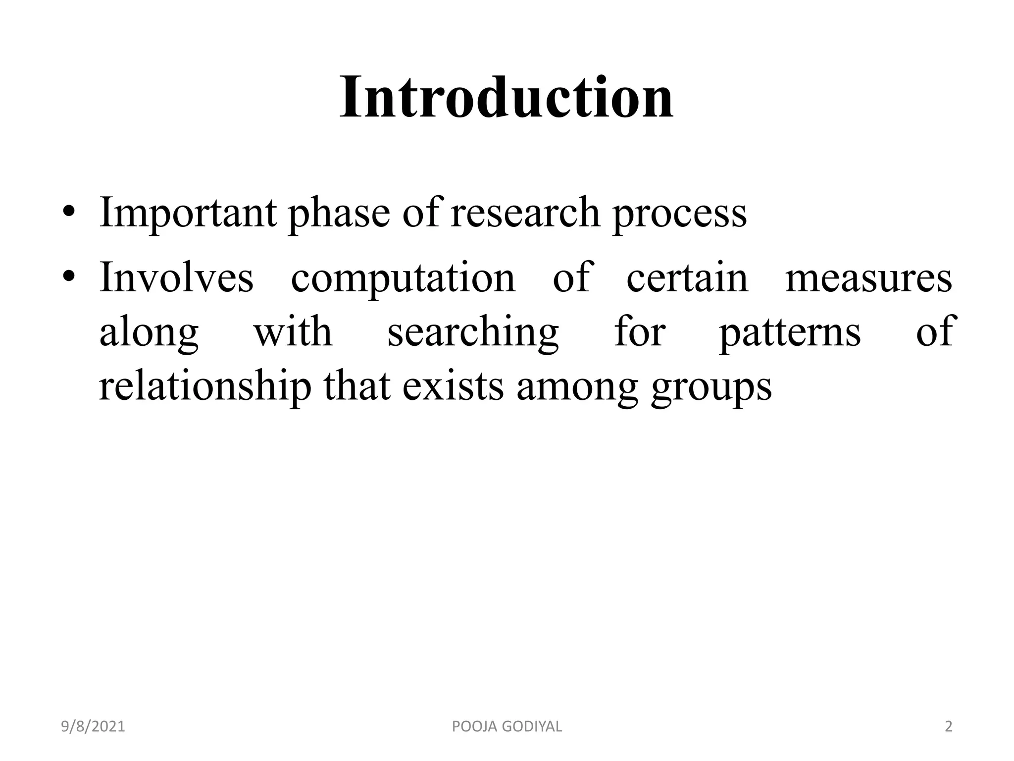
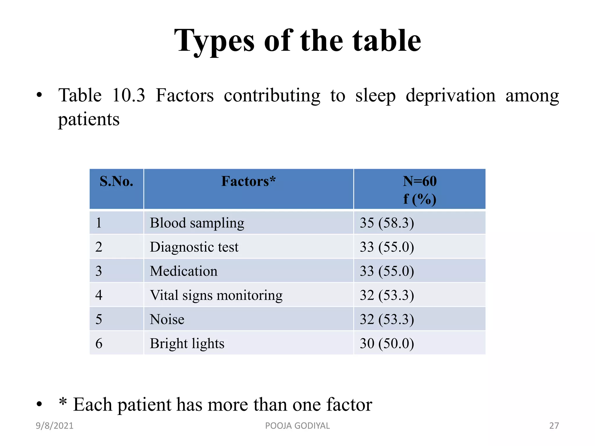
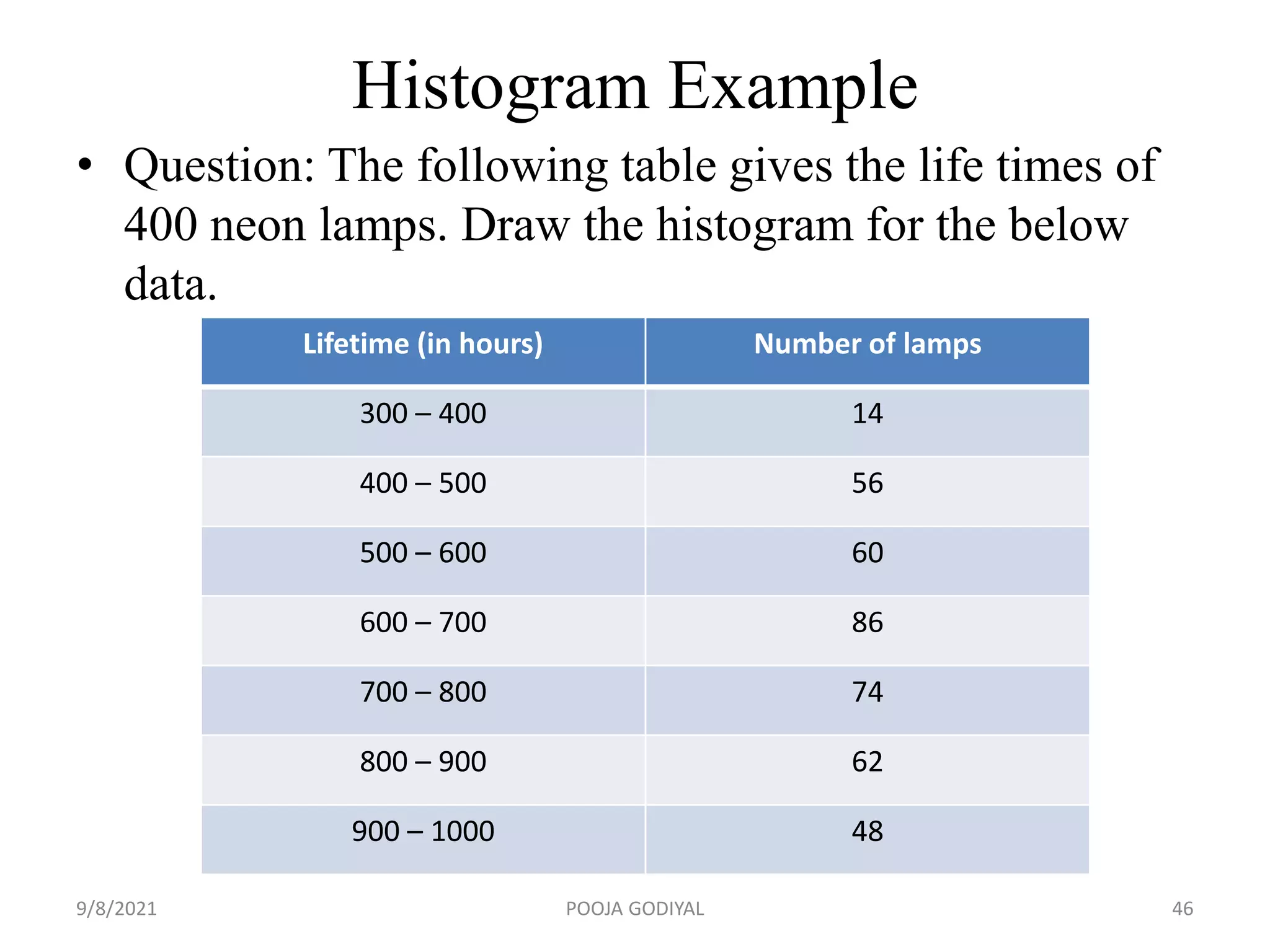
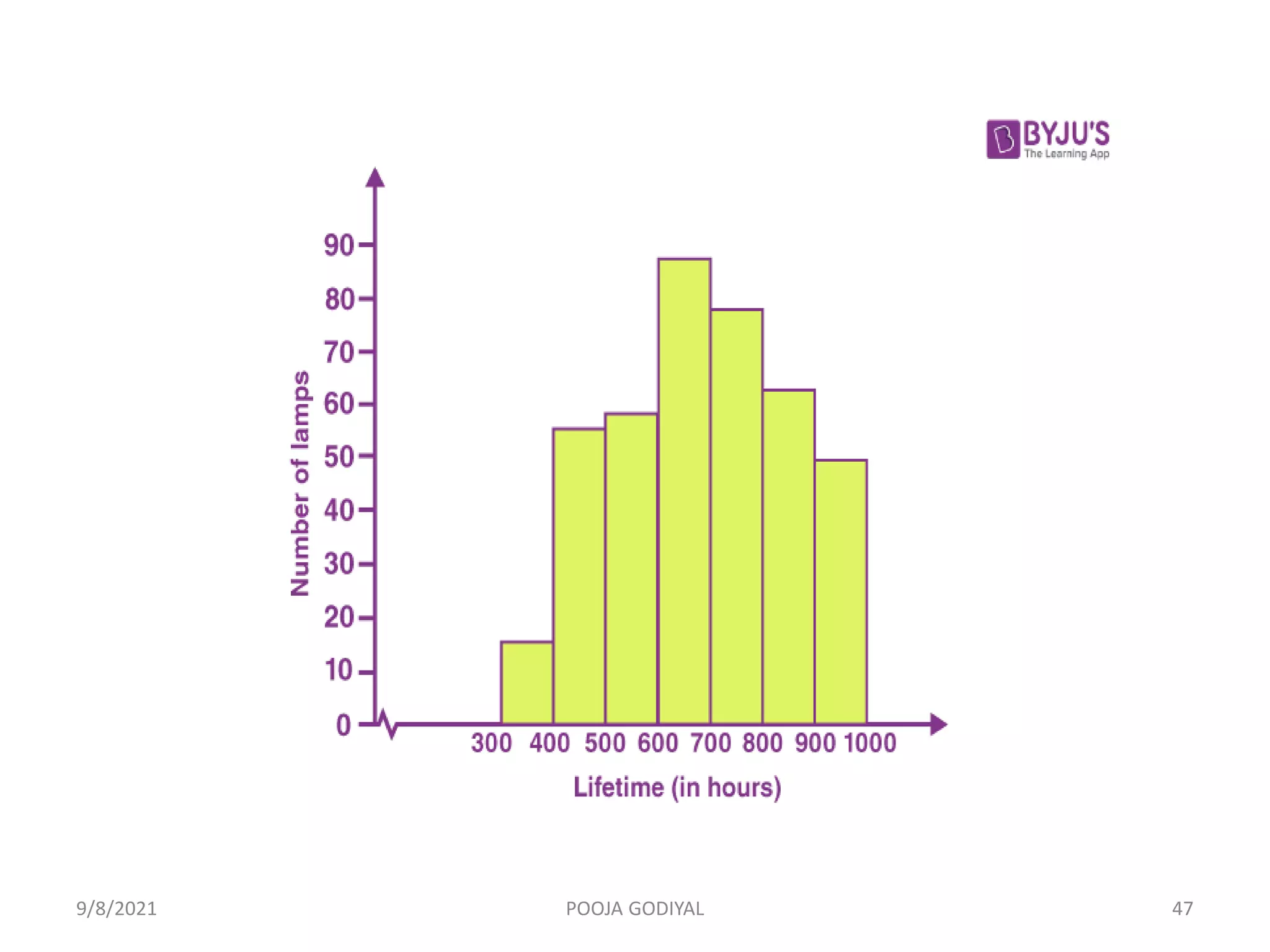
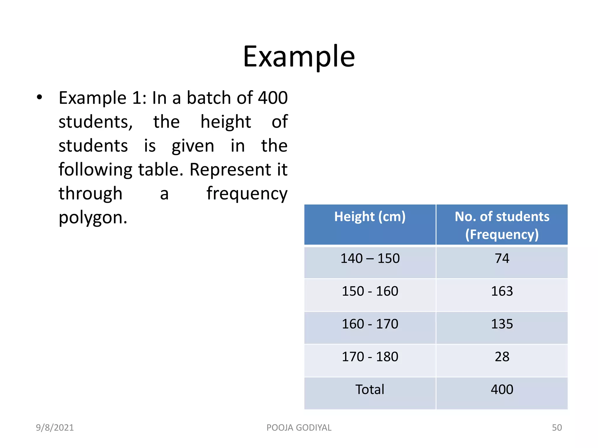
The document discusses data analysis and provides details about:
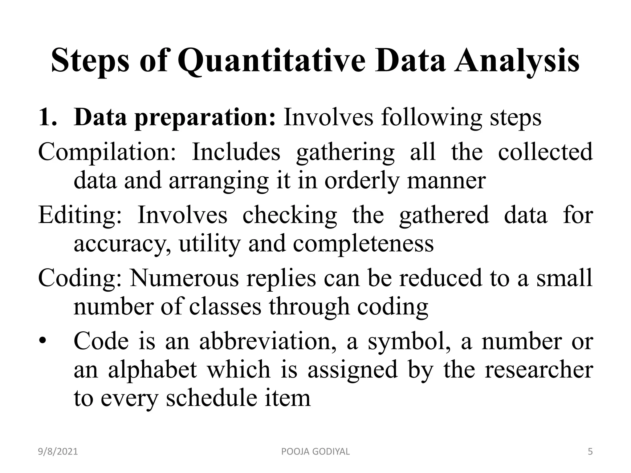
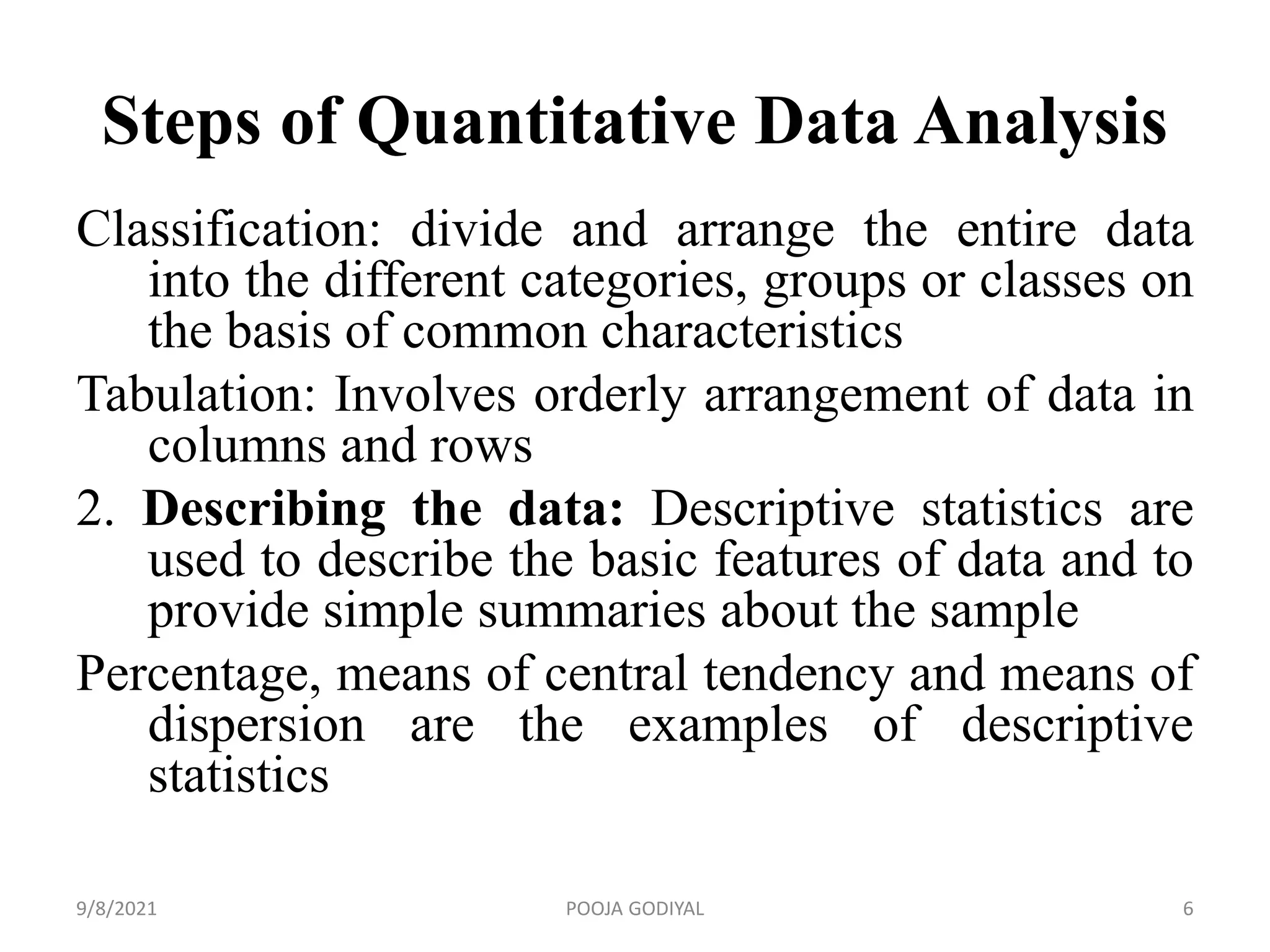
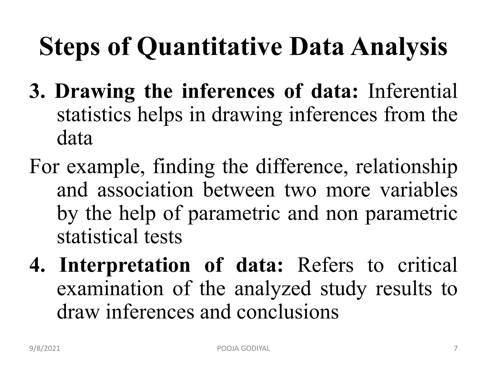
- The steps involved in quantitative data analysis including data preparation, description, inference drawing, and interpretation.
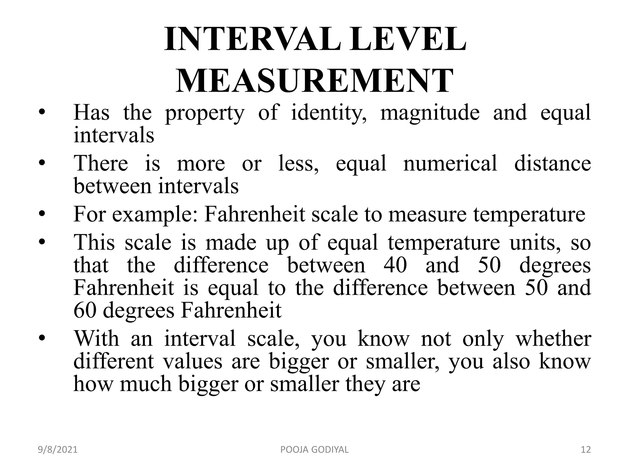
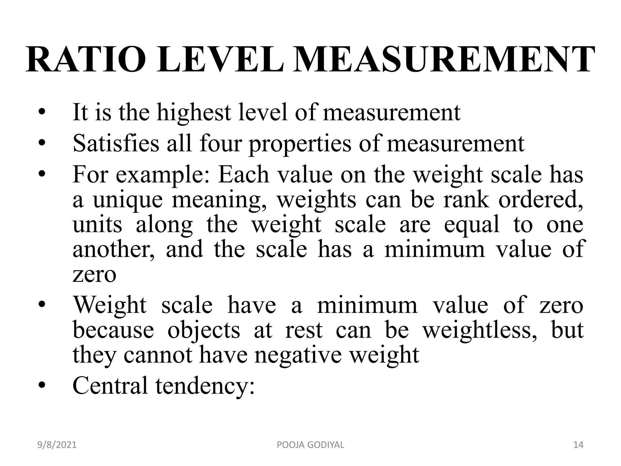
- The different scales of measurement - nominal, ordinal, interval, and ratio - and their properties.
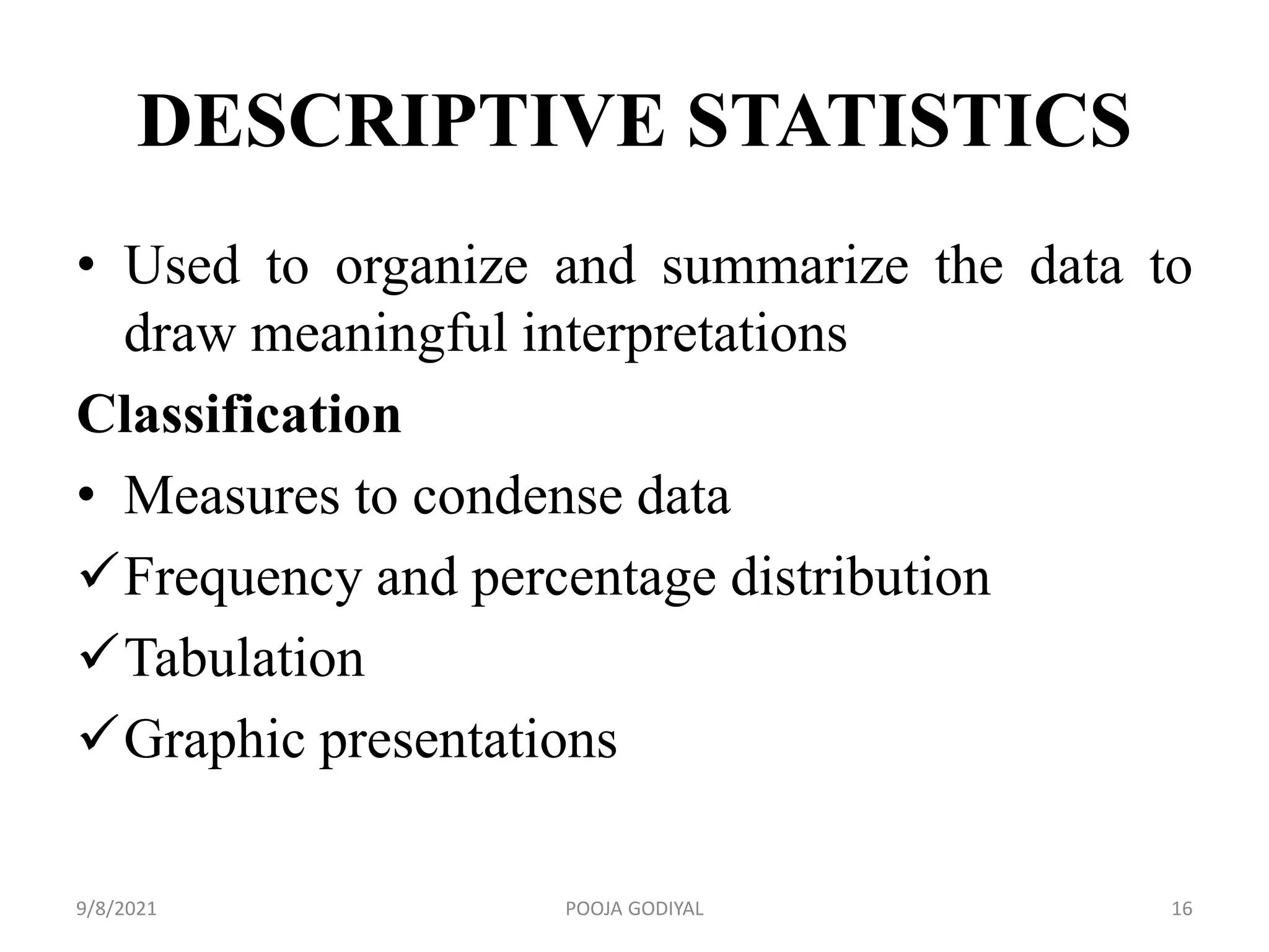
- Descriptive statistics used to organize and summarize data such as measures of central tendency, dispersion, and relationship.
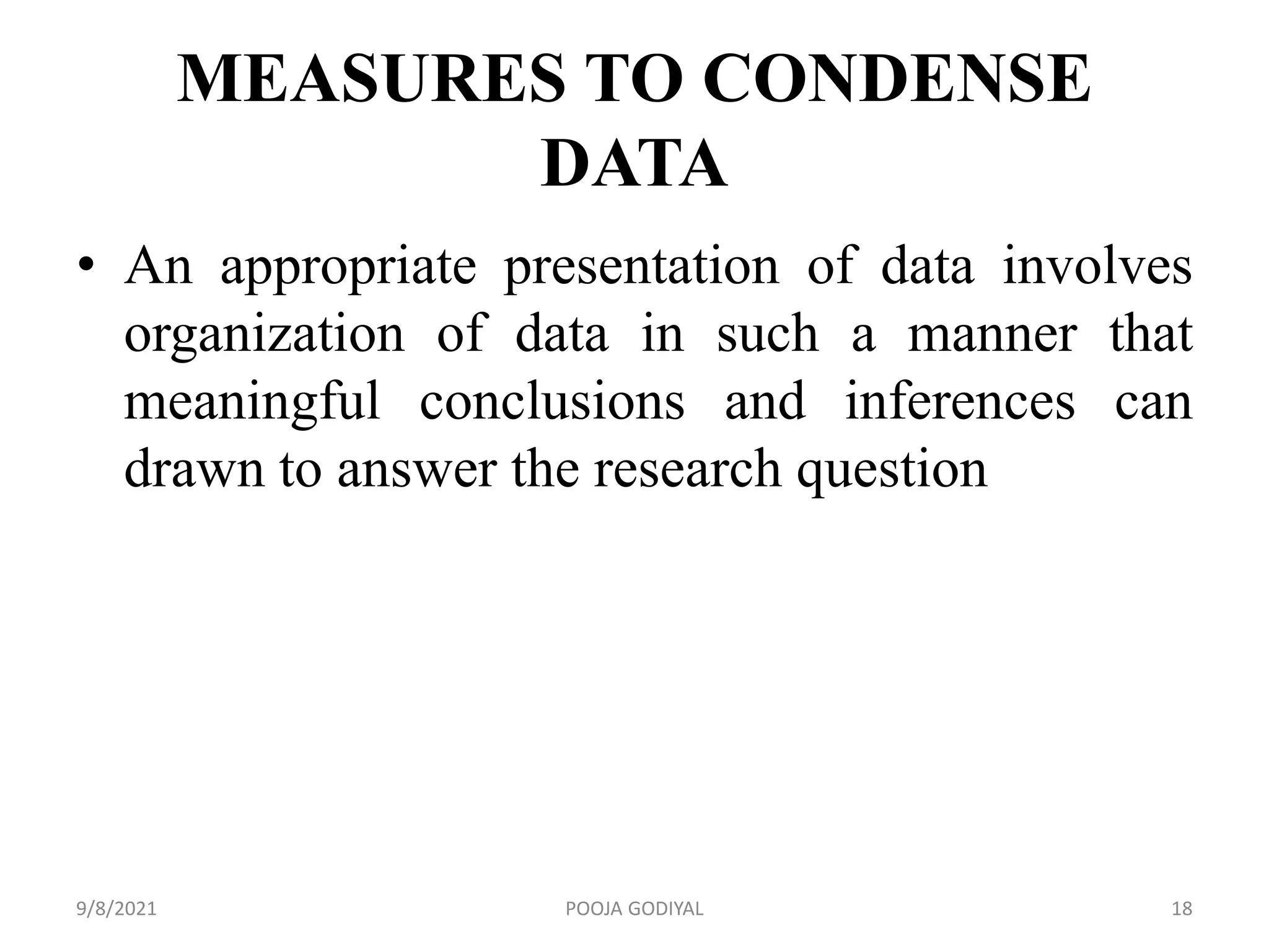
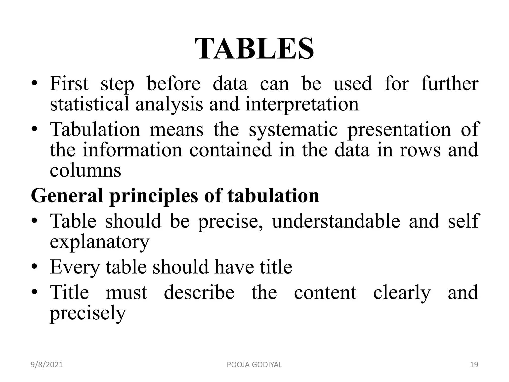
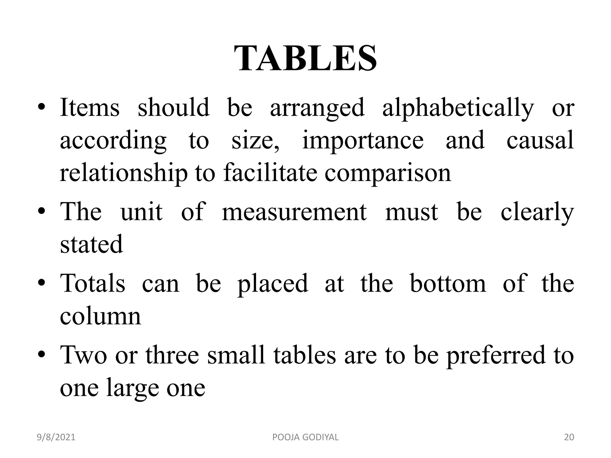
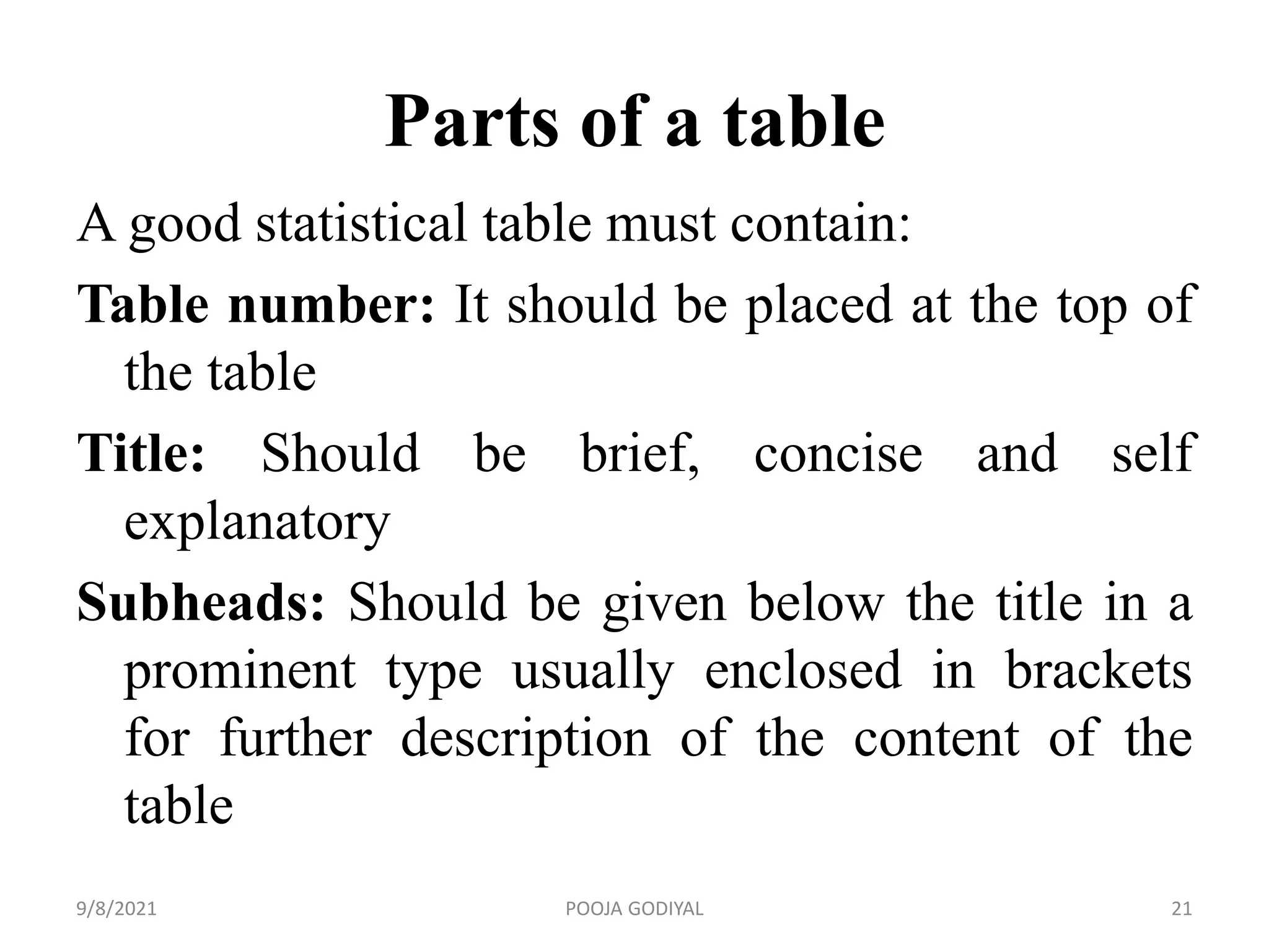
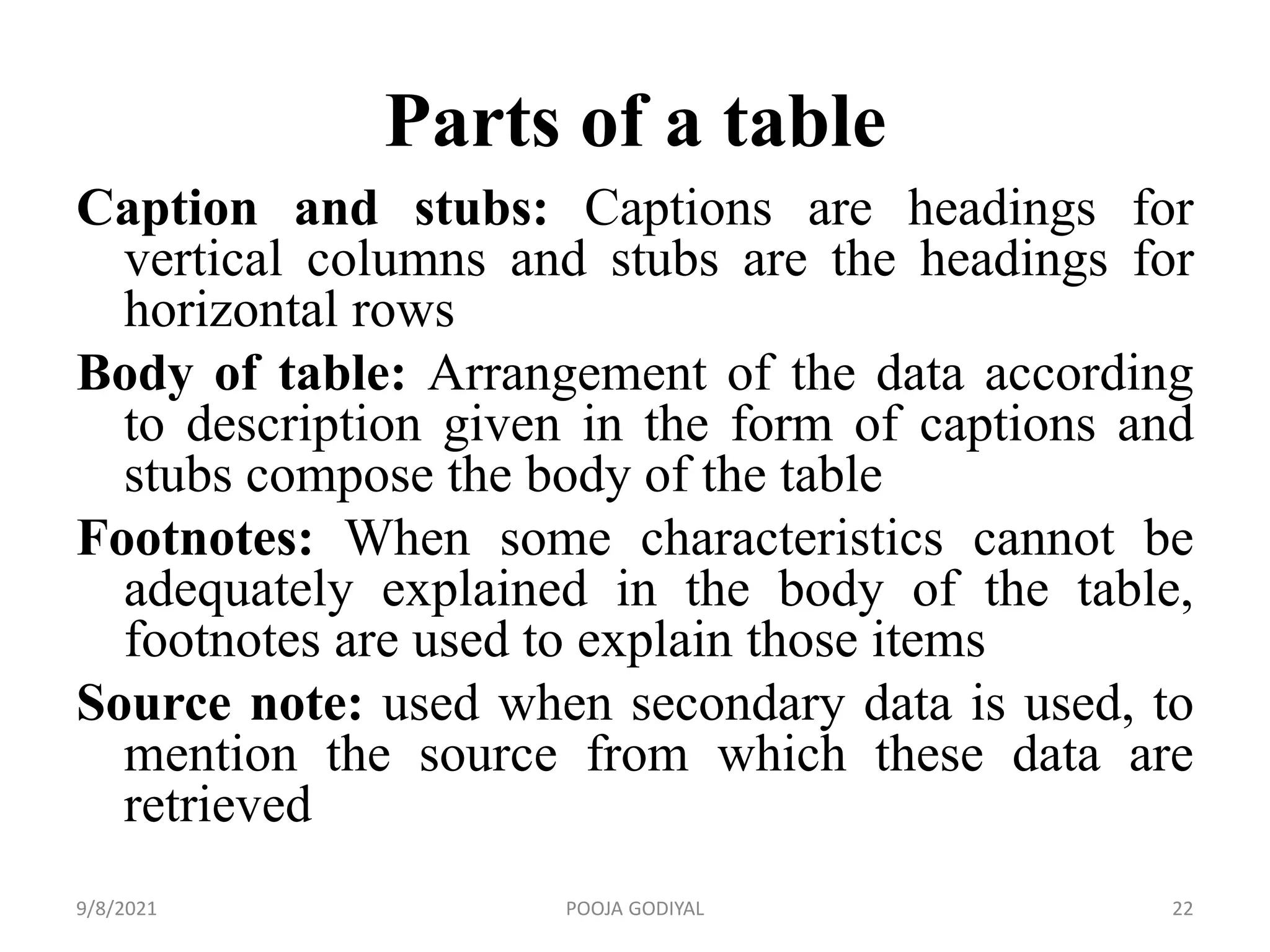
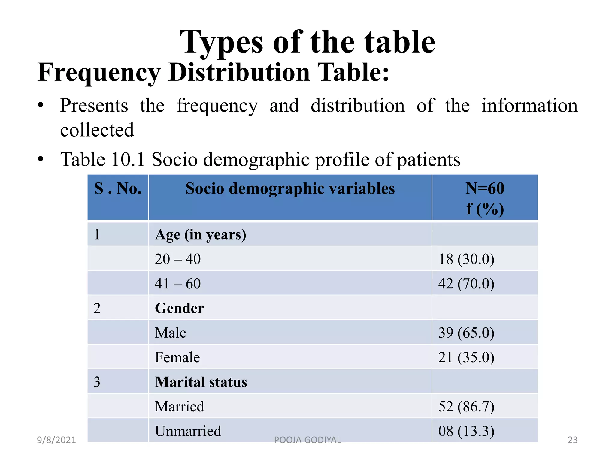
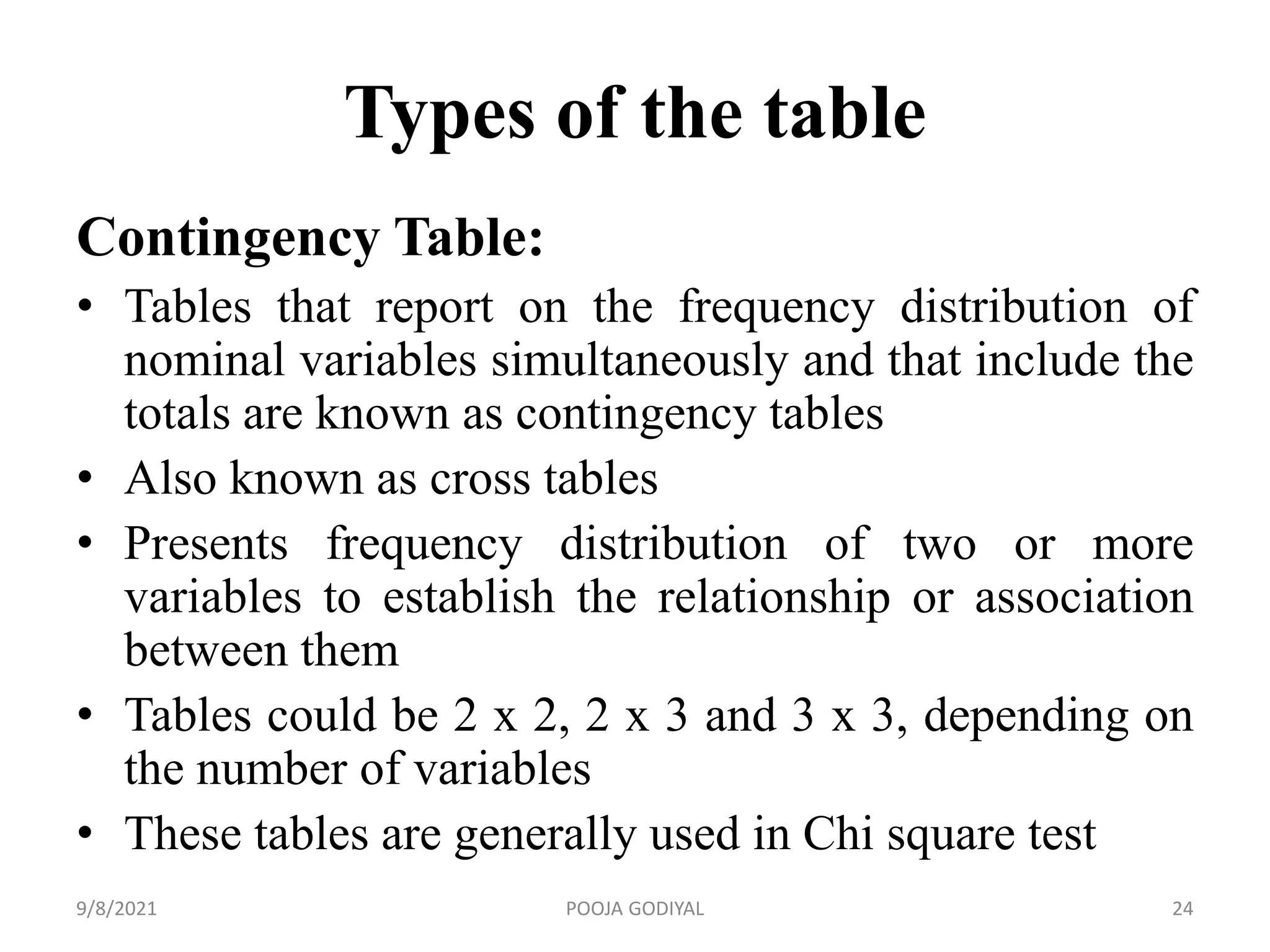
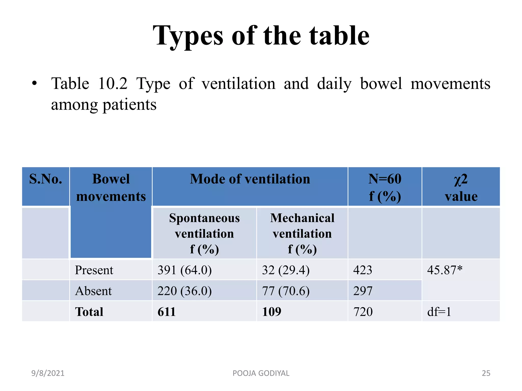
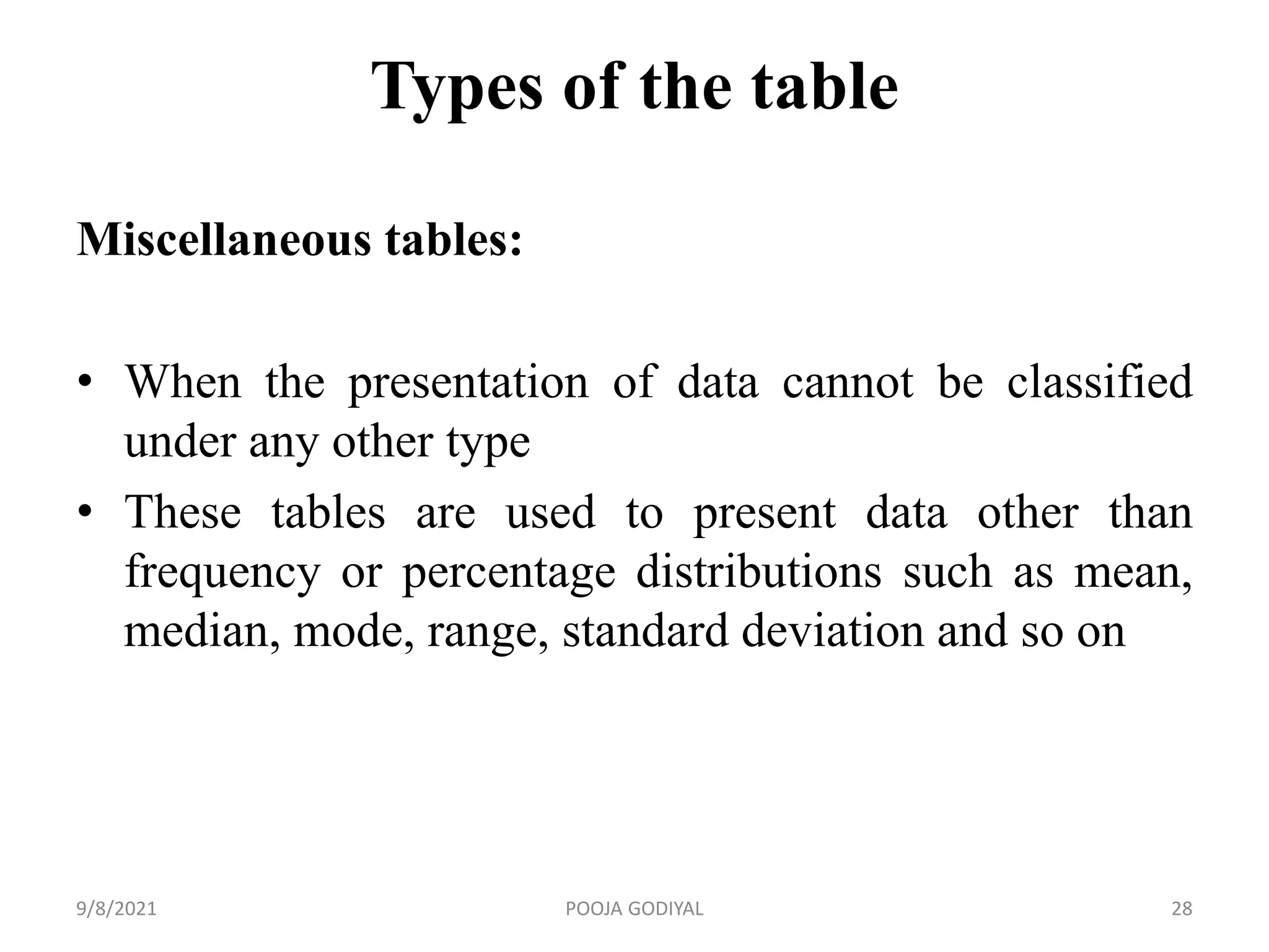
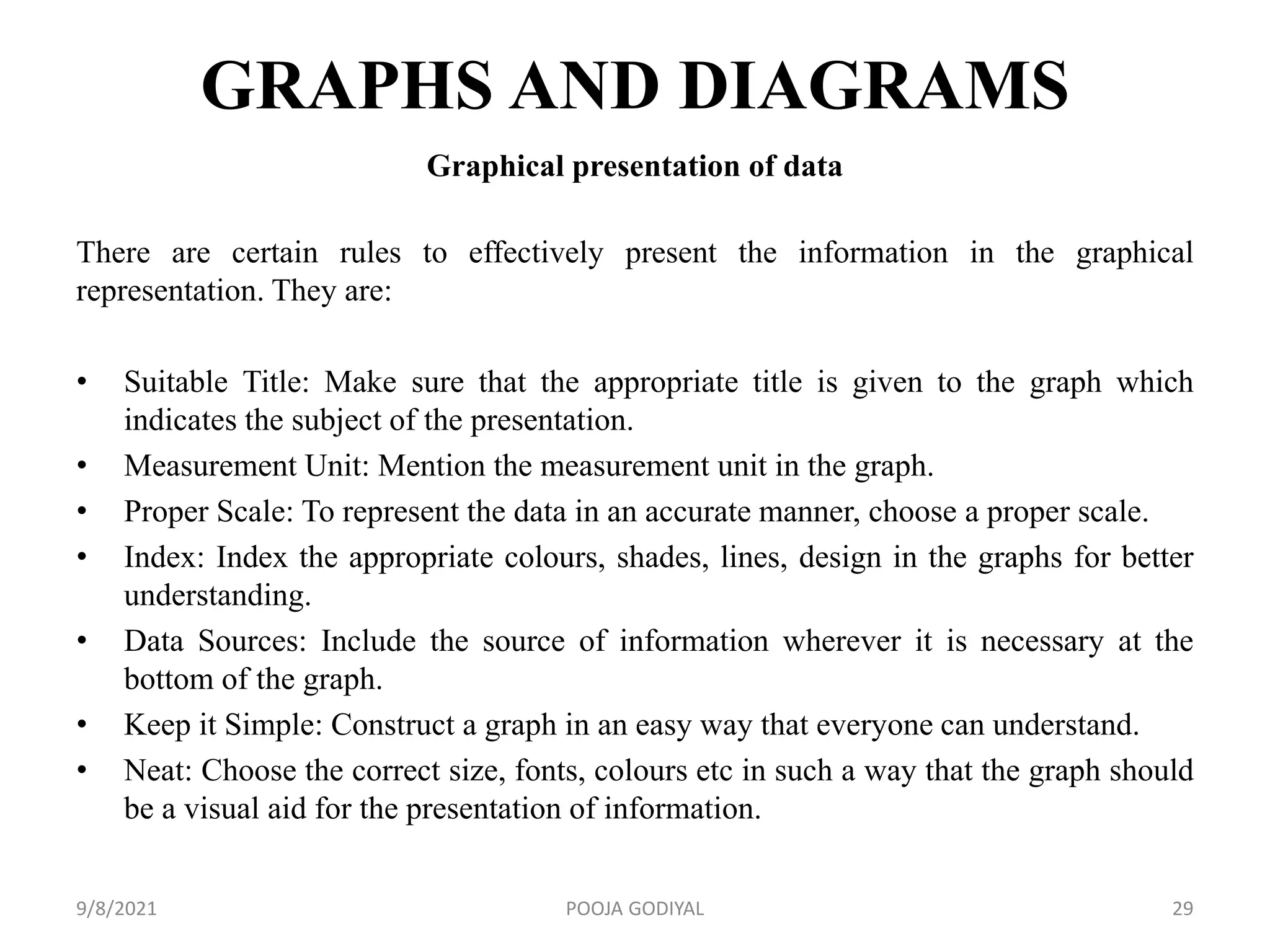
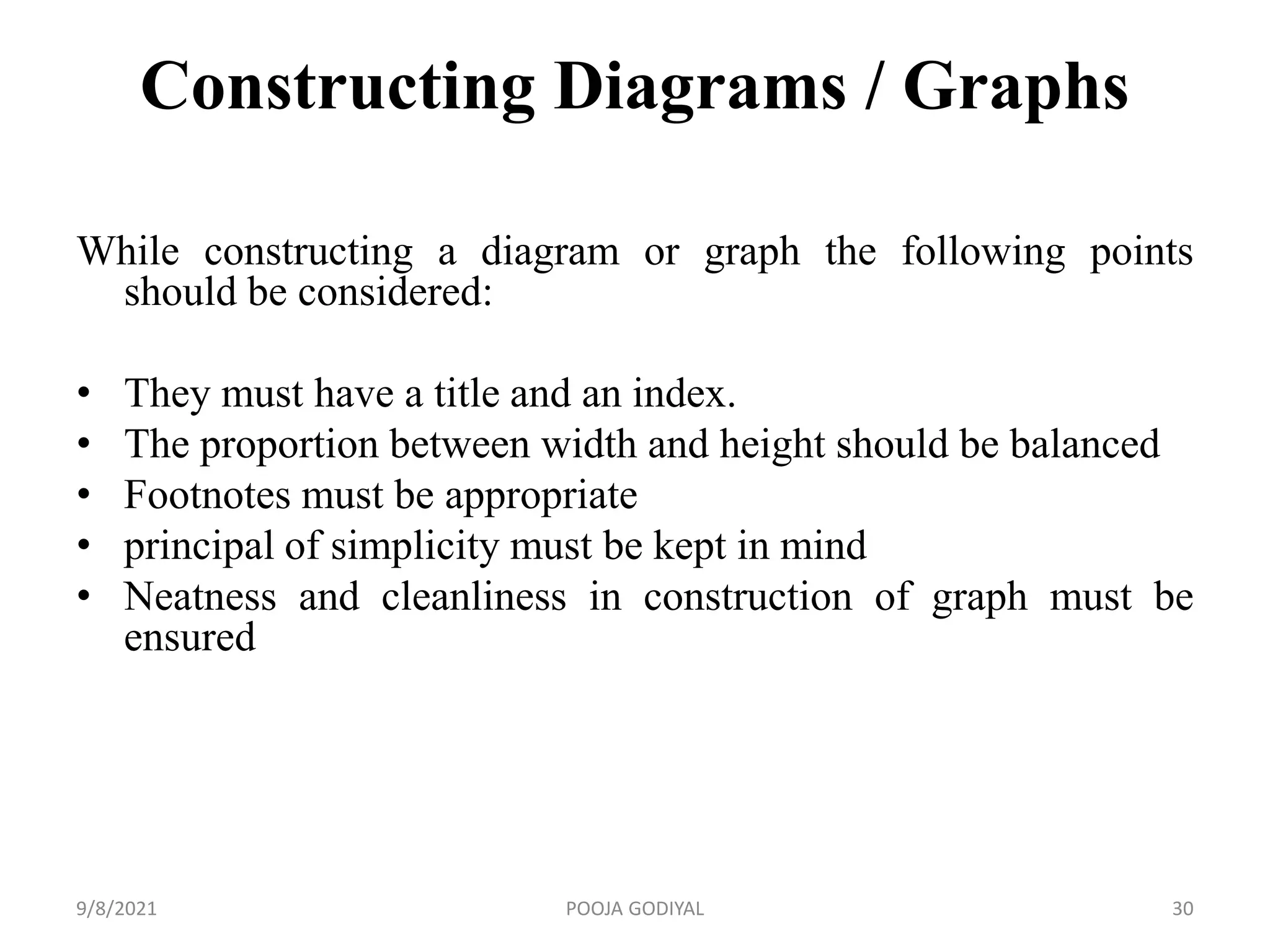
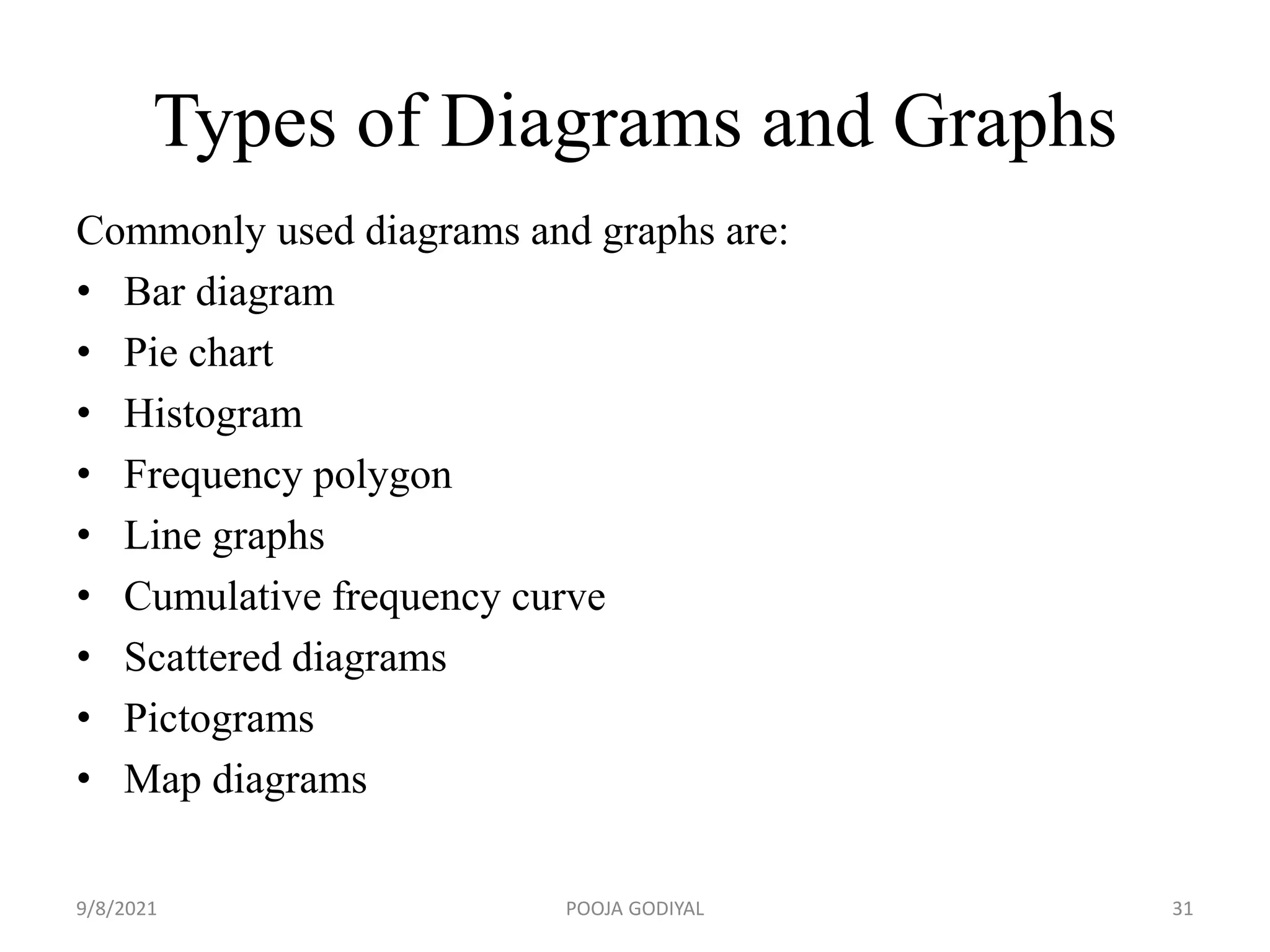
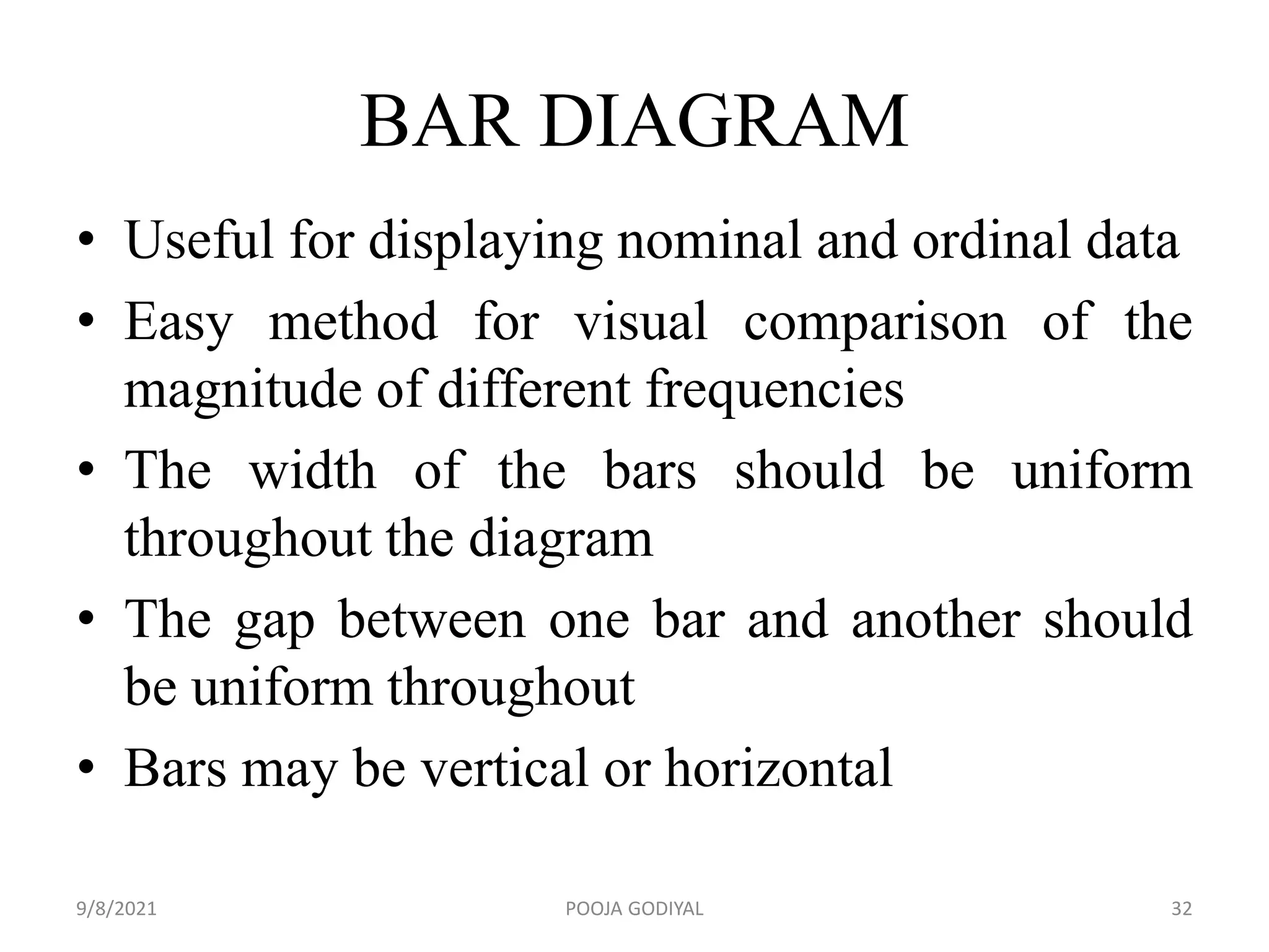
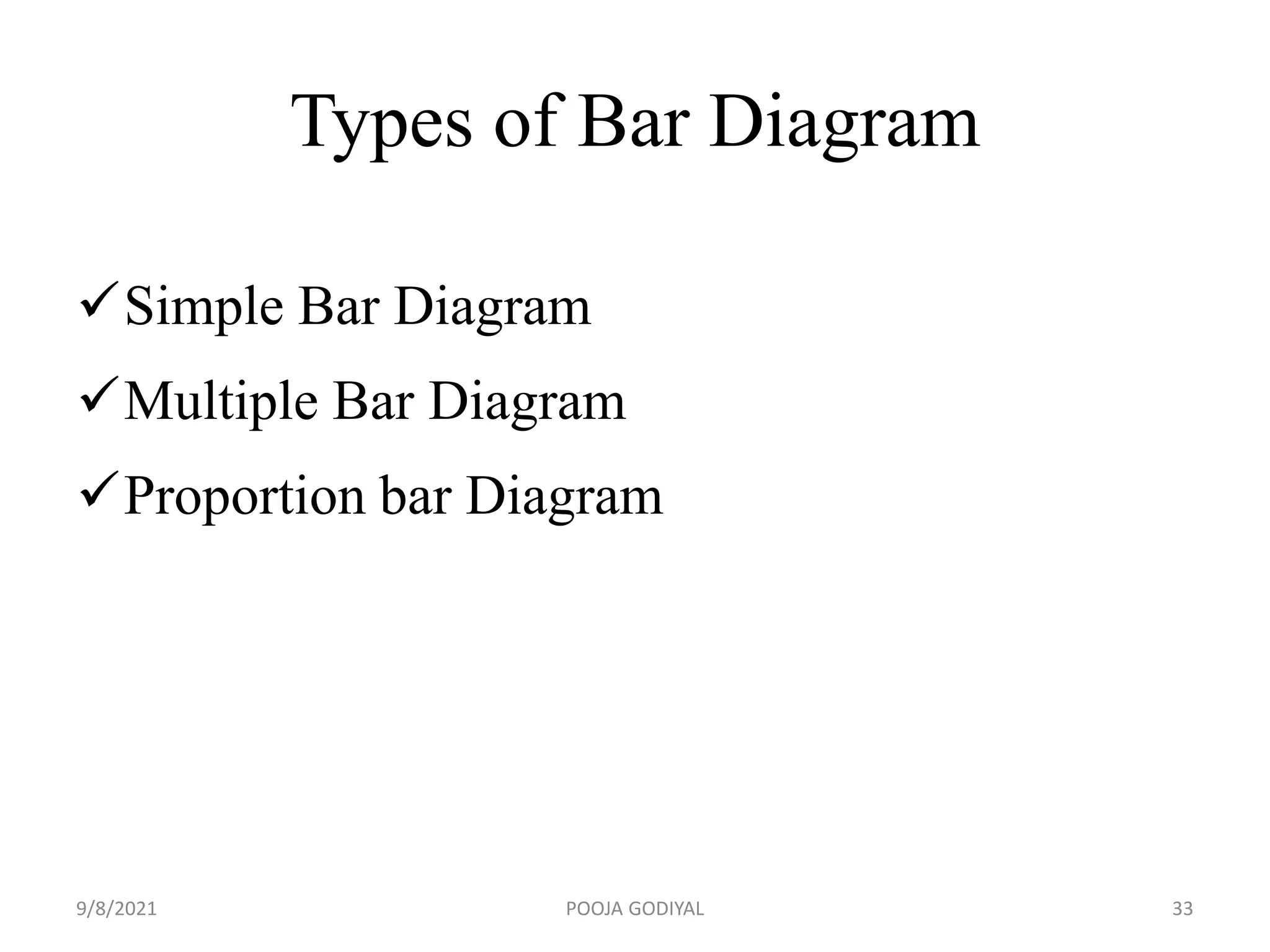
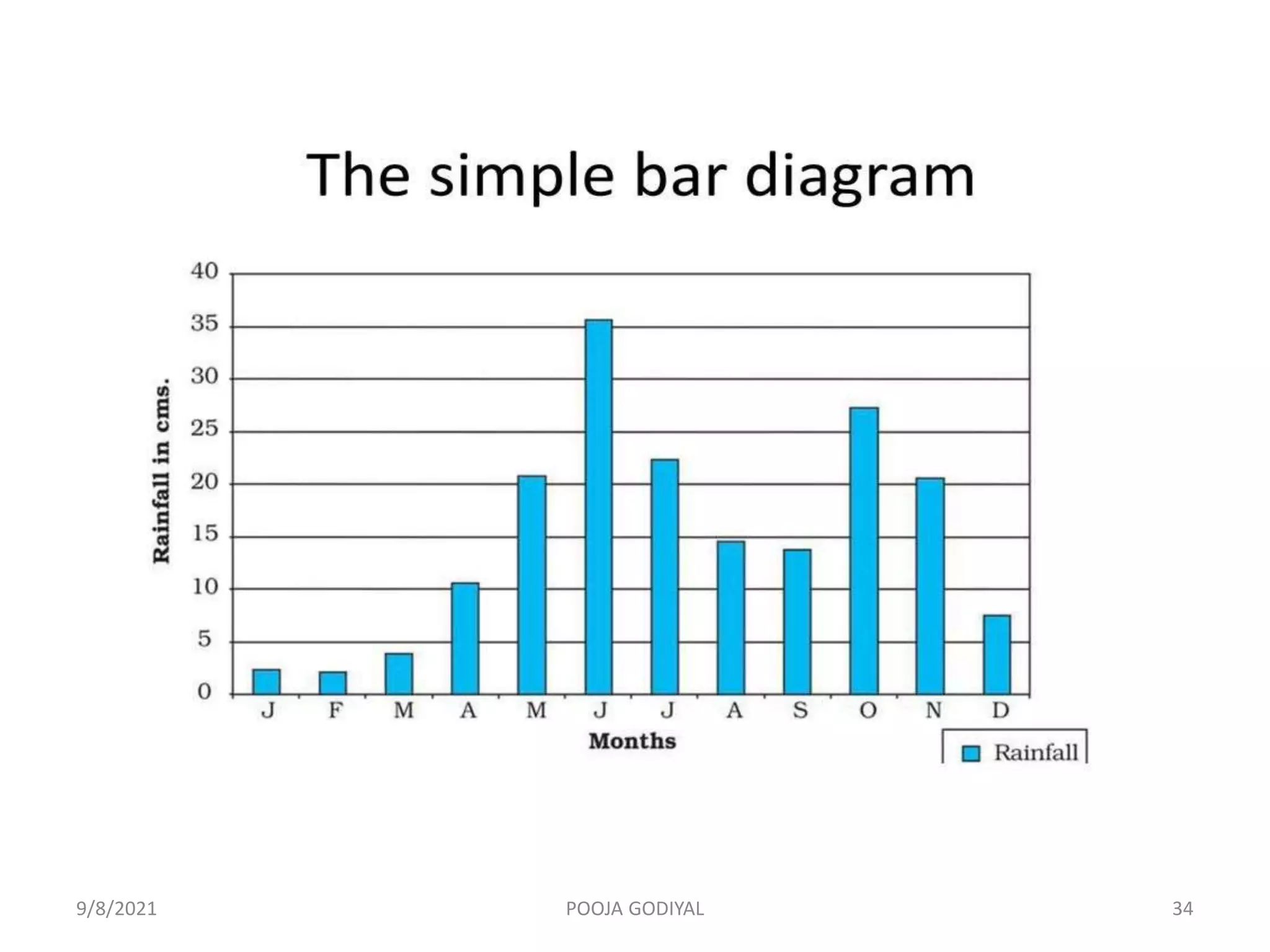
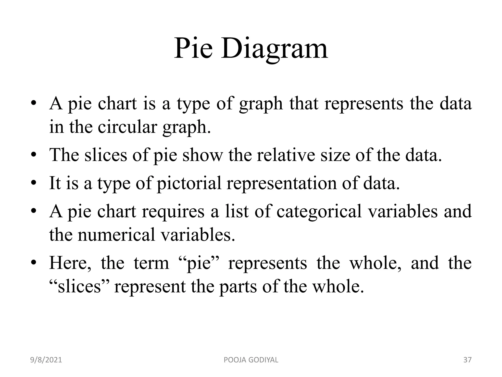
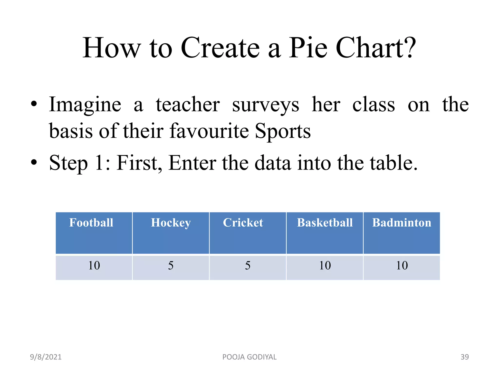
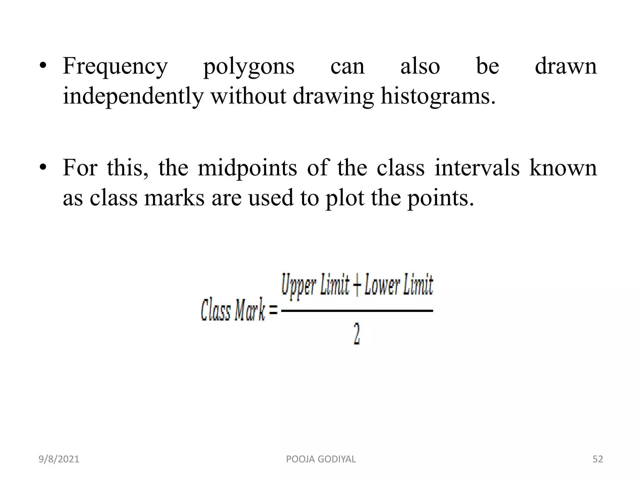
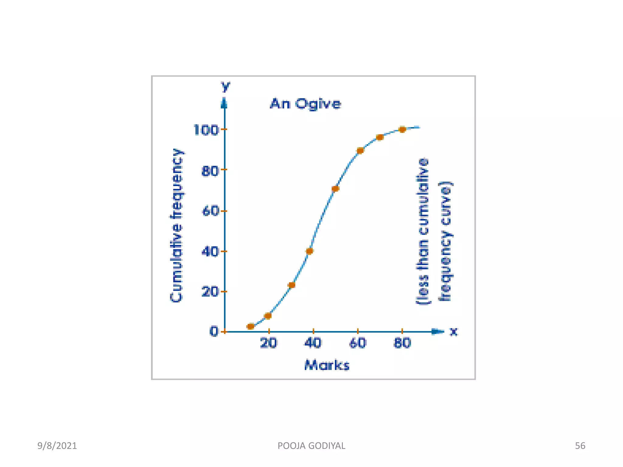
- Methods for condensing data including frequency distribution tables, contingency tables, and graphs.
Descriptive statistics offer nurse researchers valuable options for analysing and pre-senting large and complex sets of data, suggests Christine Hallett
Analysis of data
Generally Research analysis consists of two main steps :
Processing data.
Analysis of data
• The collected data may be adequate, valid and reliable to any extent. It does not serve any worth while purpose unless it is carefully edited, systematically classified, tabulated, scientifically analyzed, intelligently interpreted and rationally concluded.
I. Processing of data includes
Compilation
Editing
Coding
Classification
II. Analysis of Data
Normal provability curve is one of the important topic in the Educational research.The theory of parametric tests in the inferential statistics is completely based on the NPC. Every researcher must know the characteristics of the NPC.
Qualitative research is a systematic, interactive, subjective, approach used to describe life experience and give them meaning where as quantitative research is a formal, objective systematic process to describe, test relationships and examine cause and effect interaction among variables.
PUH 6301, Public Health Research 1 Course Learning OuTatianaMajor22
PUH 6301, Public Health Research 1
Course Learning Outcomes for Unit VI
Upon completion of this unit, students should be able to:
4. Evaluate strategies for data analysis to determine the best statistical tests needed for research
methods.
4.1 Determine the four levels of measurement as valid research statistical techniques in the public
health research process.
4.2 Explain why proper data and statistical analysis is important.
4.3 Describe the basic types of statistic tests.
Course/Unit
Learning Outcomes
Learning Activity
4.1
Unit Lesson
Chapter 28
Chapter 29
Chapter 30
Chapter 31
Chapter 33
Blog: “Descriptive vs. Inferential Statistics: What’s the Difference?
Unit VI Essay
4.2
Unit Lesson
Chapter 28
Unit VI Essay
4.3
Unit Lesson
Chapter 29
Unit VI Essay
Required Unit Resources
Chapter 28: Data Management
Chapter 29: Descriptive Statistics
Chapter 30: Comparative Statistics
Chapter 31: Regression Analysis
Chapter 33: Additional Analysis Tools
In order to access the following resource, click the link below:
The website below provides a good summary of how the public health researcher can use descriptive and
inferential statistics methods to conduct public health research.
Market Research Guy. (2011, December 1). Descriptive vs. inferential statistics: What’s the difference? [Blog
post]. http://www.mymarketresearchmethods.com/descriptive-inferential-statistics-difference/
UNIT VI STUDY GUIDE
Data Analysis Plan
http://www.mymarketresearchmethods.com/descriptive-inferential-statistics-difference/
PUH 6301, Public Health Research 2
UNIT x STUDY GUIDE
Title
Unit Lesson
Introduction
This unit covers the statistical procedures used to analyze the data collected from research tools. During this
stage of research, you may begin to draw conclusions and be able to answer the research question(s) and
sub-question(s) you developed in Unit I. Use statistics in this stage of research to manipulate the data and
make it understandable for others to read. Shi (2008) encourages researchers to know and understand basic
statistics and statistical procedures. The data analysis phase of research is important because it makes sense
of the data that can be used for future research studies (Jacobsen, 2021).
Data Management
Data management is the entire process of keeping a record of all the results of clinical assessments
conducted during a research study (Jacobsen, 2021). Record keeping includes listing details on potential
articles, pulling information from patient charts, tracking responses from surveys, or recording assessment
results from cohorts or studies. It is vital that those responsible for collecting and keeping data maintain
confidentiality and the integrity of data sets from all outside sources. Once researchers enter the data into the
spreadsheet or database, the data should be recoded and double-checked prior to beginning statistical
ana ...
Presentation is made by the student of M.phil Jameel Ahmed Qureshi Faculty of Education Elsa Kazi campus Hyderabad UoS Jamshoron, This presentation is an assignment assign by the Dr. Mumtaz Khwaja
This presentation on Introduction to Statistics helps Engineering students to review the fundamental topics of statistics. It is according tl syllabus of Institute of Engineering (IOE) but is similar to that of almost all the engineering colleges.
Results & Discussion Dr Ali Samer- 2020'Ali Muhsan
This is a chapter of the thesis or dissertation that presents the finding and outcomes of research, and reasons for that particular result in form of Text, Figures, Tables, Graphics and Charts.
Research methodology - Analysis of DataThe Stockker
Processing & Analysis of Data, Data editing, Benefits of data editing, Data coding, Classification of data, CLASSIFICATION ACCORDING THE ATTRIBUTES, CLASSIFICATION ON THE BASIS OF INTERVAL, TABULATION of data, Types of tables, Graphing of data, Bar chart, Pie chart, Line graph, histogram, Polygon / ogive, Analysis of Data, Descriptive Analysis, Uni-Variate Analysis, Bivariate Analysis, Multi-Variate Analysis, Causal Analysis, Inferential Analysis, PARAMETRIC TESTS, Non parametric Test,
Palestine last event orientationfvgnh .pptxRaedMohamed3
An EFL lesson about the current events in Palestine. It is intended to be for intermediate students who wish to increase their listening skills through a short lesson in power point.
The Roman Empire A Historical Colossus.pdfkaushalkr1407
The Roman Empire, a vast and enduring power, stands as one of history's most remarkable civilizations, leaving an indelible imprint on the world. It emerged from the Roman Republic, transitioning into an imperial powerhouse under the leadership of Augustus Caesar in 27 BCE. This transformation marked the beginning of an era defined by unprecedented territorial expansion, architectural marvels, and profound cultural influence.
The empire's roots lie in the city of Rome, founded, according to legend, by Romulus in 753 BCE. Over centuries, Rome evolved from a small settlement to a formidable republic, characterized by a complex political system with elected officials and checks on power. However, internal strife, class conflicts, and military ambitions paved the way for the end of the Republic. Julius Caesar’s dictatorship and subsequent assassination in 44 BCE created a power vacuum, leading to a civil war. Octavian, later Augustus, emerged victorious, heralding the Roman Empire’s birth.
Under Augustus, the empire experienced the Pax Romana, a 200-year period of relative peace and stability. Augustus reformed the military, established efficient administrative systems, and initiated grand construction projects. The empire's borders expanded, encompassing territories from Britain to Egypt and from Spain to the Euphrates. Roman legions, renowned for their discipline and engineering prowess, secured and maintained these vast territories, building roads, fortifications, and cities that facilitated control and integration.
The Roman Empire’s society was hierarchical, with a rigid class system. At the top were the patricians, wealthy elites who held significant political power. Below them were the plebeians, free citizens with limited political influence, and the vast numbers of slaves who formed the backbone of the economy. The family unit was central, governed by the paterfamilias, the male head who held absolute authority.
Culturally, the Romans were eclectic, absorbing and adapting elements from the civilizations they encountered, particularly the Greeks. Roman art, literature, and philosophy reflected this synthesis, creating a rich cultural tapestry. Latin, the Roman language, became the lingua franca of the Western world, influencing numerous modern languages.
Roman architecture and engineering achievements were monumental. They perfected the arch, vault, and dome, constructing enduring structures like the Colosseum, Pantheon, and aqueducts. These engineering marvels not only showcased Roman ingenuity but also served practical purposes, from public entertainment to water supply.
This is a presentation by Dada Robert in a Your Skill Boost masterclass organised by the Excellence Foundation for South Sudan (EFSS) on Saturday, the 25th and Sunday, the 26th of May 2024.
He discussed the concept of quality improvement, emphasizing its applicability to various aspects of life, including personal, project, and program improvements. He defined quality as doing the right thing at the right time in the right way to achieve the best possible results and discussed the concept of the "gap" between what we know and what we do, and how this gap represents the areas we need to improve. He explained the scientific approach to quality improvement, which involves systematic performance analysis, testing and learning, and implementing change ideas. He also highlighted the importance of client focus and a team approach to quality improvement.
The French Revolution, which began in 1789, was a period of radical social and political upheaval in France. It marked the decline of absolute monarchies, the rise of secular and democratic republics, and the eventual rise of Napoleon Bonaparte. This revolutionary period is crucial in understanding the transition from feudalism to modernity in Europe.
For more information, visit-www.vavaclasses.com
How to Split Bills in the Odoo 17 POS ModuleCeline George
Bills have a main role in point of sale procedure. It will help to track sales, handling payments and giving receipts to customers. Bill splitting also has an important role in POS. For example, If some friends come together for dinner and if they want to divide the bill then it is possible by POS bill splitting. This slide will show how to split bills in odoo 17 POS.
Students, digital devices and success - Andreas Schleicher - 27 May 2024..pptxEduSkills OECD
Andreas Schleicher presents at the OECD webinar ‘Digital devices in schools: detrimental distraction or secret to success?’ on 27 May 2024. The presentation was based on findings from PISA 2022 results and the webinar helped launch the PISA in Focus ‘Managing screen time: How to protect and equip students against distraction’ https://www.oecd-ilibrary.org/education/managing-screen-time_7c225af4-en and the OECD Education Policy Perspective ‘Students, digital devices and success’ can be found here - https://oe.cd/il/5yV
Read| The latest issue of The Challenger is here! We are thrilled to announce that our school paper has qualified for the NATIONAL SCHOOLS PRESS CONFERENCE (NSPC) 2024. Thank you for your unwavering support and trust. Dive into the stories that made us stand out!
2. Introduction
• Important phase of research process
• Involves computation of certain measures
along with searching for patterns of
relationship that exists among groups
9/8/2021 2
POOJA GODIYAL
3. Introduction
• Data collection is followed by the analysis and
interpretation of data, where collected data are
analysed and interpreted in accordance with study
objectives
• Analysis and interpretation of data includes
compilation
editing
coding
classification
presentation of data
9/8/2021 3
POOJA GODIYAL
4. Definition
• Analysis is the process of organizing and
synthesizing the data so as to answer the
research questions and test hypothesis
Purpose
• To describe the data in meaningful terms
• To analyze the data so that patterns of
relationship can be detected
9/8/2021 4
POOJA GODIYAL
5. Steps of Quantitative Data Analysis
1. Data preparation: Involves following steps
Compilation: Includes gathering all the collected
data and arranging it in orderly manner
Editing: Involves checking the gathered data for
accuracy, utility and completeness
Coding: Numerous replies can be reduced to a small
number of classes through coding
• Code is an abbreviation, a symbol, a number or
an alphabet which is assigned by the researcher
to every schedule item
9/8/2021 5
POOJA GODIYAL
6. Steps of Quantitative Data Analysis
Classification: divide and arrange the entire data
into the different categories, groups or classes on
the basis of common characteristics
Tabulation: Involves orderly arrangement of data in
columns and rows
2. Describing the data: Descriptive statistics are
used to describe the basic features of data and to
provide simple summaries about the sample
Percentage, means of central tendency and means of
dispersion are the examples of descriptive
statistics
9/8/2021 6
POOJA GODIYAL
7. Steps of Quantitative Data Analysis
3. Drawing the inferences of data: Inferential
statistics helps in drawing inferences from the
data
For example, finding the difference, relationship
and association between two more variables
by the help of parametric and non parametric
statistical tests
4. Interpretation of data: Refers to critical
examination of the analyzed study results to
draw inferences and conclusions
9/8/2021 7
POOJA GODIYAL
8. SCALES OF MEASUREMENTS
• Measurement is the assignment of numbers to
objects according to specific rules, to
characterize quantities of attribute
There are four level of measurements:
Nominal measurement
Ordinal measurement
Interval measurement
Ratio measurement
9/8/2021 8
POOJA GODIYAL
9. PROPERTIES OF
MEASUREMENT SCALE
Identity: Each value on the measurement scale has
a unique meaning
Magnitude: Value on the measurement scale have
an ordered relationship to one another. That is
some values are larger and some are smaller
Equal intervals: Scale units along the scale are
equal to one another. This means, for example,
that the difference between 1 and 2 would be
equal to the difference between 19 and 20
A minimum value of zero: the scale has a true zero
point, below which no values exist
9/8/2021 9
POOJA GODIYAL
10. NOMINAL LEVEL MEASUREMENT
• Lowest of the four levels of measurement
• Only satisfies the identity property of
measurement
• Consists of categories that are not more or
less than each other but are different from one
another in some way
• They have no quantitative values
• For example: Gender: Male, Female
• Habitat: Urban, Rural, Slums
9/8/2021 10
POOJA GODIYAL
11. ORDINAL LEVEL MEASUREMENT
• Has the property of both identity and magnitude
• Each value on the ordinal scale has a unique
meaning, and it has an ordered relationship to
every other value on the scale
• Rank objects based on their relative standing on
a specific attribute
• For example: Health status: Poor, Fair,Good
• Income status: Low income, Middle income,
Upper income
• Central tendency: Median
9/8/2021 11
POOJA GODIYAL
12. INTERVAL LEVEL
MEASUREMENT
• Has the property of identity, magnitude and equal
intervals
• There is more or less, equal numerical distance
between intervals
• For example: Fahrenheit scale to measure temperature
• This scale is made up of equal temperature units, so
that the difference between 40 and 50 degrees
Fahrenheit is equal to the difference between 50 and
60 degrees Fahrenheit
• With an interval scale, you know not only whether
different values are bigger or smaller, you also know
how much bigger or smaller they are
9/8/2021 12
POOJA GODIYAL
13. INTERVAL LEVEL
MEASUREMENT
• For example, suppose it is 60 degrees
Fahrenheit on Monday and 70 degrees on
Tuesday. You know not only that it was hotter
on Tuesday, you also know that it was 10
degrees hotter
• Central tendency:
9/8/2021 13
POOJA GODIYAL
14. RATIO LEVEL MEASUREMENT
• It is the highest level of measurement
• Satisfies all four properties of measurement
• For example: Each value on the weight scale has
a unique meaning, weights can be rank ordered,
units along the weight scale are equal to one
another, and the scale has a minimum value of
zero
• Weight scale have a minimum value of zero
because objects at rest can be weightless, but
they cannot have negative weight
• Central tendency:
9/8/2021 14
POOJA GODIYAL
15. Solve the problem
• Which of the following measurement properties
is satisfied by the centigrade scale?
1. Magnitude
2. Equal intervals
3. A minimum value of zero
A) 1 only
B) 2 only
C) 3 only
D) 1 and 2 only
E) 2 and 3 only
9/8/2021 15
POOJA GODIYAL
16. DESCRIPTIVE STATISTICS
• Used to organize and summarize the data to
draw meaningful interpretations
Classification
• Measures to condense data
Frequency and percentage distribution
Tabulation
Graphic presentations
9/8/2021 16
POOJA GODIYAL
17. DESCRIPTIVE STATISTICS
• Measures of central tendency
• Measures of dispersion
• Measures of relationship (correlation
coefficient)
9/8/2021 17
POOJA GODIYAL
18. MEASURES TO CONDENSE
DATA
• An appropriate presentation of data involves
organization of data in such a manner that
meaningful conclusions and inferences can
drawn to answer the research question
9/8/2021 18
POOJA GODIYAL
19. TABLES
• First step before data can be used for further
statistical analysis and interpretation
• Tabulation means the systematic presentation of
the information contained in the data in rows and
columns
General principles of tabulation
• Table should be precise, understandable and self
explanatory
• Every table should have title
• Title must describe the content clearly and
precisely
9/8/2021 19
POOJA GODIYAL
20. TABLES
• Items should be arranged alphabetically or
according to size, importance and causal
relationship to facilitate comparison
• The unit of measurement must be clearly
stated
• Totals can be placed at the bottom of the
column
• Two or three small tables are to be preferred to
one large one
9/8/2021 20
POOJA GODIYAL
21. Parts of a table
A good statistical table must contain:
Table number: It should be placed at the top of
the table
Title: Should be brief, concise and self
explanatory
Subheads: Should be given below the title in a
prominent type usually enclosed in brackets
for further description of the content of the
table
9/8/2021 21
POOJA GODIYAL
22. Parts of a table
Caption and stubs: Captions are headings for
vertical columns and stubs are the headings for
horizontal rows
Body of table: Arrangement of the data according
to description given in the form of captions and
stubs compose the body of the table
Footnotes: When some characteristics cannot be
adequately explained in the body of the table,
footnotes are used to explain those items
Source note: used when secondary data is used, to
mention the source from which these data are
retrieved
9/8/2021 22
POOJA GODIYAL
23. Types of the table
Frequency Distribution Table:
• Presents the frequency and distribution of the information
collected
• Table 10.1 Socio demographic profile of patients
S . No. Socio demographic variables N=60
f (%)
1 Age (in years)
20 – 40 18 (30.0)
41 – 60 42 (70.0)
2 Gender
Male 39 (65.0)
Female 21 (35.0)
3 Marital status
Married 52 (86.7)
Unmarried 08 (13.3)
9/8/2021 23
POOJA GODIYAL
24. Types of the table
Contingency Table:
• Tables that report on the frequency distribution of
nominal variables simultaneously and that include the
totals are known as contingency tables
• Also known as cross tables
• Presents frequency distribution of two or more
variables to establish the relationship or association
between them
• Tables could be 2 x 2, 2 x 3 and 3 x 3, depending on
the number of variables
• These tables are generally used in Chi square test
9/8/2021 24
POOJA GODIYAL
25. Types of the table
• Table 10.2 Type of ventilation and daily bowel movements
among patients
S.No. Bowel
movements
Mode of ventilation N=60
f (%)
χ2
value
Spontaneous
ventilation
f (%)
Mechanical
ventilation
f (%)
Present 391 (64.0) 32 (29.4) 423 45.87*
Absent 220 (36.0) 77 (70.6) 297
Total 611 109 720 df=1
9/8/2021 25
POOJA GODIYAL
26. Types of the table
• Multiple Response Tables: When classification of the
cases is to be done into categories that are neither
exclusive nor exhaustive (observation cannot be beyond
these categories), a multiple response table is used
• For example, a patient can have two or more
complaints. In such cases sum total of frequencies
would exceed the total number of subjects and
may lead to confusion
• Therefore, the total number of subjects in cases of
multiple responses is given as base, and from this
we calculate the percentages.
9/8/2021 26
POOJA GODIYAL
27. Types of the table
• Table 10.3 Factors contributing to sleep deprivation among
patients
• * Each patient has more than one factor
S.No. Factors* N=60
f (%)
1 Blood sampling 35 (58.3)
2 Diagnostic test 33 (55.0)
3 Medication 33 (55.0)
4 Vital signs monitoring 32 (53.3)
5 Noise 32 (53.3)
6 Bright lights 30 (50.0)
9/8/2021 27
POOJA GODIYAL
28. Types of the table
Miscellaneous tables:
• When the presentation of data cannot be classified
under any other type
• These tables are used to present data other than
frequency or percentage distributions such as mean,
median, mode, range, standard deviation and so on
9/8/2021 28
POOJA GODIYAL
29. GRAPHS AND DIAGRAMS
Graphical presentation of data
There are certain rules to effectively present the information in the graphical
representation. They are:
• Suitable Title: Make sure that the appropriate title is given to the graph which
indicates the subject of the presentation.
• Measurement Unit: Mention the measurement unit in the graph.
• Proper Scale: To represent the data in an accurate manner, choose a proper scale.
• Index: Index the appropriate colours, shades, lines, design in the graphs for better
understanding.
• Data Sources: Include the source of information wherever it is necessary at the
bottom of the graph.
• Keep it Simple: Construct a graph in an easy way that everyone can understand.
• Neat: Choose the correct size, fonts, colours etc in such a way that the graph should
be a visual aid for the presentation of information.
9/8/2021 29
POOJA GODIYAL
30. Constructing Diagrams / Graphs
While constructing a diagram or graph the following points
should be considered:
• They must have a title and an index.
• The proportion between width and height should be balanced
• Footnotes must be appropriate
• principal of simplicity must be kept in mind
• Neatness and cleanliness in construction of graph must be
ensured
9/8/2021 30
POOJA GODIYAL
31. Types of Diagrams and Graphs
Commonly used diagrams and graphs are:
• Bar diagram
• Pie chart
• Histogram
• Frequency polygon
• Line graphs
• Cumulative frequency curve
• Scattered diagrams
• Pictograms
• Map diagrams
9/8/2021 31
POOJA GODIYAL
32. BAR DIAGRAM
• Useful for displaying nominal and ordinal data
• Easy method for visual comparison of the
magnitude of different frequencies
• The width of the bars should be uniform
throughout the diagram
• The gap between one bar and another should
be uniform throughout
• Bars may be vertical or horizontal
9/8/2021 32
POOJA GODIYAL
33. Types of Bar Diagram
Simple Bar Diagram
Multiple Bar Diagram
Proportion bar Diagram
9/8/2021 33
POOJA GODIYAL
37. Pie Diagram
• A pie chart is a type of graph that represents the data
in the circular graph.
• The slices of pie show the relative size of the data.
• It is a type of pictorial representation of data.
• A pie chart requires a list of categorical variables and
the numerical variables.
• Here, the term “pie” represents the whole, and the
“slices” represent the parts of the whole.
9/8/2021 37
POOJA GODIYAL
38. Formula
To work out with the percentage for a pie chart, follow the steps given
below:
• Categorize the data
• Calculate the total
• Divide the categories
• Convert into percentages
• Finally, calculate the degrees
• Therefore, the pie chart formula is given as
• (Given Data/Total value of Data) × 360°
9/8/2021 38
POOJA GODIYAL
39. How to Create a Pie Chart?
• Imagine a teacher surveys her class on the
basis of their favourite Sports
• Step 1: First, Enter the data into the table.
Football Hockey Cricket Basketball Badminton
10 5 5 10 10
9/8/2021 39
POOJA GODIYAL
40. Step 2: Add all the values in the table to get the total.
• i.e. Total students are 40 in this case.
Step 3: Next, divide each value by the total and multiply
by 100 to get a per cent:
Football Hockey Cricket Basketball Badminton
(10/40) × 100
=25%
(5/ 40) × 100
=12.5%
(5/40) ×100
=12.5%
(10/ 40) ×100
=25%
(10/40)× 100
=25%
9/8/2021 40
POOJA GODIYAL
41. • Step 4: Next to know how many degrees for each “pie sector”
we need, we will take a full circle of 360° and follow the
calculations below:
• The central angle of each component = (Value of each
component/sum of values of all the components)✕360°
• Now you can draw a pie chart.
Football Hockey Cricket Basketball Badminton
(10/40) × 360°
=90°
(5/ 40) × 360°
=45°
(5/40) × 360°
=45°
(10/ 40) × 360°
=90°
(10/40) × 360°
=90°
9/8/2021 41
POOJA GODIYAL
42. • Step 5: Draw a circle and use the protractor to
measure the degree of each sector.
9/8/2021 42
POOJA GODIYAL
43. Histogram
• A histogram is a graphical representation of a
grouped frequency distribution with continuous
classes
• Histogram is a diagram involving rectangles whose
area is proportional to the frequency of a variable and
width is equal to the class interval.
9/8/2021 43
POOJA GODIYAL
45. How to Make Histogram?
You need to follow the below steps to construct a histogram.
• Begin by marking the class intervals on the X-axis and frequencies on the Y-
axis.
• The scales for both the axs have to be the same.
• Class intervals need to be exclusive.
• Draw rectangles with bases as class intervals and corresponding frequencies
as heights.
• A rectangle is built on each class interval since the class limits are marked on
the horizontal axis, and the frequencies are indicated on the vertical axis.
• The height of each rectangle is proportional to the corresponding class
frequency if the intervals are equal.
• The area of every individual rectangle is proportional to the corresponding
class frequency if the intervals are unequal.
9/8/2021 45
POOJA GODIYAL
46. Histogram Example
• Question: The following table gives the life times of
400 neon lamps. Draw the histogram for the below
data.
Lifetime (in hours) Number of lamps
300 – 400 14
400 – 500 56
500 – 600 60
600 – 700 86
700 – 800 74
800 – 900 62
900 – 1000 48
9/8/2021 46
POOJA GODIYAL
48. Frequency Polygon
• A frequency polygon is almost identical to a
histogram
• Frequency polygons are the pictorial or graphical
representation of data set
• It is used to compare sets of data or to display a
cumulative frequency distribution.
• Frequency polygons are a visually substantial method
of representing quantitative data and its frequencies.
9/8/2021 48
POOJA GODIYAL
49. Steps to Draw Frequency Polygon
To draw frequency polygons, first we need to draw histogram and then
follow the below steps:
Step 1- Choose the class interval and mark the values on the horizontal
axes
Step 2- Mark the mid value of each interval on the horizontal axes.
Step 3- Mark the frequency of the class on the vertical axes.
Step 4- Corresponding to the frequency of each class interval, mark a
point at the height in the middle of the class interval
Step 5- Connect these points using the line segment.
Step 6- The obtained representation is a frequency polygon.
9/8/2021 49
POOJA GODIYAL
50. Example
• Example 1: In a batch of 400
students, the height of
students is given in the
following table. Represent it
through a frequency
polygon. Height (cm) No. of students
(Frequency)
140 – 150 74
150 - 160 163
160 - 170 135
170 - 180 28
Total 400
9/8/2021 50
POOJA GODIYAL
51. Solution: Following steps are to be followed to
construct a histogram from the given data:
• The heights are represented on the horizontal axes on a suitable scale as
shown.
• The number of students is represented on the vertical axes on a suitable scale
as shown.
• Now rectangular bars of widths equal to the class- size and the length of the
bars corresponding to a frequency of the class interval is drawn.
• ABCDEF represents the given data graphically in form of frequency polygon as:
9/8/2021 51
POOJA GODIYAL
52. • Frequency polygons can also be drawn
independently without drawing histograms.
• For this, the midpoints of the class intervals known
as class marks are used to plot the points.
9/8/2021 52
POOJA GODIYAL
53. Line Graph
• It is mostly used where data is collected over a long
period of time
• On x-axis, values of independent variables are taken
and values of dependent variables are taken on y-
axis
9/8/2021 53
POOJA GODIYAL
54. Cumulative frequency curve or
Ogive
• This graph represents the data ofa cumulative
frequency distribution
• For drawing ogive, an ordinary frequency distribution
table is converted into cumulative frequency table
• The cumulative frequencies are then plotted
corresponding to the upper limits of the classes
• The points corresponding to cumulative frequency at
each upper limit of the classes are joined by a free
hand curve
• The diagram made is called Ogive
9/8/2021 54
POOJA GODIYAL
55. Height of 50 students
Height (cm) Frequency Cumulative
frequency
145 - 155 3 3
155 - 165 9 12
165 - 175 21 33
175 - 185 13 46
185 - 195 4 50
9/8/2021 55
POOJA GODIYAL
57. Scattered or Dotted diagram
• It is a graphic presentation that shows the nature
of correlation between two variable characters x
and y on the similar features or characteristics
• E.g. height and weight in men 20yrs old
9/8/2021 57
POOJA GODIYAL
58. Scattered or Dotted diagram
• The following table gives the height and weight of 10
students in a class
Height
(cm)
180 150 158 165 175 163 145 195 180 155
Weight
(Kg)
65 154 55 61 60 54 50 63 65 50
9/8/2021 58
POOJA GODIYAL
60. Pictograms or Picture diagram
• This method is used to impress the frequency of the
occurence of events to common people, such as
attacks, deaths, number of operations, admissions,
accidents etc.
9/8/2021 60
POOJA GODIYAL
61. Map diagram or Spot map
• These maps are
prepared to show
geographical
distribution of
frequency of
characteristics
9/8/2021 61
POOJA GODIYAL