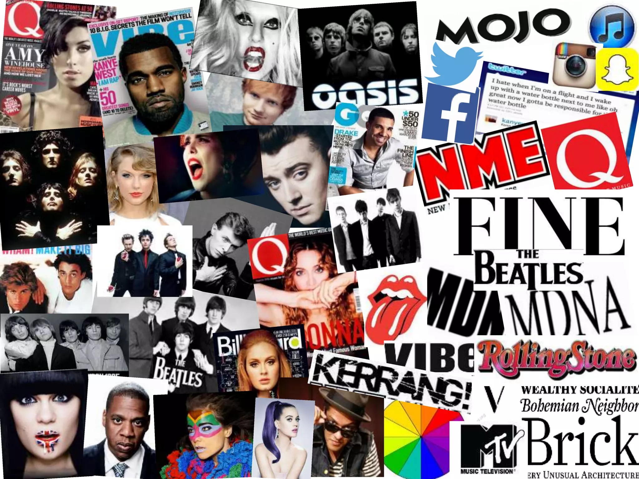
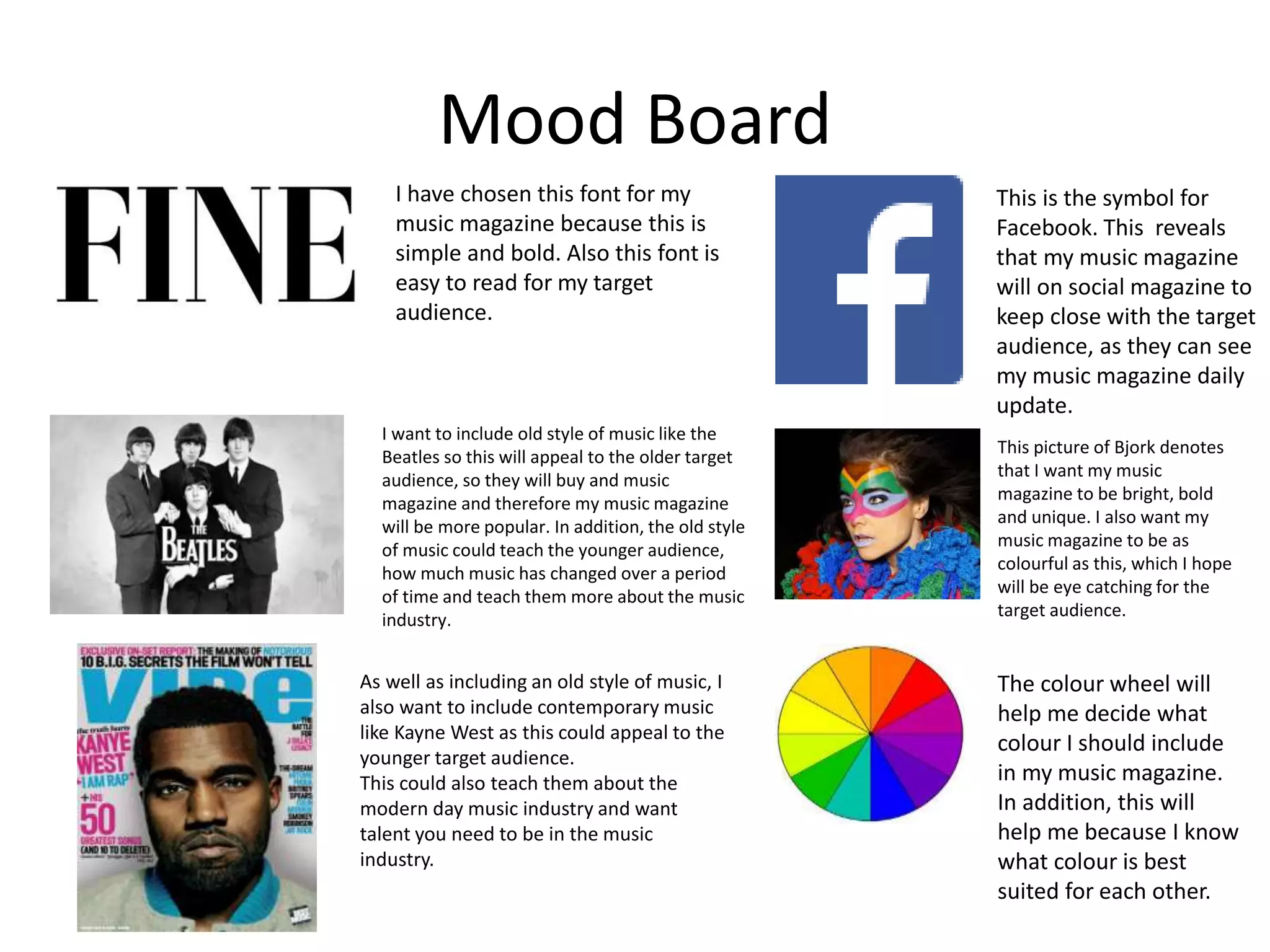
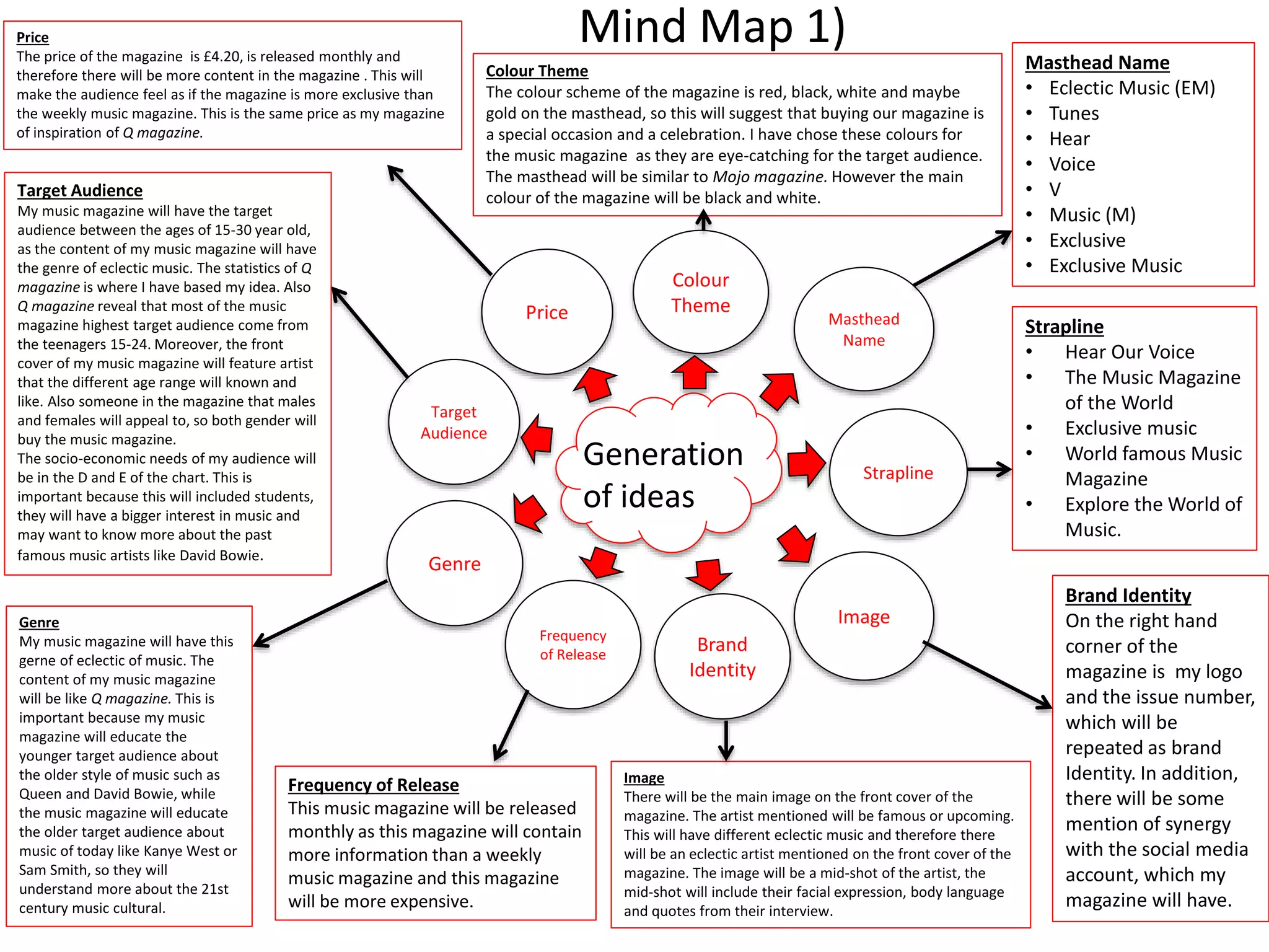
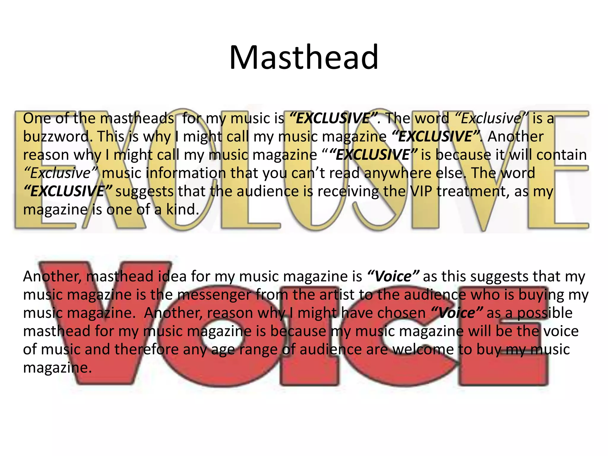
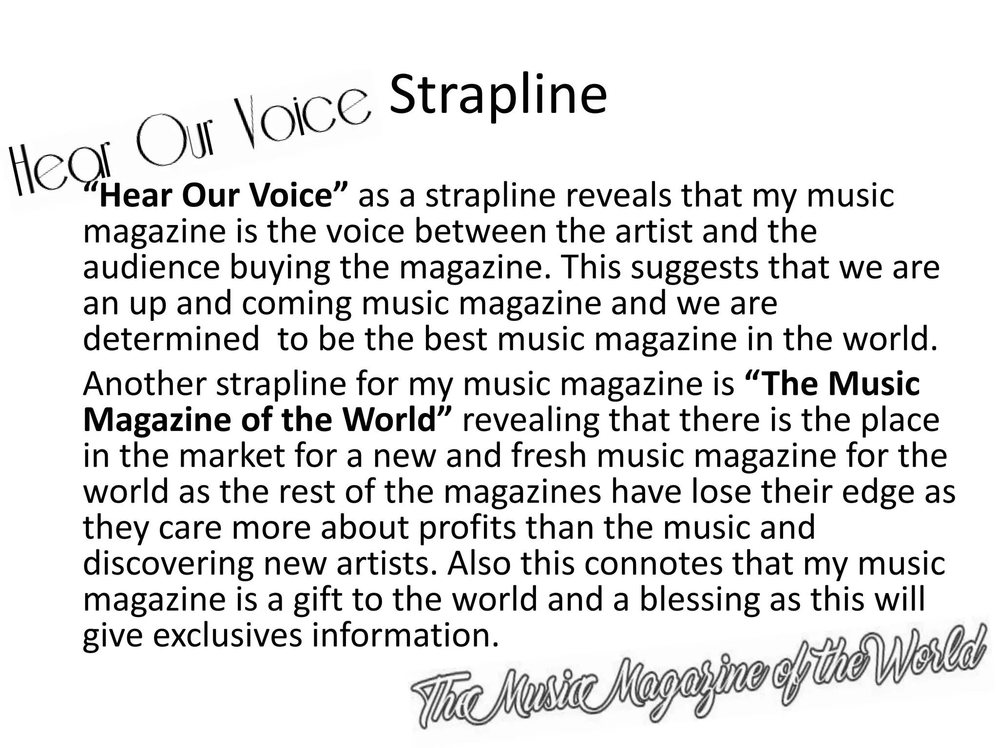
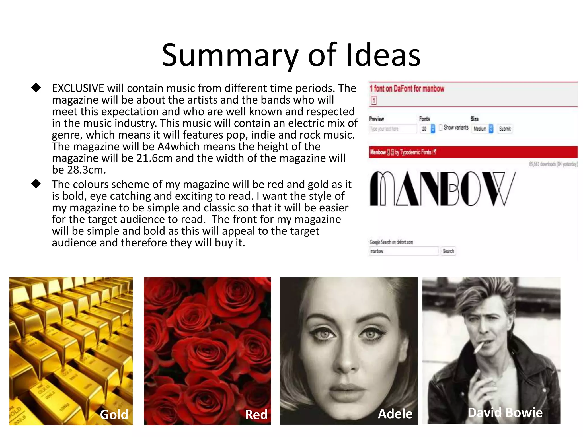
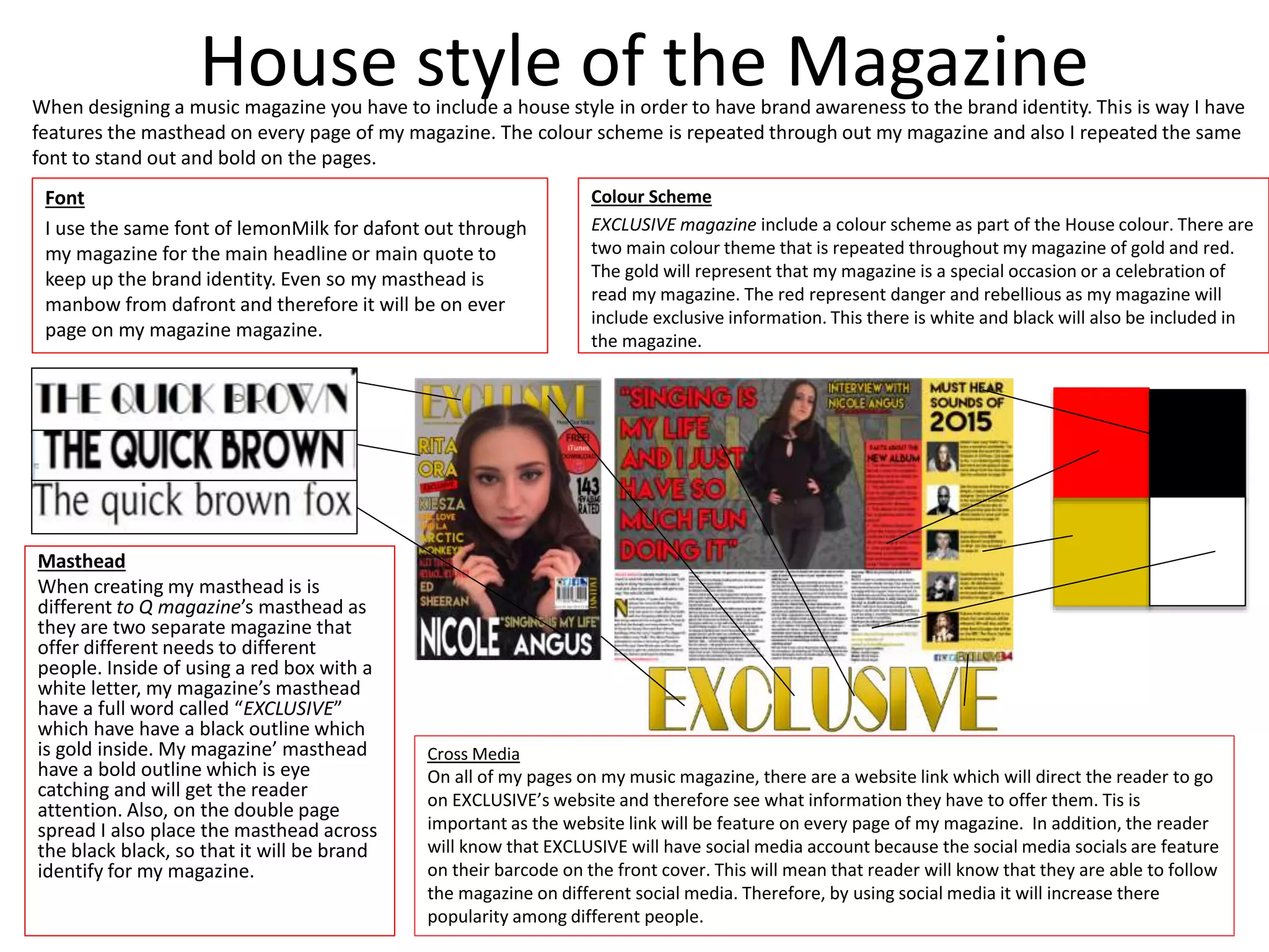
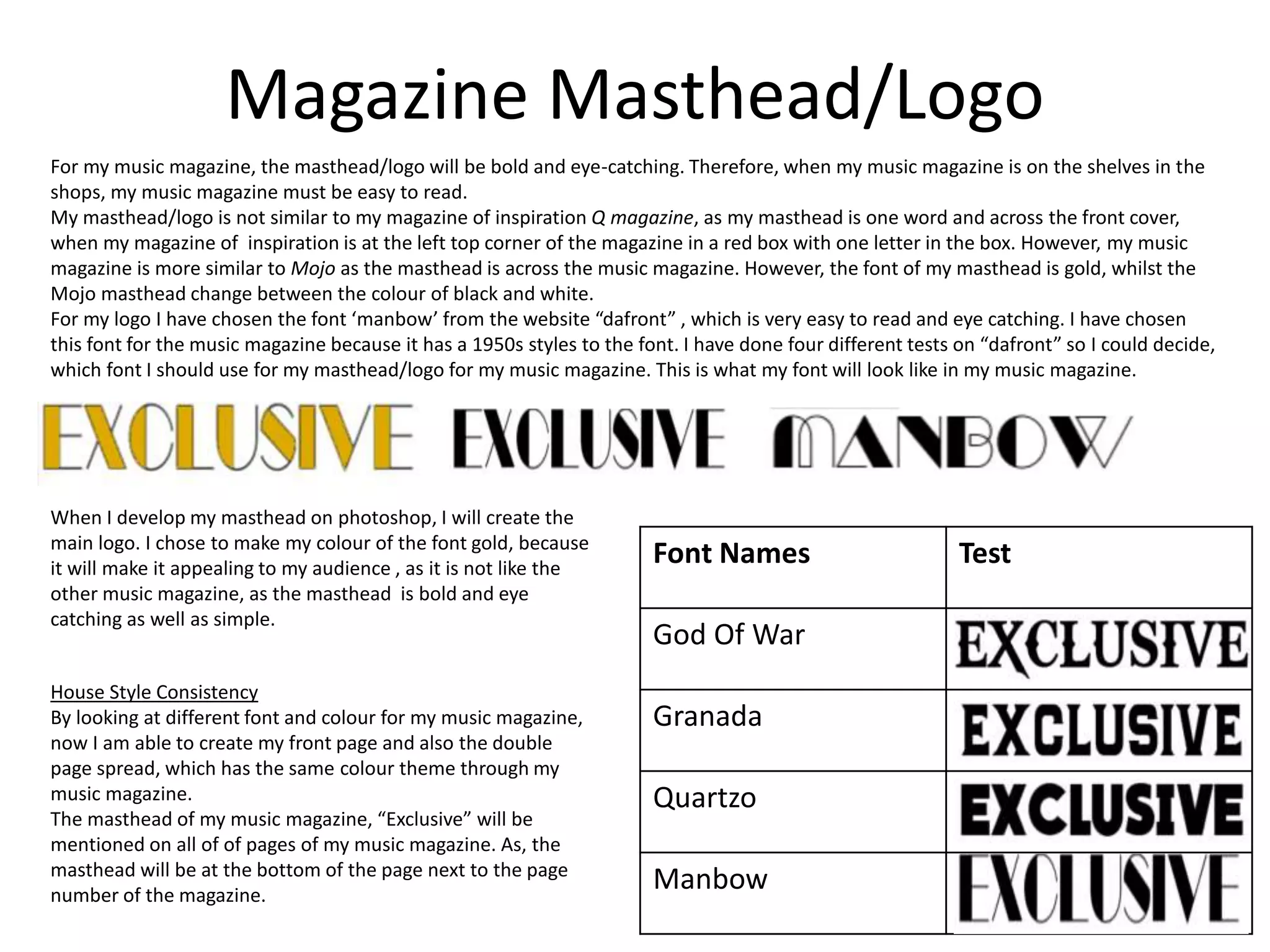
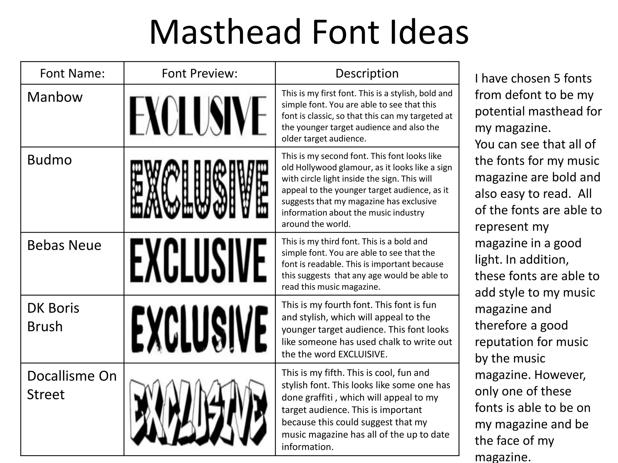
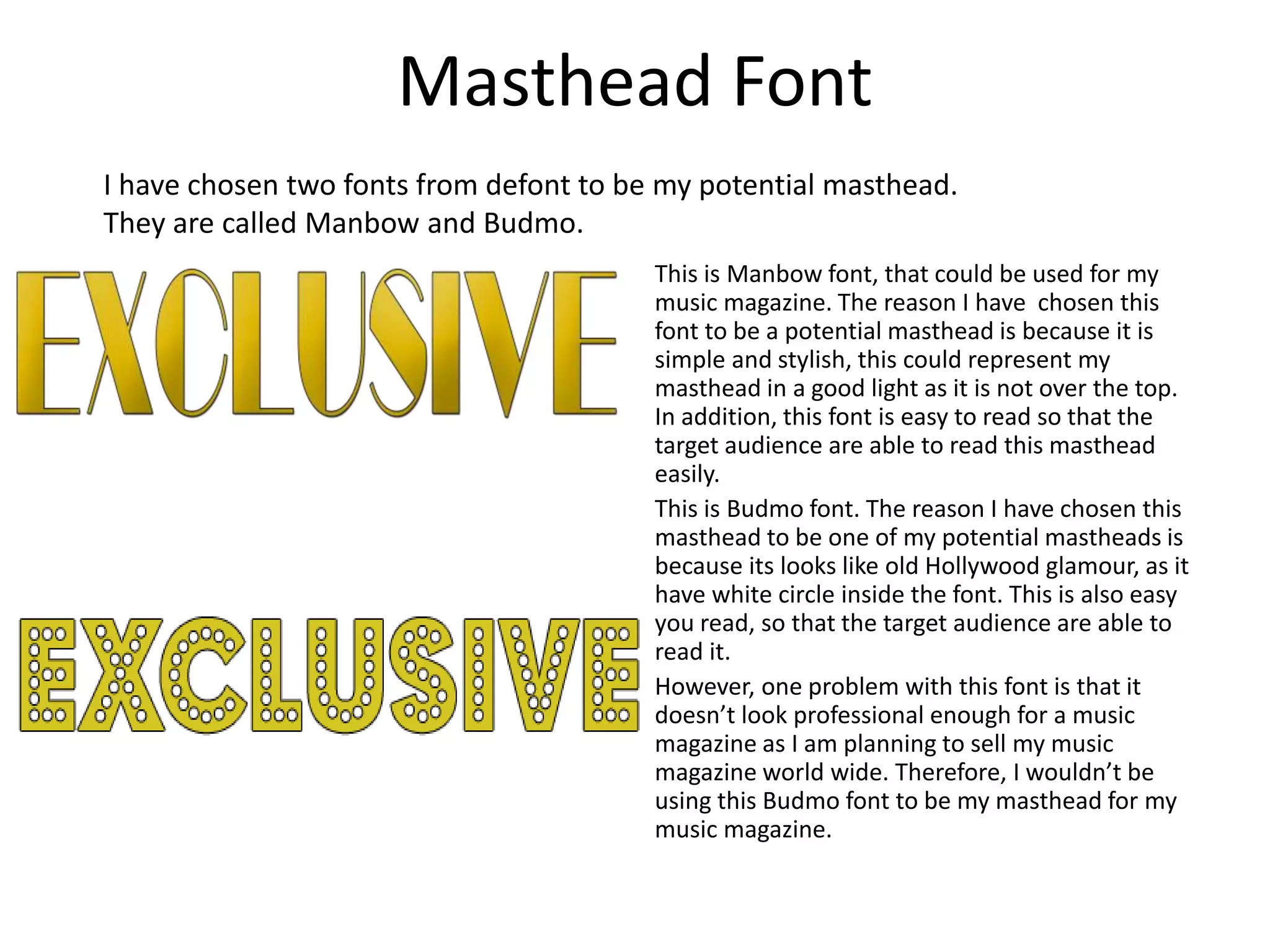
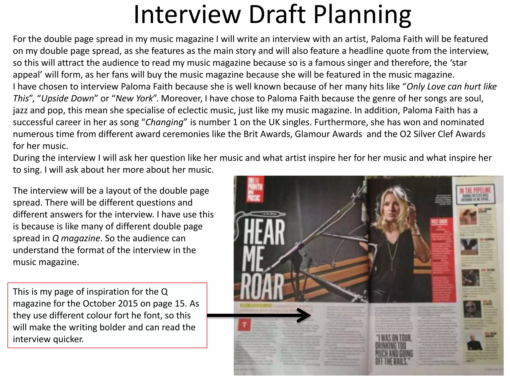
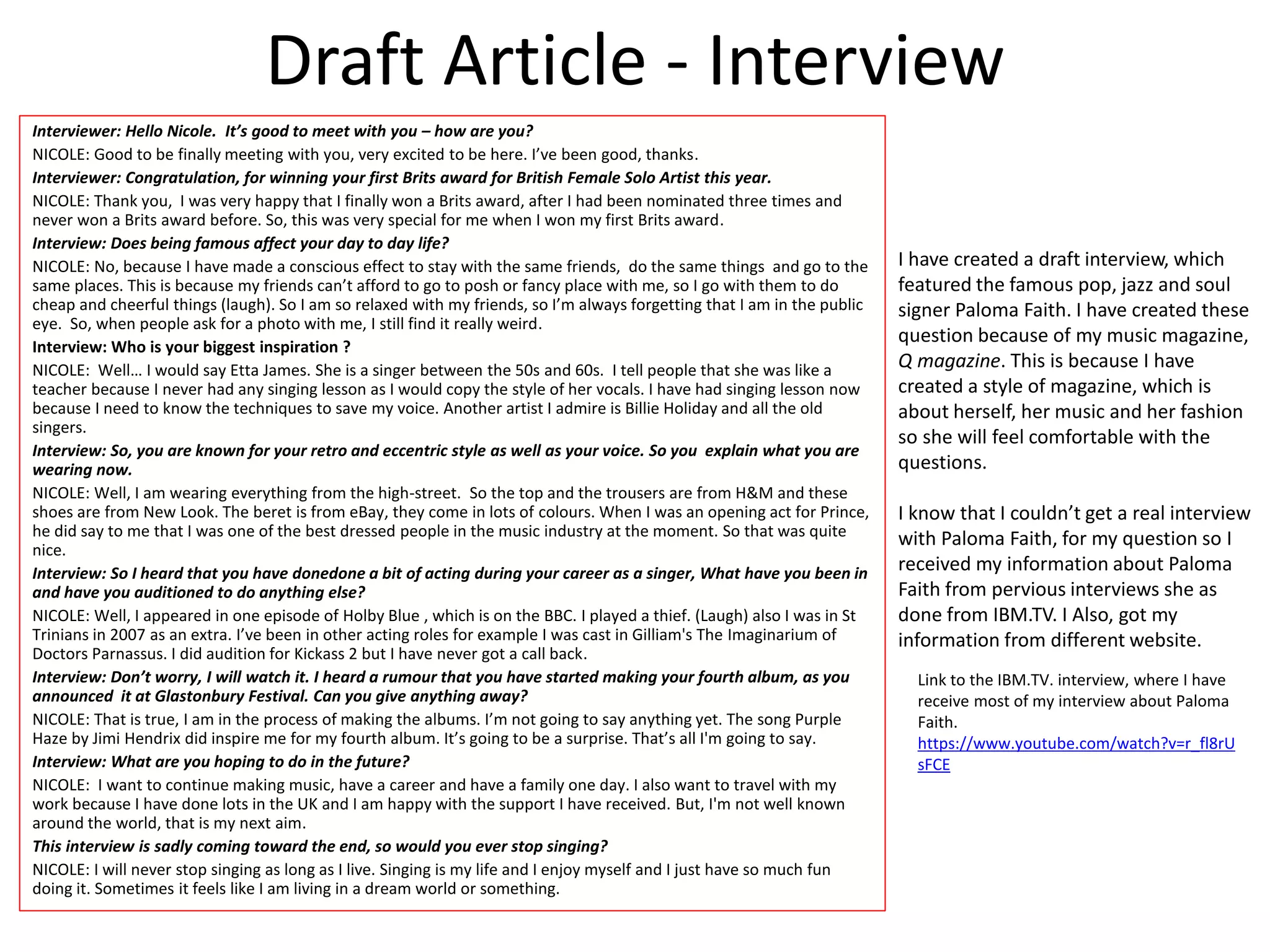
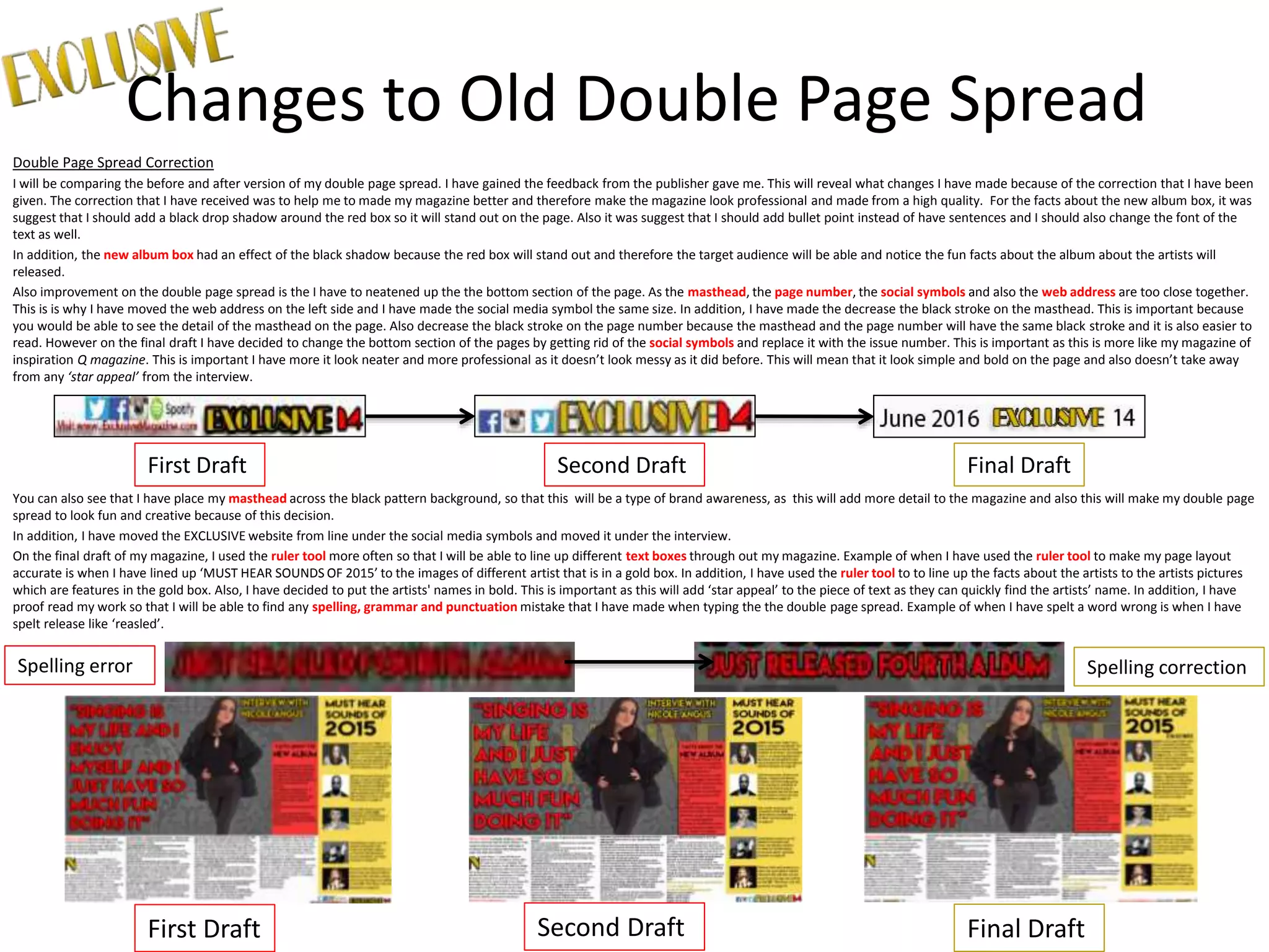
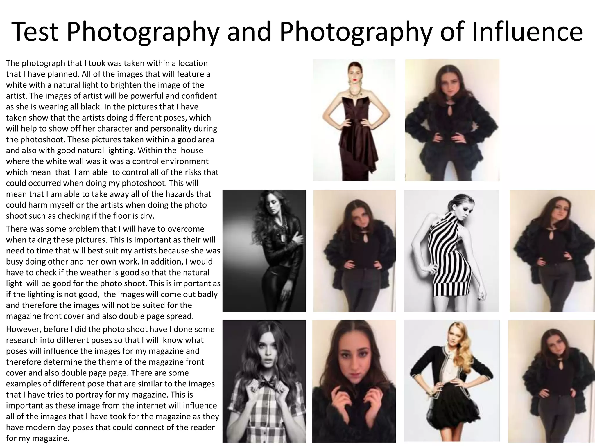
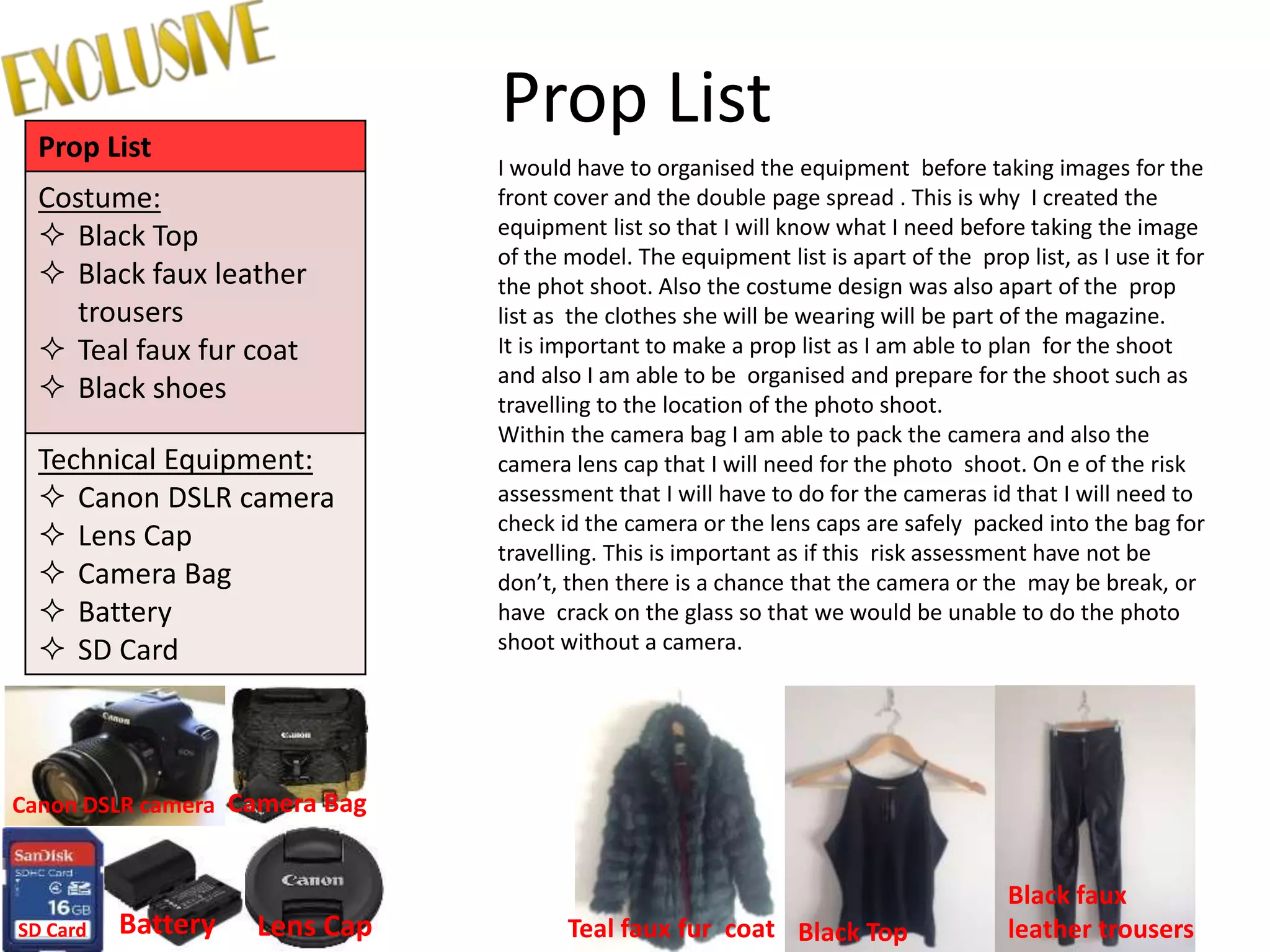
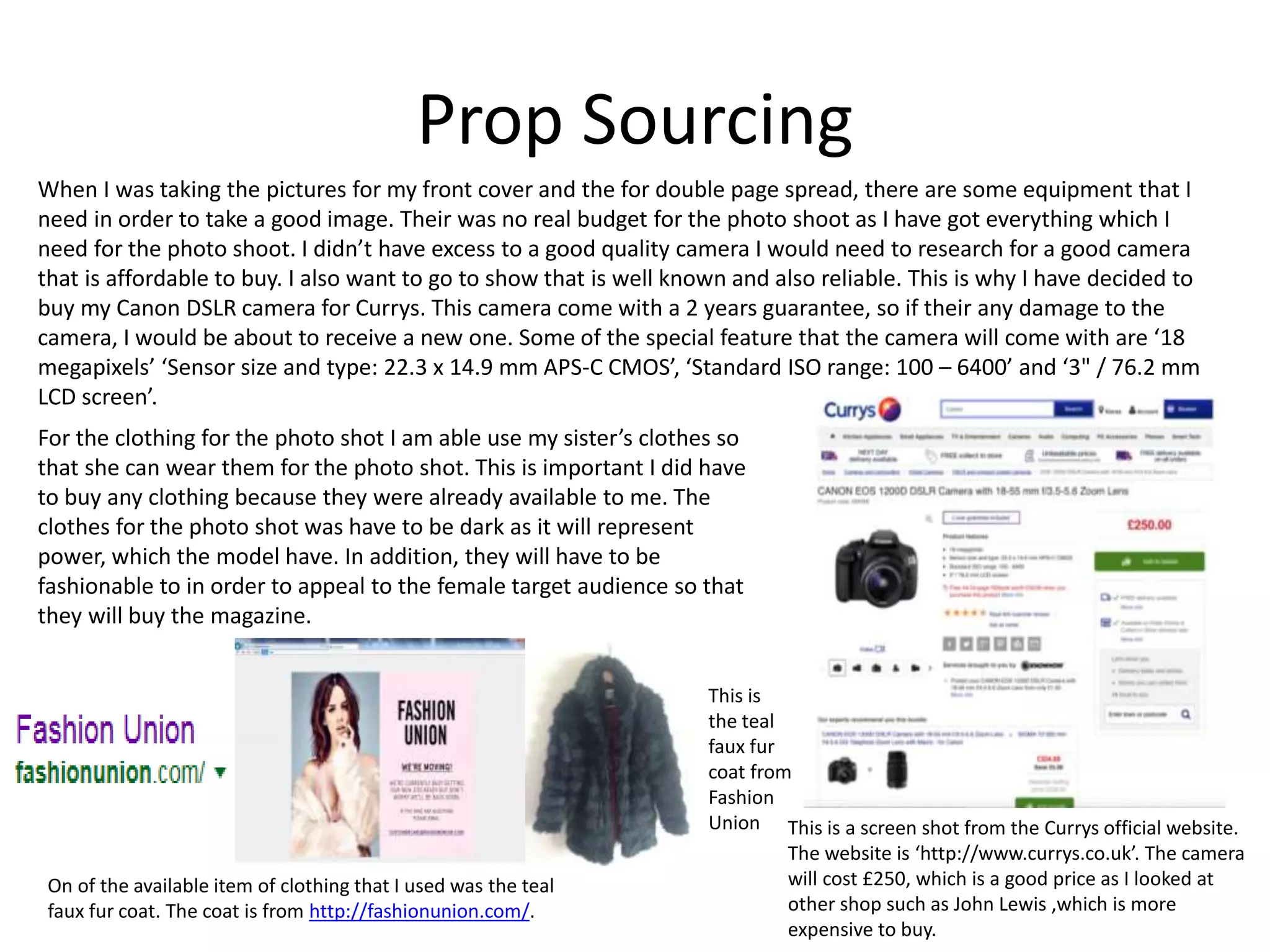
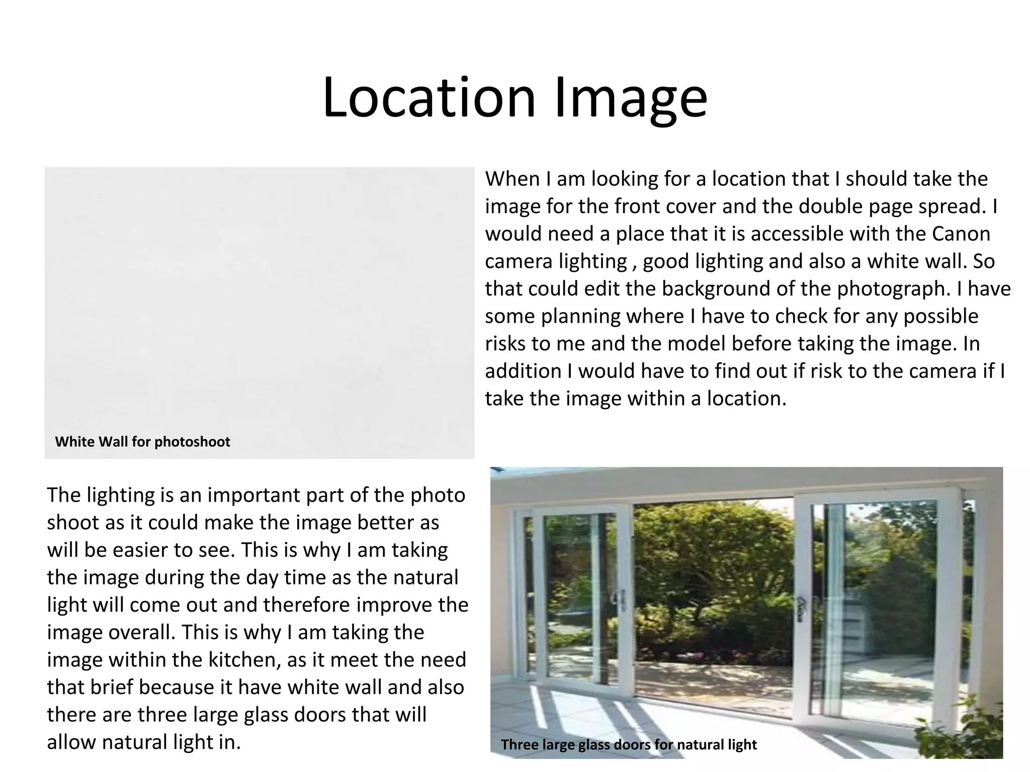
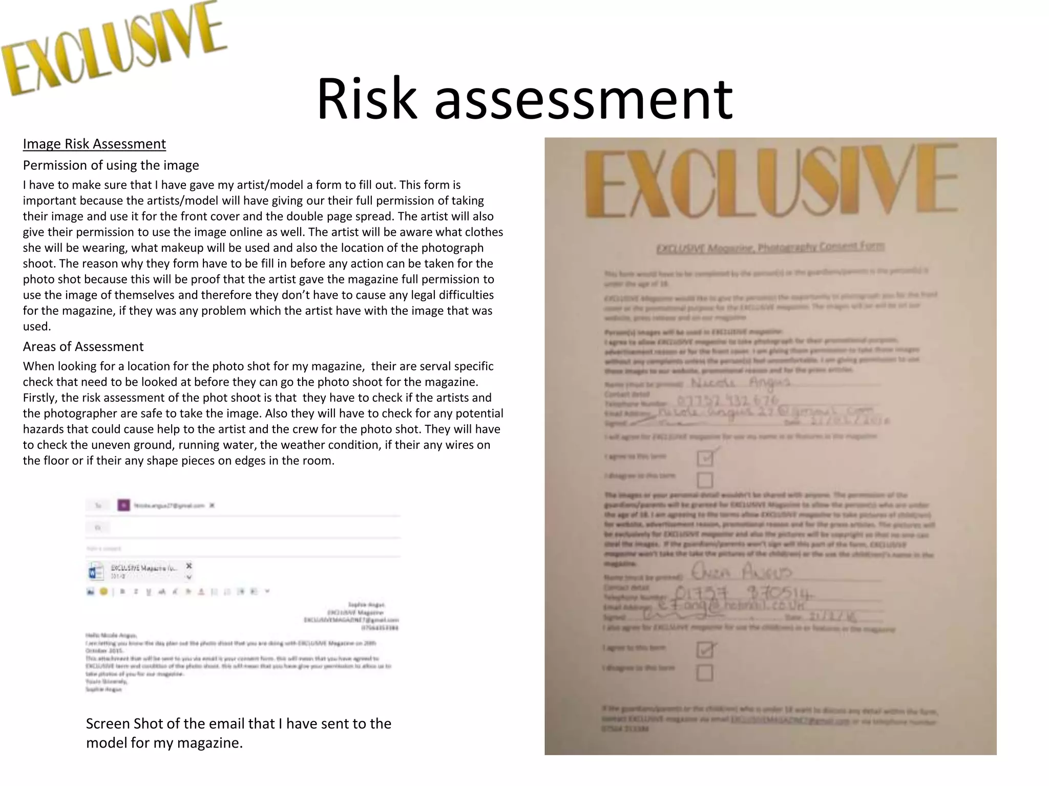
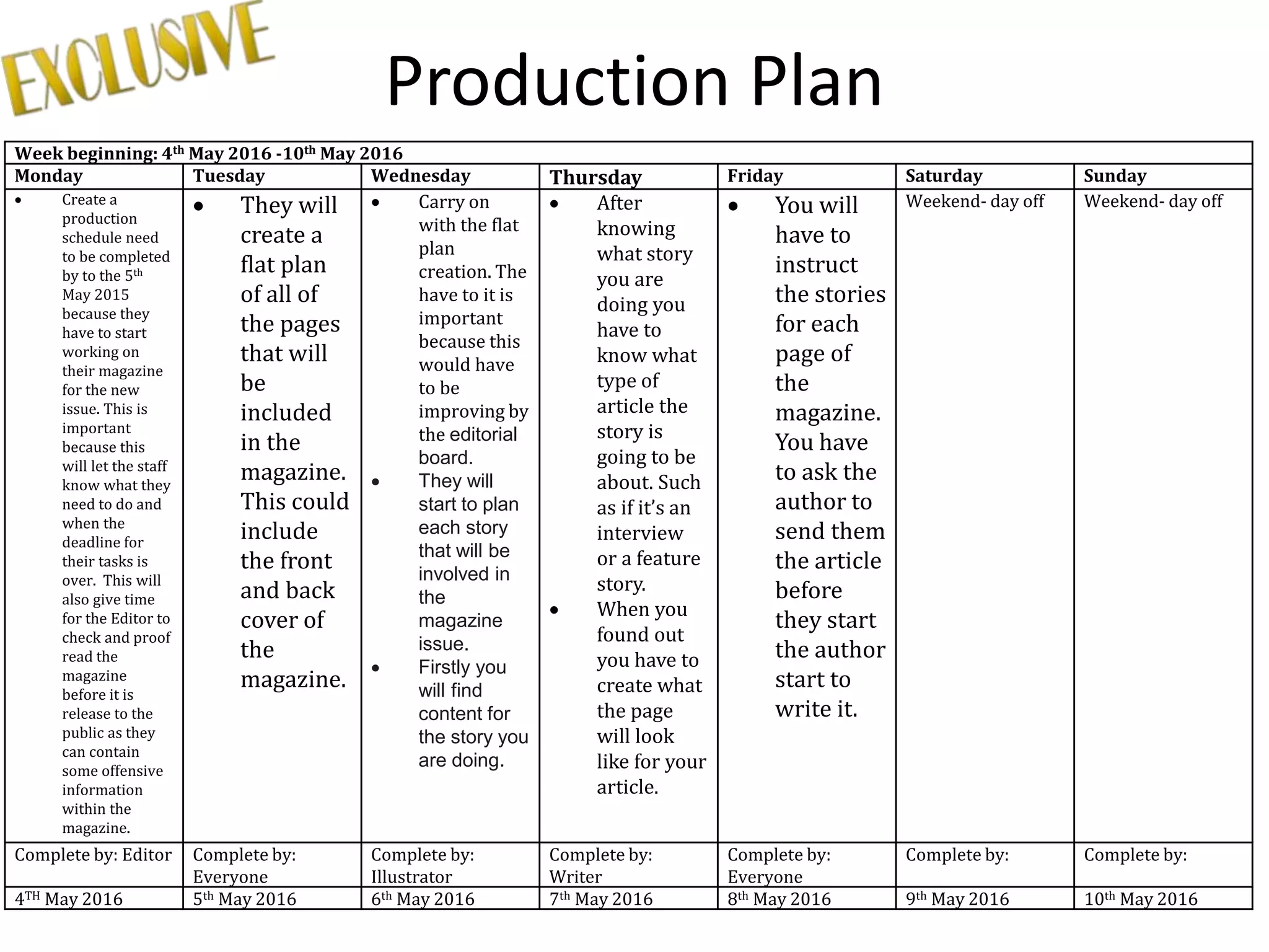
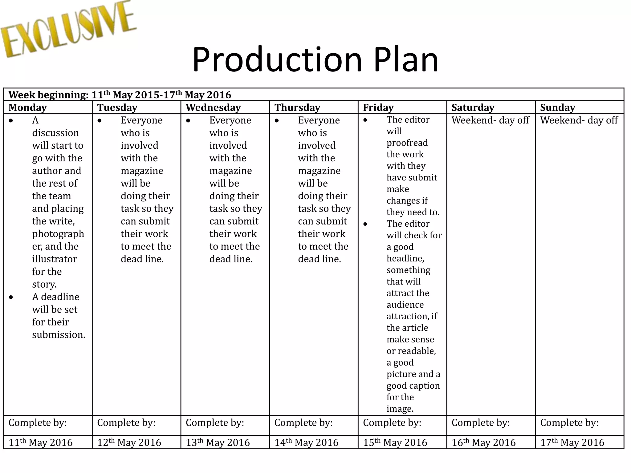
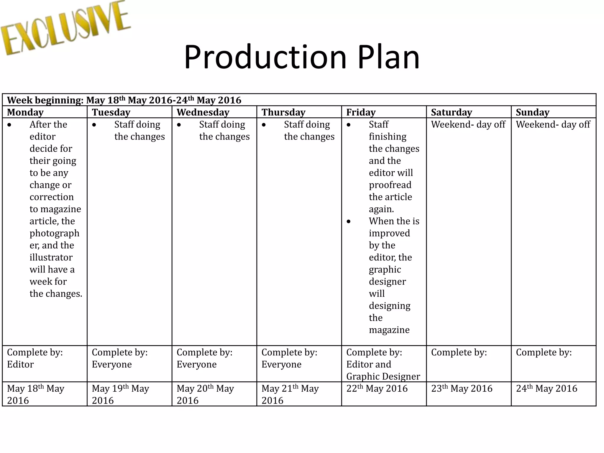
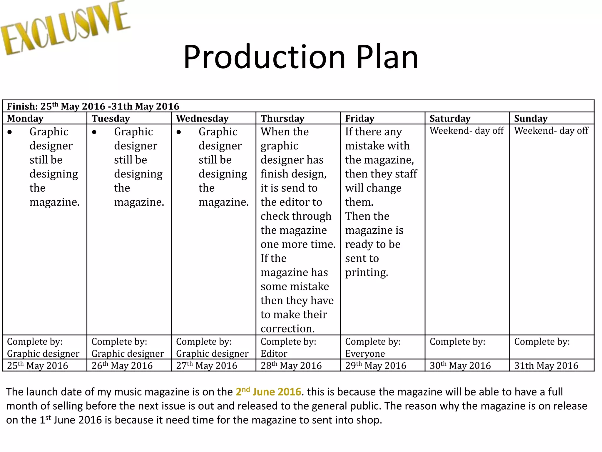
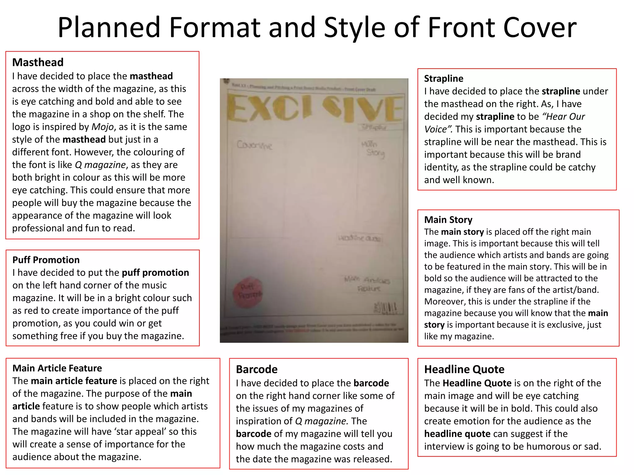
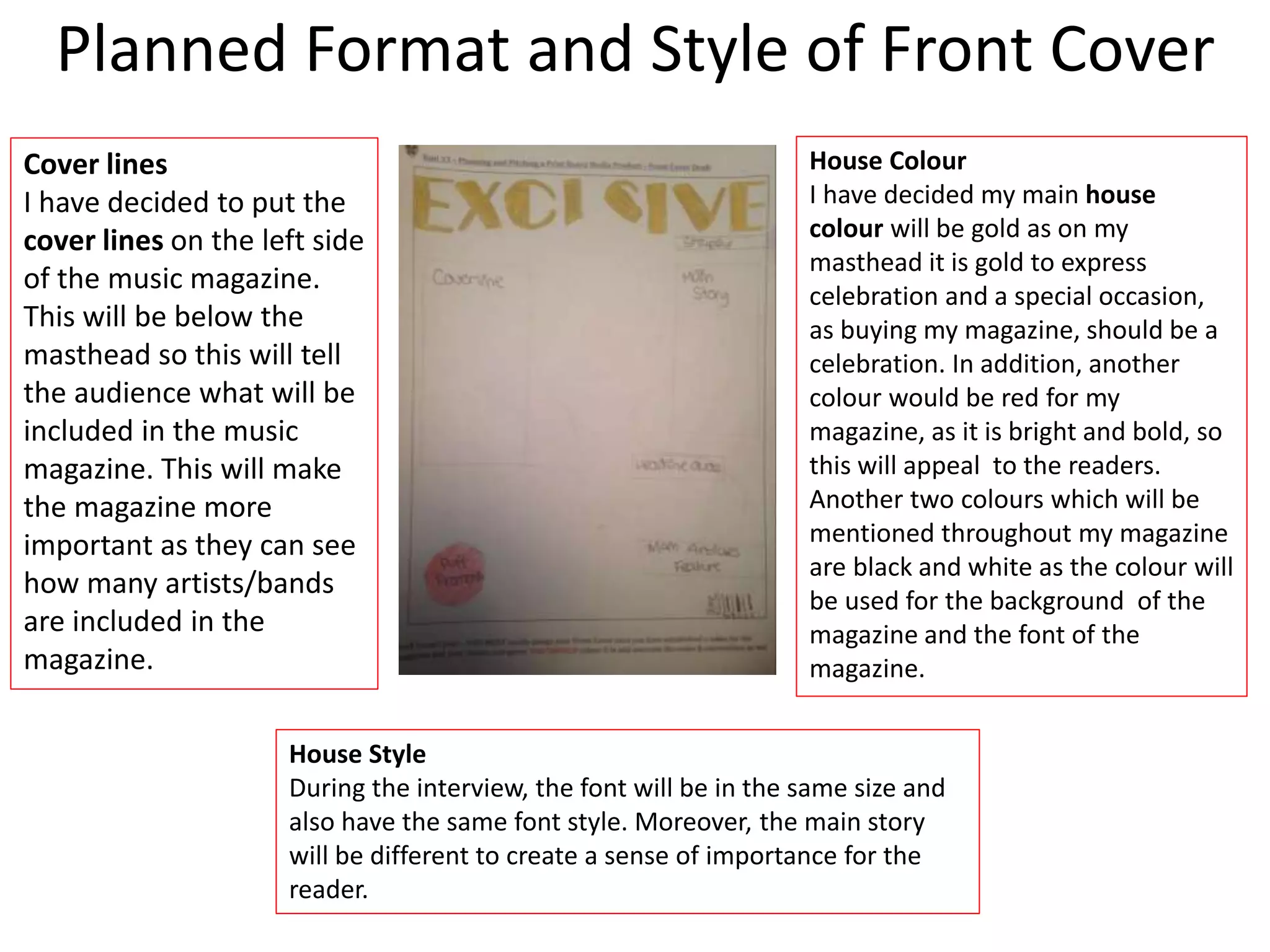
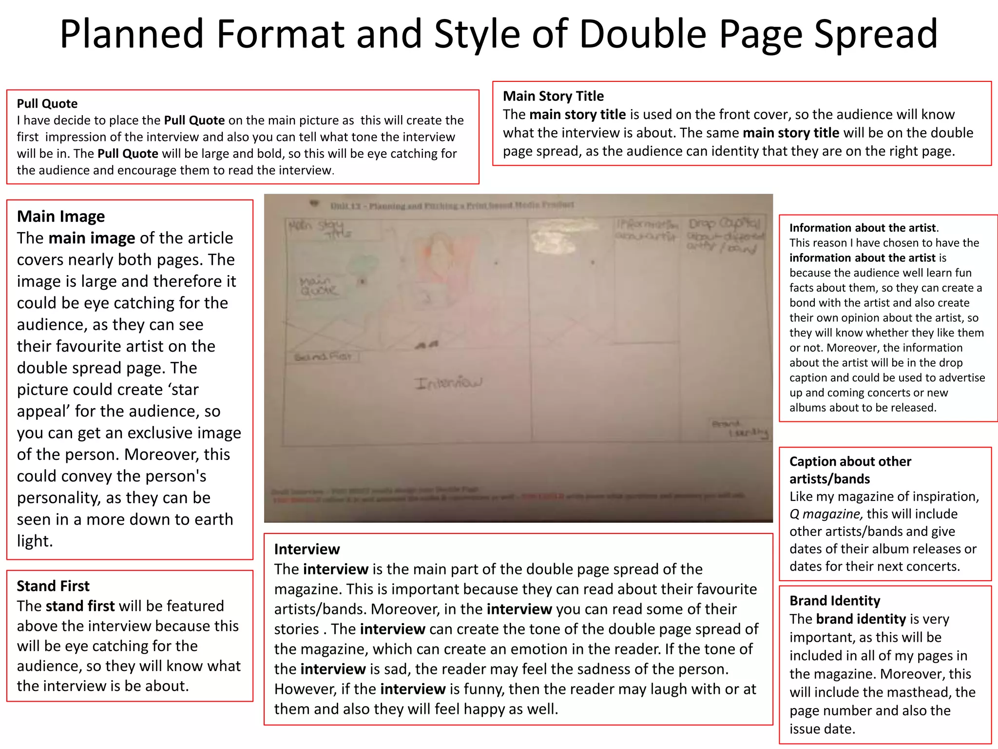
This document provides details of planning and preparation for producing a print-based music magazine. It includes mood boards, mind maps, masthead designs, and plans for interviews, photography, and layout. Specifically, it outlines plans to interview singer Paloma Faith for a double-page spread. Mockups of potential masthead fonts are presented, and the planned color scheme and consistent use of typography are described to establish the magazine's house style. Production elements like schedules and risk assessments are also referenced. The document demonstrates thorough planning for creating a print music magazine focused on eclectic genres.
Q magazine targets readers ages 15-24, especially males. It contains a variety of music genres to appeal to different musical tastes. The magazine is published monthly with each issue containing in-depth articles on popular artists. It uses a consistent color scheme of red, white, and black throughout for branding. The goal is to provide readers with exclusive music news and content not found elsewhere to explore their interests in music.
This document provides details on the proposals for two music magazines - Exclusive and Emagazine. For Exclusive, the target audience would be students interested in exploring different music genres. Emagazine's target is also students classified as "Explorers" who seek new music. Both magazines would use similar house styles with bold colors and clear fonts. Sample front covers, article drafts, budgets, and advertising rates are presented to outline the business plans. The goal is for the magazines to appeal equally to male and female readers unlike the competitor Q magazine.
1) The document outlines plans for a music magazine project, including mood boards, mind maps, and production plans.
2) It proposes the name "Eclectic Music" for the magazine, with a target audience of 15-30 year olds and a monthly release schedule.
3) Production elements that are planned include the front cover layout, double page spreads, interview formats, photography, budgets, and legal/ethical considerations.
1) The document is a proposal for a print-based pop music magazine titled "E". It will feature an interview with Paloma Faith on the front cover and double page spread of the first issue.
2) The target audience is 15-30 year olds, especially females, and it will be released monthly to provide a higher quality of information and keep audiences interested with different content about music and artists each month.
3) Photoshop will be used to construct the magazine pages to make the images and design look professional and glossy.
This document outlines the planning and pitching of a print-based music magazine called "Exclusive" or "E". It includes details on the proposed format, working title, genre, content, style/approach, target audience, length, and frequency. Market research was conducted through a 10 question survey to help determine the target demographic of 14-30 year olds, as well as content preferences like interviews and photos. Color schemes, house styles, and the use of Photoshop are discussed for visually designing the magazine pages. Sample front covers and double page spreads are presented, along with explanations for the design choices.
1. The document presents proposals and designs for two music magazines called Exclusive and Emagazine. For Exclusive, the target audience is predicted to be students aged 15-24 based on statistics from similar magazine Q. The magazine will feature a variety of artists from different eras to appeal to a broad market.
2. For Emagazine, the target audience is also predicted to be students and those in the E, D, and C2 socioeconomic groups based on Hartley's 7 subjectivities. The magazine aims to appeal to "Explorers" who seek new music. It will feature more female artists to attract more female readers compared to the male-dominated Q magazine.
3. Design elements
Sophie Angus is proposing a print music magazine called "Exclusive" targeted towards males ages 14-30. The magazine will have an eclectic mix of music genres. The first issue will feature an interview with Paloma Faith on the cover and double page spread. Sophie will use Photoshop to design the front cover and double page spread, using colors like red, gold, black and white. The magazine will be in A4 size and released monthly.
The document summarizes the key things the author learned from constructing their media product, a music magazine. They learned about:
1) Design conventions for magazine covers, contents pages, and spreads from researching real magazines.
2) The importance of audience research to understand what would attract their target readership.
3) Digital skills like using Photoshop, InDesign, and iMovie to design, edit photos and record audio for the magazine.
4) The value of planning, research, and understanding conventions before beginning a media project.
This document provides details about a student's media studies portfolio project to create promotional materials for a music magazine. It includes the student's responses to questions about the intended audience for the magazine, how it would represent social groups, and how it would attract and address its target readership. The student aimed the magazine at 16-22 year olds interested in pop-punk and rock music. Key elements of the magazine identified to attract this audience included the cover star's appearance, prominent band names, and use of fonts and graphics evoking the genre.
The student drew inspiration from existing magazines like Kerrang! and incorporated conventions like competition mentions and band images while also challenging some conventions like multiple images per page spread. Responses provide specifics
Q Magazine is a monthly UK publication focused on alternative music. It was founded in 1986 to serve an older audience still interested in CDs and albums. The magazine includes interviews, reviews, and lists related to rock and alternative genres. Its target readership is 30-40 year old males interested in those music styles.
NME is a weekly British music magazine published by IPC Media. It targets predominantly male readers ages 17-30, who are well-educated music enthusiasts. The magazine's front covers use images of contemporary bands and headlines about new music to attract its dedicated, young, and trendy audience. Codes like the prominent masthead and use of pink and white create a modern, consistent style that appeals to readers and builds brand loyalty.
This document provides an overview of the contents for a presentation on magazine design. It includes mind maps for magazine ideas, proposals for two magazine concepts ("M" and "E"), graphic layouts, mood boards, and details on the development of "My Magazine" including genre, layout, style, content, audience, subscription offers, and masthead font designs.
This document provides an analysis of a magazine called Top of the Pops published by Immediate Media Company. It first summarizes key details about the publisher, including that it was founded in 2011 and owns several magazines. It then analyzes features of Top of the Pops magazine like its covers, target audience of teenage girls, and use of bright colors and images to appeal to this audience. Primary and secondary research is also referenced to understand the magazine's market position and competitors.
The document is a media evaluation of a music magazine created by the author to appeal to a rock music audience aged 14-18. The magazine uses conventions of existing rock magazines like Kerrang! with a hand-drawn font and photos of bands. It includes a competition and represents different rock music social groups. The target audience provided feedback that the edgy style and accessibility of the magazine appropriately captured the genre.
Jake McMann is creating a double page spread for a BTEC Media assignment. The spread will be for a magazine focused on pop music, aimed at informing readers aged 13-18 about the artists and music they listen to. The spread will feature artist Dua Lipa and use neutral colors and a simple font to appeal to a wide audience rather than a specific demographic. Potential issues could include lacking the proper photo editing software or unable to access the perfect photo shoot location.
Here are some key insights from your practical research:
- Using a 35mm film camera will help capture photos with a nostalgic, retro 90s aesthetic that fits the theme of your magazine. Film cameras were very common in the 90s before digital became mainstream.
- Shooting on film requires a different photographic approach than digital. You'll need to be more selective with your shots since you can't review images immediately. This may result in more candid, natural-looking photos versus heavily posed shots.
- Film processing adds an authentic element that enhances the 90s vibe. Readers may enjoy seeing the behind-the-scenes of developing rolls of film for the magazine.
- Some limitations of film like grain,
LO1- Understand existing print-based media Products and how they are created Harrison Cole
Rock Sound is a monthly British magazine published since 1999 that focuses on rock music genres like pop punk, metal, and hardcore. It aims to promote newer and less mainstream rock acts to its readership of predominantly teenage fans of extreme rock music. Each issue includes news, album reviews, concert reviews, and interviews to keep readers informed on the latest developments in the rock scene. It has a circulation of over 13,000 and is also distributed in some other countries. The magazine is published by Rock Sound Ltd and overseen by an editorial team that includes the editor, deputy editor, and others.
Q magazine is published by Bauer Media Group, a large German publishing company that operates in 15 countries. Bauer Media produces Q magazine, as well as radio and TV stations. Q magazine was first published in 1986 and focuses on music through high quality photography and printing. It has since expanded into radio and TV under the Q brand. Bauer Media uses a cross-media approach to target various age groups and audiences to increase popularity and viewership across its various music-focused television channels.
The document provides details about creating a rock music magazine targeted towards teenagers. It discusses selecting rock as the genre since it was most popular in audience research. The magazine will include information on tours, albums, reviews, and contests. It will have an informal style with red, black and white colors. The magazine will be published monthly and cost £3 per issue.
Kerrang! is a British rock magazine published weekly by Bauer Media. It was first published in 1981 and takes its name from the sound of a power chord played on an electric guitar. Bauer Media is a large UK-based media group that owns many magazine and radio brands. Kerrang! focuses on promoting rock music genres and informs readers about new bands, music tours and festivals. It includes interviews, reviews, and articles about rock artists. The typical reader is estimated to be 19 years old. Kerrang! is available both in print and digital formats.
Mojo and Q magazines both provide monthly music magazine publications with wide-ranging genres and content to attract a broad audience. They publish physically and digitally, with Q circulating 44,050 copies and Mojo at 79,345 copies monthly. Both aim to inform, educate and provide diversion for readers across socio-economic classes by featuring various artists, music news, and interviews through consistent styles and prominent branding. Their websites further engagement through social media integration and additional interactive content.
This document discusses the design choices made for an indie rock magazine called "Noise". The cover features the bold masthead in red with the artist Lucy as the main image. On the contents page, features are listed relating to indie rock and images continue promoting Lucy as the focus of the main article. Continuity is created through consistent fonts, colors and imagery of Lucy across the pages. The target audience of 16-24 year olds interested in indie rock is addressed through the genre-focused content and social media links.
The document discusses how various elements of magazine covers provide cues to readers about the genre or target audience of the magazine. These elements include the colors used, the models or celebrities featured, mastheads or titles, and the types of articles mentioned in cover lines. Specific examples are provided of how magazines focused on genres like pop, rock, jazz, and rap would differ in their visual design choices to clearly signal their musical focus to readers.
The document provides an analysis of existing magazine covers and posters from the 1990s related to rave culture and music. It examines features such as prominent images, color schemes, fonts, and references to establish recognizability and appeal to target audiences. The analysis considers incorporating similar aspects into a new 1990s rave fashion magazine.
The document summarizes the analysis of a Billboard magazine cover:
- The masthead is simple and recognizable even partially covered.
- The main image uses Miley Cyrus, a well-known pop singer, to appeal to fans and portray a serious music industry.
- The main cover line asks a rhetorical question about Miley Cyrus to engage readers about her article inside.
- Additional lines briefly highlight other artists and articles to indicate the magazine's music genre.
- The color scheme is simple, sophisticated, and modest using light shades of purple, silver, yellow, and white.
The document outlines mind maps and plans for two music magazines titled "Riddim" and "Bass" that include details on mastheads, color schemes, target audiences, and frequencies. It also includes mood boards and analyses of magazine covers and genres to help develop the brand identities and house styles of the two magazines.
The magazine cover uses bright colors and unconventional typography to appeal to a young EDM audience. It features an image of Avicii making serious eye contact. The masthead is prominently centered to promote the lesser-known brand. Puffs and headlines throughout reference EDM songs and artists to create an insular community for readers in the know. The non-traditional layout challenges conventions to position the magazine as cutting-edge.
Sophie Angus is pitching a new eclectic music magazine called "Exclusive". The front cover and first double page spread will feature an interview with Paloma Faith. The magazine will have a bold and eye-catching design with the title in gold letters against a black background. It will be released monthly on A4 pages and target an audience aged 14-30, primarily male. Sophie will use Photoshop to design the front cover and spread to make the magazine look professional.
The document outlines the content and production process for a magazine. It includes slides detailing the front page sketches, font choices, house styles, mind maps, mood boards, draft articles, photoshop layouts, the graphic layout, flat plan, photoshoot plan, test photography, resources and equipment needed, and the production process and personnel. The production process involves content acquisition, sub-editing, page layout, proofreading and distribution. Personnel needed include an editor, assistant editor, and graphic designers.
The production process for the magazine occurs over three weeks. The first week is for organizing content like articles, design, photos, and layout. Deadlines will be set for each department as well as an overall deadline for publication on the first Monday of each month. The second two weeks will be spent collecting additional content through interviews, photos, and feedback. The final week will involve assembling all the gathered content into the final magazine version. The graphic designers will refine the layout to suit the target audience. The finished magazine will be released on the first Monday of the fourth week each month.
The document provides an overview of various legal and ethical considerations for producing a magazine. It discusses obtaining permission and assessing risks for photo shoots [Location Permission, Risk Assessment]. It also covers health and safety laws and regulations [HSE, Health and Safety at Work Act], standards for privacy, accuracy and harassment [IPSO, Privacy], and requirements for attributing sources and gaining consent [Copyright, Intellectual Property]. The document aims to ensure the magazine's content and production process meet legal and ethical guidelines.
Morgan Pearson is submitting documentation for their media production location recce and photoshoot. They arranged to do the shoot on January 9th during a shared free period with the model, John Allen. Morgan took photos of John straight on and wearing a designed t-shirt to portray a DJ. The school lighting was used which made the photos brighter. Morgan received permission from the head teacher via email. Safety precautions were taken including warning John about flashes and moving furniture to avoid tripping hazards.
The document summarizes the content of a magazine production project. It includes sections on meeting deadlines, using Photoshop for post-production skills like editing photos, following safe working practices when editing images, maintaining consistent colors and fonts, and making changes to improve the front cover, masthead, and double page spread. The conclusion restates the key elements covered in creating the magazine within the deadlines.
This document outlines the steps taken to set up equipment, conduct a photoshoot, and create content for a magazine in Adobe Photoshop. It discusses checking camera equipment, taking test photos, following a production process of acquiring, editing, and laying out content, and then proofreading. Specific steps taken in Photoshop are outlined, like adding images, text, and styles to create a front cover and double page article spread.
The production plan has three phases over a month. The first week focuses on organizing content like articles, photos, and layout. Deadlines are set for each department. The second two weeks are spent collecting interviews, photos, and feedback. The final week is used to assemble the final magazine, with the graphic designers improving the layout to suit the target audience. The magazine will be released on the first Monday of each month.
This document makes the case for relocating the Royal Australian Navy Fleet Base East from Garden Island in Sydney to the Port of Port Kembla in the Illawarra region. It argues that Port Kembla offers significant advantages over Garden Island such as more space for maintenance and growth, improved security due to lower population density, and access to affordable housing and skilled labor pools. The region is well-located near existing Navy facilities at Jervis Bay and has infrastructure and educational institutions that could support an expanded naval presence. Relocating Fleet Base East to Port Kembla represents an opportunity for economic development in the Illawarra while freeing up the valuable Garden Island lands for other uses.
This document provides an overview of key concepts for using social media effectively for business purposes. It discusses the 5 W's - who, what, when, where, and why. For each W, it provides examples and suggestions. Some key points covered include understanding customer personas, creating valuable content, choosing the right social media platforms, developing a content schedule, and being aware of potential pitfalls. The overall message is on strategically using social media to engage customers and achieve business goals like increasing awareness, engagement, and sales.
This document discusses the importance of having an online presence for cultural organizations and artists. It covers topics like the basics of websites, social media strategies, types of content to create, and how to measure success. Examples are provided of different organizations' online presences and tips are given for using various social media platforms. The presentation aims to provide guidance on developing an online and social media strategy to promote arts and culture.
This document provides information about setting up and using LinkedIn for professional and business purposes. It discusses creating a LinkedIn profile, including adding details like experience, education, skills and endorsements. It also covers building your personal and business brand on LinkedIn, expanding your professional network through connections and groups, and following industry and company news. The goal is to help users understand how to fully utilize LinkedIn's social networking features for business and career development.
RDA Illawarra (Leigh Jewiss) with support from NSW Dept of Industry, Shellharbour Council and Shellharbour Small Business Network present What Can Social Media Do For You: Connect, Communication and Engage
The document provides information about grant resources for organizations seeking funding, including websites for identifying grant opportunities and upcoming grant programs. Key grant programs highlighted are the National Stronger Regions Fund closing July 31, 2015, the Stronger Communities Programme, and the Bridges Renewal Program round 2 closing August 31, 2015. Useful websites are listed for searching Australian government, NSW, and other grants.
RDA Illawarra presentation of the National Stronger Regions Fund (NSRF) at the Grant Writing Workshop - Feb 2016
- Wollongong 09/02/16
- Shellharbour 10/02/16
Regional Development Australia (RDA) Illawarra hosted social media workshops for the Not-For-Profit Sector. The workshop are designed so the sector can learn and understand these communication channels better and to utilise them with the approaching National Disability Insurance Scheme.
Content will include:
* Why you need to be online
* How to create a digital strategy
* How to engage clients + potential clients with social media
* How to get bang for your buck & drive your dollar further
RDA Illawarra hosted Grant Writing Workshop presented by Waples Marketing.
This presentation focus on the practical writing tips to produce competitive grant submissions
Wollongong - 09/02/16
Shellharbour - 10/02/16
This document contains planning and pitching materials for a print-based music magazine, including:
1. Mind maps and masthead ideas for two potential magazine titles, focusing on genre, target audience, and branding.
2. Mood boards and inspiration sources exploring font styles, inclusion of both classic and modern music, and use of bold colors.
3. Target audience analysis drawing from Q Magazine and considering demographics, psychographics, and socioeconomic factors to profile 15-30 year old readers.
4. Draft layouts of the magazine's front cover and double page spread, comparing to Q Magazine's style.
The document contains planning and pitching details for two print-based music magazines, including mind maps, masthead ideas, target audiences, and graphic layout proposals. For the first magazine called "EXCLUSIVE", the target audience is 15-24 year olds, the genre is eclectic music from different time periods, and the graphic layout proposals include a simple bold front cover and double page interview spread. For the second magazine, the color theme is black, white, red and gold, the target audience is slightly broader at 15-30 years old, and the genre is also eclectic music to attract different types of readers. Both magazines aim to educate audiences about music from various eras through their content and choice of artists
This document contains planning and pitching materials for a print-based music magazine, including:
Mind maps and mood boards showing the development of ideas for two magazine concepts focusing on eclectic music genres. Details on mastheads, straplines, target audiences, and visual inspirations are provided.
Sections provide summaries of the magazine concepts, intended audiences, research on the target demographics, sample magazine layouts and comparisons to an inspiration magazine.
An interview draft and article are included, along with conclusions on pitching the magazines. Reference sources are cited throughout.
Unit 30 – UK Media Publishing - Proposal
The document proposes a music magazine called "E" focused on indie music. It will cover both new, unknown artists as well as popular artists. The magazine will have a similar format to Q magazine with the logo in the top left corner and large cover images. The magazine will be produced in Photoshop with an orange and black color scheme. It will target 16-24 year olds interested in music and contain interviews, images, and reviews to attract readers.
The proposal outlines a pop music magazine called 'Musique' that will feature popular artists, both established and up-and-coming. It will include images, articles, reviews, and analyses. The target audience is people aged 15-35 of all genders. 'Musique' will be published biweekly on A4 paper with 16 pages, using a red and white color scheme representing the power and perfection of music.
The proposed magazine will focus on rock music and target men aged 16-26. It will take inspiration from Kerrang magazine in focusing on rock. The masthead will use bold, eye-catching letters and an attention-grabbing color scheme. The contents page will summarize what each page covers and include artist photos, social media details, and subscription information. The front cover will feature a large dominant image to attract the target audience. Representations of artists in the magazine will depict them looking like authentic rock stars through clothing, hair, and posing with instruments.
This document provides details on the planning and pitching of a print-based music magazine by Sophie Angus. It includes proposals for the format, working title, genre, content, style/approach, target audience, length and frequency of the magazine. It also includes the results of a 10 question survey to help determine the target audience. The final selections for the magazine front cover and double page spread are presented, along with explanations for why they were chosen. Details on the magazine's color scheme, house style, font and layout are also provided.
The document outlines plans for a new rock music magazine, including targeting 16-26 year old males, featuring articles on new bands, concerts, and artists as well as subscription information. Color schemes, potential names, and promotional methods like social media, websites, television, and other magazines are discussed. Photoshoot ideas include using dark clothing, tattoos, and music instruments to represent the rock genre.
The document discusses two proposals for a new music magazine. The first proposal is for a magazine called "Smash Music Magazine" that would take inspiration from Clash Music Magazine in its style and formatting. The second proposal renames the magazine to "The News of Music Magazine" but otherwise has similar details about drawing inspiration from Clash and other magazines. Both proposals discuss the target demographics, genres covered, and pricing for the new magazine.
Carmel Seager proposes creating a music magazine called "M" focused on indie music but covering various genres. The magazine would have a similar format to Q magazine, with the logo in the top left corner of the cover and main image taking up most of the front page. The interior pages would follow a consistent house style using the colors green, black, and white. The target audience is 16-24 year olds, mostly British initially but expanding internationally, who are passionate about music. Carmel plans to use Photoshop to lay out at least 125 pages per issue to the size of an A4 magazine.
This document contains a magazine pitch proposal for "Smash Music Magazine" and "The News of Music Magazine" from Gus Devlin. It includes two proposals for different magazine concepts, with mockups of front covers, double page spreads, and details on target demographics, budgets, and production plans. The core of both magazines is inspired by defunct magazines like "Clash" and "Smash Hits" but aims to bring back enjoyment of popular music magazines. Pink and white are featured prominently in the graphic design concepts.
This document provides information about Lucy Phillips' media studies portfolio project to create materials for a music magazine, including a front cover, contents page, and double page spread. It discusses the research Lucy conducted into her target audience for the magazine, which is 16-22 year olds interested in pop-punk and rock music. It also addresses how the magazine would be distributed through Bauer Media Group, the parent company of Kerrang! magazine, and how the magazine uses conventions from real publications while also innovating in its own style.
The document is an evaluation of a music magazine called "Noir" created by the author. It discusses how the magazine uses, develops, and challenges conventions of real music magazines. It includes typical magazine features like reviews, interviews, and photos within the limited scope of the project. The target audience is described as those interested in music, film, and art. Photos of the band member Jack are used to represent his personality and appeal to readers. The magazine would likely be distributed by a publisher targeting both male and female readers with diverse interests, such as Bauer Media or by publishing it online through websites like Issuu.
The document discusses the results of a survey about 80s music audiences. It finds the most popular age groups are 31+ and 13-19. Most listeners are from the US and UK. While many have not read 80s music magazines, Smash Hits was popular. Artists like Michael Jackson, Madonna, and Blondie were favorites. The document also analyzes issues of the magazines MOJO and Q, finding they target a wide audience but with a focus on older readers. Front covers use bright colors and photos to appeal to target demographics.
The document discusses research conducted on the audience for a proposed magazine about 1980s music. A survey was distributed on various forums and websites. The results showed that the target audience spans ages 13-19 and 31+, with most interest in the US and UK. Popular 1980s artists like Michael Jackson, Madonna, and Blondie should be featured. Analysis of existing magazines like Q and Mojo found they appeal to both older and younger audiences through their mix of content and designs. Further research on cover designs, readership profiles, and content breakdowns was summarized to inform the planning of the new 1980s music magazine.
Emily Bagridge created a magazine aimed at rock music fans ages 14-18. She used conventions from existing rock magazines like Kerrang as inspiration. The magazine's color scheme of red, black, and white appeals to rock fans and represents the genre. The magazine's content and layouts, including the crowded contents page and band interview spread, are designed to attract and engage young readers. The target audience is represented on the cover by a model dressed in gothic rock style clothing. Bauer Media Group would be the best media institution to distribute the magazine, as they have extensive experience publishing successful music magazines like Kerrang and adapting brands across different media.
Rock On! will be a rock music magazine focused on North London. It will have both print and online monthly issues featuring up-and-coming rock artists. The target audience is ages 16-30 in North London. To promote the magazine, the creator will research reader demographics and distribute copies at rock music venues in Camden. The magazine will cost £3 per issue and feature interviews and news about rock music and bands.
The document discusses conventions of music magazines. It explains that magazines aim to make readers feel part of a community who share similar tastes and philosophies. Magazines influence readers' musical tastes and promote certain genres through their style and content. Features typically include articles, reviews, photos and posters to engage readers. Indie music magazines in particular focus on non-mainstream music and culture. Key conventions highlighted include use of imagery, logos and mastheads to reflect brand and genre, as well as features, covers and content tailored to the target audience.
The document outlines plans for a magazine focused on rock music. It proposes the magazine be called "Volume" and cost £4.25 monthly. It would feature in-depth articles and interviews on rock artists, as well as news, competitions, and top lists. The style would use red, black, and white colors associated with rock. Sample front covers and contents pages are displayed drawing from other music magazines.
Similar to Unit 14- Producing a Print based Media Product (20)
The document outlines Sophie Angus' pitch for her music magazine "EXCLUSIVE" which was presented to Bauer Media, including feedback from interviews and surveys that helped Sophie improve various elements of her pitch like the front cover, double page spread, and wording. The pitch provided comprehensive details on the magazine's planned content, design, production process, budgets, and marketing as well as addressing potential legal and ethical issues to convince Bauer Media to publish the magazine. Overall, the feedback helped Sophie strengthen her pitch and magazine proposal.
Bauer Media Group is Europe's largest privately owned publishing group founded in 1875 in Germany. They publish over 300 magazines worldwide along with radio stations and TV channels. Q is a monthly music magazine founded in 1986 in the UK and was originally published by EMAP until 2008 when Bauer Media Group acquired it. Q analyzes new music and provides artist interviews. It has a circulation of around 64,000. Bauer Media Group utilizes various platforms like social media, websites, radio and TV to promote their brands and reach audiences across different technologies and devices. Their main competitors in music publishing include The National Magazine Company, Future PLC, and Immediate Media Company.
The document provides details of a print-based advertising project for a music festival, including witness statements, draft layouts, a production plan, photos used, legal and ethical considerations, risk assessments, final poster and flyer designs, comparisons to existing products, and a conclusion. The production plan outlines a three-week timeline for designing and distributing posters, flyers, and an audiovisual advertisement for the festival. Legal issues around trademarks, copyright, and ensuring the advertisements are not misleading are also addressed.
The document provides a production plan for advertising an exclusive music festival over 4 weeks. It includes designing posters and flyers, printing and distributing them, and creating an audiovisual advertisement. The plan schedules tasks such as choosing headliners, designing layouts, sending materials to print, filming footage, and editing the advertisement together. The goal is to reveal information about performers and release promotional materials to publicize the festival.
This document outlines Sophie Angus's plans for creating promotional materials for a music festival, including a poster, flyer, and audiovisual advertisement. It includes inspiration pieces, target audiences, logos, color schemes, layout designs, production schedules, and plans. The poster and flyer will feature main headliners like Adele and Coldplay to attract audiences. They will be designed over one week in February/March and launched 11 March. An audiovisual ad will then be filmed and edited over two weeks in March to promote the festival starting in June. The materials aim to inform audiences 7 months in advance and appeal to a wide age range through bright colors and well-known artists.
This document provides information about a print-based advertising campaign for the Glastonbury music festival. It includes a mood board, aims and objectives, analysis of the target audience using several theories, representation considerations, and details about ticket pricing and attendance numbers. The target audience is identified as being ages 18-54, from socioeconomic classes C2, C1, and B, who want to explore new music genres and experience the festival lifestyle. Over 45,000 people aged over 45 attend, spending over £6 million on tickets.
This document contains information about Sophie Angus's Level 3 Cambridge Introductory Diploma in Media unit on print-based advertising, including a mind map, house style, proposal, discussion of legal and ethical issues, and details on registering a trademark. It includes slides on developing a logo, slogan, color scheme, and release frequency for a music festival advertisement. Legal and ethical considerations discussed are avoiding misleading information, offensive or harmful content, and following copyright and children's advertising guidelines. The trademark registration process involves checking design uniqueness, applying online, and allowing time for examination and potential opposition before final approval.
This document provides details on the planning and production process for a poster and flyer advertising an exclusive music festival. It includes mood boards highlighting inspiration from Glastonbury festivals, proposed designs for the house style, main headliners like Adele and Coldplay, photography plans, draft layouts, and proofreading steps. The goal is to create eye-catching advertisements that showcase the festival's music and experience through vibrant colors and prominent artist listings.
This document outlines Sophie Angus' plans for creating promotional materials for a music festival. It includes mood boards, draft layouts, and production schedules for a poster, flyer, and audiovisual advertisement. The target audience is ages 18-54 across socioeconomic classes E-B who want to explore new music or escape daily life. Headlining artists include Adele, Rihanna, and Coldplay. The poster and flyer will feature these artists and provide location, dates, and logo. They will use bright colors and be released 7 months before the event. The advertisement will tell a storyboard-designed narrative over 2 weeks of filming and editing to promote the festival 3 months in advance.
Q magazine is a popular monthly music magazine published in the UK. It was founded in 1986 by Mark Ellen and David Hepworth and was originally published by EMAP. In 2008, EMAP sold Q and other magazine titles to Bauer Media Group, which remains the publisher. Q magazine focuses on indie, rock, and alternative music. In addition to the print magazine, Q also operates a website and previously had a radio station and TV channel dedicated to music content. The magazine aims to provide exclusive news and interviews to readers in an engaging visual format through its use of photos, design elements, and conversational language when addressing readers.
This document provides draft designs and pages for a proposed social media site called EYE. It includes draft sketches of a sign-in page and homepage. Final designed pages shown include the sign-in, profile, homepage, fashion, and music pages. The pages include features for users to create an account, view and post content, see profiles of other users, and read news and updates within specific categories like fashion and music. Advertisements are also included to generate revenue for the free social media site.
The document provides details on three potential social media ideas for a student project. It includes mind maps outlining the key aspects of each idea such as color schemes, logos, competitors, target audiences, and technological convergences. One idea is presented in further detail with sections on its purpose, homepage features, name and slogan, competitors, layout, and target audience analysis. Font style options are discussed for the logo, and copyright information is addressed.
The document provides information about several social media platforms, including Facebook, Twitter, and Instagram. It discusses their histories, purposes, content, target users, sources of revenue, and legal/ethical issues. Facebook was launched in 2004 by Mark Zuckerberg and others. It aims to connect users and allow them to share what matters to them. Content includes profiles, posts, photos and videos. Over 1 billion people actively use Facebook. The document also examines Twitter and Instagram in a similar format, discussing their origins and key aspects of how they function as social media sites.
Sophie Angus received feedback from survey responses and witness statements on her pitch, Prezi presentation, and Photoshop work for a magazine project. The feedback highlighted strengths like detailed target audience breakdown and effective viral marketing ideas. It also noted areas for improvement such as changing terminology from "profit/loss" to "income/outgoings" and adding conventions like encouraging readers to watch online interviews. Sophie made corrections to her front cover and double page spread based on the feedback, such as adjusting colors, layout, and fixing spelling errors. She created a SurveyMonkey to collect more feedback on how her pitch went and the quality of information presented.
Sophie Angus presented two music magazine ideas to publishers and received feedback on her pitch. The feedback noted positives like including detailed target audiences and media theories, but identified areas for improvement. Sophie made changes to her Prezi presentation, photoshop designs, and script based on the feedback to strengthen her pitch for the publishers' support. This included modifying terminology to be more professional, adding references to test photography and production plans, and adjusting magazine designs. Sophie documented her pitch, the feedback received, and the improvements made to demonstrate addressing the feedback.
The document provides a production plan and schedule for a music magazine being created over several weeks in May 2016. It includes tasks such as creating a production schedule, flat plan, planning stories and articles, setting deadlines, editing, designing the magazine layout, and final proofreading before sending the magazine to print. The production schedule shows who is responsible for each task and the deadlines. It also provides estimated costs for producing the magazine, including salaries for various roles, office rental costs, equipment costs, and estimated printing costs for one year. The document aims to thoroughly plan the magazine production process and budget costs to determine feasibility and profitability.
The document contains images of a pitch for a print advertisement for EXCLUSIVE Festival. The pitch includes visuals promoting the festival through images and text. The goal is to attract attendees to the event using the print advertisement.
Sophie Angus pitched print-based advertisement ideas for a music festival to her publisher client. She provided an overview of her proposal, including the target audience and meanings behind the title. She outlined her budget breakdown, production plan, and how she would market the product. Her teacher, who witnessed the presentation, noted that Sophie discussed all required aspects of the proposal in detail, including the aims, objectives, target audience, campaign message, and pre-production materials. The teacher concluded it was an excellent pitch that covered all expected areas sufficiently and included creative pre-production samples.
Macroeconomics- Movie Location
This will be used as part of your Personal Professional Portfolio once graded.
Objective:
Prepare a presentation or a paper using research, basic comparative analysis, data organization and application of economic information. You will make an informed assessment of an economic climate outside of the United States to accomplish an entertainment industry objective.
Main Java[All of the Base Concepts}.docxadhitya5119
This is part 1 of my Java Learning Journey. This Contains Custom methods, classes, constructors, packages, multithreading , try- catch block, finally block and more.
This presentation includes basic of PCOS their pathology and treatment and also Ayurveda correlation of PCOS and Ayurvedic line of treatment mentioned in classics.
Thinking of getting a dog? Be aware that breeds like Pit Bulls, Rottweilers, and German Shepherds can be loyal and dangerous. Proper training and socialization are crucial to preventing aggressive behaviors. Ensure safety by understanding their needs and always supervising interactions. Stay safe, and enjoy your furry friends!
Physiology and chemistry of skin and pigmentation, hairs, scalp, lips and nail, Cleansing cream, Lotions, Face powders, Face packs, Lipsticks, Bath products, soaps and baby product,
Preparation and standardization of the following : Tonic, Bleaches, Dentifrices and Mouth washes & Tooth Pastes, Cosmetics for Nails.
हिंदी वर्णमाला पीपीटी, hindi alphabet PPT presentation, hindi varnamala PPT, Hindi Varnamala pdf, हिंदी स्वर, हिंदी व्यंजन, sikhiye hindi varnmala, dr. mulla adam ali, hindi language and literature, hindi alphabet with drawing, hindi alphabet pdf, hindi varnamala for childrens, hindi language, hindi varnamala practice for kids, https://www.drmullaadamali.com
This slide is special for master students (MIBS & MIFB) in UUM. Also useful for readers who are interested in the topic of contemporary Islamic banking.
This presentation was provided by Steph Pollock of The American Psychological Association’s Journals Program, and Damita Snow, of The American Society of Civil Engineers (ASCE), for the initial session of NISO's 2024 Training Series "DEIA in the Scholarly Landscape." Session One: 'Setting Expectations: a DEIA Primer,' was held June 6, 2024.
বাংলাদেশের অর্থনৈতিক সমীক্ষা ২০২৪ [Bangladesh Economic Review 2024 Bangla.pdf] কম্পিউটার , ট্যাব ও স্মার্ট ফোন ভার্সন সহ সম্পূর্ণ বাংলা ই-বুক বা pdf বই " সুচিপত্র ...বুকমার্ক মেনু 🔖 ও হাইপার লিংক মেনু 📝👆 যুক্ত ..
আমাদের সবার জন্য খুব খুব গুরুত্বপূর্ণ একটি বই ..বিসিএস, ব্যাংক, ইউনিভার্সিটি ভর্তি ও যে কোন প্রতিযোগিতা মূলক পরীক্ষার জন্য এর খুব ইম্পরট্যান্ট একটি বিষয় ...তাছাড়া বাংলাদেশের সাম্প্রতিক যে কোন ডাটা বা তথ্য এই বইতে পাবেন ...
তাই একজন নাগরিক হিসাবে এই তথ্য গুলো আপনার জানা প্রয়োজন ...।
বিসিএস ও ব্যাংক এর লিখিত পরীক্ষা ...+এছাড়া মাধ্যমিক ও উচ্চমাধ্যমিকের স্টুডেন্টদের জন্য অনেক কাজে আসবে ...
Assessment and Planning in Educational technology.pptxKavitha Krishnan
In an education system, it is understood that assessment is only for the students, but on the other hand, the Assessment of teachers is also an important aspect of the education system that ensures teachers are providing high-quality instruction to students. The assessment process can be used to provide feedback and support for professional development, to inform decisions about teacher retention or promotion, or to evaluate teacher effectiveness for accountability purposes.
How to Add Chatter in the odoo 17 ERP ModuleCeline George
In Odoo, the chatter is like a chat tool that helps you work together on records. You can leave notes and track things, making it easier to talk with your team and partners. Inside chatter, all communication history, activity, and changes will be displayed.
1. OCR –
Level 3 Cambridge Introductory Diploma in Media
Unit 14:
Sophie Angus
Candidate Number: 1006
Centre Number: 64135
Producing a Print based Media Product
2.
3. Contents for LO1
Title Slide
Mood Board 4-5
Mind Map 6
Masthead 7
Strapline 8
Summary of Ideas 9
House style of the Magazine 10
Magazine Masthead/Logo 11
Masthead Font Ideas 12
Masthead Font 13
Interview Draft Planning 14
Draft Article – Interview 15
Changes to Old Front Cover 16
Changes to Old Double Page Spread 17
Magazine Flat Plan 18
Location Recce Photography Plan 19
Photography Plan 20
Test Photography and Photography of
Influence
21
Prop List 22
Prop Sourcing 23
Title Slide
Location Image 24
Risk assessment 25
Production Plan 26-29
Planned Format and Style of Front Cover 30-31
Planned Format and Style of Double Page Spread 32
Final Planned Format and Style of Front Cover 33-34
Final Planned Format and Style of Double Page Spread 35-36
Final Plan 37
Graphic Layout 38
Conclusion 39
4.
5. Mood Board
I have chosen this font for my
music magazine because this is
simple and bold. Also this font is
easy to read for my target
audience.
I want to include old style of music like the
Beatles so this will appeal to the older target
audience, so they will buy and music
magazine and therefore my music magazine
will be more popular. In addition, the old style
of music could teach the younger audience,
how much music has changed over a period
of time and teach them more about the music
industry.
As well as including an old style of music, I
also want to include contemporary music
like Kayne West as this could appeal to the
younger target audience.
This could also teach them about the
modern day music industry and want
talent you need to be in the music
industry.
The colour wheel will
help me decide what
colour I should include
in my music magazine.
In addition, this will
help me because I know
what colour is best
suited for each other.
This picture of Bjork denotes
that I want my music
magazine to be bright, bold
and unique. I also want my
music magazine to be as
colourful as this, which I hope
will be eye catching for the
target audience.
This is the symbol for
Facebook. This reveals
that my music magazine
will on social magazine to
keep close with the target
audience, as they can see
my music magazine daily
update.
6. Mind Map 1)
Generation
of ideas
Masthead
Name
Masthead Name
• Eclectic Music (EM)
• Tunes
• Hear
• Voice
• V
• Music (M)
• Exclusive
• Exclusive Music
Colour
ThemePrice
Strapline
Brand
Identity
Image
Frequency
of Release
Target
Audience
Strapline
• Hear Our Voice
• The Music Magazine
of the World
• Exclusive music
• World famous Music
Magazine
• Explore the World of
Music.
Frequency of Release
This music magazine will be released
monthly as this magazine will contain
more information than a weekly
music magazine and this magazine
will be more expensive.
Price
The price of the magazine is £4.20, is released monthly and
therefore there will be more content in the magazine . This will
make the audience feel as if the magazine is more exclusive than
the weekly music magazine. This is the same price as my magazine
of inspiration of Q magazine.
Brand Identity
On the right hand
corner of the
magazine is my logo
and the issue number,
which will be
repeated as brand
Identity. In addition,
there will be some
mention of synergy
with the social media
account, which my
magazine will have.
Genre
Image
There will be the main image on the front cover of the
magazine. The artist mentioned will be famous or upcoming.
This will have different eclectic music and therefore there
will be an eclectic artist mentioned on the front cover of the
magazine. The image will be a mid-shot of the artist, the
mid-shot will include their facial expression, body language
and quotes from their interview.
Genre
My music magazine will have this
gerne of eclectic of music. The
content of my music magazine
will be like Q magazine. This is
important because my music
magazine will educate the
younger target audience about
the older style of music such as
Queen and David Bowie, while
the music magazine will educate
the older target audience about
music of today like Kanye West or
Sam Smith, so they will
understand more about the 21st
century music cultural.
Colour Theme
The colour scheme of the magazine is red, black, white and maybe
gold on the masthead, so this will suggest that buying our magazine is
a special occasion and a celebration. I have chose these colours for
the music magazine as they are eye-catching for the target audience.
The masthead will be similar to Mojo magazine. However the main
colour of the magazine will be black and white.Target Audience
My music magazine will have the target
audience between the ages of 15-30 year old,
as the content of my music magazine will have
the genre of eclectic music. The statistics of Q
magazine is where I have based my idea. Also
Q magazine reveal that most of the music
magazine highest target audience come from
the teenagers 15-24. Moreover, the front
cover of my music magazine will feature artist
that the different age range will known and
like. Also someone in the magazine that males
and females will appeal to, so both gender will
buy the music magazine.
The socio-economic needs of my audience will
be in the D and E of the chart. This is
important because this will included students,
they will have a bigger interest in music and
may want to know more about the past
famous music artists like David Bowie.
7. Masthead
One of the mastheads for my music is “EXCLUSIVE”. The word “Exclusive” is a
buzzword. This is why I might call my music magazine “EXCLUSIVE”. Another
reason why I might call my music magazine ““EXCLUSIVE” is because it will contain
“Exclusive” music information that you can’t read anywhere else. The word
“EXCLUSIVE” suggests that the audience is receiving the VIP treatment, as my
magazine is one of a kind.
Another, masthead idea for my music magazine is “Voice” as this suggests that my
music magazine is the messenger from the artist to the audience who is buying my
music magazine. Another, reason why I might have chosen “Voice” as a possible
masthead for my music magazine is because my music magazine will be the voice
of music and therefore any age range of audience are welcome to buy my music
magazine.
8. Strapline
“Hear Our Voice” as a strapline reveals that my music
magazine is the voice between the artist and the
audience buying the magazine. This suggests that we are
an up and coming music magazine and we are
determined to be the best music magazine in the world.
Another strapline for my music magazine is “The Music
Magazine of the World” revealing that there is the place
in the market for a new and fresh music magazine for the
world as the rest of the magazines have lose their edge as
they care more about profits than the music and
discovering new artists. Also this connotes that my music
magazine is a gift to the world and a blessing as this will
give exclusives information.
9. Summary of Ideas
EXCLUSIVE will contain music from different time periods. The
magazine will be about the artists and the bands who will
meet this expectation and who are well known and respected
in the music industry. This music will contain an electric mix of
genre, which means it will features pop, indie and rock music.
The magazine will be A4which means the height of the
magazine will be 21.6cm and the width of the magazine will
be 28.3cm.
The colours scheme of my magazine will be red and gold as it
is bold, eye catching and exciting to read. I want the style of
my magazine to be simple and classic so that it will be easier
for the target audience to read. The front for my magazine
will be simple and bold as this will appeal to the target
audience and therefore they will buy it.
Gold Red Adele David Bowie
10. House style of the Magazine
Font
I use the same font of lemonMilk for dafont out through
my magazine for the main headline or main quote to
keep up the brand identity. Even so my masthead is
manbow from dafront and therefore it will be on ever
page on my magazine magazine.
Masthead
When creating my masthead is is
different to Q magazine’s masthead as
they are two separate magazine that
offer different needs to different
people. Inside of using a red box with a
white letter, my magazine’s masthead
have a full word called “EXCLUSIVE”
which have have a black outline which
is gold inside. My magazine’ masthead
have a bold outline which is eye
catching and will get the reader
attention. Also, on the double page
spread I also place the masthead across
the black black, so that it will be brand
identify for my magazine.
Colour Scheme
EXCLUSIVE magazine include a colour scheme as part of the House colour. There are
two main colour theme that is repeated throughout my magazine of gold and red.
The gold will represent that my magazine is a special occasion or a celebration of
read my magazine. The red represent danger and rebellious as my magazine will
include exclusive information. This there is white and black will also be included in
the magazine.
When designing a music magazine you have to include a house style in order to have brand awareness to the brand identity. This is way I have
features the masthead on every page of my magazine. The colour scheme is repeated through out my magazine and also I repeated the same
font to stand out and bold on the pages.
Cross Media
On all of my pages on my music magazine, there are a website link which will direct the reader to go
on EXCLUSIVE’s website and therefore see what information they have to offer them. Tis is
important as the website link will be feature on every page of my magazine. In addition, the reader
will know that EXCLUSIVE will have social media account because the social media socials are feature
on their barcode on the front cover. This will mean that reader will know that they are able to follow
the magazine on different social media. Therefore, by using social media it will increase there
popularity among different people.
11. Magazine Masthead/Logo
Font Names Test
God Of War
Granada
Quartzo
Manbow
For my music magazine, the masthead/logo will be bold and eye-catching. Therefore, when my music magazine is on the shelves in the
shops, my music magazine must be easy to read.
My masthead/logo is not similar to my magazine of inspiration Q magazine, as my masthead is one word and across the front cover,
when my magazine of inspiration is at the left top corner of the magazine in a red box with one letter in the box. However, my music
magazine is more similar to Mojo as the masthead is across the music magazine. However, the font of my masthead is gold, whilst the
Mojo masthead change between the colour of black and white.
For my logo I have chosen the font ‘manbow’ from the website “dafront” , which is very easy to read and eye catching. I have chosen
this font for the music magazine because it has a 1950s styles to the font. I have done four different tests on “dafront” so I could decide,
which font I should use for my masthead/logo for my music magazine. This is what my font will look like in my music magazine.
House Style Consistency
By looking at different font and colour for my music magazine,
now I am able to create my front page and also the double
page spread, which has the same colour theme through my
music magazine.
The masthead of my music magazine, “Exclusive” will be
mentioned on all of of pages of my music magazine. As, the
masthead will be at the bottom of the page next to the page
number of the magazine.
When I develop my masthead on photoshop, I will create the
main logo. I chose to make my colour of the font gold, because
it will make it appealing to my audience , as it is not like the
other music magazine, as the masthead is bold and eye
catching as well as simple.
12. Masthead Font Ideas
Font Name: Font Preview: Description
Manbow This is my first font. This is a stylish, bold and
simple font. You are able to see that this
font is classic, so that this can my targeted at
the younger target audience and also the
older target audience.
Budmo This is my second font. This font looks like
old Hollywood glamour, as it looks like a sign
with circle light inside the sign. This will
appeal to the younger target audience, as it
suggests that my magazine has exclusive
information about the music industry
around the world.
Bebas Neue This is my third font. This is a bold and
simple font. You are able to see that the
font is readable. This is important because
this suggests that any age would be able to
read this music magazine.
DK Boris
Brush
This is my fourth font. This font is fun
and stylish, which will appeal to the
younger target audience. This font looks
like someone has used chalk to write out
the the word EXCLUISIVE.
Docallisme On
Street
This is my fifth. This is cool, fun and
stylish font. This looks like some one has
done graffiti , which will appeal to my
target audience. This is important
because this could suggest that my
music magazine has all of the up to date
information.
I have chosen 5 fonts
from defont to be my
potential masthead for
my magazine.
You can see that all of
the fonts for my music
magazine are bold and
also easy to read. All
of the fonts are able to
represent my
magazine in a good
light. In addition,
these fonts are able to
add style to my music
magazine and
therefore a good
reputation for music
by the music
magazine. However,
only one of these
fonts is able to be on
my magazine and be
the face of my
magazine.
13. Masthead Font
This is Manbow font, that could be used for my
music magazine. The reason I have chosen this
font to be a potential masthead is because it is
simple and stylish, this could represent my
masthead in a good light as it is not over the top.
In addition, this font is easy to read so that the
target audience are able to read this masthead
easily.
This is Budmo font. The reason I have chosen this
masthead to be one of my potential mastheads is
because its looks like old Hollywood glamour, as it
have white circle inside the font. This is also easy
you read, so that the target audience are able to
read it.
However, one problem with this font is that it
doesn’t look professional enough for a music
magazine as I am planning to sell my music
magazine world wide. Therefore, I wouldn’t be
using this Budmo font to be my masthead for my
music magazine.
I have chosen two fonts from defont to be my potential masthead.
They are called Manbow and Budmo.
14. Interview Draft Planning
For the double page spread in my music magazine I will write an interview with an artist, Paloma Faith will be featured
on my double page spread, as she features as the main story and will also feature a headline quote from the interview,
so this will attract the audience to read my music magazine because so is a famous singer and therefore, the ‘star
appeal’ will form, as her fans will buy the music magazine because she will be featured in the music magazine.
I have chosen to interview Paloma Faith because she is well known because of her many hits like “Only Love can hurt like
This”, “Upside Down” or “New York”. Moreover, I have chose to Paloma Faith because the genre of her songs are soul,
jazz and pop, this mean she specialise of eclectic music, just like my music magazine. In addition, Paloma Faith has a
successful career in her as song “Changing” is number 1 on the UK singles. Furthermore, she has won and nominated
numerous time from different award ceremonies like the Brit Awards, Glamour Awards and the O2 Silver Clef Awards
for her music.
During the interview I will ask her question like her music and what artist inspire her for her music and what inspire her
to sing. I will ask about her more about her music.
The interview will be a layout of the double page
spread. There will be different questions and
different answers for the interview. I have use this
is because is like many of different double page
spread in Q magazine. So the audience can
understand the format of the interview in the
music magazine.
This is my page of inspiration for the Q
magazine for the October 2015 on page 15. As
they use different colour fort he font, so this
will make the writing bolder and can read the
interview quicker.
15. Draft Article - Interview
Interviewer: Hello Nicole. It’s good to meet with you – how are you?
NICOLE: Good to be finally meeting with you, very excited to be here. I’ve been good, thanks.
Interviewer: Congratulation, for winning your first Brits award for British Female Solo Artist this year.
NICOLE: Thank you, I was very happy that I finally won a Brits award, after I had been nominated three times and
never won a Brits award before. So, this was very special for me when I won my first Brits award.
Interview: Does being famous affect your day to day life?
NICOLE: No, because I have made a conscious effect to stay with the same friends, do the same things and go to the
same places. This is because my friends can’t afford to go to posh or fancy place with me, so I go with them to do
cheap and cheerful things (laugh). So I am so relaxed with my friends, so I’m always forgetting that I am in the public
eye. So, when people ask for a photo with me, I still find it really weird.
Interview: Who is your biggest inspiration ?
NICOLE: Well… I would say Etta James. She is a singer between the 50s and 60s. I tell people that she was like a
teacher because I never had any singing lesson as I would copy the style of her vocals. I have had singing lesson now
because I need to know the techniques to save my voice. Another artist I admire is Billie Holiday and all the old
singers.
Interview: So, you are known for your retro and eccentric style as well as your voice. So you explain what you are
wearing now.
NICOLE: Well, I am wearing everything from the high-street. So the top and the trousers are from H&M and these
shoes are from New Look. The beret is from eBay, they come in lots of colours. When I was an opening act for Prince,
he did say to me that I was one of the best dressed people in the music industry at the moment. So that was quite
nice.
Interview: So I heard that you have donedone a bit of acting during your career as a singer, What have you been in
and have you auditioned to do anything else?
NICOLE: Well, I appeared in one episode of Holby Blue , which is on the BBC. I played a thief. (Laugh) also I was in St
Trinians in 2007 as an extra. I’ve been in other acting roles for example I was cast in Gilliam's The Imaginarium of
Doctors Parnassus. I did audition for Kickass 2 but I have never got a call back.
Interview: Don’t worry, I will watch it. I heard a rumour that you have started making your fourth album, as you
announced it at Glastonbury Festival. Can you give anything away?
NICOLE: That is true, I am in the process of making the albums. I’m not going to say anything yet. The song Purple
Haze by Jimi Hendrix did inspire me for my fourth album. It’s going to be a surprise. That’s all I'm going to say.
Interview: What are you hoping to do in the future?
NICOLE: I want to continue making music, have a career and have a family one day. I also want to travel with my
work because I have done lots in the UK and I am happy with the support I have received. But, I'm not well known
around the world, that is my next aim.
This interview is sadly coming toward the end, so would you ever stop singing?
NICOLE: I will never stop singing as long as I live. Singing is my life and I enjoy myself and I just have so much fun
doing it. Sometimes it feels like I am living in a dream world or something.
I have created a draft interview, which
featured the famous pop, jazz and soul
signer Paloma Faith. I have created these
question because of my music magazine,
Q magazine. This is because I have
created a style of magazine, which is
about herself, her music and her fashion
so she will feel comfortable with the
questions.
I know that I couldn’t get a real interview
with Paloma Faith, for my question so I
received my information about Paloma
Faith from pervious interviews she as
done from IBM.TV. I Also, got my
information from different website.
Link to the IBM.TV. interview, where I have
receive most of my interview about Paloma
Faith.
https://www.youtube.com/watch?v=r_fl8rU
sFCE
16. Changes to Old Front CoverFront Cover Correction
When I was created the first draft of front cover, I have gain feedback so I will be able to make changes to the front cover to make it better. Therefore it will make it look more
professional so that it will look like it is made from a high quality. On this page I will be comparing my first draft of front cover to my final front cover. This is important as the final
correction will reveal all of the correction that I have made. Some of the changes that for the final front cover are the background, the eye colour, puff promotion and coverline. So
when I have received feedback from my first Front Cover, I had to change the cover to make it more suited to publisher and therefore this could improve the sale figure of my
magazine as it will look more professional.
I have change the colour background from white to grey to black and change it to light grey and the dark grey. This is important because I have change the background because to
relate to my magazine of inspiration (Q magazine). Also, this could make my magazine to seem like it have a rock theme and people could get the wrong idea of what music
information will contain of. This is why the background of the magazine have a naturel as my magazine will contain if all music genre.
I have also change the coverline information and the different colours of the coverline. This is important because my magazine will feature the range of colours and not all ways
features the colour schemes in the magazine. Also also made the left side of my magazine to have all of the main story and on the right side there are just mention one main story
about rating new albums. Also I have use different colours on my coverline line such as an olive green because it will appeal to more people as it will not be just red and gold, which
could make it look unprofessional.
For the main headline and the main quote are connected together. I have created the main headline to white. Firstly, I have made the name “NICOLE” and then made the name
“ANGUS” normally. I also made the main quote on top of the “ANGUS” and then change it from an olive colour.
In addition, I have moved the puff promotion, from the bottom left side and move it from the top right side under the strapline so that it will be more like my magazine of inspiration
(Q magazine). I also change the prize of the puff promotion from winning an apple product to win free iTune because this prize will relate to music more and therefore help the my
magazine with further sales because as the prizes from the magazine can get bigger and better..
Moreover, the website link has moved next to the puff promotion and I have place the website link under the masthead.
First Draft Final Draft
Brown Eye Green Eye
Second Draft
17. Changes to Old Double Page Spread
Double Page Spread Correction
I will be comparing the before and after version of my double page spread. I have gained the feedback from the publisher gave me. This will reveal what changes I have made because of the correction that I have been
given. The correction that I have received was to help me to made my magazine better and therefore make the magazine look professional and made from a high quality. For the facts about the new album box, it was
suggest that I should add a black drop shadow around the red box so it will stand out on the page. Also it was suggest that I should add bullet point instead of have sentences and I should also change the font of the
text as well.
In addition, the new album box had an effect of the black shadow because the red box will stand out and therefore the target audience will be able and notice the fun facts about the album about the artists will
released.
Also improvement on the double page spread is the I have to neatened up the the bottom section of the page. As the masthead, the page number, the social symbols and also the web address are too close together.
This is is why I have moved the web address on the left side and I have made the social media symbol the same size. In addition, I have made the decrease the black stroke on the masthead. This is important because
you would be able to see the detail of the masthead on the page. Also decrease the black stroke on the page number because the masthead and the page number will have the same black stroke and it is also easier to
read. However on the final draft I have decided to change the bottom section of the pages by getting rid of the social symbols and replace it with the issue number. This is important as this is more like my magazine of
inspiration Q magazine. This is important I have more it look neater and more professional as it doesn’t look messy as it did before. This will mean that it look simple and bold on the page and also doesn’t take away
from any ‘star appeal’ from the interview.
You can also see that I have place my masthead across the black pattern background, so that this will be a type of brand awareness, as this will add more detail to the magazine and also this will make my double page
spread to look fun and creative because of this decision.
In addition, I have moved the EXCLUSIVE website from line under the social media symbols and moved it under the interview.
On the final draft of my magazine, I used the ruler tool more often so that I will be able to line up different text boxes through out my magazine. Example of when I have used the ruler tool to make my page layout
accurate is when I have lined up ‘MUST HEAR SOUNDS OF 2015’ to the images of different artist that is in a gold box. In addition, I have used the ruler tool to to line up the facts about the artists to the artists pictures
which are features in the gold box. Also, I have decided to put the artists' names in bold. This is important as this will add ‘star appeal’ to the piece of text as they can quickly find the artists’ name. In addition, I have
proof read my work so that I will be able to find any spelling, grammar and punctuation mistake that I have made when typing the the double page spread. Example of when I have spelt a word wrong is when I have
spelt release like ‘reasled’.
First Draft Second Draft Final Draft
Spelling error Spelling correction
First Draft Second Draft Final Draft
18. Magazine Flat Plan
This is the flat plan
for my first music
magazine. The red
number represent
which page will be
mention in the
music magazine.
I have made 60
page because the
frequency of the
magazine is
monthly and
therefore need
more pages than a
weekly or
fortnightly
magazine.
19. Location Recce Photography Plan
Location
Time:
Date:
Why?:
Image 1: ‘White wall in the Kitchen’
1:25pm
20th October 2015
The reason why I have chose to take the image in the
midday of the day is because I will have more time to
preparer for the photo shoot. Such as choosing out the
clothing or the makeup colours. In addition, the photoshoot
will be taken in midday because I am able to get the best
lighting for the image.
Image 2 ‘White wall in the Kitchen’
1:40pm
20th October 2015
I've chose to take the image at 1:40 pm because the photo
shoot will be occurring in midday because if the natural light
that can come through into the image, this will mean that
the image will look much as natural because of the lighting.
This is important as if I've took the image any later it lighting
will become darker and therefore this could damage the
image for the magazine.
Picture Needed/Required
Shot Type
Props/Equipment
Lighting
Costume
Person/People
Why?
Facial Shot ( Picture of the face)
I used no props/equipment for my photo-shoot
Black top, black faux leather trousers, teal faux fur coat and
black shoes
Nicole Angus
This photograph need to shop a powerful women on the
front cover in order to appeal to more female target
audience. She is wearing black clothing because she will
stand out from the rest . This photo must look dramatic in
order to appeal more target audience to buy the magazine.
The fur coat will add a dramatic affect to the image as it will
present power to the person
Long Shot ( below her knees)
I used no props/equipment for my photo-shoot
Black top, black faux leather trousers, teal faux fur coat and
black shoes
Nicole Angus
On the double page spread will show the model as a
powerful women so that the audience will be interested of
what she have to say. Below the image, their will be the
interview that will connect the image to the interview so that
people will be aware of the artist and what she have to say.
She wore black clothes to represent strength and also do
poses that they will appeal the target audience interested.
Permission Needs
Contact Needed to be
made
Evidence of this?
To take the image I have to have contact with the model(s)
and make them sign the permission form before taking
pictures of them. As I would need their permission use to
the pictures. I also have to make the guardians to sign their
form if the model in under the age of 18.
To take the image I have to have contact with the model(s)
and make them sign the permission form before taking
pictures of them. As I would need their permission use to the
pictures. I also have to make the guardians to sign their form
if the model in under the age of 18. so that we are able to
come with a agreement with the photo shoot.
Potential Hazard/Risk
Location Specific
Why?
Against a white wall
The reason why I have chose to take the picture against a
white wall is because it is easier to edit the background of
the white wall rather than having a pattern background and
therefore hard to make the background to have the same
background like the magazine of inspiration.
Against a white wall
This is because this will mean that the image will look much
as natural because of the plainest of the wall. This will make
my model to stand out and therefore to be he main feature
of the magazine. Instead of the readers are focus o the
background. In addition, the reason why the image will be
against a white wall is because it will be easier to edit or
remove the background.
Image 1 Image 2
Permission
Form
Costume
White Wall for photoshoot
Uneven tiles
20. Photography Plan
Image
Location: White wall in the Kitchen White wall in the Kitchen
Time 1:25pm 1:40pm
Date 20th October 2015 20th October 2015
Why ? This is important because it is easier to edit the background of the white
wall rather than having a pattern background and therefore hard to make
the background to have the same background like the magazine of
inspiration. In addition, the photoshoot will be taken in midday because I
am able to get the best lighting for the image.
This is important because the photo shoot will be occurring in midday
because if the natural light that can come through into the image, this
will mean that the image will look much as natural because of the
lighting. In addition, the reason why the image will be against a white
wall is because it will be easier to edit or remove the background.
Picture Needed/Required Looking at the camera. Looking at the camera but her head position to the right side.
Shot Type Facial Shot Long Shot
Lighting Natural Light Natural Light
Costume Black Top
Black faux leather trousers
Teal faux fur coat.
Black shoes
Black Top
Black faux leather trousers
Teal faux fur coat.
Black shoes
Person/People Nicole Angus Nicole Angus
Why? This photograph need to shop a powerful women on the front cover in
order to appeal to more female target audience. She is wearing black
clothing because she will stand out from the rest . This phot must look
dramatic in order to appeal more target audience to buy the magazine.
On the double page spread will show the model as a powerful women
so that the audience will be interested of what she have to say. Below
the image, their will be the interview that will connect the image to the
interview so that people will be aware of the artist and what she have to
say.
Permission Needed To take the image I have to have contact with the model(s) and make
them sign the permission form before taking pictures of them. As I would
need their permission use to the pictures. I also have to make the
guardians to sign their form if the model in under the age of 18.
To take the image I have to have contact with the model(s) and make
them sign the permission form before taking pictures of them. As I would
need their permission use to the pictures. I also have to make the
guardians to sign their form if the model in under the age of 18. so that
we are able to come with a agreement with the photo shoot.
Potential hazard/Risk The kitchen may have potential risk when doing the photoshoot such as
water on the floor. Knives on the table, oven could be on and burn down
the house. Also you can break the lens or the camera. Broken glass could
be on the floor. Uneven tiling on the floor to cause falling over.
The kitchen may have potential risk when doing the photoshoot such as
water on the floor. Knives on the table, oven could be on and burn down
the house. Also you can break the lens or the camera. Broken glass could
be on the floor. Uneven tiling on the floor to cause falling over.
21. Test Photography and Photography of Influence
The photograph that I took was taken within a location
that I have planned. All of the images that will feature a
white with a natural light to brighten the image of the
artist. The images of artist will be powerful and confident
as she is wearing all black. In the pictures that I have
taken show that the artists doing different poses, which
will help to show off her character and personality during
the photoshoot. These pictures taken within a good area
and also with good natural lighting. Within the house
where the white wall was it was a control environment
which mean that I am able to control all of the risks that
could occurred when doing my photoshoot. This will
mean that I am able to take away all of the hazards that
could harm myself or the artists when doing the photo
shoot such as checking if the floor is dry.
There was some problem that I will have to overcome
when taking these pictures. This is important as their will
need to time that will best suit my artists because she was
busy doing other and her own work. In addition, I would
have to check if the weather is good so that the natural
light will be good for the photo shoot. This is important as
if the lighting is not good, the images will come out badly
and therefore the images will not be suited for the
magazine front cover and also double page spread.
However, before I did the photo shoot have I done some
research into different poses so that I will know what
poses will influence the images for my magazine and
therefore determine the theme of the magazine front
cover and also double page page. There are some
examples of different pose that are similar to the images
that I have tries to portray for my magazine. This is
important as these image from the internet will influence
all of the images that I have took for the magazine as they
have modern day poses that could connect of the reader
for my magazine.
22. Prop ListProp List
Costume:
Black Top
Black faux leather
trousers
Teal faux fur coat
Black shoes
Technical Equipment:
Canon DSLR camera
Lens Cap
Camera Bag
Battery
SD Card
I would have to organised the equipment before taking images for the
front cover and the double page spread . This is why I created the
equipment list so that I will know what I need before taking the image
of the model. The equipment list is apart of the prop list, as I use it for
the phot shoot. Also the costume design was also apart of the prop
list as the clothes she will be wearing will be part of the magazine.
It is important to make a prop list as I am able to plan for the shoot
and also I am able to be organised and prepare for the shoot such as
travelling to the location of the photo shoot.
Within the camera bag I am able to pack the camera and also the
camera lens cap that I will need for the photo shoot. On e of the risk
assessment that I will have to do for the cameras id that I will need to
check id the camera or the lens caps are safely packed into the bag for
travelling. This is important as if this risk assessment have not be
don’t, then there is a chance that the camera or the may be break, or
have crack on the glass so that we would be unable to do the photo
shoot without a camera.
Canon DSLR camera
Lens Cap
Camera Bag
BatterySD Card Teal faux fur coat
Black faux
leather trousersBlack Top
23. Prop Sourcing
When I was taking the pictures for my front cover and the for double page spread, there are some equipment that I
need in order to take a good image. Their was no real budget for the photo shoot as I have got everything which I
need for the photo shoot. I didn’t have excess to a good quality camera I would need to research for a good camera
that is affordable to buy. I also want to go to show that is well known and also reliable. This is why I have decided to
buy my Canon DSLR camera for Currys. This camera come with a 2 years guarantee, so if their any damage to the
camera, I would be about to receive a new one. Some of the special feature that the camera will come with are ‘18
megapixels’ ‘Sensor size and type: 22.3 x 14.9 mm APS-C CMOS’, ‘Standard ISO range: 100 – 6400’ and ‘3" / 76.2 mm
LCD screen’.
This is a screen shot from the Currys official website.
The website is ‘http://www.currys.co.uk’. The camera
will cost £250, which is a good price as I looked at
other shop such as John Lewis ,which is more
expensive to buy.
For the clothing for the photo shot I am able use my sister’s clothes so
that she can wear them for the photo shot. This is important I did have
to buy any clothing because they were already available to me. The
clothes for the photo shot was have to be dark as it will represent
power, which the model have. In addition, they will have to be
fashionable to in order to appeal to the female target audience so that
they will buy the magazine.
On of the available item of clothing that I used was the teal
faux fur coat. The coat is from http://fashionunion.com/.
This is
the teal
faux fur
coat from
Fashion
Union
24. Location Image
When I am looking for a location that I should take the
image for the front cover and the double page spread. I
would need a place that it is accessible with the Canon
camera lighting , good lighting and also a white wall. So
that could edit the background of the photograph. I have
some planning where I have to check for any possible
risks to me and the model before taking the image. In
addition I would have to find out if risk to the camera if I
take the image within a location.
The lighting is an important part of the photo
shoot as it could make the image better as
will be easier to see. This is why I am taking
the image during the day time as the natural
light will come out and therefore improve the
image overall. This is why I am taking the
image within the kitchen, as it meet the need
that brief because it have white wall and also
there are three large glass doors that will
allow natural light in.
White Wall for photoshoot
Three large glass doors for natural light
25. Risk assessmentImage Risk Assessment
Permission of using the image
I have to make sure that I have gave my artist/model a form to fill out. This form is
important because the artists/model will have giving our their full permission of taking
their image and use it for the front cover and the double page spread. The artist will also
give their permission to use the image online as well. The artist will be aware what clothes
she will be wearing, what makeup will be used and also the location of the photograph
shoot. The reason why they form have to be fill in before any action can be taken for the
photo shot because this will be proof that the artist gave the magazine full permission to
use the image of themselves and therefore they don’t have to cause any legal difficulties
for the magazine, if they was any problem which the artist have with the image that was
used.
Areas of Assessment
When looking for a location for the photo shot for my magazine, their are serval specific
check that need to be looked at before they can go the photo shoot for the magazine.
Firstly, the risk assessment of the phot shoot is that they have to check if the artists and
the photographer are safe to take the image. Also they will have to check for any potential
hazards that could cause help to the artist and the crew for the photo shot. They will have
to check the uneven ground, running water, the weather condition, if their any wires on
the floor or if their any shape pieces on edges in the room.
Screen Shot of the email that I have sent to the
model for my magazine.
26. Production Plan
Week beginning: 4th May 2016 -10th May 2016
Monday Tuesday Wednesday Thursday Friday Saturday Sunday
Create a
production
schedule need
to be completed
by to the 5th
May 2015
because they
have to start
working on
their magazine
for the new
issue. This is
important
because this
will let the staff
know what they
need to do and
when the
deadline for
their tasks is
over. This will
also give time
for the Editor to
check and proof
read the
magazine
before it is
release to the
public as they
can contain
some offensive
information
within the
magazine.
They will
create a
flat plan
of all of
the pages
that will
be
included
in the
magazine.
This could
include
the front
and back
cover of
the
magazine.
Carry on
with the flat
plan
creation. The
have to it is
important
because this
would have
to be
improving by
the editorial
board.
They will
start to plan
each story
that will be
involved in
the
magazine
issue.
Firstly you
will find
content for
the story you
are doing.
After
knowing
what story
you are
doing you
have to
know what
type of
article the
story is
going to be
about. Such
as if it’s an
interview
or a feature
story.
When you
found out
you have to
create what
the page
will look
like for your
article.
You will
have to
instruct
the stories
for each
page of
the
magazine.
You have
to ask the
author to
send them
the article
before
they start
the author
start to
write it.
Weekend- day off Weekend- day off
Complete by: Editor Complete by:
Everyone
Complete by:
Illustrator
Complete by:
Writer
Complete by:
Everyone
Complete by: Complete by:
4TH May 2016 5th May 2016 6th May 2016 7th May 2016 8th May 2016 9th May 2016 10th May 2016
27. Production Plan
Week beginning: 11th May 2015-17th May 2016
Monday Tuesday Wednesday Thursday Friday Saturday Sunday
A
discussion
will start to
go with the
author and
the rest of
the team
and placing
the write,
photograph
er, and the
illustrator
for the
story.
A deadline
will be set
for their
submission.
Everyone
who is
involved
with the
magazine
will be
doing their
task so they
can submit
their work
to meet the
dead line.
Everyone
who is
involved
with the
magazine
will be
doing their
task so they
can submit
their work
to meet the
dead line.
Everyone
who is
involved
with the
magazine
will be
doing their
task so they
can submit
their work
to meet the
dead line.
The editor
will
proofread
the work
with they
have submit
make
changes if
they need to.
The editor
will check for
a good
headline,
something
that will
attract the
audience
attraction, if
the article
make sense
or readable,
a good
picture and a
good caption
for the
image.
Weekend- day off Weekend- day off
Complete by: Complete by: Complete by: Complete by: Complete by: Complete by: Complete by:
11th May 2016 12th May 2016 13th May 2016 14th May 2016 15th May 2016 16th May 2016 17th May 2016
28. Production Plan
Week beginning: May 18th May 2016-24th May 2016
Monday Tuesday Wednesday Thursday Friday Saturday Sunday
After the
editor
decide for
their going
to be any
change or
correction
to magazine
article, the
photograph
er, and the
illustrator
will have a
week for
the changes.
Staff doing
the changes
Staff doing
the changes
Staff doing
the changes
Staff
finishing
the changes
and the
editor will
proofread
the article
again.
When the is
improved
by the
editor, the
graphic
designer
will
designing
the
magazine
Weekend- day off Weekend- day off
Complete by:
Editor
Complete by:
Everyone
Complete by:
Everyone
Complete by:
Everyone
Complete by:
Editor and
Graphic Designer
Complete by: Complete by:
May 18th May
2016
May 19th May
2016
May 20th May
2016
May 21th May
2016
22th May 2016 23th May 2016 24th May 2016
29. Production Plan
Finish: 25th May 2016 -31th May 2016
Monday Tuesday Wednesday Thursday Friday Saturday Sunday
Graphic
designer
still be
designing
the
magazine.
Graphic
designer
still be
designing
the
magazine.
Graphic
designer
still be
designing
the
magazine.
When the
graphic
designer has
finish design,
it is send to
the editor to
check through
the magazine
one more time.
If the
magazine has
some mistake
then they have
to make their
correction.
If there any
mistake with
the magazine,
then they staff
will change
them.
Then the
magazine is
ready to be
sent to
printing.
Weekend- day off Weekend- day off
Complete by:
Graphic designer
Complete by:
Graphic designer
Complete by:
Graphic designer
Complete by:
Editor
Complete by:
Everyone
Complete by: Complete by:
25th May 2016 26th May 2016 27th May 2016 28th May 2016 29th May 2016 30th May 2016 31th May 2016
The launch date of my music magazine is on the 2nd June 2016. this is because the magazine will be able to have a full
month of selling before the next issue is out and released to the general public. The reason why the magazine is on release
on the 1st June 2016 is because it need time for the magazine to sent into shop.
30. Planned Format and Style of Front Cover
Masthead
I have decided to place the masthead
across the width of the magazine, as this
is eye catching and bold and able to see
the magazine in a shop on the shelf. The
logo is inspired by Mojo, as it is the same
style of the masthead but just in a
different font. However, the colouring of
the font is like Q magazine, as they are
both bright in colour as this will be more
eye catching. This could ensure that more
people will buy the magazine because the
appearance of the magazine will look
professional and fun to read.
Main Story
The main story is placed off the right main
image. This is important because this will tell
the audience which artists and bands are going
to be featured in the main story. This will be in
bold so the audience will be attracted to the
magazine, if they are fans of the artist/band.
Moreover, this is under the strapline if the
magazine because you will know that the main
story is important because it is exclusive, just
like my magazine.
Puff Promotion
I have decided to put the puff promotion
on the left hand corner of the music
magazine. It will be in a bright colour such
as red to create importance of the puff
promotion, as you could win or get
something free if you buy the magazine.
Barcode
I have decided to place the barcode
on the right hand corner like some of
the issues of my magazines of
inspiration of Q magazine. The
barcode of my magazine will tell you
how much the magazine costs and
the date the magazine was released.
Headline Quote
The Headline Quote is on the right of the
main image and will be eye catching
because it will be in bold. This could also
create emotion for the audience as the
headline quote can suggest if the
interview is going to be humorous or sad.
Main Article Feature
The main article feature is placed on the right
of the magazine. The purpose of the main
article feature is to show people which artists
and bands will be included in the magazine.
The magazine will have ‘star appeal’ so this
will create a sense of importance for the
audience about the magazine.
Strapline
I have decided to place the strapline under
the masthead on the right. As, I have
decided my strapline to be “Hear Our
Voice”. This is important because the
strapline will be near the masthead. This is
important because this will be brand
identity, as the strapline could be catchy
and well known.
31. Planned Format and Style of Front Cover
House Colour
I have decided my main house
colour will be gold as on my
masthead it is gold to express
celebration and a special occasion,
as buying my magazine, should be a
celebration. In addition, another
colour would be red for my
magazine, as it is bright and bold, so
this will appeal to the readers.
Another two colours which will be
mentioned throughout my magazine
are black and white as the colour will
be used for the background of the
magazine and the font of the
magazine.
Cover lines
I have decided to put the
cover lines on the left side
of the music magazine.
This will be below the
masthead so this will tell
the audience what will be
included in the music
magazine. This will make
the magazine more
important as they can see
how many artists/bands
are included in the
magazine.
House Style
During the interview, the font will be in the same size and
also have the same font style. Moreover, the main story
will be different to create a sense of importance for the
reader.
32. Planned Format and Style of Double Page Spread
Stand First
The stand first will be featured
above the interview because this
will be eye catching for the
audience, so they will know what
the interview is be about.
Main Image
The main image of the article
covers nearly both pages. The
image is large and therefore it
could be eye catching for the
audience, as they can see
their favourite artist on the
double spread page. The
picture could create ‘star
appeal’ for the audience, so
you can get an exclusive image
of the person. Moreover, this
could convey the person's
personality, as they can be
seen in a more down to earth
light.
Pull Quote
I have decide to place the Pull Quote on the main picture as this will create the
first impression of the interview and also you can tell what tone the interview
will be in. The Pull Quote will be large and bold, so this will be eye catching for
the audience and encourage them to read the interview.
Caption about other
artists/bands
Like my magazine of inspiration,
Q magazine, this will include
other artists/bands and give
dates of their album releases or
dates for their next concerts.
Brand Identity
The brand identity is very
important, as this will be
included in all of my pages in
the magazine. Moreover, this
will include the masthead, the
page number and also the
issue date.
Interview
The interview is the main part of the double page spread of the
magazine. This is important because they can read about their favourite
artists/bands. Moreover, in the interview you can read some of their
stories . The interview can create the tone of the double page spread of
the magazine, which can create an emotion in the reader. If the tone of
the interview is sad, the reader may feel the sadness of the person.
However, if the interview is funny, then the reader may laugh with or at
them and also they will feel happy as well.
Information about the artist.
This reason I have chosen to have the
information about the artist is
because the audience well learn fun
facts about them, so they can create a
bond with the artist and also create
their own opinion about the artist, so
they will know whether they like them
or not. Moreover, the information
about the artist will be in the drop
caption and could be used to advertise
up and coming concerts or new
albums about to be released.
Main Story Title
The main story title is used on the front cover, so the audience will know
what the interview is about. The same main story title will be on the double
page spread, as the audience can identity that they are on the right page.
33. Final Planned Format and Style of
Front Cover
Masthead
The masthead is across the magazine page at
the top of the magazine page. This is important
because this will make the magazine eye-
catching and therefore standout from the shelf
in a shop. In addition, this will gain ‘star appeal’ (
Richard Dyer), as the people will know and
recognized the magazine. The masthead is gold
with a black outline which is easy for the target
audience to read and as they be interesting
about the content of the magazine.
Main Story
That main story is placed off the right main image.
This is important because this will be the audience
will know that this magazine will be mostly about
the artist/bands. This will be in bold so the audience
will be attracted to the magazine, if they are fans of
the artist/band.
Moreover, this is under the strapline if the magazine
because you will know that the main story is
important because it is exclusive, just like my
magazine. This will gain star appeal (Richard Dyer) as
people will know ho will be featured in the magazine
and therefore buy the magazine because of the
artist and band. They will be interested by what
they have to say about their personal life and their
music career as well.
Puff Promotion
The puff promotion is place on the right hand side on
the top. This is important because this will appeal to
the puff promotion as it feel like that they are
gaining something them the magazine and therefore
buy the magazine for the free gift. The puff
promotion will be in a shape such as a circle because
it will be eyes catching and the target audience will
know where to look for their free gift or they will
know how to enter in a competition.
Barcode
I have decided to place the barcode on
the right hand side at the bottom
because like in some of the issue of my
magazines of inspiration of Q magazine.
However, the barcode is above the
headline quote. The barcode of my
magazine will tell you how the magazine
cost and the date of the magazine were
released.
Headline Quote
The headline quote is on the left of the main
image above the main headline because this
will be eye catching because it will be in bold.
This could also create feeling in the audience
by the headline quote because by the quote,
you can sense if the interview is going to be
humorous or sad. Therefore the target
audience are able to judge the interview and
the magazine before buying the magazine.
Main Headline
The main headline is at the left hand side of the
page. It is at the bottom of the page but under the
headline quote. This is important as this will gain the
‘star appeal’ ( Richard Byer) as people will
recognized the artists at the front and therefore
there is more chance that they will read the
magazine because they will be interested of what
they have to say. In addition, if they know that their
favourite artist will be included in this issue .
Strapline
I have decided to place the strapline under the
masthead on the right. As, I have decided my
strapline to be “Hear Our Voice”. This is important
because the strapline will be near masthead. This is
important because this will be brand identity, as
the strapline could be catchy and well known.
34. Final Planned Format and Style of
Front Cover House Colour
I have decided my my main house colour
to be gold as on my masthead it is gold, to
express celebration and a special
occasion, as buying my magazine, should
be a celebration when buying my music
magazine. In addition, another colour
would be red for my magazine, as it is
bright and bold, so this will appeal to the
reader. Another two colours which will be
mentioned throughout my magazine, is
black and white as the colour will be use
for the back of the magazine or the font
of the magazine. The house colour will
feature outthought my magazine, as these
colour is the reason why my music
magazine is unique and special for the
music magazine industry.
Cover lines
I have decided to to put the cover
lines to be one the left side of
the music magazine. This will be
below the masthead so this will
tell the audience what will be
included in the music magazine.
This will make the magazine more
important, they can see how
many artists/bands they can be
included in the magazine. The
target audience will gain star
appeal (Richard Dyer) as this will
tell the target audience what the
magazine will include in this
issue, which will appeal to them.
This action could increase in sale
and therefore becoming more
popular and also having a better
reputation within the UK or world
wide.
House Style
During the interview, the font will be in the same size and also have the same font. Moreover, the main story will
be different to create a sense of importance for the reader. In addition, by keeping within these guideline this will
create a good reputation of a high quality. Therefore, this will increase the sales and create a higher profit for the
music magazine business.
35. Final Planned Format and Style of Double
Page Spread
Stand First
The stand first will be featured above
the interview because this will be eye
catching for the audience, so they will
know what the interview will be about.
The first stand is important as this will
introduce the interview and will
mention basic facts such as name and
age. This is important because the
target audience are able to start to
build a relationship with the artist and
also a mutual understanding for them.
The first stand would be above the
interview.
Main Image
The main image of the article is
covered nearly both the page. The
image is large and therefore is could be
eye catching for the audience, as they
can see their favourite artist on the
double spread page. The picture could
create ‘star appeal’(Richard Dyer) for
the audience, so you can get an
exclusive image of the person.
Moreover, this could convey the
person's personality, as they can be
seen in a more down to earth.
Pull Quote
I have decide to
place the Pull Quote
on the main picture,
or this will create the
first impression of
the interview and
also you can tell
what tone the
interview will be
about. The Pull
Quote will be large
and bold, so this will
be eye catching for
the audience and
encourage them to
read the interview.
Interview
The interview is the main part of the double page spread of the magazine. This is important
because they can read, which the artist/band really think of their music. Moreover, in the
interview you can read some of their stories . The interview can create what the of the double
page spread of the magazine, which can create an emotion in the reader, as is the tone of the
interview is sad, the reader may feel the sadness of the interview. However, if the interview is
funny, then the reader may laugh with or at them and also they will feel happy as well. The
interview within the magazine is able to appeal to the target audience because they can
understand the artist more as a person and also see what they have to say about their music
career so far. The interview will be in four separate column at the bottom of the page.
36. Final Planned Format and Style of
Double Page Spread Caption about other artists/bands
Like my magazine of inspiration, Q
magazine, this will included other
artist/band and to see when their
album release or when their next
concerts start. In addition, this is
added ‘star appeal’ ( Richard Dyer)
because they are featuring well
known and loved artists and also
feature a interview within the
magazine. This will allow the target
audience to get excited when
reading the magazine as they will
know what to expect to find.
Brand Identity
The brand identity is very important,
as this will be included in all of my
pages of the magazine. Moreover,
this will include the masthead, the
page number and also the issue date.
Another, brand identity technique
that I have done for the magazine is
that have use the my masthead and
place it across magazine background.
This is important because this will
have a good effect on of my
magazine . This could suggest that all
of the information and the images
which are on the double page spread
are exclusive to my magazine.
Therefore, no one can use the
information and the image that my
magazine had discovered, designed
and created.
Information about the artist box.
This reason why I have choice to
have the information about the
artist box is because the audience
well know fun facts about them, so
they can create a bond with the
artist and also create their own
option about the artist, so they will
know whether they like them or
not. Moreover, the information
about the artist drop caption could
be use to advertise themselves like
if they have a up and coming
concerts or if they have a albums,
which is going to be release. In
addition within the caption there
are detail about the reason behind
her album and the success of their
single. This box is next to the main
image and the caption about other
artists/bands. Moreover, this box is
also above the interview section.
Article Title and the Sub Title
The article title and the sub title is used on the to introduce the the double page spread. The article
title is used to appeal the target audience to read the rest of the interview as it will state, which artists
will be included in the double page spread. In addition, this will gain ‘star appeal’ (Richard Dyer) as as
more more will want to read what their favourite artist or bands have to say about their personal life,
their inspiration and their successful music career. However, the sub title will state a facts about their
music career such as in EXCLSUIVE the magazine’s sub title was “Just Released Forth Album”.
37. Final Plan
Final Front Cover Draft
This is the final front cover that have I drawn of my magazine. You can see that the masthead of my magazine across the page at
the top and the strapline in above the masthead on the right side. The masthead will be feature on every page of my magazine.
This is important because the masthead will be a type of brand identify as it will gain the ‘star appeal’ ( Richard Dyer) as the target
audience will know what the magazine is, then buy because it will have a good reputation and therefore it will have a positive
impact on the target audience. In addition, I have place the puff promotion above the strapline as this will appeal to the target
audience of the magazine as they will feel like that they will be gaining something when buying the music magazine.
One of the magazine convention I have place is the main headline to be at the bottom left of the magazine. The reason why the
main headline is overlapping the main image is because the main headline is about the artist ad therefore it will be promoting the
story and this issue of the magazine. This will be gain the ‘star appeal’ ( Richard Dyer) as they will buy the magazine because of the
artist on the front cover. Also by the headline quote being features on the front page spread they will they know what they will
expect when reading the interview and therefore it will linking the quote to the main story.
In addition, on the right hand side there are coverline which will features different artists that will be included in the magazine.
This won’t take any ‘star appeal’ (Richard Dyer) as they are not the main story of the magazine issues. However, on the right hand
side below the puff promotion as this will feature all of the main stories that will be included on the magazine and this will keep
the target audience interesting of what they have to say about themselves. Finally, is at the bottom right of the magazine. This is
important because this will state the date of its released, the issue and the prices of the magazine this is important because the
target audience will know the basic detail of my magazine. My barcode will included different social media symbols and also the
Bauer logo as it is their publisher group that my magazine is a part of. This is important because the target audience are able to
follow them on social and therefore this will increase their popularity amount its target audience. This will help to increase sells of
mu magazine because the target audience will recognised the magazine and therefore buy it. Next to the barcode there is another
smaller masthead as it is brand identity. This is important because the magazine will like to keep up their brand awareness, so that
the target audience will recognised my magazine ‘s logo and therefore and a connection.
Final Double Page Spread Draft
This is the final double page spread that have drawn to help me to design and
create this page for my magazine. You are able to see that the main image and
the headline quote would be the first item you would see as they have both
large on the page and therefore this will gain ‘star appeal’ (Richard Dyer) as
they are able to see their favourite artist on the page and therefore they will
know that the artist would of gave the magazine an interview. In addition, this
will create interest for the target audience to but the magazine and read it. The
reason why the quote is on the left hand side on the image is because it will
attract the reader to read the quote and then start to be interested about the
purpose of the double page spread and also what to know what they have to
say about themselves. They can also discover the style of interview that the
artist will be given such as if the interview is serious or fun.
The interview on the double page spread is in four column of text. This is
important ad they reader can read the interview easily and it also have a good
layout for the double page spread. In addition I used a drop capital within the
interview with the letter ‘N’ so that it would look more profession and it is also
exciting as it add more detail within the magazine.
38. Graphic LayoutFront Cover
I have designed a graphic layout before creating my magazine front
cover onto Photoshop. This will help to know where of the magazine
convention is best suited for the magazine pages. This help me to
keep the positioning of the magazine convention accurate to the
design. This is why have don the convention in a different colour and
therefore different sizes as this could relate to my magazine. The
graphic layout is more helpful to me rather than the hand drawn
graph that I've also created as it is neater as I am allow to overlay
different magazine convention which each. This will help me to see
what my magazine will look like rather than see the hand drawn
draft's magazine convention separate from each other.
This graphic layout helped my to receive a positive review from other
after I have created the front cover onto Photoshop. This helped to
me organised all of the magazine convention and also helped me to
add the ‘star appeal’ (Richard Dyer) as I know that I should place
magazine convention such as the cover line over the main image. This
is important because if the cover line is too much on the image, the
target audience won’t be able to see the image and therefore take
away from the ‘star appeal’ (Richard Dyer)
Double Page Spread
The graphic layout of the double page spread didn’t help me to design
and create the double page spread onto Photoshop. This is important
because there were only four magazine convention onto the graphic
layout, which help me with the basic design of the page. By this page I
will know the style of what the page could look like. However, on the
Photoshop page I have used more magazine convention, that will
appeal to the target audience and also gain ‘star appeal’ (Richard
Dyer). This is why I have found using the hand draw double page
spread was more useful to me as it have more magazine convention
included and I will know how to organised the double page spread.
It was easy to make the magazine convent accurate because of the
‘ruler tool’ that Photoshop have provided. This will allow is to make the
magazine to look more professional and therefore a higher quality
because of ruler tool.
39. Conclusion
I have created new hand drawn draft with the correct magazine convention, where it should match up to the
EXCLUSIVE magazine’ convention. This is important as this will give me a visual layout of what magazine is and
therefore I am able to see if this look good on paper. In addition, I am able to compare with my old hand drawn
draft to my new hand drawn draft so that I able to see how much my magazine has change since the old
drawn draft. Therefore I am able to see how my magazine have adapted to my target audience’s need , which
mean it is more suitable. In addition, their was graphic layout that I sued to help me to create my front cover
and also double page spread on Adobe Photoshop CS5. This is important as my magazine was based on the
designed that I have created for the graphic layout before I have changes it in order top make it look more
professional.
Moreover, I have created a production plan so that my magazine can be created to the highest expected that
the staff for my magazine can make it. This is important that my magazine have a production plan is because
they will know what they are doing, they can keep up with their deadline and also they are able to catch any
mistakes before they are released to the public. This is important as they would be able to focus on the
magazines’ images, interviews and font and colour styles that will be included in EXCLUSIVE. In addition, the
production plan will enable me to know how long the staff and also I should be created the magazine. This is
important as this will help the staff to know how long it should take them to finish that task what they are
expected to do.