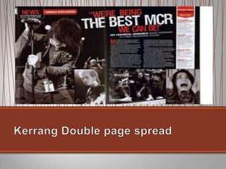
Jesse McNamara
• A sans serif font is used in the
  title with the addition of making it
  bold in order for it to stand out
  from the rest of the magazine. It
  is the same type of font and style
  as other articles in NME showing
  consistency within the magazine.
  The fact that it is made to stand
  out shows that the article is
  about them and connotates that
  it is a big and important band.
  The purpose of a headline is to
  outline what the article is going
  to be about, as used here as it is
  showing that the article is going
  to be about the band.
• In the Kerrang article a sans serif font is used
  again in the title. Unlike the NME magazine which
  uses a plain font with a colour that stands out
  from the background (following the rule of less is
  more) to draw attention, Kerrang used red and
  white writing to draw attention to the title with the
  addition of it being bigger than the rest of the
  writing. “The Best MCR” is the biggest writing of
  the title A sans serif font is used in the title with a
  white font which stands out more than the red
  which immediately draws our eyes to it. Also like
  NME it uses the same type of font and style as
  the other articles which is comforting to the
  reader as it shows consistency and makes the
  magazine easier to follow. The use of an
  abbreviation (“MCR”) connotates that it is a well
  known band as the audience wouldn‟t understand
  the abbreviation if they weren‟t. The title is
  important as it highlights what the article is going
  to be about, as shown here the article is about
  how MCR are improving themselves.
• The purpose of a stand
  first/slug/subheading is to draw you in to
  read the article. The stand first in this
  article has used the same font as the
  rest of the article but in a bigger size in
  order to make it stand out to the
  reader, it is also placed at the top of the
  article above the beginning of it in order
  to, again, bring attention as the attention
  will be brought to the beginning of the
  article. The words used in the stand first
  are important as one that was plain and
  boring wouldn‟t make someone want to
  read the article. For example, strong
  words are used like “hate” and “shot” to
  make it more enticing. They also use
  phrases like “nothing will stop” to bring
  attention to the reader as it connotates
  that the band are going further and
  further in their success.
• The purpose of a stand first/slug/subheading is to
  draw you in to read the article. Where the stand
  first in the NME article has used the same font as
  the rest of the article but in a bigger size in order
  to make it stand out to the reader and also placed
  it above the article away from the title, Kerrang
  have chose it to also be placed above the article
  but below the title, this brings attention as we are
  drawn to the medium between the two and the
  use of the bold writing of “my chemical romance”
  draws attention also. bring attention as the
  attention will be brought to the beginning of the
  article. The words used in the stand first are
  important as one that was plain and boring
  wouldn‟t make someone want to read the article.
  For example, in NME they used words such as
  “shot” whereas in Kerrang words like “invite” and
  “their” are used which makes it sound like a
  privilege for Kerrang to be there. Also the way
  that the stand first is written makes MCR sound
  like they are totally focused in to their music and
  shows that the article will focus on this.
• A drop cap is where the
  beginning letter of a sentence
  is made bigger than the rest
  of the words. Here, the drop
  cap is used exactly like that
  with a highlighted
  background in order to make
  the article look more
  significant on the page. The
  way that the drop capital is
  highlighted brings our eye
  towards it, enticing us to read
  the article.
• A drop cap is where the
  beginning letter of a sentence is
  made bigger than the rest of the
  words. Like NME, the drop cap
  in Kerrang is used exactly like
  that although whereas NME use
  a highlighted background in
  order to make the article look
  more significant on the
  page, Kerrang uses just a red
  bold M which shows consistency
  with the house theme and isn‟t
  too distracting from the article
  while still drawing attention.
• The reason behind columns and
  grid systems is to make the page
  easier to read and more
  organised rather than having it
  all laid out without any order.
  They are encouraged to read the
  article as it looks easy to read
  and each text used in the article
  is left aligned which shows a
  house system which is used
  continually in the article. It‟s easy
  to follow the article as only one
  pull quote is used which doesn‟t
  distract too much attention from
  the article yet it adds attention to
  the article in general.
• The reason behind columns and
  grid systems is to make the page
  easier to read and more
  organised rather than having it
  all laid out without any order.
  Like the NME article the text is
  left aligned which is comforting
  to the eye. The article is in two
  columns and is smaller in
  comparison to the rest of the
  text. The third column on the
  right hand page is music the
  band have done which is more
  information about the band so
  the reader can find out more
  about them.
• Pull quotes show a quote used in the
  article but with the font size bigger to
  make it stand out. It‟s a typical
  convention used in magazines, if the
  reader reads the pull quote first and
  the quote interests them they are
  more likely to read the article so the
  text used has to be picked cautiously
  so that it looks interesting, for
  example words like “shot” are used to
  gain attention, with the following “it‟s
  no big thing for me” which makes the
  reader think „why is it no big thing‟ and
  will make them want to read it. The
  pull quote in this magazine has been
  strategically placed in order to break
  up the article and make it easier for
  the audience to read.
• Pull quotes show a quote used in the
  article but with the font size bigger to make
  it stand out. It‟s a typical convention used
  in magazines, although unlike NME,
  Kerrang have used a more clever way of
  introducing the pull quote as the quote is
  both a pull quote and the title. If the reader
  reads the pull quote/title then they will gain
  more information about the article and will
  come to a decision of whether or not they
  read it so the text used has to be picked
  cautiously so that it looks interesting, for
  example words like “best” are used to gain
  attention, and different words are of
  different sizes which draws your eye to it.
  The pull quote in this magazine has been
  strategically placed in order to not make
  the article look too full.
• A caption has been used in
  NME to give credit to the
  photographer and explain
  who was in the image
  which adds anchorage as it
  gives meaning to the
  image. They are important
  so that the audience know
  that the images are relevant
  to the magazine.
• Whereas NME uses one
  photo and one
  caption, Kerrang uses four
  photos with four captions.
  The captions add
  anchorage to the images as
  they show what they mean
  and who is in the image.
  They are important so that
  the audience know that the
  images are relevant to the
  magazine.
• NME uses one image in their article in order
  to draw attention. The image is in full colour
  and the image in articles usually display the
  band and who is in the band or who will
  feature in the interview as done here. Music
  magazines usually make the main image
  take up a whole page which is what has
  been done here. The setting for the image is
  in what seems to be a family home which
  connotates that the band are calm and
  casual about being famous and still remain
  level headed. The image is quite unusual as
  they have people who are not part of the
  band with things tied around their eyes
  which suggests that the band are a bit quirky
  (considering the setting also) unlike other
  bands who pose in an actual setting. The
  lighting of the band is made to make the
  immediate eye focus on the band sitting
  around the table.
• Unlike NME, Kerrang have chose to
  include multiple images that are black
  and white in order to make the main
  focus on the title and text. Each of the
  photos has been manipulated for it to be
  this way in order to create a certain style
  of imagery, for example the images
  edited in this article are almost gothic
  and emo which is the type of music that
  My Chemical Romance produce. The
  size of the band is evident considering
  the pictures they have chosen which
  connotates their success. The separate
  images increases the fandom of the
  band as it makes the reader feel like
  they are included more in the article
  rather than just having one image of the
  band.
• The structure of NME is
        straightforward and the
        parts in the magazine are
        placed specifically in order
        to make the magazine flow
        for your eyes, for example
        the magazine makes your
NME
        eyes go from left to right to
        left. The information is
        revealed straight away as
        NME seem to jump into the
        article.
• Unlike NME, Kerrang‟s structure
            is less straightforward and more
            complicated as it uses multiple
            images and different parts to the
            article which has the same eye
            catching effects as NME but
            makes it look a lot complicated.
            Whereas NME makes you go
Kerrang     from left to right to left, Kerrang
            makes your eyes go all over as
            there isn‟t a certain part of the
            magazine to focus on and
            different things included in the
            magazine distract you when you
            are focused on something.
• NME‟s mode of address in the
        article is indirect which keeps up
        the interview. A direct mode of
        address in an interview would
        most likely cause confusion to
        the reader. Words such as
        “rippers” are used in the article
        which is slang and words like
NME     “indie” are reader specific as an
        older person would most likely
        not understand what this means.
        The article is wrote in first
        person which makes it more
        personal to the reader.
• Like NME the article is written in
            first person which again increases
            the fandom of the band as the
            readers feel more connected with
            the article. The mode of address is
            indirect in order to not make
            confusion with the writing, as the
            reader may not understand
            whether the band or the writer is
            talking. Unlike NME, Kerrang
Kerrang     doesn‟t use words that are slang.
            Words that are reader specific are
            used, for example My Chemical
            Romance is shortened down to
            MCR which assumes that the
            reader is already aware of what the
            band are called and who they are
            and will know what MCR stands for.
• NME follows the house style of
        left aligned text and a colour
        scheme of black, pink, purple
        and blue. It is maintained
        through the article as everything
        (such as the title, text, logo) is
        left aligned, the drop cap‟s
        background is purple, “new
NME     noise” is purple, pink and black
        and the square in the bottom
        right hand corner includes all the
        house colours. The house style
        is also continued onto the actual
        image where writing on a shirt is
        blue.
• Kerrangs house style is
            black, white and red. The text
            is left aligned in the actual
            article but the title/pull quote
            is center aligned. Kerrang
            have followed the house style
            colours really well and even
Kerrang     the images included are
            black and white to make the
            article seem more consistent.
            The title includes two colours
            (red and white) and the
            background is black in order
            to pull it all together.
• The identity that the
        magazine are creating for the
        Chapman family is a small-
        town band that are easy
        going as the band member
        didn‟t seem to bothered
        about being shot. The
        magazine creates an identity
NME     for the band as if they are
        unstoppable, by using words
        such as “nothing will stop”
        and acting as if they should
        have already stopped
        because they have been
        shot.
• The identity that the
            magazine are creating for the
            Chapman family is a small-
            town band that are easy
            going as the band member
            didn‟t seem to bothered
            about being shot. The
            magazine creates an identity
Kerrang     for the band as if they are
            unstoppable, by using words
            such as “nothing will stop”
            and acting as if they should
            have already stopped
            because they have been
            shot.
• The identity that Kerrang
            are creating for My
            Chemical Romance is an
            old band that are doing well
            for themselves and are
            continuing to improve. It is
Kerrang     representing social groups
            such as goths and emos by
            the gothic editing of the
            pictures and the black and
            red constant house theme.

Double page spread article analysis media task 4

  • 1.
  • 4.
    • A sansserif font is used in the title with the addition of making it bold in order for it to stand out from the rest of the magazine. It is the same type of font and style as other articles in NME showing consistency within the magazine. The fact that it is made to stand out shows that the article is about them and connotates that it is a big and important band. The purpose of a headline is to outline what the article is going to be about, as used here as it is showing that the article is going to be about the band.
  • 5.
    • In theKerrang article a sans serif font is used again in the title. Unlike the NME magazine which uses a plain font with a colour that stands out from the background (following the rule of less is more) to draw attention, Kerrang used red and white writing to draw attention to the title with the addition of it being bigger than the rest of the writing. “The Best MCR” is the biggest writing of the title A sans serif font is used in the title with a white font which stands out more than the red which immediately draws our eyes to it. Also like NME it uses the same type of font and style as the other articles which is comforting to the reader as it shows consistency and makes the magazine easier to follow. The use of an abbreviation (“MCR”) connotates that it is a well known band as the audience wouldn‟t understand the abbreviation if they weren‟t. The title is important as it highlights what the article is going to be about, as shown here the article is about how MCR are improving themselves.
  • 6.
    • The purposeof a stand first/slug/subheading is to draw you in to read the article. The stand first in this article has used the same font as the rest of the article but in a bigger size in order to make it stand out to the reader, it is also placed at the top of the article above the beginning of it in order to, again, bring attention as the attention will be brought to the beginning of the article. The words used in the stand first are important as one that was plain and boring wouldn‟t make someone want to read the article. For example, strong words are used like “hate” and “shot” to make it more enticing. They also use phrases like “nothing will stop” to bring attention to the reader as it connotates that the band are going further and further in their success.
  • 7.
    • The purposeof a stand first/slug/subheading is to draw you in to read the article. Where the stand first in the NME article has used the same font as the rest of the article but in a bigger size in order to make it stand out to the reader and also placed it above the article away from the title, Kerrang have chose it to also be placed above the article but below the title, this brings attention as we are drawn to the medium between the two and the use of the bold writing of “my chemical romance” draws attention also. bring attention as the attention will be brought to the beginning of the article. The words used in the stand first are important as one that was plain and boring wouldn‟t make someone want to read the article. For example, in NME they used words such as “shot” whereas in Kerrang words like “invite” and “their” are used which makes it sound like a privilege for Kerrang to be there. Also the way that the stand first is written makes MCR sound like they are totally focused in to their music and shows that the article will focus on this.
  • 8.
    • A dropcap is where the beginning letter of a sentence is made bigger than the rest of the words. Here, the drop cap is used exactly like that with a highlighted background in order to make the article look more significant on the page. The way that the drop capital is highlighted brings our eye towards it, enticing us to read the article.
  • 9.
    • A dropcap is where the beginning letter of a sentence is made bigger than the rest of the words. Like NME, the drop cap in Kerrang is used exactly like that although whereas NME use a highlighted background in order to make the article look more significant on the page, Kerrang uses just a red bold M which shows consistency with the house theme and isn‟t too distracting from the article while still drawing attention.
  • 12.
    • The reasonbehind columns and grid systems is to make the page easier to read and more organised rather than having it all laid out without any order. They are encouraged to read the article as it looks easy to read and each text used in the article is left aligned which shows a house system which is used continually in the article. It‟s easy to follow the article as only one pull quote is used which doesn‟t distract too much attention from the article yet it adds attention to the article in general.
  • 13.
    • The reasonbehind columns and grid systems is to make the page easier to read and more organised rather than having it all laid out without any order. Like the NME article the text is left aligned which is comforting to the eye. The article is in two columns and is smaller in comparison to the rest of the text. The third column on the right hand page is music the band have done which is more information about the band so the reader can find out more about them.
  • 14.
    • Pull quotesshow a quote used in the article but with the font size bigger to make it stand out. It‟s a typical convention used in magazines, if the reader reads the pull quote first and the quote interests them they are more likely to read the article so the text used has to be picked cautiously so that it looks interesting, for example words like “shot” are used to gain attention, with the following “it‟s no big thing for me” which makes the reader think „why is it no big thing‟ and will make them want to read it. The pull quote in this magazine has been strategically placed in order to break up the article and make it easier for the audience to read.
  • 15.
    • Pull quotesshow a quote used in the article but with the font size bigger to make it stand out. It‟s a typical convention used in magazines, although unlike NME, Kerrang have used a more clever way of introducing the pull quote as the quote is both a pull quote and the title. If the reader reads the pull quote/title then they will gain more information about the article and will come to a decision of whether or not they read it so the text used has to be picked cautiously so that it looks interesting, for example words like “best” are used to gain attention, and different words are of different sizes which draws your eye to it. The pull quote in this magazine has been strategically placed in order to not make the article look too full.
  • 16.
    • A captionhas been used in NME to give credit to the photographer and explain who was in the image which adds anchorage as it gives meaning to the image. They are important so that the audience know that the images are relevant to the magazine.
  • 17.
    • Whereas NMEuses one photo and one caption, Kerrang uses four photos with four captions. The captions add anchorage to the images as they show what they mean and who is in the image. They are important so that the audience know that the images are relevant to the magazine.
  • 18.
    • NME usesone image in their article in order to draw attention. The image is in full colour and the image in articles usually display the band and who is in the band or who will feature in the interview as done here. Music magazines usually make the main image take up a whole page which is what has been done here. The setting for the image is in what seems to be a family home which connotates that the band are calm and casual about being famous and still remain level headed. The image is quite unusual as they have people who are not part of the band with things tied around their eyes which suggests that the band are a bit quirky (considering the setting also) unlike other bands who pose in an actual setting. The lighting of the band is made to make the immediate eye focus on the band sitting around the table.
  • 19.
    • Unlike NME,Kerrang have chose to include multiple images that are black and white in order to make the main focus on the title and text. Each of the photos has been manipulated for it to be this way in order to create a certain style of imagery, for example the images edited in this article are almost gothic and emo which is the type of music that My Chemical Romance produce. The size of the band is evident considering the pictures they have chosen which connotates their success. The separate images increases the fandom of the band as it makes the reader feel like they are included more in the article rather than just having one image of the band.
  • 20.
    • The structureof NME is straightforward and the parts in the magazine are placed specifically in order to make the magazine flow for your eyes, for example the magazine makes your NME eyes go from left to right to left. The information is revealed straight away as NME seem to jump into the article.
  • 21.
    • Unlike NME,Kerrang‟s structure is less straightforward and more complicated as it uses multiple images and different parts to the article which has the same eye catching effects as NME but makes it look a lot complicated. Whereas NME makes you go Kerrang from left to right to left, Kerrang makes your eyes go all over as there isn‟t a certain part of the magazine to focus on and different things included in the magazine distract you when you are focused on something.
  • 22.
    • NME‟s modeof address in the article is indirect which keeps up the interview. A direct mode of address in an interview would most likely cause confusion to the reader. Words such as “rippers” are used in the article which is slang and words like NME “indie” are reader specific as an older person would most likely not understand what this means. The article is wrote in first person which makes it more personal to the reader.
  • 23.
    • Like NMEthe article is written in first person which again increases the fandom of the band as the readers feel more connected with the article. The mode of address is indirect in order to not make confusion with the writing, as the reader may not understand whether the band or the writer is talking. Unlike NME, Kerrang Kerrang doesn‟t use words that are slang. Words that are reader specific are used, for example My Chemical Romance is shortened down to MCR which assumes that the reader is already aware of what the band are called and who they are and will know what MCR stands for.
  • 24.
    • NME followsthe house style of left aligned text and a colour scheme of black, pink, purple and blue. It is maintained through the article as everything (such as the title, text, logo) is left aligned, the drop cap‟s background is purple, “new NME noise” is purple, pink and black and the square in the bottom right hand corner includes all the house colours. The house style is also continued onto the actual image where writing on a shirt is blue.
  • 25.
    • Kerrangs housestyle is black, white and red. The text is left aligned in the actual article but the title/pull quote is center aligned. Kerrang have followed the house style colours really well and even Kerrang the images included are black and white to make the article seem more consistent. The title includes two colours (red and white) and the background is black in order to pull it all together.
  • 26.
    • The identitythat the magazine are creating for the Chapman family is a small- town band that are easy going as the band member didn‟t seem to bothered about being shot. The magazine creates an identity NME for the band as if they are unstoppable, by using words such as “nothing will stop” and acting as if they should have already stopped because they have been shot.
  • 27.
    • The identitythat the magazine are creating for the Chapman family is a small- town band that are easy going as the band member didn‟t seem to bothered about being shot. The magazine creates an identity Kerrang for the band as if they are unstoppable, by using words such as “nothing will stop” and acting as if they should have already stopped because they have been shot.
  • 28.
    • The identitythat Kerrang are creating for My Chemical Romance is an old band that are doing well for themselves and are continuing to improve. It is Kerrang representing social groups such as goths and emos by the gothic editing of the pictures and the black and red constant house theme.