
Recommended
More Related Content
What's hot
What's hot (19)
Viewers also liked
Viewers also liked (20)
Similar to Existing media analysis
Similar to Existing media analysis (20)
More from daisyfranklinmedia
More from daisyfranklinmedia (16)
Recently uploaded
Recently uploaded (20)
Existing media analysis
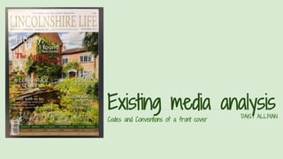
- 1. Existing media analysisDAISY ALLMAN Codes and Conventions of a front cover
- 2. MASTHEAD: The masthead is the title of the magazine which makes the reader familiar with what they are reading. The title ‘Lincolnshire Life’ is written in a posh, newspaper style font which attracts an older audience. It clearly represents what the magazine is about with this title as the reader knows it will contain information about life in lincolnshire. This title is written in gold which attracts readers of a higher class. The actual name of the magazine is effective as it uses alliteration which makes it memorable. WEBSITE: The front cover features the website so the reader can look up other editions of the magazine and find out more information about life in lincolnshire. SELLING LINE: The selling line is the introductory headline describing the magazine.This selling line is effective because it makes the reader think that there is a lot going on in Lincolnshire and entices the reader to buy the magazine. It gives the impression there is a lot of exciting stuff going on in Lincolnshire which is worth reading about with the use of repetition of the word ‘full’ PRICE: The price features at the top of the front cover of the magazine to inform readers how much the magazine is. This is effective on the front of the magazine because it helps the reader decide whether they want to purchase the magazine or not.
- 3. MAIN COVER LINE: The main cover line is smaller than the masthead but bigger than the other cover lines. The main coverline is effective because the font size is bigger than the other cover lines. It stands out from the rest because part of the writing is in red and none of the others are. This makes it clear to the reader that this is the most important story featuring in the magazine. COVERLINES: Coverlines tell us stories that feature in the magazine. This is just 2 of the example of the 4 coverlines that feature on the front of the front of the magazine. The coverline is effective because it is written in the same colour and font as the main coverline but smaller so you can see which story is more important. They are thing that stand out the least on the front cover and therefore the thing that is read last. The language is persuasive for example ‘WHAT'S HOT’ to make the reader want to open the magazine and read on. SCREAMER: A screamer is a story which is in bold and seems to be shouted at the reader to attract attention to the story. This is an effective screamer because it stands out boldly from the other stories because it is in a larger font and features a different colour. However, this screamer isn’t as bold as one you’d find on a magazine aimed at a young magazine because this magazine doesn’t have the same upbeat atmosphere as magazines such as ‘Cosmo’ because it is a chilled magazine talking about the countryside for older
- 4. BARCODE: Used to identify the magazine and to give it a price for customers. COVER PHOTO: The cover photo is the background image on the front cover of a magazine. This is an effective photo because it compliments the house style. It entices the target audience to the magazine because the photo is of high quality photo and links to the socio-economic background of the reader because they are likely to be well off enough to afford a house like the one that is shown on the photo. It is also effective because the age of the target audience is older so this photo is more likely to appeal to them than a picture that you’d see on the cover of NME magazine of a pop icon. It is also effective because it reflects life in Lincolnshire appropriately as a peaceful and green region. PROMOTIONAL PANEL: This is used to give the readers a brief insight of what features in the magazine. This is effective on the front cover of the magazine because the reader can have a brief look at the magazine and know whether it is the kind of thing they are interested in reading or not
- 5. Codes and Conventions of a double page spread
- 6. HEADLINE: The title is the name of the cover story and gives the idea a brief idea of what the story includes. The font of the title is formal to reflect the older target audience that the magazine is aimed at. This title is effective because it straightaway informs the reader that the story is about the longwool sheep so if they take an interest in that they can read on and if they don’t then they can turn over. It is also effective because you know the story is about a sheep but you don’t know what it’s about so it makes you want to read on. PICTURES: The pictures on a double page spread are used for a similar reason to the title to give a brief idea of what the cover story consists of. These photos are effective because you can clearly see the story talks about the longwool sheep. The photos, however, are used to accompany the story, not to tell the story so they don’t prevent the reader from finding out what the story includes. SUBHEADLINE: This is used to give a brief insight to what the story is about. This is effective because if the reader doesn’t have time to read the whole story they can get updated of what it is about quickly by reading the overview.
- 7. Codes and Conventions of a contents page
- 8. TITLE: The title of this page informs the reader that this is what the whole magazine consists of. This is useful because the reader can easily find a story that they are interested in. PICTURES: These pictures show what the magazine consists of. They are useful on the contents page because it informs the reader what the magazine includes. CONTENTS: The contents page is useful because it helps the reader find which story they are interested in. This contents is useful because the information is bold and it is laid out in a way to make the reader easily understand it.