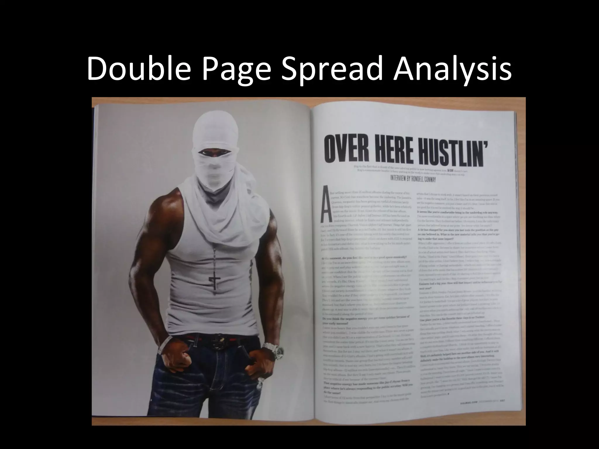
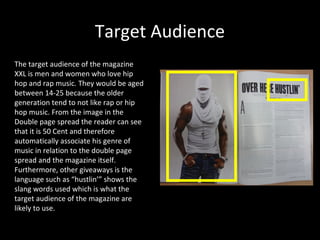
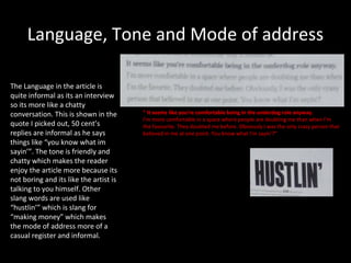
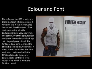
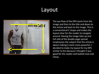
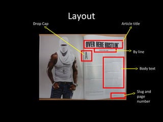
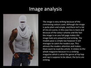
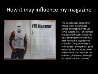
Double Page Spread Analysis
Magazine History
•In 1997, XXL was founded by former Source staffers as well as other Harris Publication
employees, who wanted to create their own magazine about the hip-hop music and culture
using the model developed by the founders of The Source.

•The magazine's past editors included Elliott Wilson and Datwon. In May 2009 Datwon
Thomas resigned from XXL and executive editor Vanessa Satten, who had been with XXL
since 1998, was named the new Editor-in-Chief.

•In December 2006, XXL took over the struggling Hip-Hop producer and DJ magazine Scratch
(another publication owned by Harris Publications), re-branding it as "XXL Presents Scratch
Magazine". Scratch shut down in September 2007.

• Other titles with limited runs have been launched under the XXL brand, including Hip-Hop
Soul, Eye Candy and Shade45. XXL has released many other special projects including tour
programs, mix tapes and exclusive DVDs. XXL also maintains a popular website, which
provides daily hip-hop news, original content and content from the magazine
Target Audience
The target audience of the magazine
XXL is men and women who love hip
hop and rap music. They would be aged
between 14-25 because the older
generation tend to not like rap or hip
hop music. From the image in the
Double page spread the reader can see
that it is 50 Cent and therefore
automatically associate his genre of
music in relation to the double page
spread and the magazine itself.
Furthermore, other giveaways is the
language such as “hustlin’” shows the
slang words used which is what the
target audience of the magazine are
likely to use.
Language, Tone and Mode of address

The Language in the article is
quite informal as its an interview
so its more like a chatty
conversation. This is shown in the      “ It seems like you’re comfortable being in the underdog role anyway.
                                        I’m more comfortable in a space where people are doubting me than when I’m
quote I picked out, 50 cent’s           the favourite. They doubted me before. Obviously I was the only crazy person that
replies are informal as he says         believed in me at one point. You know what I’m sayin’?”
things like “you know what im
sayin’”. The tone is friendly and
chatty which makes the reader
enjoy the article more because its
not boring and its like the artist is
talking to you himself. Other
slang words are used like
“hustlin’” which is slang for
“making money” which makes
the mode of address more of a
casual register and informal.
Colour and Font
The colour of the DPS is plain and
there is a lot of white space used,
however this makes it look good
because of the skin colour of 50
cent contrasting with the
background looks very powerful.
The continuity of the colours black
and white makes the DPS look eye
catching and professional. The
fonts used are sans serif and the
title is big and bold which makes it
stand out to the reader. The sans
serif fonts bodes well with the
DPS in relation to the genre
because sans serif fonts look
more casual which is what the
DPS is – casual.
Layout
    The eye flow of the DPS starts from the
    image and then to the title and down to
    the article and back to the image. This is
    a conventional C shape and makes the
    layout clear for the reader to navigate
    around. Having the image take up one
    full side of the double page spread
    emphasises the subject that the article is
    about making it seem more powerful. I
    decided to make my layout for my DPS
    similar to this because I thought it was
    good for the reader and looked neat and
    classy.
Layout
Drop Cap            Article title


                            By line


                                Body text


                              Slug and
                              page
                              number
Image analysis

     The image is very striking because of the
     contrasting colours used. Although the image
     is quite plain and simple, and there isn't a lot
     of mis-en-scene, in this case less is more and
     because of the colour scheme and the fact
     the image is on one full page makes the
     image look very powerful and striking. The
     models pose is simple too however it still
     manages to catch the readers eye. This
     attracts the readers attention and makes
     them want to read the article. It relates to the
     whole magazine because it is a striking
     magazine which is what the genre of hip hop
     and rap is suppose to be about, the lyrics are
     striking.
How it may influence my magazine

                    The Double page spread may
                    influence my double page
                    spread and inspire me to use
                    some aspects of it. For example
                    the layout I thought was really
                    clear and neat therefore I may
                    base my double page spread
                    around it. Using one image a
                    full A4 page I thought was good
                    because it creates more power
                    to the article. Furthermore the
                    boldness of the fonts I thought
                    was good so I used that too.

Double page spread xxl

  • 1.
  • 2.
    Magazine History •In 1997,XXL was founded by former Source staffers as well as other Harris Publication employees, who wanted to create their own magazine about the hip-hop music and culture using the model developed by the founders of The Source. •The magazine's past editors included Elliott Wilson and Datwon. In May 2009 Datwon Thomas resigned from XXL and executive editor Vanessa Satten, who had been with XXL since 1998, was named the new Editor-in-Chief. •In December 2006, XXL took over the struggling Hip-Hop producer and DJ magazine Scratch (another publication owned by Harris Publications), re-branding it as "XXL Presents Scratch Magazine". Scratch shut down in September 2007. • Other titles with limited runs have been launched under the XXL brand, including Hip-Hop Soul, Eye Candy and Shade45. XXL has released many other special projects including tour programs, mix tapes and exclusive DVDs. XXL also maintains a popular website, which provides daily hip-hop news, original content and content from the magazine
  • 3.
    Target Audience The targetaudience of the magazine XXL is men and women who love hip hop and rap music. They would be aged between 14-25 because the older generation tend to not like rap or hip hop music. From the image in the Double page spread the reader can see that it is 50 Cent and therefore automatically associate his genre of music in relation to the double page spread and the magazine itself. Furthermore, other giveaways is the language such as “hustlin’” shows the slang words used which is what the target audience of the magazine are likely to use.
  • 4.
    Language, Tone andMode of address The Language in the article is quite informal as its an interview so its more like a chatty conversation. This is shown in the “ It seems like you’re comfortable being in the underdog role anyway. I’m more comfortable in a space where people are doubting me than when I’m quote I picked out, 50 cent’s the favourite. They doubted me before. Obviously I was the only crazy person that replies are informal as he says believed in me at one point. You know what I’m sayin’?” things like “you know what im sayin’”. The tone is friendly and chatty which makes the reader enjoy the article more because its not boring and its like the artist is talking to you himself. Other slang words are used like “hustlin’” which is slang for “making money” which makes the mode of address more of a casual register and informal.
  • 5.
    Colour and Font Thecolour of the DPS is plain and there is a lot of white space used, however this makes it look good because of the skin colour of 50 cent contrasting with the background looks very powerful. The continuity of the colours black and white makes the DPS look eye catching and professional. The fonts used are sans serif and the title is big and bold which makes it stand out to the reader. The sans serif fonts bodes well with the DPS in relation to the genre because sans serif fonts look more casual which is what the DPS is – casual.
  • 6.
    Layout The eye flow of the DPS starts from the image and then to the title and down to the article and back to the image. This is a conventional C shape and makes the layout clear for the reader to navigate around. Having the image take up one full side of the double page spread emphasises the subject that the article is about making it seem more powerful. I decided to make my layout for my DPS similar to this because I thought it was good for the reader and looked neat and classy.
  • 7.
    Layout Drop Cap Article title By line Body text Slug and page number
  • 8.
    Image analysis The image is very striking because of the contrasting colours used. Although the image is quite plain and simple, and there isn't a lot of mis-en-scene, in this case less is more and because of the colour scheme and the fact the image is on one full page makes the image look very powerful and striking. The models pose is simple too however it still manages to catch the readers eye. This attracts the readers attention and makes them want to read the article. It relates to the whole magazine because it is a striking magazine which is what the genre of hip hop and rap is suppose to be about, the lyrics are striking.
  • 9.
    How it mayinfluence my magazine The Double page spread may influence my double page spread and inspire me to use some aspects of it. For example the layout I thought was really clear and neat therefore I may base my double page spread around it. Using one image a full A4 page I thought was good because it creates more power to the article. Furthermore the boldness of the fonts I thought was good so I used that too.