This document analyzes various design elements of the Rolling Stones magazine, including the front cover, double page spread, and contents page. Across all sections, the magazine maintains consistency in its typography, layout, colors, images, and language to appeal to its target audience of older music fans. Red and black are featured prominently. The organized layout and sophisticated yet straightforward writing style also reinforce the magazine's identity and mode of address.
2024.06.01 Introducing a competency framework for languag learning materials ...Sandy Millin
http://sandymillin.wordpress.com/iateflwebinar2024
Published classroom materials form the basis of syllabuses, drive teacher professional development, and have a potentially huge influence on learners, teachers and education systems. All teachers also create their own materials, whether a few sentences on a blackboard, a highly-structured fully-realised online course, or anything in between. Despite this, the knowledge and skills needed to create effective language learning materials are rarely part of teacher training, and are mostly learnt by trial and error.
Knowledge and skills frameworks, generally called competency frameworks, for ELT teachers, trainers and managers have existed for a few years now. However, until I created one for my MA dissertation, there wasn’t one drawing together what we need to know and do to be able to effectively produce language learning materials.
This webinar will introduce you to my framework, highlighting the key competencies I identified from my research. It will also show how anybody involved in language teaching (any language, not just English!), teacher training, managing schools or developing language learning materials can benefit from using the framework.
The Art Pastor's Guide to Sabbath | Steve ThomasonSteve Thomason
What is the purpose of the Sabbath Law in the Torah. It is interesting to compare how the context of the law shifts from Exodus to Deuteronomy. Who gets to rest, and why?
Synthetic Fiber Construction in lab .pptxPavel ( NSTU)
Synthetic fiber production is a fascinating and complex field that blends chemistry, engineering, and environmental science. By understanding these aspects, students can gain a comprehensive view of synthetic fiber production, its impact on society and the environment, and the potential for future innovations. Synthetic fibers play a crucial role in modern society, impacting various aspects of daily life, industry, and the environment. ynthetic fibers are integral to modern life, offering a range of benefits from cost-effectiveness and versatility to innovative applications and performance characteristics. While they pose environmental challenges, ongoing research and development aim to create more sustainable and eco-friendly alternatives. Understanding the importance of synthetic fibers helps in appreciating their role in the economy, industry, and daily life, while also emphasizing the need for sustainable practices and innovation.
The Indian economy is classified into different sectors to simplify the analysis and understanding of economic activities. For Class 10, it's essential to grasp the sectors of the Indian economy, understand their characteristics, and recognize their importance. This guide will provide detailed notes on the Sectors of the Indian Economy Class 10, using specific long-tail keywords to enhance comprehension.
For more information, visit-www.vavaclasses.com
Ethnobotany and Ethnopharmacology:
Ethnobotany in herbal drug evaluation,
Impact of Ethnobotany in traditional medicine,
New development in herbals,
Bio-prospecting tools for drug discovery,
Role of Ethnopharmacology in drug evaluation,
Reverse Pharmacology.
How to Split Bills in the Odoo 17 POS ModuleCeline George
Bills have a main role in point of sale procedure. It will help to track sales, handling payments and giving receipts to customers. Bill splitting also has an important role in POS. For example, If some friends come together for dinner and if they want to divide the bill then it is possible by POS bill splitting. This slide will show how to split bills in odoo 17 POS.
How to Create Map Views in the Odoo 17 ERPCeline George
The map views are useful for providing a geographical representation of data. They allow users to visualize and analyze the data in a more intuitive manner.
The French Revolution, which began in 1789, was a period of radical social and political upheaval in France. It marked the decline of absolute monarchies, the rise of secular and democratic republics, and the eventual rise of Napoleon Bonaparte. This revolutionary period is crucial in understanding the transition from feudalism to modernity in Europe.
For more information, visit-www.vavaclasses.com
Unit 8 - Information and Communication Technology (Paper I).pdfThiyagu K
This slides describes the basic concepts of ICT, basics of Email, Emerging Technology and Digital Initiatives in Education. This presentations aligns with the UGC Paper I syllabus.
Students, digital devices and success - Andreas Schleicher - 27 May 2024..pptxEduSkills OECD
Andreas Schleicher presents at the OECD webinar ‘Digital devices in schools: detrimental distraction or secret to success?’ on 27 May 2024. The presentation was based on findings from PISA 2022 results and the webinar helped launch the PISA in Focus ‘Managing screen time: How to protect and equip students against distraction’ https://www.oecd-ilibrary.org/education/managing-screen-time_7c225af4-en and the OECD Education Policy Perspective ‘Students, digital devices and success’ can be found here - https://oe.cd/il/5yV
Chapter 3 - Islamic Banking Products and Services.pptx
Task three completed 1
1. Hollie Hubbard Task three
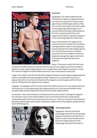
Front cover
Typography- The mode of address for the
rolling stones magazine is organised and set
out more set up properly his makes it more
appealing to an older target audience. They
also use white and red for the text this makes
it more appealing to different genres as it
connotes different things to different genres.
Also this is conventional for this music
magazine and it doesn’t specify on one genre
it has a wide range of genres linked into it.
Layout- The layout for the magazine uses
route of the eye, this makes it more ordered
and organised this makes it more appealing
and eye catching to the older target audience
as it isn’t all messy or just put in random
places like most music magazines which are
targeted to younger teenagers and children
for example the top of the pops music
magazine.
Colour- The colours used for the front cover
are plainer but affective this is conventional for this type of music magazine as it has to be able to
appeal to a large range of target audience. As it is targeted to a wide range of music genre s. It also
fits in with the magazines mode of address because it uses similar colours in each issue.
Images- The image fits into the identity of the magazine because it is quite edgy and appealing to the
audience especially the female teenager and older audience as it is revealing of one of a very
popular male artist. It also fits to the identity of the magazine as most images used for the front
cover of rolling stones are edgy and use sex appeal.
Language- The language used fits into the mode of the address because it is more sophisticated and
intellectual so it is more appealing to older target audience as its not simple and childish so less
younger people would be appealed to the text whereas elder target audience
Conventions - this is conventional for a rolling stones front cover and for a mixed genre magazine
this is because it has its own mode of address and its own brand identity this is shown by the
masthead being the same on every front cover of every issue. They also used colours that attracts to
the wide range of target audience that rolling stones magazine has as they target to people who like
lots of different genres.
Double page spread
Typography- the font used for the
double page spread for the rolling stones
magazine used mainly serif fonts as it is
based on a well-known female artist so
there main target audience for the
double page spread will be females. It
2. Hollie Hubbard Task three
also fits into the magazine identity because it is using very similar fonts as it does for its front cover
and other double page spreads. This also keeps it linked into the rest of the magazine.
Layout- The layout of the double page spread follows the route of the eye, so it is more appealing to
the target audience. It also fits into the identity of the magazine as it is usually well organised and
laid out professionally instead of being messy and put in random places so this continues with their
mode of address.
Colour- they colours used for this particular double page spread are black and white, this gives it a
more edgy feeling to the article, it also fits into the fact that it is a multi -genre magazine, so it has a
wide range of audience so it needs to be able to appeal to many more people than it would if it was
a specific genre targeted magazine.
Image- the image used in this article fits in well with the magazine because it focuses on the specific
artist and not what is around them, at it is a more older and sophisticated magazine. It also uses
basic make up and big hair to make the artist look edgy but still exciting and interesting, which also
fits in with the magazine as that’s also the image the magazine wants to give off.
Language- The language used in the spread is quite formal but inspirational toward the artist and her
music, it also uses a more sophisticated language as it is targeted at an older target audience. The
magazine also has a unique sophisticated identity so intellectual language fits in with the identity of
the magazine.
Conventions- The magazine is conventional because it uses all the techniques that fit in with the
identity of the brand and that it is a mixed genre music video for example it uses colours that don’t
connote anything specific apart from sophistication or darkness as it is mainly dark colours. It also
uses route of the eye and it well laid out and structured which also fits into the identity as it is
targeted to a more middle to higher social group also and older target audience.
Contents page
Typography- The fonts used for the contents page are both san serif
and serif. Serif fonts have been used mainly for the main headlines and
san serif fonts have been made for the less important and interesting
information. This makes the more important and eye catching news
and information stand out more to the target audience as it is also in
bold red which makes it more vibrant and stand out than the less
interesting news which is smaller and in plain black text. It also
includes the issue number this is also in every issue on the contents
page, this is its brand identity and mode of address this also looks
authentic and original as most magazines have their issue number in
small text on the inside cover or in a corner.
Layout- the layout for the contents page is quite organised and uses route of the eye. This also links
into the double page spread and front cover which also use the same technique. As in every issue of
the rolling stone, the layout is always need and tidy, it’s not busy and messy so even the contents
page fits into the identity of the magazine and stays in form of the mode of address.
Colour- As seen in this contents page the colours used are all neutral and plain colours; red, black
and white. This also links into their identity as they always use red for their masthead colour and a
black and white outline. It also fits into their target audience as it isn’t targeted at a specific genre.
3. Hollie Hubbard Task three
Image- The image used in the contents page is very retro and old fashioned this fits into the target
audience and identity of the magazine as it targets different genres so it has targeted a specific
genre for the contents page where they may be a little bit about the genre in the magazine, also
because it links into the theme of that issue which is “women who rock 2012” this shows that this
specific issue is targeted to mainly females or males who prefer female artists, it also links into the
identity of the magazine because it shows originality.
Language-the language used in the contents page is quite basic but to the point and effective this is
because it doesn’t want to give you too much information before you go to read all the magazine
however it is still more intellectual language which is still appealing to the older target audience.
Conventions- this is conventional for the magazine because it uses all the same layout, colours and
language which set the mode of address and identity for the magazine.