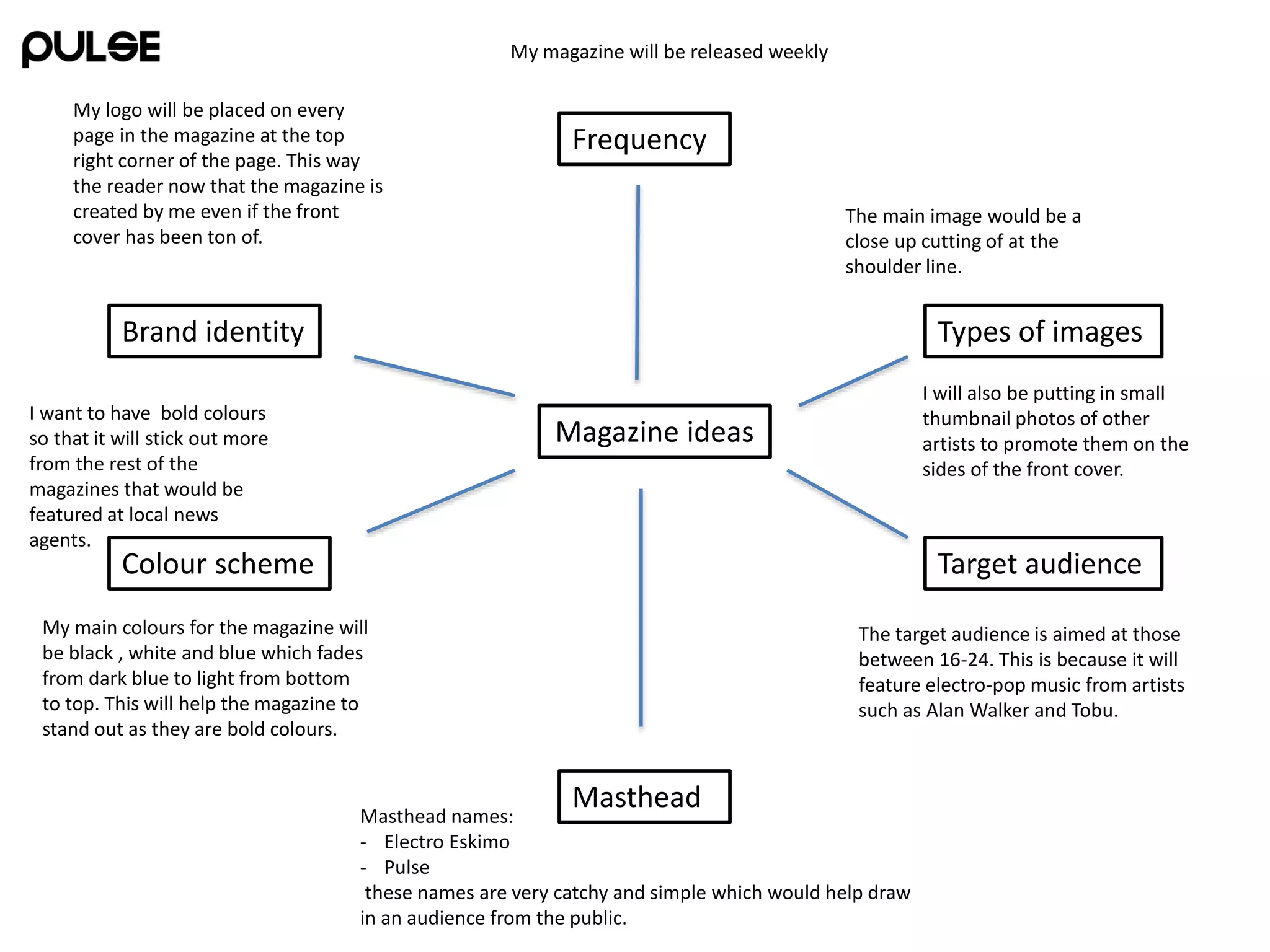
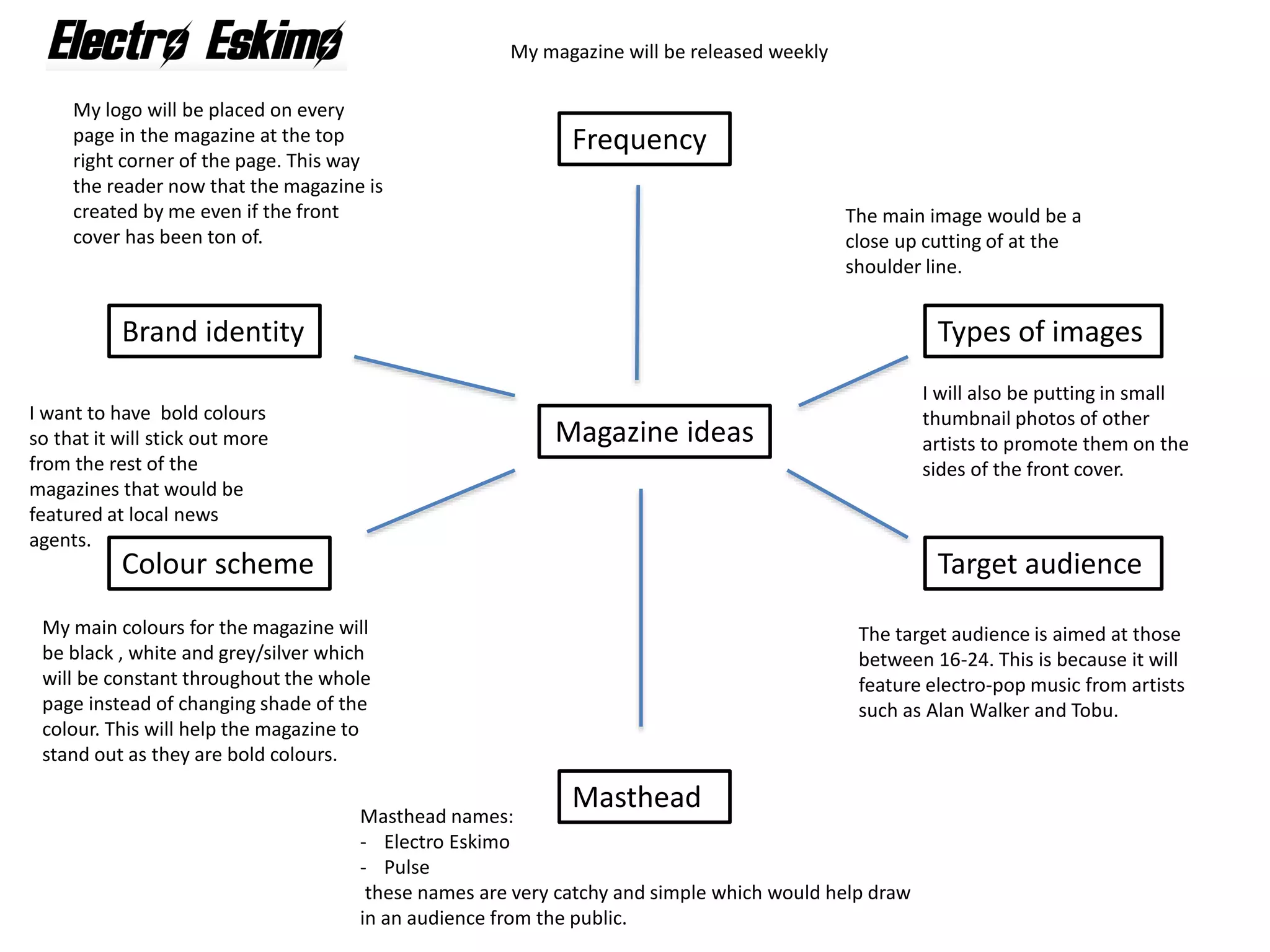
The documents provide details on the proposed layouts, designs, and target audience for two electro music magazines called Pulse and Electro Eskimo. Key details include:
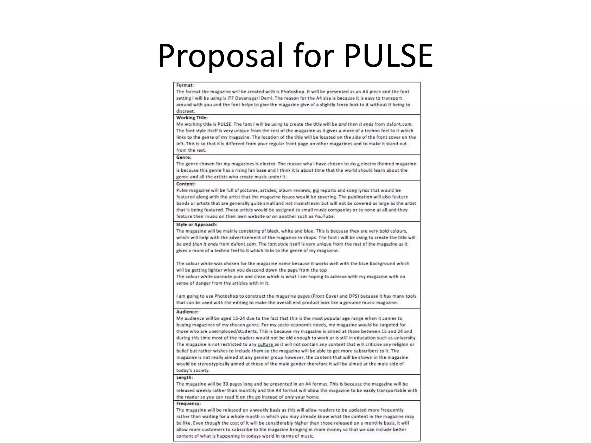
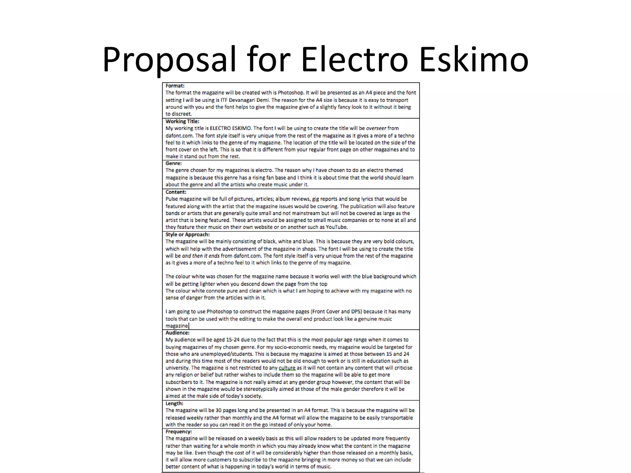
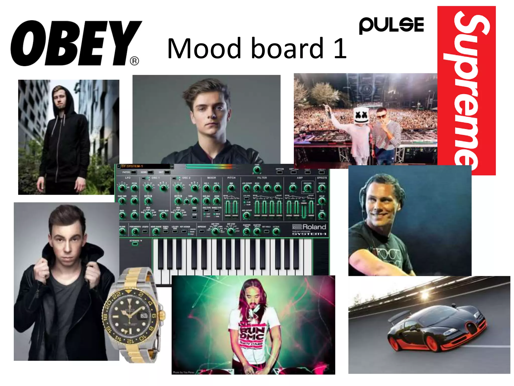
- The magazines will have a weekly release schedule and target 16-24 year olds who enjoy electro-pop artists like Alan Walker and Tobu.
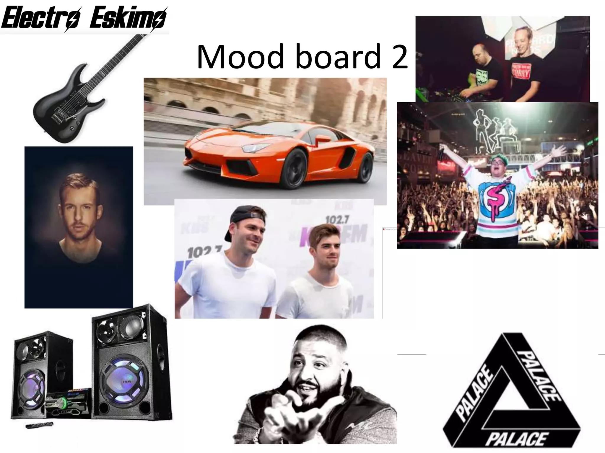
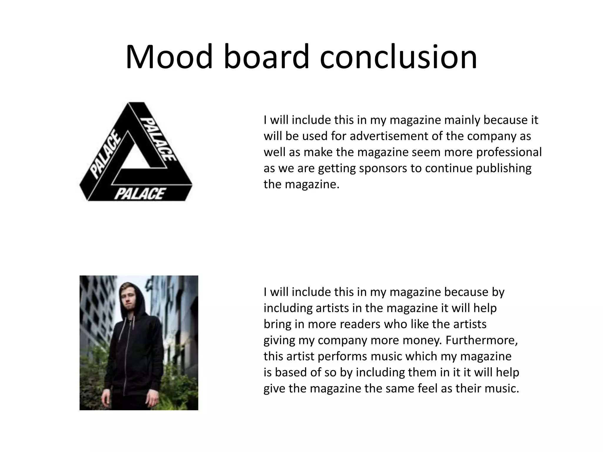
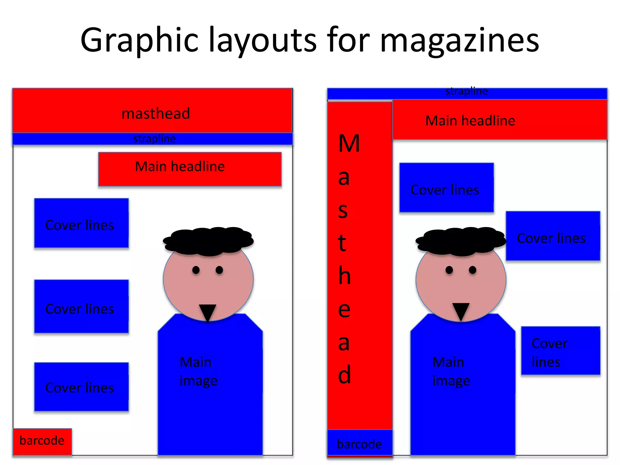
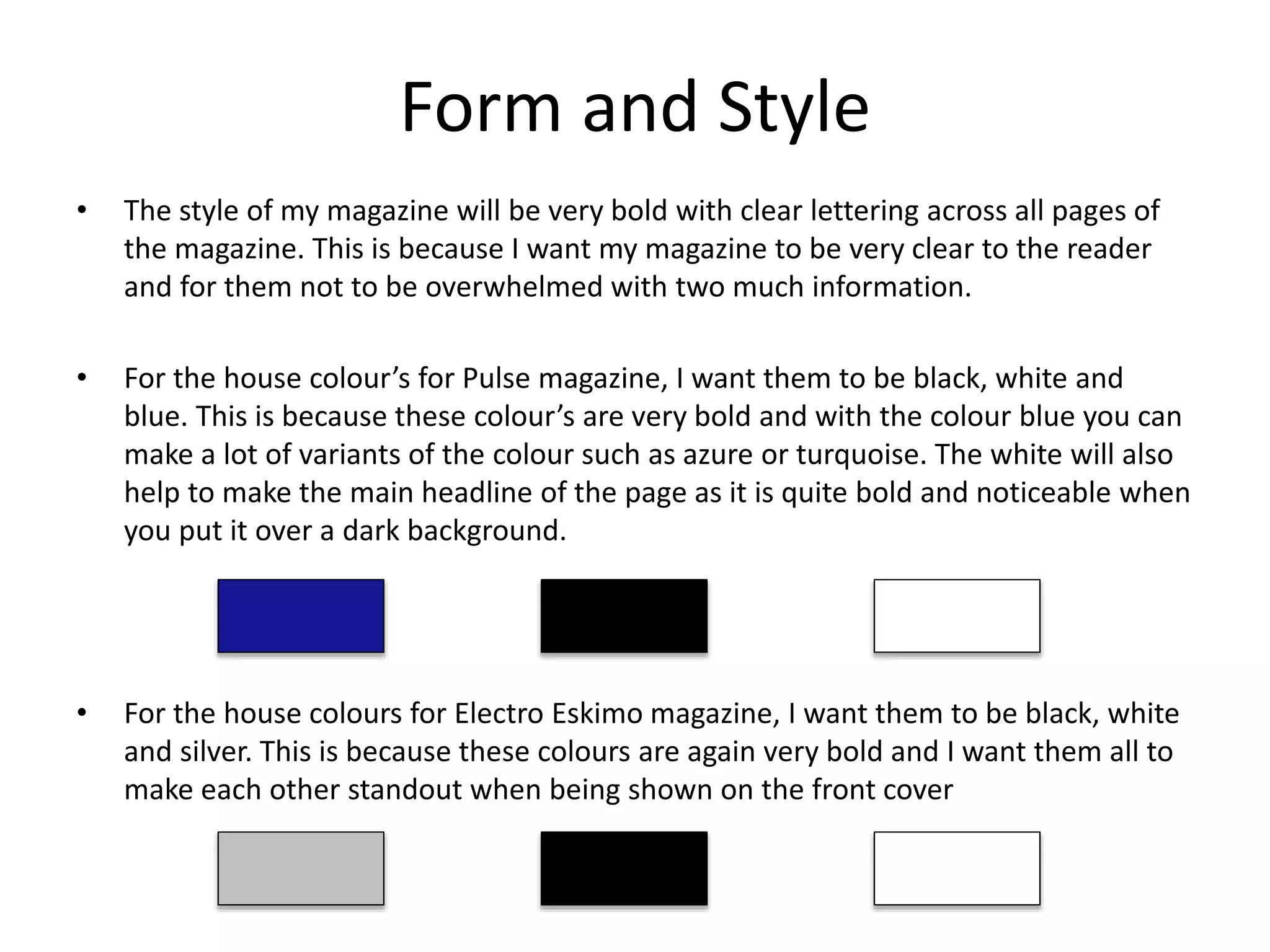
- The color scheme will be bold blacks, whites, and blues to stand out on newsstands. Thumbnail images of other artists will also be included.
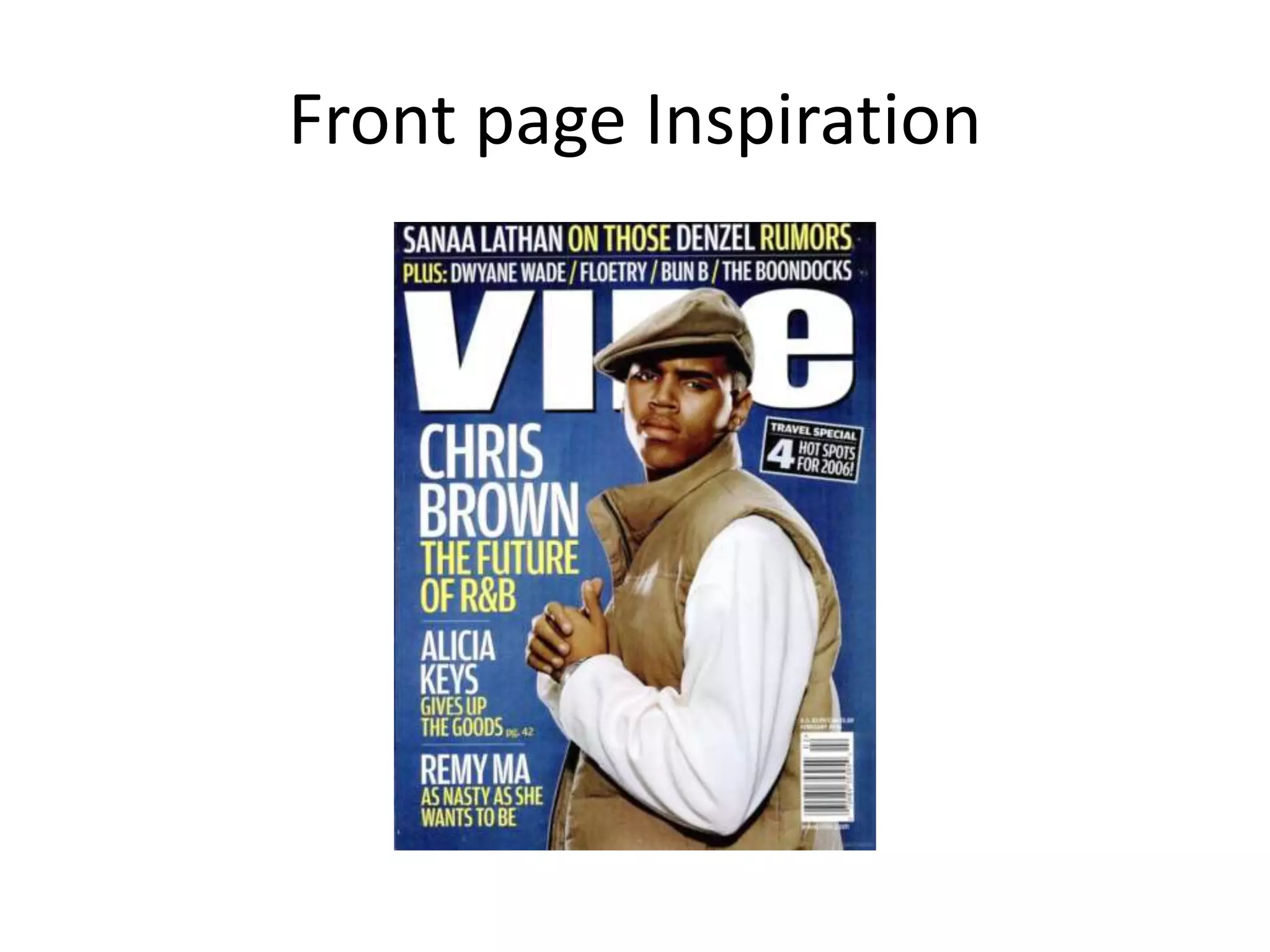
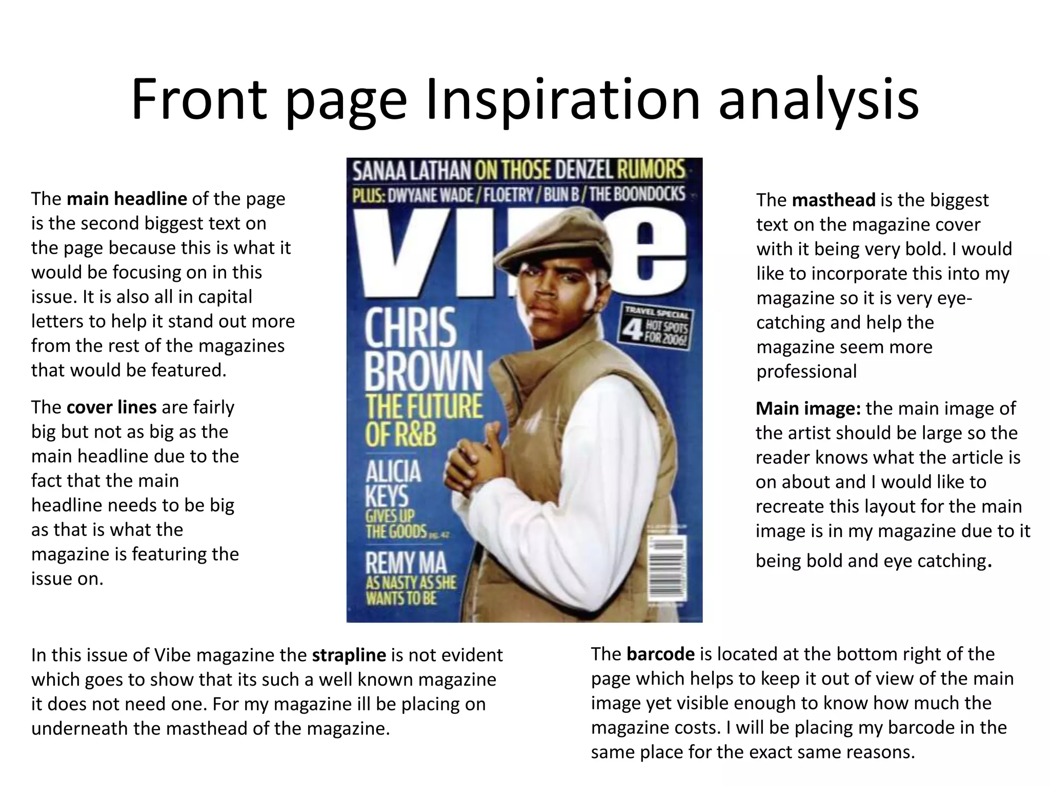
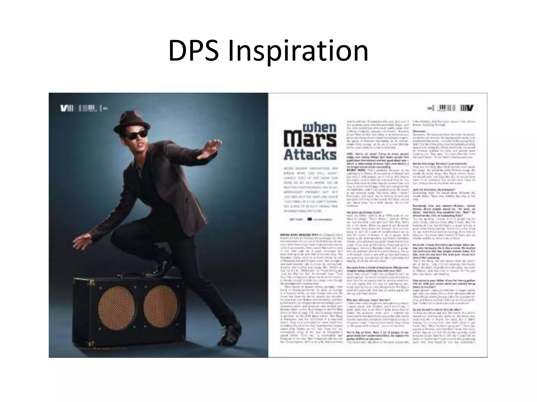
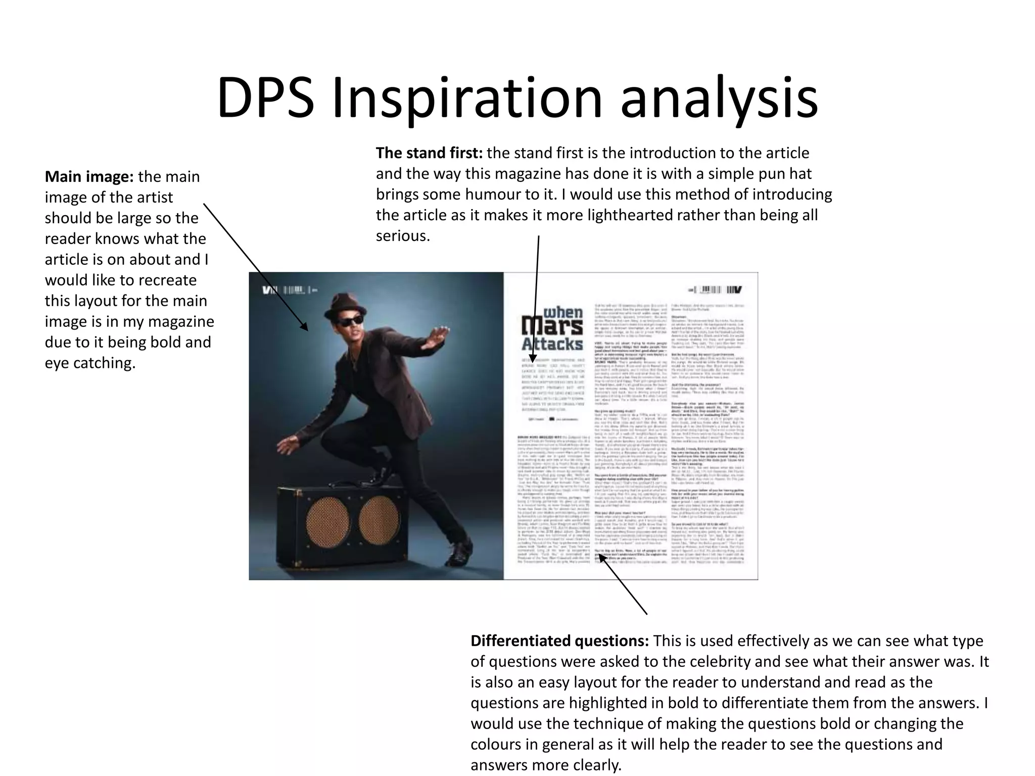
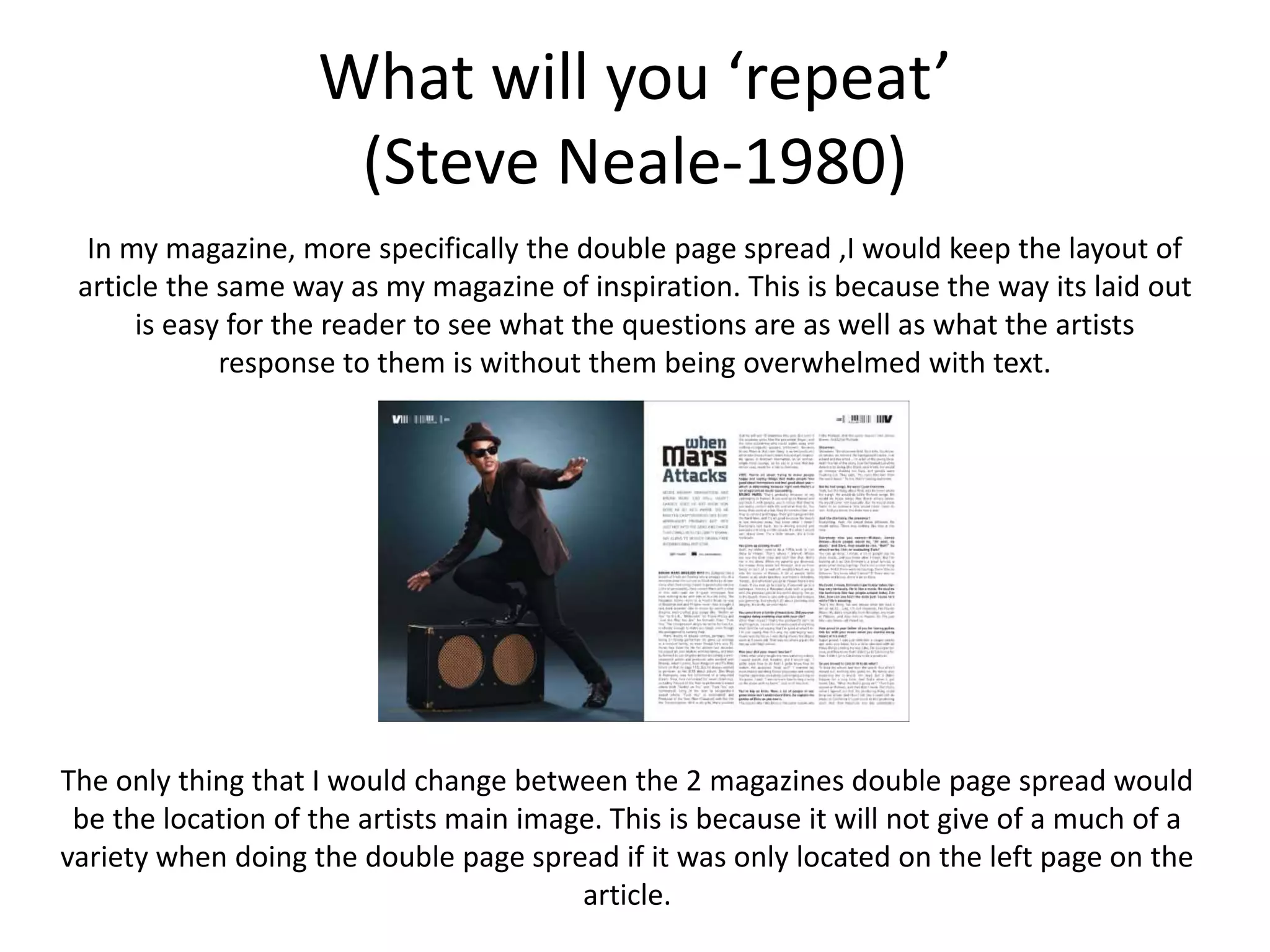
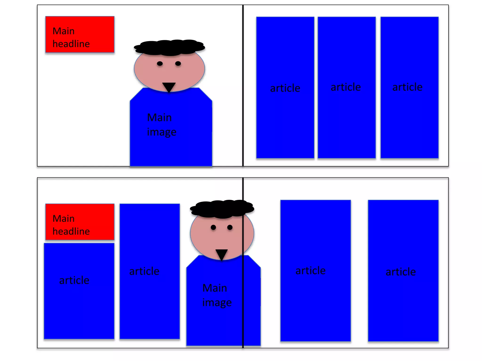
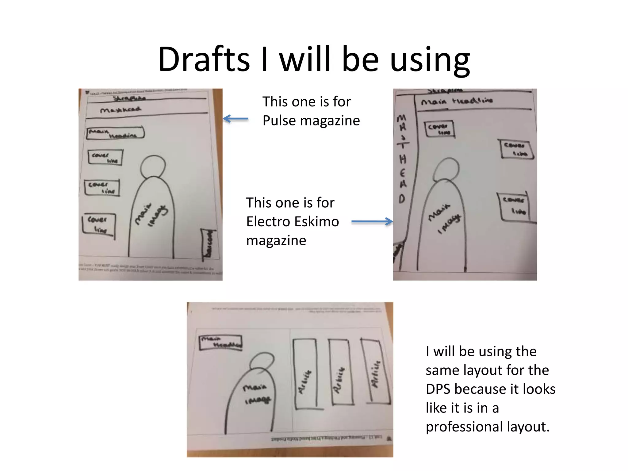
- Inspiration is taken from existing magazine layouts, including large central images, differentiated text sizes, and consistent logo placement.
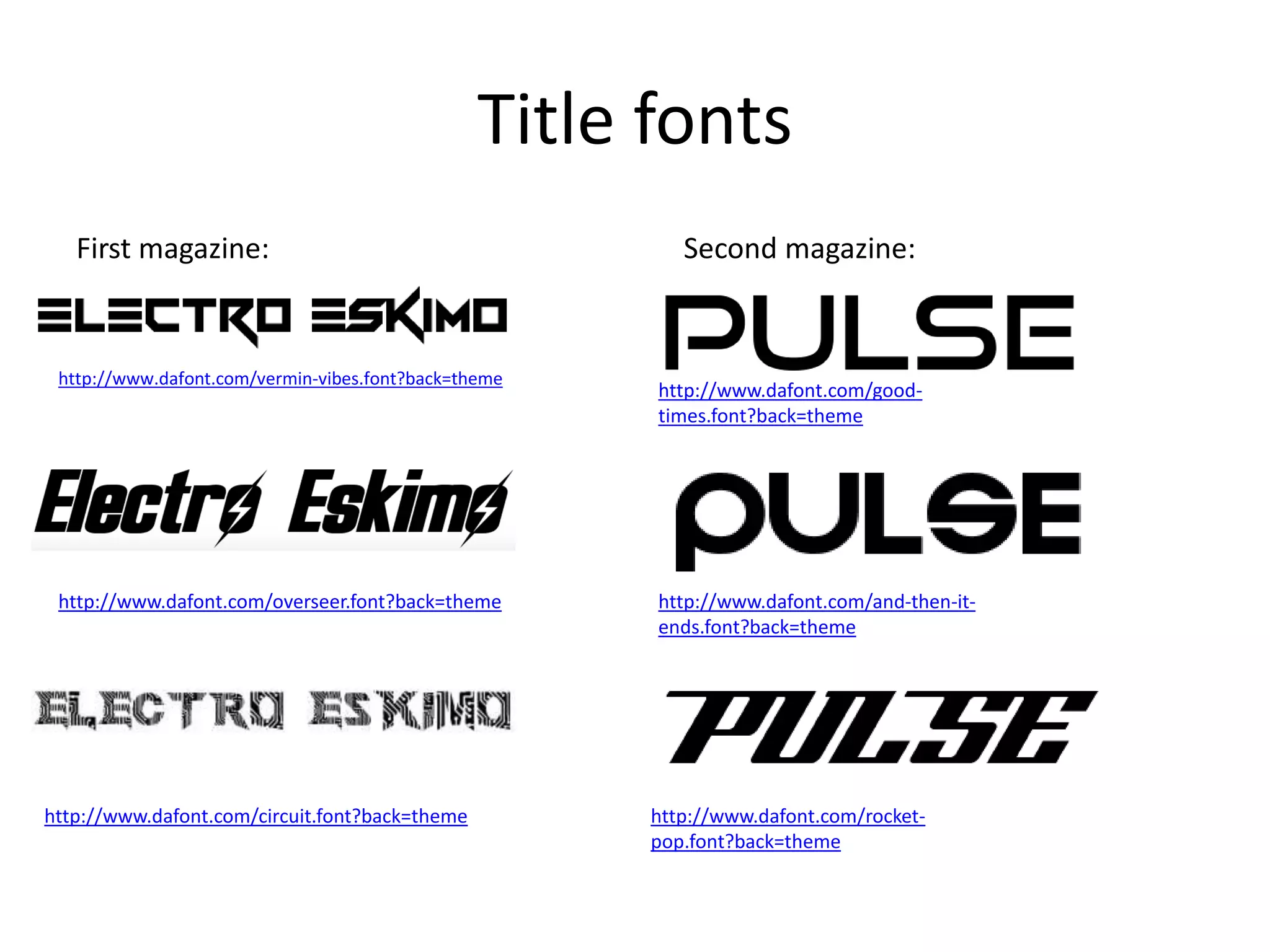
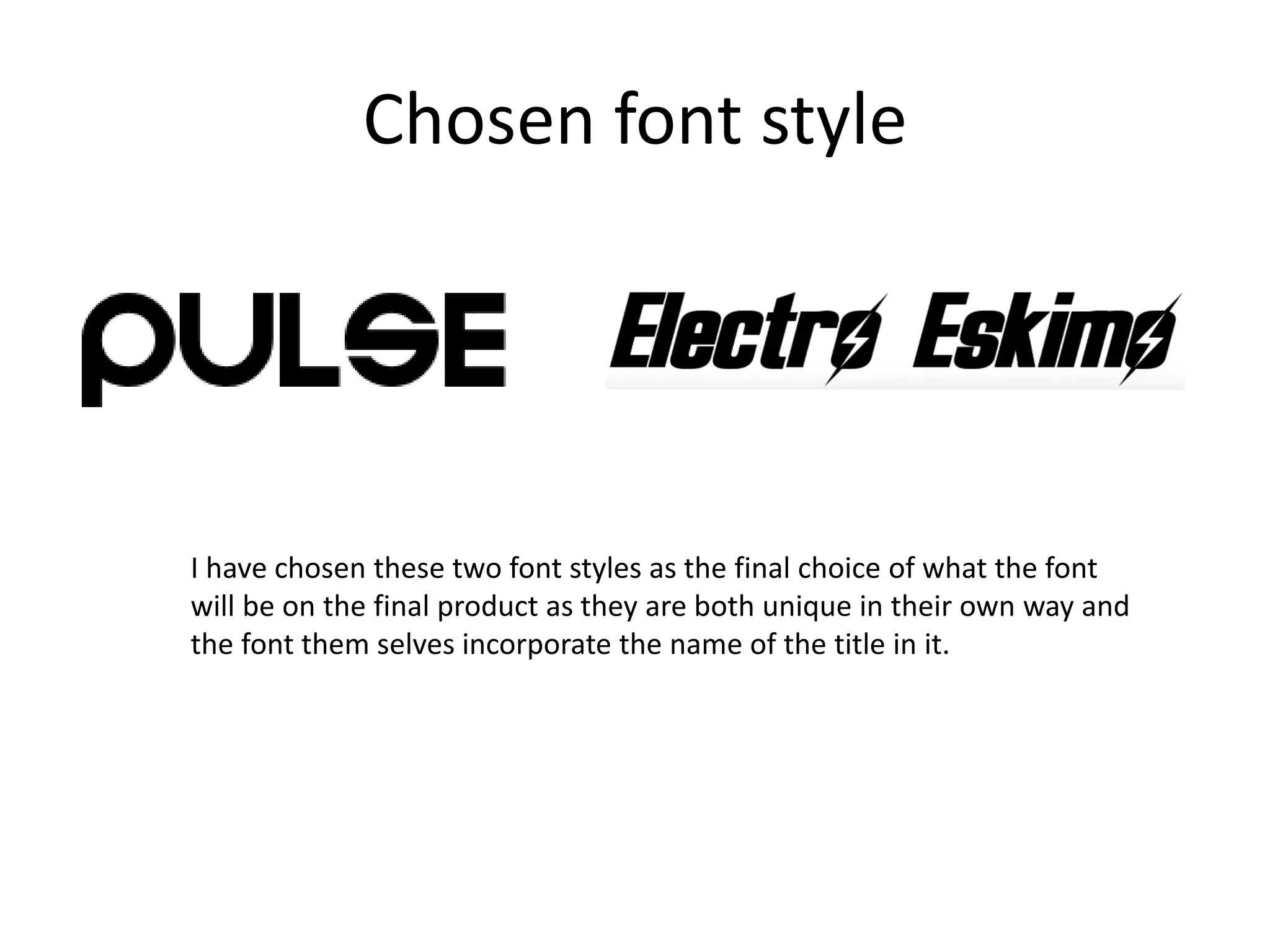
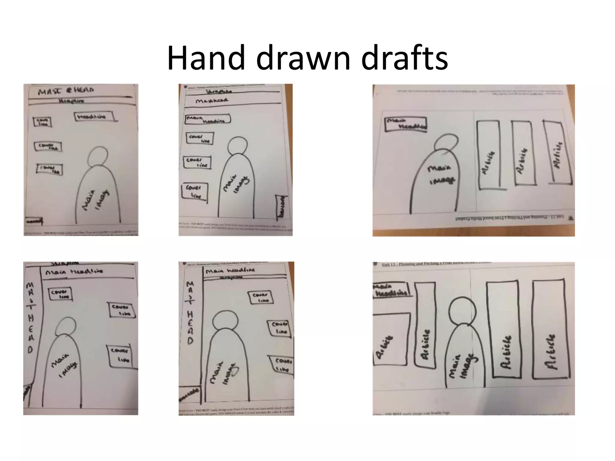
- Draft layouts and typeface options are presented, with the goal of a professional,