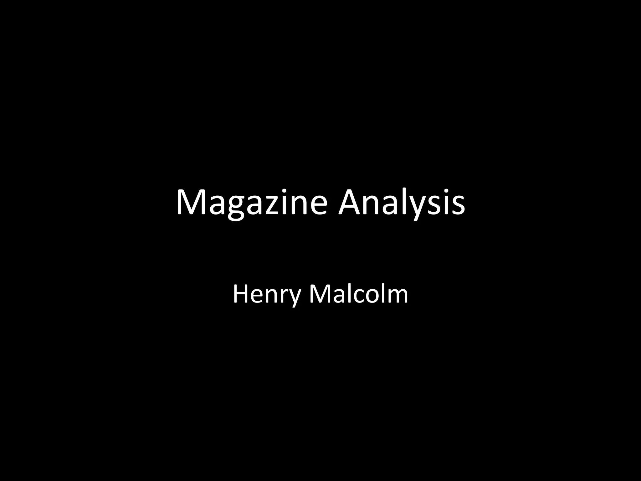
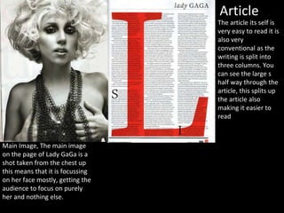
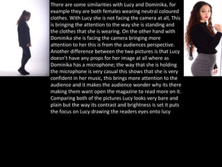
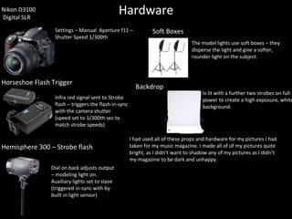
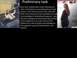
Magazine Analysis
Henry Malcolm
Cover
Masthead
Dominant Image
Barcode
Date
Teasing Contents
I have put the selling line above the mast head as this is where it
is known for going in magazines, I used the same colour for the
cover stars lips as well this is so that my magazine follows my
colour scheme.
Selling Line
My dominant image does follow the conventions as the
featured artist has eye contact, this is a positive as the audience
are more likely to feel like they are connecting with the artist.
My mast head is located at the top of the page this is because it
is the most visible at the top and it is the most common for
magazines to have it here.
Following the conventions. It is a minor, but
important part of the front page as it
inform us on the date and price of the
magazine.
This is a cover line that is teasing what articles
that are going to be in the magazine. A cover
line is used along side the main image, I have
out it in another colour as it makes it stand
out more making it easer for the reader to
see.
The masthead is bold and bright in places so it stands out to the audience, although part
of the masthead is placed behind the image of Katy Perry the audience are expected to
know what the title of the magazine is.
The date of the magazine makes it sellable to the audience letting them know what issue
of the magazine it is they are buying so they are keeping up to date.
The main picture of Katy Perry is the most dominating thing on the page
Teasing contents- cover line that gets the readers eager to read
the magazine.
Billboard helped me to make my cover of the magazine, I used a similar simplistic
approach, as you can see I have got a similar masthead style of font to this billboard
magazine.
Katy Perry has a large amount of female fans, this magazine will appeal to girls because
they can relate to her and identify with her.
The flowers and baby pink background are all quite feminine and this will appeal to the
target audience (mainly females from the age of 13 to 26 years of age)
Contents The masthead is bold so it stands out to the
audience the masthead is placed is placed right at
the top of the magazine with nothing covering it as
the magazine is new and not as well known as
BillBoard so I could not cover my masthead with my
model.
I believe my image for the contents reflects really
well on my magazine as my magazine has a
simplistic approach and I wanted to show this by the
colour scheme and the image as these go very well
together. My model doesn't have any eye contact
with the reader, this is because I want the reader
suspicious and to be wondering what is going to be
in the magazine.
Colour scheme, My colour scheme is very simple
with the white, black and grey, but I also did follow
through the red/pink colour from Dominika’s lips
who features in the article.
Article
Main Image, The main image
on the page of Lady GaGa is a
shot taken from the chest up
this means that it is focussing
on her face mostly, getting the
audience to focus on purely
her and nothing else.
The article its self is
very easy to read it is
also very
conventional as the
writing is split into
three columns. You
can see the large s
half way through the
article, this splits up
the article also
making it easier to
read
The title, is the most important
convention because it tells the reader
what the article is about and who it is
about.
Pull quote, I have used a all quote as it
gives the reader more information on
the article and I want the reader to be
pulled in and read the article.
Page Numbers, In every magazine they
have to have page numbers as the
reader needs to know what page they
are on to get to the right article/page.
Article photograph, The photograph in the article is very important as with out it the article
would look very bare and bland with out it, you can work with the photographs in many different
ways, in my article I wanted it to be bright and eye-catching so I didn't include any shadows, I
also wanted my model for my magazine to look directly into the camera so the reader feels
personally involved in the article.
Question 2
• How does your media product represent
particular social groups?
• Representation: Representation within a
Media text is the study of the portrayal of
someone or something in a particular way.
• In my media product (magazine) for my contents I
have used Lucy a typical heterosexual white female, I
Have created this image by tying her hair up into a
high pony tail, she is wearing minimal makeup as it is
a full body shot and she is looking down meaning the
camera is not focusing on the whole of her face. I
have dressed Lucy up in black as it stands up against
the white background.
• For my cover I have used Dominika, she is also
a typical heterosexual white female,
comparing Dominika to Lucy you can see that
the two pictures are quite different for
example Dominika has a full face of makeup
on, her hair is untied, and she is also looking at
the camera this will make the audience feel
more connected with Dominika.
There are some similarities with Lucy and Dominika, for
example they are both females wearing neutral coloured
clothes. With Lucy she is not facing the camera at all, This
is bringing the attention to the way she is standing and
the clothes that she is wearing. On the other hand with
Dominika she is facing the camera bringing more
attention to her this is from the audiences perspective.
Another difference between the two pictures is that Lucy
doesn’t have any props for her image at all where as
Dominika has a microphone; the way that she is holding
the microphone is very casual this shows that she is very
confident in her music, this brings more attention to the
audience and it makes the audience wonder why its there
making them want open the magazine to read more on it.
Comparing both of the pictures Lucy looks very bare and
plain but the way its contrast and brightness is set it puts
the focus on Lucy drawing the readers eyes onto lucy
Q3.
• What kind of media institution might
distribute your media product and why?
• Media Institution = the companies that
produce and distribute magazines.
Blaze Publishing
Blaze has grown to become the largest independently-owned publishing company in the
shooting sector.
It has expanded into music magazines and live events.
Blaze publishing specializes in niche magazines, they also do two formats of the same magazine,
one is digital and one is a paper format of the magazine.
Bauer Distribution
• Billboard is owned by Prometheus Global
Media, a diversified company with leading
assets in the media and entertainment arenas.
• Three years later, Guggenheim Partners
aquired Pluribus’ share of Prometheus and
became the sole owner of Billboard. In
December 2015 Guggenheim sold Billboard
over the Todd Boehly and he then formed The
Hollywood Reporter-Billboard Media Group.
Q4/5
• Who would be the audience for your media product?
• How did you attract/address your audience?
• “Who are your target audience and how did you attract
and address them?”
• Target Audience = the types of people who you would
expect to buy your music magazine.
• Attract them = what have you done on the cover to get
their attention?
• Address them = what sort of language and tone have you
used to use to talk to your audience and why?
Here are some photos of typical teenagers that would read
this magazine, they are all fans from all different genres of
music because my magazine is aimed at any person that has
any type of taste in music, but I would say my although my
magazine includes music on all genres, it does focus on the
most popular music like Pop and RnB, just because it appeals
to the audience a lot more and as Merge is the most talked
about magazine in the UK, it does need to appeal to the mass
audience, so it includes the “popular” genres of music a lot
more.
R&B Indie “Emo girl”
Pop
Q6
• Q6. What have you learnt about technologies from the
process of constructing this product?
• Describe/Illustrate the technologies you have used and
explain what they do – then show me something you
learnt about using them.
• Hardware = equipment
• Software = programs
• IMAGES – use screens shots to show what you’ve
learned about using Photoshop/InDesign/Wordpress
etc.
• HYPERLINKS – link to relevant manufacturers websites,
product pages.
HardwareNikon D3100
Digital SLR
Settings – Manual Aperture f11 –
Shutter Speed 1/300th
Infra red signal sent to Strobe
flash – triggers the flash in-sync
with the camera shutter
(speed set to 1/300th sec to
match strobe speeds)
Horseshoe Flash Trigger
Dial on back adjusts output
– modeling light on.
Auxiliary lights set to slave
(triggered in-sync with by
built in light sensor)
Hemisphere 300 – Strobe flash
Soft Boxes
The model lights use soft boxes – they
disperse the light and give a softer,
rounder light on the subject.
Is lit with a further two strobes on full
power to create a high exposure, white
background.
Backdrop
I had used all of these props and hardware for my pictures I had
taken for my music magazine. I made all of of my pictures quite
bright, as I didn’t want to shadow any of my pictures as I didn’t
my magazine to be dark and unhappy.
Software
• Photoshop
• Indesign
• Wordpress
Adobe Photoshop
• Using photoshop definitely did help me to understand how much effort
and time it does take to edit photos and layer them. But with the (what
I believe to be handy) tools on the program it did decrease the time to
edit the photos, the magic wand tool really did help me out as it took
away most of the white background of the photograph, but in some
cases it doesn't come out “perfect” so I then had to alter the
saturation, contrast and the brightness and then I refined it so it would
be easier to differentiate the background from the actual image then I
could easily erase the background and leave the image how I wanted it.
But because I altered the image earlier I changed the saturation,
contrast and the brightness back to how it was.
Indesign
• With indesign I learnt how to get my images, page numbers and
titles from my photoshop file, so I exported it to an indesign A3
article page it helped me get the columns in place by using the
rulers so I could line everything up, then I added the Q&A’s that I
typed up and had to copy and paste into the columns.
Wordpress
• Wordpress has allowed me to put all of my progress of my magazine on
to a blog, I found it very useful how I could also add new pages to my
blog so I could then have an evaluation page for my work to go on to
meaning it can all be separated so it is easy to find different parts of my
work. As both of my teachers are admins on my page they can check up
on my work whenever they want so they can give me feedback and
suggestions on what I could do next to improve my work. I really did
find it easy when my teachers could advise me what to do as it really
did help me progress with my work a lot.
Q7
Looking back at your preliminary task, what do you feel
you have learnt in the progression from it to the full
product?
Preliminary task
Over time I believe that I have improved my
skills in photoshop as everything doesn't look
so basic, and I have put more time work and
effort into it because of the extended time and
my knowledge on photoshop has grown. I also
had some background information by looking at
music magazines in my own time and this
helped me as well to build my knowledge on
the magazine to get the best product I can
achieve.

Magazine analysis Questions

  • 1.
  • 2.
    Cover Masthead Dominant Image Barcode Date Teasing Contents Ihave put the selling line above the mast head as this is where it is known for going in magazines, I used the same colour for the cover stars lips as well this is so that my magazine follows my colour scheme. Selling Line My dominant image does follow the conventions as the featured artist has eye contact, this is a positive as the audience are more likely to feel like they are connecting with the artist. My mast head is located at the top of the page this is because it is the most visible at the top and it is the most common for magazines to have it here. Following the conventions. It is a minor, but important part of the front page as it inform us on the date and price of the magazine. This is a cover line that is teasing what articles that are going to be in the magazine. A cover line is used along side the main image, I have out it in another colour as it makes it stand out more making it easer for the reader to see.
  • 3.
    The masthead isbold and bright in places so it stands out to the audience, although part of the masthead is placed behind the image of Katy Perry the audience are expected to know what the title of the magazine is. The date of the magazine makes it sellable to the audience letting them know what issue of the magazine it is they are buying so they are keeping up to date. The main picture of Katy Perry is the most dominating thing on the page Teasing contents- cover line that gets the readers eager to read the magazine. Billboard helped me to make my cover of the magazine, I used a similar simplistic approach, as you can see I have got a similar masthead style of font to this billboard magazine. Katy Perry has a large amount of female fans, this magazine will appeal to girls because they can relate to her and identify with her. The flowers and baby pink background are all quite feminine and this will appeal to the target audience (mainly females from the age of 13 to 26 years of age)
  • 4.
    Contents The mastheadis bold so it stands out to the audience the masthead is placed is placed right at the top of the magazine with nothing covering it as the magazine is new and not as well known as BillBoard so I could not cover my masthead with my model. I believe my image for the contents reflects really well on my magazine as my magazine has a simplistic approach and I wanted to show this by the colour scheme and the image as these go very well together. My model doesn't have any eye contact with the reader, this is because I want the reader suspicious and to be wondering what is going to be in the magazine. Colour scheme, My colour scheme is very simple with the white, black and grey, but I also did follow through the red/pink colour from Dominika’s lips who features in the article.
  • 6.
    Article Main Image, Themain image on the page of Lady GaGa is a shot taken from the chest up this means that it is focussing on her face mostly, getting the audience to focus on purely her and nothing else. The article its self is very easy to read it is also very conventional as the writing is split into three columns. You can see the large s half way through the article, this splits up the article also making it easier to read
  • 7.
    The title, isthe most important convention because it tells the reader what the article is about and who it is about. Pull quote, I have used a all quote as it gives the reader more information on the article and I want the reader to be pulled in and read the article. Page Numbers, In every magazine they have to have page numbers as the reader needs to know what page they are on to get to the right article/page. Article photograph, The photograph in the article is very important as with out it the article would look very bare and bland with out it, you can work with the photographs in many different ways, in my article I wanted it to be bright and eye-catching so I didn't include any shadows, I also wanted my model for my magazine to look directly into the camera so the reader feels personally involved in the article.
  • 8.
    Question 2 • Howdoes your media product represent particular social groups? • Representation: Representation within a Media text is the study of the portrayal of someone or something in a particular way.
  • 9.
    • In mymedia product (magazine) for my contents I have used Lucy a typical heterosexual white female, I Have created this image by tying her hair up into a high pony tail, she is wearing minimal makeup as it is a full body shot and she is looking down meaning the camera is not focusing on the whole of her face. I have dressed Lucy up in black as it stands up against the white background.
  • 10.
    • For mycover I have used Dominika, she is also a typical heterosexual white female, comparing Dominika to Lucy you can see that the two pictures are quite different for example Dominika has a full face of makeup on, her hair is untied, and she is also looking at the camera this will make the audience feel more connected with Dominika.
  • 11.
    There are somesimilarities with Lucy and Dominika, for example they are both females wearing neutral coloured clothes. With Lucy she is not facing the camera at all, This is bringing the attention to the way she is standing and the clothes that she is wearing. On the other hand with Dominika she is facing the camera bringing more attention to her this is from the audiences perspective. Another difference between the two pictures is that Lucy doesn’t have any props for her image at all where as Dominika has a microphone; the way that she is holding the microphone is very casual this shows that she is very confident in her music, this brings more attention to the audience and it makes the audience wonder why its there making them want open the magazine to read more on it. Comparing both of the pictures Lucy looks very bare and plain but the way its contrast and brightness is set it puts the focus on Lucy drawing the readers eyes onto lucy
  • 12.
    Q3. • What kindof media institution might distribute your media product and why? • Media Institution = the companies that produce and distribute magazines.
  • 13.
    Blaze Publishing Blaze hasgrown to become the largest independently-owned publishing company in the shooting sector. It has expanded into music magazines and live events. Blaze publishing specializes in niche magazines, they also do two formats of the same magazine, one is digital and one is a paper format of the magazine.
  • 14.
    Bauer Distribution • Billboardis owned by Prometheus Global Media, a diversified company with leading assets in the media and entertainment arenas. • Three years later, Guggenheim Partners aquired Pluribus’ share of Prometheus and became the sole owner of Billboard. In December 2015 Guggenheim sold Billboard over the Todd Boehly and he then formed The Hollywood Reporter-Billboard Media Group.
  • 15.
    Q4/5 • Who wouldbe the audience for your media product? • How did you attract/address your audience? • “Who are your target audience and how did you attract and address them?” • Target Audience = the types of people who you would expect to buy your music magazine. • Attract them = what have you done on the cover to get their attention? • Address them = what sort of language and tone have you used to use to talk to your audience and why?
  • 16.
    Here are somephotos of typical teenagers that would read this magazine, they are all fans from all different genres of music because my magazine is aimed at any person that has any type of taste in music, but I would say my although my magazine includes music on all genres, it does focus on the most popular music like Pop and RnB, just because it appeals to the audience a lot more and as Merge is the most talked about magazine in the UK, it does need to appeal to the mass audience, so it includes the “popular” genres of music a lot more. R&B Indie “Emo girl” Pop
  • 17.
    Q6 • Q6. Whathave you learnt about technologies from the process of constructing this product? • Describe/Illustrate the technologies you have used and explain what they do – then show me something you learnt about using them. • Hardware = equipment • Software = programs • IMAGES – use screens shots to show what you’ve learned about using Photoshop/InDesign/Wordpress etc. • HYPERLINKS – link to relevant manufacturers websites, product pages.
  • 18.
    HardwareNikon D3100 Digital SLR Settings– Manual Aperture f11 – Shutter Speed 1/300th Infra red signal sent to Strobe flash – triggers the flash in-sync with the camera shutter (speed set to 1/300th sec to match strobe speeds) Horseshoe Flash Trigger Dial on back adjusts output – modeling light on. Auxiliary lights set to slave (triggered in-sync with by built in light sensor) Hemisphere 300 – Strobe flash Soft Boxes The model lights use soft boxes – they disperse the light and give a softer, rounder light on the subject. Is lit with a further two strobes on full power to create a high exposure, white background. Backdrop I had used all of these props and hardware for my pictures I had taken for my music magazine. I made all of of my pictures quite bright, as I didn’t want to shadow any of my pictures as I didn’t my magazine to be dark and unhappy.
  • 19.
  • 20.
    Adobe Photoshop • Usingphotoshop definitely did help me to understand how much effort and time it does take to edit photos and layer them. But with the (what I believe to be handy) tools on the program it did decrease the time to edit the photos, the magic wand tool really did help me out as it took away most of the white background of the photograph, but in some cases it doesn't come out “perfect” so I then had to alter the saturation, contrast and the brightness and then I refined it so it would be easier to differentiate the background from the actual image then I could easily erase the background and leave the image how I wanted it. But because I altered the image earlier I changed the saturation, contrast and the brightness back to how it was.
  • 21.
    Indesign • With indesignI learnt how to get my images, page numbers and titles from my photoshop file, so I exported it to an indesign A3 article page it helped me get the columns in place by using the rulers so I could line everything up, then I added the Q&A’s that I typed up and had to copy and paste into the columns.
  • 22.
    Wordpress • Wordpress hasallowed me to put all of my progress of my magazine on to a blog, I found it very useful how I could also add new pages to my blog so I could then have an evaluation page for my work to go on to meaning it can all be separated so it is easy to find different parts of my work. As both of my teachers are admins on my page they can check up on my work whenever they want so they can give me feedback and suggestions on what I could do next to improve my work. I really did find it easy when my teachers could advise me what to do as it really did help me progress with my work a lot.
  • 23.
    Q7 Looking back atyour preliminary task, what do you feel you have learnt in the progression from it to the full product?
  • 24.
    Preliminary task Over timeI believe that I have improved my skills in photoshop as everything doesn't look so basic, and I have put more time work and effort into it because of the extended time and my knowledge on photoshop has grown. I also had some background information by looking at music magazines in my own time and this helped me as well to build my knowledge on the magazine to get the best product I can achieve.