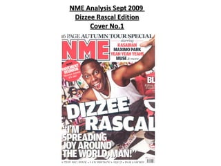
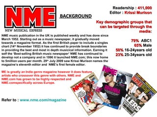
This document provides an analysis of the cover of the September 2009 edition of NME (New Musical Express) magazine focused on Dizzee Rascal. It summarizes the target audience as primarily being 16-34 year old males, especially those interested in indie/rock music. The cover features Dizzee Rascal's image and quotes to attract this audience. Colors, layout, and other artists featured also aim to appeal to and be accessible for the target demographic.
Embracing GenAI - A Strategic ImperativePeter Windle
Artificial Intelligence (AI) technologies such as Generative AI, Image Generators and Large Language Models have had a dramatic impact on teaching, learning and assessment over the past 18 months. The most immediate threat AI posed was to Academic Integrity with Higher Education Institutes (HEIs) focusing their efforts on combating the use of GenAI in assessment. Guidelines were developed for staff and students, policies put in place too. Innovative educators have forged paths in the use of Generative AI for teaching, learning and assessments leading to pockets of transformation springing up across HEIs, often with little or no top-down guidance, support or direction.
This Gasta posits a strategic approach to integrating AI into HEIs to prepare staff, students and the curriculum for an evolving world and workplace. We will highlight the advantages of working with these technologies beyond the realm of teaching, learning and assessment by considering prompt engineering skills, industry impact, curriculum changes, and the need for staff upskilling. In contrast, not engaging strategically with Generative AI poses risks, including falling behind peers, missed opportunities and failing to ensure our graduates remain employable. The rapid evolution of AI technologies necessitates a proactive and strategic approach if we are to remain relevant.
Read| The latest issue of The Challenger is here! We are thrilled to announce that our school paper has qualified for the NATIONAL SCHOOLS PRESS CONFERENCE (NSPC) 2024. Thank you for your unwavering support and trust. Dive into the stories that made us stand out!
Unit 8 - Information and Communication Technology (Paper I).pdfThiyagu K
This slides describes the basic concepts of ICT, basics of Email, Emerging Technology and Digital Initiatives in Education. This presentations aligns with the UGC Paper I syllabus.
The Roman Empire A Historical Colossus.pdfkaushalkr1407
The Roman Empire, a vast and enduring power, stands as one of history's most remarkable civilizations, leaving an indelible imprint on the world. It emerged from the Roman Republic, transitioning into an imperial powerhouse under the leadership of Augustus Caesar in 27 BCE. This transformation marked the beginning of an era defined by unprecedented territorial expansion, architectural marvels, and profound cultural influence.
The empire's roots lie in the city of Rome, founded, according to legend, by Romulus in 753 BCE. Over centuries, Rome evolved from a small settlement to a formidable republic, characterized by a complex political system with elected officials and checks on power. However, internal strife, class conflicts, and military ambitions paved the way for the end of the Republic. Julius Caesar’s dictatorship and subsequent assassination in 44 BCE created a power vacuum, leading to a civil war. Octavian, later Augustus, emerged victorious, heralding the Roman Empire’s birth.
Under Augustus, the empire experienced the Pax Romana, a 200-year period of relative peace and stability. Augustus reformed the military, established efficient administrative systems, and initiated grand construction projects. The empire's borders expanded, encompassing territories from Britain to Egypt and from Spain to the Euphrates. Roman legions, renowned for their discipline and engineering prowess, secured and maintained these vast territories, building roads, fortifications, and cities that facilitated control and integration.
The Roman Empire’s society was hierarchical, with a rigid class system. At the top were the patricians, wealthy elites who held significant political power. Below them were the plebeians, free citizens with limited political influence, and the vast numbers of slaves who formed the backbone of the economy. The family unit was central, governed by the paterfamilias, the male head who held absolute authority.
Culturally, the Romans were eclectic, absorbing and adapting elements from the civilizations they encountered, particularly the Greeks. Roman art, literature, and philosophy reflected this synthesis, creating a rich cultural tapestry. Latin, the Roman language, became the lingua franca of the Western world, influencing numerous modern languages.
Roman architecture and engineering achievements were monumental. They perfected the arch, vault, and dome, constructing enduring structures like the Colosseum, Pantheon, and aqueducts. These engineering marvels not only showcased Roman ingenuity but also served practical purposes, from public entertainment to water supply.
Biological screening of herbal drugs: Introduction and Need for
Phyto-Pharmacological Screening, New Strategies for evaluating
Natural Products, In vitro evaluation techniques for Antioxidants, Antimicrobial and Anticancer drugs. In vivo evaluation techniques
for Anti-inflammatory, Antiulcer, Anticancer, Wound healing, Antidiabetic, Hepatoprotective, Cardio protective, Diuretics and
Antifertility, Toxicity studies as per OECD guidelines
2. BACKGROUND Refer to : www.nme.com/magazine Readership : 411,000 Editor : Krissi Murison Key demographic groups that can be targeted through the media: 79% ABC1 65% Male 50% 16-24years old 23% 25-34years old NME music publication in the UK is published weekly and has done since March 1952. Starting out as a music newspaper, it gradually moved towards a magazine format. As the first British paper to include a singles chart (14 th November 1952) it has continued to provide break boundaries in providing the best and most in depth musicical information. Earning it self the ‘Best-selling British music newspaper’ NME has continued to develop not a company and in 1996 it launched NME.com; this now home to 5million users per month. 29 th July 2009 saw Krissi Murison names the magazine’s eleventh editor and NME’s first female editor. ME is greatly an Indie genre magazine however it does feature artists who crossover this genre with others. NME and NME.com has grown to be highly respected and NME.comspecifically across Europe.
3. Target Audience This cover of NME “New Musical Express” use of a vibrant and bold theme and house style to attract an audience. With an exciting and busy layout their target audience of young adults/late teens are aware of the magazine’s large content and exciting information to be offered. The header creates an immediate attraction and sets the tone for this particular edition of the magazine, “16 Page Autumn Tour Special”, this creates an interest for the readers greatly interested in music's and artists, and so they will want to see what tour information NME exclusively has. The house style/Colour scheme consists of Red, black and white throughout the whole front cover these bold colours attract attention whilst remaining serious enough to keep their target audience’s interest. Without the use of too many colours the page remains professional and much more fitting for its purpose as it is regarded as a serious, informative magazine exploring all aspects of music, (eg. The artists, their songs and their tours). These colours are far from the bright pinks/yellows found on magazines for a younger audience, whilst they are accessible to both males and females it would be fair to say it is slightly more masculine then feminine. The Pull Quote’s language is very much fitting for its target audience which is of a younger age with “man!”, the use of this very masculine and it is clear the target audience is largely aimed at males s as they are found to be 65% of NME’s readers. The artists listed in the cover lines and footer of this magazine are of an Indie/Rock genre, this being loud and expressive music through the use of voice and percussion similarly resemble the magazine’s vibe and possibly specific to the personalities of their readers. The names of these artists are against a white background and are visible for the audience to see separating this information from that on the main article of Dizzee Rascal Dizzee Rascal being the focal point of the cover greatly links to the audience too, he is also a male and in his early twenties, this playing on the character that perhaps NME’s readers aspire to be /inspired by and the age range of NME’s target audience. NME is published weekly allowing its audience to be updated regularly and at a selling price of £2.50 it is accessible to its young target audience, whether they are employed or not. This is beneficial as the target audience’s age range covers students.
4. FRONT COVER ANALYSIS THE MASTHEAD – This is name of the magazine. This magazine is called NME, this sets the house style, in this case the colours consists of Red, White and Black. In bold lettering with an outline of white and black this makes it clear and large for the audience to see. COVER LINES – The cover lines are to give the audience of a preview of what’s inside of the magazine. Again keeping the house style consistant keeps a loud tone and attracts readers. THE MAIN IMAGE – The main image is usually of the person(s) the magazine has a major article about and also what genre this edition of the magazine will be based around. In this case Dizzee Rascal’s facial expression is happy and body language is welcoming and energetic; it also links to the pull quote with his arms stretched and “I’m spreading joy around the world, man”. THE MAIN COVER LINE - The main cover line often links with the main image and article attracting readers. This denotes to us Dizzee Rascal’s actual name however this connotates his loud personality and vibe in bold capitals. The use of White letters with a black shadow consist with the house style. BARCODE/DATE ISSUE/PRICE – This is conventional and is displayed on every magazine. THE FOOTER – This is information is about other features that can be found in the magazine besides the main article/image on the front cover. USE OF A PULL QUOTE – This is out of the main story and double page spread of the featured artist. This is an effort to gain interest into the article,artist and attention to the magazine. ‘I’m spreading joy around the world, man!’ The connotation of this is to promote Dizzee Rascal and create an interest in what he has to say. BACKGROUND - The background consists of graffiti work. This image denotes that it is linked to the artist Dizzee Rascal and his background. The denotation of this is the link to his childhood and the life he once lived, however the connotation is of his loud character and the energic stance/expression displayed on the front cover. This loud vibe sets the tone for the audience and contents of the magazine. FLASHER- This gives an extra promotional offer this also links to the genre of the magazine. Rule of Thirds – This allows the magazine to look professional and helps keep the images, and cover lines within a good distance of each other and presented well on the page.
5. CONTENTS ANALYSIS SUBSCRIPTION - This is advertising the magazine’s service of providing magazines to readers repeatedly without them going to a shop for it. This offer for subscription works out being cheaper for customer and attracts potential customers gaining more readers for the NME readership. This has the details such as the website, number to make this simple for customer to apply for. BRIEF HEADING – This is the summary of content and giving the reader an insight of what’s included in the magazine, this is in black text with the numbers in red, sticking to the house style colours. SUB HEADING – This is blocked out into separate sub sections these are the main sections found in the magazine, the use of larger lettering highlights this and helps readers navigate on where in the magazine to look for specific information. DATE - This is conventional and you would expect to see this on every magazine so readers are informed the date of its publish. BANNER –This is where you would expect to see Banners on all magazines, this also follows the house style. NME MASTHEAD – This is the same colour as the Masthead on the front cover, this comes across as professional and also a consistent house style . MAIN IMAGE – The main image is the focal point of this page as this is the biggest image, this grabs the audiences attention . It correlates with the magazine’s header “16 Autumn Tour Special”, this image relates to the article below a summary of the contexts found in the magazine and other tour information. In addition to this the image is edited so it looks like a photograph and the model stands outside of a tour bus. The tour bus is red with black windows, and the model wears a grey/white/black t-shirt, again this keeps to the house style of this edition of NME. It is appropriate for this image to look like a photograph because as it looks like a collectors photograph that they may have received/taken whilst on the tour. INDEX - Bands are listed in red with page number in black. The effect of this is house style colours used and appealing to the eye. This helps readers navigate through the magazine to read information on the artists they seek.
6. DOUBLE SPREAD ANALYSIS MISE EN SCENE – This is created by graffiti wall background. This is a recurring background from the front cover and continues to denotate Dizzee Rascal’s background, alongside the prop spray paint can being held up to the wall by Dizzee. MAIN IMAGE – this image is of Dizzee in a bright Red jacket, white tee and dark jeans. Holding a can up to the graffiti covered wall he eagerly looks over his right shoulder towards the left end of the page. The red jacket and white tee continue on from the front cover and contents page’s house style. This links the three pages and reinforces the link between them. The Red jacket would also be a denotation his bright and bold personality and lifestyle, this would appealing to readers especially those inspired by him. Additionally this lifestyle and clothing would appear to young adults, the target audience of this edition of NME. As Dizzee looks over his right shoulder their a sense of him doing something he shouldn't’ and looking out to get caught, this rebellious factor is one often youth are associated with, particularly crime; further connections with the target audience . Placing Dizzee in this setting, allows the readers to relate to him and creates an instant and shared aspect of life for both parties. Looking back it could also be interpreted that he is looking back on the life he used to live before fame and music where he was familiar with this kind of scene, again the target audience would relate to this. As the article is about his current activities and music there is a contrast in what he was doing before the fame and what he is doing nowadays. PAGE NUMBER/NME TITLE/DATE – This conventional and expected to see on all double page spreads. Copy begins with A large letter Y using Drops Cap 4 COLOUMNS – the use of this allows quite a bit of information to be place in a small amount of space. As the text wraps around the image of the radio allows it to cover the page with ease whilst highlighting the second image and its link to the text. Smaller Image – this is of empty beer bottles and a radio. This is associated with NME’s target audience of young adults notorious for drinking and the sound system linked to Dizzee Rascal and the parties young adults would be part of. This creates a relationship between the artist and audience and so they feel they can relate to each other. MAIN HEADLINE – “From Tags to Riches” plays on the phrase, “From rags to riches” This like the denotation of Dizzee looking over his solider back on his life prior to music we the difference is clear. From being involved in activities such as tagging to now earning a substantial amount of money doing what he loves, he is clearer better off and has earnt something for himself aiming higher. Tagging is that associated with young people – some say it is street art and others crime, whatever is perceived to be with Dizzee in this, the target audience can relate. Looking to Dizzee as an icon again this would suggest to the target audience that like him they can better themselves too. Byline - This is credit for author and photographer Caption – The caption saying Dizzee, is another convention feature and usually recounts the article on this page and what the following article will be about as well as background information.