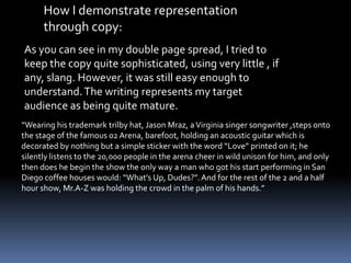
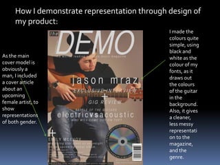
Download to read offline
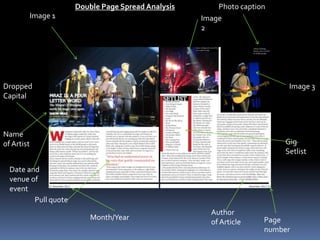
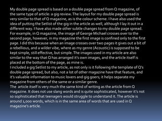
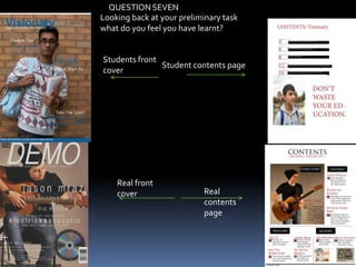


The document describes the process of creating a magazine front cover and contents page based on existing magazine templates. It discusses how conventions from the template magazines were used and developed. For the front cover, the main image style and positioning of text were similar to the template, while the cover model's pose and positioning of cover lines challenged conventions. The contents page largely followed the template layout but used only two colors instead of various colors. Overall, the document shows how the created magazine pieces both emulate and tweak conventions from the templates.


