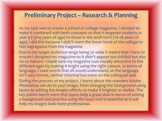
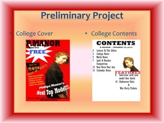
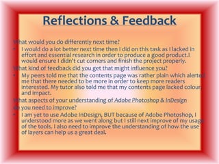
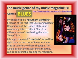
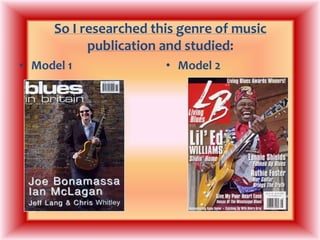
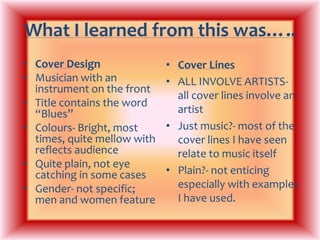
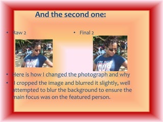
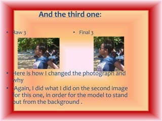
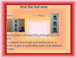
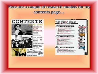
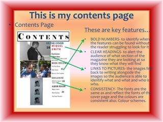
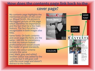
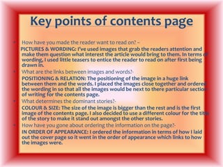
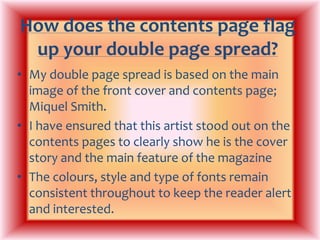
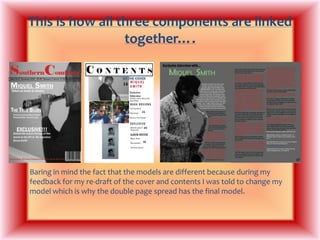
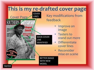
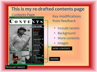
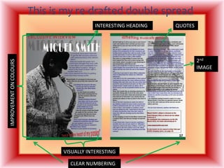
AS MEDIASTUDIESFOUNDATION PORTFOLIORESEARCH & PLANNINGCENTRE NO: 11049ST FRANCIS XAVIER COLLEGE
My name is: Duschan NembhardCandidate No: 1387
Preliminary Project – Research & PlanningAs my task was to create a school or college magazine, I decided to make it combined with both concepts so that it targeted students in year 9 (13/14 years of age) to those in the sixth form (16-18 years of age). I did this because I didn’t want the lower band of the college to feel segregated from the magazineDue to my target audience range being so wide it meant that I have to ensure I designed my magazine so it didn’t appear too childish but also no so mature. I made sure my magazine was visually attractive to the different ages by making it bright using the right colours. In terms of language, I used words that all would understand, so the language isn't very formal, neither informal but more on the colloquial sideDuring the process of my project, I learnt about the wonders Adobe Photoshop can do to your image, from changing the background using layers to editing the images effects to make it brighter or darker. The key points learnt were that layers help a great deal in terms of setting a background and practice using the lasso tool is essential as it will help my images look more professional.
Preliminary ProjectCollege CoverCollege Contents
Reflections & FeedbackWhat would you do differently next time?I would do a lot better next time then I did on this task as I lacked in effort and essential research in order to produce a good product.I would ensure I didn't cut corners and finish the project properly.What kind of feedback did you get that might influence you?My peers told me that the contents page was rather plain which alerted me that there needed to be more in order to keep more readers interested. My tutor also told me that my contents page lacked colour, and impact.What aspects of your understanding of Adobe Photoshop & InDesigndo you need to improve?I am yet to use Adobe InDesign, BUT because of Adobe Photoshop, I understood more as we went along but I still next improve of my usage of the tools. I also need to improve the understanding of how the use of layers can help us a great deal. 
The music genre of my music magazine is:http://www.youtube.com/watch?v=Yd60nI4sa9ABLUESGenre : My chosen title is “Southern Comforts” because of the fact that Blues originated in Deep South of the United States and I wanted my title to reflect Blues in a different way of  just having the word “blues” in it. I thought the word “comforts” would link right back to the root of Blues as it was used as comfort to those singing it. This would also let the reader think that they can be comfortable reading my magazine.
So I researched this genre of music publication and studied:Model 1Model 2
What I learned from this was…..Cover DesignMusician with an instrument on the frontTitle contains the word “Blues”Colours- Bright, most times, quite mellow with reflects audienceQuite plain, not eye catching in some casesGender- not specific; men and women featureCover LinesALL INVOLVE ARTISTS- all cover lines involve an artistJust music?- most of the cover lines I have seen relate to music itself Plain?- not enticing especially with examples I have used.
For my music magazine….Target Audience:  Men and Women aged 25 and over because this genre does not have a dominant sex and the age of the artists tend to be mature.Frequency: Fortnightly- this would enable the reader to have something to look forward too and ensure that the magazine gives them something different each time.Cover price: £1.60- this would ensure the magazine appears to be value for money and make the reader want to continue purchasing the magazine.Publisher: RhinegoldUnique Selling Point: Brings the comfort back into Blues- this links to the title and puts out the message that this magazine is all about true Blues
This is the face of the magazineFront coverThis is how it worksBlack and white vs. colour- I wanted to change the conventionsI have seen of using coloured images on the front coverKeeps the conventions- artist with instrument, which is trait most examples show.Link to Blues- the fact it is in black and white links to time when Blues started, which gives it an authentic look and appeal.
Here are the 4 original photographs I shot for the project……
I modified each photograph; here is the original next to the final version: Final 1Raw 1Here is how I changed the photograph and why I cropped the image but didn't do much else because it looks as though it wasn't necessary.
And the second one: Raw 2Final 2Here is how I changed the photograph and why-I cropped the image and blurred it slightly, well attempted to blur the background to ensure the main focus was on the featured person.
And the third one: Raw 3Final 3Here is how I changed the photograph and why-Again, I did what I did on the second image for this one, in order for the model to stand out from the background .
And the last one: Raw 4Final 4Here is how I changed the photograph and why-I cropped this image and feathered it, in order to give it a priceless look of an antique image.
Here are a couple of research models for my contents page…
This is my contents pageContents PageThese are key features…BOLD NUMBERS- to identify where the features can be found without the reader struggling to look for itCLEAR HEADINGS- to alert the audience of what section of the magazine they are looking at so they know what they will findLINKS TO PICTURES- the images link back to writing alongside the images so the audience is able to identify what and what and who is who.CONSISTENCY- The fonts are the same as and reflect the fonts of the cover page and the colours are consistent also. Colour schemes.
How does the contents page link back to the cover page?My contents page highlights the mentioned people on the cover i.e. Miquel Smith. His picture is the biggest picture on the page which identifies his importance and the fact that he is the main feature. The fact the artist is recognizable in both images also links.Same fonts- On both contents and cover page the fonts are the same. I did this for consistency so that my mature looked professional and would assure the reader of good standards.Colors- the colour scheme remains the same (red, black, grey and white) another colour was added to the contents but it still goes well with the cover page and doesn't distract to the readerSAME FONTCOVER STORYCOLOURS
Key points of contents page How have you made the reader want to read on? –PICTURES & WORDING: I’ve used images that grab the readers attention and make them question what interest the article would bring to them. In terms of wording, I used little teasers to entice the reader to read on after first being drawn in.What are the links between images and words?-POSITIONING & RELATION: The positioning of the image in a huge link between them and the words. I placed the images close together and ordered the wording in so that all the images would be next to there particular section of writing for the contents page.What determines the dominant stories?-COLOUR & SIZE: The size of the image is bigger than the rest and is the first image of the contents page. I also decided to use a different colour for the title of the story to make it stand out amongst the other stories.How have you gone about ordering the information on the page?-IN ORDER OF APPEARANCE: I ordered the information in terms of how I laid out the cover page so it went in the order of appearance which links to how the images were.
How does the contents page flag up your double page spread?My double page spread is based on the main image of the front cover and contents page; Miquel Smith.I have ensured that this artist stood out on the contents pages to clearly show he is the cover story and the main feature of the magazineThe colours, style and type of fonts remain consistent throughout to keep the reader alert and interested.
Here’s an example of an inspiring double page spread…
This is why I think that double spread worksThis double page spread uses traits that I aim to have on my own double page spread; simplicity and effectiveness.The use of the black and white theme with the red, highlights significant information and creates authenticity.The layout isn’t over crowded which is exactly what I need for my audience to be attracted and intrigued to read on.My music genre being Blues means my magazine has to have a relaxed theme which I think this double page spread represents clearly.
This is my double-page spread
This is how my double page spread worksMy double page spread uses the same simplistic features which my cover page and contents use. Colour schemes show a clear link to the cover page and the contents pageI have changed the model for my magazine so it would appear that there is no link to my front cover but my re-drafted cover page & contents page uses images that link clearly to this double page to indentify with the audience that is my main story.
This is how all three components are linked together….Baring in mind the fact that the models are different because during my feedback for my re-draft of the cover and contents I was told to change my model which is why the double page spread has the final model.
This is my re-drafted cover pageCOVER LINESKey modifications from feedbackCover PageImprove on imageTasters to stand out moreDifferentiate cover linesReconsider mise en sceneMAIN COVER LINE IDENTIFIEDBETTER IMAGE WITH NEW MODELTASTER
This is my re-drafted contents pageContents PageKey modifications from feedbackInclude tastersBackgroundMore contentsImages MORE CONTENTSTASTERSREVELANT IMAGES
This is my re-drafted double spreadInteresting headingQUOTES2nd IMAGEIMPROVEMENT ON COLOURSVISUALLY INTERESTINGCLEAR NUMBERING
Key modifications to double spread from feedbackInclude quotes from textColour schemesInclude more than one imageEnsure all text is within itMore visually interesting
EvaluationYou can find my blog here:(URL) http://duschla.blogspot.com/And You can find my evaluation with responses to the 7 questions here:(URL) http://duschla.blogspot.com/2010/12/music-magazine-front-cover.html

My Media Presentation

  • 1.
    AS MEDIASTUDIESFOUNDATION PORTFOLIORESEARCH& PLANNINGCENTRE NO: 11049ST FRANCIS XAVIER COLLEGE
  • 2.
    My name is:Duschan NembhardCandidate No: 1387
  • 3.
    Preliminary Project –Research & PlanningAs my task was to create a school or college magazine, I decided to make it combined with both concepts so that it targeted students in year 9 (13/14 years of age) to those in the sixth form (16-18 years of age). I did this because I didn’t want the lower band of the college to feel segregated from the magazineDue to my target audience range being so wide it meant that I have to ensure I designed my magazine so it didn’t appear too childish but also no so mature. I made sure my magazine was visually attractive to the different ages by making it bright using the right colours. In terms of language, I used words that all would understand, so the language isn't very formal, neither informal but more on the colloquial sideDuring the process of my project, I learnt about the wonders Adobe Photoshop can do to your image, from changing the background using layers to editing the images effects to make it brighter or darker. The key points learnt were that layers help a great deal in terms of setting a background and practice using the lasso tool is essential as it will help my images look more professional.
  • 4.
  • 5.
    Reflections & FeedbackWhatwould you do differently next time?I would do a lot better next time then I did on this task as I lacked in effort and essential research in order to produce a good product.I would ensure I didn't cut corners and finish the project properly.What kind of feedback did you get that might influence you?My peers told me that the contents page was rather plain which alerted me that there needed to be more in order to keep more readers interested. My tutor also told me that my contents page lacked colour, and impact.What aspects of your understanding of Adobe Photoshop & InDesigndo you need to improve?I am yet to use Adobe InDesign, BUT because of Adobe Photoshop, I understood more as we went along but I still next improve of my usage of the tools. I also need to improve the understanding of how the use of layers can help us a great deal. 
  • 6.
    The music genreof my music magazine is:http://www.youtube.com/watch?v=Yd60nI4sa9ABLUESGenre : My chosen title is “Southern Comforts” because of the fact that Blues originated in Deep South of the United States and I wanted my title to reflect Blues in a different way of just having the word “blues” in it. I thought the word “comforts” would link right back to the root of Blues as it was used as comfort to those singing it. This would also let the reader think that they can be comfortable reading my magazine.
  • 7.
    So I researchedthis genre of music publication and studied:Model 1Model 2
  • 8.
    What I learnedfrom this was…..Cover DesignMusician with an instrument on the frontTitle contains the word “Blues”Colours- Bright, most times, quite mellow with reflects audienceQuite plain, not eye catching in some casesGender- not specific; men and women featureCover LinesALL INVOLVE ARTISTS- all cover lines involve an artistJust music?- most of the cover lines I have seen relate to music itself Plain?- not enticing especially with examples I have used.
  • 9.
    For my musicmagazine….Target Audience: Men and Women aged 25 and over because this genre does not have a dominant sex and the age of the artists tend to be mature.Frequency: Fortnightly- this would enable the reader to have something to look forward too and ensure that the magazine gives them something different each time.Cover price: £1.60- this would ensure the magazine appears to be value for money and make the reader want to continue purchasing the magazine.Publisher: RhinegoldUnique Selling Point: Brings the comfort back into Blues- this links to the title and puts out the message that this magazine is all about true Blues
  • 10.
    This is theface of the magazineFront coverThis is how it worksBlack and white vs. colour- I wanted to change the conventionsI have seen of using coloured images on the front coverKeeps the conventions- artist with instrument, which is trait most examples show.Link to Blues- the fact it is in black and white links to time when Blues started, which gives it an authentic look and appeal.
  • 11.
    Here are the4 original photographs I shot for the project……
  • 12.
    I modified eachphotograph; here is the original next to the final version: Final 1Raw 1Here is how I changed the photograph and why I cropped the image but didn't do much else because it looks as though it wasn't necessary.
  • 13.
    And the secondone: Raw 2Final 2Here is how I changed the photograph and why-I cropped the image and blurred it slightly, well attempted to blur the background to ensure the main focus was on the featured person.
  • 14.
    And the thirdone: Raw 3Final 3Here is how I changed the photograph and why-Again, I did what I did on the second image for this one, in order for the model to stand out from the background .
  • 15.
    And the lastone: Raw 4Final 4Here is how I changed the photograph and why-I cropped this image and feathered it, in order to give it a priceless look of an antique image.
  • 16.
    Here are acouple of research models for my contents page…
  • 17.
    This is mycontents pageContents PageThese are key features…BOLD NUMBERS- to identify where the features can be found without the reader struggling to look for itCLEAR HEADINGS- to alert the audience of what section of the magazine they are looking at so they know what they will findLINKS TO PICTURES- the images link back to writing alongside the images so the audience is able to identify what and what and who is who.CONSISTENCY- The fonts are the same as and reflect the fonts of the cover page and the colours are consistent also. Colour schemes.
  • 18.
    How does thecontents page link back to the cover page?My contents page highlights the mentioned people on the cover i.e. Miquel Smith. His picture is the biggest picture on the page which identifies his importance and the fact that he is the main feature. The fact the artist is recognizable in both images also links.Same fonts- On both contents and cover page the fonts are the same. I did this for consistency so that my mature looked professional and would assure the reader of good standards.Colors- the colour scheme remains the same (red, black, grey and white) another colour was added to the contents but it still goes well with the cover page and doesn't distract to the readerSAME FONTCOVER STORYCOLOURS
  • 19.
    Key points ofcontents page How have you made the reader want to read on? –PICTURES & WORDING: I’ve used images that grab the readers attention and make them question what interest the article would bring to them. In terms of wording, I used little teasers to entice the reader to read on after first being drawn in.What are the links between images and words?-POSITIONING & RELATION: The positioning of the image in a huge link between them and the words. I placed the images close together and ordered the wording in so that all the images would be next to there particular section of writing for the contents page.What determines the dominant stories?-COLOUR & SIZE: The size of the image is bigger than the rest and is the first image of the contents page. I also decided to use a different colour for the title of the story to make it stand out amongst the other stories.How have you gone about ordering the information on the page?-IN ORDER OF APPEARANCE: I ordered the information in terms of how I laid out the cover page so it went in the order of appearance which links to how the images were.
  • 20.
    How does thecontents page flag up your double page spread?My double page spread is based on the main image of the front cover and contents page; Miquel Smith.I have ensured that this artist stood out on the contents pages to clearly show he is the cover story and the main feature of the magazineThe colours, style and type of fonts remain consistent throughout to keep the reader alert and interested.
  • 21.
    Here’s an exampleof an inspiring double page spread…
  • 22.
    This is whyI think that double spread worksThis double page spread uses traits that I aim to have on my own double page spread; simplicity and effectiveness.The use of the black and white theme with the red, highlights significant information and creates authenticity.The layout isn’t over crowded which is exactly what I need for my audience to be attracted and intrigued to read on.My music genre being Blues means my magazine has to have a relaxed theme which I think this double page spread represents clearly.
  • 23.
    This is mydouble-page spread
  • 24.
    This is howmy double page spread worksMy double page spread uses the same simplistic features which my cover page and contents use. Colour schemes show a clear link to the cover page and the contents pageI have changed the model for my magazine so it would appear that there is no link to my front cover but my re-drafted cover page & contents page uses images that link clearly to this double page to indentify with the audience that is my main story.
  • 25.
    This is howall three components are linked together….Baring in mind the fact that the models are different because during my feedback for my re-draft of the cover and contents I was told to change my model which is why the double page spread has the final model.
  • 26.
    This is myre-drafted cover pageCOVER LINESKey modifications from feedbackCover PageImprove on imageTasters to stand out moreDifferentiate cover linesReconsider mise en sceneMAIN COVER LINE IDENTIFIEDBETTER IMAGE WITH NEW MODELTASTER
  • 27.
    This is myre-drafted contents pageContents PageKey modifications from feedbackInclude tastersBackgroundMore contentsImages MORE CONTENTSTASTERSREVELANT IMAGES
  • 28.
    This is myre-drafted double spreadInteresting headingQUOTES2nd IMAGEIMPROVEMENT ON COLOURSVISUALLY INTERESTINGCLEAR NUMBERING
  • 29.
    Key modifications todouble spread from feedbackInclude quotes from textColour schemesInclude more than one imageEnsure all text is within itMore visually interesting
  • 30.
    EvaluationYou can findmy blog here:(URL) http://duschla.blogspot.com/And You can find my evaluation with responses to the 7 questions here:(URL) http://duschla.blogspot.com/2010/12/music-magazine-front-cover.html

Editor's Notes

  • #4 How did you think about target audience?How did awareness of that audience impact upon your visual design and choice of language?What key points did you learn about Adobe Photoshop and InDesign in constructing your artefacts?