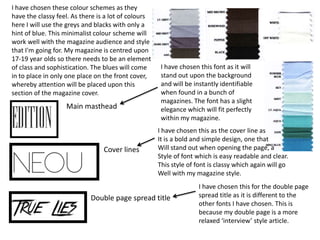
I have chosen these colour schemes as they
have the classy feel. As there is a lot of colours
here I will use the greys and blacks with only a
hint of blue. This minimalist colour scheme will
work well with the magazine audience and style
that I'm going for. My magazine is centred upon
17-19 year olds so there needs to be an element
of class and sophistication. The blues will come
in to place in only one place on the front cover,
whereby attention will be placed upon this
section of the magazine cover.

Main masthead

Cover lines

I have chosen this font as it will
stand out upon the background
and will be instantly identifiable
when found in a bunch of
magazines. The font has a slight
elegance which will fit perfectly
within my magazine.
I have chosen this as the cover line as
It is a bold and simple design, one that
Will stand out when opening the page, a
Style of font which is easy readable and clear.
This style of font is classy which again will go
Well with my magazine style.

Double page spread title

I have chosen this for the double page
spread title as it is different to the
other fonts I have chosen. This is
because my double page is a more
relaxed ‘interview’ style article.

Task 10 style sheet

  • 3.
    I have chosenthese colour schemes as they have the classy feel. As there is a lot of colours here I will use the greys and blacks with only a hint of blue. This minimalist colour scheme will work well with the magazine audience and style that I'm going for. My magazine is centred upon 17-19 year olds so there needs to be an element of class and sophistication. The blues will come in to place in only one place on the front cover, whereby attention will be placed upon this section of the magazine cover. Main masthead Cover lines I have chosen this font as it will stand out upon the background and will be instantly identifiable when found in a bunch of magazines. The font has a slight elegance which will fit perfectly within my magazine. I have chosen this as the cover line as It is a bold and simple design, one that Will stand out when opening the page, a Style of font which is easy readable and clear. This style of font is classy which again will go Well with my magazine style. Double page spread title I have chosen this for the double page spread title as it is different to the other fonts I have chosen. This is because my double page is a more relaxed ‘interview’ style article.