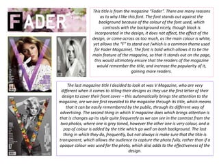
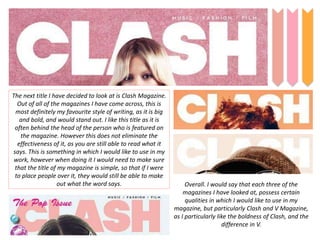
Title Analysis…
This title is from the magazine “Fader”. There are many reasons
as to why I like this font. The font stands out against the
background because of the colour of the font used, which
contrasts with the background nicely, though black is
incorporated in the design, it does not affect, the effect of the
design, or come across as too much, as the main colour is white,
yet allows the “F” to stand out (which is a common theme used
for Fader Magazine). The font is bold which allows it to be the
main feature of the magazine, so that it stands out on the page,
this would ultimately ensure that the readers of the magazine
would remember the title, and increase the popularity of it,
gaining more readers.
The last magazine title I decided to look at was V Magazine, who are very
different when it comes to titling their designs as they use the first letter of their
design to cover their front cover – this automatically brings the attention to the
magazine, are we are first revealed to the magazine through its title, which means
that it can be easily remembered by the public, through its different way of
advertising. The second thing in which V magazine does which brings attention is
that is changes up its style quite frequently as we can see in the contrast from the
two photos, where one is grey toned, however the other one is very colour, and a
pop of colour is added by the title which go well on both background. The last
thing in which they do, frequently, but not always is make sure that the title is
transparent, which allows the audience to capture the photo fully, rather than if a
opaque colour was used for the photo, which also adds to the effectiveness of the
design.
The next title I have decided to look at is Clash Magazine.
Out of all of the magazines I have come across, this is
most definitely my favourite style of writing, as it is big
and bold, and would stand out. I like this title as it is
often behind the head of the person who is featured on
the magazine. However this does not eliminate the
effectiveness of it, as you are still able to read what it
says. This is something in which I would like to use in my
work, however when doing it I would need to make sure
that the title of my magazine is simple, so that if I were
to place people over it, they would still be able to make
out what the word says. Overall. I would say that each three of the
magazines I have looked at, possess certain
qualities in which I would like to use in my
magazine, but particularly Clash and V Magazine,
as I particularly like the boldness of Clash, and the
difference in V.

Title analysis

  • 1.
  • 2.
    This title isfrom the magazine “Fader”. There are many reasons as to why I like this font. The font stands out against the background because of the colour of the font used, which contrasts with the background nicely, though black is incorporated in the design, it does not affect, the effect of the design, or come across as too much, as the main colour is white, yet allows the “F” to stand out (which is a common theme used for Fader Magazine). The font is bold which allows it to be the main feature of the magazine, so that it stands out on the page, this would ultimately ensure that the readers of the magazine would remember the title, and increase the popularity of it, gaining more readers. The last magazine title I decided to look at was V Magazine, who are very different when it comes to titling their designs as they use the first letter of their design to cover their front cover – this automatically brings the attention to the magazine, are we are first revealed to the magazine through its title, which means that it can be easily remembered by the public, through its different way of advertising. The second thing in which V magazine does which brings attention is that is changes up its style quite frequently as we can see in the contrast from the two photos, where one is grey toned, however the other one is very colour, and a pop of colour is added by the title which go well on both background. The last thing in which they do, frequently, but not always is make sure that the title is transparent, which allows the audience to capture the photo fully, rather than if a opaque colour was used for the photo, which also adds to the effectiveness of the design.
  • 3.
    The next titleI have decided to look at is Clash Magazine. Out of all of the magazines I have come across, this is most definitely my favourite style of writing, as it is big and bold, and would stand out. I like this title as it is often behind the head of the person who is featured on the magazine. However this does not eliminate the effectiveness of it, as you are still able to read what it says. This is something in which I would like to use in my work, however when doing it I would need to make sure that the title of my magazine is simple, so that if I were to place people over it, they would still be able to make out what the word says. Overall. I would say that each three of the magazines I have looked at, possess certain qualities in which I would like to use in my magazine, but particularly Clash and V Magazine, as I particularly like the boldness of Clash, and the difference in V.