
Recommended
More Related Content
What's hot
What's hot (18)
Similar to Media Studies 2 Covers.Ppt 1
Similar to Media Studies 2 Covers.Ppt 1 (20)
Recently uploaded
Recently uploaded (20)
Media Studies 2 Covers.Ppt 1
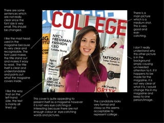
- 1. I like the mast head used in the magazine because its very clear and recognisable. The font used makes the title stand out and makes it easy to read. The title itself is clear and understandable and points out what the magazine covers inside. This cover is quite appealing to present itself as a magazine however it is not very eye catching or interesting because there are not enough colour or eye-catching words and pictures. I like the way that on the left hand side, the text is mainly all lined up There is a main picture which is a medium shot. This is very good and eye-catching. There are some sentences which are not really clear since the font size is very small. This should be changed. I don’t really understand why this other picture is in the background simply causing un-needed attention to it. If it happens to be made for the magazine, it is not very clear of what it is. I would change this in my magazine and keep to one person/image. The candidate looks very formal and classy so this seems acceptable to represent college .
- 2. This is the main imagine used in this cover. From looking at this, I wouldn’t use a picture with 4 people because its not very appealing or clear, however the image stands out seeing that its the only picture on the cover. I also like the way that the picture is cropped into the school logo. I like the font used in this masthead because its not plain or simple. I don't think that it is too attractive but I like how the font is white against a navy blue background so that it stands out. When I first looked at this, I didn't think it was a magazine cover because its not striking at all or have any headlines to make you want to look through. I would add more detail to the cover .