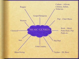
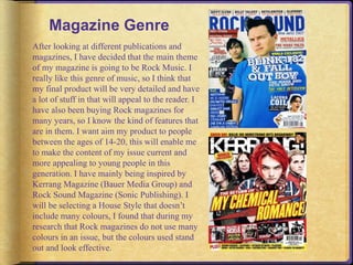
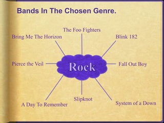
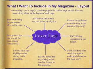
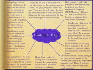
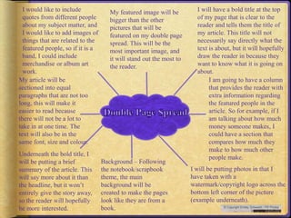
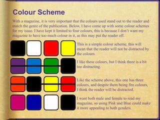
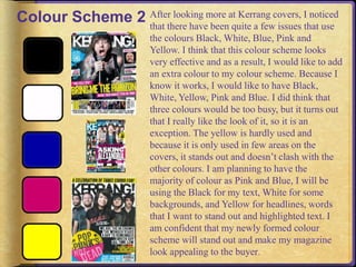
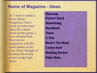
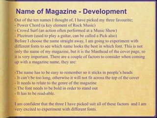
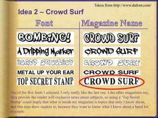
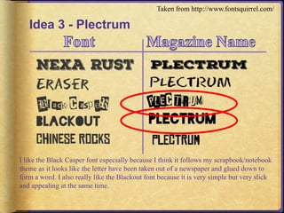
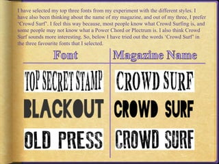
Culture – African, 
Chinese, Indian, 
Tribal etc. 
Pop – Chart Music 
Rock – Metal, 
Punk Rock, Pop 
Punk etc. 
Hip Hop 
Techno – DJ, Rave 
Folk/Country 
Reggae 
Western 
Jazz 
Classical 
Blues/Swing 
Gospel/Religious
Magazine Genre 
After looking at different publications and 
magazines, I have decided that the main theme 
of my magazine is going to be Rock Music. I 
really like this genre of music, so I think that 
my final product will be very detailed and have 
a lot of stuff in that will appeal to the reader. I 
have also been buying Rock magazines for 
many years, so I know the kind of features that 
are in them. I want aim my product to people 
between the ages of 14-20, this will enable me 
to make the content of my issue current and 
more appealing to young people in this 
generation. I have mainly being inspired by 
Kerrang Magazine (Bauer Media Group) and 
Rock Sound Magazine (Sonic Publishing). I 
will be selecting a House Style that doesn’t 
include many colours, I found that during my 
research that Rock magazines do not use many 
colours in an issue, but the colours used stand 
out and look effective.
Bands In The Chosen Genre. 
Blink 182 
Fall Out Boy 
System of a Down 
The Foo Fighters 
Slipknot 
Bring Me The Horizon 
Pierce the Veil 
A Day To Remember
What I Want To Include In My Magazine - Layout 
I am creating a cover page, a contents page and a double page spread. Here are 
some of my ideas for the layout of each page. 
Feature Image based 
on main story in the 
centre of the cover. 
Puff offering 
something to the 
reader. 
Main Headline with 
small description 
underneath based on 
the main story. 
Skyline across the 
top talking about 
another feature in 
the magazine. 
Section showing 
the posters on 
offer in the issue. 
Background that 
ties in with the 
main image 
(colour wise) 
Several titles that 
highlight other 
stories in the 
magazine. 
A Masthead that stands 
out just below the skyline.
Background – I really like 
the idea of making each page 
look like a page from a 
notebook or scrapbook 
(MCR Magazine – Hammer) 
so I would like to look at 
having my magazine look 
very artistic and unique. 
Text Layout – Like most of 
the magazines I have 
looked at, two coloured 
fonts are used – one for the 
main title of the story and 
page number and the other 
for the small description of 
the article. 
Featured Image – I am going 
to put an image at the top of 
my contents page that links to 
my main article from the front 
cover. 
I really like the idea of having an over-view 
Editor Description – Like Kerrang, I 
am going to put a section on the 
contents dedicated to the editor of the 
magazine (me). This will include a 
photo of me, a sub-heading and a 
small paragraph. 
House Style – All of my 
writing will be in the same 
font and the colour palette 
will be limited but suited 
to the target audience. 
I am going to have a 
couple of shapes on the 
page with information 
in, I am planning on 
having one that tells 
the reader about a 
competition that is in 
the issue. I will put the 
page number on so 
they know where to 
look for the details. 
I am planning to put 
the issue number and 
date of publication at 
the top of the page 
under the contents 
heading, so the reader 
knows if it is the most 
recent edition of the 
magazine. 
I am going to have the word 
‘Contents’ in the magazine 
logo’s font in the top corner of 
the page so the reader knows 
this is the contents page. 
of the issue on the contents page, so 
I think I am going to include one on my 
page. The over-view will mainly focus on 
my main story but I will also cover topics 
that are on the cover and mention the free 
items that my publication is offering.
I will have a bold title at the top 
of my page that is clear to the 
reader and tells them the title of 
my article. This title will not 
necessarily say directly what the 
text is about, but it will hopefully 
draw the reader in because they 
want to know what it is going on 
about. 
I am going to have a column 
that provides the reader with 
extra information regarding 
the featured people in the 
article. So for example, if I 
am talking about how much 
money someone makes, I 
could have a section that 
compares how much they 
make to how much other 
people make. 
I will be putting photos in that I 
have taken with a 
watermark/copyright logo across the 
bottom left corner of the picture 
(example underneath). 
Background – Following 
the notebook/scrapbook 
theme, the main 
background will be 
created to make the pages 
look like they are from a 
book. 
I would like to include 
quotes from different people 
about my subject matter, and 
I would like to add images of 
things that are related to the 
featured people, so if it is a 
band, I could include 
merchandise or album art 
work. 
My article will be 
sectioned into equal 
paragraphs that are not too 
long, this will make it 
easier to read because 
there will not be a lot to 
take in at one time. The 
text will also be in the 
same font, size and colour. 
Underneath the bold title, I 
will be putting a brief 
summary of the article. This 
will say more about it than 
the headline, but it won’t 
entirely give the story away, 
so the reader will hopefully 
be more interested. 
My featured image will be 
bigger than the other 
pictures that will be 
featured on my double page 
spread. This will be the 
most important image, and 
it will stand out the most to 
the reader.
Colour Scheme 
With a magazine, it is very important that the colours used stand out to the reader and 
match the genre of the publication. Below, I have come up with some colour schemes 
for my issue. I have kept it limited to four colours, this is because I don’t want my 
magazine to have too much colour in it, as this may put the reader off. 
This is a simple colour scheme, this will 
mean that the reader will not be distracted by 
the colours. 
I like these colours, but I think three is a bit 
too distracting. 
Like the scheme above, this one has three 
colours, and despite them being fire colours, 
I think the reader will be distracted. 
I want both male and female to read my 
magazine, so using Pink and Blue could make 
it more appealing to both genders.
Colour Scheme 2 After looking more at Kerrang covers, I noticed 
that there have been quite a few issues that use 
the colours Black, White, Blue, Pink and 
Yellow. I think that this colour scheme looks 
very effective and as a result, I would like to add 
an extra colour to my colour scheme. Because I 
know it works, I would like to have Black, 
White, Yellow, Pink and Blue. I did think that 
three colours would be too busy, but it turns out 
that I really like the look of it, so it is an 
exception. The yellow is hardly used and 
because it is only used in few areas on the 
covers, it stands out and doesn’t clash with the 
other colours. I am planning to have the 
majority of colour as Pink and Blue, I will be 
using the Black for my text, White for some 
backgrounds, and Yellow for headlines, words 
that I want to stand out and highlighted text. I 
am confident that my newly formed colour 
scheme will stand out and make my magazine 
look appealing to the buyer.
Font 
To make my magazine look neat and tidy, the majority of the text on each page will be in 
the same font, size and colour. I have sampled with some fonts below which I think will 
look good in my magazine. Every word is going to be in caps lock also, to make sure 
every word is clear to the reader. 
Arial 
Bookman Old Style 
Century 
Ebrima 
Georgia 
Lucida Sans Unicode 
MS Gothic 
Nirmala UI 
ARIAL 
BOOKMAN OLD STYLE 
CENTURY 
EBRIMA 
GEORGIA 
LUCIDA SANS UNICODE 
MS GOTHIC 
NIRMAL UI 
I personally feel that the Ebrima font looks the best, so this is the font that I will be using 
in my magazine.
Page Layout 
The MCR Hammer Magazine has inspired me 
greatly on the layout front. I really like how 
each page is styled like a scrapbook and I 
would love to have a magazine based on this 
layout. Obviously, my genre is Rock Music so 
I couldn’t have flowery backgrounds and love 
heart stickers, but I do believe I will be able to 
come up with something that will not only suit 
my target audience and genre, but will also 
look very effective at the same time. 
I found a double page blank sketchbook 
on Google 
Images:http://dotgrid.co/product/sketch 
-book-a5-manilla/ and I think this is 
how I want my double page spread 
especially to be set out. The sketchbook 
also ties in with my targeted audience, 
because people who like Rock Music 
are stereotyped as people who are very 
creative and spend a lot of time drawing 
and painting, so I think this page style 
works very well.
Pinterest 
On my Pinterest account, I have 
created a board called ‘Media’ and 
I have pinned some scrapbook 
page ideas. This is giving me some 
inspiration for the pages in my 
magazine and it has been a great 
help for me. I definitely will be 
taking some ideas from what I 
have found. Something that I 
found that I like especially, is the 
layout on the bottom left image, I 
think that this style looks very 
detailed and well thought through. 
I would love to get this idea into 
my magazine somehow. I also 
really like the flags on the top left 
image, I think they look really nice 
and make the page look more 
interactive. 
http://uk.pinterest.com/emilymoorby/
Featured Images 
Here are some examples of the kind of photos that I 
would like to include in my magazine. I have got: 
-Close Up (Image 1) 
-Medium Close Up (Image 2) 
-Long Shot (Image 3) 
-Medium Long Shot (Image 4) 
I will be taking my own photos for my magazine 
and I am very excited to do this. I am planning on 
adding a review to a show that I took some photos 
at and I will use some of the images, I will be using 
a model for my front cover image and I am planning 
on making a music merchandise advertising poster 
to put in my issue.
Name of Magazine - Ideas 
As I want to make a 
Rock Music 
Magazine, I have 
come up with some 
ideas for a name 
based on the genre. I 
have checked that 
there are no 
magazines with the 
same names as the 
ones I have thought of 
because this could 
create a copyright 
issue.
Name of Magazine - Development 
Out of the ten names I thought of, I have picked my three favourite; 
- Power Chord (a key element of Rock Music) 
- Crowd Surf (an action often performed at a Music Show) 
- Plectrum (used to play a guitar, can be called a Pick also) 
Before I choose the name straight away, I am going to experiment with 
different fonts to see which name looks the best in which font. This is not 
only the name of my magazine, but it is the Masthead of the cover page, so 
it is very important. There are a couple of factors to consider when coming 
up with a magazine name, they are: 
-The name has to be easy to remember so it sticks in people’s heads 
- It can’t be too long, otherwise it will not fit across the top of the cover 
- It needs to relate to the genre of the magazine 
- The font needs to be bold in order to stand out 
- It has to be read-able. 
I am confident that the three I have picked suit all of these factors and I am 
very excited to experiment with different fonts.
Idea 1 – Power Chord 
Taken from http://www.urbanfonts.com 
Above, I have experimented with five different fonts from UrbanFonts.Com. I have put 
circles around the ones that I like the most. I chose the ones that I did because not only 
do I like the look of them, I think they all match my music genre and target audience 
(14-20). I also picked the sketchy one as an idea because I want my magazine layout to 
be in the style of a notebook/scrapbook, so I felt this font suited my ideal style.
Idea 2 – Crowd Surf 
Taken from http://www.dafont.com/ 
Out of the five fonts I selected, I only really like the last one. Like other magazines say, 
they provide the reader will exclusive news about subjects, so using a ‘Top Secret 
Stamp’ could imply that what is inside my magazine is topics that only I know about, 
and this may draw readers in, because they want to know what I know about a band for 
example.
Idea 3 - Plectrum 
Taken from http://www.fontsquirrel.com/ 
I like the Black Casper font especially because I think it follows my scrapbook/notebook 
theme as it looks like the letter have been taken out of a newspaper and glued down to 
form a word. I also really like the Blackout font because it is very simple but very slick 
and appealing at the same time.
I have selected my top three fonts from my experiment with the different styles. I 
have also been thinking about the name of my magazine, and out of my three, I prefer 
‘Crowd Surf’. I feel this way because, most people know what Crowd Surfing is, and 
some people may not know what a Power Chord or Plectrum is. I also think Crowd 
Surf sounds more interesting. So, below I have tried out the words ‘Crowd Surf’ in 
the three favourite fonts that I selected.

Initial Ideas For My Magazine

  • 2.
    Culture – African, Chinese, Indian, Tribal etc. Pop – Chart Music Rock – Metal, Punk Rock, Pop Punk etc. Hip Hop Techno – DJ, Rave Folk/Country Reggae Western Jazz Classical Blues/Swing Gospel/Religious
  • 3.
    Magazine Genre Afterlooking at different publications and magazines, I have decided that the main theme of my magazine is going to be Rock Music. I really like this genre of music, so I think that my final product will be very detailed and have a lot of stuff in that will appeal to the reader. I have also been buying Rock magazines for many years, so I know the kind of features that are in them. I want aim my product to people between the ages of 14-20, this will enable me to make the content of my issue current and more appealing to young people in this generation. I have mainly being inspired by Kerrang Magazine (Bauer Media Group) and Rock Sound Magazine (Sonic Publishing). I will be selecting a House Style that doesn’t include many colours, I found that during my research that Rock magazines do not use many colours in an issue, but the colours used stand out and look effective.
  • 4.
    Bands In TheChosen Genre. Blink 182 Fall Out Boy System of a Down The Foo Fighters Slipknot Bring Me The Horizon Pierce the Veil A Day To Remember
  • 5.
    What I WantTo Include In My Magazine - Layout I am creating a cover page, a contents page and a double page spread. Here are some of my ideas for the layout of each page. Feature Image based on main story in the centre of the cover. Puff offering something to the reader. Main Headline with small description underneath based on the main story. Skyline across the top talking about another feature in the magazine. Section showing the posters on offer in the issue. Background that ties in with the main image (colour wise) Several titles that highlight other stories in the magazine. A Masthead that stands out just below the skyline.
  • 6.
    Background – Ireally like the idea of making each page look like a page from a notebook or scrapbook (MCR Magazine – Hammer) so I would like to look at having my magazine look very artistic and unique. Text Layout – Like most of the magazines I have looked at, two coloured fonts are used – one for the main title of the story and page number and the other for the small description of the article. Featured Image – I am going to put an image at the top of my contents page that links to my main article from the front cover. I really like the idea of having an over-view Editor Description – Like Kerrang, I am going to put a section on the contents dedicated to the editor of the magazine (me). This will include a photo of me, a sub-heading and a small paragraph. House Style – All of my writing will be in the same font and the colour palette will be limited but suited to the target audience. I am going to have a couple of shapes on the page with information in, I am planning on having one that tells the reader about a competition that is in the issue. I will put the page number on so they know where to look for the details. I am planning to put the issue number and date of publication at the top of the page under the contents heading, so the reader knows if it is the most recent edition of the magazine. I am going to have the word ‘Contents’ in the magazine logo’s font in the top corner of the page so the reader knows this is the contents page. of the issue on the contents page, so I think I am going to include one on my page. The over-view will mainly focus on my main story but I will also cover topics that are on the cover and mention the free items that my publication is offering.
  • 7.
    I will havea bold title at the top of my page that is clear to the reader and tells them the title of my article. This title will not necessarily say directly what the text is about, but it will hopefully draw the reader in because they want to know what it is going on about. I am going to have a column that provides the reader with extra information regarding the featured people in the article. So for example, if I am talking about how much money someone makes, I could have a section that compares how much they make to how much other people make. I will be putting photos in that I have taken with a watermark/copyright logo across the bottom left corner of the picture (example underneath). Background – Following the notebook/scrapbook theme, the main background will be created to make the pages look like they are from a book. I would like to include quotes from different people about my subject matter, and I would like to add images of things that are related to the featured people, so if it is a band, I could include merchandise or album art work. My article will be sectioned into equal paragraphs that are not too long, this will make it easier to read because there will not be a lot to take in at one time. The text will also be in the same font, size and colour. Underneath the bold title, I will be putting a brief summary of the article. This will say more about it than the headline, but it won’t entirely give the story away, so the reader will hopefully be more interested. My featured image will be bigger than the other pictures that will be featured on my double page spread. This will be the most important image, and it will stand out the most to the reader.
  • 8.
    Colour Scheme Witha magazine, it is very important that the colours used stand out to the reader and match the genre of the publication. Below, I have come up with some colour schemes for my issue. I have kept it limited to four colours, this is because I don’t want my magazine to have too much colour in it, as this may put the reader off. This is a simple colour scheme, this will mean that the reader will not be distracted by the colours. I like these colours, but I think three is a bit too distracting. Like the scheme above, this one has three colours, and despite them being fire colours, I think the reader will be distracted. I want both male and female to read my magazine, so using Pink and Blue could make it more appealing to both genders.
  • 9.
    Colour Scheme 2After looking more at Kerrang covers, I noticed that there have been quite a few issues that use the colours Black, White, Blue, Pink and Yellow. I think that this colour scheme looks very effective and as a result, I would like to add an extra colour to my colour scheme. Because I know it works, I would like to have Black, White, Yellow, Pink and Blue. I did think that three colours would be too busy, but it turns out that I really like the look of it, so it is an exception. The yellow is hardly used and because it is only used in few areas on the covers, it stands out and doesn’t clash with the other colours. I am planning to have the majority of colour as Pink and Blue, I will be using the Black for my text, White for some backgrounds, and Yellow for headlines, words that I want to stand out and highlighted text. I am confident that my newly formed colour scheme will stand out and make my magazine look appealing to the buyer.
  • 10.
    Font To makemy magazine look neat and tidy, the majority of the text on each page will be in the same font, size and colour. I have sampled with some fonts below which I think will look good in my magazine. Every word is going to be in caps lock also, to make sure every word is clear to the reader. Arial Bookman Old Style Century Ebrima Georgia Lucida Sans Unicode MS Gothic Nirmala UI ARIAL BOOKMAN OLD STYLE CENTURY EBRIMA GEORGIA LUCIDA SANS UNICODE MS GOTHIC NIRMAL UI I personally feel that the Ebrima font looks the best, so this is the font that I will be using in my magazine.
  • 11.
    Page Layout TheMCR Hammer Magazine has inspired me greatly on the layout front. I really like how each page is styled like a scrapbook and I would love to have a magazine based on this layout. Obviously, my genre is Rock Music so I couldn’t have flowery backgrounds and love heart stickers, but I do believe I will be able to come up with something that will not only suit my target audience and genre, but will also look very effective at the same time. I found a double page blank sketchbook on Google Images:http://dotgrid.co/product/sketch -book-a5-manilla/ and I think this is how I want my double page spread especially to be set out. The sketchbook also ties in with my targeted audience, because people who like Rock Music are stereotyped as people who are very creative and spend a lot of time drawing and painting, so I think this page style works very well.
  • 12.
    Pinterest On myPinterest account, I have created a board called ‘Media’ and I have pinned some scrapbook page ideas. This is giving me some inspiration for the pages in my magazine and it has been a great help for me. I definitely will be taking some ideas from what I have found. Something that I found that I like especially, is the layout on the bottom left image, I think that this style looks very detailed and well thought through. I would love to get this idea into my magazine somehow. I also really like the flags on the top left image, I think they look really nice and make the page look more interactive. http://uk.pinterest.com/emilymoorby/
  • 13.
    Featured Images Hereare some examples of the kind of photos that I would like to include in my magazine. I have got: -Close Up (Image 1) -Medium Close Up (Image 2) -Long Shot (Image 3) -Medium Long Shot (Image 4) I will be taking my own photos for my magazine and I am very excited to do this. I am planning on adding a review to a show that I took some photos at and I will use some of the images, I will be using a model for my front cover image and I am planning on making a music merchandise advertising poster to put in my issue.
  • 14.
    Name of Magazine- Ideas As I want to make a Rock Music Magazine, I have come up with some ideas for a name based on the genre. I have checked that there are no magazines with the same names as the ones I have thought of because this could create a copyright issue.
  • 15.
    Name of Magazine- Development Out of the ten names I thought of, I have picked my three favourite; - Power Chord (a key element of Rock Music) - Crowd Surf (an action often performed at a Music Show) - Plectrum (used to play a guitar, can be called a Pick also) Before I choose the name straight away, I am going to experiment with different fonts to see which name looks the best in which font. This is not only the name of my magazine, but it is the Masthead of the cover page, so it is very important. There are a couple of factors to consider when coming up with a magazine name, they are: -The name has to be easy to remember so it sticks in people’s heads - It can’t be too long, otherwise it will not fit across the top of the cover - It needs to relate to the genre of the magazine - The font needs to be bold in order to stand out - It has to be read-able. I am confident that the three I have picked suit all of these factors and I am very excited to experiment with different fonts.
  • 16.
    Idea 1 –Power Chord Taken from http://www.urbanfonts.com Above, I have experimented with five different fonts from UrbanFonts.Com. I have put circles around the ones that I like the most. I chose the ones that I did because not only do I like the look of them, I think they all match my music genre and target audience (14-20). I also picked the sketchy one as an idea because I want my magazine layout to be in the style of a notebook/scrapbook, so I felt this font suited my ideal style.
  • 17.
    Idea 2 –Crowd Surf Taken from http://www.dafont.com/ Out of the five fonts I selected, I only really like the last one. Like other magazines say, they provide the reader will exclusive news about subjects, so using a ‘Top Secret Stamp’ could imply that what is inside my magazine is topics that only I know about, and this may draw readers in, because they want to know what I know about a band for example.
  • 18.
    Idea 3 -Plectrum Taken from http://www.fontsquirrel.com/ I like the Black Casper font especially because I think it follows my scrapbook/notebook theme as it looks like the letter have been taken out of a newspaper and glued down to form a word. I also really like the Blackout font because it is very simple but very slick and appealing at the same time.
  • 19.
    I have selectedmy top three fonts from my experiment with the different styles. I have also been thinking about the name of my magazine, and out of my three, I prefer ‘Crowd Surf’. I feel this way because, most people know what Crowd Surfing is, and some people may not know what a Power Chord or Plectrum is. I also think Crowd Surf sounds more interesting. So, below I have tried out the words ‘Crowd Surf’ in the three favourite fonts that I selected.