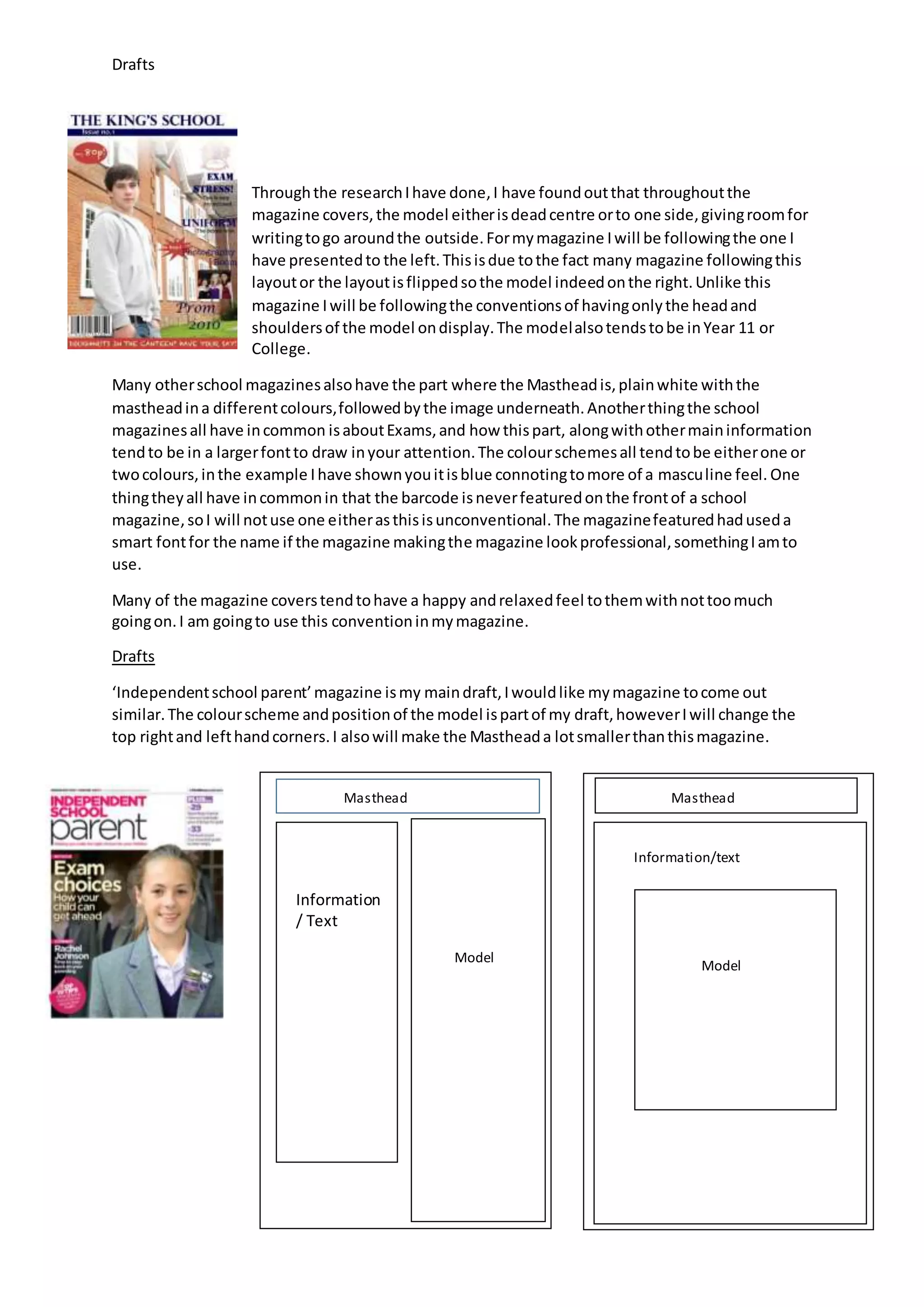
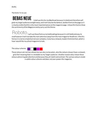
The document discusses draft designs for a school magazine cover. It analyzes conventions from other school magazine covers, such as positioning the masthead in plain white above a full-body model shot. The draft design will feature a smaller masthead and change the top corners. Font choices are described for the masthead, subheadings, and body text that aim to grab attention but not overpower the design. A two-color subtle scheme was selected to have a relaxed, feminine feel relatable to the target audience.