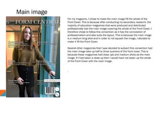
B
y
K
I E
R
A
N
H
A
D
F
I E
L
D
In
what ways does your m
edia product use, develop
or
challenge form
s and
conventions of real m
edia products?
Main image
For my magazine, I chose to make the main image fill the whole of the
Front Cover. This is because after conducting my secondary research, the
majority of education magazines that were produced and distributed
professionally had the main image covering the whole of the Front Cover. I
therefore chose to follow this convention as it has the connotation of
professionalism and also suits the layout. This is because the main image
is a medium long shot and in order to not squash the image, I decided to
make it fill the Front Cover.
Several other magazines that I saw decided to subvert this convention had
the main image take up half to three quarters of the front cover. This is
because these magazines had close ups and medium shots as the main
image. If I had taken a close up then I would have not taken up the whole
of the Front Cover with the main image.
.
Cover lines
In terms of layout, my cover lines followed the
convention however they also subverted my
secondary research. To have the connotations of
professional and well organised, I decided to keep
the cover lines simplistic. This is because I believe
that my target audience would be less interested in
my magazine if it looked too vibrant and
extravagant. On the other hand, I still had to make
the cover lines appeal to them. By having cover
lines which relate to them and interest them, such
as “socials” and “Christmas time”, my target
audience would want to read these features.
The presentation of my cover lines connote
organisation and professionalism. By having each
of them in line with each other, my magazine has
a smart layout. Additionally, unlike my secondary
research, my masthead does not have the same
typeface as my cover lines. This is to represent
my magazine as unique and to make it stand out.
Whilst some brands have it as their brand identity,
I chose to make my brand identity my masthead.
This is so the reader can get an instant insight
into the contents of the magazine.
Underneath the cover lines, I decided to
incorporate some additional text. This is to give
the reader some background information about
the features. This is not also present on front
covers of magazines. This represents my
magazine as unique and therefore worth
reading.
Upon reflection, I feel that although my magazine
front cover looks professional, it also looks a bit
plain and almost too simplistic. Next time, I would
add a pug where there is space to add diversity to
the front cover.
Price and bar code
Other conventions of a magazine front cover are the price and bar code. Whilst my magazine would not be
distributed because it's only for school, I still decided to include a bar code in the bottom right hand side of
the page. This is because it is a convention. I could have subverted this convention however I chose not to
as one of the first things people would realise is that the bar code is missing. They would then question the
professionalism and quality of the magazine. Whilst this is not massively important, I still wanted to include
a bar code.
I decided that the magazine would be free. This is because it is not going to be distributed and
therefore does not need a price. If I had decided to give my magazine a price, then I would make it
£1.50 -£2.00 as my secondary research shows that this is a common price range for magazines. If I
had priced it higher then my target audience would be discouraged from reading it because the price
would be too high.
House style
For my magazine, I decided to have a plain colour scheme,
connoting purity and simplicity. I decided to use a white font colour
for all my text, this is because it stands out against all the colours
in the main image and also connotes purity and goodness. Whilst
there were a variety of colours on the front cover, such as orange,
turquoise and yellow, I stuck with a white font colour as alternative
colours wouldn't compliment the colours of the main image. If I
had changed the location of my main image then I would have
chosen more than one colour of font. The lighting behind Ulani
made it difficult to have an alternative colour of font for that area.
This font colour would then have to be the same for the rest of the
cover lines which would have caused issues such as difficulty of
reading. I decided to subvert the convention of multiple font
colours. This is mainly because of the lighting and colours in the
shot. Due to these colours, I was limited on what colour I could
use for the font. Alternatively, I also decided to only use one font
to be unique. The connotation of the singular font colour would be
that there is only one Sixth Form like this one.
In order to bring out the white font colour, I decided to add a black
outline to all of the text. This connotes boldness and importance,
two connotations I wanted. The aim of the Front Cover is to draw
readers in and make them want to read more. For the Masthead, I
decided to use the font “Baskerville”, this is because it's a serif
font which connotes sophistication and also stands out. The
Masthead font would appeal to older students as the lower years
would prefer big bold text.
MENTION COVER LINE FONT
Mode of address and type of photography used
To grab the reader's attention, I decided to use direct address. By
getting Ulani to look directly into the camera, the reader feels like
Ulani is looking at them. This is successful as it draws them in.
Another mode of address was the Cover lines. I decided to use
enticing language as well as the personal pronoun “you”, to make
the content relevant to the reader. This lures the reader in and
makes them want to read more.
For the main image, I decided to use a medium long shot of Ulani,
smiling into the camera. This medium long shot allows the reader to
see Ulani's expression and her surroundings. The main image
clearly shows how she is in a school environment. On the other
hand, due to the lack of people in the image and the awkward hand
position, Ulani could be represented as isolated and lonely in the
school environment. This was not the representation I was trying to
create. In the future, I will now think about the composition of my
images more carefully and the negative representations of them.

Evaluation question 1

  • 1.
    B y K I E R A N H A D F I E L D In whatways does your m edia product use, develop or challenge form s and conventions of real m edia products?
  • 2.
    Main image For mymagazine, I chose to make the main image fill the whole of the Front Cover. This is because after conducting my secondary research, the majority of education magazines that were produced and distributed professionally had the main image covering the whole of the Front Cover. I therefore chose to follow this convention as it has the connotation of professionalism and also suits the layout. This is because the main image is a medium long shot and in order to not squash the image, I decided to make it fill the Front Cover. Several other magazines that I saw decided to subvert this convention had the main image take up half to three quarters of the front cover. This is because these magazines had close ups and medium shots as the main image. If I had taken a close up then I would have not taken up the whole of the Front Cover with the main image. .
  • 3.
    Cover lines In termsof layout, my cover lines followed the convention however they also subverted my secondary research. To have the connotations of professional and well organised, I decided to keep the cover lines simplistic. This is because I believe that my target audience would be less interested in my magazine if it looked too vibrant and extravagant. On the other hand, I still had to make the cover lines appeal to them. By having cover lines which relate to them and interest them, such as “socials” and “Christmas time”, my target audience would want to read these features. The presentation of my cover lines connote organisation and professionalism. By having each of them in line with each other, my magazine has a smart layout. Additionally, unlike my secondary research, my masthead does not have the same typeface as my cover lines. This is to represent my magazine as unique and to make it stand out. Whilst some brands have it as their brand identity, I chose to make my brand identity my masthead. This is so the reader can get an instant insight into the contents of the magazine. Underneath the cover lines, I decided to incorporate some additional text. This is to give the reader some background information about the features. This is not also present on front covers of magazines. This represents my magazine as unique and therefore worth reading. Upon reflection, I feel that although my magazine front cover looks professional, it also looks a bit plain and almost too simplistic. Next time, I would add a pug where there is space to add diversity to the front cover.
  • 4.
    Price and barcode Other conventions of a magazine front cover are the price and bar code. Whilst my magazine would not be distributed because it's only for school, I still decided to include a bar code in the bottom right hand side of the page. This is because it is a convention. I could have subverted this convention however I chose not to as one of the first things people would realise is that the bar code is missing. They would then question the professionalism and quality of the magazine. Whilst this is not massively important, I still wanted to include a bar code. I decided that the magazine would be free. This is because it is not going to be distributed and therefore does not need a price. If I had decided to give my magazine a price, then I would make it £1.50 -£2.00 as my secondary research shows that this is a common price range for magazines. If I had priced it higher then my target audience would be discouraged from reading it because the price would be too high.
  • 5.
    House style For mymagazine, I decided to have a plain colour scheme, connoting purity and simplicity. I decided to use a white font colour for all my text, this is because it stands out against all the colours in the main image and also connotes purity and goodness. Whilst there were a variety of colours on the front cover, such as orange, turquoise and yellow, I stuck with a white font colour as alternative colours wouldn't compliment the colours of the main image. If I had changed the location of my main image then I would have chosen more than one colour of font. The lighting behind Ulani made it difficult to have an alternative colour of font for that area. This font colour would then have to be the same for the rest of the cover lines which would have caused issues such as difficulty of reading. I decided to subvert the convention of multiple font colours. This is mainly because of the lighting and colours in the shot. Due to these colours, I was limited on what colour I could use for the font. Alternatively, I also decided to only use one font to be unique. The connotation of the singular font colour would be that there is only one Sixth Form like this one. In order to bring out the white font colour, I decided to add a black outline to all of the text. This connotes boldness and importance, two connotations I wanted. The aim of the Front Cover is to draw readers in and make them want to read more. For the Masthead, I decided to use the font “Baskerville”, this is because it's a serif font which connotes sophistication and also stands out. The Masthead font would appeal to older students as the lower years would prefer big bold text. MENTION COVER LINE FONT
  • 6.
    Mode of addressand type of photography used To grab the reader's attention, I decided to use direct address. By getting Ulani to look directly into the camera, the reader feels like Ulani is looking at them. This is successful as it draws them in. Another mode of address was the Cover lines. I decided to use enticing language as well as the personal pronoun “you”, to make the content relevant to the reader. This lures the reader in and makes them want to read more. For the main image, I decided to use a medium long shot of Ulani, smiling into the camera. This medium long shot allows the reader to see Ulani's expression and her surroundings. The main image clearly shows how she is in a school environment. On the other hand, due to the lack of people in the image and the awkward hand position, Ulani could be represented as isolated and lonely in the school environment. This was not the representation I was trying to create. In the future, I will now think about the composition of my images more carefully and the negative representations of them.