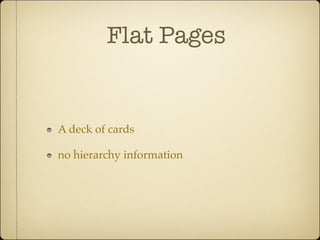
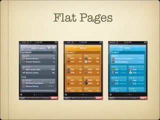
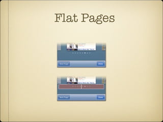
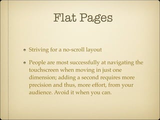
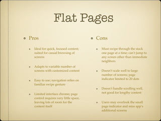
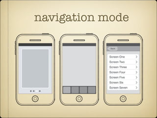
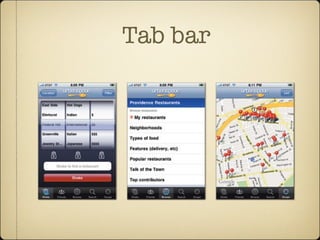
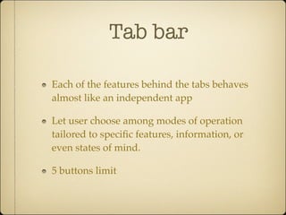
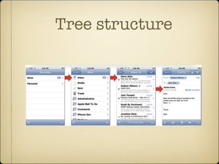
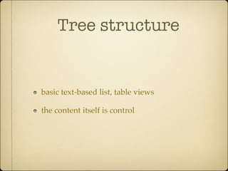
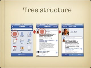
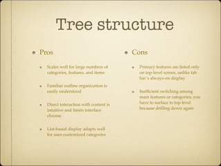
Tapworthy
Chapter 4
navigation mode
The three navigation models each have signature design silhouettes. From left to right: flat pages, tab bar, and tree
structure.
www.it-ebooks.info
Flat Pages
A deck of cards
no hierarchy information
Flat Pages
of screens, particularly variations on the same relatively
Screens in ESPN ScoreCenter show a roundup of sports scores, with each“page”targeted to a different team or
league.Tap the gear icon to see the app’s settings.
www.it-ebooks.info
Flat Pages
ons on the same relatively
navigation model is a better
ings while browsing through
he standard page control,
ttom of flat-page apps. The
pages in the collection, with
our current position in the
ontrol gives your audience
ne of several screens, and it’s
ft or right half of the control
xt screen—an alternative to
up of sports scores, with each“page”targeted to a different team or
ttings.
The presence of a page control signals
that you’re browsing a collection of
flat pages, with the highlighted dot
Flat Pages
Striving for a no-scroll layout
People are most successfully at navigating the
touchscreen when moving in just one
dimension; adding a second requires more
precision and thus, more effort, from your
audience. Avoid it when you can.
Flat Pages
Pros
Ideal for quick, focused content;
suited for casual browsing of
screens
Adapts to variable number of
screens with customized content
Easy to use; navigation relies on
familiar swipe gesture
Limited interface chrome; page
control requires very little space,
leaving lots of room for the
content itself
Cons
Must swipe through the stack
one page at a time; can’t jump to
any screen other than immediate
neighbors
Doesn’t scale well to large
number of screens; page
indicator limited to 20 dots
Doesn’t handle scrolling well,
not good for lengthy content
Users may overlook the small
page indicator and miss app’s
additional screens
navigation mode
The three navigation models each have signature design silhouettes. From left to right: flat pages, tab bar, and tree
structure.
www.it-ebooks.info
Tab bar
Urbanspoon uses a tab bar to offer five different ways to approach a restaurant search.The screens for the Shake,
Browse, and Scope tabs are shown here from left to right.
www.it-ebooks.info
Tab bar
Each of the features behind the tabs behaves
almost like an independent app
Let user choose among modes of operation
tailored to specific features, information, or
even states of mind.
5 buttons limit
Tab bar
Avoid the More button.
When you sweep key navigation elements
behind the More button’s curtain, you add
more than just an extra tap. You ask users to
remember what operations are back there, a
brain burden that might seem trivial and will
inevitably cause those hidden features to go
overlooked and underappreciated.
Tab bar
the More button. When you sweep key navigation elements behind the
button’s curtain, you add more than just an extra tap. You ask users to re-
screen lists the tabs that
on the tab bar. Here, the New
es app offers section-specific
rom its More screen (left).Tap-
ction name in that screen takes
ist of articles from that section.
e the tab-bar icons by tapping
utton (circled), which reveals
ew (right) that lets you drag
rite sections to the tab bar.
www.it-ebooks.info
Tab bar
Pros
One-tap access to all
of the app’s main
features
Clearly labeled
menu advertises
primary features,
shows current
location
Cons
Only 5 tabs can be
displayed at once
Absorbs significant
screen space on all
(or most) screens of
the app
navigation mode
The three navigation models each have signature design silhouettes. From left to right: flat pages, tab bar, and tree
structure.
www.it-ebooks.info
Tree structure
Tree-structure apps use the same file/category structure that we use to organize our desktop computers.The column
view of Mac OS X (top) matches up conceptually and visually to tree-structure apps.The built-in Mail app lets you
drill down to an individual mail message the same way you would drill down through folders on the desktop.Tap an
account, then a mailbox, then a message to finally see its details.
Tree Structure: Let 1,000 Screens Bloom 111
Tree structure
basic text-based list, table views
the content itself is control
Tree structure
that resembles the iPhone Home screen. The approach is not only graphical and
familiar but also highlights that Facebook (as both platform and iPhone app) is
really a collection of mini-apps comprising news, contacts, messages, calendar
events, and more. This main-screen arrangement may look different than the pre-
vious list-based examples, but it’s the same underlying organizational structure.
A list of primary features leads to lists of content, and you keep tapping to drill
down through these structured layers. (For more about Facebook’s design
Tree structure
Facebook (top) uses icons in its main screen to represent the app’s primary features.The built-in Photos app (bottom)
uses thumbnail images to represent individual photos in the album view.
Tree Structure: Let 1,000 Screens Bloom 113
Tree structure
Pros
Scales well for large numbers of
categories, features, and items
Familiar outline organization is
easily understood
Direct interaction with content is
intuitive and limits interface
chrome
List-based display adapts well
for user-customized categories
Cons
Primary features are listed only
on top-level screen, unlike tab
bar’s always-on display
Inefficient switching among
main features or categories; you
have to surface to top level
because drilling down again

Tapworthy ch4

  • 1.
  • 2.
    navigation mode The threenavigation models each have signature design silhouettes. From left to right: flat pages, tab bar, and tree structure. www.it-ebooks.info
  • 3.
    Flat Pages A deckof cards no hierarchy information
  • 4.
    Flat Pages of screens,particularly variations on the same relatively Screens in ESPN ScoreCenter show a roundup of sports scores, with each“page”targeted to a different team or league.Tap the gear icon to see the app’s settings. www.it-ebooks.info
  • 5.
    Flat Pages ons onthe same relatively navigation model is a better ings while browsing through he standard page control, ttom of flat-page apps. The pages in the collection, with our current position in the ontrol gives your audience ne of several screens, and it’s ft or right half of the control xt screen—an alternative to up of sports scores, with each“page”targeted to a different team or ttings. The presence of a page control signals that you’re browsing a collection of flat pages, with the highlighted dot
  • 6.
    Flat Pages Striving fora no-scroll layout People are most successfully at navigating the touchscreen when moving in just one dimension; adding a second requires more precision and thus, more effort, from your audience. Avoid it when you can.
  • 7.
    Flat Pages Pros Ideal forquick, focused content; suited for casual browsing of screens Adapts to variable number of screens with customized content Easy to use; navigation relies on familiar swipe gesture Limited interface chrome; page control requires very little space, leaving lots of room for the content itself Cons Must swipe through the stack one page at a time; can’t jump to any screen other than immediate neighbors Doesn’t scale well to large number of screens; page indicator limited to 20 dots Doesn’t handle scrolling well, not good for lengthy content Users may overlook the small page indicator and miss app’s additional screens
  • 8.
    navigation mode The threenavigation models each have signature design silhouettes. From left to right: flat pages, tab bar, and tree structure. www.it-ebooks.info
  • 9.
    Tab bar Urbanspoon usesa tab bar to offer five different ways to approach a restaurant search.The screens for the Shake, Browse, and Scope tabs are shown here from left to right. www.it-ebooks.info
  • 10.
    Tab bar Each ofthe features behind the tabs behaves almost like an independent app Let user choose among modes of operation tailored to specific features, information, or even states of mind. 5 buttons limit
  • 11.
    Tab bar Avoid theMore button. When you sweep key navigation elements behind the More button’s curtain, you add more than just an extra tap. You ask users to remember what operations are back there, a brain burden that might seem trivial and will inevitably cause those hidden features to go overlooked and underappreciated.
  • 12.
    Tab bar the Morebutton. When you sweep key navigation elements behind the button’s curtain, you add more than just an extra tap. You ask users to re- screen lists the tabs that on the tab bar. Here, the New es app offers section-specific rom its More screen (left).Tap- ction name in that screen takes ist of articles from that section. e the tab-bar icons by tapping utton (circled), which reveals ew (right) that lets you drag rite sections to the tab bar. www.it-ebooks.info
  • 13.
    Tab bar Pros One-tap accessto all of the app’s main features Clearly labeled menu advertises primary features, shows current location Cons Only 5 tabs can be displayed at once Absorbs significant screen space on all (or most) screens of the app
  • 14.
    navigation mode The threenavigation models each have signature design silhouettes. From left to right: flat pages, tab bar, and tree structure. www.it-ebooks.info
  • 15.
    Tree structure Tree-structure appsuse the same file/category structure that we use to organize our desktop computers.The column view of Mac OS X (top) matches up conceptually and visually to tree-structure apps.The built-in Mail app lets you drill down to an individual mail message the same way you would drill down through folders on the desktop.Tap an account, then a mailbox, then a message to finally see its details. Tree Structure: Let 1,000 Screens Bloom 111
  • 16.
    Tree structure basic text-basedlist, table views the content itself is control
  • 17.
    Tree structure that resemblesthe iPhone Home screen. The approach is not only graphical and familiar but also highlights that Facebook (as both platform and iPhone app) is really a collection of mini-apps comprising news, contacts, messages, calendar events, and more. This main-screen arrangement may look different than the pre- vious list-based examples, but it’s the same underlying organizational structure. A list of primary features leads to lists of content, and you keep tapping to drill down through these structured layers. (For more about Facebook’s design
  • 18.
    Tree structure Facebook (top)uses icons in its main screen to represent the app’s primary features.The built-in Photos app (bottom) uses thumbnail images to represent individual photos in the album view. Tree Structure: Let 1,000 Screens Bloom 113
  • 19.
    Tree structure Pros Scales wellfor large numbers of categories, features, and items Familiar outline organization is easily understood Direct interaction with content is intuitive and limits interface chrome List-based display adapts well for user-customized categories Cons Primary features are listed only on top-level screen, unlike tab bar’s always-on display Inefficient switching among main features or categories; you have to surface to top level because drilling down again