Download as PDF, PPTX

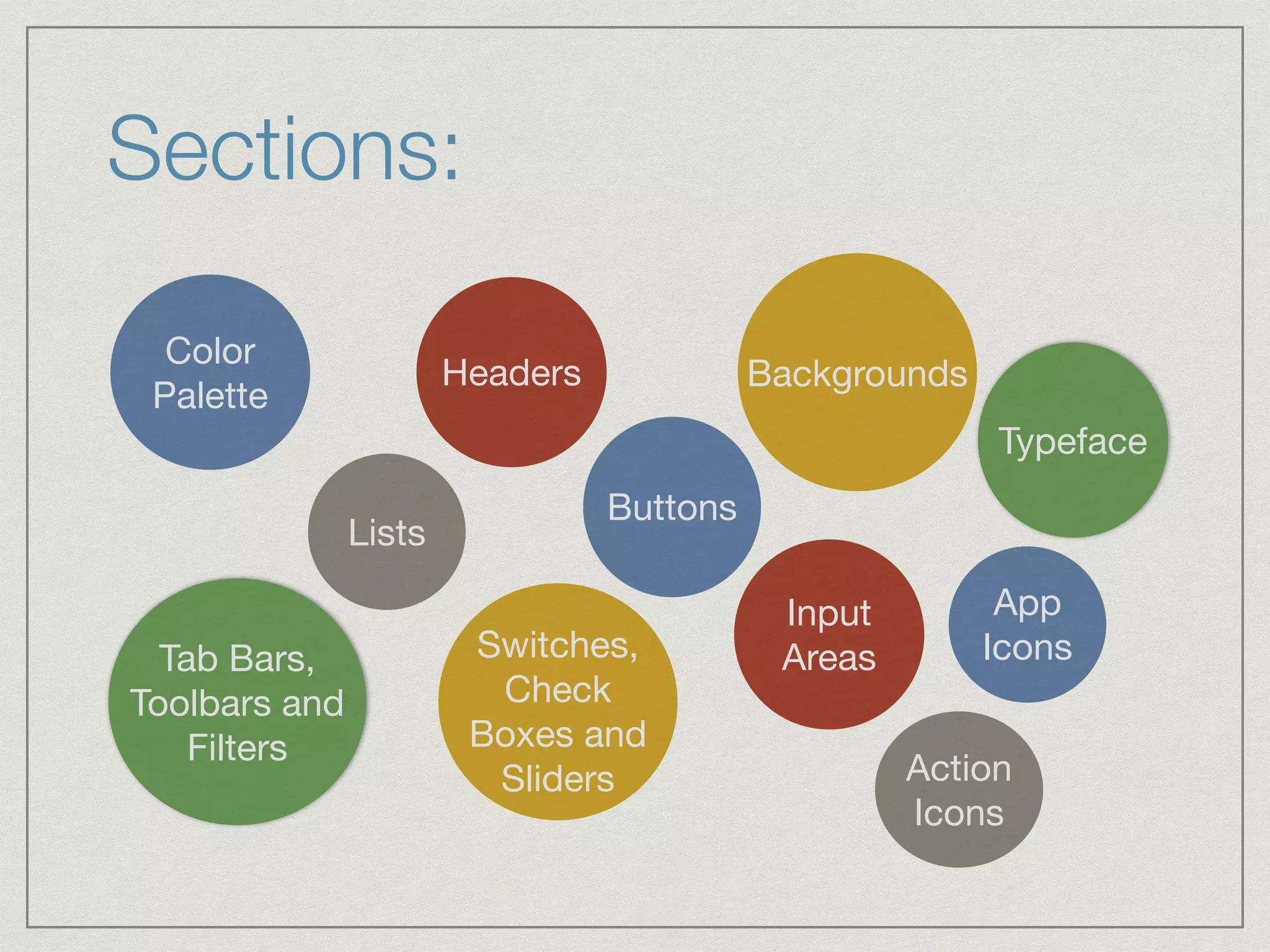
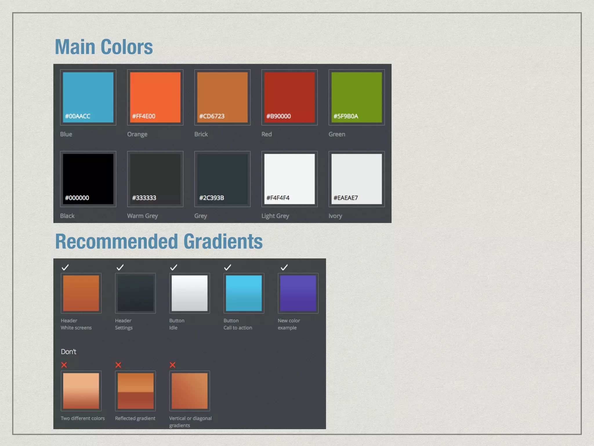
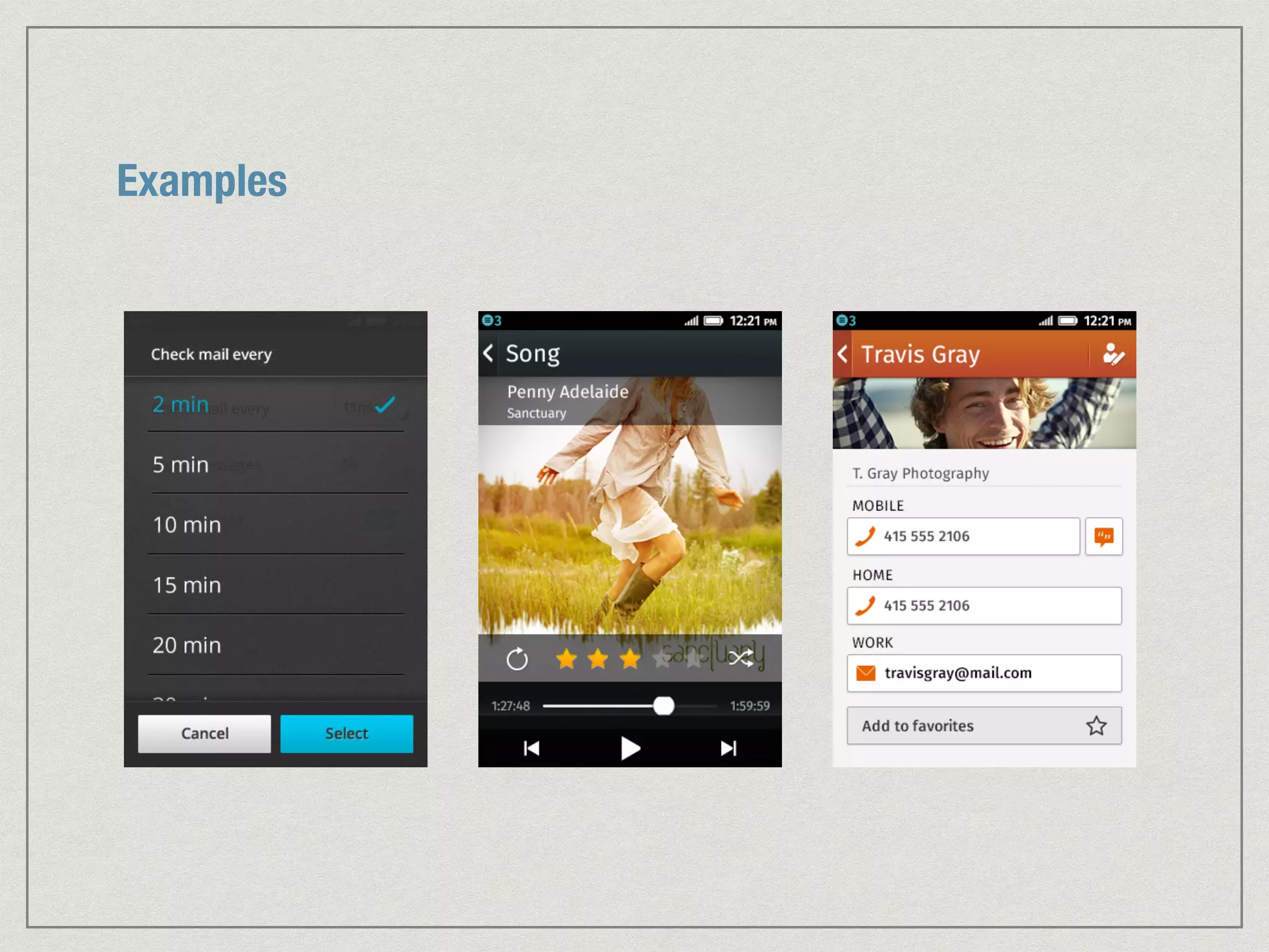
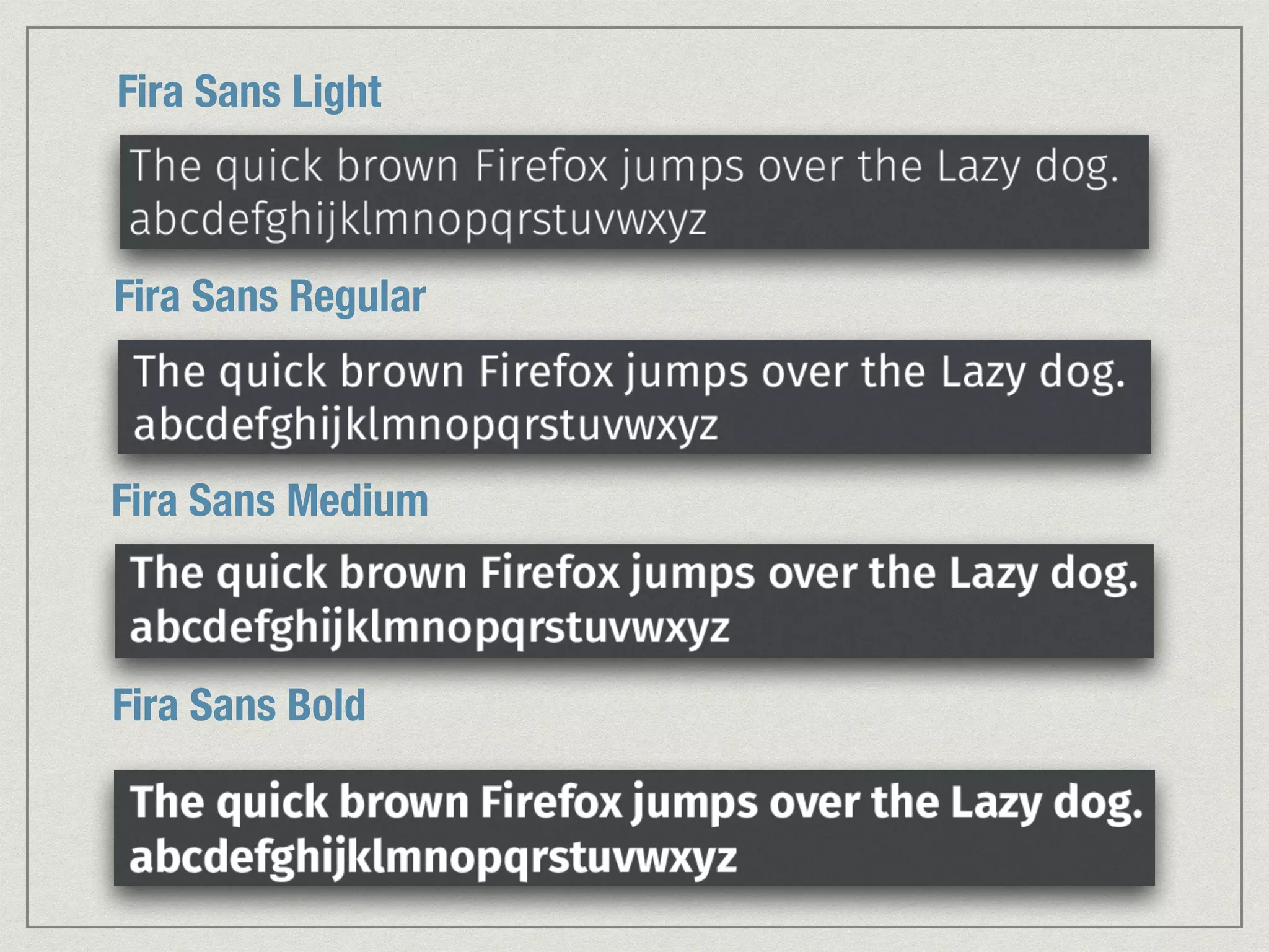
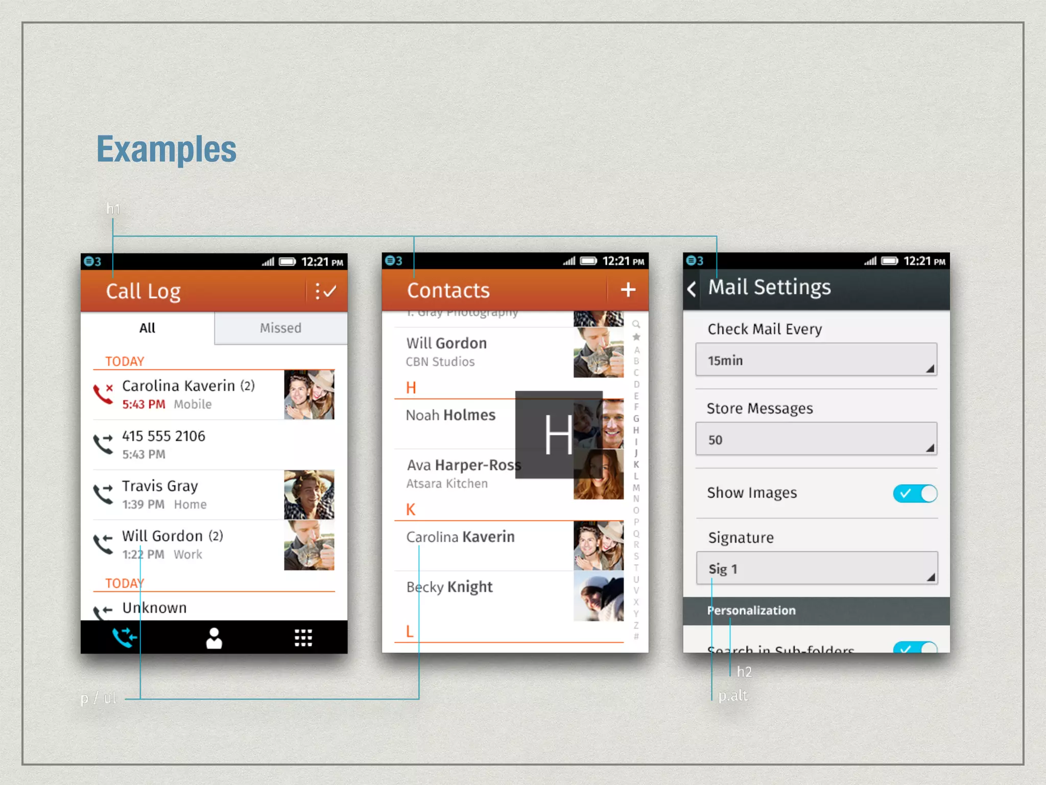

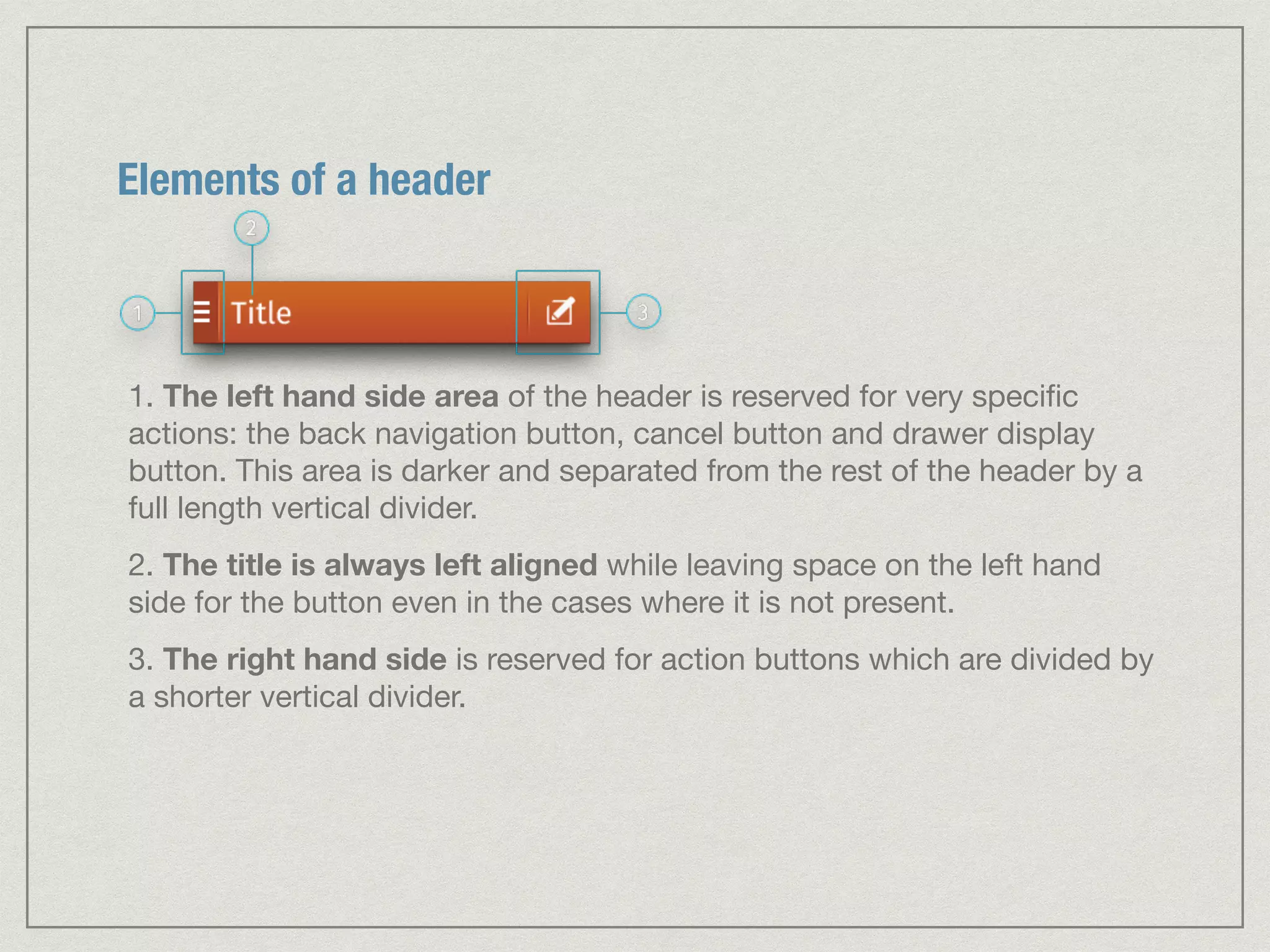
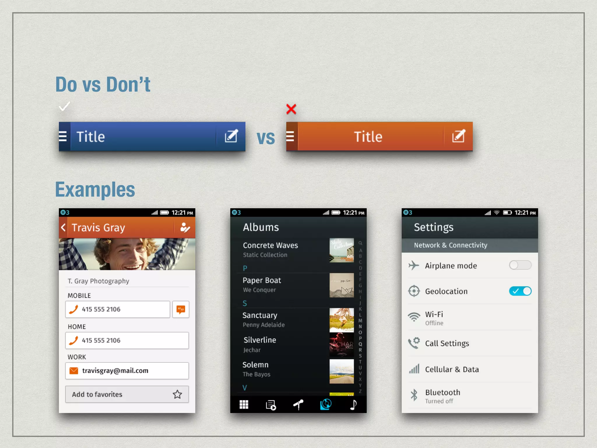

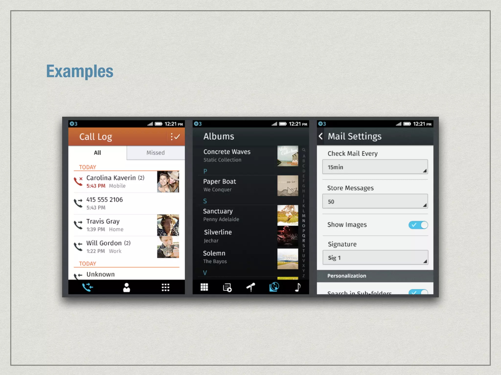

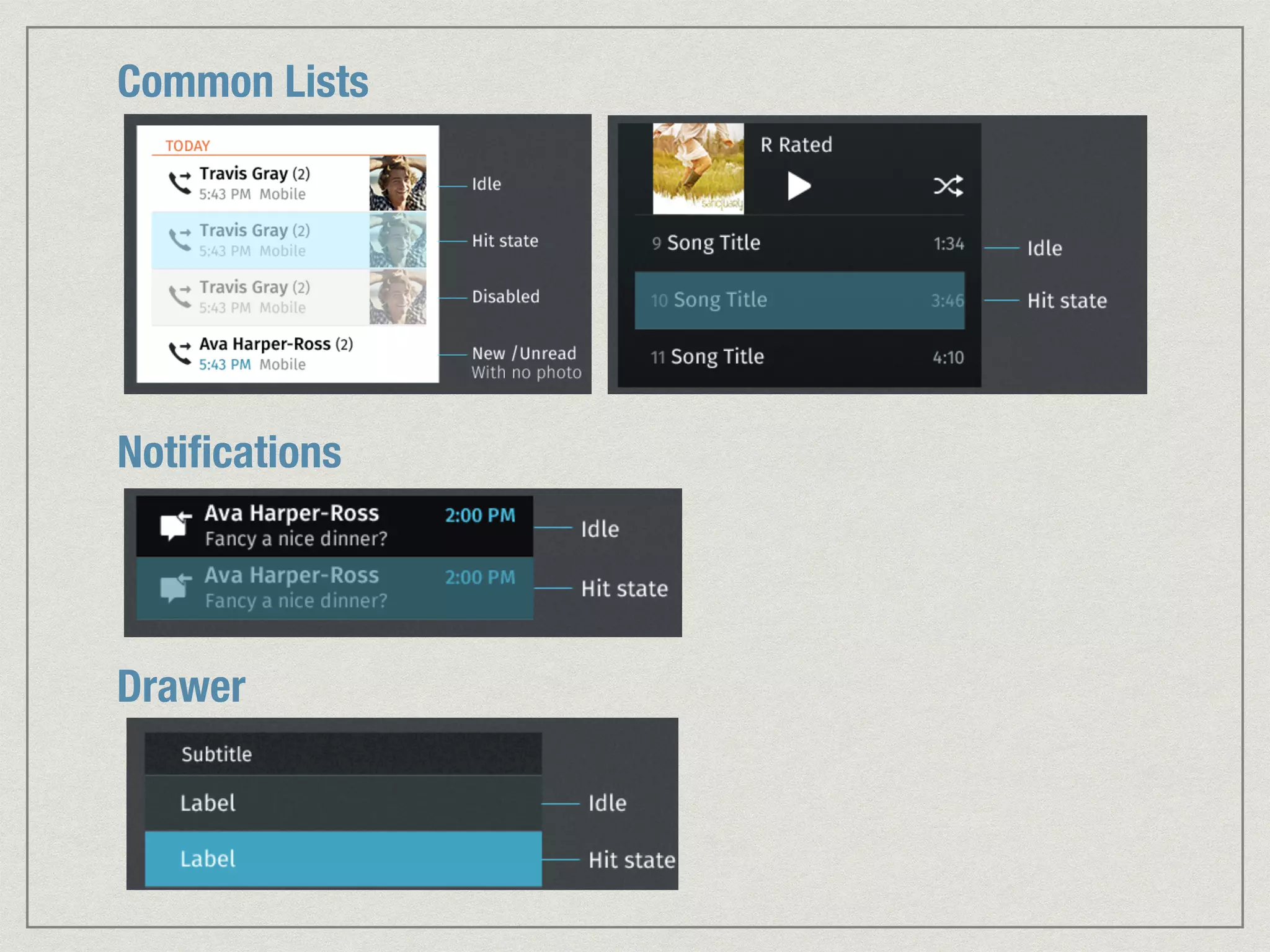
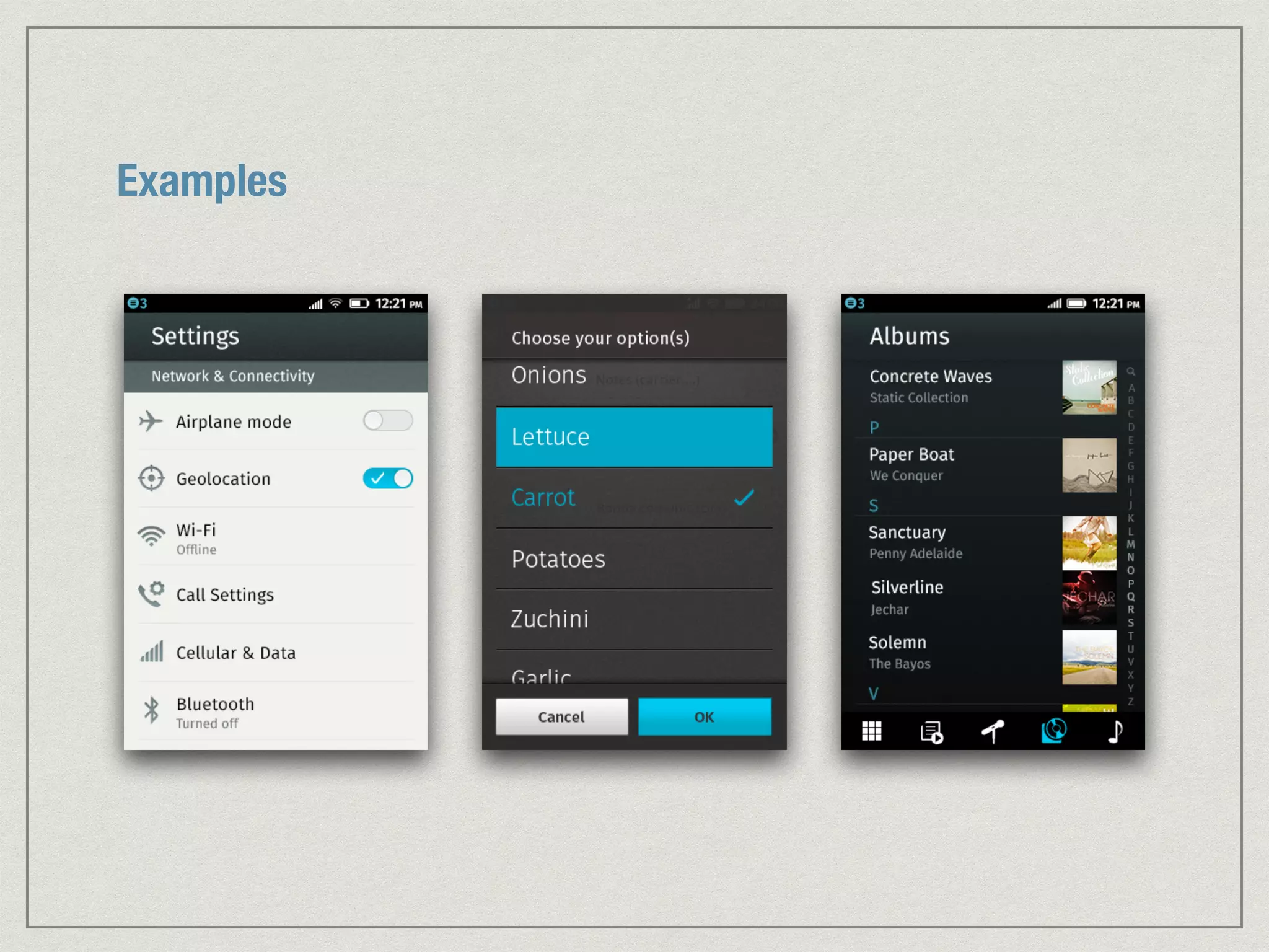
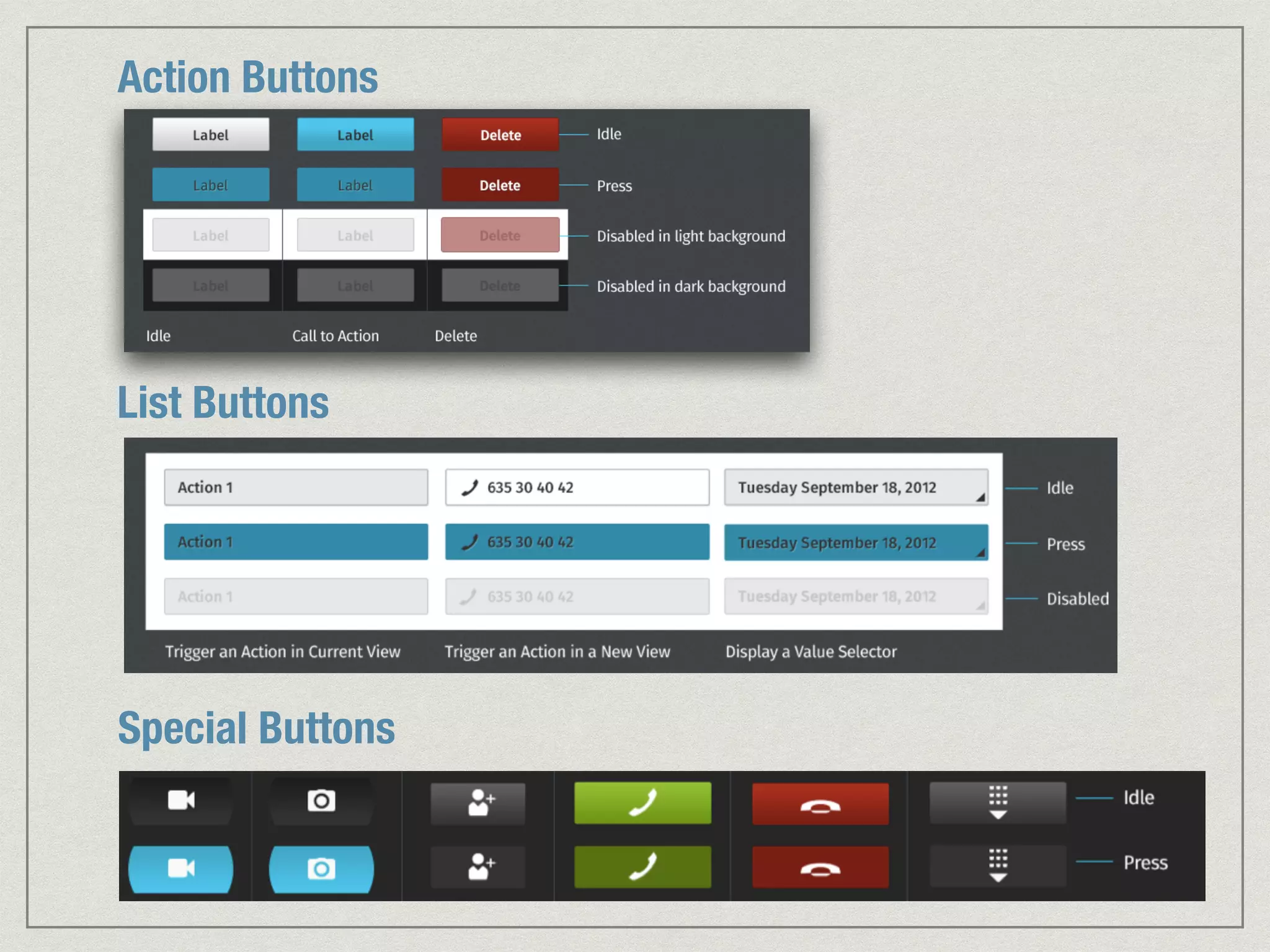
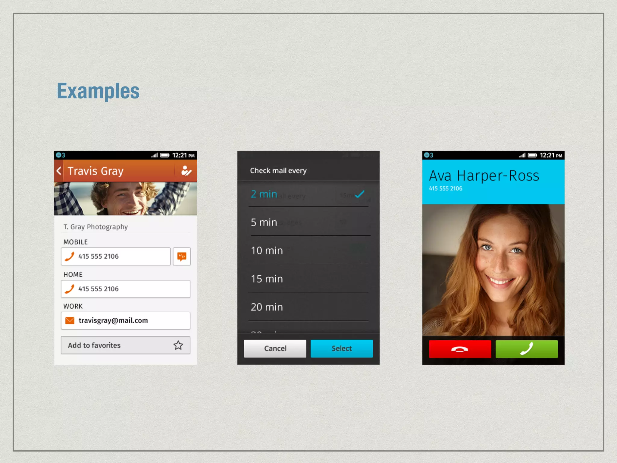
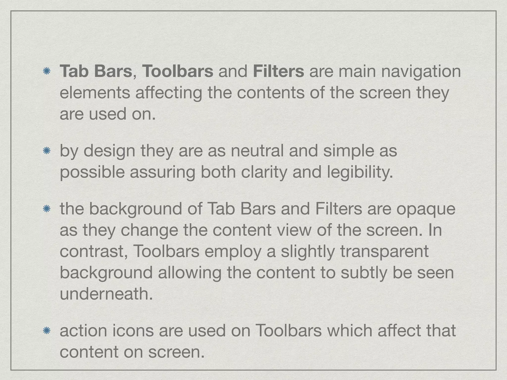
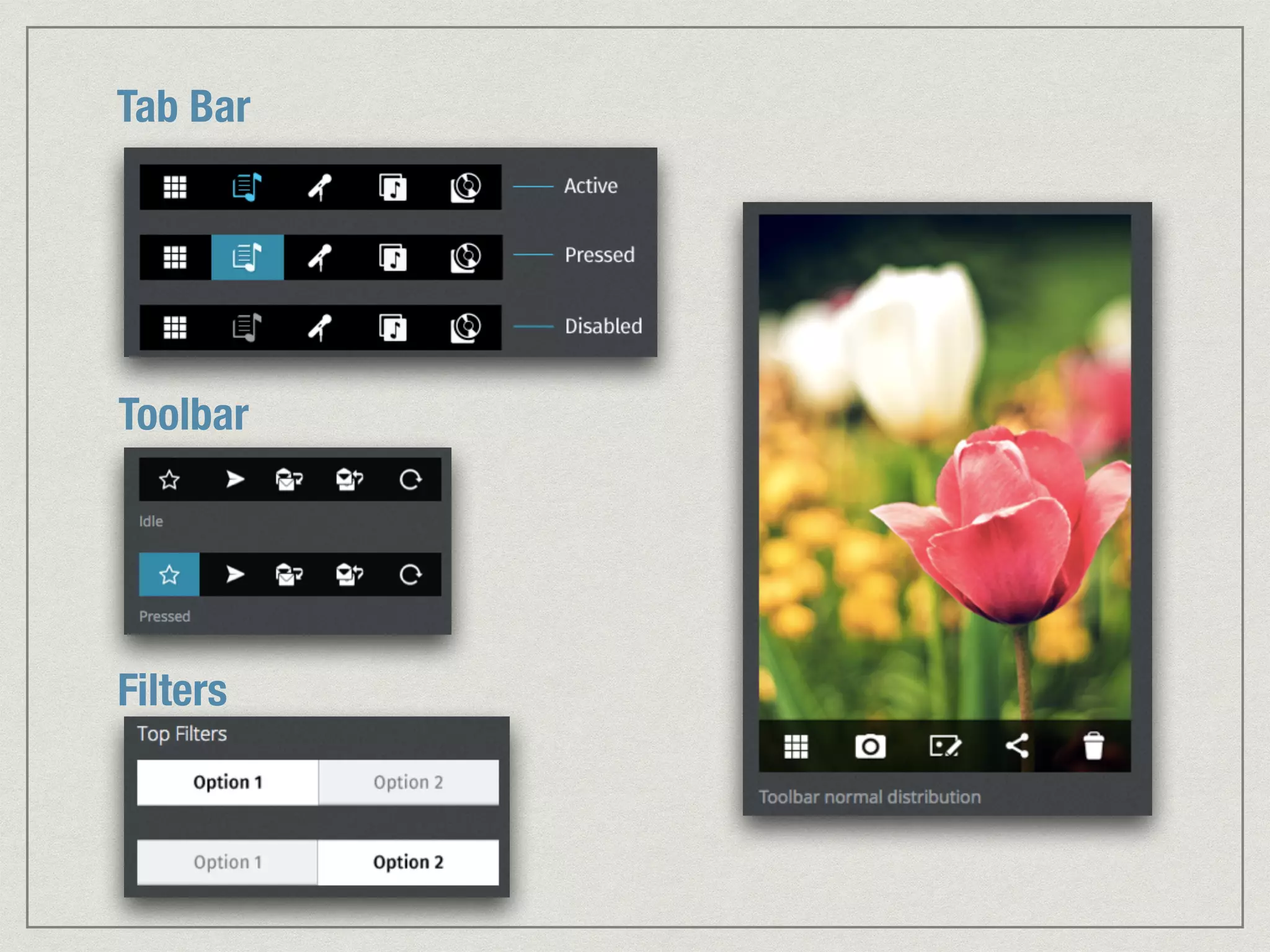
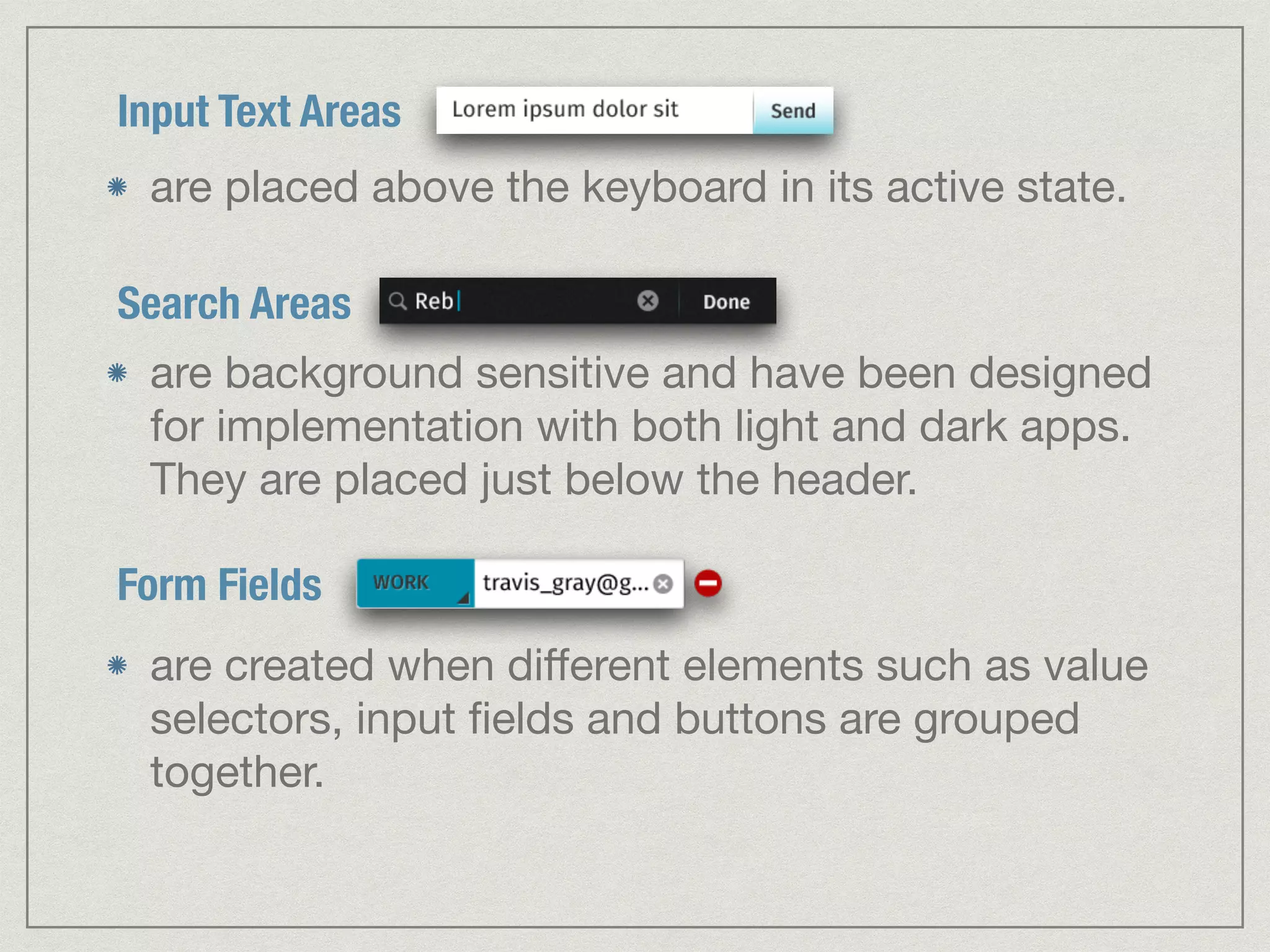
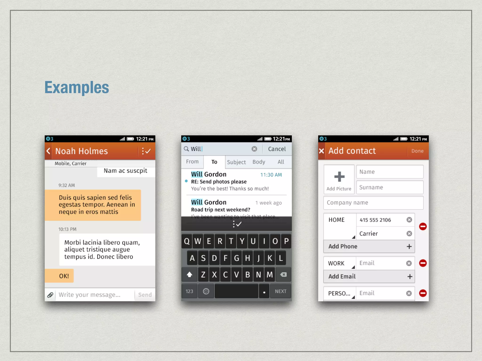
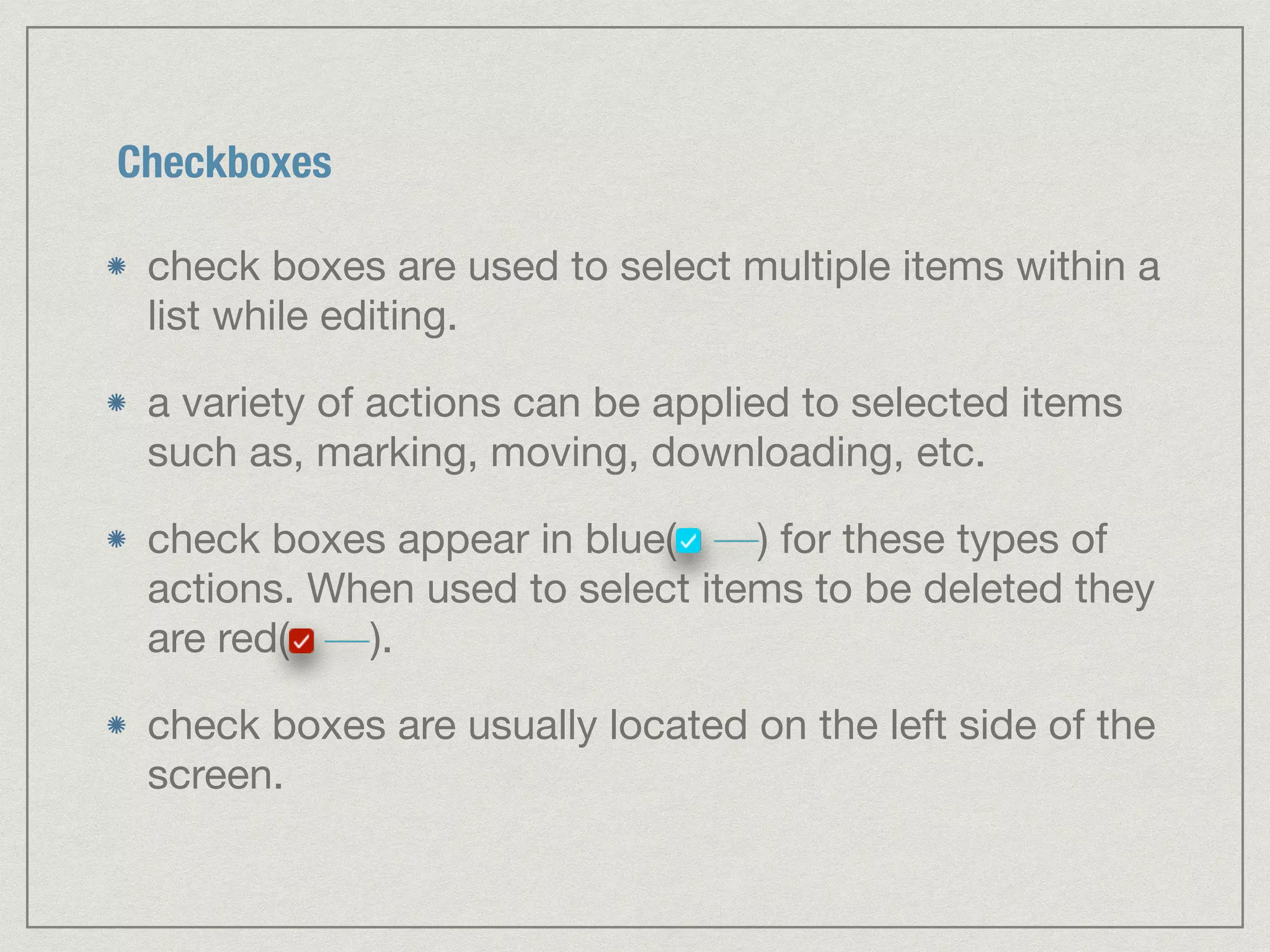
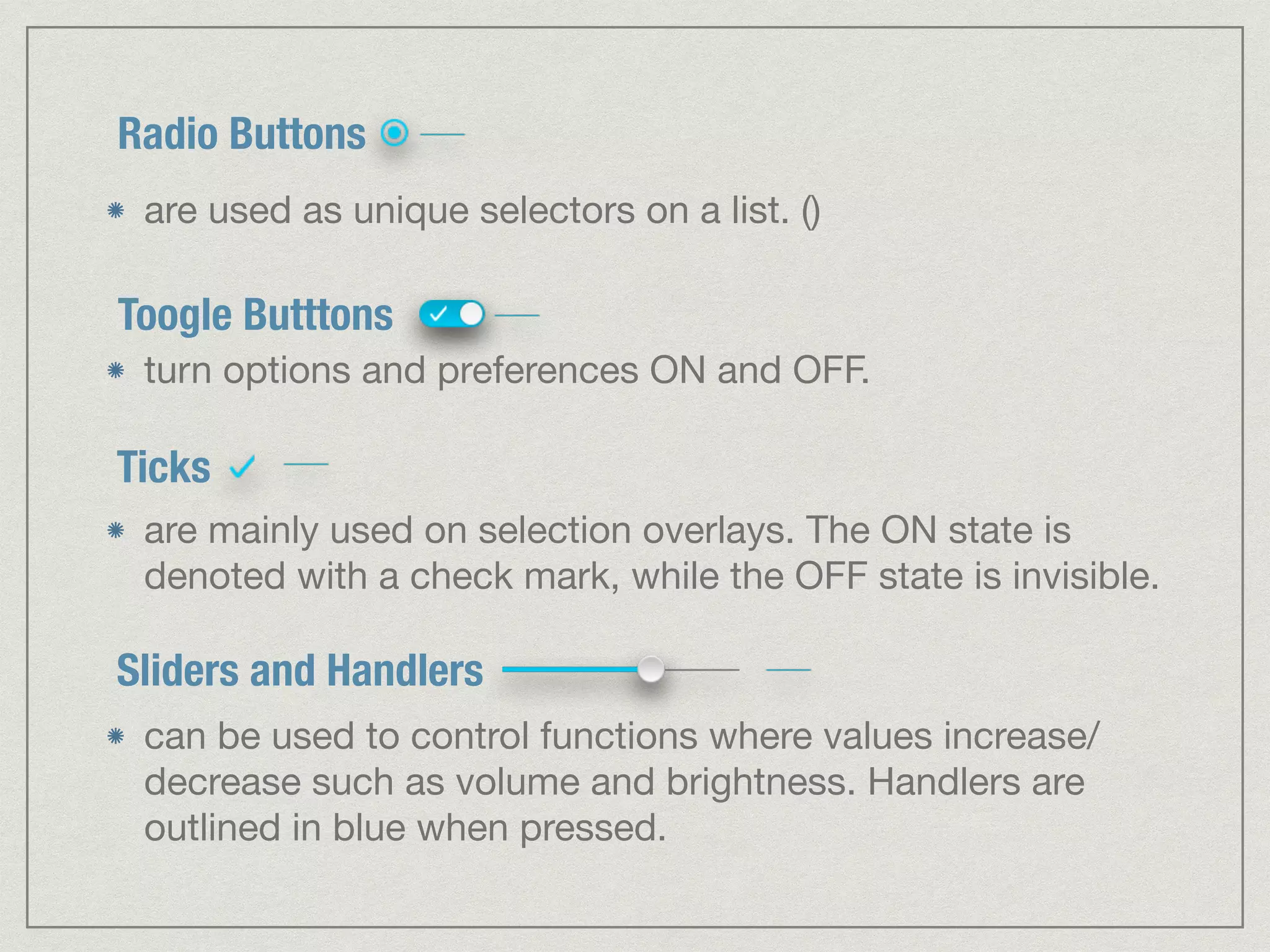

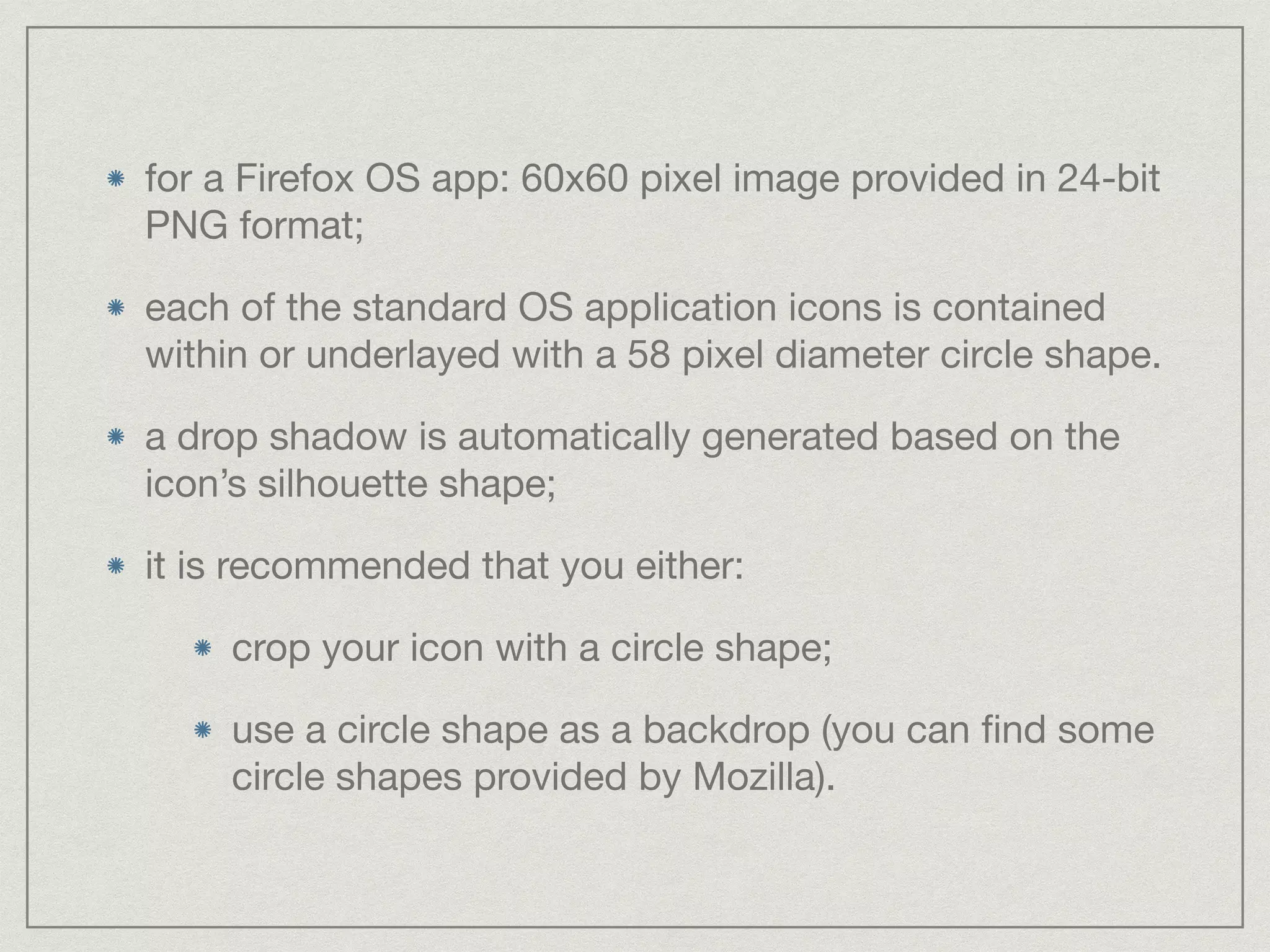
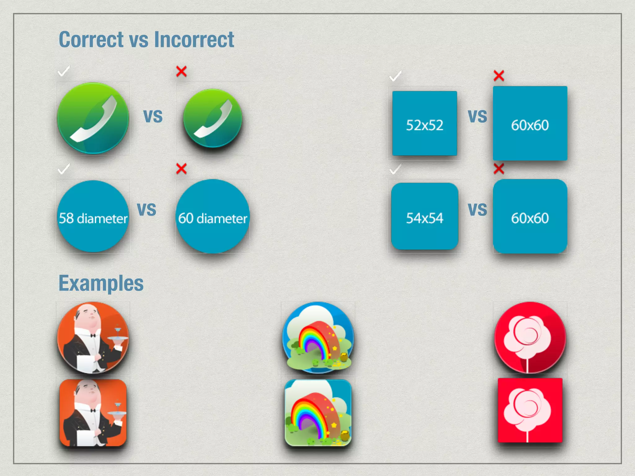
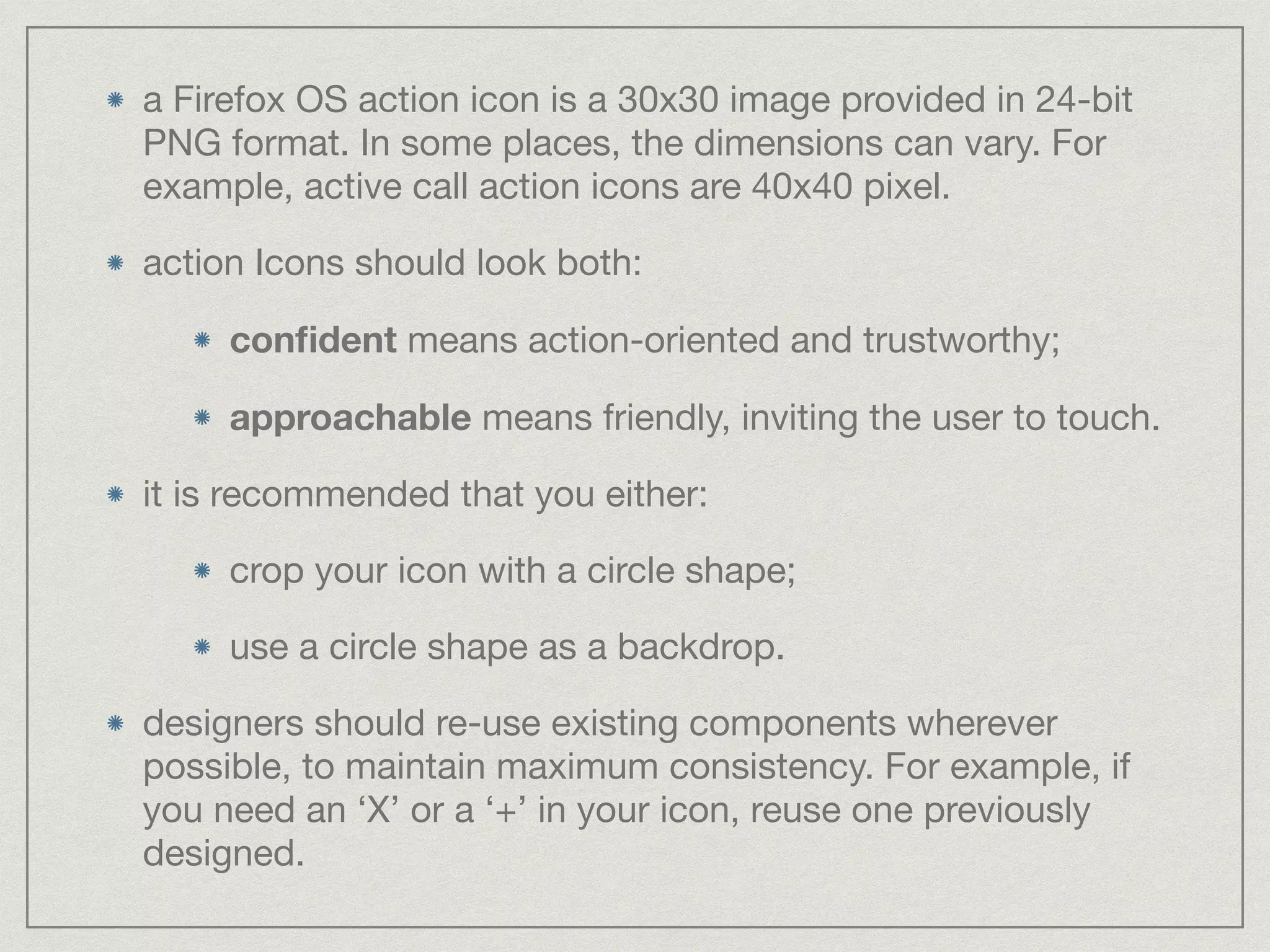
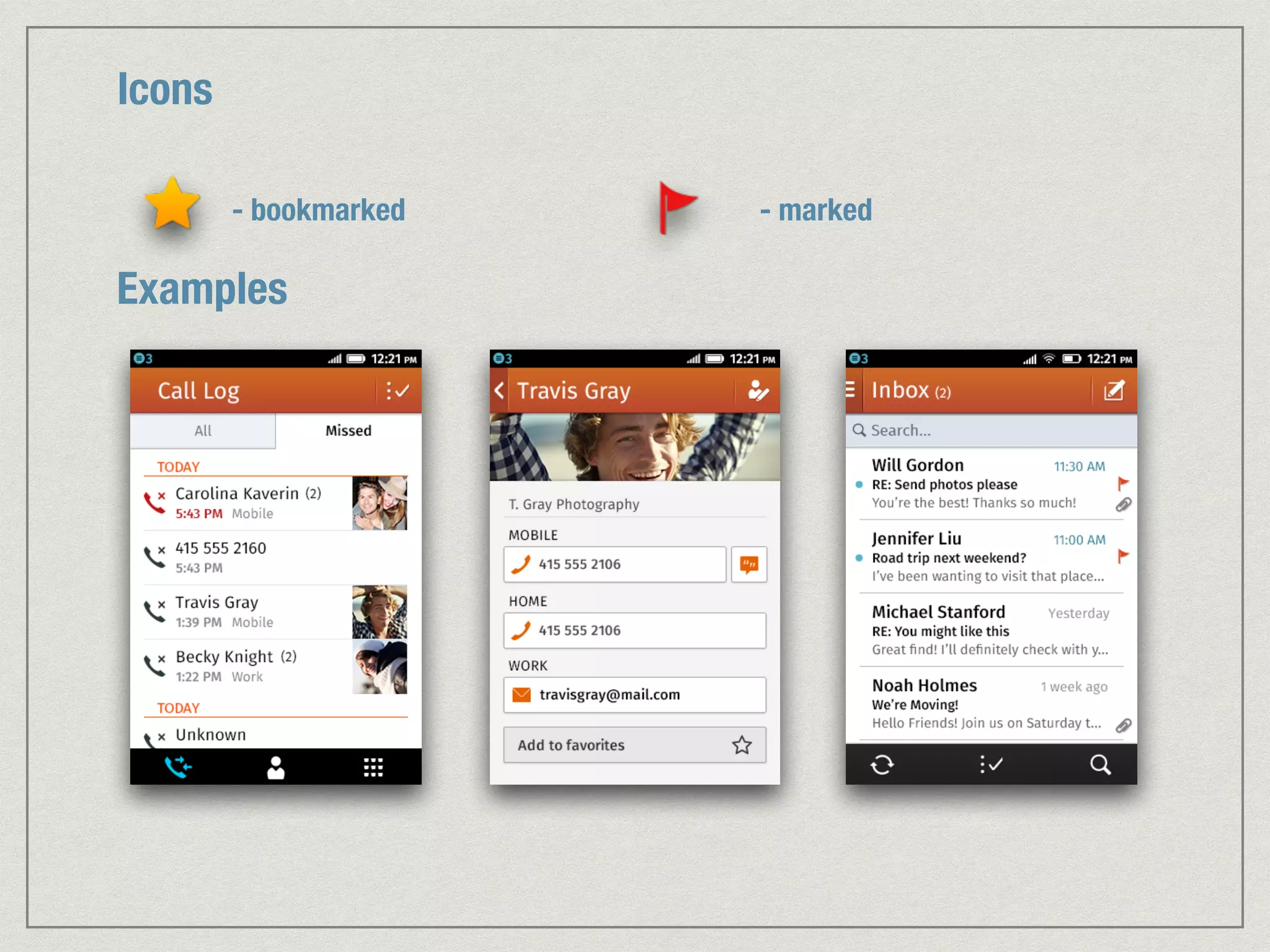


This document provides design guidelines for Firefox OS, including sections on color palette, typeface, headers, backgrounds, lists, buttons, tab bars, toolbars, filters, input areas, switches, check boxes, sliders, app icons, and action icons. It specifies the recommended colors, typefaces, layouts, and icons to use to maintain a consistent visual design across the Firefox OS interface. Examples are provided for most sections to illustrate proper and improper implementations.


![Trabajo en ingles[1]](https://cdn.slidesharecdn.com/ss_thumbnails/trabajoeningles1-101206133007-phpapp01-thumbnail.jpg?width=640&height=640&fit=bounds)


![Soundtoys Mac v5.5.5.0 Crack for MacOS Full Version [Latest] pptx](https://cdn.slidesharecdn.com/ss_thumbnails/softwareoverview-251207193711-91d8ae6b-thumbnail.jpg?width=640&height=640&fit=bounds)
![Driver Easy Pro Key 7.1.0.2641 Full Mac Crack Free Activated Download [2026]....](https://cdn.slidesharecdn.com/ss_thumbnails/software-251207185324-b2fb71b4-thumbnail.jpg?width=640&height=640&fit=bounds)


