Download to read offline
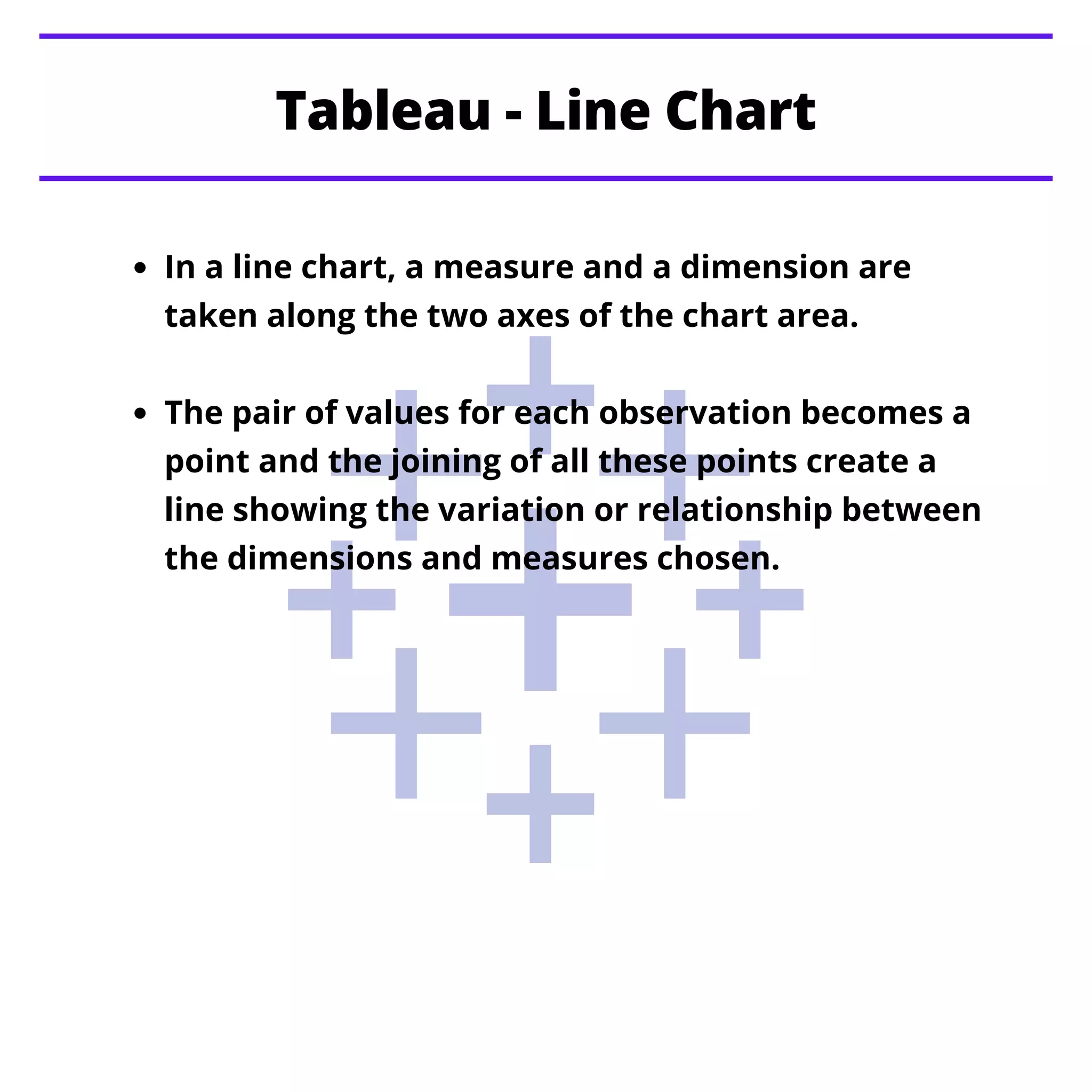
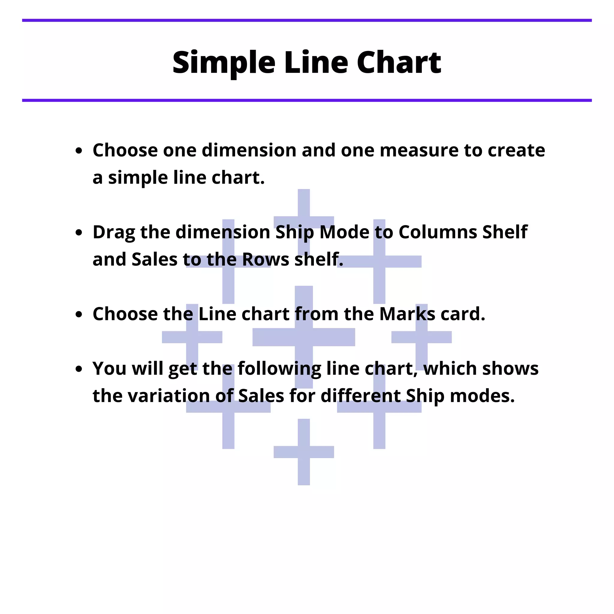
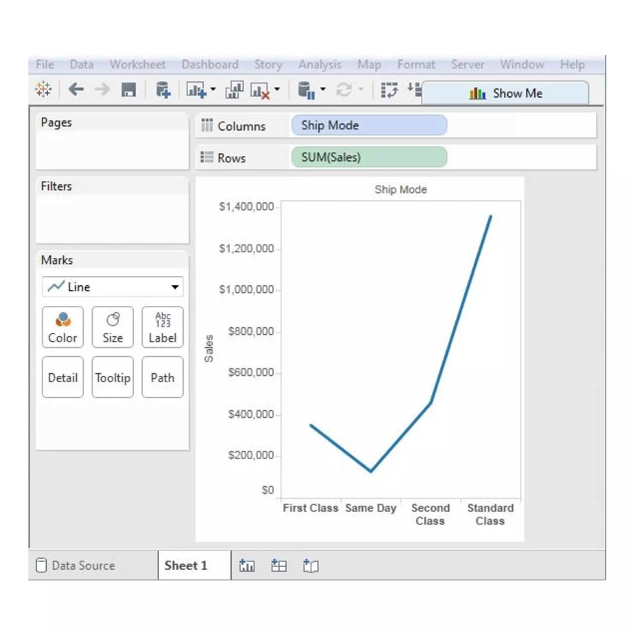
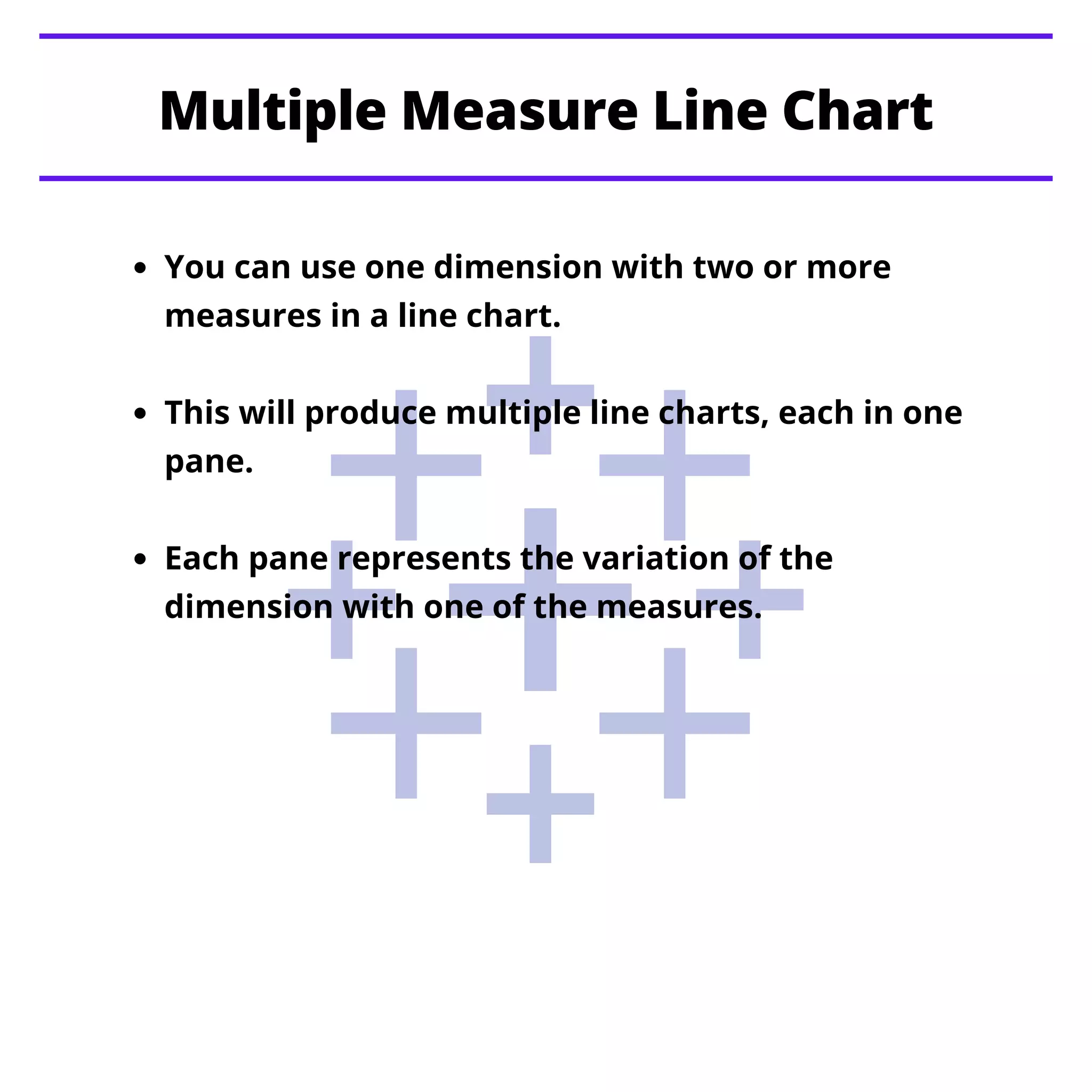
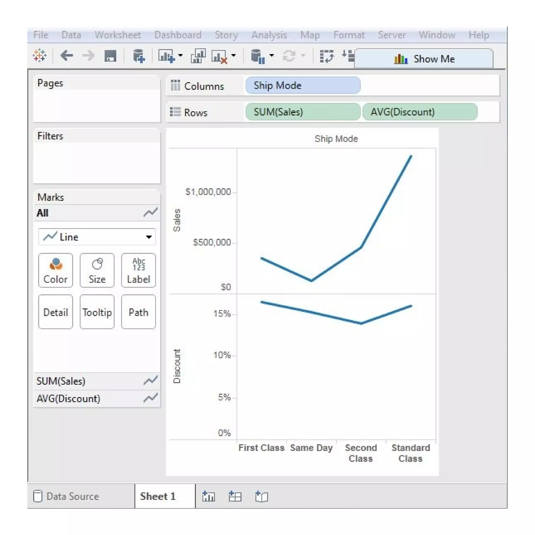
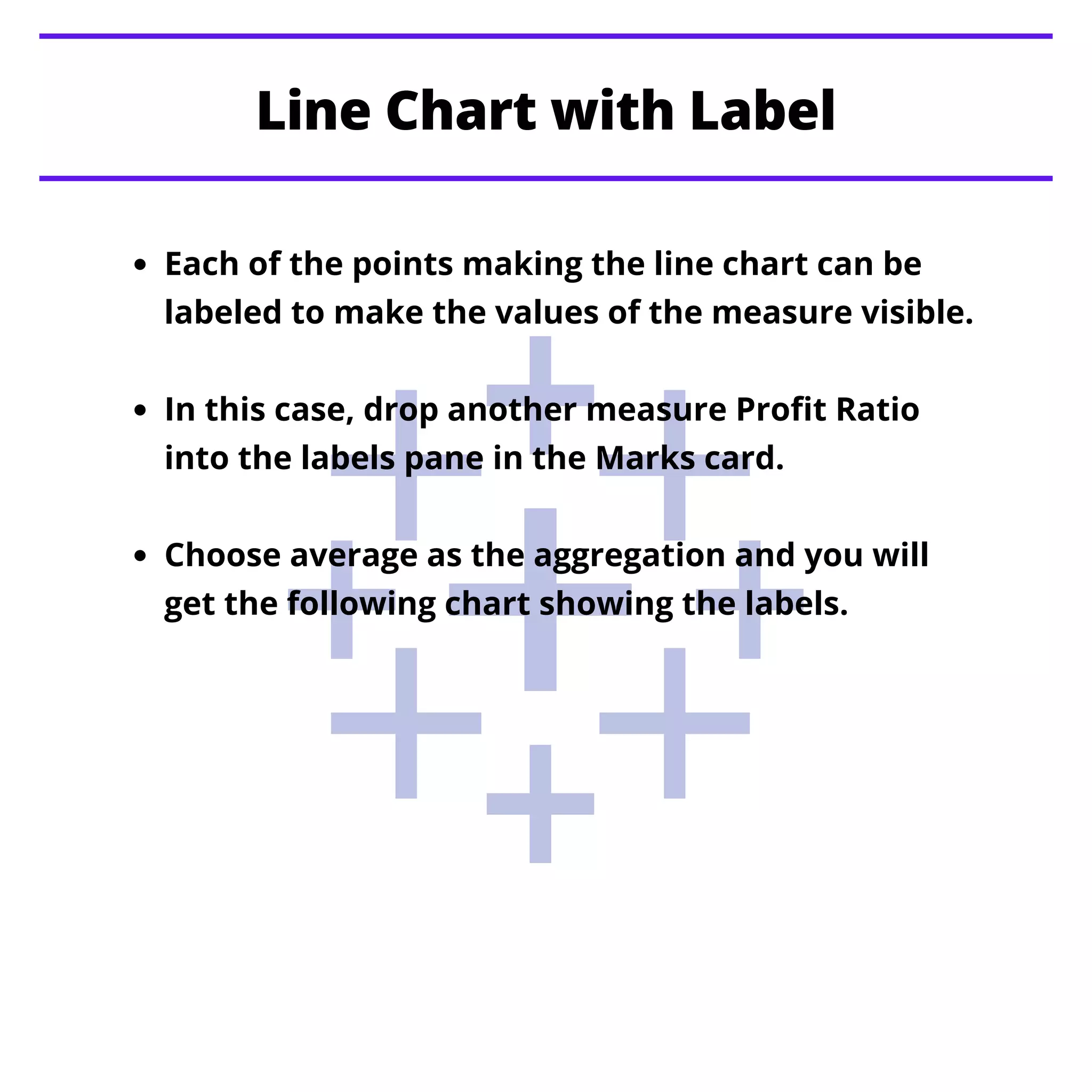
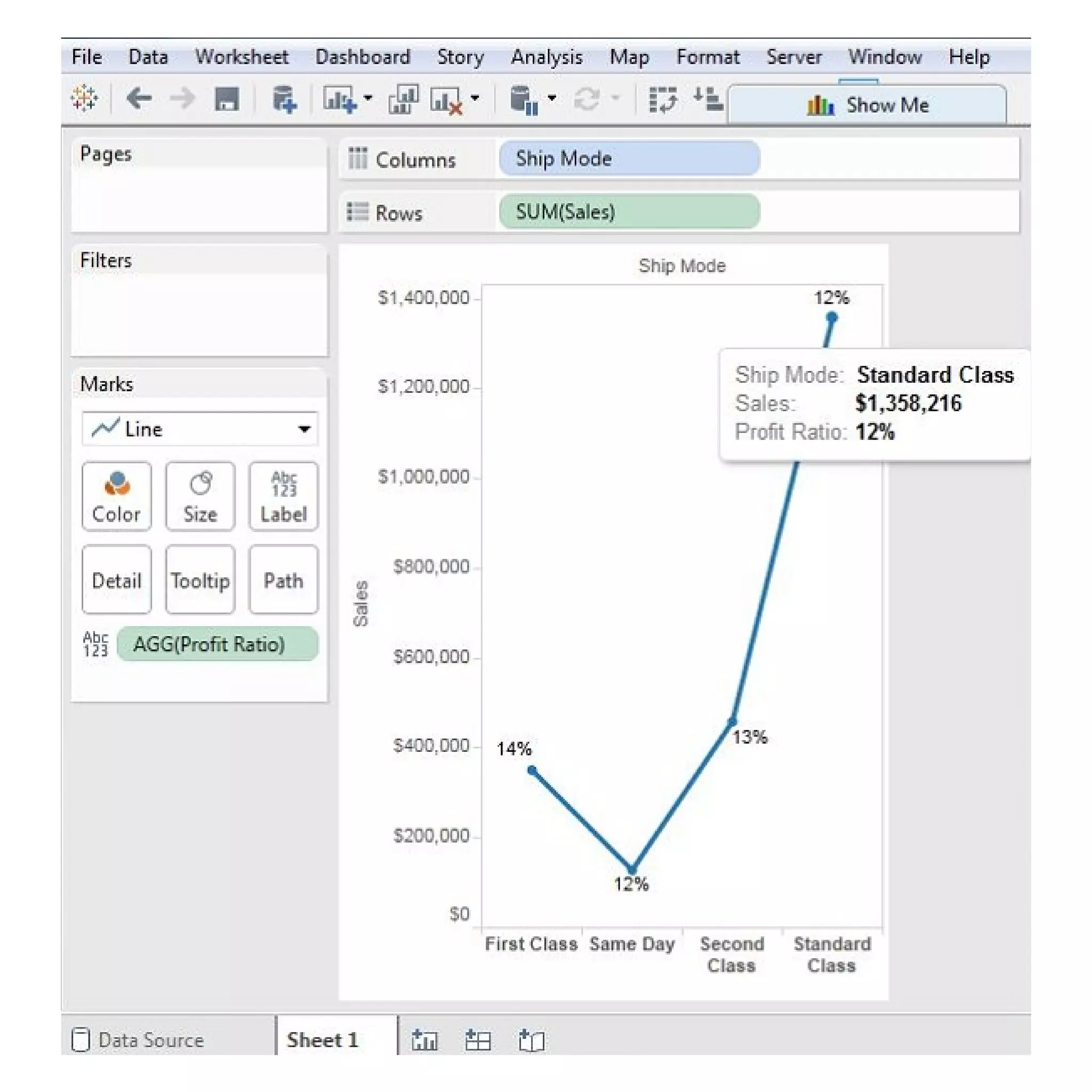


The document provides instructions on creating different types of line charts in Tableau, including simple line charts, multiple measure line charts, and charts with labeled measures. It explains how to select dimensions and measures, utilize the marks card, and visualize variations in data. The document also hints at upcoming topics related to other chart types such as pie charts and scatter plots.