Download to read offline
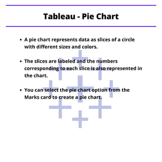
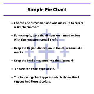
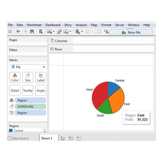

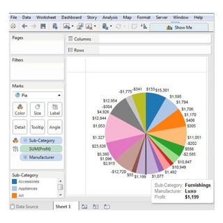
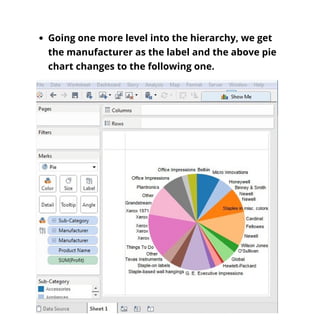


The document explains how to create pie charts in Tableau, highlighting the representation of data as slices of a circle. It details the process for creating both simple and drill-down pie charts using dimensions and measures, with examples using regions and sub-categories. The document also mentions upcoming topics on crosstabs, scatter plots, and bubble charts.