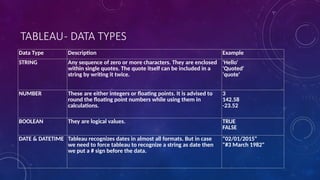
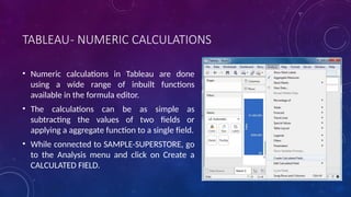
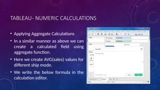
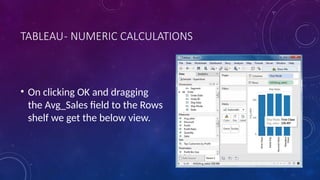
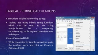
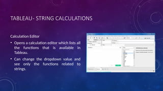
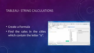
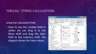
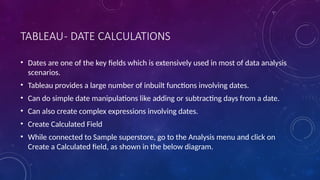
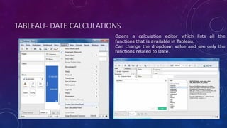
Tableau is a powerful business intelligence tool used for visual data analysis, allowing users to create interactive dashboards and analyze data through graphs and charts. It supports real-time collaboration, connects to various data sources, and features an easy drag-and-drop interface, making data exploration accessible even to those without advanced programming skills. With functionalities for data blending, modeling, and presentation, Tableau is widely adopted by businesses, researchers, and governments and is recognized as a leader in the business intelligence space.


![TABLEAU- OPERATORS
• Comparison Operators
• These operators are used in expressions whose result is a Boolean giving the output as TRUE or FALSE.
Operator Description Example
= = or = (Equal to) Compares two numbers or two strings or two dates to be equal.
Returns the Boolean value TRUE if they are else returns false.
‘Hello’ = ‘Hello’
5 = 15/ 3
!= or <> (not equal to) Compares two numbers or two strings or two dates to be unequal.
Returns the Boolean value TRUE if they are else returns false.
‘Good’ <> ‘Bad’
18 != 37 / 2
> (greater than) Compares two numbers or two strings or two dates where the first argument is greater
than second. Returns the boolean value TRUE if it is the case else returns false.
[Profit] > 20000
[Category] > ‘Q’
[Ship date] > #April 1, 2004#
< (less than) Compares two numbers or two strings or two dates where the first argument is smaller
than second. Returns the boolean value TRUE if it is the case else returns false.
[Profit] < 20000
[Category] < ‘Q’
[Ship date] < #April 1, 2004#](https://image.slidesharecdn.com/tableau-250118065820-41100c41/85/TABLEAU-TRENDS-IN-BIG-DATA-LIBRAARIES-pptx-93-320.jpg)
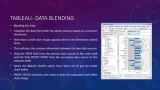
![TABLEAU- OPERATORS
• Comparison Operators
• These operators are used in expressions whose result is a Boolean giving the output as TRUE or FALSE.
Operator Description Example
AND If the expressions or Boolean values present in both sides to AND
operator is evaluated to be TRUE then the result is TRUE. Else the result
is FALSE.
[Ship Date] > #April 1, 2012# AND
[Profit] > 10000
OR If any one or both of the expressions or Boolean values present in both
sides to AND operator is evaluated to be TRUE then the result is TRUE.
Else the result is FALSE.
[Ship Date] > #April 1, 2012# OR
[Profit] > 10000
NOT This operator negates the Boolean value of the expression present after
it.
NOT [Ship Date] > #April 1, 2012#](https://image.slidesharecdn.com/tableau-250118065820-41100c41/85/TABLEAU-TRENDS-IN-BIG-DATA-LIBRAARIES-pptx-94-320.jpg)


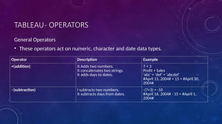
![TABLEAU- FUNCTIONS
• Number Functions
• These are the functions used for numeric calculations. They only take numbers as inputs.
Function Description Example
CEILING(number) Rounds a number to the nearest
integer of equal or greater value.
CEILING(2.145) = 3
POWER(number, power) Raises the number to the specified
power.
POWER(5,3) = 125
ROUND(number, [decimals]) Rounds numbers to a specified
number of digits.
ROUND(3.14152,2) = 3.14](https://image.slidesharecdn.com/tableau-250118065820-41100c41/85/TABLEAU-TRENDS-IN-BIG-DATA-LIBRAARIES-pptx-97-320.jpg)

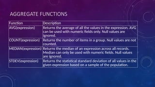
![TABLEAU- FUNCTIONS
• Date Functions
• Tableau has a variety of date functions to carry out calculations involving dates.
• All the date functions use the date_part which is a string indicating the part of the
date like - month, day or year.
Function Description Example
DATEADD(date_part, increment,
date)
Returns an increment added to
date. The type of increment is
specified in date_part.
DATEADD('month', 3, #2004-04-
15#) = 2004-07-15 12:00:00 AM
DATENAME(date_part, date,
[start_of_week])
Returns date_part of date as a
string. The start_of_week
parameter is optional.
DATENAME('month', #2004-04-
15#) = "April"
DAY(date) Returns the day of the given date
as an integer.
DAY(#2004-04-12#) = 12
NOW( ) Returns the current date and time. NOW( ) = 2004-04-15 1:08:21 PM](https://image.slidesharecdn.com/tableau-250118065820-41100c41/85/TABLEAU-TRENDS-IN-BIG-DATA-LIBRAARIES-pptx-99-320.jpg)
![TABLEAU- FUNCTIONS
• Logical Functions
• These functions evaluate some single value or result of an expression and give a boolean output.
Function Description Example
IFNULL(expression1, expression2) The IFNULL function returns the first
expression if the result is not null, and
returns the second expression if it is null.
IFNULL([Sales], 0) = [Sales]
ISDATE(string) The ISDATE function returns TRUE if the
string argument can be converted to a date
and FALSEif it cannot.
ISDATE("11/05/98") = TRUE
ISDATE("14/05/98") = FALSE
MIN(expression) The MIN function returns the minimum of an
expression across all records or the minimum
of two expressions for each record.](https://image.slidesharecdn.com/tableau-250118065820-41100c41/85/TABLEAU-TRENDS-IN-BIG-DATA-LIBRAARIES-pptx-100-320.jpg)
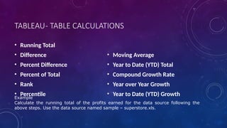


![TABLEAU- LOD EXPRESSIONS
• Use the Sample - Superstore data source
• Create two calculated fields: a FIXED level of detail expression, and a date subtraction.
• First_Purchase_Date = {FIXED [Customer Name] : MIN([Order Date])}
• Days_Since_First_Purchase =DATETRUNC('month', [Order Date])-
DATETRUNC('month', [First Purchase Date])
• Drag Days_Since_First_Purchase from the Measures area of the Data pane to the
Dimensions area.
• Drag Days_Since_First_Purchase to Columns.](https://image.slidesharecdn.com/tableau-250118065820-41100c41/85/TABLEAU-TRENDS-IN-BIG-DATA-LIBRAARIES-pptx-126-320.jpg)


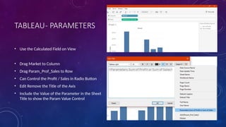
![TABLEAU- PARAMETERS
• Use on the Calculated Field
• Create a Calculated Field - Param_Prof_Sales
• Apply the Formula –
CASE[Sum of Profit or Sum of Sales]
WHEN 1 THEN SUM([Profit])
WHEN 2 THEN SUM([Sales])
END](https://image.slidesharecdn.com/tableau-250118065820-41100c41/85/TABLEAU-TRENDS-IN-BIG-DATA-LIBRAARIES-pptx-253-320.jpg)