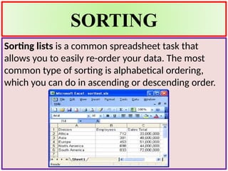
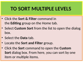
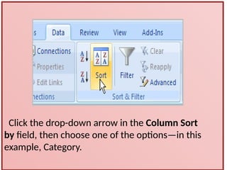
COMPUTER LITERACY
SORTING AND FILTERING
A Microsoft Excel spreadsheet can contain a great
deal of information. Sometimes you may find that
you need to reorder or sort that information, create
groups, or filter information to be able to use it most
effectively
SORTING
Sorting lists is a common spreadsheet task that
allows you to easily re-order your data. The most
common type of sorting is alphabetical ordering,
which you can do in ascending or descending order.
To sort in alphabetical order
• Select a cell in the column you want to sort (In this
example, we choose a cell in column A).
• Click the Sort & Filter command in
the Editing group on the Home tab.
• Select Sort A to Z. Now the information in the
Category column is organized in alphabetical order.
• You can Sort in reverse alphabetical order by
choosing Sort Z to A in the list
TO SORT FROM SMALLEST TO
LARGEST
• Select a cell in the column you want to sort (a
column with numbers).
• Click the Sort & Filter command in
the Editing group on the Home tab.
• Select From Smallest to Largest. Now the
information is organized from the smallest to
largest amount.
• You can sort in reverse numerical order by
choosing From Largest to Smallest in the list.
TO SORT MULTIPLE LEVELS
• Click the Sort & Filter command in
the Editing group on the Home tab.
• Select Custom Sort from the list to open the dialog
box.
• Select the Data tab.
• Locate the Sort and Filter group.
• Click the Sort command to open the Custom
Sort dialog box. From here, you can sort by one
item or multiple items.
Click the drop-down arrow in the Column Sort
by field, then choose one of the options—in this
example, Category.
• Choose what to sort on. In this example, we'll
leave the default as Value.
• Choose how to order the results.
Leave it as A to Z so it is organized
alphabetically.
• Click Add Level to add another item
to sort by.
• The spreadsheet has been sorted. All of
the categories are organized in
alphabetical order, and within each
category the unit cost is arranged from
smallest to largest.
• Remember that all of the information
and data is still here—it's just in a
different order
Filter data in a range or table
Using AutoFilter to filter data is a quick
and easy way to find and work with a
subset of data in a range of cells or table.
Once you have filtered data in a range of
cells or table, you can either reapply a
filter to get up-to-date results, or clear a
filter to redisplay all of the data.
What is filtering
• Filtered data displays only the rows that
meet criteria that you specify and hides
rows that you do not want displayed.
After you filter data, you can copy, find,
edit, format the subset of filtered data
without rearranging or moving it.
• You can also filter by more than one
column.
TYPES OF FILTERING:
Auto Filter
Using AutoFilter, you can create
three types of filters: by a list
values, by a format, or by criteria.
you can filter by cell color or by a
list of numbers. you can filter by
icon
Range of cells
• Select a range of cells containing alphanumeric
data.
• On the Data tab, in the Sort & Filter group,
click Filter.
Select from a list of text values
• In the list of text values, select or clear one or more
text values to filter by.
• The list of text values can be up to 10,000. If the list
is large, clear (Select All) at the top, and then select
the specific text values to filter by.
• To make the AutoFilter menu wider or longer, click
and drag the grip handle at the bottom.
LEARN ABOUT CHARTS
• Charts are used to display series of numeric data
in a graphical format to make it easier to
understand large quantities of data and the
relationship between different series of data.
• To create a chart in Excel, you start by entering the
numeric data for the chart on a worksheet. Then
you can plot that data into a chart by selecting the
chart type that you want to use on the Office
Fluent Ribbon (Insert tab, Charts group).
INSERTING CHARTS
• To insert a chart click on the button insert
• According to desire click on the type of chart you
want to insert
• Types: pie chart, column chart, line chart, bar
chart, area chart, scatter charts, etc
TO MODIFY A CHART, YOU CAN
• Change the display of chart axes You can specify
the scale of axes and adjust the interval between
the values or categories that are displayed. To
make your chart easier to read, you can also add
tick marks to an axis, and specify the interval at
which they will appear.
• Add titles and data labels to a chart To help
clarify the information that appears in your chart,
you can add a chart title, axis titles, and data
labels.
TO ADD FORMATTING YOU CAN
• Fill chart elements You can use colors, textures,
pictures, and gradient fills to help draw attention
to specific chart elements.
• Change the outline of chart elements You can
use colors, line styles, and line weights to
emphasize chart elements.
• Add special effects to chart elements You can
apply special effects, such as shadow, reflection,
glow, soft edges and 3-D rotation to chart element
shapes, which gives your chart a finished look.
sorting and filtering Powerpoint presentation

sorting and filtering Powerpoint presentation

  • 1.
  • 2.
    SORTING AND FILTERING AMicrosoft Excel spreadsheet can contain a great deal of information. Sometimes you may find that you need to reorder or sort that information, create groups, or filter information to be able to use it most effectively
  • 3.
    SORTING Sorting lists isa common spreadsheet task that allows you to easily re-order your data. The most common type of sorting is alphabetical ordering, which you can do in ascending or descending order.
  • 4.
    To sort inalphabetical order • Select a cell in the column you want to sort (In this example, we choose a cell in column A). • Click the Sort & Filter command in the Editing group on the Home tab. • Select Sort A to Z. Now the information in the Category column is organized in alphabetical order.
  • 5.
    • You canSort in reverse alphabetical order by choosing Sort Z to A in the list
  • 6.
    TO SORT FROMSMALLEST TO LARGEST • Select a cell in the column you want to sort (a column with numbers). • Click the Sort & Filter command in the Editing group on the Home tab. • Select From Smallest to Largest. Now the information is organized from the smallest to largest amount. • You can sort in reverse numerical order by choosing From Largest to Smallest in the list.
  • 7.
    TO SORT MULTIPLELEVELS • Click the Sort & Filter command in the Editing group on the Home tab. • Select Custom Sort from the list to open the dialog box. • Select the Data tab. • Locate the Sort and Filter group. • Click the Sort command to open the Custom Sort dialog box. From here, you can sort by one item or multiple items.
  • 8.
    Click the drop-downarrow in the Column Sort by field, then choose one of the options—in this example, Category.
  • 9.
    • Choose whatto sort on. In this example, we'll leave the default as Value.
  • 10.
    • Choose howto order the results. Leave it as A to Z so it is organized alphabetically. • Click Add Level to add another item to sort by.
  • 11.
    • The spreadsheethas been sorted. All of the categories are organized in alphabetical order, and within each category the unit cost is arranged from smallest to largest. • Remember that all of the information and data is still here—it's just in a different order
  • 12.
    Filter data ina range or table Using AutoFilter to filter data is a quick and easy way to find and work with a subset of data in a range of cells or table. Once you have filtered data in a range of cells or table, you can either reapply a filter to get up-to-date results, or clear a filter to redisplay all of the data.
  • 13.
    What is filtering •Filtered data displays only the rows that meet criteria that you specify and hides rows that you do not want displayed. After you filter data, you can copy, find, edit, format the subset of filtered data without rearranging or moving it. • You can also filter by more than one column. TYPES OF FILTERING:
  • 14.
    Auto Filter Using AutoFilter,you can create three types of filters: by a list values, by a format, or by criteria. you can filter by cell color or by a list of numbers. you can filter by icon
  • 15.
    Range of cells •Select a range of cells containing alphanumeric data. • On the Data tab, in the Sort & Filter group, click Filter.
  • 16.
    Select from alist of text values • In the list of text values, select or clear one or more text values to filter by. • The list of text values can be up to 10,000. If the list is large, clear (Select All) at the top, and then select the specific text values to filter by. • To make the AutoFilter menu wider or longer, click and drag the grip handle at the bottom.
  • 17.
    LEARN ABOUT CHARTS •Charts are used to display series of numeric data in a graphical format to make it easier to understand large quantities of data and the relationship between different series of data. • To create a chart in Excel, you start by entering the numeric data for the chart on a worksheet. Then you can plot that data into a chart by selecting the chart type that you want to use on the Office Fluent Ribbon (Insert tab, Charts group).
  • 19.
    INSERTING CHARTS • Toinsert a chart click on the button insert • According to desire click on the type of chart you want to insert • Types: pie chart, column chart, line chart, bar chart, area chart, scatter charts, etc
  • 20.
    TO MODIFY ACHART, YOU CAN • Change the display of chart axes You can specify the scale of axes and adjust the interval between the values or categories that are displayed. To make your chart easier to read, you can also add tick marks to an axis, and specify the interval at which they will appear. • Add titles and data labels to a chart To help clarify the information that appears in your chart, you can add a chart title, axis titles, and data labels.
  • 21.
    TO ADD FORMATTINGYOU CAN • Fill chart elements You can use colors, textures, pictures, and gradient fills to help draw attention to specific chart elements. • Change the outline of chart elements You can use colors, line styles, and line weights to emphasize chart elements.
  • 22.
    • Add specialeffects to chart elements You can apply special effects, such as shadow, reflection, glow, soft edges and 3-D rotation to chart element shapes, which gives your chart a finished look.