
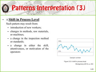
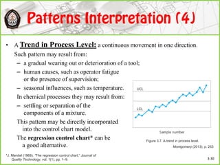
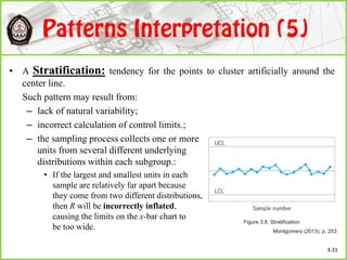
![In general, x-bar chart is insensitive (robust) to small departures from normality.
• The usual normal theory control limit constants are very robust to the normality
assumption and can be employed unless the population is extremely non-normal.*
• When the underlying distribution is uniform, right triangular, gamma (with λ = 1 and r =
½, 1, 2, 3, 4), and two bimodal distributions formed as mixtures of two normal
distributions, sample of size 4 or 5 are sufficient to ensure reasonable robustness to the
normality assumption**
– Worst case were for small values of r in the gamma distribution [r = ½ and r = 1 (the
exponential distribution)]: the α will be 0.014 or less if n ≥ 4 with r = ½.
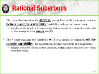
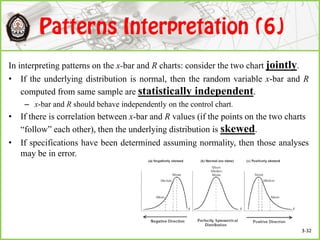
In contrast, R-chart is more sensitive than x-bar chart.
• The sampling distribution of R is not symmetric, even when sampling from the
normal distribution. When 3-sigma is used, the α is not 0.0027 (in fact, for n = 4,
the α is 0.00461).
*I. J. Burr (1967). “The effect of nonnormality on constants for x and R charts,” Industrial Quality Control, 23(11), pp. 563–569.
**E. G. Schilling and P. R. Nelson (1976), “The effect of nonnormality on the control limits of x charts,” Journal of Quality
Technology, 8(4), pp. 183–188. 3-33](https://image.slidesharecdn.com/shewhartchartforvariables-180109143424/85/Shewhart-Charts-for-Variables-33-320.jpg)
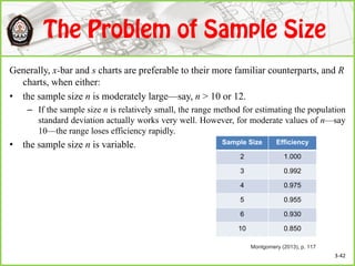
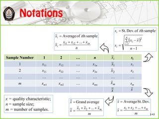
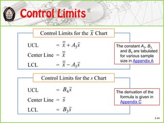
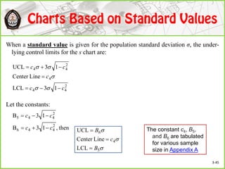


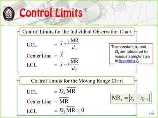
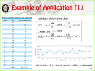
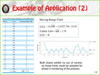


This document discusses Shewhart control charts for monitoring process quality through mean and variability, covering topics such as control limits, estimating process capability, and chart design. It details the importance of trial control limits, revising them based on out-of-control points, and emphasizes the impact of sample size and control limit widths on process monitoring. Additionally, it explores the relationship between natural variability, control limits, and specification limits, and recommends periodic revision for effective quality control.