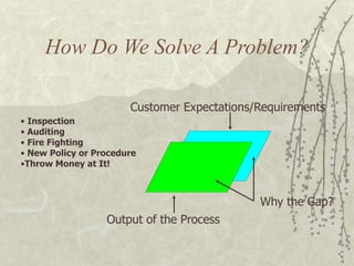
1. How Do We Solve A Problem?
Customer Expectations/Requirements
Output of the Process
Why the Gap?
• Inspection
• Auditing
• Fire Fighting
• New Policy or Procedure
•Throw Money at It!
2. What Causes A Problem?
Customer Expectations/Requirements
Output of the Process
Why the Gap?
EnvironmentPeople Methods
Machines Materials
3. How Should We Solve A
Problem?
Customer Expectations/Requirements
Output of the Process
Why the Gap?
9. Flowcharts [4]
Flow lines
– Show the flow of control through the flow chart
between the processes and decision boxes.
– The arrows are very important they show the
direction of flow. It must not be possible to go
in both directions along a flow line, therefore
all flowlines must have arrows on them.
11. Advantages and Disadvantages
of Flowcharts
For
– Easy to create
– Easy to read
Against
– Potentially generates unnecessarily complicated
logic.
– Produces inflexible algorithms (Parallel
activity?).
12. Why use the Flow Chart.
Flow Charts provide
us with a step-by-step
process.
Flowcharts help us to
determine which steps
are more complex and
might require more
time or a little extra
help.
Flow Charts provide
us with a picture of the
process.
13. Benefits of Flow Charts
Understanding of process steps
Understanding the interdependence of process
steps
Helps build a complete picture of the process
Helps identify sources of variation
14. The Flow Chart is a way of recording the following:
Steps in a process
Decisions to be made in that process
Useful data about these steps if this is helpful
Suggestions for using Flowcharts
Walk through a process before you make your flowchart,
taking notes as you do this.
Make a first draft of you flowchart and try it out to be sure
you have not forgotten any of the steps.
Make a flowchart of the process as it is, rather than changing
it as you go along. You can change it later, but your first purpose is
simply to record the process in the form of a flowchart.
Ask someone else to go through your process, using only the
flowchart to do it. This is a good way to see if you have left
anything out.
17. Constructing a Run Chart
Collect data for the item being measured for each
time period
– Minutes
– Hours
– Days
– Weeks
Plot each point on the graph in date sequence
order
– Do not omit periods of time
18. Run Chart Example
-
1,000
2,000
3,000
4,000
5,000
6,000
M ar-
00
Apr-
00
M ay-
00
Jun-
00
Jul-00 Aug-
00
Sep-
00
Oct-
00
Nov-
00
Dec-
00
Jan-
01
Feb-
01
M ar-
01
Apr-
01
M ay-
01
Jun-
01
Jul-01 Aug-
01
Month
NumberofTransactions
Actual 6-Mo Avg
Accounts Payable Invoice Processing
20. Began with the industrial revolution and a
factory system.
1920’s – major statistical quality control
tools were developed.
1924 – Shewhart introduced control charts
Importance of quality grew during and after
WWII
Dr. W. Edward Deming taught statistical
quality control concept to the Japanese
manufacturing sector
21. US was trying to catch up
1987 - Malcolm Baldrige National Quality
Award established
ISO 9000 International Quality Standards
US still trying to catch up??
J.M. Juran also worked with the
Japanese.
22. First, look at quality from a consumer’s point of
view.
Imagine that you are
shopping for a white
cotton shirt. What do
you consider to be a
quality shirt?
Describe the quality
characteristics of a
cotton shirt.
What is quality? Let’s define it.
23. Use a quality rubric to help you define the quality
standards for this product. For example,
A rubric is an objective means of assessment in
which you can not only characterize but also
quantify quality.
Criteria Excellent Good Fair Poor
Percent
Cotton
in Shirt
100%,
heavy weight
100 – 75%,
medium
weight
50%,
light weight
< 50%,
very light
weight
24. Establishing Standards
Monitoring Standards
Making Measurements
Taking Corrective Action
How do we do this?
Take random samples (subgroup) of size n
(usually 3, 4, 5, …) along the process.
Make the measurement(s) on the sample.
Compare to pre-determined standards (limits).
25. If our measurements are within the pre-
determined limits, then OK.
If not, then examine the process and take
corrective action.
What do we use to do this?
Control Charts – a graphical presentation of data
over time.
Upper and lower limits define acceptable limits of
quality.
The center line represents expected quality
measure (overall mean)
The data points are either averages or ranges of
the random samples (subgroups) at a specific
point in time.
26. All processes contain variability. Your job is to
keep variation under control.
By using control charts to track the process and
catch a problem before it gets too big.
How do you keep variation under control?
There are two types of variability:
Natural Variation Assignable Variation
• Random in nature
• Inherent in process
• Always present
• Normally distributed
• Common Cause Var.
• Intermittent in nature
• Inconsistent
• Uncontrollable
• Identified & removed
• Special Cause Var.
27. Whenever measurements are taken on a
continuous scale (e.g., weight, height, density,
length, time, temperature, etc.), then use
X-bar and R control charts.
X-bar Chart
X-bar or X represents the mean. In this chart,
changes in central tendency (or the mean) of the
process is indicated.
R Chart
R represents the range (a measure of spread) and
indicates a change in variability in the process.
How do you calculate the range of a set of values
(for example 1, 2, 3)?
28. The X-bar and R control charts are both based on
the Normal Distribution.
Central Limit Theorem
The distribution of sample means ( X ) will tend
to follow a normal distribution as the sample size
grows large.
The mean of the distribution of sample means (X
or X-double bar) will equal the mean of the
overall population (m, the mean of the means).
However, what if the individual data points are
not normally distributed? How can we then use
these control charts?
The standard deviation of the sampling
distribution is called the standard error sx= sx / n
where n is the subgroup size.
29. -3sx -2sx -1sx +1sx +2sx +3sxX = µ
mean
Standard error = sx =
sx
n
95.5% of all x fall within ± 2s x
99.7% of all x
fall within ± 3s x
30. Collect 20 – 25 samples (subgroups) of size
n = 4 or n = 5 from a stable process.
Compute the mean and range of each sample
(subgroup).
Calculate the upper and lower control limits.
If the process is not stable, use the desired
mean instead of the sample mean.
Compute the overall means (X and R). Set
the appropriate control limits – usually at the
99.7% level (Z = 3).
31. Look to see if any fall outside acceptable
limits (above or below the control limits).
Graph the sample (subgroup) means and
ranges on their respective control charts.
Try to assign causes for the variation, make
corrections and then resume the process.
Collect additional samples. If necessary,
revalidate the control limits using the new
data.
Look for trends. Investigate points or
patterns that indicate the process is out of
control.
32. Since we know the subgroup ranges and we want
99.7% control limits, we will use the following
formulas for the X-bar chart:
Upper Control Limit
UCLX = X + A2 R LCLX = X - A2 R
Lower Control Limit
Where X = mean of the sample means (grand
mean)
A2 = tabulated value based on normality
and subgroup size
R = mean of the sample ranges
The Center Line (CL) is X.
33. Upper Control Limit
UCLR = D4R
Lower Control Limit
Where D3 and D4 are tabulated values based on
the Normal Distribution and the subgroup
size n.
LCLR = D3R
Again, since we know the subgroup ranges and
we want 99.7% control limits, we will use the
following formulas for the R- chart:
The Center Line (CL) is R.
Where do A2, D3, and D4 come from?
34. Factors for Computing Control Chart Limits
SAMPLE SIZE, n MEAN FACTOR, A2 UPPER RANGE, D4 LOWER RANGE, D3
2 1.880 3.268 0
3 1.023 2.574 0
4 0.729 2.282 0
5 0.577 2.114 0
6 0.483 2.004 0
7 0.419 1.924 0.076
8 0.373 1.864 0.136
9 0.337 1.816 0.184
10 0.308 1.777 0.223
12 0.266 1.716 0.284
14 0.235 1.671 0.329
16 0.212 1.636 0.364
18 0.194 1.608 0.392
20 0.180 1.586 0.414
25 0.153 1.541 0.459
Source : Reprinted by permission of American Society for Testing Materials, copyright.
Taken from Special Technical Publication 15-C, "Quality of Materials," pp. 63 and 72, 1951.
Tabulated Values for Control Charts
35. +3s
+2s
+1s
Upper control
chart limit (UCL)
Target
Lower control
chart limit (LCL)
-1s
-2s
-3s
Normal behavior,
within + 3s units.
One point
above UCL,
investigate
cause
One point
below LCL,
investigate
cause
Out of Control Points
36. Upper control
chart limit (UCL)
Target
Lower control
chart limit
(LCL)
+3s
+2s
+1s
-1s
-2s
-3s
Cause to Investigate
Two points
near LCL
(in -3s range).Two points
near UCL
(in +3s range).
Run of 5 or
more above
central line.
37. Cause to Investigate
Erratic
behavior.
Upper control limit (UCL)
Target
Lower
control limit (LCL)
-1s
-2s
-3s
+3s
+2s
+1s
Run of 5 or
more below
central line.
Trends in either
Direction of 5
or more points.
40. WHAT IS A PIE CHART:
Pie chart show percentage of total quantities by
dividing a circle into proportionate wedge (like pieces
of a pie)
WHEN TO USE A PIE CHART :
When the largest share and their magnitudes have to
be highlighted in relation to total quantities.
42. HOW TO MAKE A PIE CHART.
•Calculate the proportion of each item from the total.
•Multiply the proportional by 360 to determine the
angle size of the wedges.
•Mark the angles to divide the circle into wedge.
•Complete the pie chart with legend and totals for clear
communication.
43. HOW TO INTERPRET A PIE CHART.
Pie Chart shows the items with large shares and offers
clues for reasons and causes for events.
45. WHAT IS STRATIFICATION
Is a statistical technique of breaking down values and
number into meaningful categories or classification to
focus corrective action or identify true cause.
46. REJECTION DUE TO UNBONDING
0
20
40
60
80
100
JAN FEB MAR APR MAY
MONTH
NUMBERS
REJECTED
MODEL-B
MODEL-A
STRATIFICATION
47. WHEN TO USE STRATIFICATION :
•To identify the cause of problem , if they come from a
particular source.
•To identify the source of variation and then infer the
cause of variation
•To analyse root cause in conjunction with other
technique like Pareto Diagram, Histogram and graphs.
48. HOW TO USE STRATIFICATION:
•Re-group the original data as per the source of the
data.
•If required , collect data, afresh after marking the
source from which they come.
•Recreate histogram, pareto chart and graphs on
classification data.
49. HOW TO INTERPRET STRATIFIED DATA:
•Can be used same techniques of Histogram,Pareto
chart and graph.
•If Data after stratification show significant difference
compare to the prior analysis, there is strong reason to
suspect a major cause isolated in the stratified class.
•It narrows down the search of problem and possible
solutions
50. Frequency distribution
– An organized tabulation of the number of individuals
located in each category on the scale of measurement
– Presented as either tables or a graph
Two elements of Frequency Distributions
– The set of categories that make up the original
measurement scale.
– A record of the number of individuals in each category.
57. Frequency Distributions Graphs
Histograms
– Vertical bars above each score
– Height of bar corresponds to Frequency
– Width extends to real limits of the score
Bar graphs
– Vertical bars above each score with space between each
bar
– Designates separate distinct categories
Frequency Distribution Polygon (line graph)
– A dot is centered above the score w/ height
corresponding to frequency
– Connected with a contentious line
63. Quality Circles & Teams
Quality Team - a team that is part of an organization’s
structure & is empowered to act on its decisions
regarding product & quality service
Quality Circles (QC) - a small group of employees
who work voluntarily on company time, typically
one hour per week, to address work-related
problems
QC’s deal with substantive issues
– Do not require final decision authority
– QC’s need periodic reenergizing
64. Groups & Teams
Group - two or more people with common
interests, objectives, and continuing interaction
Work Team - a group of people with
complementary skills who are committed to a
common mission, performance goals, and
approach for which they hold themselves
mutually accountable
65. Characteristics of a
Well-Functioning, Effective
Group
Relaxed, comfortable, informal atmosphere
Task well understood & accepted
People express feelings & ideas
Members listen well & participate
66. Characteristics of a
Well-Functioning, Effective
Group
Consensus decision making
Conflict & disagreement center
around ideas or methods
Clear assignments made & accepted
Group aware of its operation & function
67. Group Behavior
Norms of Behavior - the standards that a work group
uses to evaluate the behavior of its members
Group Cohesion - the “interpersonal glue” that
makes members of a group stick together
Social Loafing - the failure of a group member to
contribute personal time, effort, thoughts, or other
resources to the group
Loss of Individuality - a social process in which
individual group members lose self-awareness &
its accompanying sense of accountability,
inhibition, and responsibility for individual
behavior
68. Group Formation
Formal Groups –
official or assigned
groups gathered to
perform various tasks
need ethnic, gender,
cultural, and
interpersonal
diversity
need professional
and geographical
diversity
Informal Groups -
unofficial or emergent
groups that evolve in
the work setting to
gratify a variety of
member needs not met
by formal groups
69. Stages of Group Formation
Mutual
acceptance
Emphasis
on
interpersonal
concern and
awareness
Motivation
and
commitment
Decision
making
Control
and
sanctions
Emphasis
on task
planning,
authority
and
influence
Emphasis
on task
accomplishment,
leadership and
performance
Emphasis
on rewards
and
punishment
70. Mature Group Characteristics
Purpose and Mission
May be assigned or may emerge from the
group
Group often questions, reexamines, and
modifies mission and purpose
Mission converted into specific agenda,
clear goals, and a set of critical success
factors
71. Productivity Norms – may be consistent or
inconsistent, supportive or unsupportive of
organization’s productivity standards
Mature Group Characteristics
Behavioral Norms - well-understood
standards of behavior within a group
Formal & written
Ground
rules
for
meetings
Informal but
well understood
Intragroup
socializing
72. Mature Group Characteristics
Group Cohesion - interpersonal attraction binding
group members together
Enables groups to exercise effective control over
the members
Groups with high cohesiveness
– demonstrate lower tension & anxiety
– demonstrate less variation in productivity
– demonstrate better member satisfaction, commitment,
& communication
73. Cohesiveness &
Work-Related Tension
3.2
3.3
3.4
3.5
3.6
3.7
3.8
3.9
4
1 2 3 4 5 6 7
Mean tension
Group Cohesiveness from low to high
7 16 52 65 57 19 12
Number of groups
“Does your
work ever make
you jumpy or
nervous?”
Low score =
high tension
From S. E. Seashore, Group Cohesiveness in the Industrial
Work Force, 1954. Research conducted by Stanley E.
Seashore at the Institute for Social Research, University of
Michigan. Reprinted by permission.
74. Mature Group Characteristics
Status Structure - the set of authority & task
relations among a group’s members
Hierarchical
Often leadership is shared
ContributorData/Info
CollaboratorMission
CommunicatorFacilitator
ChallengerDevil’s advocate
Diversity
Styles
75. Team Task Functions
Task Functions - those activities directly related to
the effective completion of the team’s work
Initiate activities
Evaluate effectiveness
Elaborate concepts
Summarize ideas
Diagnose problems
Seek information
Give information
Test ideas
Coordinate activities
76. Team Task Functions
Maintenance Functions - those activities essential to
the effective, satisfying interpersonal relationships
within a team or group
Support others
Gatekeep communication
Test consensus
Express member feelings
Reduce tension
Set standards
Follow others’ lead
Harmonize conflict
Test group decisions
77. Good when performing complicated, complex,
interrelated and/or more voluminous work than
one person can handle
Good when knowledge, talent, skills, & abilities
are dispersed across organizational members
Empowerment and collaboration; not power and
competition
Basis for total quality efforts
Why Teams OR Quality Circles?
79. Social Benefits of Teams
Psychological Intimacy -
emotional & psychological
closeness to other team
or group members
Integrated Intimacy -
closeness achieved
through tasks & activities
80. An attribute of a
person or of an
organization’s culture
Preparation & careful
planning focuses
empowered employees
Encourages
participation
Solve specific and
global problems
Foundations for Empowerment
82. Self-Managed Teams
Self-Managed Teams - teams that make
decisions that were once reserved for managers
How does an organization capitalize
on the advantages and avoid the risks
of self managed teams?
83. Upper Echelons:
Teams at the Top
Top management's
background characteristics
predict organizational
characteristics
Organization reflects
top management's
values, competence,
ethics & unique characteristics
Management team's
leadership, composiiton, &
dynamics influences the
organization's performance
Upper Echelons -
A top-level executive team
in an organization
84. Executive Tenure &
Organizational Performance
Organizationalperformance
relativetotheindustryaverage
High
Low
1 7 14
CEO tenure (years)Source: D. Hambrick, The Seasons of an Executive’s Tenure, keynote address, the
Sixth Annual Texas Conference on Organizations, Lago Vista, Texas, April, 1991.
85. Multicultural Teams
Multicultural groups represent
three or more ethnic backgrounds.
Diversity may increase uncertainty,
complexity, & inherent confusion in
group processes. Culturally
diverse groups may generate more
& better ideas & limit groupthink.
89. Force Field Analysis
What is it?
Force field analysis is an analytical tool that
clarifies opposing aspects of a desired change.
Driving or positive forces that support an action
or situation
Restraining or negative forces that try to
prevent it
When the team is planning implementation of a
solution.
When the team is identifying causes of a
problem
When the team is identifying problems in a
process
90. Any time a change is expected to be difficult.
When students are working together and need
to make a yew/no decision.
When the team is planning implementation of a
solution.
When the team is identifying causes of a
problem
When the team is identifying problems in a
process
91.
92. Force Field Analysis
How is it made?
1. Define the desired change or
action.
2. Brainstorm the driving forces.
3. Brainstorm the restraining forces.
4. Prioritize the driving forces.
5. Prioritize the restraining forces.
6. List action to be taken.
93. Driving Forces:
Forces which move you
toward your goal
Restraining Forces:
Forces which keep you from
your goal.
94. Process in the Classroom
Step 1-Clue the Class In
Introduce the tool. Let the people know why you
are doing this and explain the value of this
process.
Explain the concept of driving forces and
restraining forces.
Write the purpose, desired outcomes, and
process on the flip chart.
Post for the class to see.
95. Prepare a Force Field Chart
Write the topic at the top o f the chart and
underline it.
Draw a line down the center of the chart.
Write “Driving Forces” on the left side beneath
the topic heading and “Restraining Forces” on the
right sides.
96. Identify Driving and Restraining Forces
Ask the kids to identify driving and restraining
forces that affect the topic or decision.
Record all forces on the appropriate side of the
chart.
Review the Listed Forces
As you review the listed forces, check for
understanding.
Have the kids brainstorm ideas for strengthening
the driving forces and for reducing the restraining
forces.
Use this information, develop a plan for next
steps.
97. Reviews proposed change from both
for and against viewpoint.
Provides a starting point for action.
A list of actions is the output.