This document provides an overview of the Xbar-S control chart, including how to read and set up the chart. The Xbar-S chart plots the sample means (Xbar) and standard deviations (S) of continuous data over time. It requires rational subgrouping of data into at least two samples. The chart is used to determine whether a process is in statistical control and to identify special causes of variation. An example Xbar-S chart is shown with explanation of how points outside the control limits could indicate special causes of non-random variation.
Overview of Xbar-S control chart in Six Sigma; importance of complex tools and clear teaching.
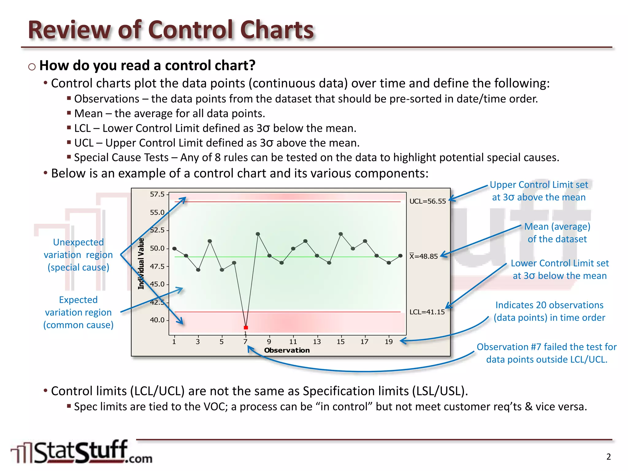
How to interpret control charts with components such as Mean, LCL, and UCL; data observation explanation.
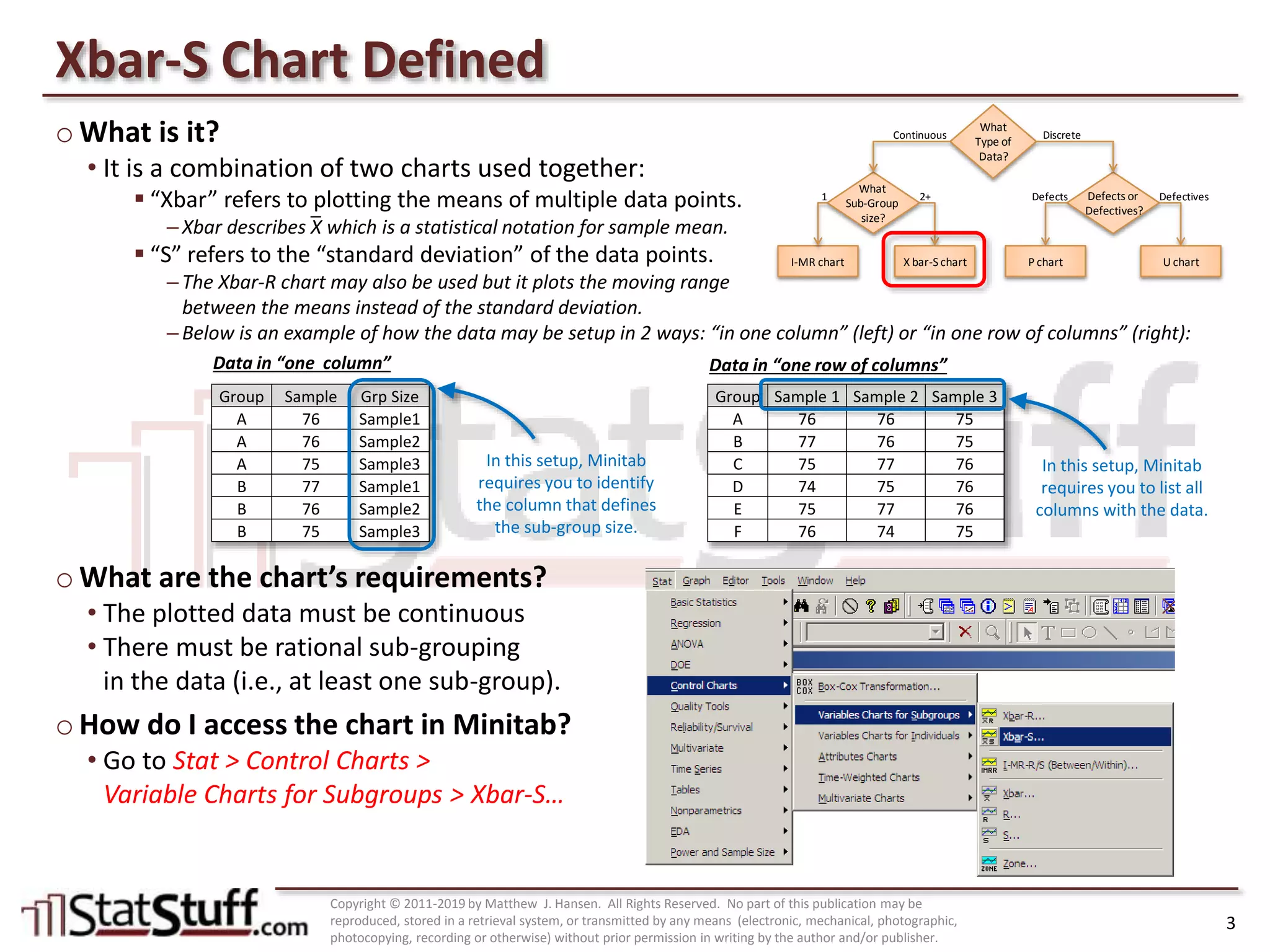
Explanation of Xbar-S chart; requirements for use and accessing it in Minitab software.
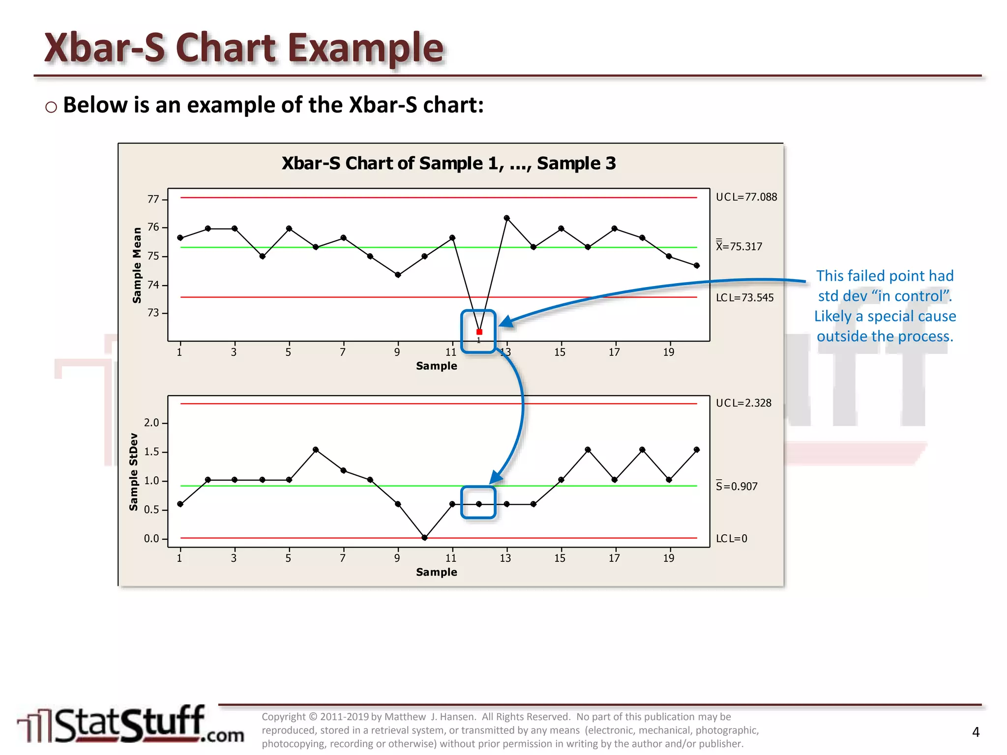
Example of Xbar-S chart showcasing sample means and standard deviations with analysis of control limits.
Guide to apply Xbar-S chart using organizational metrics, identifying failures, and understanding variations.


![Control Charts[1]](https://cdn.slidesharecdn.com/ss_thumbnails/controlcharts1-1226081330857138-9-thumbnail.jpg?width=640&height=640&fit=bounds)


