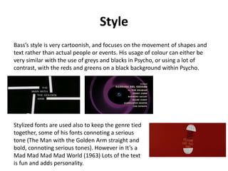
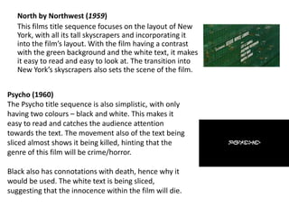
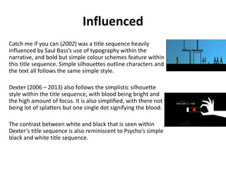
Saul Bass – Title sequence
designer
Maddie H and Niamh
Career Summary
Saul Bass studied part-time at the Art Students League within Manhattan, and
then transferred to night classes at Brooklyn College.
Saul had a 40 year career, creating title sequences from 50s to 90s.
Bass worked with: Alfred Hitchcock, Otto Preminger, Billy Wilder, Stanley
Kubrick and Martin Scorsese. Some of his most famous title sequences
include: The Man with the Golden Arm (1995), North by Northwest (1958)
and Psycho (1960).
Style
Bass’s style is very cartoonish, and focuses on the movement of shapes and
text rather than actual people or events. His usage of colour can either be
very similar with the use of greys and blacks in Psycho, or using a lot of
contrast, with the reds and greens on a black background within Psycho.
Stylized fonts are used also to keep the genre tied
together, some of his fonts connoting a serious
tone (The Man with the Golden Arm straight and
bold, connoting serious tones). However in It’s a
Mad Mad Mad Mad World (1963) Lots of the text
is fun and adds personality.
Most notable works
His most famous works are: The Man with the Golden Arm (1955), North to
Northwest (1958) and Psycho (1960).
The Man with the Golden Arm (1955)
The Man with the Golden Arm was Bass’s big breakthrough. The title
sequence has a greyscale colour scheme, making everything transition and
look sleek and organised. The straight-edge font gives the film a serious tone,
and can set the genre of drama as it is cutting edge and exciting for the
audience.
The swift movement of the shapes could connote how heroin use is only for a
short (2 hour) period of time, and the slim rectangles could connote the
needle used for injecting heroin.
North by Northwest (1959)
This films title sequence focuses on the layout of New
York, with all its tall skyscrapers and incorporating it
into the film’s layout. With the film having a contrast
with the green background and the white text, it makes
it easy to read and easy to look at. The transition into
New York’s skyscrapers also sets the scene of the film.
Psycho (1960)
The Psycho title sequence is also simplistic, with only
having two colours – black and white. This makes it
easy to read and catches the audience attention
towards the text. The movement also of the text being
sliced almost shows it being killed, hinting that the
genre of this film will be crime/horror.
Black also has connotations with death, hence why it
would be used. The white text is being sliced,
suggesting that the innocence within the film will die.
Influenced
Catch me if you can (2002) was a title sequence heavily
influenced by Saul Bass’s use of typography within the
narrative, and bold but simple colour schemes feature within
this title sequence. Simple silhouettes outline characters and
the text all follows the same simple style.
Dexter (2006 – 2013) also follows the simplistic silhouette
style within the title sequence, with blood being bright and
the high amount of focus. It is also simplified, with there not
being lot of splatters but one single dot signifying the blood.
The contrast between white and black that is seen within
Dexter’s title sequence is also reminiscent to Psycho’s simple
black and white title sequence.
Questionnaire
How did this title sequence make you feel?
Many people answered to feeling confused and curious.
Does this title sequence make you want to watch the rest of the film?
Most people answered yes to this.
Have you heard of Saul Bass before?
Most people answered no.
Have you watched any of Saul Bass’s film before?
There was a 50/50 split of how many people had watched Saul Bass’s films.
What genre do you think this film is?
Most people said horror and thriller.
Is there anything you think this title sequence is lacking?
The answered for this were varied, and included different imagery, more text and a different
range of colours.

Saul Bass presentation.

  • 1.
    Saul Bass –Title sequence designer Maddie H and Niamh
  • 2.
    Career Summary Saul Bassstudied part-time at the Art Students League within Manhattan, and then transferred to night classes at Brooklyn College. Saul had a 40 year career, creating title sequences from 50s to 90s. Bass worked with: Alfred Hitchcock, Otto Preminger, Billy Wilder, Stanley Kubrick and Martin Scorsese. Some of his most famous title sequences include: The Man with the Golden Arm (1995), North by Northwest (1958) and Psycho (1960).
  • 3.
    Style Bass’s style isvery cartoonish, and focuses on the movement of shapes and text rather than actual people or events. His usage of colour can either be very similar with the use of greys and blacks in Psycho, or using a lot of contrast, with the reds and greens on a black background within Psycho. Stylized fonts are used also to keep the genre tied together, some of his fonts connoting a serious tone (The Man with the Golden Arm straight and bold, connoting serious tones). However in It’s a Mad Mad Mad Mad World (1963) Lots of the text is fun and adds personality.
  • 4.
    Most notable works Hismost famous works are: The Man with the Golden Arm (1955), North to Northwest (1958) and Psycho (1960). The Man with the Golden Arm (1955) The Man with the Golden Arm was Bass’s big breakthrough. The title sequence has a greyscale colour scheme, making everything transition and look sleek and organised. The straight-edge font gives the film a serious tone, and can set the genre of drama as it is cutting edge and exciting for the audience. The swift movement of the shapes could connote how heroin use is only for a short (2 hour) period of time, and the slim rectangles could connote the needle used for injecting heroin.
  • 5.
    North by Northwest(1959) This films title sequence focuses on the layout of New York, with all its tall skyscrapers and incorporating it into the film’s layout. With the film having a contrast with the green background and the white text, it makes it easy to read and easy to look at. The transition into New York’s skyscrapers also sets the scene of the film. Psycho (1960) The Psycho title sequence is also simplistic, with only having two colours – black and white. This makes it easy to read and catches the audience attention towards the text. The movement also of the text being sliced almost shows it being killed, hinting that the genre of this film will be crime/horror. Black also has connotations with death, hence why it would be used. The white text is being sliced, suggesting that the innocence within the film will die.
  • 6.
    Influenced Catch me ifyou can (2002) was a title sequence heavily influenced by Saul Bass’s use of typography within the narrative, and bold but simple colour schemes feature within this title sequence. Simple silhouettes outline characters and the text all follows the same simple style. Dexter (2006 – 2013) also follows the simplistic silhouette style within the title sequence, with blood being bright and the high amount of focus. It is also simplified, with there not being lot of splatters but one single dot signifying the blood. The contrast between white and black that is seen within Dexter’s title sequence is also reminiscent to Psycho’s simple black and white title sequence.
  • 7.
    Questionnaire How did thistitle sequence make you feel? Many people answered to feeling confused and curious. Does this title sequence make you want to watch the rest of the film? Most people answered yes to this. Have you heard of Saul Bass before? Most people answered no. Have you watched any of Saul Bass’s film before? There was a 50/50 split of how many people had watched Saul Bass’s films. What genre do you think this film is? Most people said horror and thriller. Is there anything you think this title sequence is lacking? The answered for this were varied, and included different imagery, more text and a different range of colours.