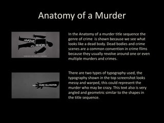
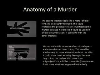
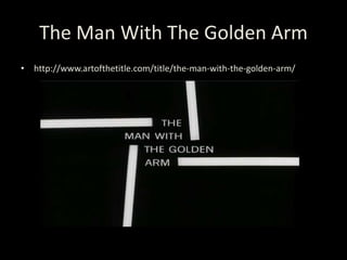
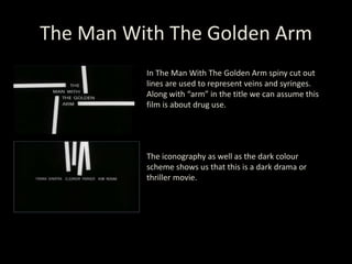
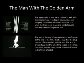
SAUL
BASS
• Saul Bass (1920-1996) was an American
graphic designer who was most famous for his
work in film title sequences and classic logo
design.
• He is well known for using simple, geometric
shapes and them having symbolism within the
context of the film. Often he uses a dominant
image throughout sequence.
Anatomy of a Murder
• http://www.artofthetitle.com/title/anatomy-of-a-murder/
Anatomy of a Murder
In the Anatomy of a murder title sequence the
genre of crime is shown because we see what
looks like a dead body. Dead bodies and crime
scenes are a common convention in crime films
because they usually revolve around one or even
multiple murders and crimes.
There are two types of typography used, the
typography shown in the top screenshot looks
messy and warped, this could represent the
murder who may be crazy. This text also is very
angled and geometric similar to the shapes in
the title sequence.
Anatomy of a Murder
The second typeface looks like a more “official”
font and also slightly rounded. This could
represent the police/detectives investigating the
murder because it looks like it could be used on
official documentation. It contrasts with the
other typeface.
We see in the title sequence shots of body parts
and some shots of them cut up. This could be
another way to show information about the killer.
It could show them as being deranged because
they cut up the body or that there is an
enigma(which is a thriller convention) because we
don’t know what has happened to the body.
The Man With The Golden Arm
• http://www.artofthetitle.com/title/the-man-with-the-golden-arm/
The Man With The Golden Arm
In The Man With The Golden Arm spiny cut out
lines are used to represent veins and syringes.
Along with “arm” in the title we can assume this
film is about drug use.
The iconography as well as the dark colour
scheme shows us that this is a dark drama or
thriller movie.
The Man With The Golden Arm
The typography is very basic and works well with
the simple imagery to to put emphasis on the
imagery, the audience is meant to figure out
what the lines could mean and not to focus to
much on the meaning of the text.
The arm at the end of the sequence is a reference
to the title of the film. This ties together the drug
use link of the needles and the arm. The arm is
crooked just like the unsettling angles of the lines,
this could be used to represent how the character
in the film is affected.

Saul bass - Designer Presentation

  • 1.
  • 2.
    • Saul Bass(1920-1996) was an American graphic designer who was most famous for his work in film title sequences and classic logo design. • He is well known for using simple, geometric shapes and them having symbolism within the context of the film. Often he uses a dominant image throughout sequence.
  • 3.
    Anatomy of aMurder • http://www.artofthetitle.com/title/anatomy-of-a-murder/
  • 4.
    Anatomy of aMurder In the Anatomy of a murder title sequence the genre of crime is shown because we see what looks like a dead body. Dead bodies and crime scenes are a common convention in crime films because they usually revolve around one or even multiple murders and crimes. There are two types of typography used, the typography shown in the top screenshot looks messy and warped, this could represent the murder who may be crazy. This text also is very angled and geometric similar to the shapes in the title sequence.
  • 5.
    Anatomy of aMurder The second typeface looks like a more “official” font and also slightly rounded. This could represent the police/detectives investigating the murder because it looks like it could be used on official documentation. It contrasts with the other typeface. We see in the title sequence shots of body parts and some shots of them cut up. This could be another way to show information about the killer. It could show them as being deranged because they cut up the body or that there is an enigma(which is a thriller convention) because we don’t know what has happened to the body.
  • 6.
    The Man WithThe Golden Arm • http://www.artofthetitle.com/title/the-man-with-the-golden-arm/
  • 7.
    The Man WithThe Golden Arm In The Man With The Golden Arm spiny cut out lines are used to represent veins and syringes. Along with “arm” in the title we can assume this film is about drug use. The iconography as well as the dark colour scheme shows us that this is a dark drama or thriller movie.
  • 8.
    The Man WithThe Golden Arm The typography is very basic and works well with the simple imagery to to put emphasis on the imagery, the audience is meant to figure out what the lines could mean and not to focus to much on the meaning of the text. The arm at the end of the sequence is a reference to the title of the film. This ties together the drug use link of the needles and the arm. The arm is crooked just like the unsettling angles of the lines, this could be used to represent how the character in the film is affected.