Analysis by Molly
Ruby
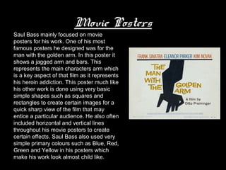
Saul Bass was an American graphic
designer who became famous for his
logos. Saul Bass used a lot of simple
geometric shapes in his work and
their symbolisms. He often hand drew
his work to create a casual
appearance. He also revolutionized
the way that people viewed title credit
sequences.
Saul Bass’s most popular
         work
       • The Man with the golden arm
       • North by North west
       • Psycho
       • Anatomy of a murder
       • West side story
       • The shining
Movie Posters
Saul Bass mainly focused on movie
posters for his work. One of his most
famous posters he designed was for the
man with the golden arm. In this poster it
shows a jagged arm and bars. This
represents the main characters arm which
is a key aspect of that film as it represents
his heroin addiction. This poster much like
his other work is done using very basic
simple shapes such as squares and
rectangles to create certain images for a
quick sharp view of the film that may
entice a particular audience. He also often
included horizontal and vertical lines
throughout his movie posters to create
certain effects. Saul Bass also used very
simple primary colours such as Blue, Red,
Green and Yellow in his posters which
make his work look almost child like.
Title sequences
Not only did Saul Bass design film posters, he also designed some title sequences
such as The man with the golden arm
In this title sequence it is very simple and consistent through out of the same thing
happening over and over again of white rectangles appearing across the screen. This is a
perfect example of Bass’s use of simple shapes in his work as he did so here. The white
rectangles may represent many different things for this film, such as the cocaine addiction
of the main characters has in the movie, the lines may reflect the cocaine itself. They also
may represent the many different events that may occur in the story that all link together in
some way as the lines interlink and cross over each other, showing that there may be
multiple stories within the film that all somehow join together in the end.
Saul Bass chose to use very plane and dull
colours like black and white which does not
indicate very much for an audience as it is
so simple and not detailed, this makes the
title sequence seem really mysterious and
dark.
Over all what Saul Bass created for this film
title sequence was not very clear for the
audience as it does not give much
information away about the film/ what the
film is about at all. The fact that his work is
very simple makes it a lot more difficult for
people to understand the main features of a
film.

Saul bass analysis1

  • 1.
  • 2.
    Saul Bass wasan American graphic designer who became famous for his logos. Saul Bass used a lot of simple geometric shapes in his work and their symbolisms. He often hand drew his work to create a casual appearance. He also revolutionized the way that people viewed title credit sequences.
  • 3.
    Saul Bass’s mostpopular work • The Man with the golden arm • North by North west • Psycho • Anatomy of a murder • West side story • The shining
  • 4.
    Movie Posters Saul Bassmainly focused on movie posters for his work. One of his most famous posters he designed was for the man with the golden arm. In this poster it shows a jagged arm and bars. This represents the main characters arm which is a key aspect of that film as it represents his heroin addiction. This poster much like his other work is done using very basic simple shapes such as squares and rectangles to create certain images for a quick sharp view of the film that may entice a particular audience. He also often included horizontal and vertical lines throughout his movie posters to create certain effects. Saul Bass also used very simple primary colours such as Blue, Red, Green and Yellow in his posters which make his work look almost child like.
  • 5.
    Title sequences Not onlydid Saul Bass design film posters, he also designed some title sequences such as The man with the golden arm In this title sequence it is very simple and consistent through out of the same thing happening over and over again of white rectangles appearing across the screen. This is a perfect example of Bass’s use of simple shapes in his work as he did so here. The white rectangles may represent many different things for this film, such as the cocaine addiction of the main characters has in the movie, the lines may reflect the cocaine itself. They also may represent the many different events that may occur in the story that all link together in some way as the lines interlink and cross over each other, showing that there may be multiple stories within the film that all somehow join together in the end. Saul Bass chose to use very plane and dull colours like black and white which does not indicate very much for an audience as it is so simple and not detailed, this makes the title sequence seem really mysterious and dark. Over all what Saul Bass created for this film title sequence was not very clear for the audience as it does not give much information away about the film/ what the film is about at all. The fact that his work is very simple makes it a lot more difficult for people to understand the main features of a film.